|
| Group |
Round |
C/R |
Comment |
Date |
Image |
| 86 |
Jul 23 |
Reply |
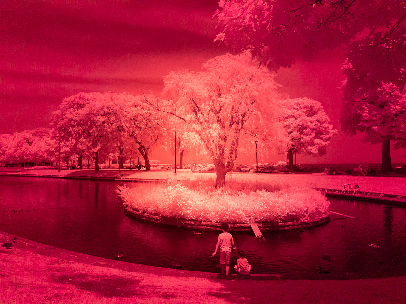
Thank you! Although I didn't notice the "leaning" when I first viewed the image - after Kieu-Hanh mentioned it - I see it - also in the smaller buildings. I think your decision to "split the difference" makes sense - since a "flat" look while architecturally accurate - is not what our eyes expect. |
Jul 19th |
| 86 |
Jul 23 |
Comment |
Jack - which iPhone lens was this? Kieu-Hanh make a good point.
|
Jul 19th |
| 86 |
Jul 23 |
Reply |
Tx for your kind words! Regarding the color of the foliage - I wasn't sure if it was like that - or if I did something in post-processing - so I went back to the original .dng file from the iPhone (attached). Seems the leaves in that corner are darker. I hadn't noticed that. Reading on-line - the classic white appearance of foliage can vary - based on how the light is striking the plant, species of the plant/leaf, and health of the plant. I don't fully understand it. I encourage you to play with the filter you bought - it's fun and can be addictive (see image I submitted this month to Group 87 - also iPhone IR). |
Jul 18th |
 |
| 86 |
Jul 23 |
Comment |
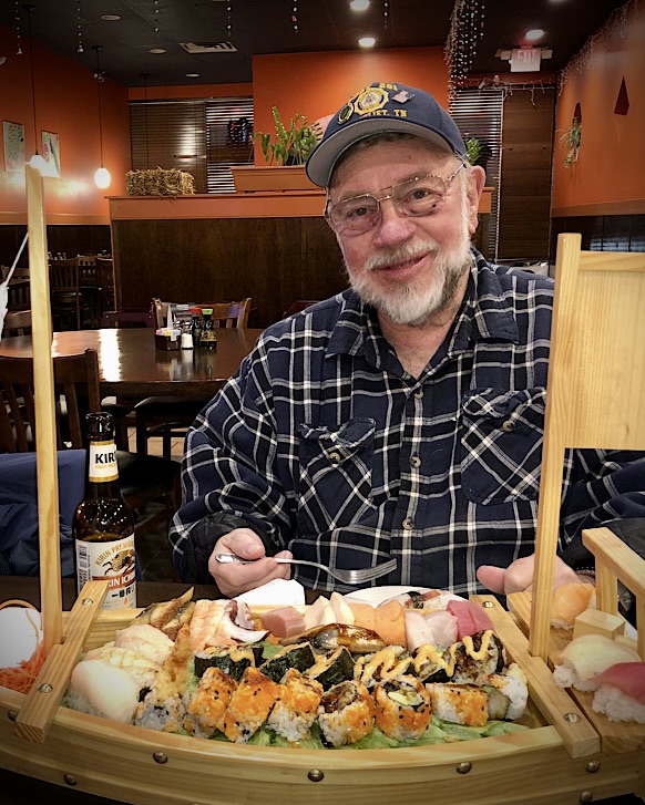
This makes me hungry for sushi! This guy look so happy. I like what you did with your edits; although clearly not "real" (sometimes I don't even know what that means these days) - it's well done and holds my interest more than the original. There is a bit of tension between the guys face and the sushi boat; my eyes keep darting back and forth (perhaps OK). The boat is large/colorful/bright - keeps pulling my gaze. Depending what you consider the "subject" you could further edit to focus more attention on either the boat or the face. Could also dim/blur the background. And a tighter crop might help (see attached). Your images have a recognizable style; something I'm told is a good thing for a photographer to develop! |
Jul 14th |
 |
| 86 |
Jul 23 |
Comment |
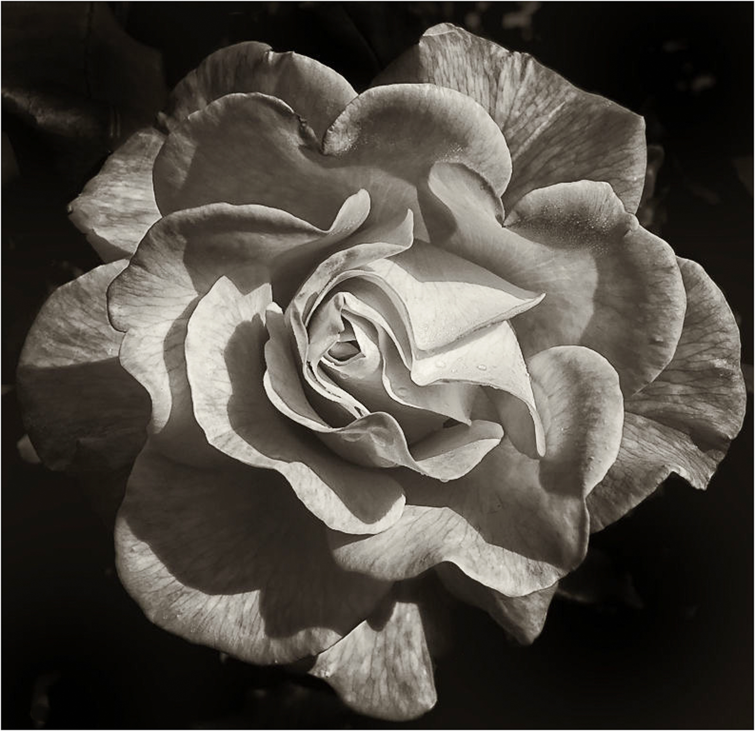
I like the detail, sharpness, and texture of this image. For me - the color doesn't add much; that makes me think B&W. I tried to clean it up a bit and converted to B&W with slight sepia tone. Interesting that you mention liking the rich colors . . . what do you think of the monochrome version? |
Jul 14th |
 |
| 86 |
Jul 23 |
Comment |
Very interesting image - most of the skyline is so homogeneous - that massive skyscraper really stands out. Also the lighting of it is so different. It almost doesn't look real. In terms of composition - the top of the skyscraper seems a bit too close to the edge of the frame; I'd rather have bit more sky - even if that means slightly less water. Given how large/bright the skyscraper is - it does give the whole image an unbalanced feel. Not sure if you have wider images - and could explore how it would look closer to the center. Agree that the iPhone (and the photographer!) performed well from a moving boat with low light. Just curious - what was the shutter speed and ISO? Although the overall scene is dark (mostly sky/water) - the buildings are quite bright. Would be interesting to know what exposure was require to capture.
|
Jul 6th |
| 86 |
Jul 23 |
Comment |
Beautiful image - I like the silhouette against the sky. Perfect composition. One suggestion to consider monochrome. There isn't much color in this image - and I think monochrome (perhaps with sepia toning) would be worth experimenting with. |
Jul 6th |
| 86 |
Jul 23 |
Comment |
Nice image - kudos to you for getting low. Great example of the lower vantage point makes something special - out of scene that would have been pretty boring if taken at normal eye level. Hopefully you didn't get wet! I like the color and processing. Improves the image - yet not over-done. |
Jul 6th |
6 comments - 2 replies for Group 86
|
| 87 |
Jul 23 |
Reply |
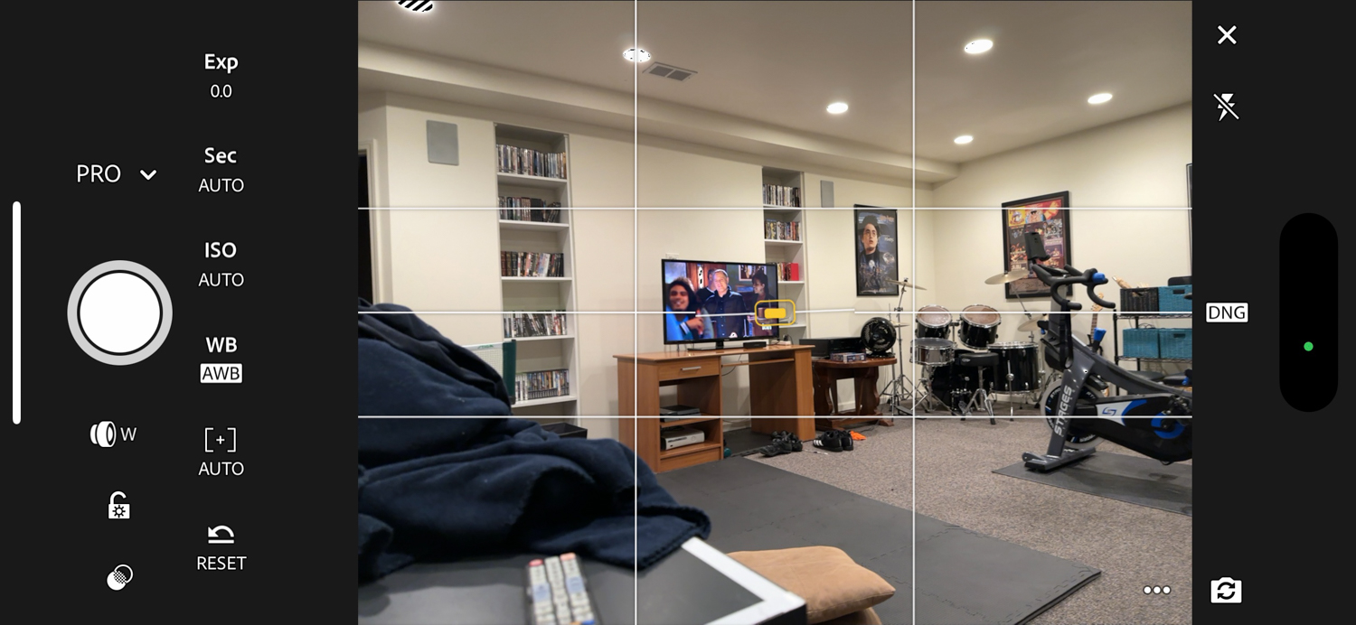
If you tap the camera icon - it will open the camera (see next image from my basement). Your's may look a little different, since this reflects options I have selected. There are many choices/controls for the camera. |
Jul 6th |
 |
| 87 |
Jul 23 |
Reply |
if you have Lightroom mobile on your phone - and open the app - your screen will likely look something like this. I circled in red (lower right) where you can go to turn on the LR camera. |
Jul 6th |
 |
| 87 |
Jul 23 |
Reply |
Also - If you have the adobe photography package - it includes LR mobile - that includes a very capable camera (that shoots in raw!) - better than most cell phones. |
Jul 6th |
| 87 |
Jul 23 |
Reply |
Cindy - I have grappled with this question many times - and where I come out is to take my cell phone AND mirrorless camera with a 24-105 f4 zoom. Nothing else. That's pretty compact. Although cell phones are phenomenal - there are many things you will do differently/better with the canon body. Resist the slippery slope of addling more lenses, filters, flashes, tripods, etc.
And regarding phones - my suggestion is to think of it as your "other" camera that takes great photographs (download pictures after each shoot, import/curate/edit in LR) - and don't think of it as a phone that also takes snapshots. I'd invest in learning your phone's camera and any camera apps you decide to use (for things like long exposures). Phones have many modes/features that aren't intuitive. Learning to use them at home will result in better images during travel. I increasingly find taking pictures with my cell phone enjoyable and liberating! |
Jul 6th |
| 87 |
Jul 23 |
Comment |
Very creative - agree this would work well as part of a series! I like the low contrast processing - it creates a softness that is effective. It's a scene that makes me think of light painting - which would have required you "big boy" camera and have produced a very different (sharp/textured) image. I agree with Chan that the grain adds to the effectiveness. What iso was this shot at? |
Jul 6th |
| 87 |
Jul 23 |
Comment |
WOW - you nailed focus on this little guy. Sharp eye/catchlight! People who have never tried - have no idea how fast these birds move - and the erratic nature of their flight. Very hard to see/track. I like the separation from the background; would have been even better if the background was a different color - I appreciate you can't "pose" them! To my eye the neck/breast and part of the underside are blown out. Those areas do have texture - that is likely impossible to bring out. Other things to consider - Would a tighter crop be better (I'd leave in part of the feeder - but I think there is real estate in this image that isn't adding much? Would you like to reduce background noise (pretty easy now with one click in LR)? Was the feeder hanging at an angle like you have captured? Keep shooting/posting these pics! |
Jul 6th |
| 87 |
Jul 23 |
Comment |
So many square themes - frames within frames - the crop is prefect. I love the lighting - apparent from the shadow of the first pot - that the sun is essentially at the horizon to camera left. You included just the right amount of floor. Those two silver "things" on the wall - my first inclination was to say remove them - but upon reflection they create more interest as I think about what they are for. Kudos to you for taking a very ordinary scene and making it special! |
Jul 6th |
| 87 |
Jul 23 |
Comment |
My first reaction - was that this was a Ps composite - I never imagined that a chipmunk would get so close to a person. When I realized it was real - I could hear my wife in the background saying "Don't get that close, they bite and have diseases." The detail is fantastic - even a catchlight in the tiny eye! Nice background separation - even at f6.3 - likely due to the distance between the subject and the background. You need to move quickly to capture an image like this. Well done!
|
Jul 6th |
| 87 |
Jul 23 |
Comment |
I'm really enjoying your portraits - learning from them and getting inspired to try! I like the simplicity of the black t-shirt/background, the natural lighting coming from camera right and the mono processing. The dark side of his face is still easily visible - and yet the variation in lighting creates lots of interest! When I looked at this image prior to reading your text - I saw toughness - someone who had been through something (I also thought about a veteran) - and also a softness/warmth/thoughtfulness that was reassuring. That contrast was interesting. Reading your narrative creates even more interest/empathy; a good reminder that we often know little about what others have been through - and that we should always err on the side kindness. Excellent image! |
Jul 6th |
5 comments - 4 replies for Group 87
|
11 comments - 6 replies Total
|


