|
| Group |
Round |
C/R |
Comment |
Date |
Image |
| 86 |
Jun 23 |
Reply |
Tx - you raise an interesting point. I agree that including the central vein/stem or the leaf edge would make the image more recognizable. On the other hand - I think it would diminish the intrigue you describe - it would make the subject more recognizable and less abstract/open to interpretation. |
Jun 24th |
| 86 |
Jun 23 |
Reply |
I agree with you that Jack's original is better . . . the foreground statue is pretty dark and doesn't distract. Without it - there just seems lie lots of empty space. |
Jun 12th |
| 86 |
Jun 23 |
Comment |
I like this image and your edits. Nice composition - framing the capitol rotunda with the trees/fountain. |
Jun 12th |
| 86 |
Jun 23 |
Comment |
Nice capture of great old car . . . I like your edits! Definitely agree the car/person needed to be removed. Another suggestion might be to change the color of the bright red rectangular roof of the gas station. It's bright/red and pulls my gaze to that corner and away from the car. I also think the car would look good in B&W! Not sure the color adds much to this image. |
Jun 12th |
| 86 |
Jun 23 |
Comment |
Agree - very futuristic and interesting. Your crop makes sense to me. Something else I would consider is conversion to high-contrast B&W. The current image has an aqua/blue tint (at least on my monitor) - perhaps due to the lighting in the space. I find the B&W more compelling. |
Jun 12th |
| 86 |
Jun 23 |
Reply |
Thank you. I also had the iPhone X until recently. Although the newer phones have some new features, the iPhone X has aged well and still takes good images! |
Jun 9th |
| 86 |
Jun 23 |
Comment |
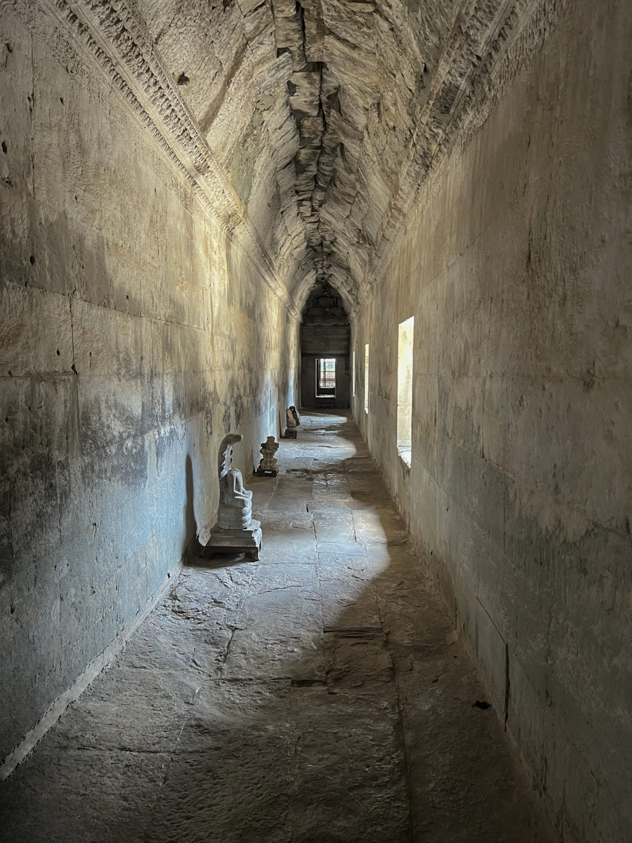
Jack - I like the simplicity of this image and the way the light is streaming through the windows. It appears (in Lr) that some areas of few windows are blown out; easily corrected by reducing the exposure/highlights slightly. The effect is not noticeable on my screen - but might make a difference if you chose to print this. I played with removing the statue/shadow in the foreground. I'm not sure which rendition is better. What do others think? |
Jun 6th |
 |
| 86 |
Jun 23 |
Comment |
Beautiful flower - the sharp yellow pops nicely against the leafy background. So summery! I could see this photo hanging in the entryway of a botanical garden. Well done. |
Jun 6th |
| 86 |
Jun 23 |
Comment |
I like this image - all the detail - and so many shades of blue throughout. I had a similar thought as Jack - interested to see the original for comparison. My sense is that this image has some distortion related to the lens. The clouds and ripples in the water all seems to point to the center. This creates an interesting aesthetic. Only you may recall what the actual scene looked like. A very soothing image! |
Jun 6th |
| 86 |
Jun 23 |
Reply |
Thanks Jack. iPhone 13 and 14 have a macro feature which, if enabled, automatically switches to the wide angle lens and allows sharp focus about an inch from the subject. This is done with optics and not software. This mode allows close focus/detail. Similar to conventional macro photography - the plane of focus is shallow and any movement (like these leaves blowing in the breeze or slight hand shake) create softness. In my image, I suspect that the leaf was not flat; hence out of focus areas in the periphery. |
Jun 6th |
6 comments - 4 replies for Group 86
|
| 87 |
Jun 23 |
Reply |
I'm skeptical that it's real. Cute - but I doubt it would offer the tiny dog much protection in a collision. I'm sure it get lots of attention. |
Jun 8th |
| 87 |
Jun 23 |
Comment |
I give you credit for finding interest/beauty in the ordinary. I would have walked by this scene - and not paused. I like the serpentine appearance of the branches - as they wander through the leaves. Agree that might work as part of a series of similar prints . . . . the monochrome works! |
Jun 7th |
| 87 |
Jun 23 |
Comment |
Great image - I love it. Kudos to you for snapping it quickly. At first it almost does't look real - then we realize it is and admire it. You got a perfect profile of the rider - and a head-on shot of his precious cargo. Couldn't have staged it better. Are helmets for dogs a real thing to protect their heads? Or is this a joke/costume? I've never seen anything like that. |
Jun 7th |
| 87 |
Jun 23 |
Comment |
A bittersweet image; looks like a beautiful horse - aging and bothered by insects; that emotional tug is important. Two suggestions for future photo ops - I'd try to find a more attractive background (the current one is a bit blown out) and I think this crop is too tight. I know you wanted to showcase the flies; still the star of the image is the horse and I would at least include the lower part of his face/nose/mouth. Definitely a subject I'd revisit! |
Jun 7th |
| 87 |
Jun 23 |
Comment |
I like this image - including the soft focus in various parts. Although I usual prefer sharp images or those that use shall depth of field in a deliberate/logical manner. This image is more random and harder to understand - likely due to the breeze. Still - we know what each flower is, enjoy the different stages of development and parts are sharp. Enough is in focus. Kudos to you for having the patience to use a macro lens in the breeze. I find the yellow pop adds to the image; we know it's present elsewhere - but the angle of the flowers hide it. I could see this hanging in the entry hall of a botanic garden. |
Jun 7th |
| 87 |
Jun 23 |
Comment |
I like the peaceful seen. Very will done. Some people work to exclude (or remove) people from landscape scenes - but the people on the pier in your image make it MUCH more interesting to me! They help me imagine being there - and I also wonder who they are and what they are thinking/discussing. They make the image better. |
Jun 7th |
| 87 |
Jun 23 |
Reply |
YES - go back to old images. I've been able to improve a few - between the remove tool (in the current Ps version) and generative fill (in the beta version). Enjoy!
|
Jun 7th |
| 87 |
Jun 23 |
Comment |
I really enjoy this portrait! Your crop is perfect. I like the way you darkened the background - so it blends with his shirt. His skin pops nicely against the darkness. The texture of his hair (facial and scalp) conveys a somewhat gruff feel - that contrasts with his soft and expressive eyes/skin. Well done. (as an aside - probably could have opened the aperture more - and lowered the ISO to around 1000). |
Jun 7th |
6 comments - 2 replies for Group 87
|
12 comments - 6 replies Total
|


