|
| Group |
Round |
C/R |
Comment |
Date |
Image |
| 86 |
Mar 23 |
Reply |
Thank you Pat! I agree that sharing an unedited version helps the viewer understand what was done in post-processing. I am using my iPhone more an enjoying that simplicity. |
Mar 28th |
| 86 |
Mar 23 |
Reply |
Quang - Thank you for your comments/encouragement. |
Mar 26th |
| 86 |
Mar 23 |
Reply |
I like the B&W; nice job capturing a wide range of tones. I'm always amazed that B&W renditions of very colorful scenes (like blooming flowers) can be very impactful. To my eye, the painterly effect on the sky still looks artificial, but I understand that the software doesn't allow you to adjust that. |
Mar 25th |
| 86 |
Mar 23 |
Comment |
Nice capture! I like your processing and think it adds interest - definitely more vivid. I wonder if the central grass is too green/bright/saturated - it's the least interesting part of the photo and is currently the brightest. My eyes keep getting pulled to the center and away from the main subject(s).
My other thought (not possible roadside) would be to consider using shallow depth of field to blur either the foreground animals or the background barn. |
Mar 11th |
| 86 |
Mar 23 |
Reply |
Thank for stopping by to view this image! Alway appreciate your comments! Agree about 35mm vs iPhone. I'm learning that for some scenes/intended uses - there are no advantages to a conventional camera. For others - the functionality of a conventional camera remains critical. |
Mar 11th |
| 86 |
Mar 23 |
Comment |
Quang: Interesting image - well done/creative. I like the lighting - with one side of the statue fading into darkness. This relates a sense of reality, depth and interest!
I like your processing - it apppears natural to me and the subtle colors are what imagine an old statue might look like.
Few minor suggestions:
1) Can you remove the item(s) on the piano to the left of the statue. They are a distraction.
2) I'd include (or add) a bit more room below the statue. It's now too close to the edge of the frame and the bottom is cut off.
3) When an image like this is viewed against a black background (like this DPI site), it's impossible for a viewer to tell where the image ends. Consider adding a fine white border to separate the image from the larger screen.
4) Is the statue angled? What's that intentional? I think I'd prefer it perfectly vertical.
|
Mar 8th |
| 86 |
Mar 23 |
Comment |
I hope this means that Spring is around the corner! Very pleasing/calming image - the flowers pop nicely against the sky.
I like the painterly feel on the flowers - it adds to their texture/softness/interest.
In my opinion - that effect in the sky creates a perfectly repetitive (and hence obviously artificial) pattern in the beautiful blue sky. On the tree trunk - your processing removes the texture/detail present in the original; creating an appearance that is too smooth (almost plastic-like) - esp the bright spot where the sun is hitting the trunk.
Is there a way to mask in where the effect is/isn't?
I admire your creativity! You are motivating me to learn more about BeCasso.
|
Mar 8th |
| 86 |
Mar 23 |
Comment |
Thank you both for your comments!
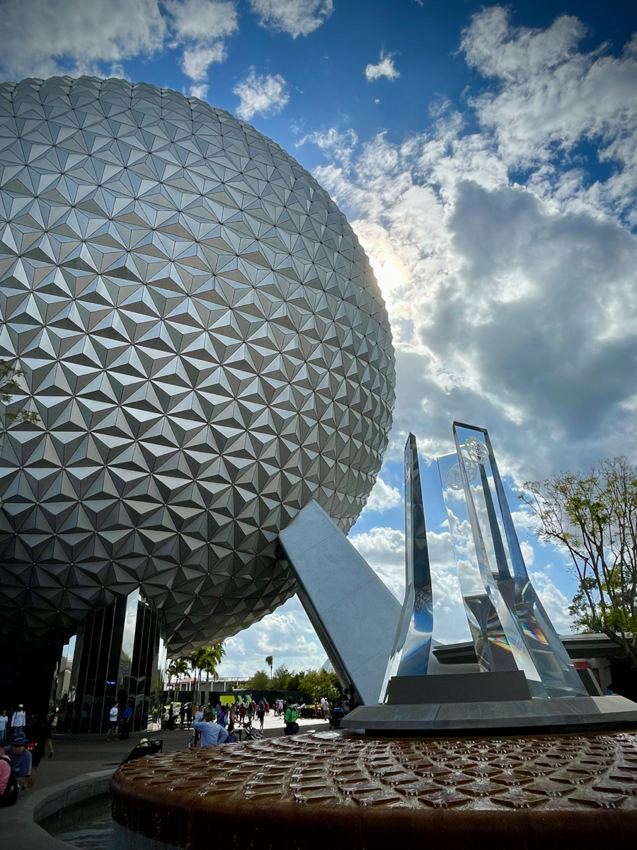
Kieu-Hanh is correct. The globe at the entrance to Epcot. It was a sunny day around noon. Another image of the larger structure is attached. I tend to avoid abstract interpretations - but this image inspired me to look at it "differently." |
Mar 6th |
 |
| 86 |
Mar 23 |
Comment |
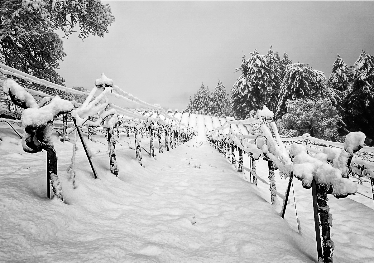
Wow - a once in 20 year snow! Glad the vines survived. I like the repeating lines in this image - and the depth of the scene. To my eye - this has a blue hue (even the snow) - not sure why? I think a high contrast/high structure B&W might work better and further emphasize the vines - example attached. For me - this brings out the detail/depth of the scene. Great job capturing a very unusual Ca scene!
|
Mar 2nd |
 |
| 86 |
Mar 23 |
Comment |
I like the varying shapes/lines and colors. Makes for an interesting image. The colors have a soft/pastel feel. The image does not feel very sharp . . . not sure what you were trying to focus on? Parts of the image remind of Picasso's paintings/Cubism. Kudos to you for "seeing" this . . . . |
Mar 2nd |
6 comments - 4 replies for Group 86
|
| 87 |
Mar 23 |
Reply |
Thanks Jennifer - please see my explanation above. Fun to play with such scenes. |
Mar 8th |
| 87 |
Mar 23 |
Reply |
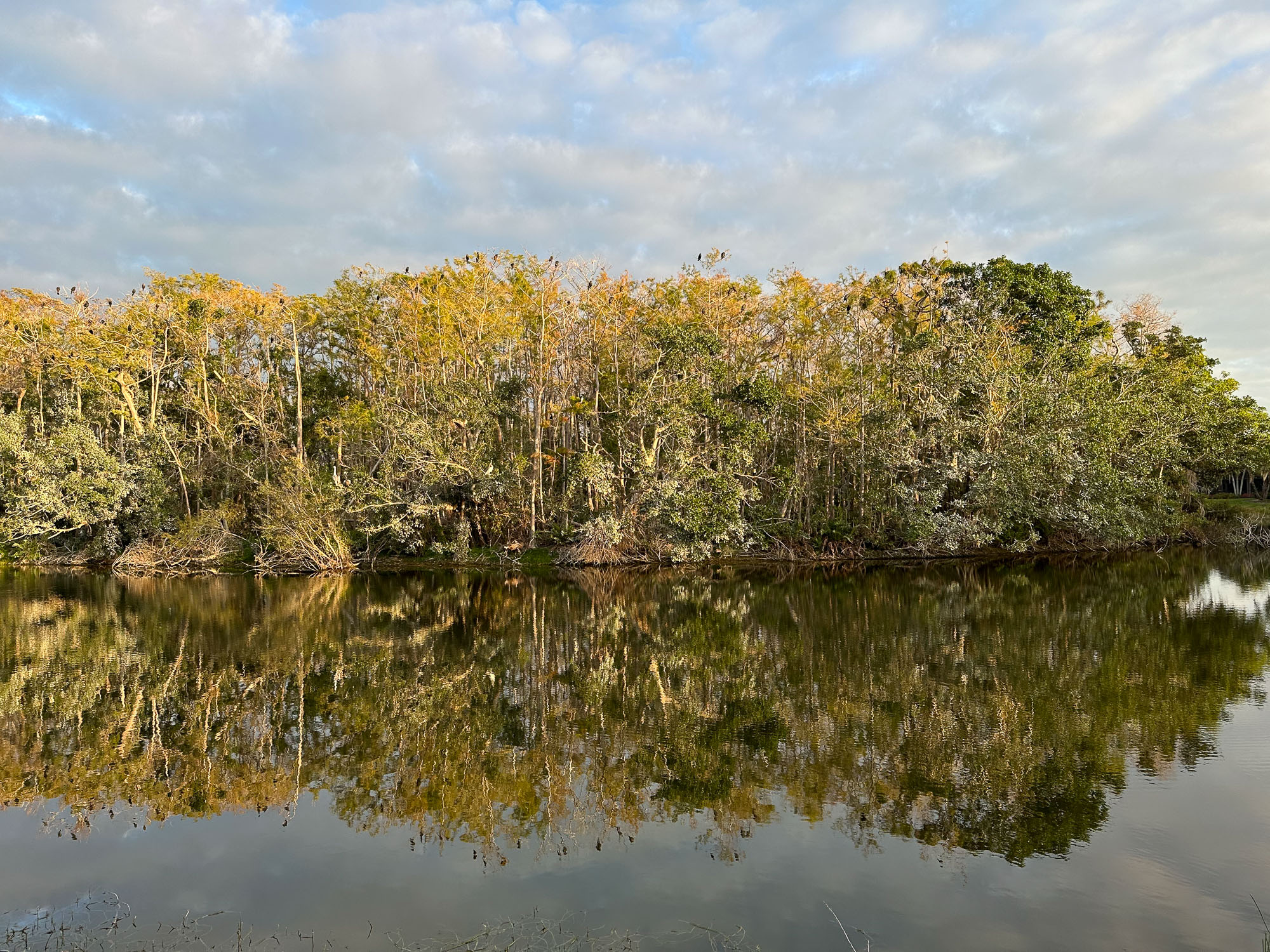
Chan - thank you for your comments - you are correct! I'm attaching the original image of the vegetation/reflection. I experimented with creating a mirror image of the upper part and then offsetting it slightly so it would not be a perfect reflection. Then I smoothed the junction of the two, rotated it 90 degrees and converted to B&W. Not sure if I made it better or worse than the original. |
Mar 8th |
 |
| 87 |
Mar 23 |
Comment |
Agree with Cindy/Lance - I don't have much to add. Really well planned/captured. My only suggestion - if you view it on a black background - like this website or a DPI competition - is to put a small what border around it. Without that viewers can't tell where the image ends . . . in this case the lower part - provides nice negative space and helps tell the story about how really dark the scene was. Great capture! |
Mar 2nd |
 |
| 87 |
Mar 23 |
Comment |
Nice image . . . agree with Lance that the bird is bit dark - against a very bright background. These birds are so tiny and difficult to photograph. They are almost always in motion - so this shot is unusual. This bird looks to thin/frail - perhaps the angle. Ideally - I would have liked to see more of the body/color. I realize this might already be a tight crop (shot with a 100mm lens); but the subject of the frame occupies only a small part of the image. I look forward to Spring/Summer when these critters return to Chicago! |
Mar 2nd |
| 87 |
Mar 23 |
Comment |
Very well done - your HDR is not too "HDR-ish" and the long exposure of the water blends perfectly. I would not have thought this was an HDR or composite image. It has an overall dim quality; perhaps that was the scene during a cloudy sunset under a bridge. |
Mar 2nd |
| 87 |
Mar 23 |
Comment |
Interesting image - I like the varying textures and detail in the sand. B&W definitely works - although I'm not sure about the blue tint. For me this is a warmer scene - would think about copper or sepia toning. Not sure the diptych or triptych would add much. I find the reflection of the sun a bit distracting; it keeps pulling my attention - it's the brightest part of the scene and isn't that interesting. Consider alternate crop/tone (attached) focusing more on the sand/water. Fun image. Kudos to you for finding beauty in something that many people would simply walk by! |
Mar 2nd |
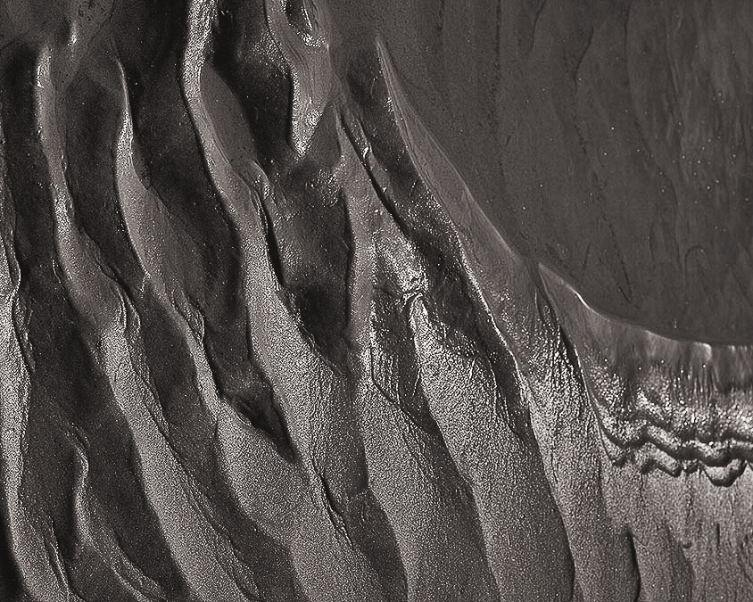 |
| 87 |
Mar 23 |
Comment |
Beautiful - I like the soft focus (not sure how you achieved that), the B&W is so much more impactful than the color - even the "white on white" works for this scene! I also like the oval shape of the frame - in some way mirroring the shape of the object. Well done. |
Mar 2nd |
5 comments - 2 replies for Group 87
|
11 comments - 6 replies Total
|


