|
| Group |
Round |
C/R |
Comment |
Date |
Image |
| 86 |
Jan 23 |
Reply |
I never made it to NY (it's a 14 hour drive - which I would not do in Winter); which was OK - had a nice break at home. I agree with you that Kieu-Hanh's crop is good. |
Jan 17th |
| 86 |
Jan 23 |
Reply |
Thank you - I like your crop. You're right that the upper part of my frame (and the original) add nothing to the story. Your crop capture the girl that caught my attention - in the context of the craziness. |
Jan 7th |
| 86 |
Jan 23 |
Comment |
Happy New Year - a nice/festive image! You were lucky to capture an interesting sky that adds to the image and works with the underlying green trees. Perfect for a holiday card! The burlap cloth on the bottom of the fountain seems a bit out of place - but nothing you could have done about it. The way you framed the scene (cutting out the sides/bottom of the fountain base) is good. I might have cloned out the wire and small/distant light. |
Jan 6th |
| 86 |
Jan 23 |
Comment |
Nice sharp/colorful image! I like your edits - two questions -
1) How did you add the missing shoe tip? Well done!
2) Why did you decide to cutoff the shoes on the top of the frame? They were present in the original - and I think the image is more pleasing with them included. |
Jan 6th |
| 86 |
Jan 23 |
Comment |
I'm still jealous of your deck! I like the layers of this image - I don't find anything in the foreground distracting. The low hanging cloud/fog creates interest. The sky has a lot of texture that helps. I also like that there are not foreground trees partially obscuring the view (like in your prior image). |
Jan 5th |
| 86 |
Jan 23 |
Comment |
Hi Ruth - I like this image - the repeating theme (N=3) is interesting. I would not have known was the background is - but your explanation makes sense. The fourth bird in the back (partially obscured) - is a little distracting - but nothing you could have done about that. I would not have suspected that you shot this through a window. Well done! Might explore a monochrome version of this . . . since there really isn't much color in it. |
Jan 5th |
| 86 |
Jan 23 |
Reply |
Great feedback - I didn't think of that - but you are 100% right that my crop does NOT capture the magnitude of the lines/chaos. I tried some other shots that day - but the lines were long/straight (stretching the length of there terminal) - and I didn't find a composition that worked. Something I will keep in mind - about the importance of needing more context. The story I wanted to share was NOT about this girl trying to get home - rather it was about the larger picture. |
Jan 1st |
4 comments - 3 replies for Group 86
|
| 87 |
Jan 23 |
Reply |
Your last question is interesting and I don't know the answer. In my club, there are no constraints on or disclosure of techniques used to edit an image entered in competition (I realize certain genres/clubs have restrictions in areas like nature or documentary). Following the logic in my club - appreciation of an image would not be connected to methods used to produce it. Each image is judged on its own merit. |
Jan 5th |
| 87 |
Jan 23 |
Reply |
Thanks Chan . . . I'll look at the flipped image - I do tend to find motion going from left to right more pleasing. |
Jan 5th |
| 87 |
Jan 23 |
Reply |
I'm not knowledgeable about those terms/genres. I tend to abstain from competitions/rules - preferring to create images that I enjoy. And I've gotten comfortable with more digital manipulation (at first - it seemed wrong/unethical). I view it as using available tools to create interesting images. Not sure what the future holds; I am amazed at the edits one can do on a phone! |
Jan 5th |
| 87 |
Jan 23 |
Reply |
I enjoyed the PSA mtg (it was my first); good lectures and photo ops. The INDIA trip sounds amazing - enjoy! I hope you'll treat us all to some of those images. |
Jan 5th |
| 87 |
Jan 23 |
Comment |
I also like the blue hue of the monochrome image. Both are abstracts from nature - in which viewers can see so many different things. The smaller/original image - I would have guessed was ice. The main image is so complex/abstract - that I don't think I would have figured out the subject. Both offer no context for the size of what we are looking at; that adds intrigue. Good examples of finding art in everyday observations! |
Jan 5th |
| 87 |
Jan 23 |
Comment |
Chan - I agree with the comments above and continue to be inspired by your creativity. The original looks like a water heater in the garage . . . a picture I'd glance at briefly and move on. The B&W is so much more engaging - well done! |
Jan 5th |
| 87 |
Jan 23 |
Comment |
Interesting image - usually we see holiday lights against a dark background - in this case there is light and sunset. I'm also struck that the lights appear chaotically placed (not sure if intentional or not) - something I find less pleasing. Perhaps it's my dominant left brain - seeking order/sequence. Others probably enjoy the chaos. And certainly nothing you could have impacted with your photography. I'm curious what the original sculpture was intended to be?
Enjoy your olympus camera . . . and reach of those light lenses! |
Jan 5th |
| 87 |
Jan 23 |
Comment |
Very nice image . . . makes me want to go photograph some eggs! I enjoy photographs that inspire me to take pictures!
I like the fact that you angled it - and left some spaces empty. I think that adds interest.
One suggestion would be to play with light coming from a lower/more acute angle. As you lit it - essentially all of the visible egg is lit. You do have varying brightness - which is good. But not deep shadows. Different lighting might have created each egg fading into darkness . . . . which would have had a different vibe. |
Jan 5th |
| 87 |
Jan 23 |
Comment |
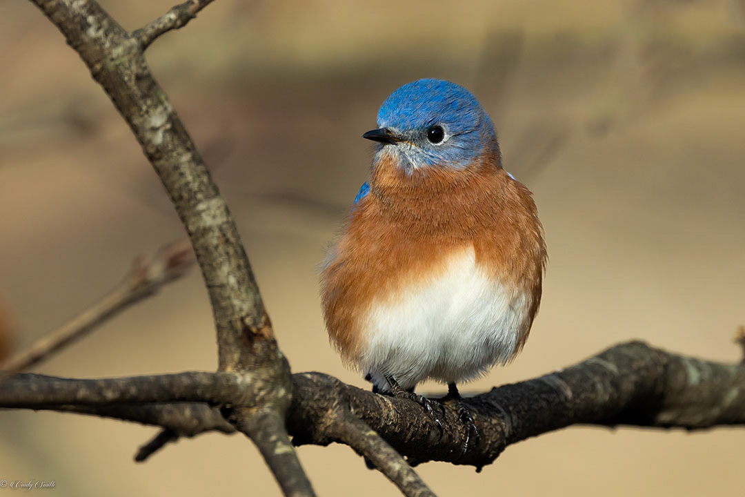
Nice sharp image - through a window! Well exposed. Good detail and colors. I like how the branches frame the bird.
I agree with Will that the leaf on upper right is distracting. I also think the branch to the left of the bird is too bright (it's the shiniest part of the photo and draws my attention!). My gaze bounces between the bird, leaf and bright branch. Even the background is a bit bright.
I tried to address the above in LR mobile (attached). |
Jan 5th |
 |
| 87 |
Jan 23 |
Comment |
I wish you told us to press leaves in September! Definitely something I'll try next year. I love it - very creative and different from other Fall foliage images.
|
Jan 5th |
6 comments - 4 replies for Group 87
|
10 comments - 7 replies Total
|


