|
| Group |
Round |
C/R |
Comment |
Date |
Image |
| 51 |
Nov 22 |
Comment |
Jerry: The panorama works perfectly - so much to see! Great colors and range of brightness. After years of listening to you talk about iPhones . . . I decided to get more serious about it and have joined Group 86 to learn more about the craft. Walking around without my "big boy" camera feels great! Then when I pick up my camera - it feels like a brick around my neck. I suspect each tool has it's place!
|
Nov 6th |
1 comment - 0 replies for Group 51
|
| 86 |
Nov 22 |
Reply |
Good eye! I didn't appreciate the change in lettering when I was at the park (I think I was mesmerized by the Fall colors) - but looking at the images at home I noticed it. Perhaps another reason to take pictures! |
Nov 22nd |
| 86 |
Nov 22 |
Comment |
I like this image - definitely has a natural retro feel. I also find the flipped version much more appealing. It's got lots of texture in the trees/grass (some would describe it as crispy!) - but that works well with this image. B&W was a good choice. Regarding the lettering on the door - if you hadn't mentioned it - not sure I would have noticed it - but now I keep looking at the door - seems to have some artifact - not sure if that's due to your cloning or the processing with the more artistic apps. Did you use the desktop version of Ps? Or mobile? |
Nov 11th |
| 86 |
Nov 22 |
Reply |
I like your tighter crop . . . much better/more focus on carver's work. I was really distracted by the "Bar . . . " letters in the original image - I struggled to guess what the word was - and still am not sure! Perhaps another example of text drawing attention. |
Nov 11th |
| 86 |
Nov 22 |
Reply |
Yes - the new image is a composite of the tree/grass (seen on left edge) from my image this month - and the foreground (carver, pumpkins, table, etc.) is your image. I hope it's OK that I play with these images - I enjoy editing and learn along the way! I thought the two images fit well together! |
Nov 10th |
| 86 |
Nov 22 |
Comment |
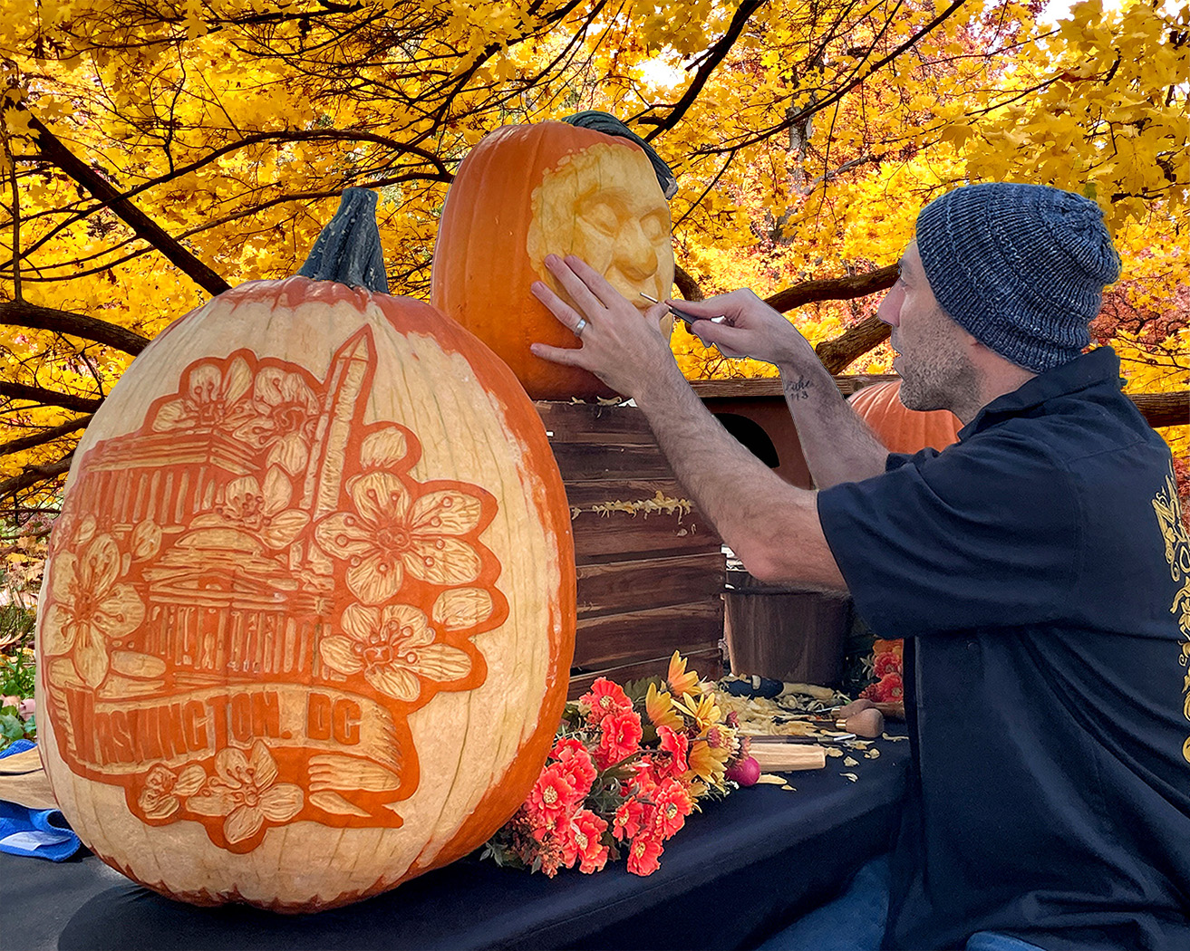
I really enjoy this image - it's sharp and the bright orange pops against the dark tablecloth/sweatshirt! I like the strong line of concentration from the carver to his hands/knife. Perfect angle for this shot! I thought these intricate carvings were done with some kind of stencil; from your image they appear to be free-hand - which makes them even more impressive!
The urban scene - struck me as a bit out of place. That may add to viewer interest. Just for fun - I tried putting him in front of my tree from this month (this did require photoshop). Different vibe.
|
Nov 8th |
 |
| 86 |
Nov 22 |
Comment |
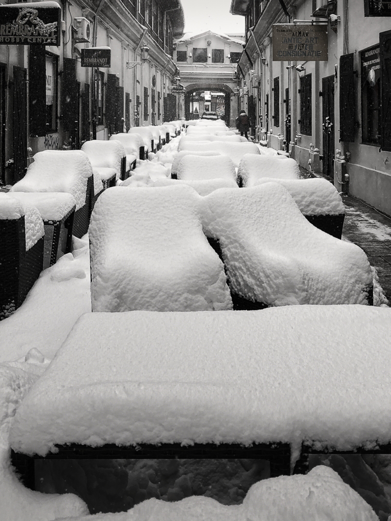
Interesting image! The B&W and portrait orientation work perfectly for the scene. At first I wasn't sure what those snow covered structures are? I see from Kieu-Hanh's note that they are tables/chairs. The sidewalk is perfectly cleared - and yet the street/chairs remain covered with snow. The person walking in the distance creates some interest; I'm interested in others' thought as to whether the person improves or distracts from the image.
One suggestion re: exposure - the brightest parts of your image are the sky and foreground snow. The very bright snow closest to the camera keep pulling the viewers' eyes. You could use the light to lead the viewer down the center of the frame as I tried to do in the attached.
I've never been to Bucharest; your picture makes me want to visit! |
Nov 8th |
 |
| 86 |
Nov 22 |
Reply |
Thanks Jack . . . I never thought about letters/text drawing viewers attention - but it makes sense - we're trained to read things! In this case, I suppose the size of the letters contributes to the dominance of the word. |
Nov 4th |
| 86 |
Nov 22 |
Comment |
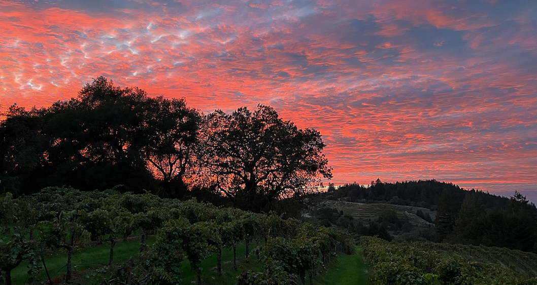
What a beautiful scene! I like your edits - and do not think the foreground is too dark. It was a dim scene - the foreground draws my interest - perhaps the dim lighting even helps. I'd even consider going a notch darker. The clouds and colors are amazing - my only suggestion might be to crop it even tighter than you have done - perhaps a 16:9 aspect ratio. The upper part of your frame doesn't add much - and a tighter crop might create even greater focus on the sunset (see attached, also with 0.25 stop less exposure). Perhaps my crop is too tight?
You are fortunate to live/work in such a gorgeous setting!
re: exporting - I agree that mobile apps typically don't have the functionality to reduce size while preserving quality. FYI - LR Mobile has an export function that allows selection of image size/quality. |
Nov 3rd |
 |
| 86 |
Nov 22 |
Comment |
Beautiful image! I like the way you edited it - both the orientation and addition of more yellow flowers. They help frame the butterfly! I'm amazed that you were able to pick up and move the butterfly? Do you think it was sick? The brown/green/yellow color palette works well - and the butterfly pops naturally against that background. Well done. |
Nov 3rd |
| 86 |
Nov 22 |
Comment |
What a great image - very creative/playful! I really like what you did with it (although I don't know how you did it!) - the seemingly random variation in circle size and color add interest; to my eye almost like wheels turning as she (or he) thinks! Is there a way to make the colors even more vivid (some yellow/red/blue)? So much more intriguing than the original ornament. I believe that the original includes the shadow of the photographer which detracts from the image - that would be pretty easy to avoid with a different camera angle or more subdued lighting. Thank you for introducing us to Percolator . . . I will learn about it! |
Nov 3rd |
6 comments - 4 replies for Group 86
|
| 87 |
Nov 22 |
Reply |
Don't judge the quality of the image by how it does in competition! Most of my favorite images don't score well . . . which is fine. |
Nov 13th |
| 87 |
Nov 22 |
Comment |
Beautiful scene . . . and yes - the white home in the background adds a lot - very New England! I'm guessing you were few weeks prior to peak colors. So often with birds in flight we capture one . . . I like what you did - creating the scene with several coming/going. I share Lance's question as to what was the point of focus (can you go back to the image on your card/computer - and see the actual focus point(s)? Some cameras have that feature? There is a lot of depth in this image; even at f8 - might have been tough to get everything sharp with one exposure. The Maine shoreline is so picturesque! |
Nov 3rd |
| 87 |
Nov 22 |
Comment |
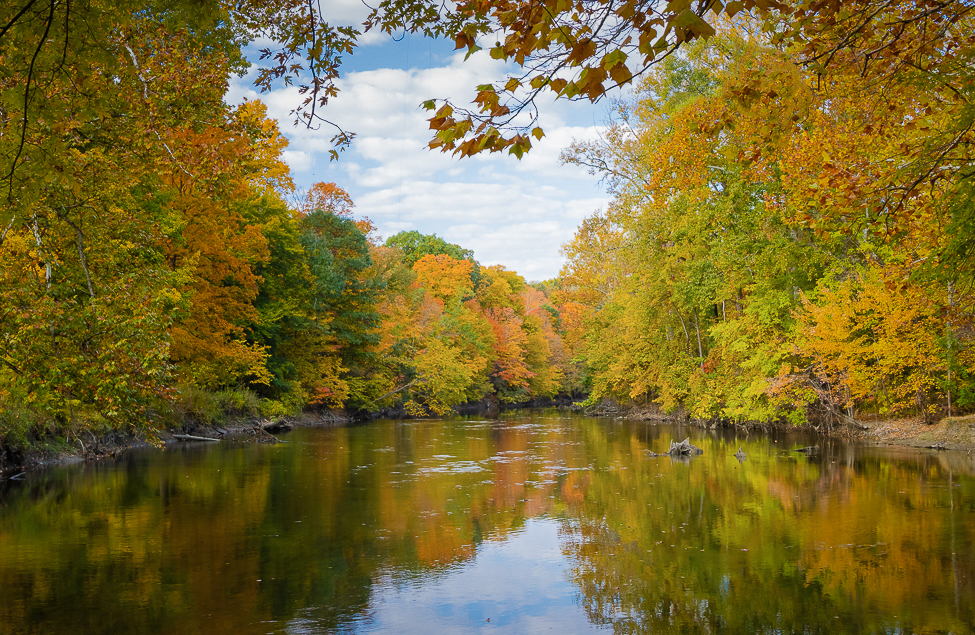
Great Fall scene . . . such a beautiful time of year and part of the country! I love the colors, reflections and the way the water leads the viewer into the frame. Perfectly composed! Although I typically favor B&W - a scene like this seems to demand the vivid colors of the season!
Two suggestions if you were to play with editing this further - consider using light to lead the viewer to the center (darkening the corners/edges a bit) and remove some of the lowest hanging branches that overlie the distant tree line (see example). The canopy above helps frame the scene.
Soon it will be time for frozen rivers and snow scenes . . . . |
Nov 3rd |
 |
| 87 |
Nov 22 |
Comment |
Hi Cindy - I love rainbows - and you certainly captured this one through some trees and the window (if I understand what you did correctly). To Lance's point - shooting through an extra layer of glass always poses challenges - sometimes that's not avoidable. If you had been able to get outside - you probably would have captured a sharper image.
Regarding exposure - my sense is that the whole frame is a bit dark - I wonder if that is due to the auto metering system. Similar to photographing white snow - the sky is usually very bright - and an auto exposure systems will try to make everything a "middle gray" (on average). This results in underexposing the scene. One relatively easy solution is to use 1-2 stops of positive exposure compensation that would have brightened the scene and made it closer to reality.
re: focus - this is exactly the type of scene that confuses auto-focus systems. It appears to me that your camera focused on the branch in the center . . . Quite sure your intent would have been to focus on the sky/rainbow - and accept out of focus branches in the foreground.
Lots to think about in a scene like this. Fun stuff! |
Nov 3rd |
| 87 |
Nov 22 |
Comment |
Greetings Chan - Wow - a very creative image that grabs my interest! At first glance I also had the impression that the vine was growing around the instrument. The simple/textured/gray background ensures viewer focus on the instrument/vine (like a still-life). I see Lance's point that putting the Dulcimer in a usual location would have created more of a sense of the place/scene - but that would be a very different image.
One minor technical point - not sure how you processed the scene - but the four leaves at the top appear to be growing out of the instrument and there is a solitary leaf center right that appears not connected to anything. Probably only relevant if you contemplate printing this.
|
Nov 3rd |
| 87 |
Nov 22 |
Reply |
Appreciate your kind words. This was shot in aperture priority. I set the ISO to 1000 to allow me to get shutter speeds approx 1/focal length (despite the wing speed - when hovering/drinking the birds are quite still - allowing usual shutter speeds to produce sharp images). It was 6:20PM - still daylight - but soft/subdued light.
If I could do this again - I'd do some things differently . . . perhaps next year!
Agree bracketing shutter speeds would have been interesting - but the scene was moving too quickly for me to do that. I was just happy to get the whole bird in the frame :) |
Nov 3rd |
| 87 |
Nov 22 |
Comment |
The processing is perfect - just the right vibe. Clearly the barn is old and in disrepair. The surrounding vegetation reinforces that this is a place nobody has been to recently. My left brain orientation finds the horizontal branch in the center (across the barn) distracting; I appreciate others will think it adds to the aesthetic. |
Nov 3rd |
| 87 |
Nov 22 |
Reply |
The shutter speed/wing blur was a happy accident. I was just trying to properly expose the frame . . . and there was not nearly enough light to freeze the wings. I've since read about photographing hummingbirds; freezing their wings requires very fast exposure - typically with speed lights. |
Nov 3rd |
| 87 |
Nov 22 |
Reply |
Thank you - agree the background if too distracting/busy; I tried to blur/darken it, but will work that more! |
Nov 3rd |
| 87 |
Nov 22 |
Comment |
Great light - perfect spot/timing/exposure! You couldn't have staged this better. I love how his head pops against the dark background. It's a high key monochrome image that works! The shadows draw my eye and create interest! Agree with Jennifer - he needs more headroom - so I tried that in Ps. Although irrational, I prefer him riding left to right. |
Nov 3rd |
 |
6 comments - 4 replies for Group 87
|
13 comments - 8 replies Total
|


