|
| Group |
Round |
C/R |
Comment |
Date |
Image |
| 87 |
Jul 21 |
Comment |
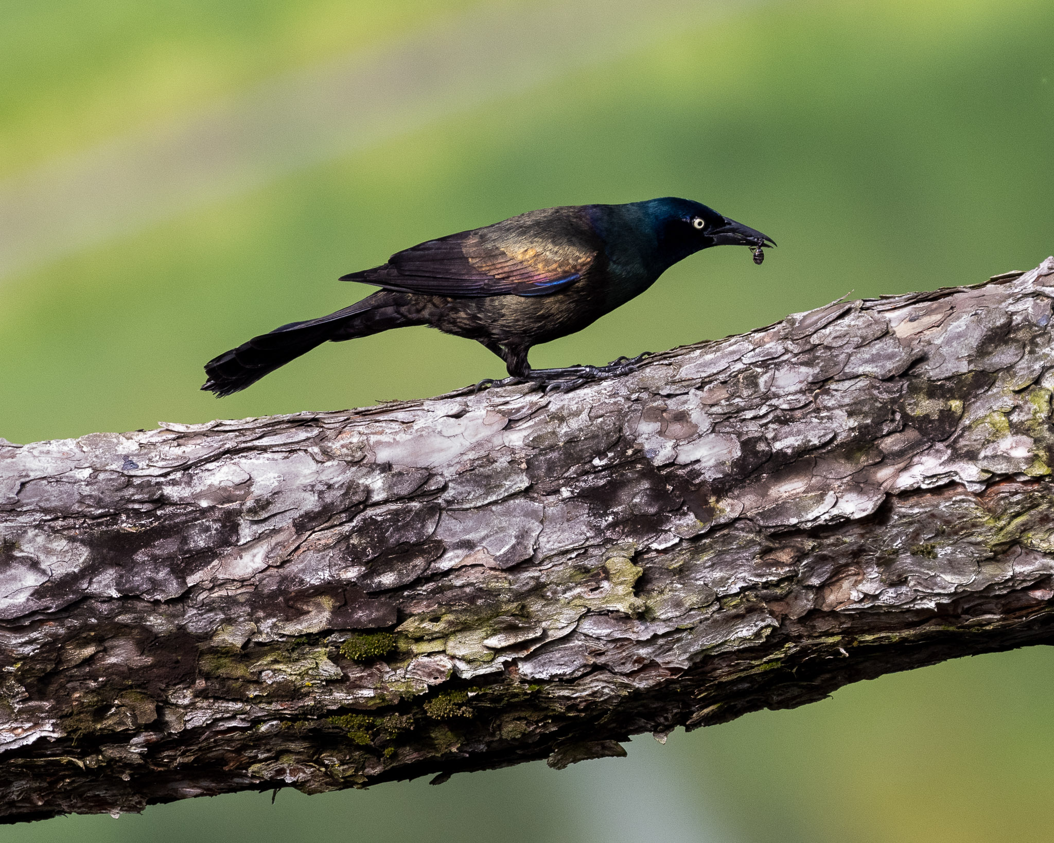
Nice image - challenging to capture birds in flight (notice in my image this month -a bird standing on a branch!). To answer your questions -
YES - I find it interesting - the legs ready for "touch down" - like landing gear on a jet! I like that you got eye-level with the bird. The bird's colors pop against the water.
A little hard to judge sharpening on this low res image . . . but I think I'm seeing more grain than I'd expect for ISO 200. Also - is there some halo around the bird's neck? Would need the original image to understand better. Overall - I still find focus a bit "soft."
I love splashing water in bird images . . . but in this case - in my opinion - the two tiny drops don't add much and may distract. Could be mistaken for dust spots. I'd be inclined to remove them.
I would consider flipping - so the bird is flying left to right . . .
Keep shooting birds!
|
Jul 12th |
| 87 |
Jul 21 |
Reply |
Along these lines . . . I tried to darken to branch . . . to draw less attention to it. Do you think that helps? |
Jul 10th |
 |
| 87 |
Jul 21 |
Reply |
I appreciate your comment. I was trying to leave more room in front of the bird for him (or her) to move into . . . but I think you aright that I left too much - and a tighter crop works better. It also makes me think - that given another opportunity to take this shot - perhaps I angle a bit more - so the head/eye is larger and in front, with the body tapering toward the back. Thank you for the suggestions! |
Jul 10th |
| 87 |
Jul 21 |
Reply |
Dale: Tx for sharing the original . . . I erroneously assumed that the light was actually on when you took the photograph (and you were trying to preserve its color) - so my earlier comments don't really apply. I like Lance's edits - somehow the yellow color in your image creates an artificial sense, in the context of the overall monochrome image. Keeping the whole image B&W creates a natural feel and works well! |
Jul 5th |
| 87 |
Jul 21 |
Comment |
I like this image and the name! Blue and green are such positive/calming/happy colors - appropriate for both the time of year and re-opening world!
I wonder if the sky might be a bit over-processed, perhaps bleeding onto the buildings (not sure what the scene looked like to you?). The palm trees are almost exploding with life (like fireworks - without color!) and the bit of glare in the upper right adds.
I also would not correct distortion . . . it helps the viewer "feel" the height!
Glad you got to Southern Ca! |
Jul 4th |
| 87 |
Jul 21 |
Comment |
Cindy: I like this image . . . older home overshadowed by a massive tree!
One of the greatest minds in particle physics . . . lived in a natural/humble environment.
Regarding exposure - agree that there isn't much you can do about the light when traveling (it is what it is when you get there!). One thing I learned recently is to shoot such images few stops darker . . . since modern cameras are much better at recovering detail in the shadows than they are at recovering blown out highlights. Expose in manual and use the histogram to make sure nothing is blown out (the LCD panel on a sunny day is pretty useless!). I tried this recently at a sunrise shoot . . . and it really helped! The metered exposure would have totally blown out the sun and it's reflection on water . . . |
Jul 4th |
| 87 |
Jul 21 |
Comment |
Interesting image . . . can you share the original?
I'm unclear if the light is still B&W? Or if you introduced some yellow? The remainder of the image definitely works in B&W. It's a bit flat . . . perhaps that is how you saw it.
I was thinking that one editing approach might be to only mask out the light/surrounding sky - and then convert to B&W - so the light would be selectively colored. That might be a way to make the light pop more. Perhaps even by also darkening that larger scene.
I like that the shape of the building us unusual for a lighthouse. |
Jul 4th |
| 87 |
Jul 21 |
Comment |
Glad you decided to follow that sign!
I like this image and especially your edits. Great job removing the tree/sign. I like the way you've warmed the whole scene . . . definitely works!
I'm guessing that the actual scene was closer to your original - but your edits are definitely more pleasing! Reminds me of an article I read recently about color; the author concluded that photographers generally don't want accurate color . . . instead they want "most appealing color." Makes sense to me!
One suggestion might be to remove the chain link fence that doesn't appear to "belong" in the scene.
|
Jul 4th |
| 87 |
Jul 21 |
Comment |
Very interesting image . . . I'm not convinced I understand what I'm looking at! Despite staring at the image and asking my wife for help! Agree with Chan that images the make on think are great!
Can you explain it?
Definitely works in B&W. |
Jul 4th |
6 comments - 3 replies for Group 87
|
6 comments - 3 replies Total
|


