|
| Group |
Round |
C/R |
Comment |
Date |
Image |
| 87 |
Mar 21 |
Reply |
Thank you.
Wow - stunning car (with and without manipulation!).
Love the colors/shapes/detail/shadows.
Definitely a great photo op - makes me want to go to a car show! |
Mar 26th |
| 87 |
Mar 21 |
Comment |
Welcome to the group! I hope you enjoy the monthly opportunity to see new/interesting images and get feedback on your work.
My initial thought was of a distorted cross-section of a human chest . . . with the lungs, heart and arms all visible. Upon further inspection - I recognize the headlights, etc.
I confess that this is a bit abstract for my taste - I've succumbed to the burden of focusing on what this is and how you manipulated it . . . and that is interfering with my ability to think creatively about what it could be. The right side of my brain requires further development. Kudos to you for venturing out of your comfort zone!
I'd be interested to see the original image. Can you share that (the system allows you to add that to your response)? I'm also curious about your exposure settings . . . (1/4000 sec. @ f/4. ISO-500). Seems like you had opportunity to lower the ISO to the base ISO - and still have a pretty fast shutter speed for a stationary subject in what I assume was bright light. |
Mar 24th |
| 87 |
Mar 21 |
Comment |
Welcome to the group! I like this image . . . the way the cut glass and oil droplets bend the light; each droplet becoming a small lens. The left side of the image . . . rotated 90 degrees is reminiscent of a sunburst around sunrise or sunset.
The yellow/orange works well against the blue.
I also played with refraction in crystal (see my Feb image/description). You added a layer of complexity/interest with the droplets of oil. Well done! |
Mar 24th |
| 87 |
Mar 21 |
Reply |
Thank you . . . easier to get there this afternoon. What a difference one month makes! |
Mar 19th |
 |
| 87 |
Mar 21 |
Reply |
Chan: I like this crop best! The lighting - and L to R path lead me to the blue object of greatest interest. The pillow is less distracting. Well done! This is a good reminder for me to take more time to inspect the scene prior to taking the picture; for example - if you had this to do over again would you have removed the pillow?
In late 2019 I had an opportunity to take what turned out to be our last extended family photograph on the occasion of my mother's 90th birthday/70th wedding anniversary. We were a group of about 20 that traveled quite far to be together. I set up the scene, got the lighting to work, etc. - and took the picture with everyone nicely dressed prior to dinner. Everything was perfect - EXCEPT - my 25 year old niece, sitting front row/center, was barefoot; not something I can correct in post. I should have seen that - it wasn't hidden or subtle. We still cherish the photo! |
Mar 18th |
| 87 |
Mar 21 |
Reply |
Chan/Lance - Thank you for your comments.
Lance - I see your point about the staged appearance. A single exposure would never have allowed proper exposure of sunlit snow and wood grain in the shadows. The photo merge accomplishes that - with the risks you mention. A good reminder! |
Mar 12th |
| 87 |
Mar 21 |
Comment |
Lance: Unfortunately I deleted the image with my edits - to I can't repost. I will remember in the future to downsize as you describe.
Jennifer: It is a great shot - I suspect there is a lot of data in the original camera output that has enough detail to dial down the yellows - and bring more texture/detail to them (while keeping the brilliant color) if you choose to edit further. You live in a beautiful part of the country! |
Mar 11th |
| 87 |
Mar 21 |
Reply |
Sorry - looking closer I think it is the pillow on the shelf below in your final print. |
Mar 6th |
| 87 |
Mar 21 |
Reply |
I didn't mean to imply that you should or shouldn't have removed it. Just posing the question. Also - my understanding is that all our posted images (and all our comments) are publicly visible to anyone via the PSA website, link to digital dialogue groups. You need to be a member to add a comment. Let's see what others think . . . |
Mar 6th |
| 87 |
Mar 21 |
Comment |
I have to love this image . . . since my first car was a used Mustang (1978ish); gold color with a small sunroof. Fun car. Many good memories!
I like the angle of your shot and that you got down to the car's level. The green didn't bother me when I first saw it - but perhaps Chan is right that it's a bit too intense. It didn't distract me since the car in the forground is large and completely different color/tone. It pops nicely.
I'm curious why you removed the license number? If the car is out in public; isn't that fair game to photograph? I was practicing panning moving vehicles in my neighborhood this week (have posted some images on social media) - and would not have thought to obscure faces of drivers or license plates. What is your thinking/understanding?
In one image - the driver was staring at me/obviously annoyed that I was taking his picture; but that expression made the image more powerful. Of course - I only saw that back home on the larger monitor.
|
Mar 5th |
| 87 |
Mar 21 |
Comment |
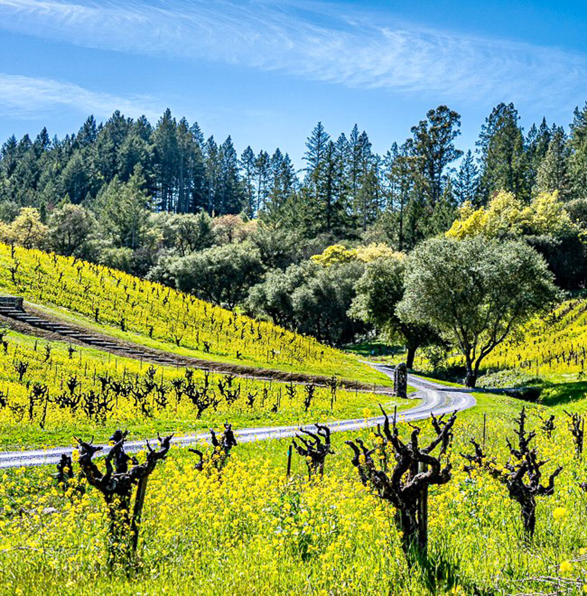
I love this image . . . agree with Chan - lots of interest/leading lines. The colors are brilliant - and I love the dark/stark vines with no growth (they almost look like creatures!) and the yellow flowers are spectacular. I think the composition works; there isn't much interest in the upper third - but - it's not distracting and I find it pleasing. There was some orange structure in the foreground and also a patch of brown leaves in the background - I removed those in lightroom. Also - on my monitor - the yellow flowers are almost too bright and blur together; I tried to brush in decreased exposure/saturation/vibrance and add some structure. I also tried to darken the path. I think the result (at least on my monitor) is a sense of discrete yellow flowers that was missing from the original. The changes are subtle and may look different on your monitor. Probably a great place to shoot the same scene as the seasons change. I would print this! |
Mar 5th |
 |
| 87 |
Mar 21 |
Comment |
Chan: I like the simplicity, clarity and colors in this image. Kudos to you for not shooting it head on (straight) - the angle is more interesting! And for not centering anything . . . I can't seem to break out of that habit. I wonder if a slightly tighter crop would be cleaner . . . eliminating the surface of the shelf above - and the details of whatever is in the lower left corner. I find both of those a little distracting. Looks like you cloned out the pillows . . . perhaps replaced them with some iron that the shelf it made of? Not sure. Well done! |
Mar 5th |
| 87 |
Mar 21 |
Comment |
Lance - I had the same initial reaction as Chan . . . that you were superimposing bars (like in a zoo) and I was looking at the profile of some large animals head. I like the concept of splitting a photo the way you have done . . . creates a whole different way to think about images. Key will be what surface you mount it on . . . and what is the color/tone between them. I think that the heavy B&W frames (cage bars!) detract from the approach. Perhaps you were just doing this to illustrate for us. Once again - you are motivating us to think/try different. The B&W definitely works. Well done. |
Mar 5th |
7 comments - 6 replies for Group 87
|
7 comments - 6 replies Total
|