|
| Group |
Round |
C/R |
Comment |
Date |
Image |
| 87 |
Dec 20 |
Reply |
During quarantine induced boredom . . . I explored the effect of ISO on grain/noise with my Canon 6D Mark II (aging and reported to have "issues" with sensor quality/noise). I set up a scene with different colors/textures on a shelf, dimmed the lights - tripod, 50mm lens, f8 - and made 20 exposures covering the full ISO range (100-40,000) using appropriate exposures (10 secs - 1/40 sec). The most extreme unedited image (ISO 40,000 and 1/40 sec) is attached. Different textures/colors have varying appearances of noise (most obvious on the black background). I had difficulty seeing any noise on my desktop monitor until the ISO 400-800 range and it didn't get problematic until around 2500. Bottom line - shooting at the lowest/native ISO is still good advice . . .but - there is room to bump up the ISO before having a problem with grain. Each camera is different . . . sensors and denoise software are only getting better! |
Dec 4th |
 |
| 87 |
Dec 20 |
Reply |
The branches were removed with the patch tool in photoshop. I didn't go after individual branches with the healing brushes; instead replaced "chunks" with patches from the nearby clear water. I did it hastily - but if you spend some time - the result should be pretty good!
Regarding lighting - I mean having the sand bar get brighter as it gets further out (as in the example I provided) - I think it helps a viewer start with the large/prominent foreground - and then follow the scene/leading line to the more brightly lit distant elements. I think the sky is less critical.
Have fun. |
Dec 3rd |
| 87 |
Dec 20 |
Reply |
Thank you for your kind words! Rest assured that despite the tranquility of the image, Chicago is not a fairytale town. It is crowded, dirty, unsafe, cold - and I don't like the contrast between the "haves and have-nots" . . . and I grew up in NYC! I live North of the city . . . it's enjoyable to get there occasionally (and sometimes more pleasurable to get back home!).
Regarding hyperlocal distance - many references on line - the poor man's trick is to keep your lens stopped down (I find f8 works well) and focus approximately one third the distance into your scene. Key point is NOT to focus on the prominent background (in this case the skyscrapers) - because you will lose focus of the foreground elements.
Alternatively there are apps (photopills is the best - highly recommend!) that allow you to input your camera, lens, f-stop, subject distance, etc. - and see exactly what can be expected to to reasonably sharp. Focus stacking is an alternative . . . but it takes a bit more planning, time and processing.
Regarding the bright orange railing - stay tuned for my image next month. You'll see a totally different view of Ping Tom Park (from about 500 feet behind where this image was taken) . . . where the color actually fits into the scene.
Stay well! |
Dec 3rd |
| 87 |
Dec 20 |
Comment |
Greetings Chan . . . hope you and your's are well and weathering this crazy period. Very interesting image - I'm struck by the total lack of organization - true chaos.
Leaves me trying to figure out how it got to that state - what's connected to what? Some are dead/barren - others full of healthy green growth - that adds interest. I also get a feeling of longevity . . . like it has taken MANY years for nature to create this morass. And that it will probably be around for a while - continuing to evolve.
|
Dec 3rd |
| 87 |
Dec 20 |
Comment |
Lance - I also like the simplicity/solitude of the leaf . . . and your capture of the background is perfect; just sharp enough to get a sense for what's there. It almost looks like water . . or a reflection . . . intriguing.
Kudos to you for appreciating depth of field through the viewfinder . . . I don't think I could do that. Even with "live view" . . . I'm skeptical I could make out background focus (or lack thereof).
You do make a good point re: grain. We pay for software to denoise our images; then use a grain filter to make them look older/film-like. Go figure.
If there would have been a frame with truly only one leaf . . that might have been even more interesting - several are visible in your composition, but they are scarce and weathered - the season is clear.
Stay safe.
|
Dec 3rd |
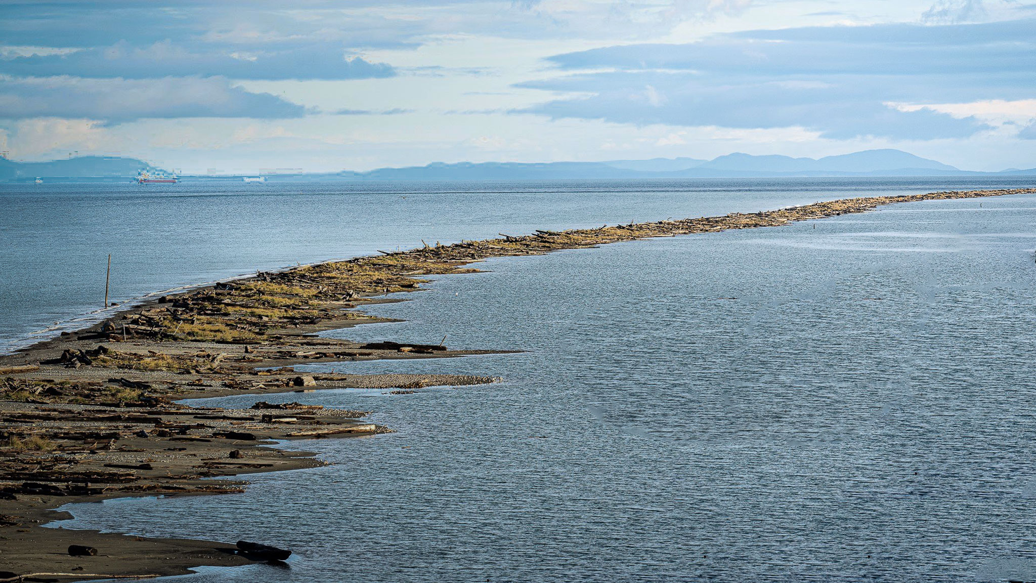
| 87 |
Dec 20 |
Comment |
I never heard of a spit . . . so thank you for introducing that! 5 miles long - wow. Interesting the way the sandbar splits the water . . . and similar color scheme between the water and sky.
I like this image . . . few suggestions in the attached re:composition - very interested in what you/others think:
1) I'd get rid of the branch in the lower right. I find it distracting and doesn't add anything.
2) Consider changing aspect ratio to 16:9 . . . to emphasize the direction of the spit.
3) I think there is a lot of sky . . . which is not particularly interesting - so room to crop that down.
4) Could use light to help guide viewer to the upper right (making that corner the brightest.
|
Dec 3rd |
 |
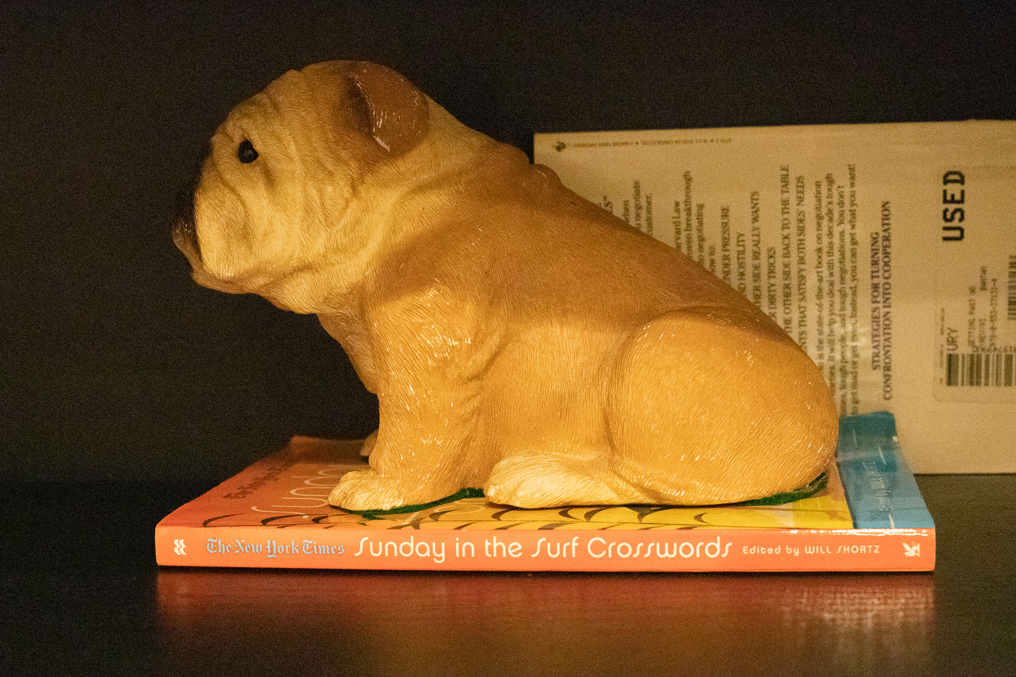
| 87 |
Dec 20 |
Comment |
Great shot - love the sharpness/texture of the wood and simple surroundings. Glad you chose to bring back the red/green - makes the scene festive and pop.
One property of the Silver Efex control points is that they select or mask in similar colors/tones within some radius. Sometimes those are hard to see when you display the mask (esp as they feather out). In your image - the table/chairs appear to have a colored hue (some red/orange/yellow/green) - I think because they were brown - and brown has some many of those other colors. When you selectively colorized the red/green lights - I think some of that spilled onto the wood. The upside is you have smoother transitions and often more appealing results - makes the control points relatively easy to use (without feathering edges, etc.).
I tried to repeat what you did - using a mask I could brush in (not in Silver Efex) - to ensure that the colorization was localized. To my eye , the resulting image gives the wood a truer B&W quality.
Which one you prefer - is personal choice! |
Dec 3rd |
 |
4 comments - 3 replies for Group 87
|
4 comments - 3 replies Total
|


