|
| Group |
Round |
C/R |
Comment |
Date |
Image |
| 87 |
Nov 20 |
Reply |
Thank you Lance - I really like your crop and dodging the bright spots near the large tree. It's definitely a style I will experiment with again. FYI - based on some of your advice - I increasingly go out to shoot with only a small nifty-fifty lens. I'm enjoying that - find that I'm taking fewer better images. So much so that I'm thinking about buying the fuji x-100-v (a rangefinder style, crop sensor, fixed lens camera that weighs 1 pound) to walk around with. |
Nov 9th |
| 87 |
Nov 20 |
Reply |
Jennifer: Thank you - agree the colors are the focus . . . and the right side is too bright/different/distracting. Out of curiosity - I submitted this image to my camera club competition last week - it scored 48th out of 50 images. Not that contest scores are always a surrogate for image quality - but I think it does reflect that this has flaws and is also a bit polarizing (some like it - others don't). I will try this approach again when I find the right setting. |
Nov 9th |
| 87 |
Nov 20 |
Reply |
I love this photo - both the snowfall - and setting! Great capture.
You motivated me to resist my instinct (and my wife's admonitions!) to hunker down during snowfall - and get out to take some pictures. I'll avoid the deep stuff . . . rather look for a time with early/big flakes during good light. I will post anything worthwhile. |
Nov 9th |
| 87 |
Nov 20 |
Comment |
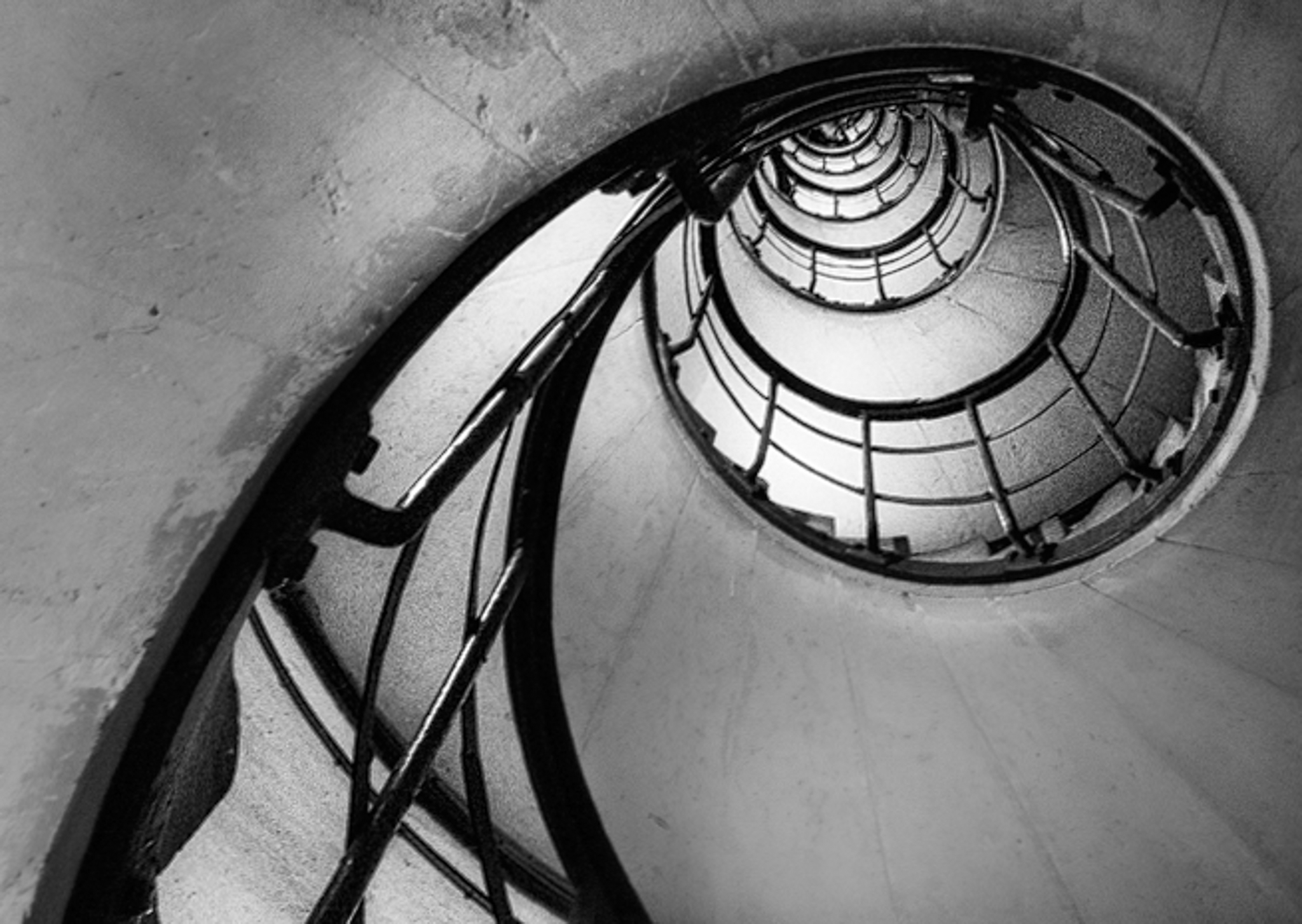
Graham . . . interesting image - I spent some time staring at it (it's more soothing than watching the election returns!) - tough to get to a better crop. I tried few options and liked this one the best. The bright ceiling light is distracting (I was not able to get rid of it) - also I think the flow works best from lower left - to upper right with key points of interest not centered. I kept your original aspect ratio. Thoughts?
I had no idea one could get into the Arc de Triomphe; perhaps something to do on a future trip - after the world reopens. |
Nov 5th |
 |
| 87 |
Nov 20 |
Reply |
Great job adding the bricks! And I agree - the darkness adds to the "shady" or "alley" feel . . . |
Nov 2nd |
| 87 |
Nov 20 |
Comment |
Lance: I like the soft/pastel/muted appearance. I can make out the streaks of rain (just barely!) - so the 1/30 sec worked. That slow speed may also have contributed to the overall softness of the image. Would a speed light to freeze the rain close to the camera have helped or hurt?
The stuff in the water adds interest - and doesn't distract - makes it realistic.
I've heard that the worst weather creates some of the best images; so far I've not been that brave. Kudos to your wife for protecting you (and more importantly, your camera!).
|
Nov 2nd |
| 87 |
Nov 20 |
Comment |
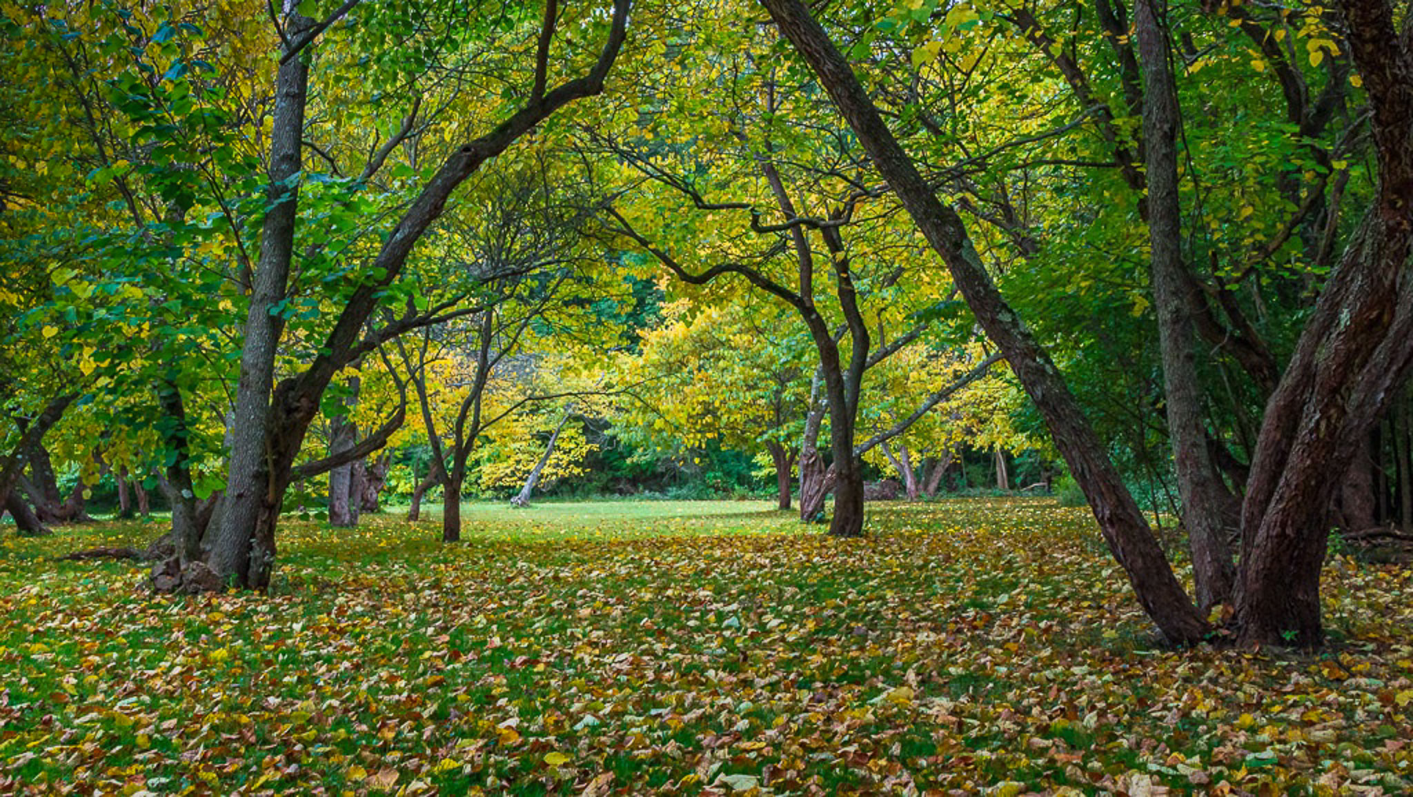
Dale - The low perspective (although a pain - literally!) - esp with a wide angle lens - works really well for shots like this. I see that you were trying to frame the bright spot under the canopy of leaves and between the trees. Well done - and the mixture of yellow and green is calming. Two suggested edits (see attached):
1) There are few bright spots (sky) in the upper left - I find those distracting; esp given their location along the edge and far from your focus of interest. I tried to clone in more leaves in PS.
2) I darkened several areas in LR to bring greater focus to the central bright area.
Of course - it would have been great is there was something of interest in that area . . . but that wasn't in the scene that day :)
I enjoyed playing with this image!
Steve |
Nov 2nd |
 |
| 87 |
Nov 20 |
Comment |
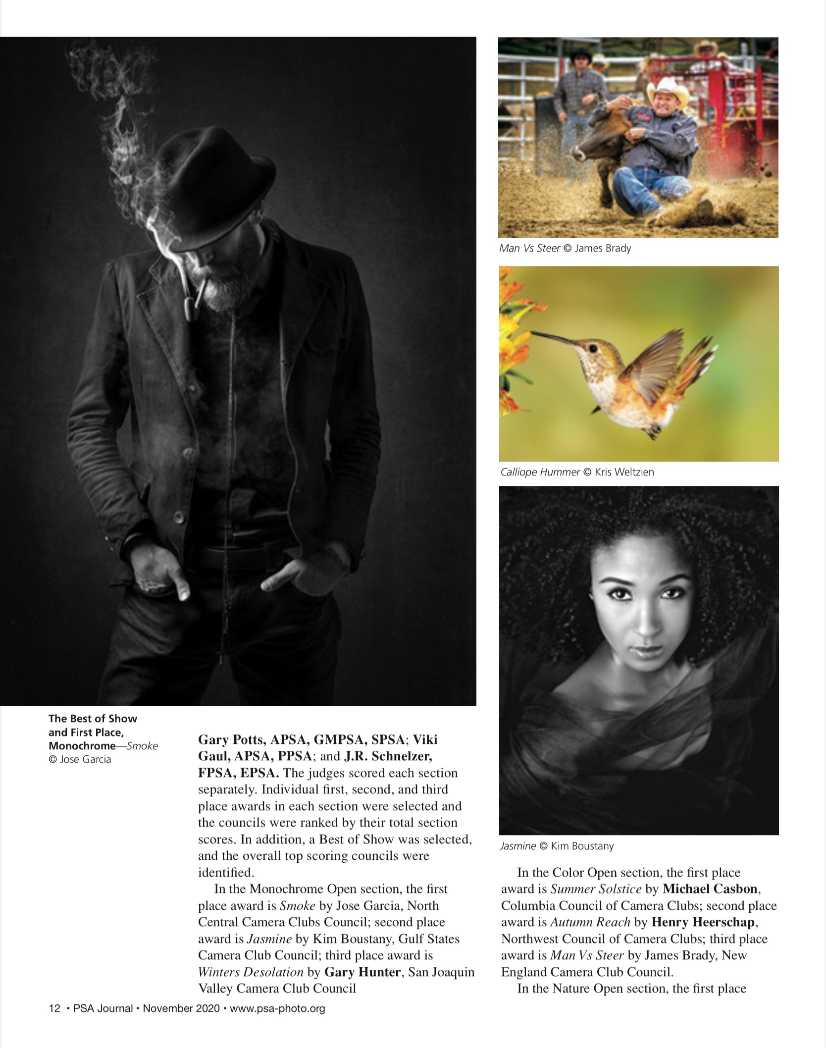
Wow - you are so talented with these portraits! Great exposure/contrasts . . . love the way the dark suit blends into the wall behind. And there is just enough exposure/interest to draw me into the bricks behind, adding a sense of place. The smoke is a perfect addition. Tack sharp focus on the left eye . . . the unshaven face and poorly fitting jacket adds grittiness . . . makes me think of someone around 17 years of age. What was your intent with the redness on his cheek? Cold outside? Alcohol? Acne? The diagonal shape of that patch of color (from his nose to the angle of his jawbone) looks a bit unnatural?
This morning I opened the November 2020 PSA Journal on-line - and saw an image on P 12 that was almost exactly the same as your's! That image (see attached) won First Place and Best of Show! It shows even less of the face . . . more disheveled clothes. It lacks the brick background.
I suspect you're on track for a "Best in Show" picture! |
Nov 2nd |
 |
| 87 |
Nov 20 |
Comment |
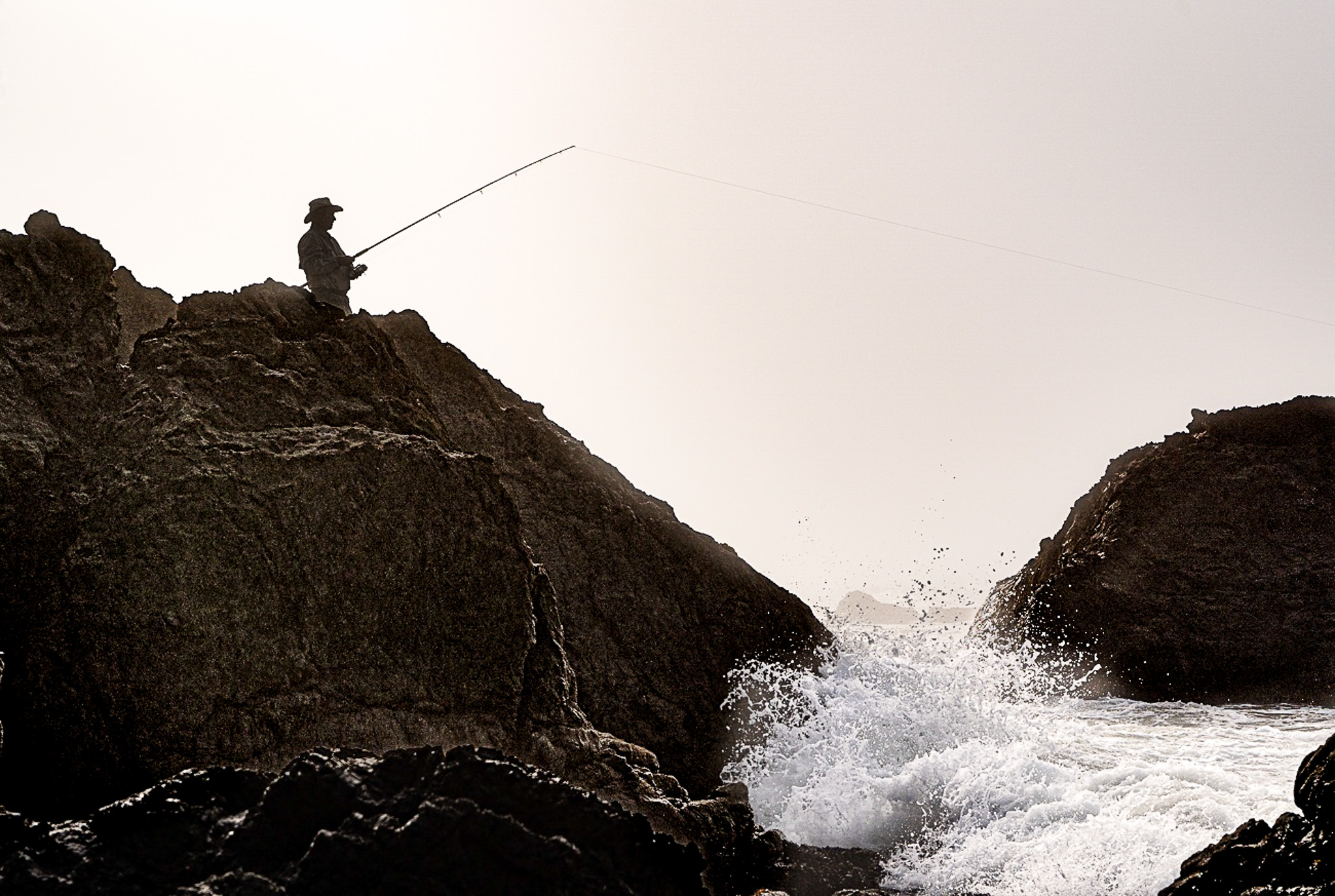
Jennifer - I like this image a lot . . . the simplicity (B&W is perfect) and contrast between the calm of the fisherman and the roughness of the water/rock. The crop works well - my attention starts with the rough/moving/bright water splash - then drifts up the line of the rock to the person . . . where I find greatest interest.
One suggestion might be to bring out more texture/detail/contrast in the rocks. As you present it - those appear to me washed out or gray. Your exposure captured so much fantastic detail in the rock that could add interest. Example attached - not sure if this is better or worse. I also changed the tone of the person a bit . . . . hopefully keeping your original intent. Thoughts? |
Nov 2nd |
 |
5 comments - 4 replies for Group 87
|
5 comments - 4 replies Total
|


