|
| Group |
Round |
C/R |
Comment |
Date |
Image |
| 87 |
Jul 20 |
Reply |
WOW! You converted an average looking school picture . . . . into something special/artistic. Thank you for sharing. |
Jul 3rd |
| 87 |
Jul 20 |
Comment |
You are very talented with B&W. I confess that the color image didn't keep my attention (I would have skimmed by it without a second look) and yet the B&W pulls me in and keeps my interest.
The most interesting aspect for me is the largest tree . . . with those undulating branches . . . almost like arms waving at the viewer. Or waving at the other (younger/smaller) trees. As though it's the leader.
I wonder if a tighter crop would be even more interesting and increase focus on that aspect. Not sure the three small tress on the far right add much.
The foreground grass (in the B&W) works perfectly and conveys a sense of place.
You took a routine scene . . . and made it special. Well done. |
Jul 3rd |
| 87 |
Jul 20 |
Reply |
For the right image (like your daughter's portrait) - I think the jet black background works really well. It's clean - and ensures total focus on the subject.
I can't see the original - if it was > 1 mb; the system just rejects it and doesn't alert you. That happened to me recently. |
Jul 3rd |
| 87 |
Jul 20 |
Comment |
Great scene . . . The long exposure works and contributes to that dreamy look. I'm assuming it was daytime - did you need an ND filter to get to the 73 sec exposure? Or was f18 enough?
I agree with the others - that toning done the bright spot in front would help - perhaps even slightly brightening the wood in the water; to draw more attention to that.
So many textures (rocks, water, wood, foliage).
Personally - I find the green in the edits image a bit over-saturated; and imagine the true scene looking more like the original. The edits do make the greenery pop more. . . as someone told me "add salt to taste" . . . a matter of personal preference. |
Jul 3rd |
| 87 |
Jul 20 |
Comment |
Nice shot - I Ike the cluster . . . and range of colors in the image. With images like this - I try to use narrower depth of field for focus on more on a flower; reducing the distraction of surrounding leaves/mulch. Either way works! Your post processing is good - not over done - I can imagine this plant appearing exactly the way you depict it.
You are motivating me to take some picture of flowers! |
Jul 3rd |
| 87 |
Jul 20 |
Comment |
Between you daughter and the zebra; I'm sensing a "black background" theme. Is your daughter in front of a black background? Or is the technique similar to what you described for the zebra?
Great shot; you and she share the credit! Great use of lighting on her face/hair - and the texture of her skin make for a compelling image. Her eyes are so sharp (with great catch lights) - and her expression draws me in; it's neither a smile nor a frown - rather a young girl with a mature/pensive pose.
If you can share some of your tips/tricks (perhaps even original CR image); we will all learn more from your work. |
Jul 3rd |
| 87 |
Jul 20 |
Comment |
Great image . . . I like the tall vertical crop; works with the tree. And the sharp bark/moss/vine make for an interesting image. For me the off-center location works; either way (since the tree is not moving!). I find it intriguing that the sky and water look almost identical through the branches; almost unclear where one ends and the other begins. Well done! |
Jul 3rd |
| 87 |
Jul 20 |
Comment |
Thanks Jennifer! I'm a "morning person" . . . 5:30AM is a great time for my body. Much better at sunrise vs. sunset :) |
Jul 3rd |
| 87 |
Jul 20 |
Reply |
Birds in flight are challenging - but in my experience it's 15% skill, 15% having the right lens (I originally rented from LENSPROTOGO), and 70% perseverance/patience. The morning I got this shot; I came home with 580 images; about 5 were worth keeping. But those few make it worthwhile. I can't imagine people doing that with film . . . I like your idea of a wider image and will explore; current crop is tight on both ends. I originally tried a 16:9 long aspect ratio - just felt the bird was small - and there was a lot of empty space - so I landed on this square image to emphasize the bird. It's a good point for me to revisit. Thank you! |
Jul 3rd |
| 87 |
Jul 20 |
Reply |
Thanks Lance - I appreciate your comments and ideas! I will explore the B&W options; perhaps following the tips you posted on the bulletin board. I like the orange glow; and esp how the light colors the feathers. |
Jul 3rd |
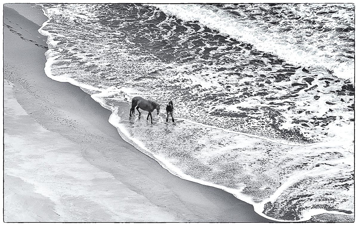
| 87 |
Jul 20 |
Comment |
Love this image -especially the breadth/scale. I think about the size of that massive animal . . . and how tiny the horse looks on the open beach. The woman and horse's footprints in the upper left are perfect - including how they disappear into the water. Love the foam in the water - and how we have that clear line between the water and sand. I tried few edits in the attached (toned down the highlights/brightness in the foam strip in the upper right, sharpened/increased contrast/blacks in the woman/horse and added slight vignette) - all to make the woman/horse pop more and avoid the distraction of the overexposed foam strip.
Regarding title . . . for me - this photo is about the relationship between the woman and horse . . . how about "Kindred spirits" . . . .
Glad you were carrying your Sony!
|
Jul 2nd |
 |
7 comments - 4 replies for Group 87
|
7 comments - 4 replies Total
|


