|
| Group |
Round |
C/R |
Comment |
Date |
Image |
| 87 |
May 20 |
Comment |
I like this image a lot! I agree the 4x3 crop is better; the focus is really the two geese and the island in the middle of the water. In my opinion, the tree/land on the right side of the original don't add to the story and could distract. The crop increases focus on the geese. I wonder the pros/cons of trying this in monochrome. It's almost there already; except for the blue boat near the house (perhaps a nice "pop"), the green in some of the trees and a little yellow below the house. The image has a lot of "white" . . . but I think it works - conveys the starkness. Is there any way to make the house/geese more prominent? |
May 19th |
| 87 |
May 20 |
Reply |
Thank you - appreciate your comment. |
May 19th |
| 87 |
May 20 |
Reply |
Thanks Chan. While the king down is a sign of loss/resignation - it is also a sign of dignity and respect. Good chess players will typically not play until they get mated; when it is clear they will lose - the king is laid down and their arm outstretched to congratulate their opponent. Hope you and your's are well. |
May 19th |
| 87 |
May 20 |
Reply |
Thanks Lance . . . I'm going to buy the Efex Pro 2 - your recommendation (esp for vintage B&W) means a lot.
I really like both tulips; if I was going to hang one in my home - it would be the B&W! That's am amazing shot - really causes the viewer to stop/stare/think.
And I like the sprinkler idea (better than getting wet) - will try it this Spring/Summer on my deck and share an image or two. |
May 5th |
| 87 |
May 20 |
Comment |
Dale - welcome to the group!
I like the way the light hits these flower so differently - some of the pistils/stamens are in complete shade - others in bright sun. Makes the exposure interesting. I also like that the yellow flowers/plant in the far background or nicely blurred. The bright color would be distracting - if they were sharp - but they are so blurry that I don't find them distracting - and the contrast creates interest.
Do you think some flowers in the main grouping are older than others? Their appearance is so different? Perhaps it's just lighting.
Do the few flowers in the upper left corner add interest? Or would it increase viewer focus on the main cluster if they were cloned out? |
May 3rd |
| 87 |
May 20 |
Comment |
Lance: On the main flower - I like the soft "creaminess" (?) of the image and the way the red flower "pops" from the green background. The composition is great - nice view of long stem with leaves - and the flower in the upper third of the frame. It is reminiscent of a painting. How did you shoot this? Is it through a window? How did you keep the camera dry if you were outside?
I LOVE the tulip!!!! Great detail/texture/sharpness - and blurred background. The monochrome works so well. I never thought of taking a colored flower into B&W - but I will try it this Spring. Can you share the original image? Curious what it looked like. Was it a brightly colored tulip?
Also - you and Jennifer both mention the Efex Pro-2. I looked at it on line. Do you find it does a better job with B&W (vs. for example, Lightroom)? Might be something worth investing in.
Regarding the two images - - - given limited space on the page - my inclination would be to share the original image and the post-production final (or two shots from the same session/subject). That may have greater teaching value vs. two different pictures. Just my two cents.
|
May 3rd |
| 87 |
May 20 |
Comment |
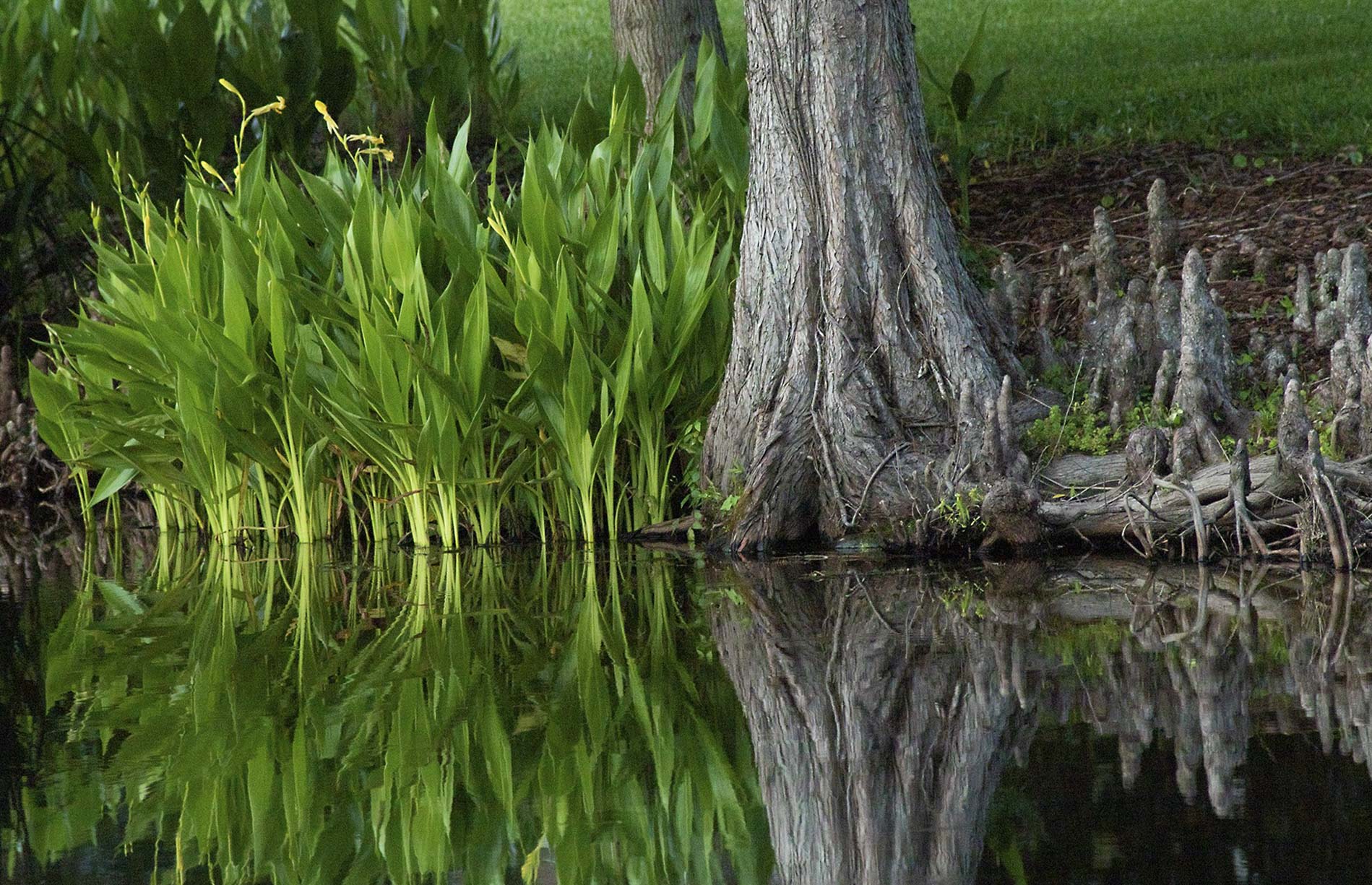
Nice shot - I like the stillness of the water - and also find it attractive that the picture appears to be monochrome plus green. Makes for an interesting/simple image. I like the clarity/sharpness. And contrast of the size/age of the tree trunk vs. the "new" spring growth to the left. Appealing composition.
I was curious about the angle of the water line? Was that intentional? Do you think that straightening (attached) - helps or hurts the image? I had trouble following the water line among the vegetation to straighten properly . . . Was your intent to crop the tops of some of the reflected plants? Does the original file have more? |
May 3rd |
 |
| 87 |
May 20 |
Comment |
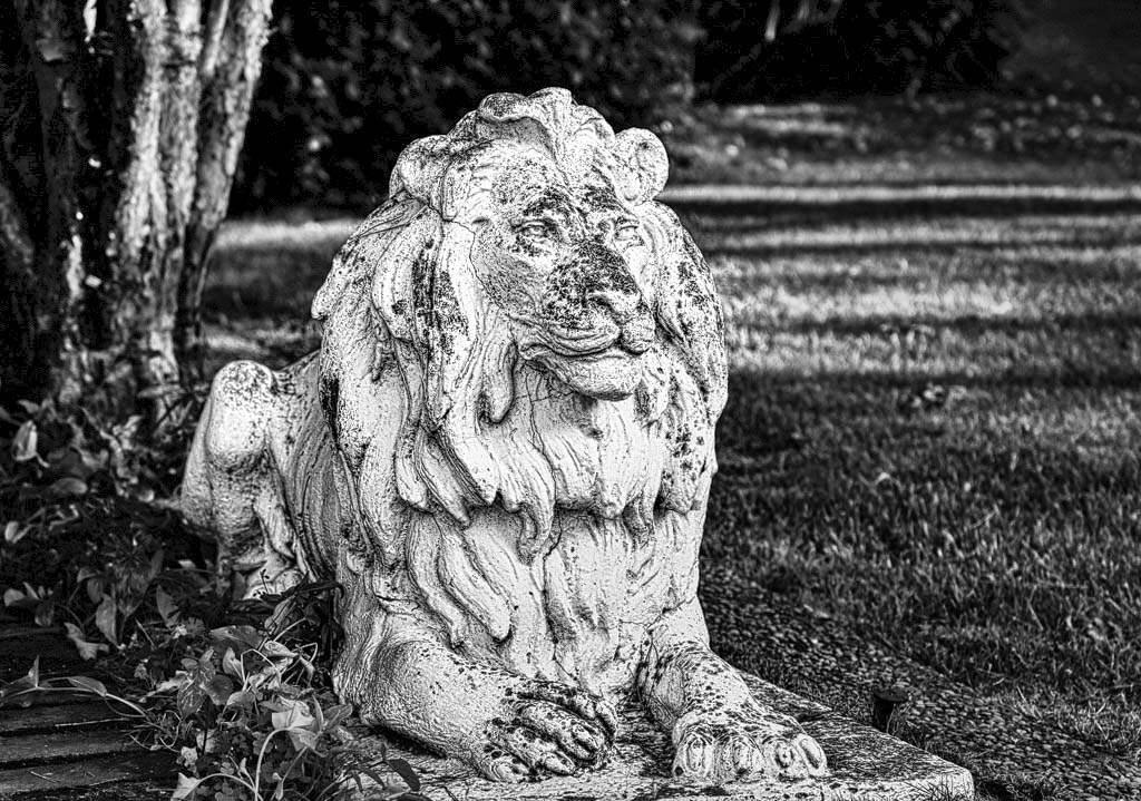
Yes - but he has aged gracefully and still looks good! I like the detail/contrasts . . . what is Silver Effects Pro? For me - the image is a little "flat" - would like it to pop more and show more vividly texture and the signs of age. Took a shot at it - attached. Perhaps I went too far . . . (as usual). |
May 1st |
 |
| 87 |
May 20 |
Comment |
Jennifer: Thank you - I appreciate your comments - they make me think! I actually like the length leading up to the King . . . but I agree with you that the bright white in the foreground is distracting. How about this - I used a radial filter to darken the foreground . . . getting brighter as the viewer approaches the king. Thoughts? |
May 1st |
 |
6 comments - 3 replies for Group 87
|
6 comments - 3 replies Total
|


