|
| Group |
Round |
C/R |
Comment |
Date |
Image |
| 10 |
Nov 22 |
Comment |
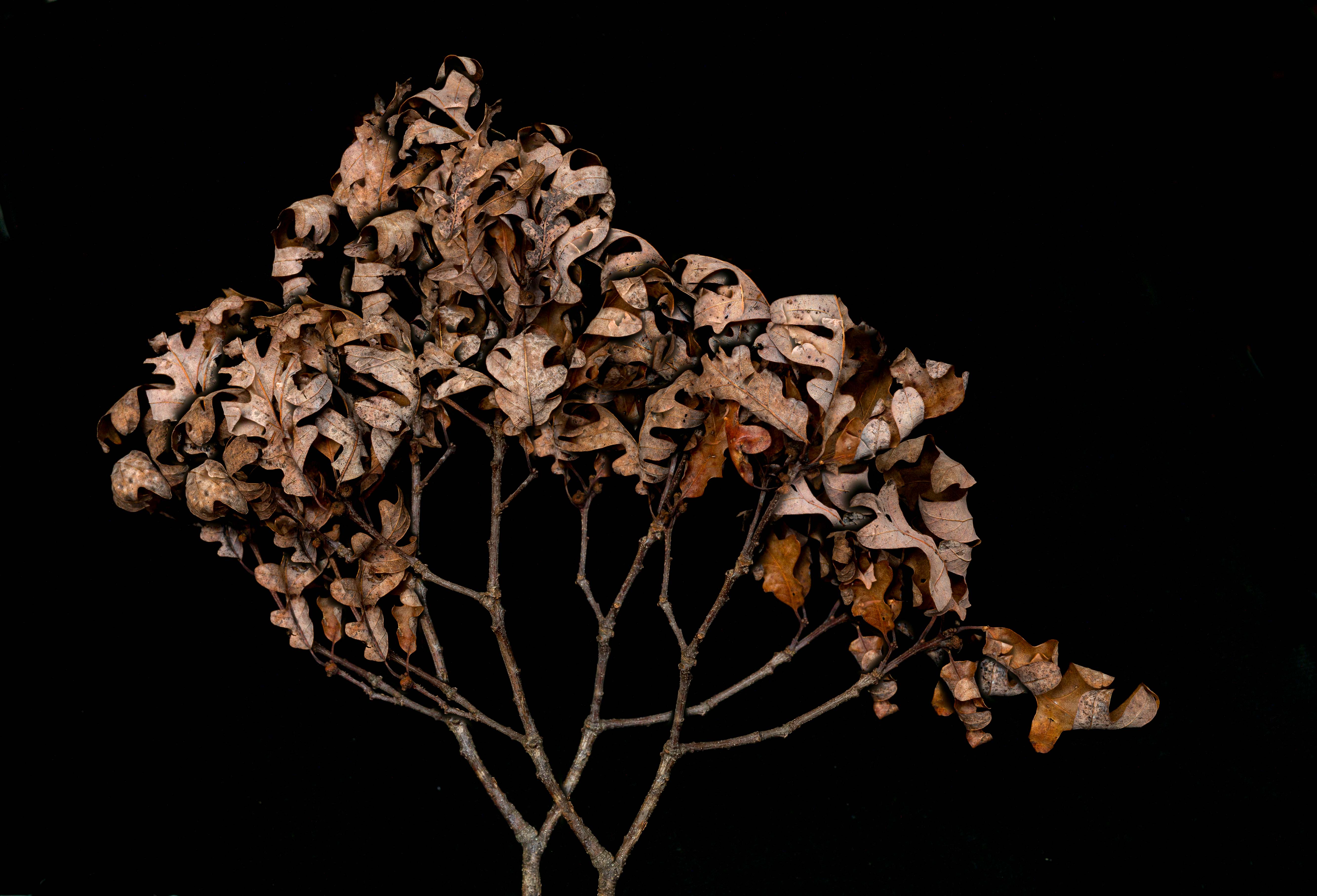
Beuatiful. You might clone out the log in front of one of the falls. Also, you might darken some of the rocks, especially the big ones to the left. For my tastes, they are too prominent. You captured the falls and the mood wonderfully. |
Nov 12th |
| 10 |
Nov 22 |
Comment |
I too love the original. Her left forearm may be blown. This image is worth taking the time to clone some of the stone texture in. |
Nov 12th |
| 10 |
Nov 22 |
Comment |
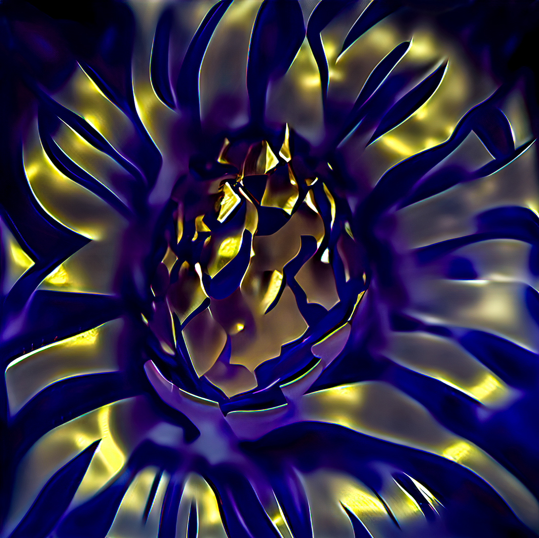
Beautiful. The center perhaps needs more difinition. Do you have Topaz Sharpen AI? I apply it to only what I want, & increasing texture & clairty after getting it back to LR helps. I would like to see what the background would look like if you bring out more of the colors just a little. |
Nov 12th |
| 10 |
Nov 22 |
Comment |
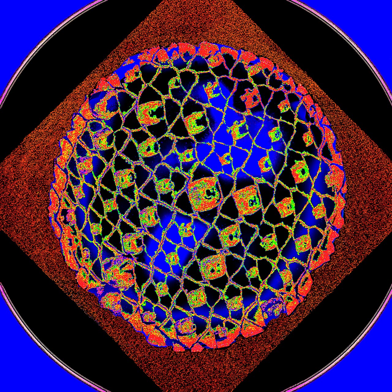
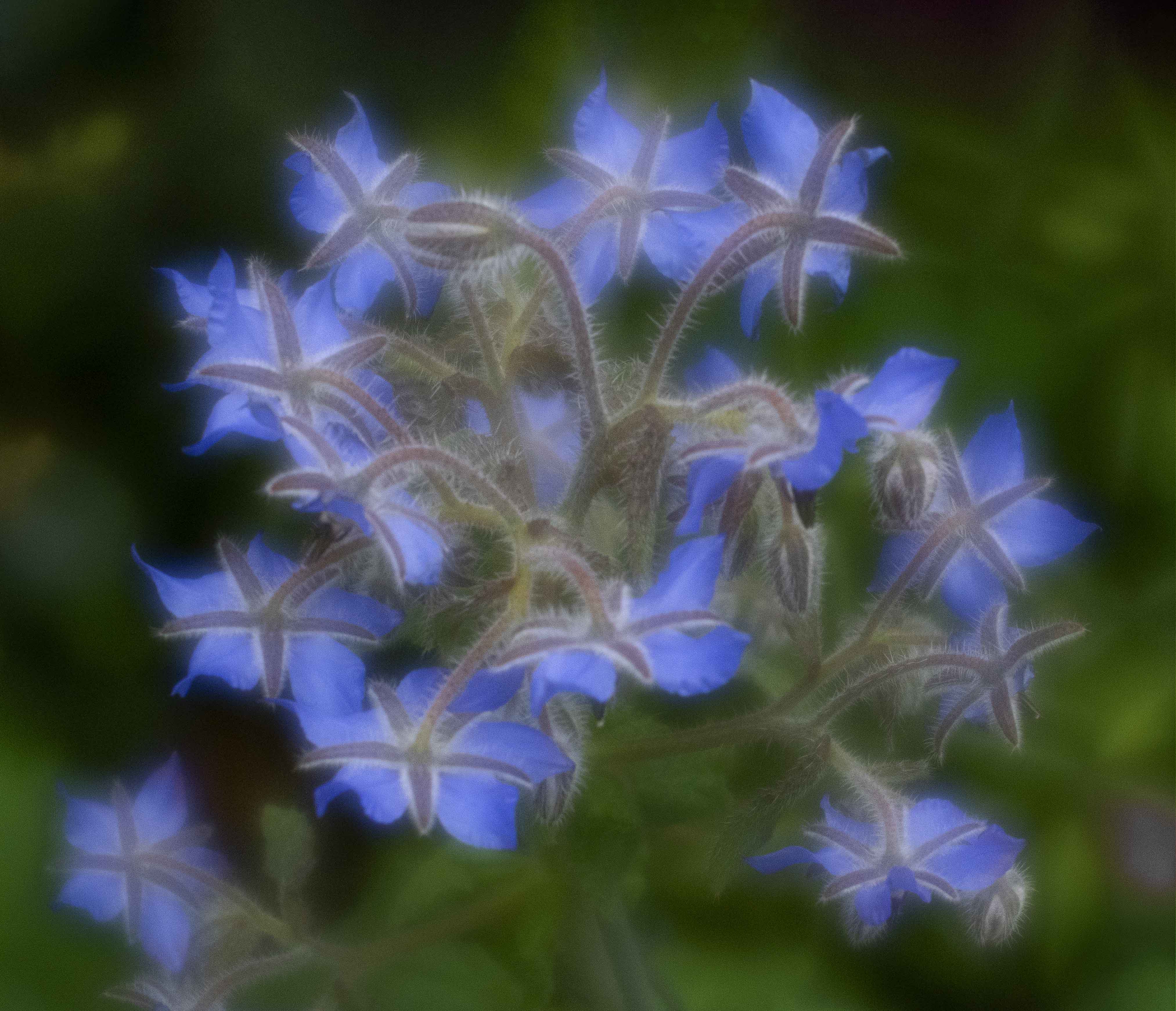
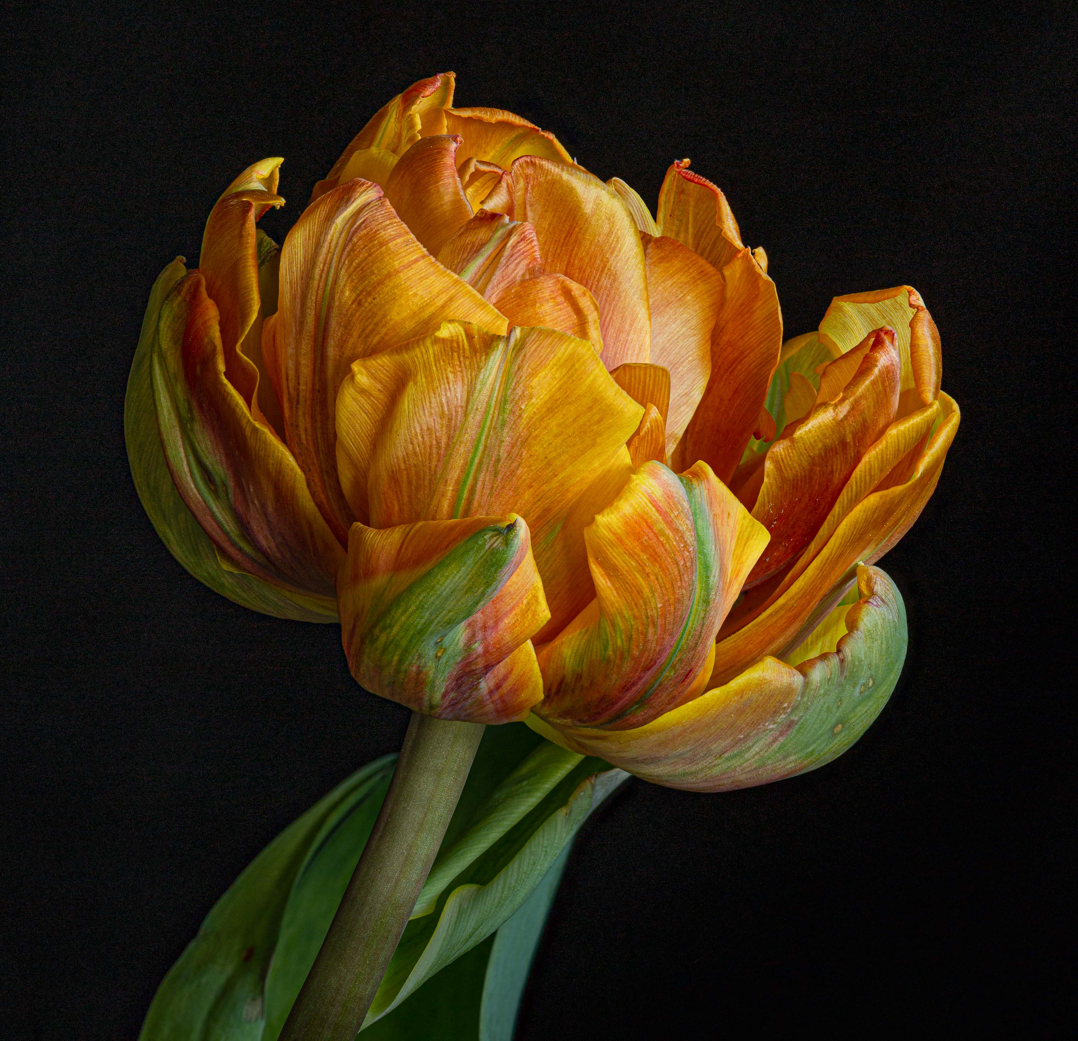
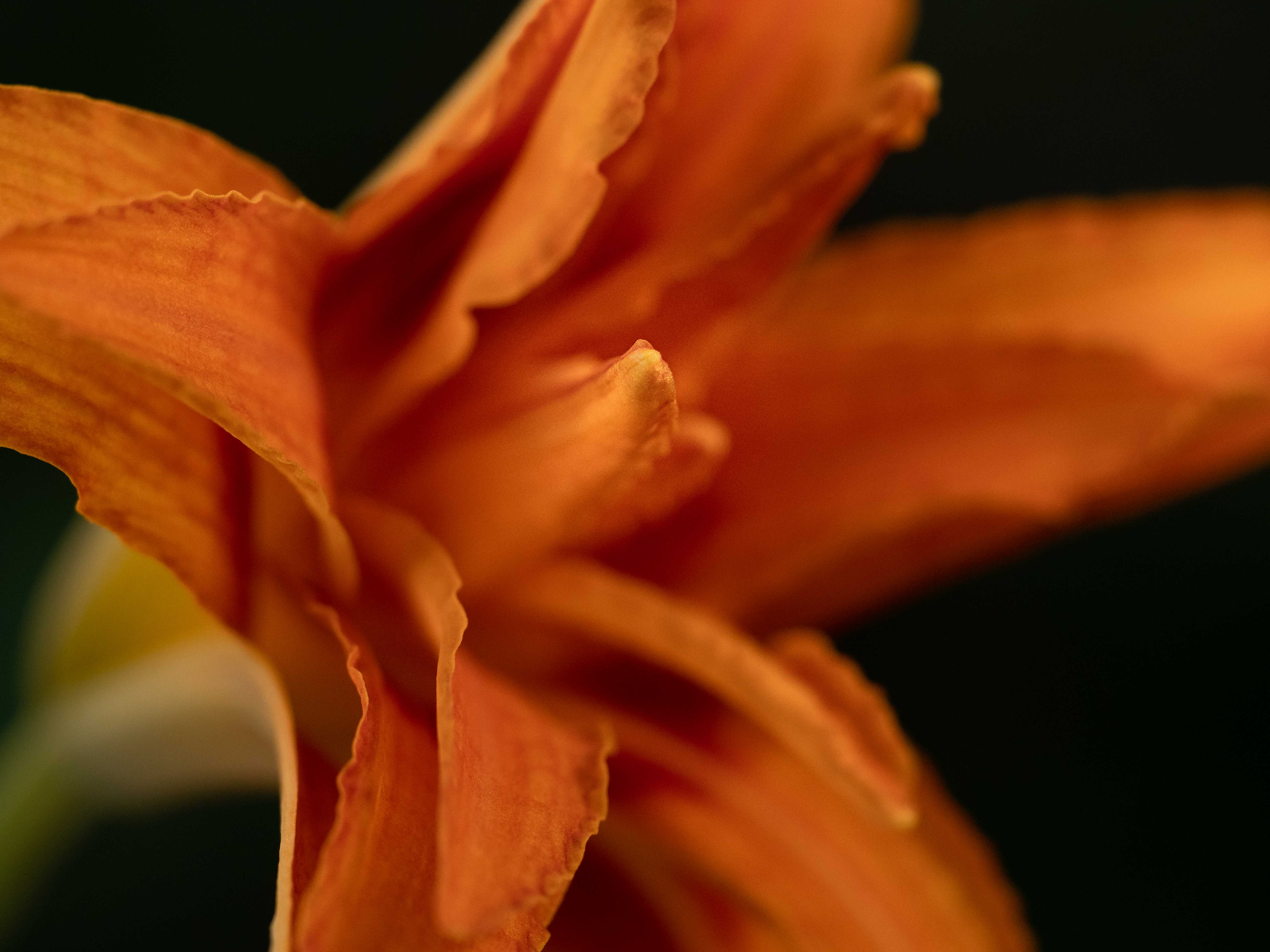
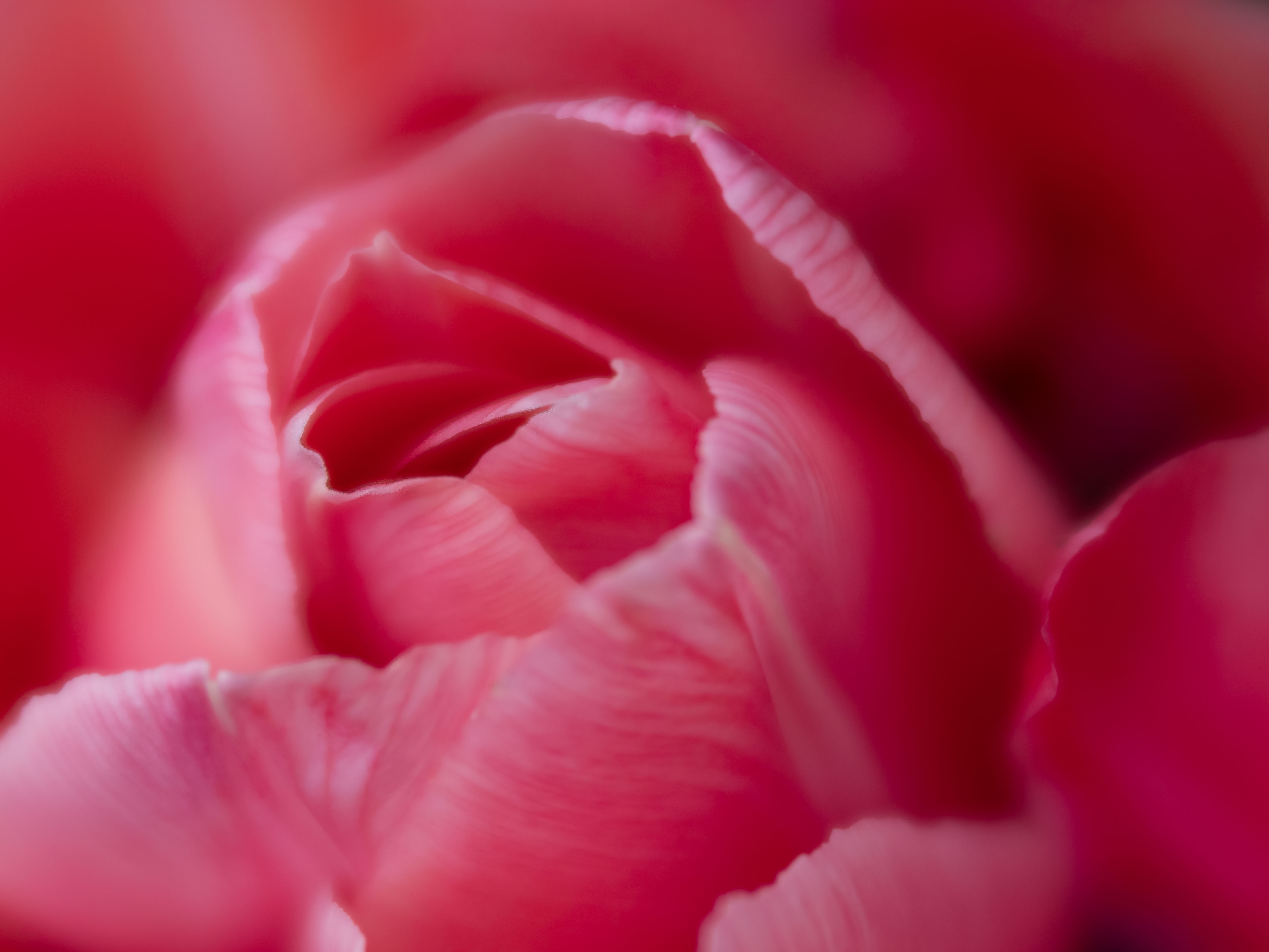
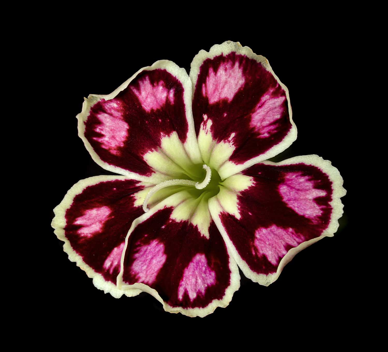
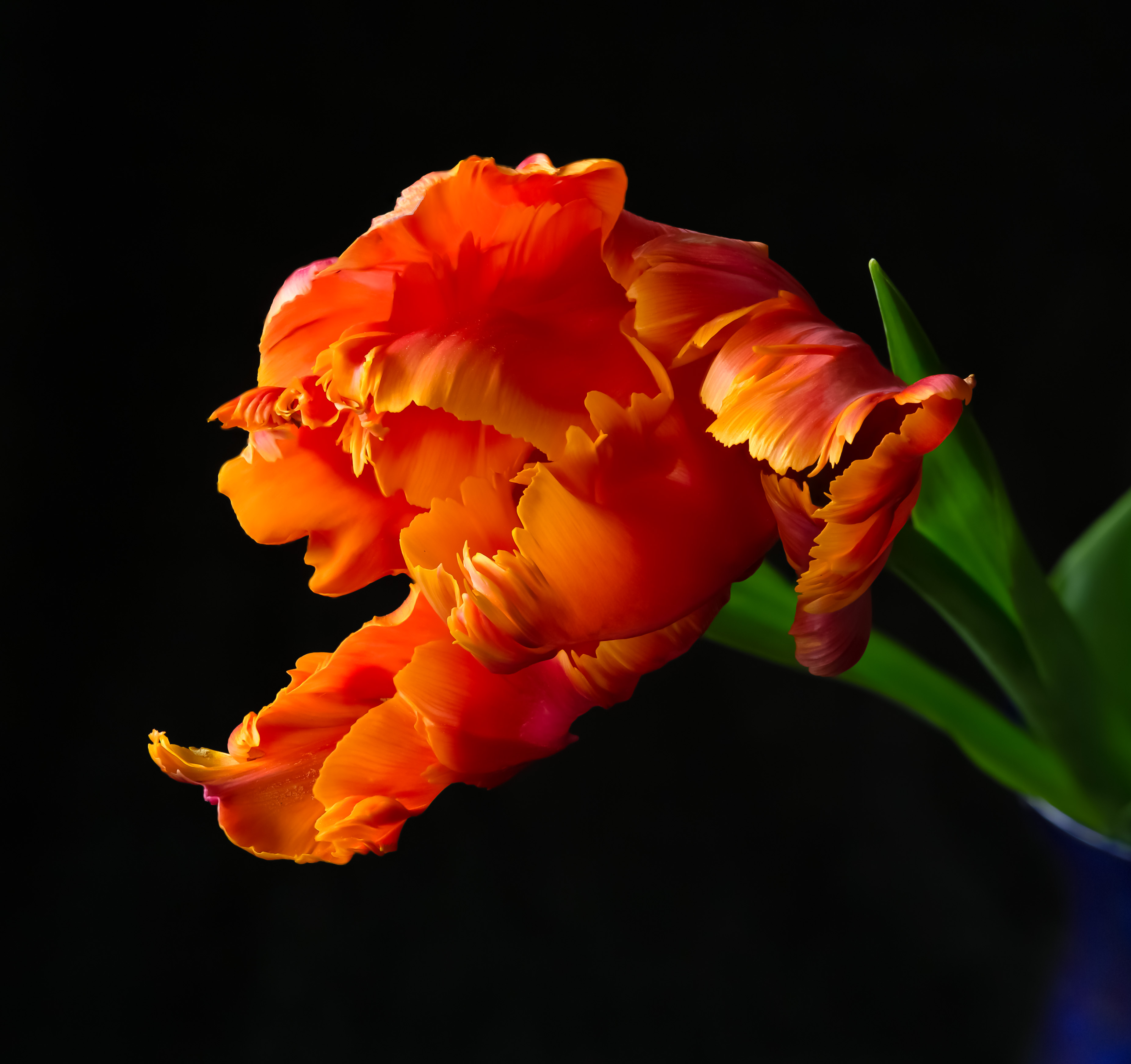
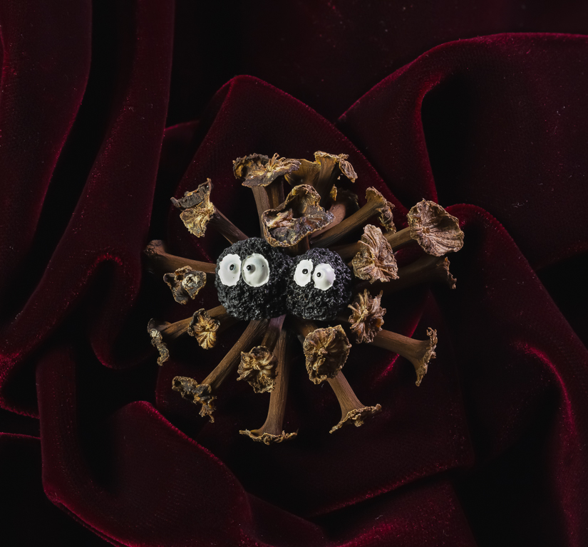
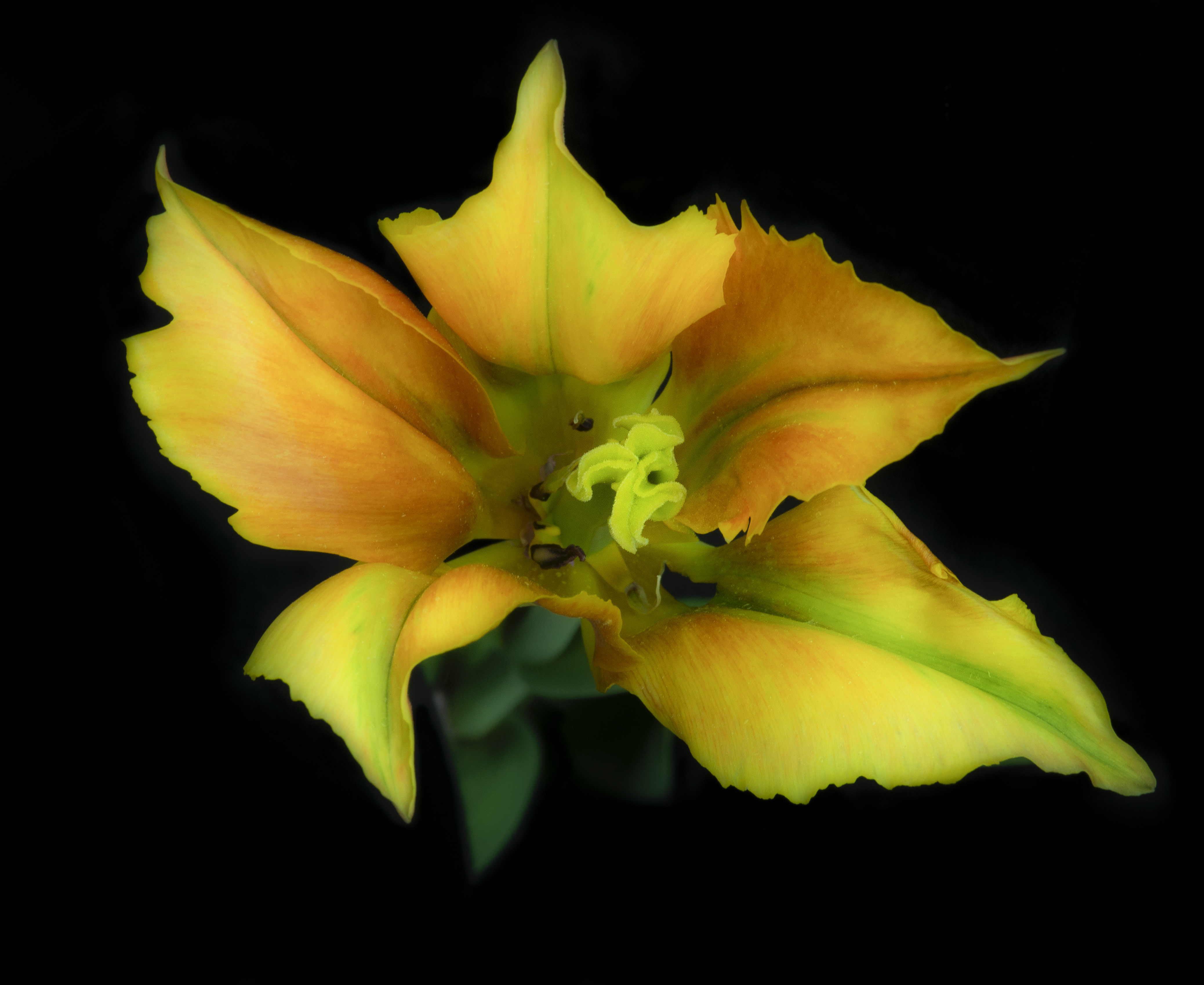
Kathleen Clemons observes that the eye is drawn to part of the image with the most contrast. In this image, it is definitely between the light & dark red of the flower. Lighten the dark & darken the light? I love the dragonfly. Any way to make it more contrasty with the background? I love the way he's perched on the flower. |
Nov 12th |
| 10 |
Nov 22 |
Comment |
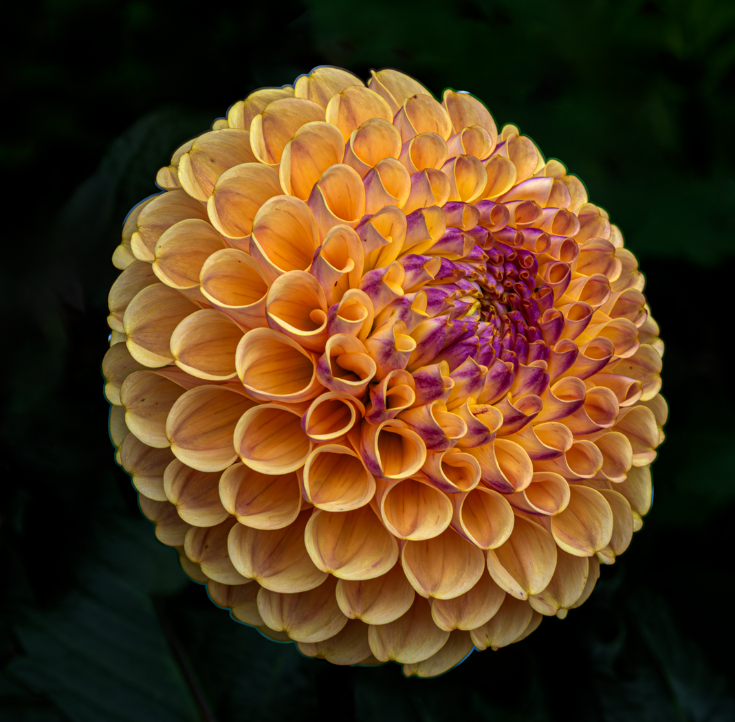
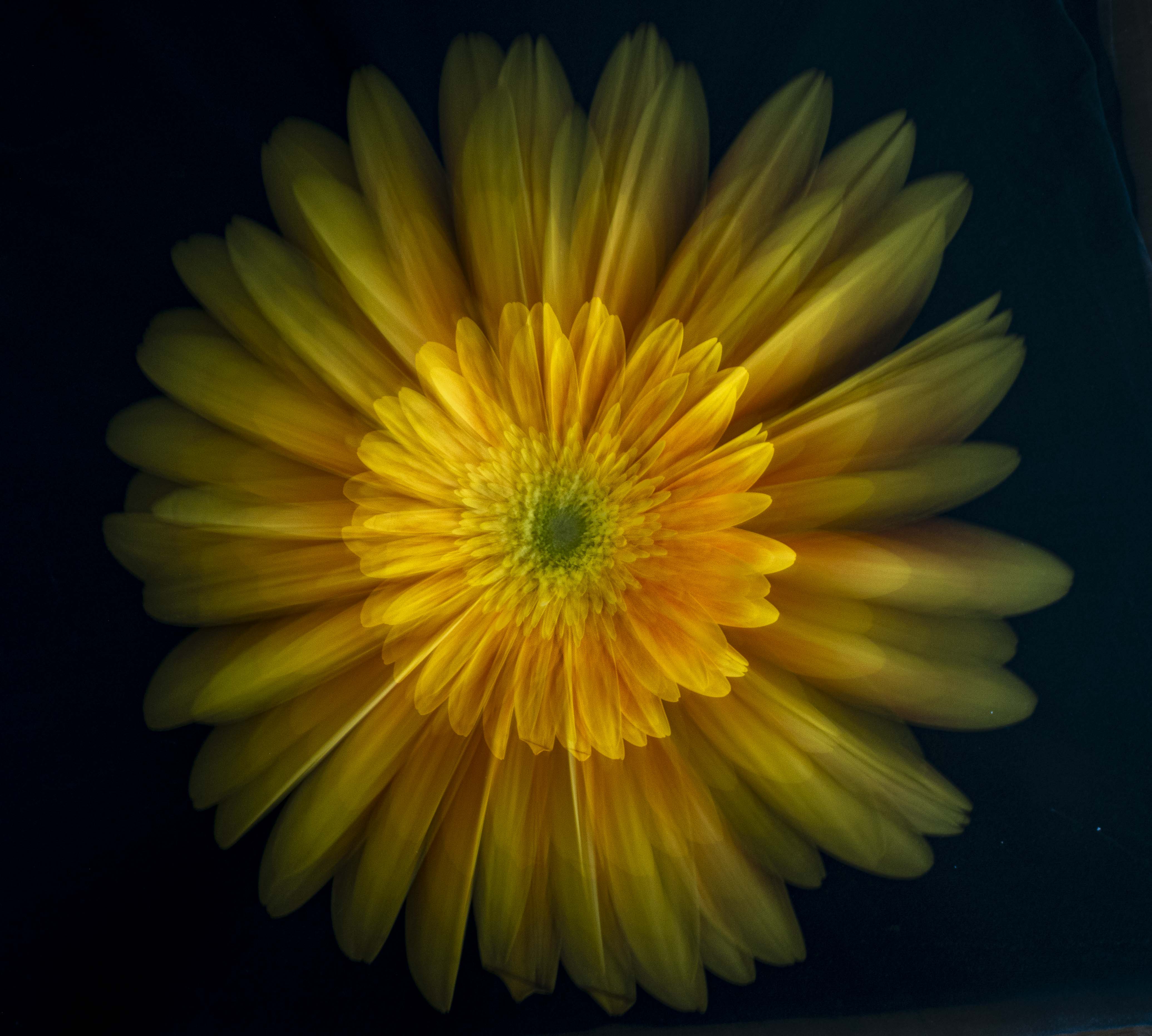
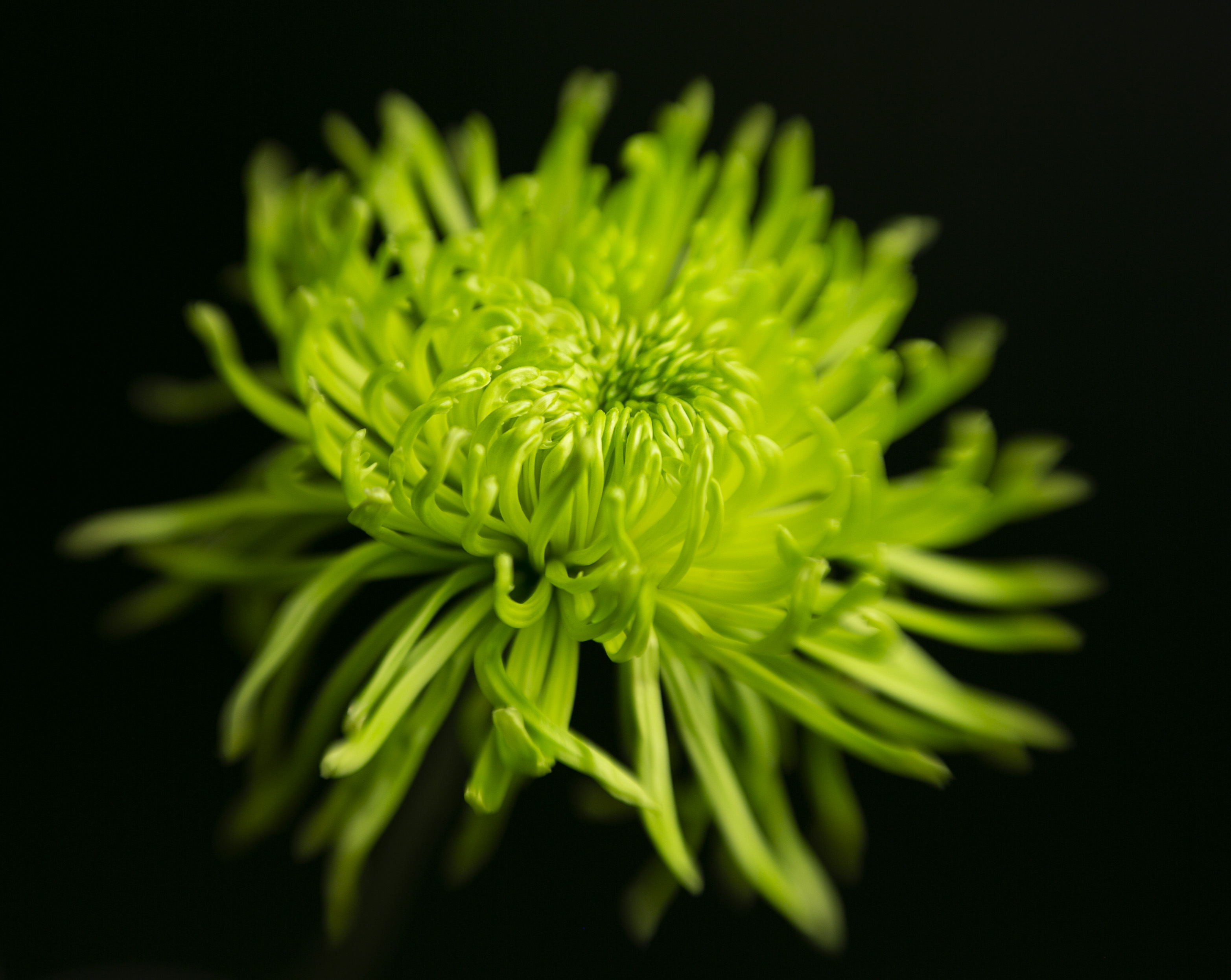
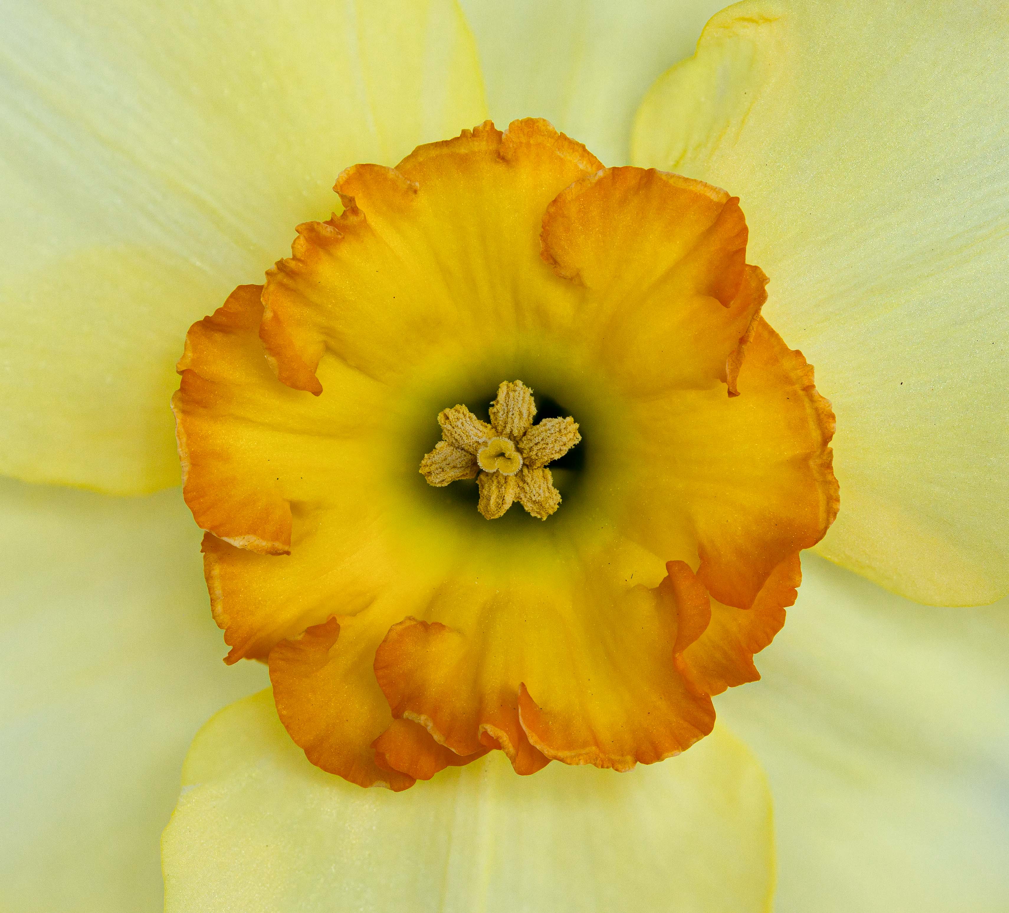
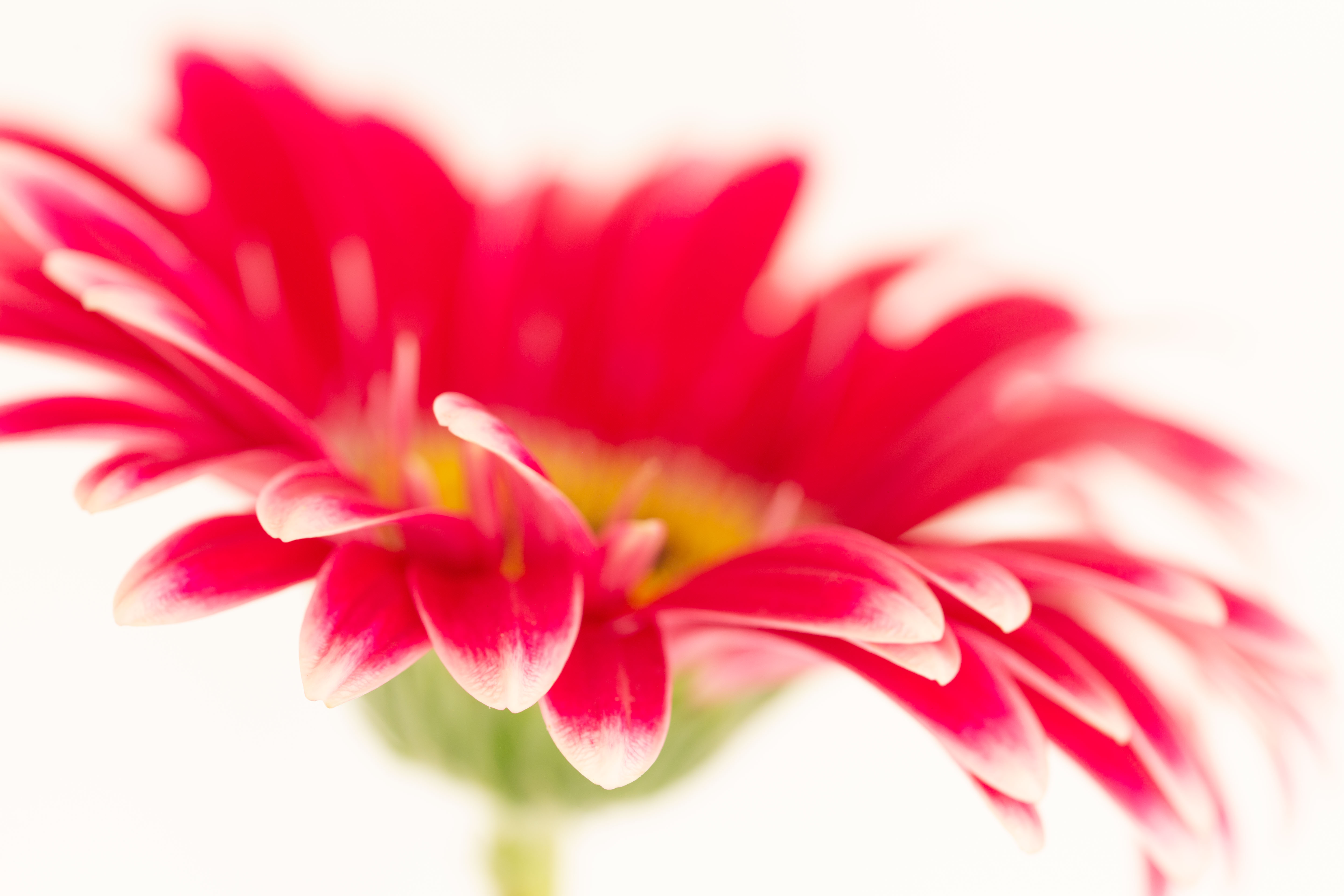
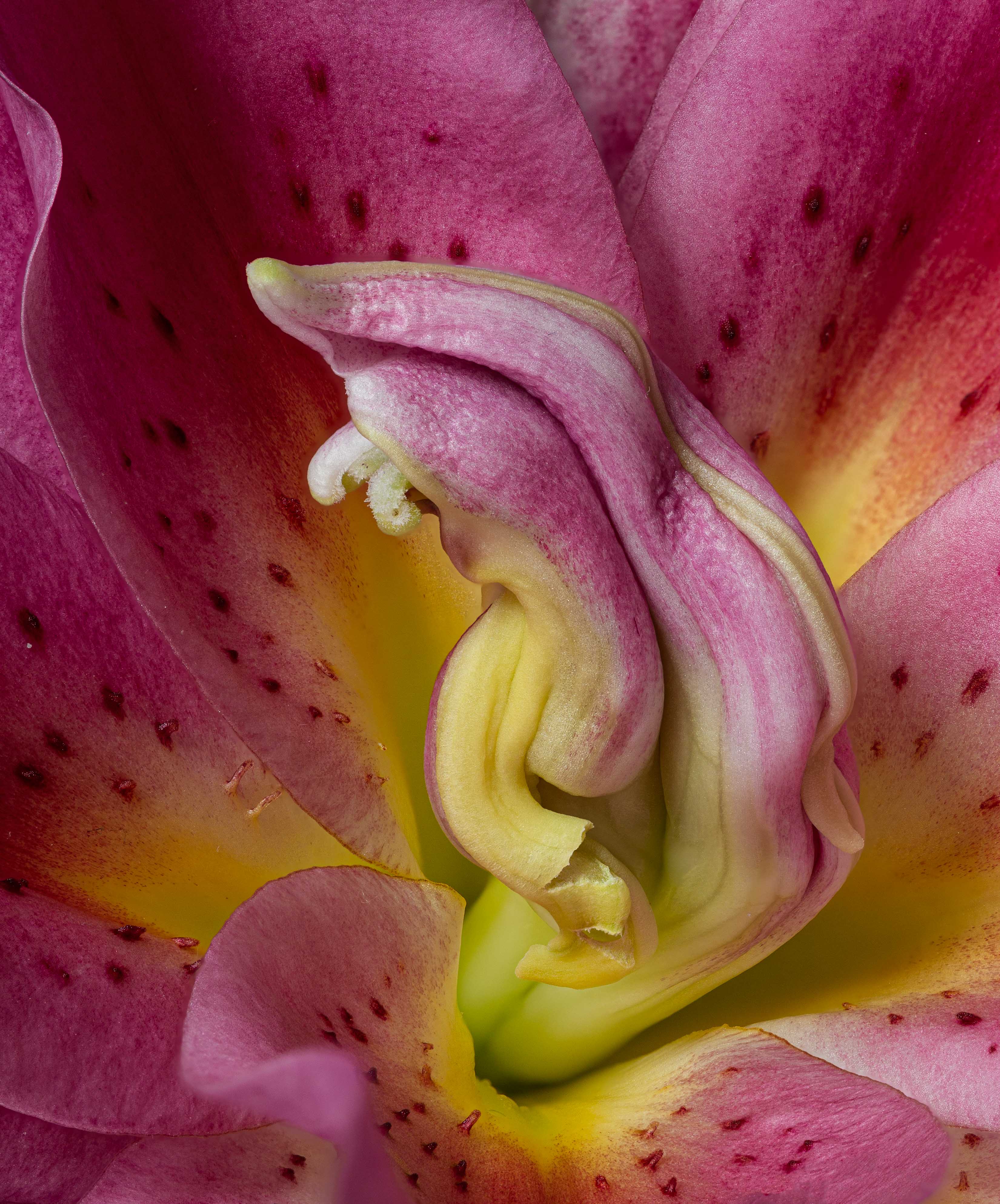
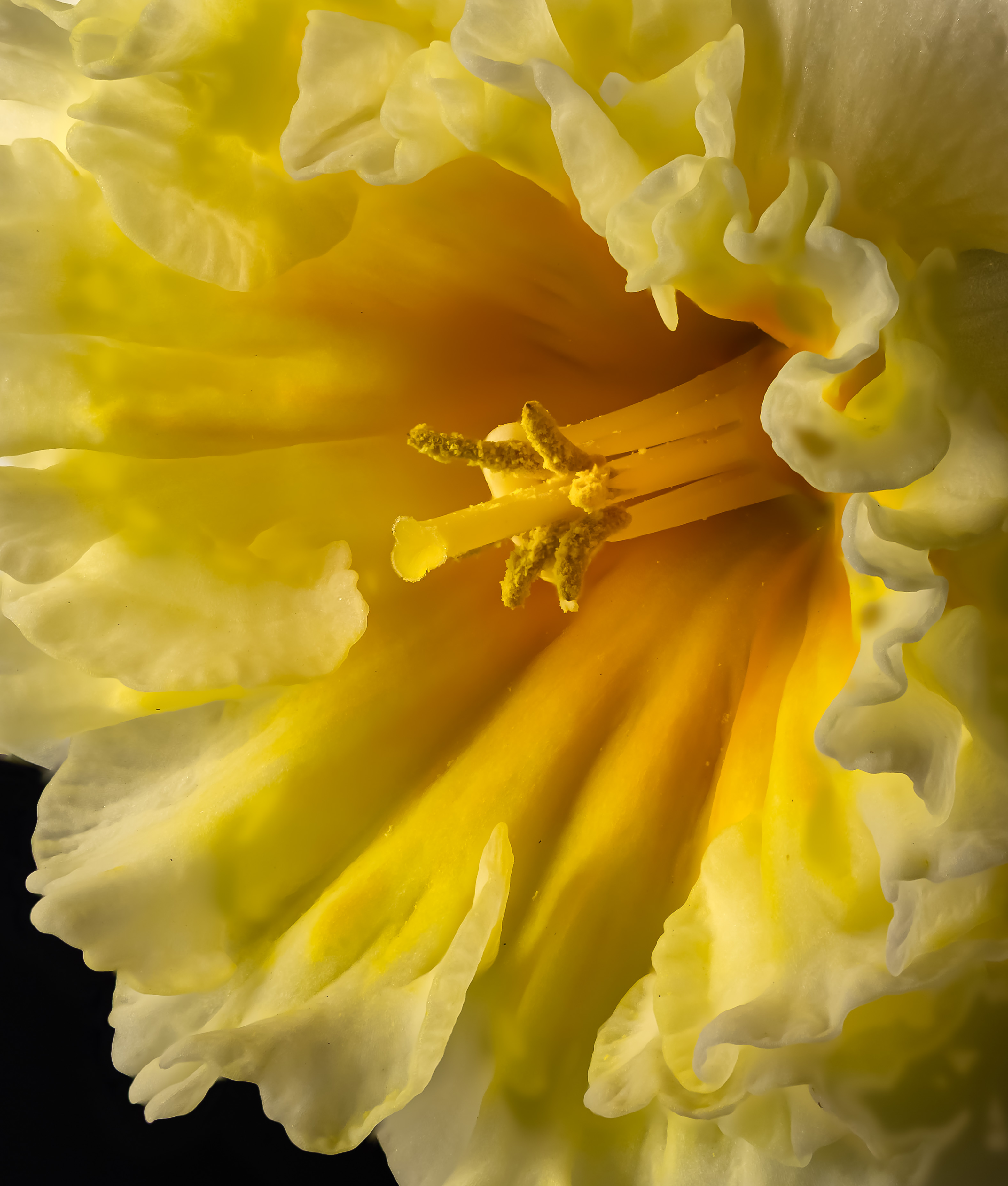
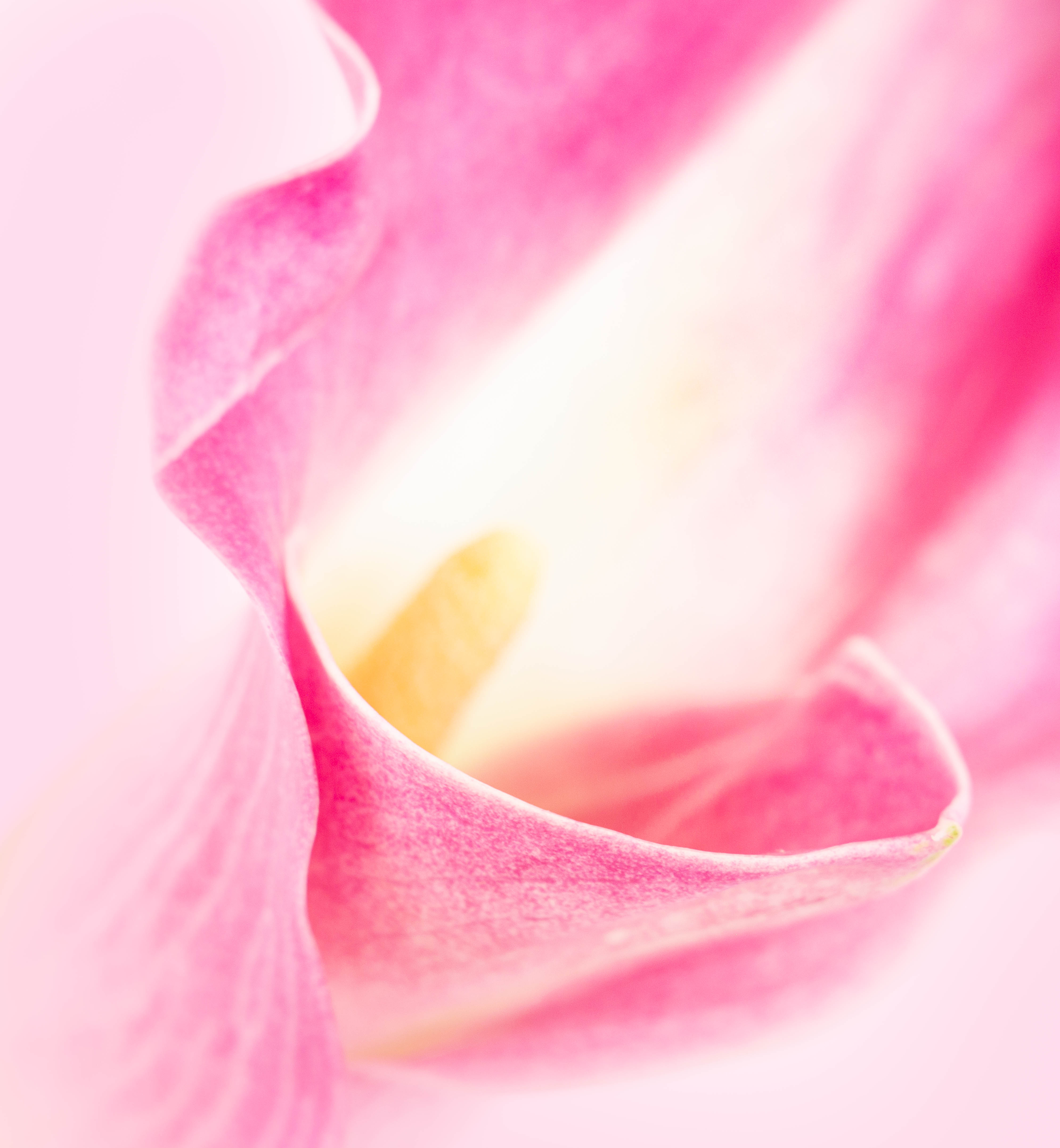
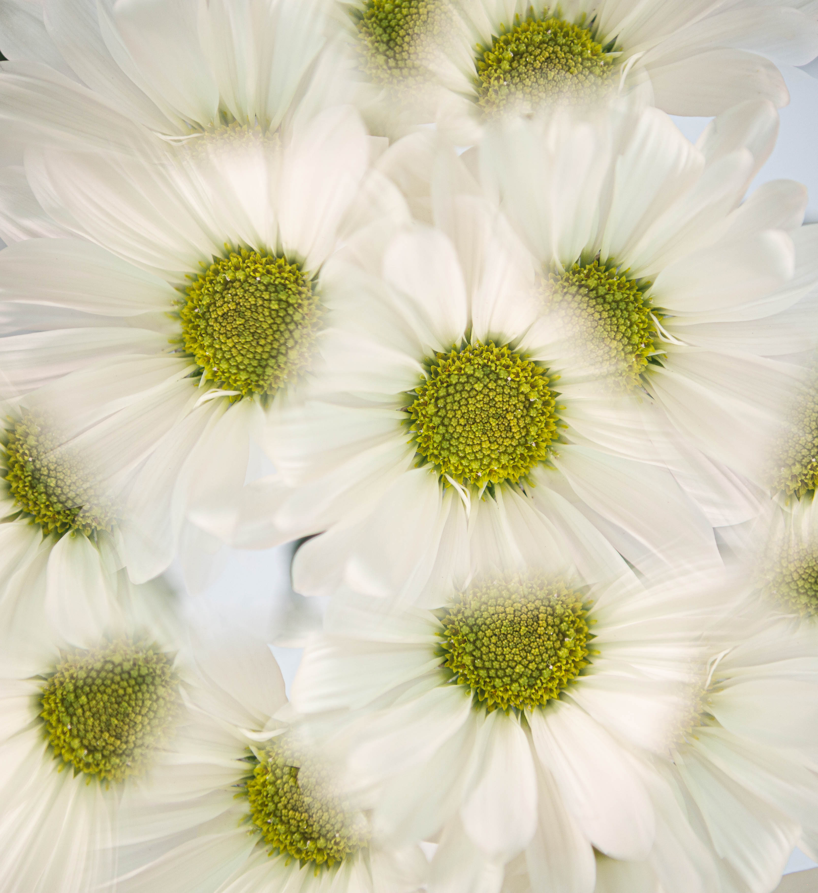
My basic impression is that I love it. The center is a bit too dark. I would maybe add some more yellow to the almost white in the upper left (by Kathleen's method of PS eye-dropper & brush?). I love the softening you did. |
Nov 12th |
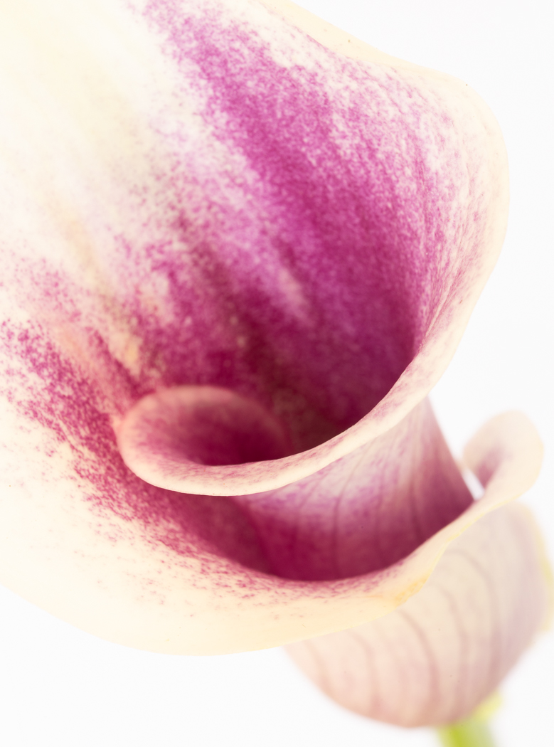
| 10 |
Nov 22 |
Reply |
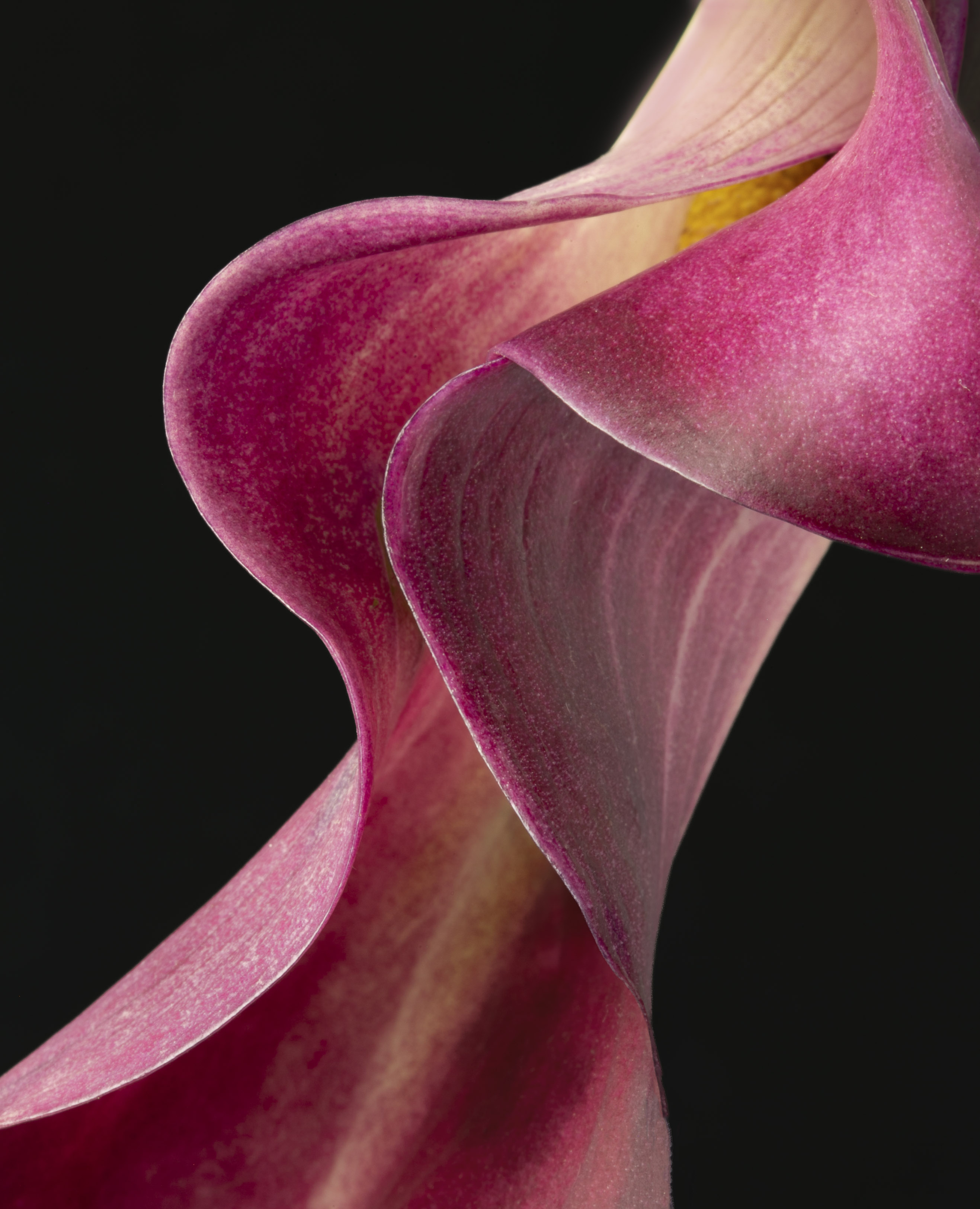
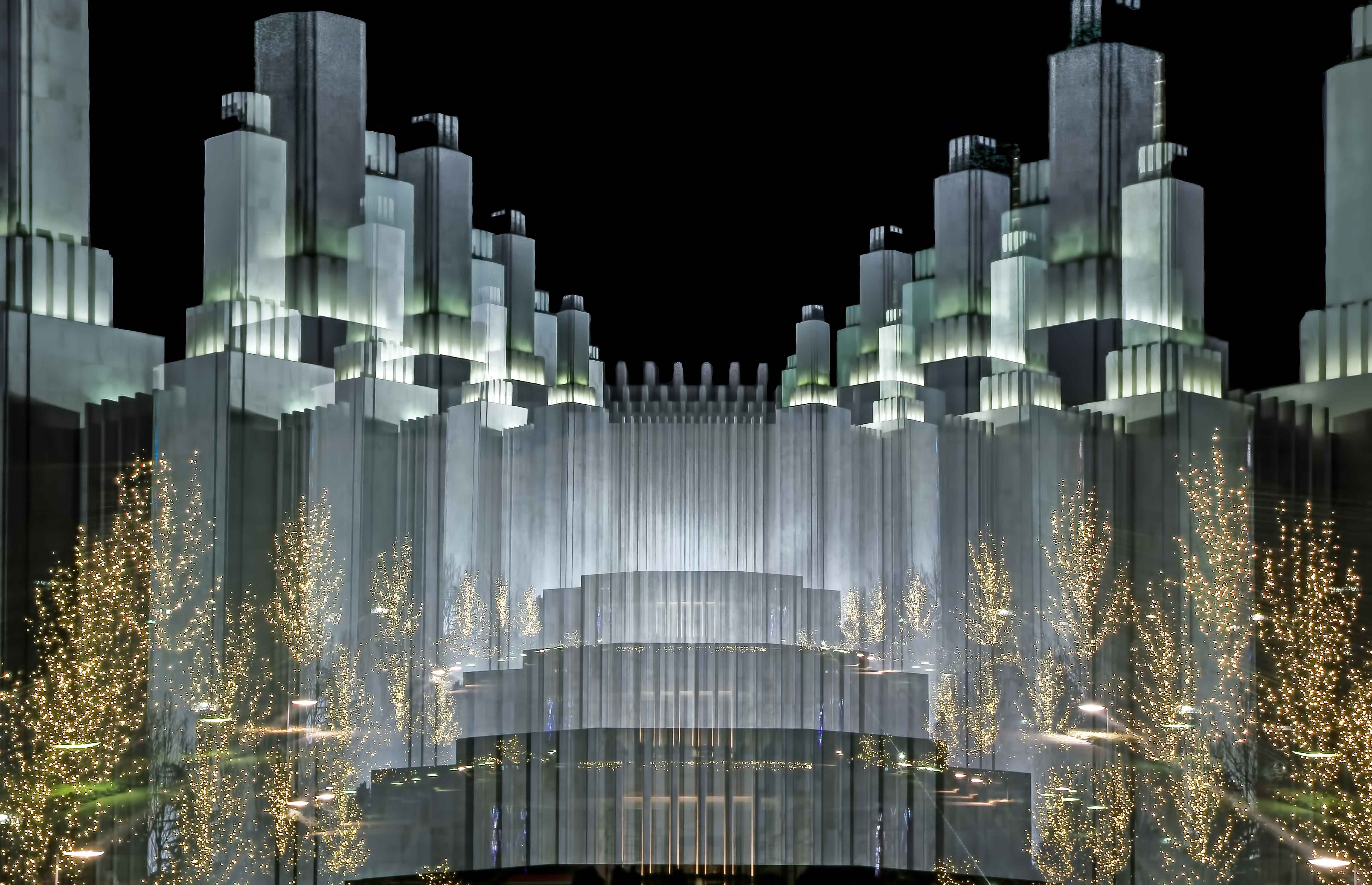
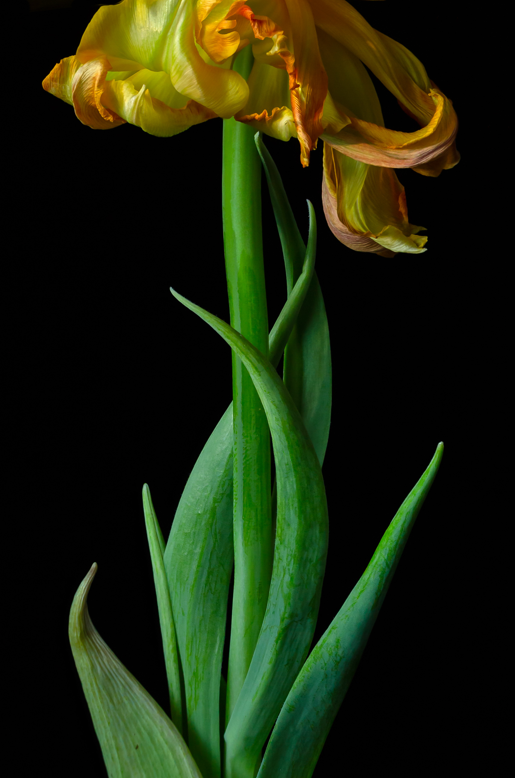
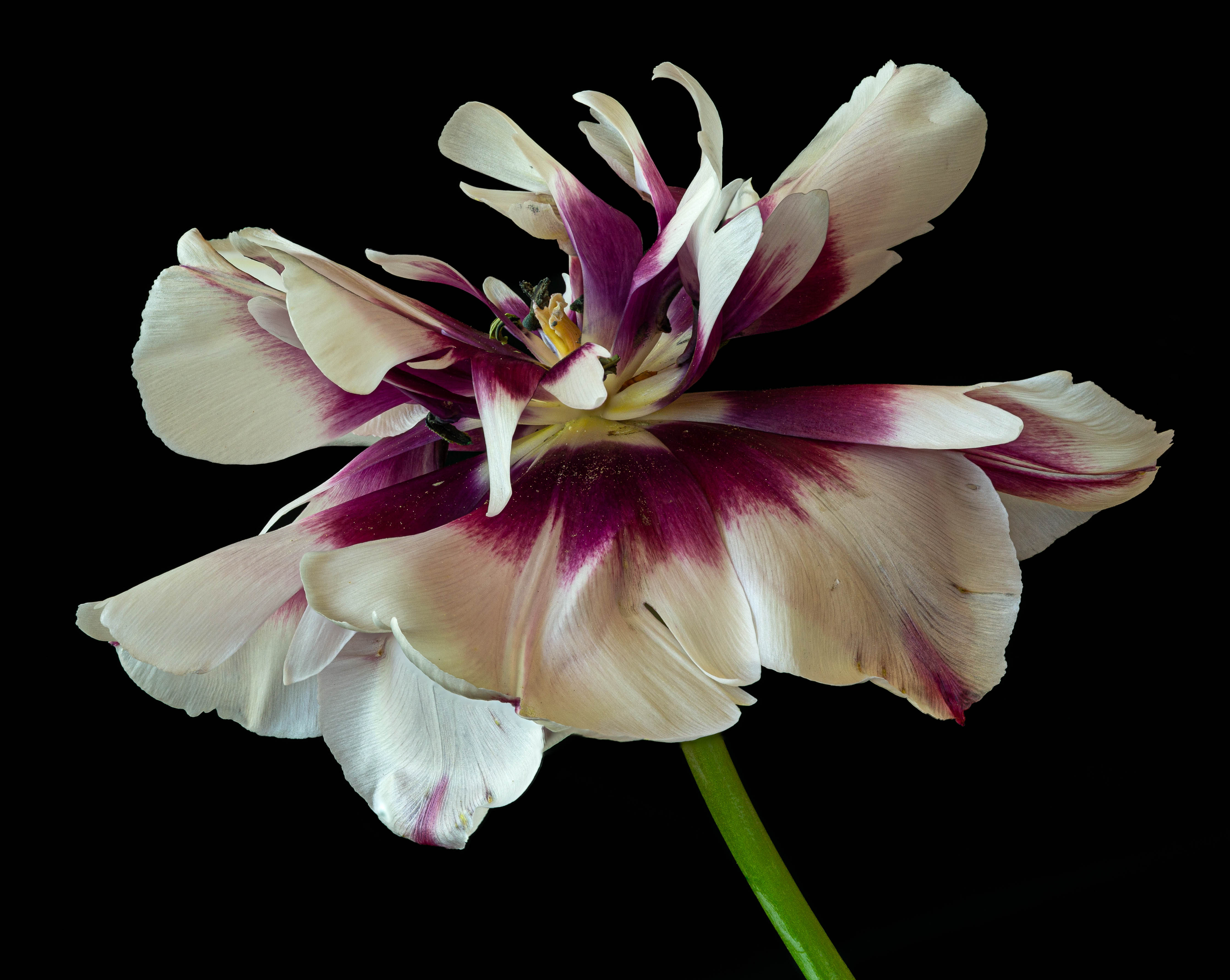
This was Kathleen's fave for that week. (My fave is what I posted for DDG 80.) At any event, what I was striving for is only the front petals in focus. This is quite a change for me as most of what I've shot is focus stacked against a black background! |
Nov 12th |
| 10 |
Nov 22 |
Reply |
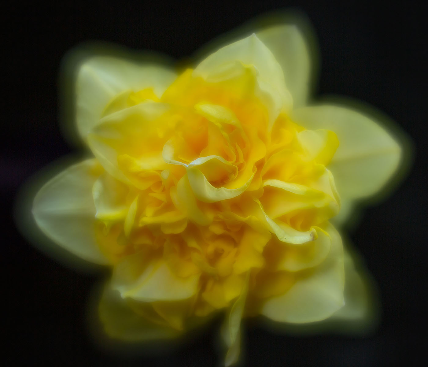
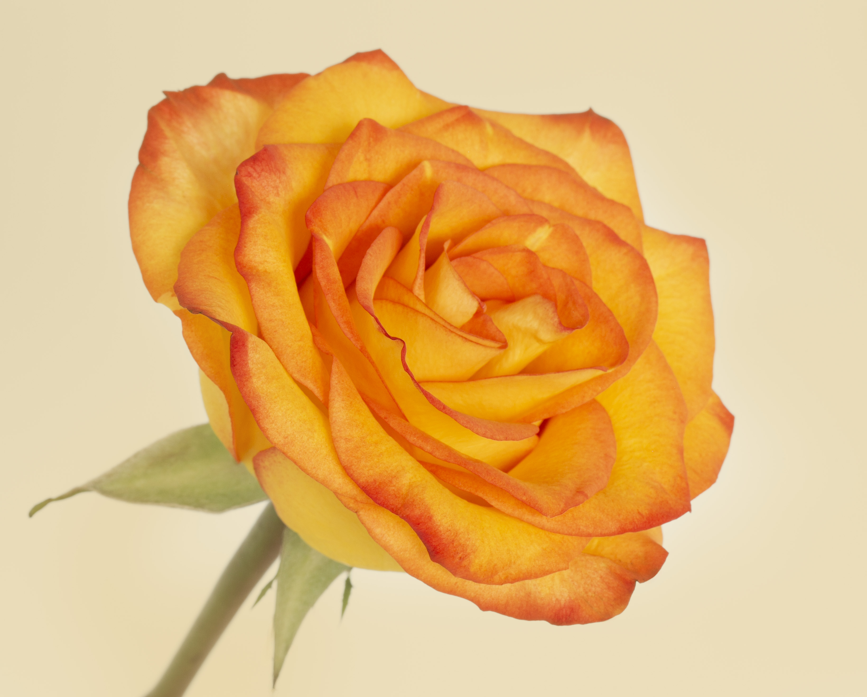
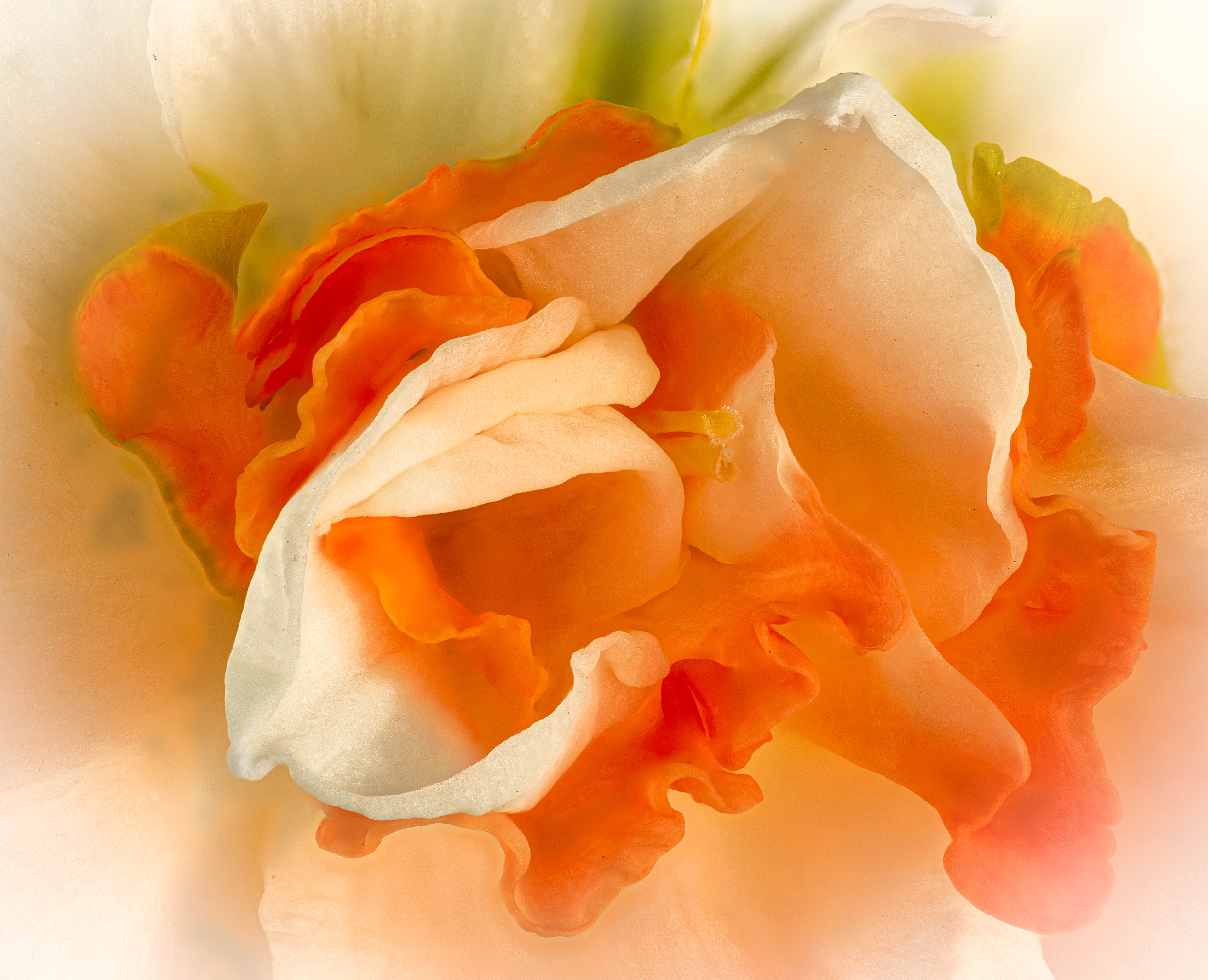
Thank you!!! I am not convinced that the white background is the best. It's good to know that you like it so much. |
Nov 12th |
5 comments - 2 replies for Group 10
|
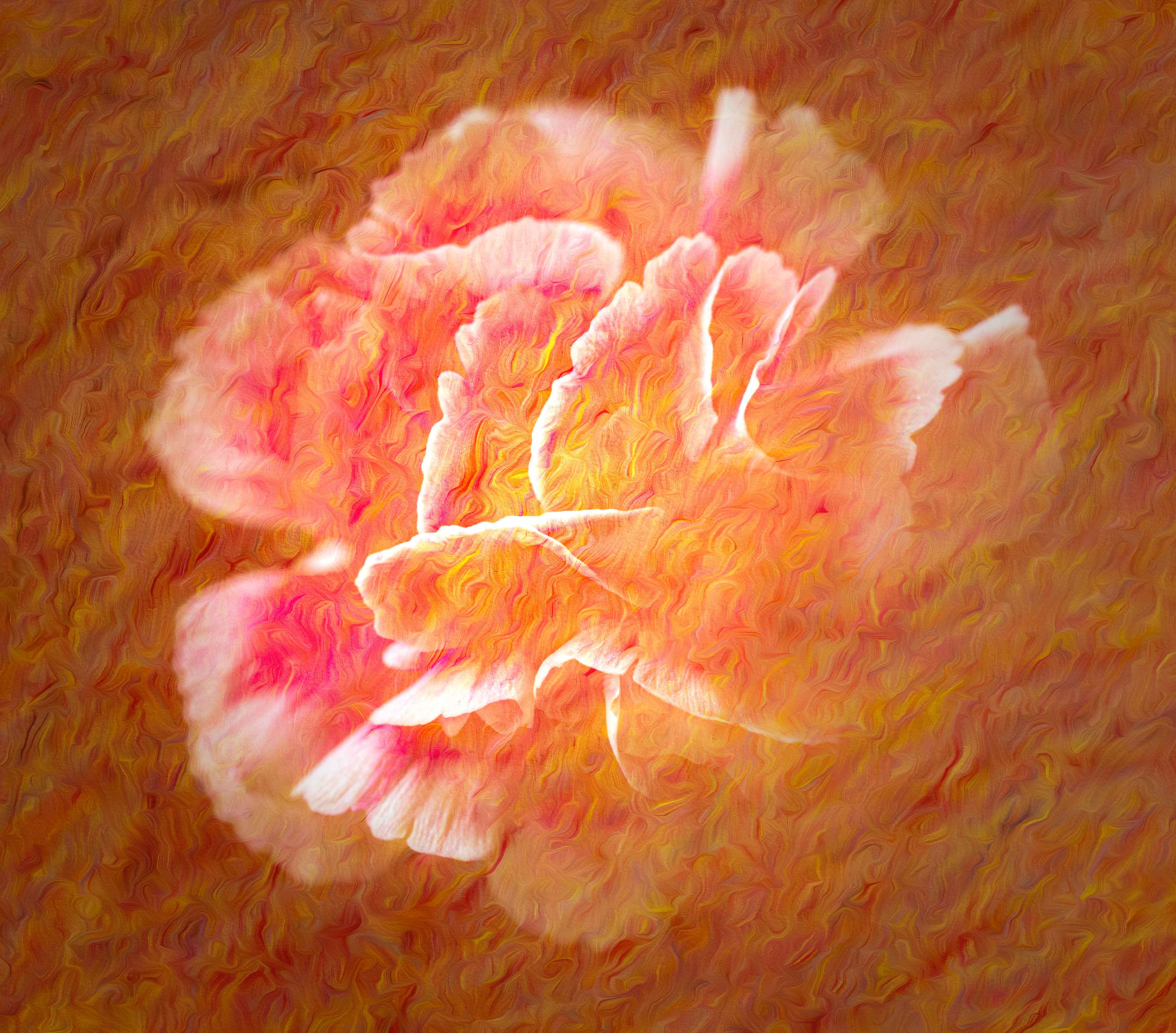
| 80 |
Nov 22 |
Comment |
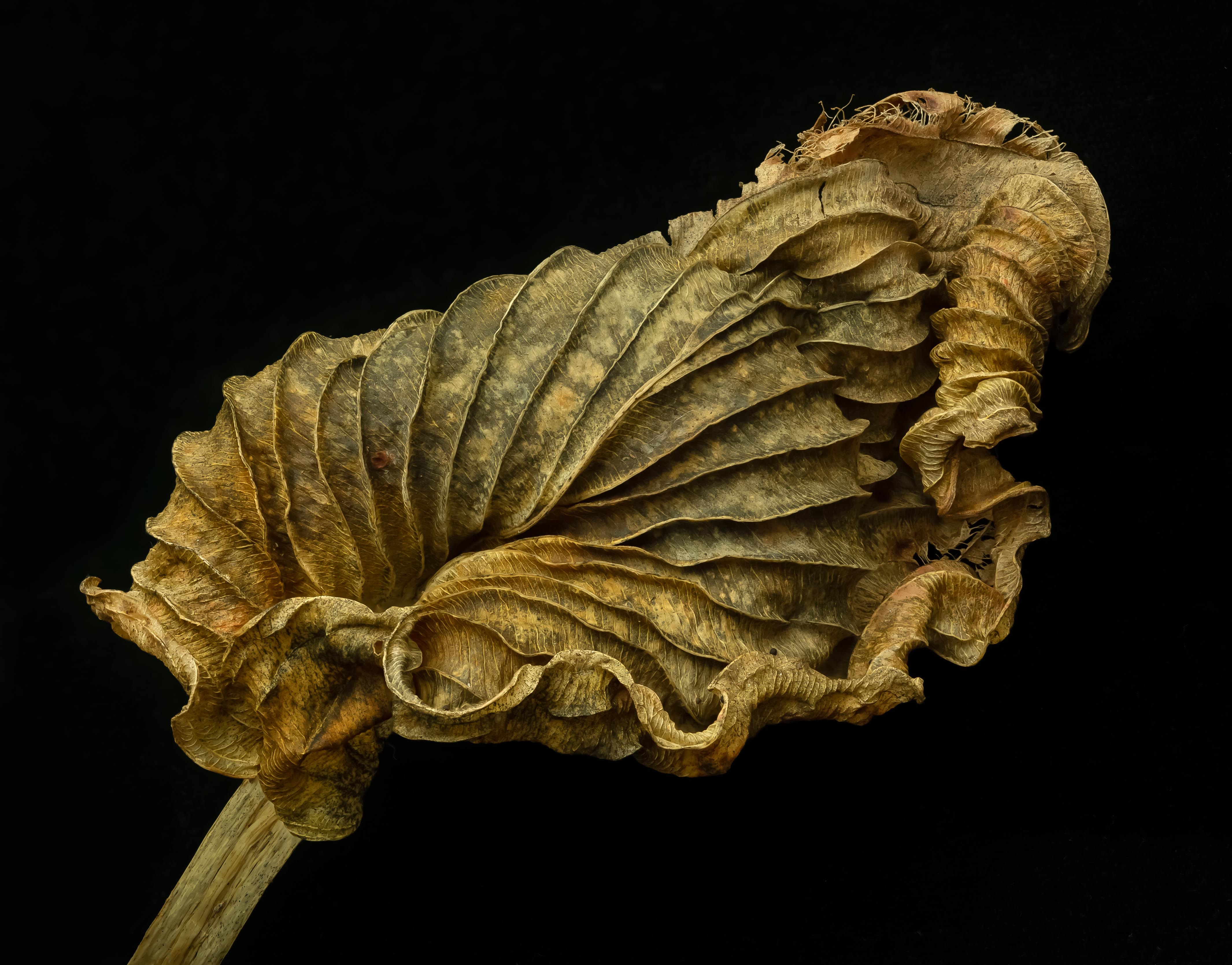
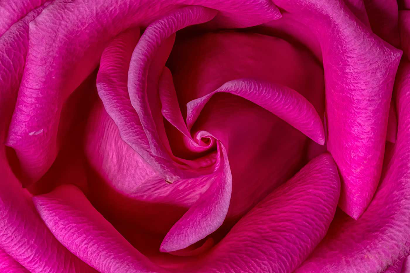
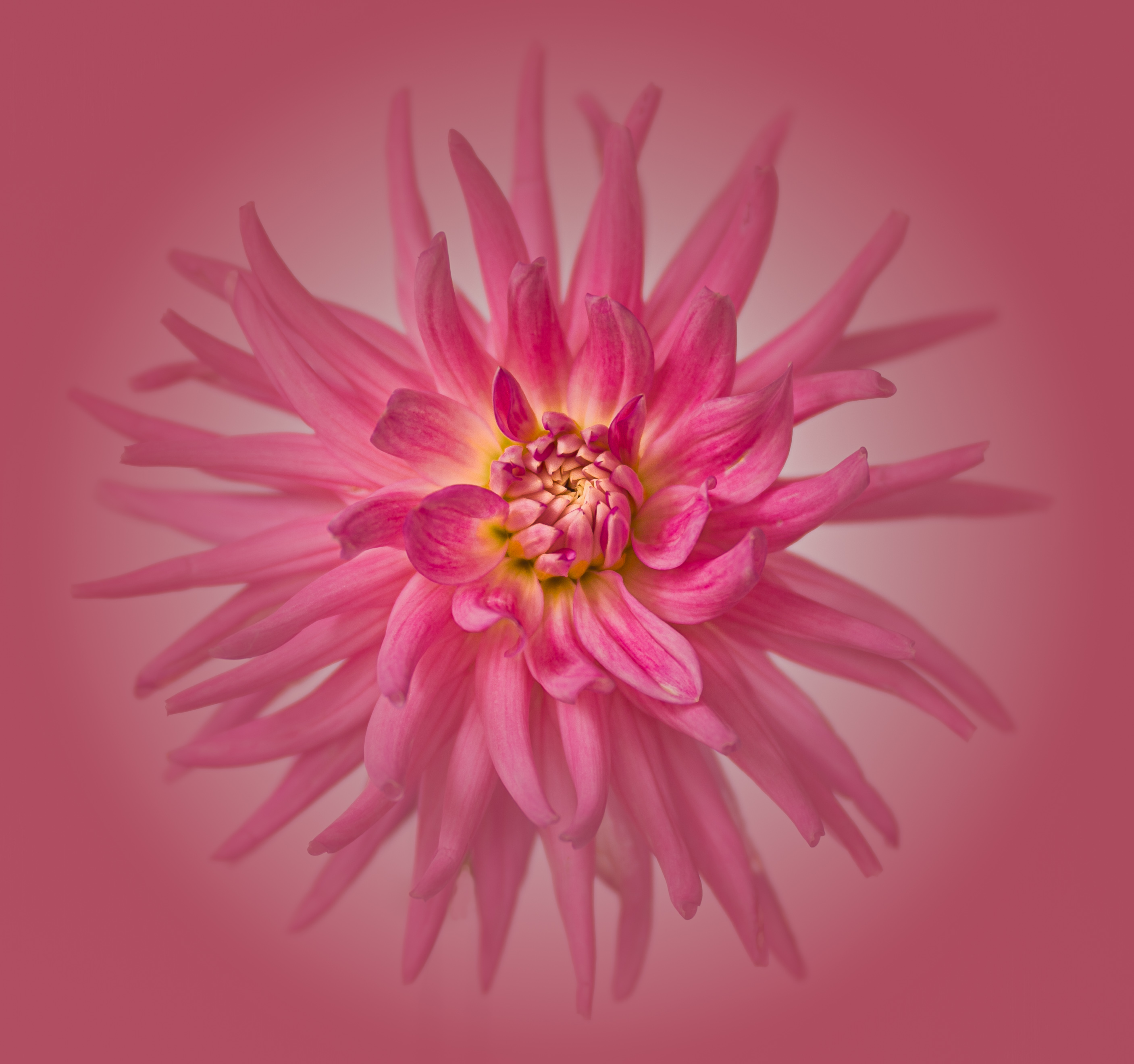
I love the original image. I love it with a black background. I'm not sure I like the combo -- I think it dilutes the strength of the parts. I really don't know where to look. |
Nov 10th |
| 80 |
Nov 22 |
Comment |
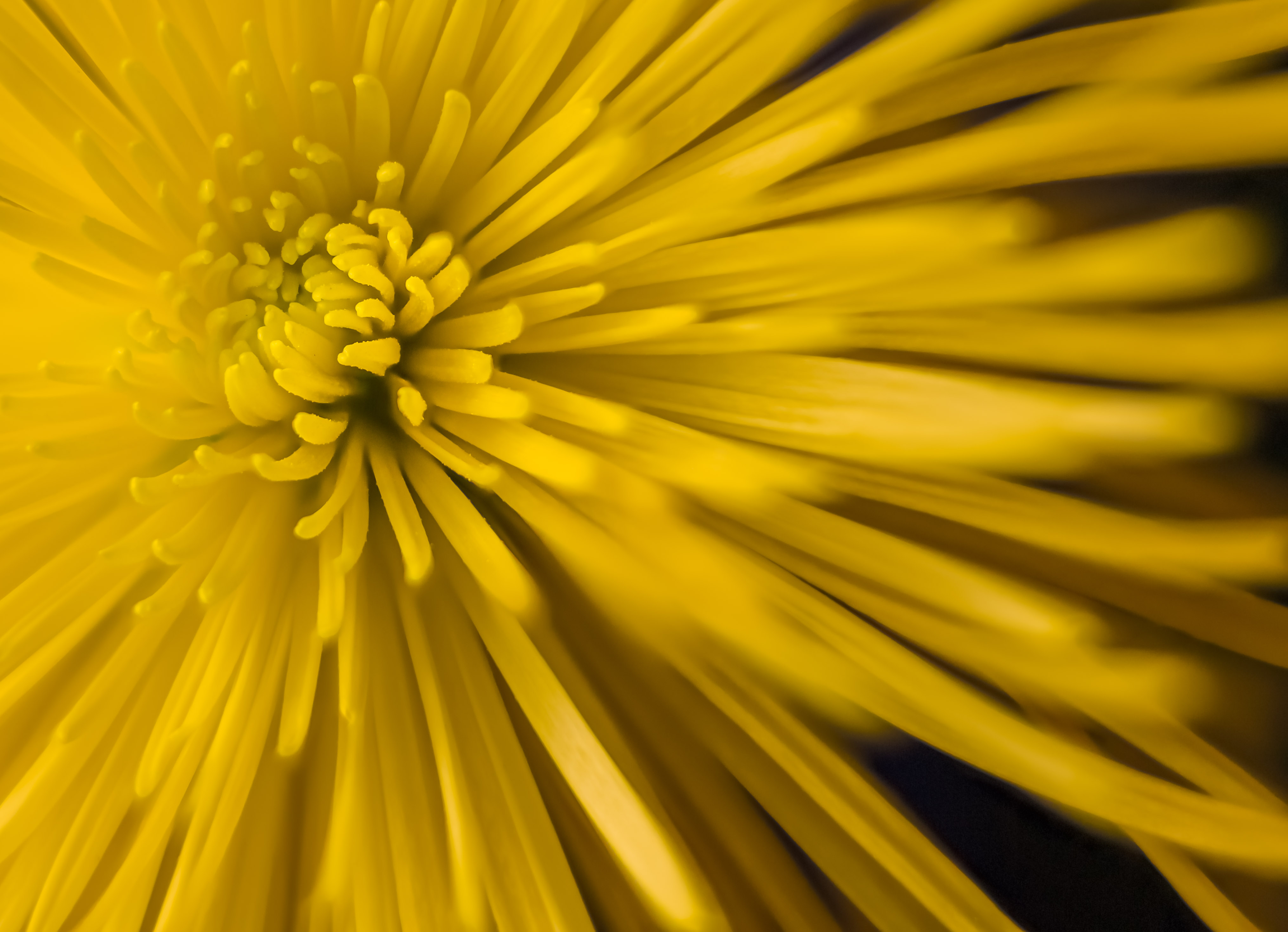
This is a beautiful image; the colors, the composition, are compelling. I wish the bee were more in focus. |
Nov 10th |
| 80 |
Nov 22 |
Comment |
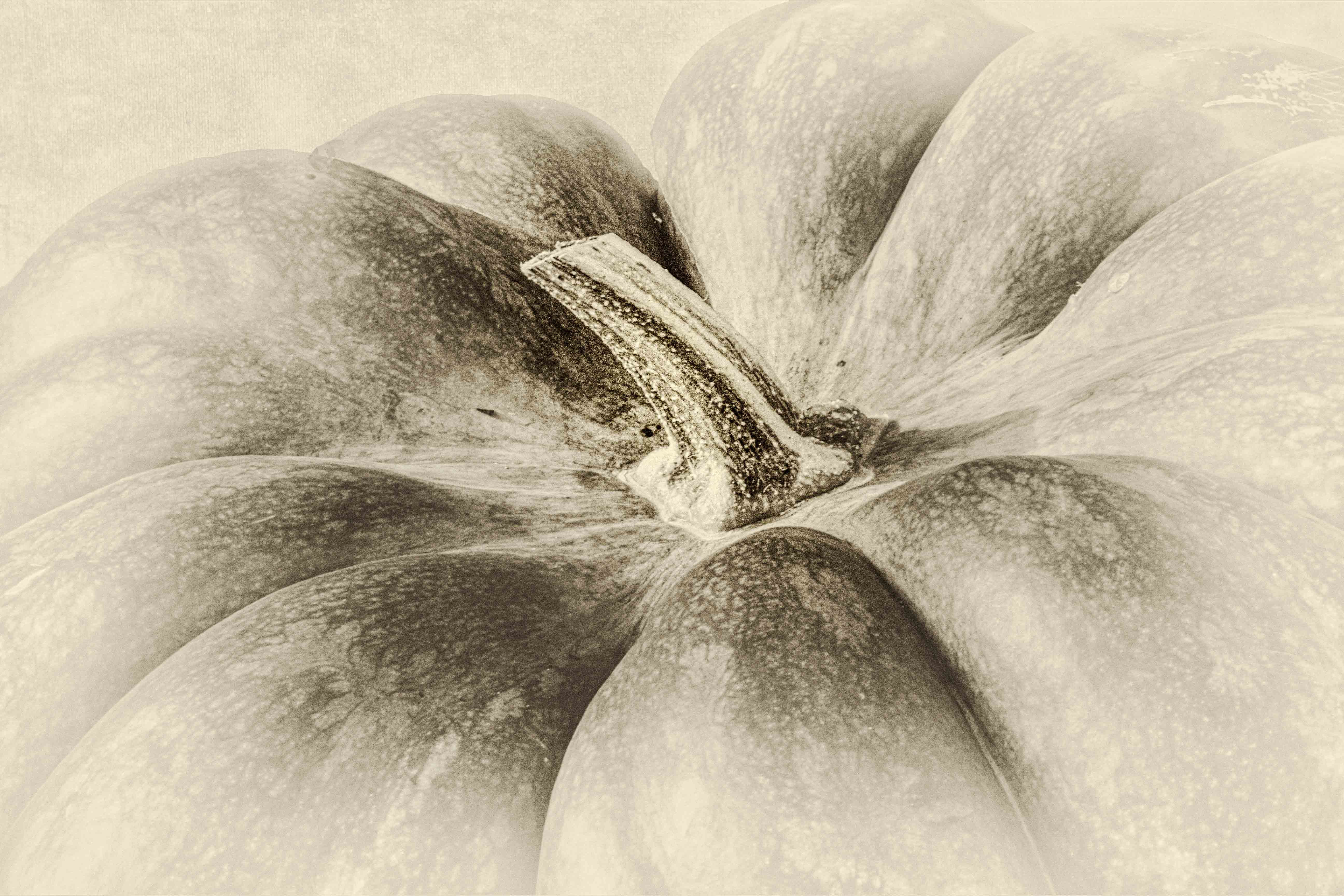
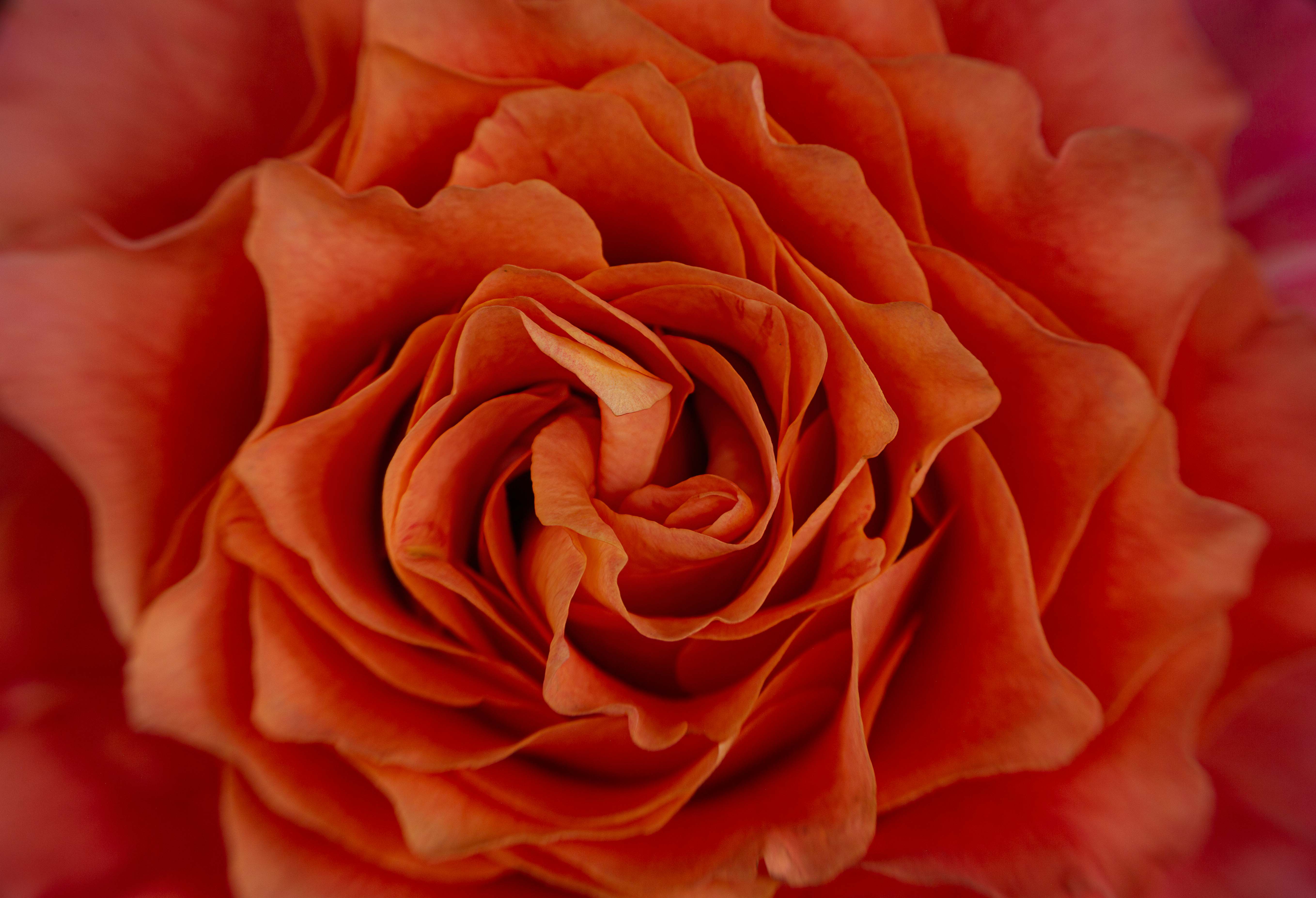
As always, amazing texture application to a beautiful rose. I think the lower left is too dark now; it obscures the stem. |
Nov 10th |
| 80 |
Nov 22 |
Comment |
I potentially like the white version the best. Maybe a black background works better with a more vivid flower. The problem with the white is that it looks pasted on. Any way of softening the edges? |
Nov 10th |
| 80 |
Nov 22 |
Comment |
I like what happened to the flower. Yes, this version is certainly vivid (understatement). If you could make the stem more vivid too, I think that would help. The stem now is at best an afterthought. I think I would like to see less competative background for comparison. |
Nov 10th |
| 80 |
Nov 22 |
Reply |
As I replied to Bob, it is only window light. I can see what you mean that the light area could make you eye go back & forth. However, I do like the contrast with the stem. My wife agrees that some more pink could be added. |
Nov 7th |
| 80 |
Nov 22 |
Reply |
I took this image using only window light. My music room, which doubles as my studio, has a bank of 5 tall casement windows bounded by 3 on one side & 2 on the other. So the light can come from different directions. The translucent quality was achieved by over exposing. |
Nov 7th |
| 80 |
Nov 22 |
Reply |
Thank you for your thoughtful edit. Yes, it is more dramatic, focusing attention on the base. I like the more dreamy look of the original; maybe somewhere in between would be best. |
Nov 7th |
5 comments - 3 replies for Group 80
|
10 comments - 5 replies Total
|