|
| Group |
Round |
C/R |
Comment |
Date |
Image |
| 27 |
May 23 |
Reply |
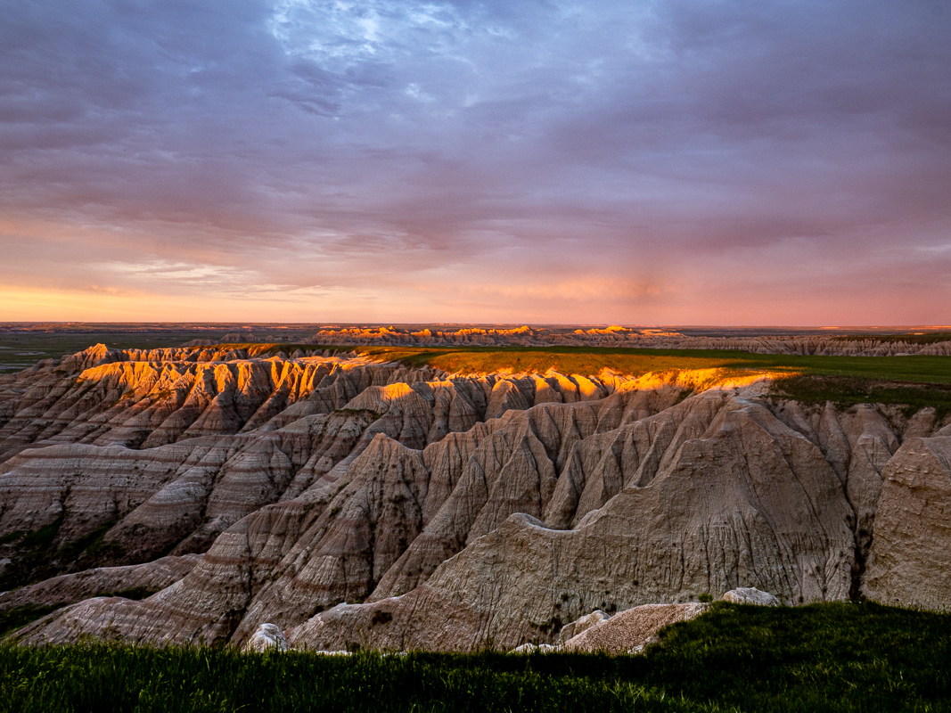
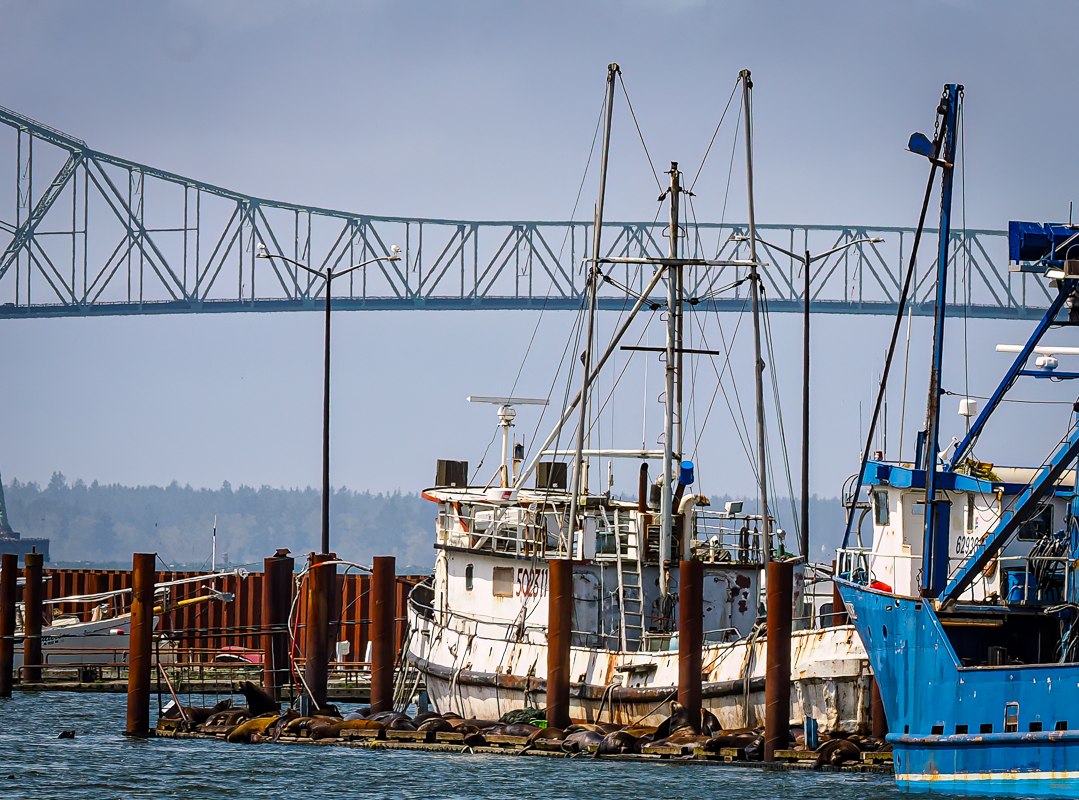
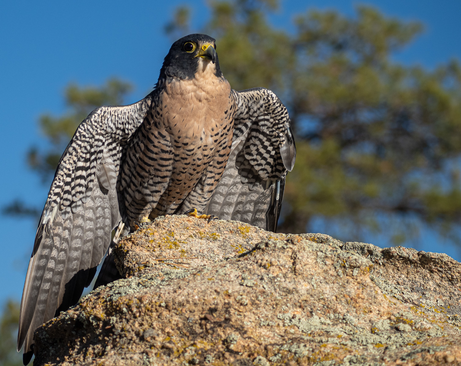
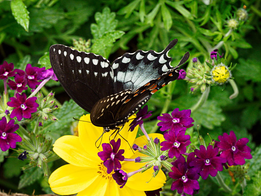
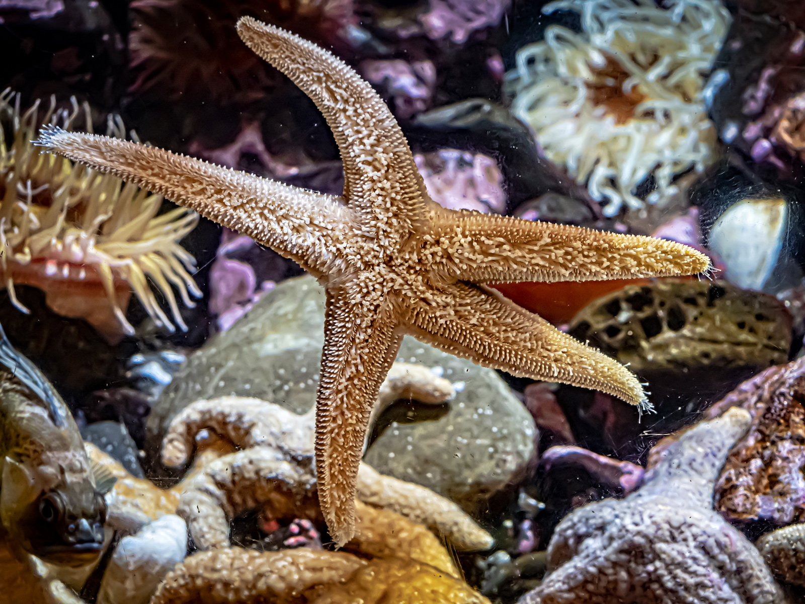
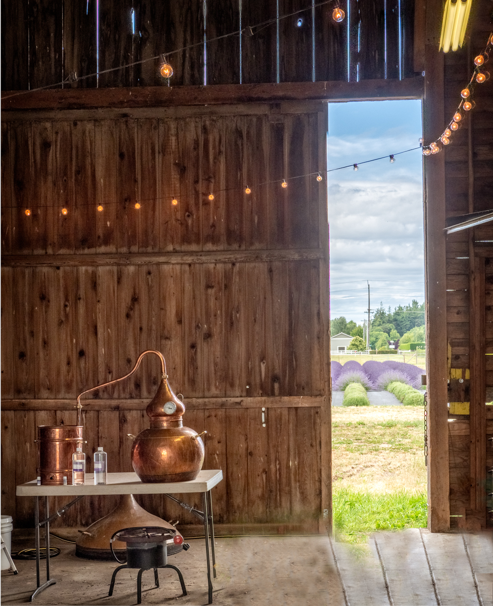
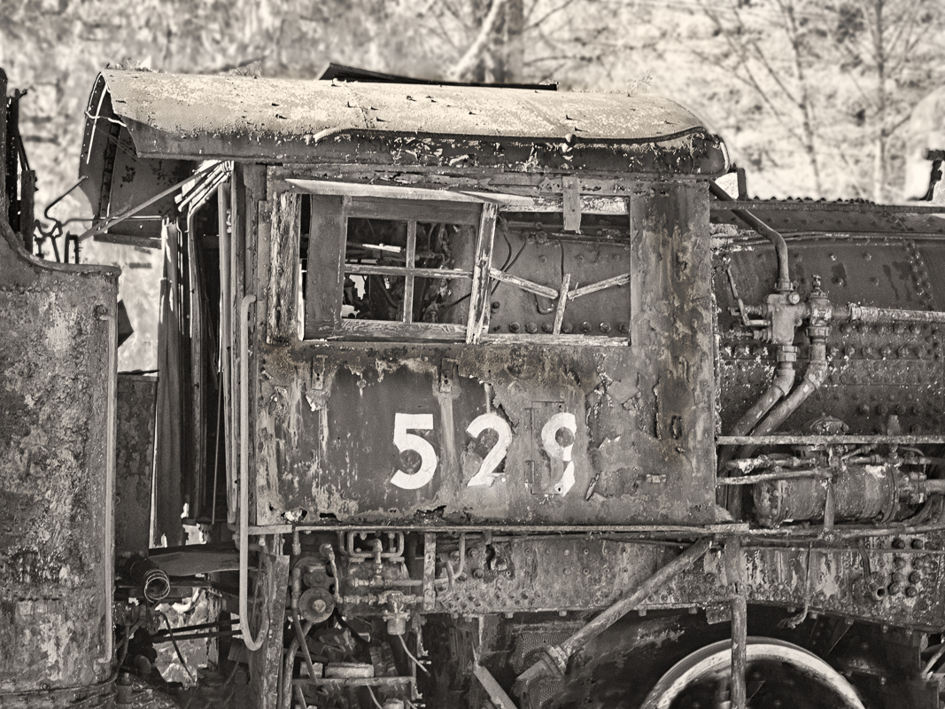
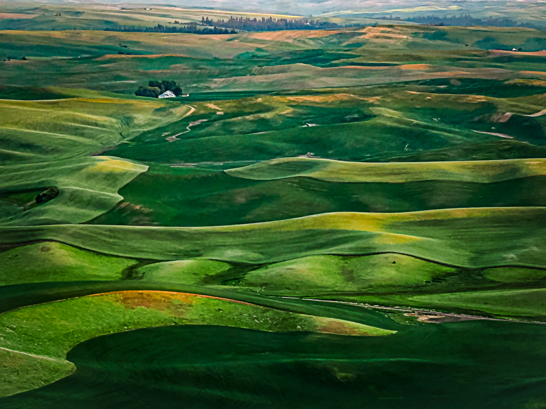
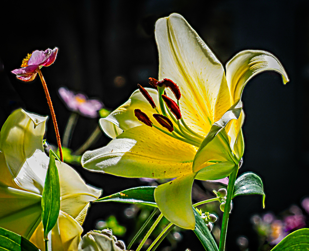
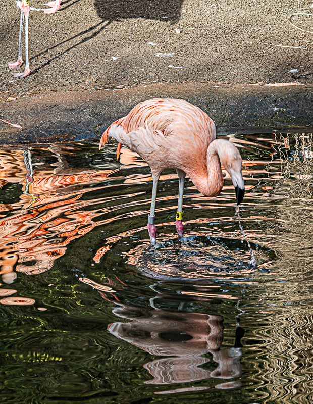
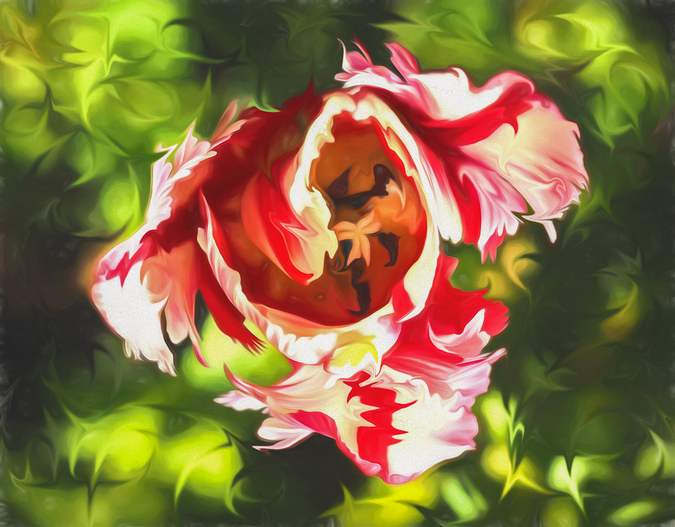
Thanks Becca, I think this is better. So what is so wrong about having vertical lines that everyone is upset about? I might try increasing the pixels with AI and playing around with that - although Fishing with Lions is a point around Washington state, since the sea lions are always getting the salmon at the locks, even though they have tried everything from rebuilding a fish ladder to using shotgun noises to scare them away. They even took a bunch of them to California, and dropped them off - and in a week they were back! |
May 22nd |
| 27 |
May 23 |
Reply |
OIC - one of those table umbrellas! Aha. I'd clone it out with the sign next to it. Your preferences. |
May 12th |
| 27 |
May 23 |
Comment |
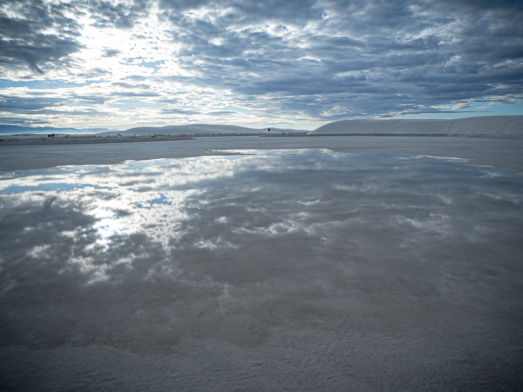
Nice reflections. I agree with Renee again. Also cropping off the last fisherman gets rid of the sign which is always going to distract you. |
May 11th |
| 27 |
May 23 |
Comment |
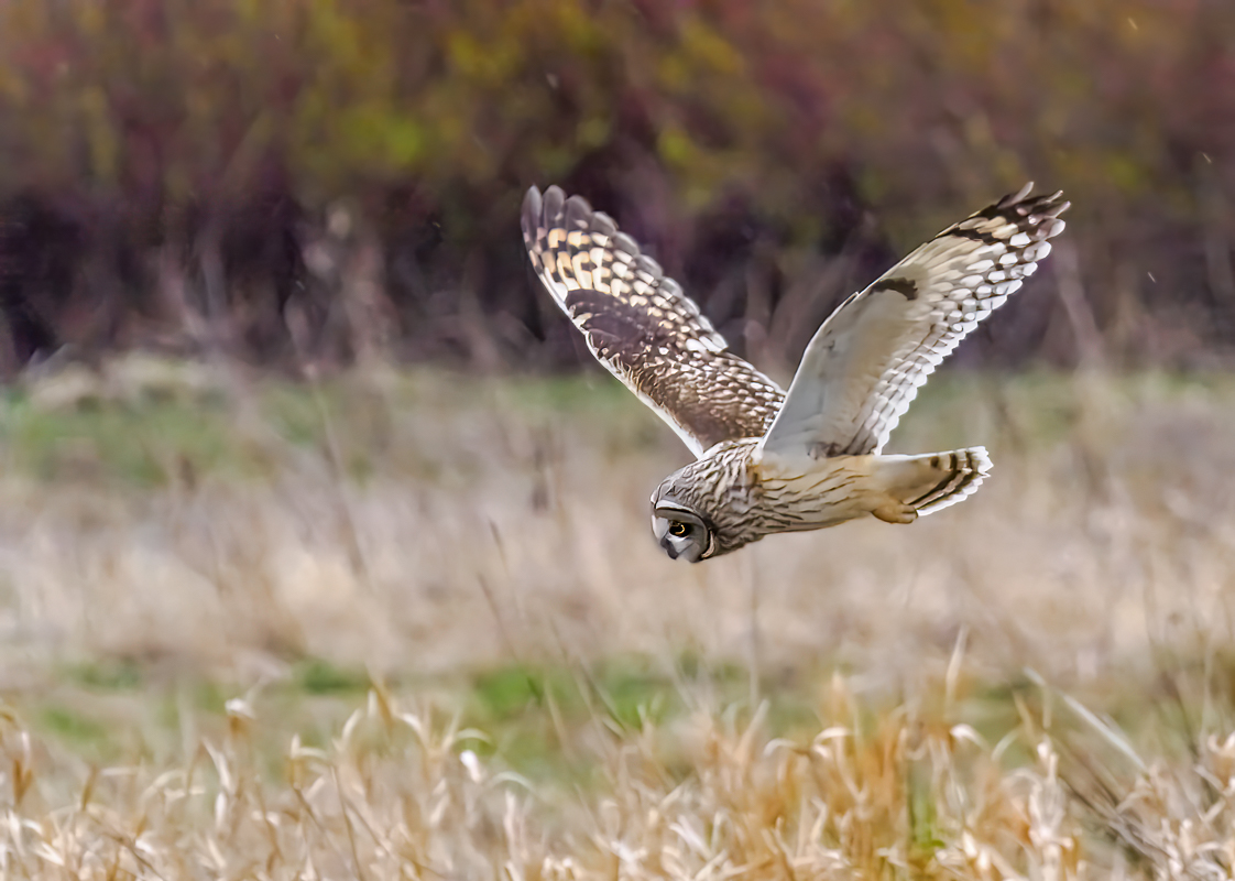
Beautiful owl. I always like the way they blend into the tree with camouflage. I agree with Renee, remove the end of the branch. Not exactly PSA rules, but hey, a better photo. |
May 11th |
| 27 |
May 23 |
Comment |
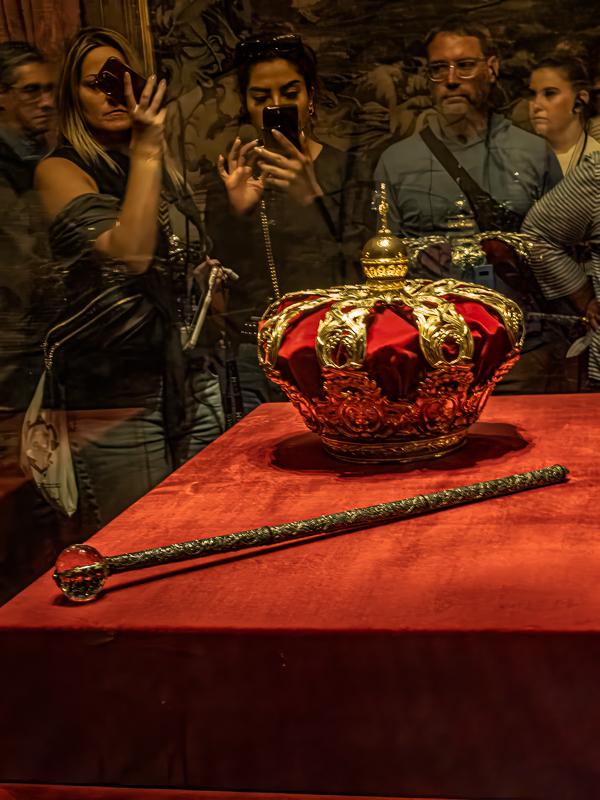
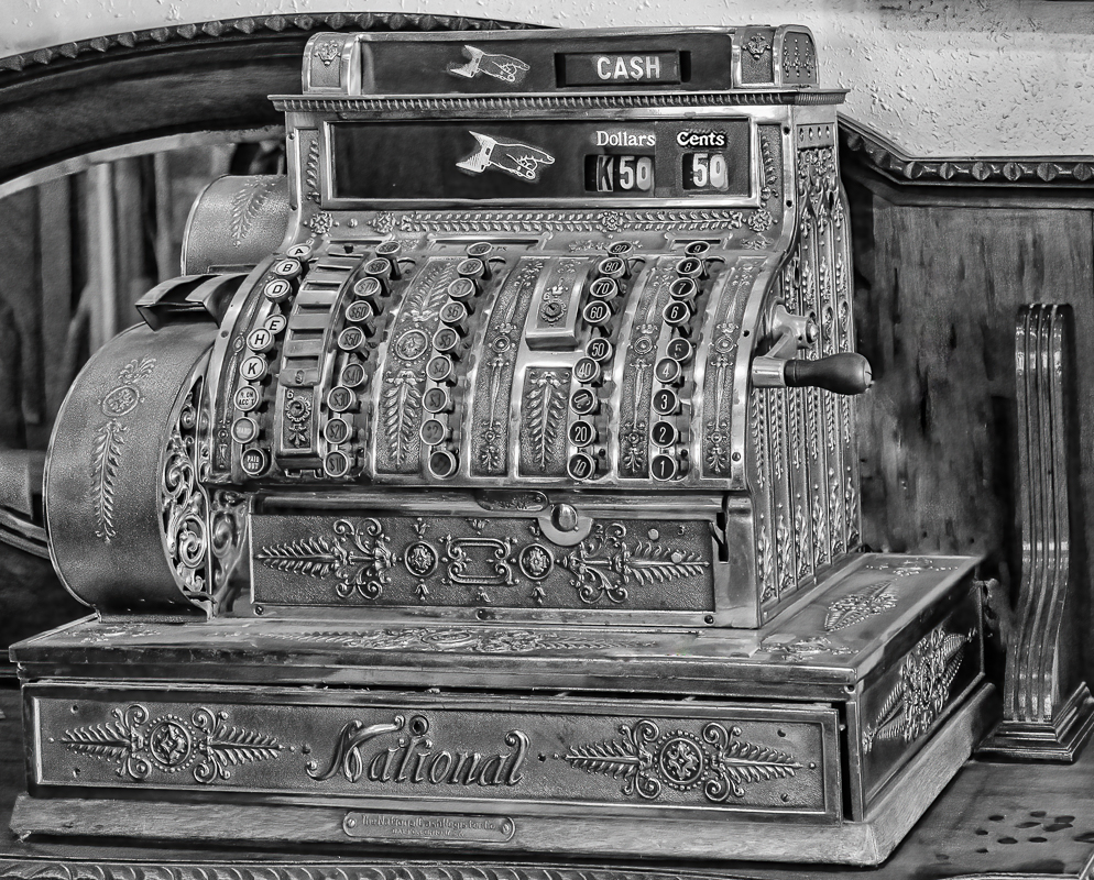
Is this closer to what you want? I darkened the edge of the tray by using a dodge and burn layer (new layer, 80%, brush, use black or X to switch). Then I used the content aware very messily - you have time to correct it - to get rid of the white under the tray. Then I used the clone stamp to replicate the wood grain and with the shift +click to make straight lines. I did the same to get rid of the reflection above the tray. This is just a quick example of how.. |
May 11th |
 |
| 27 |
May 23 |
Comment |
Reminds me of the drive-in A & W where they had a barrel on thetop of the restaurant, and you bring the tray to the car. I think the edge of the tray needs darkening, and eliminate the white under the tray. |
May 11th |
| 27 |
May 23 |
Comment |
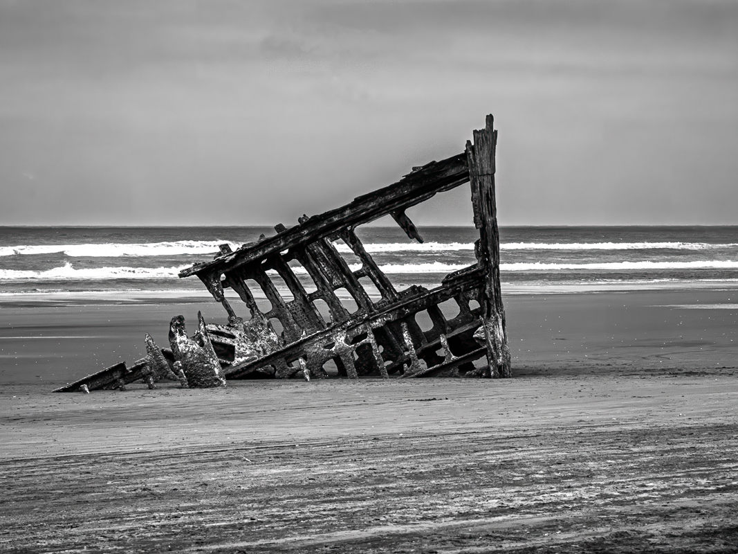
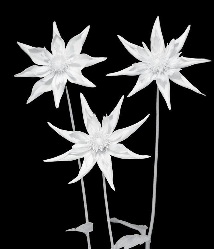
This photo tells a story! I agree that the brown decay on the beach is distracting, and I want to know more about the boat. |
May 11th |
| 27 |
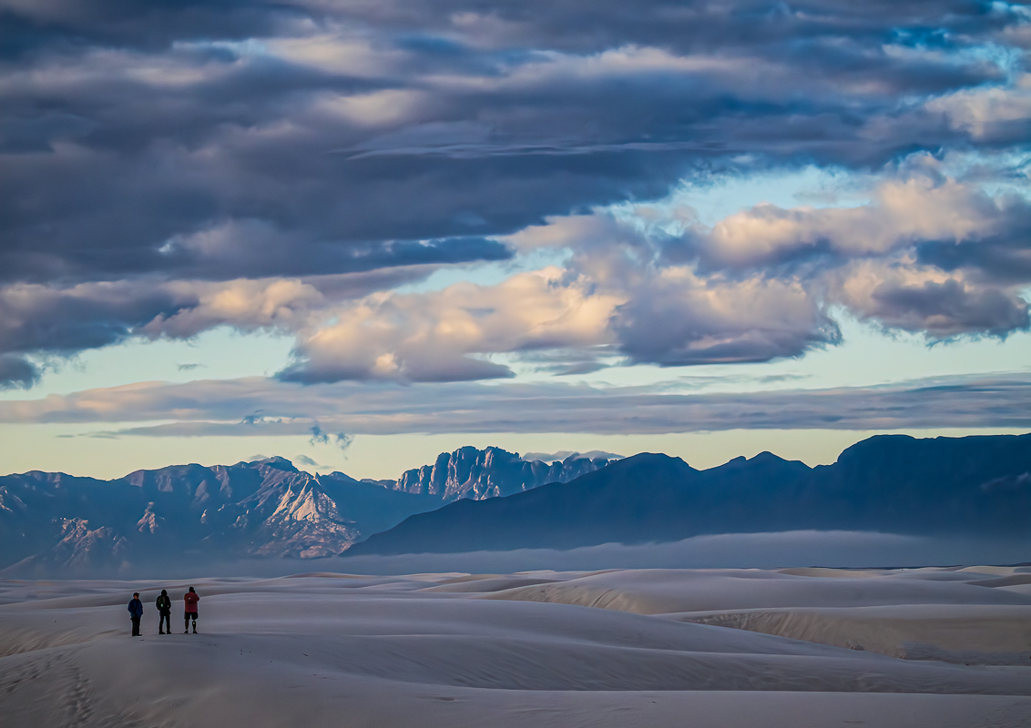
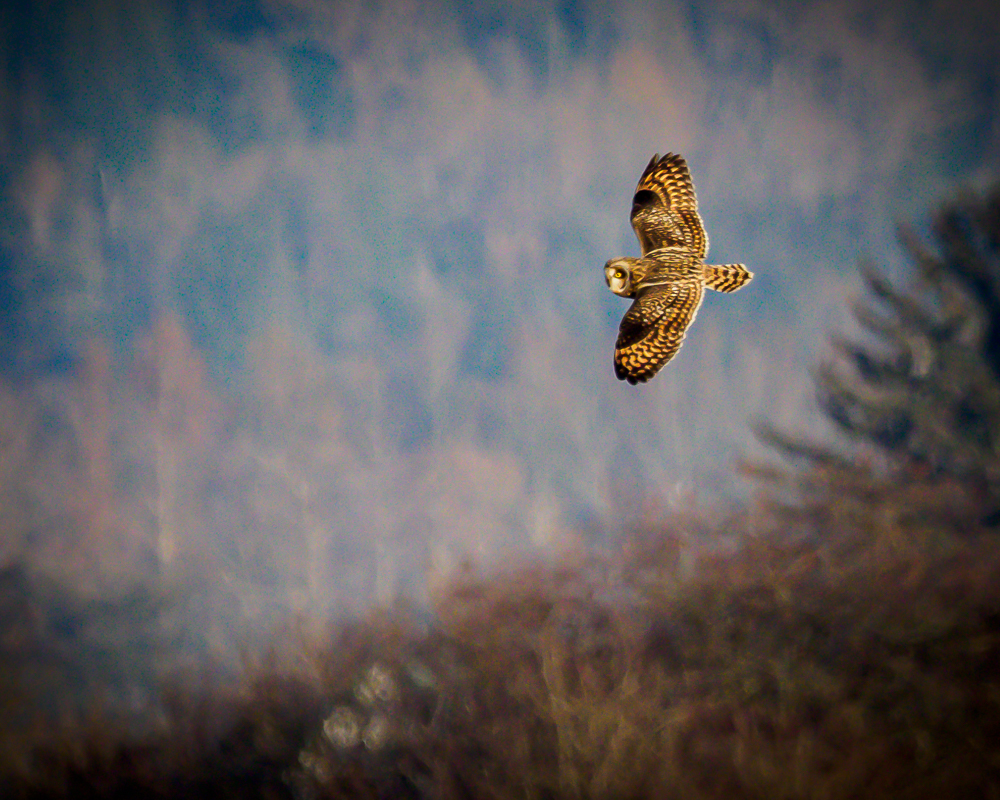
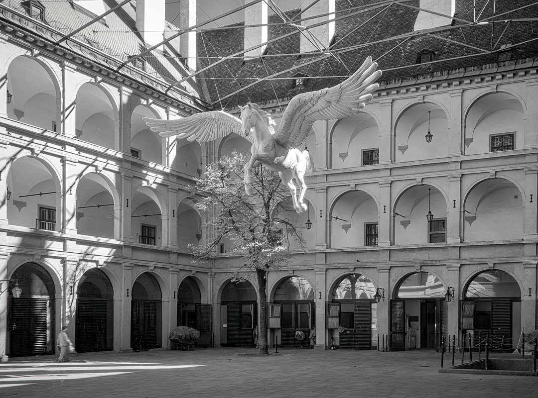
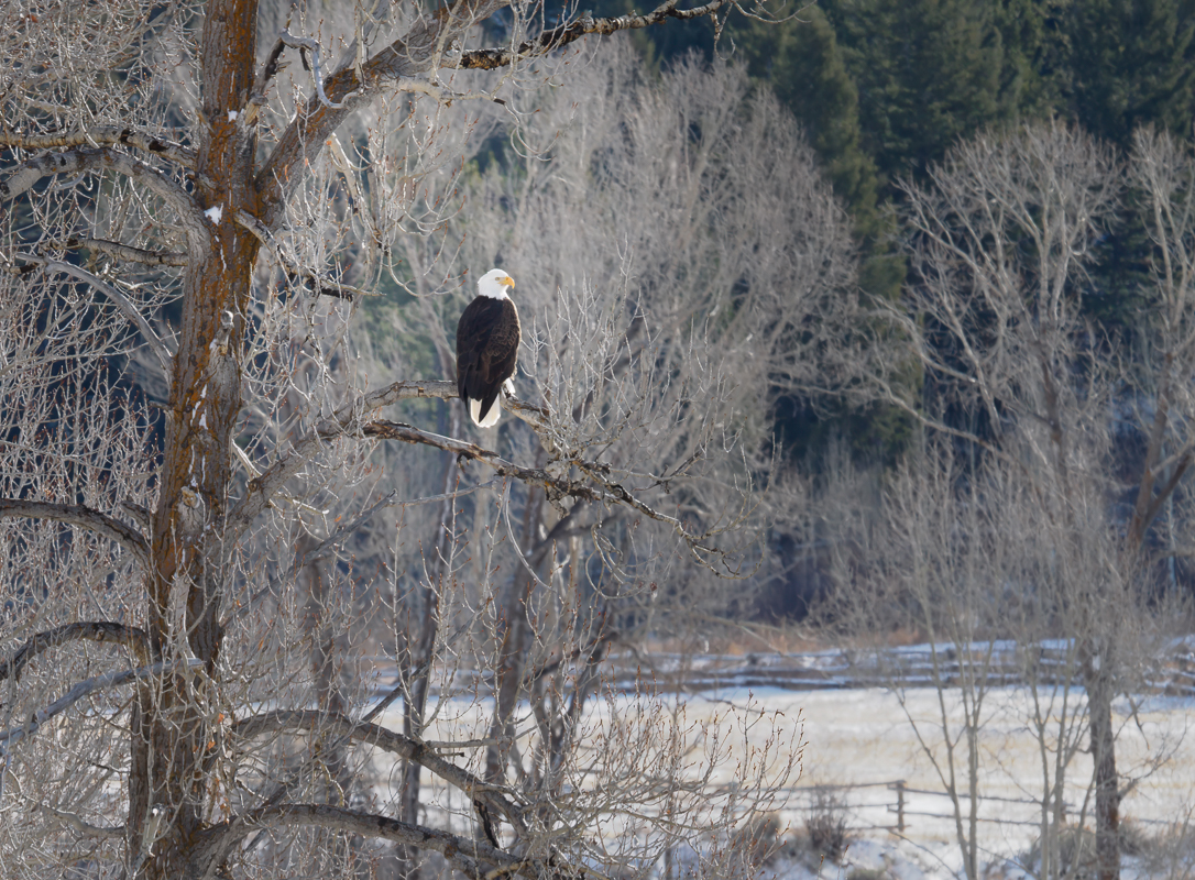
May 23 |
Reply |
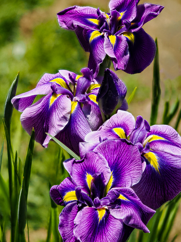
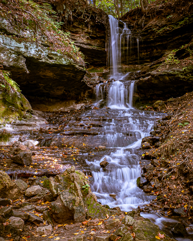
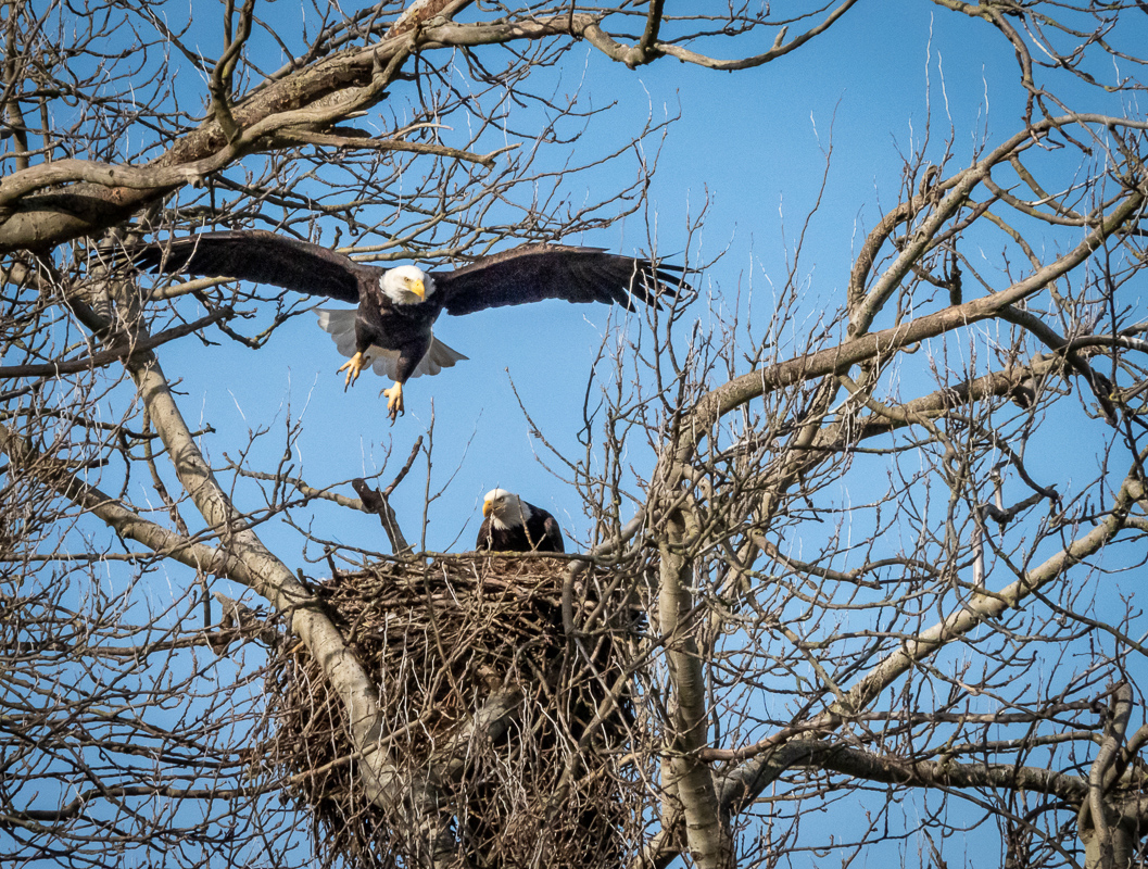
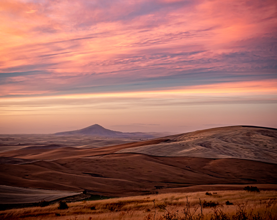
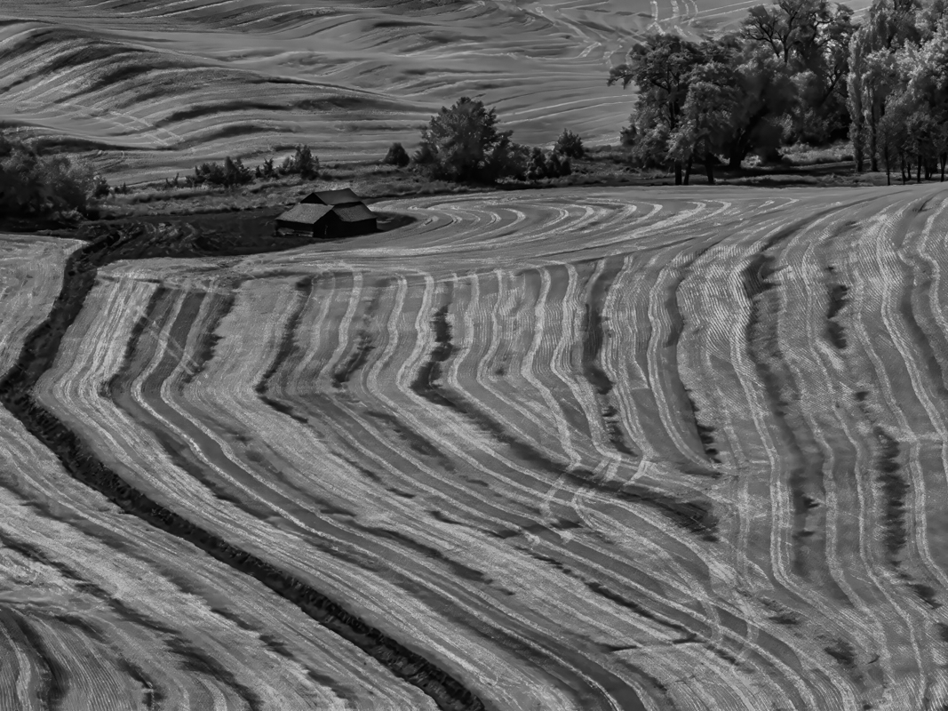
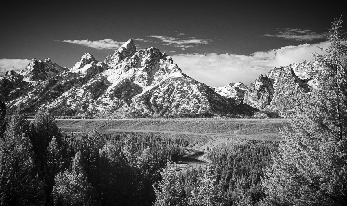
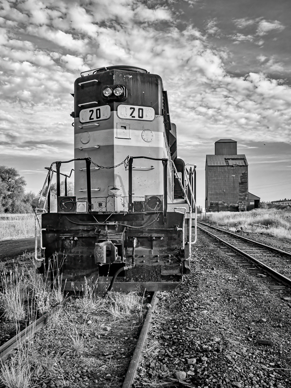
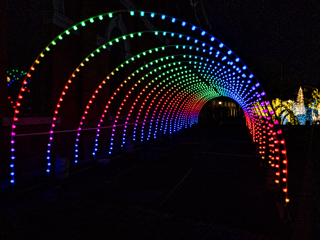
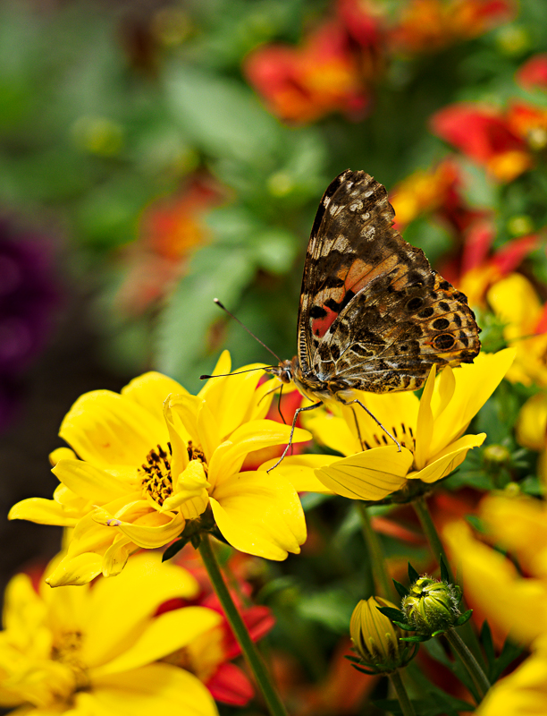
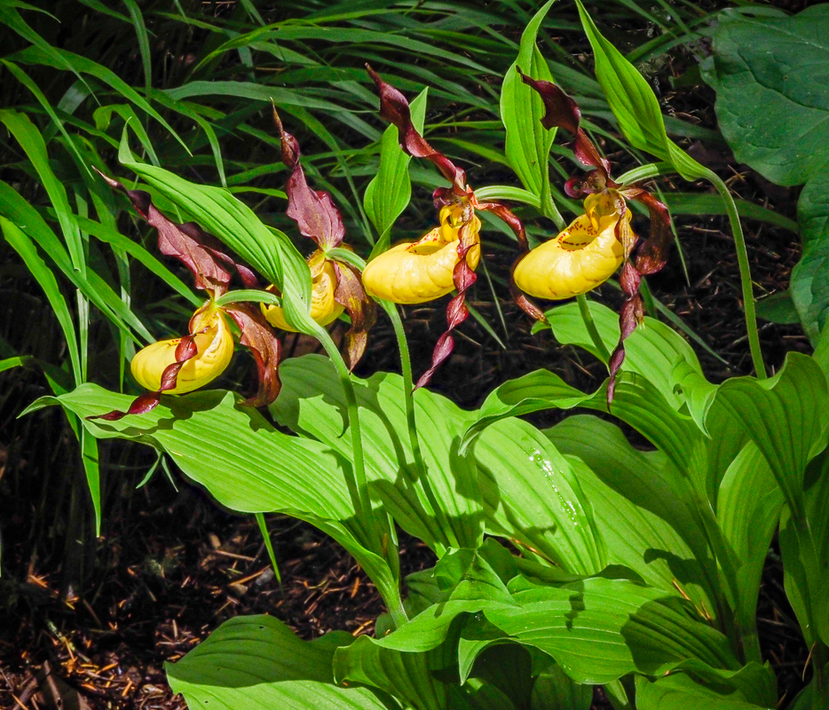
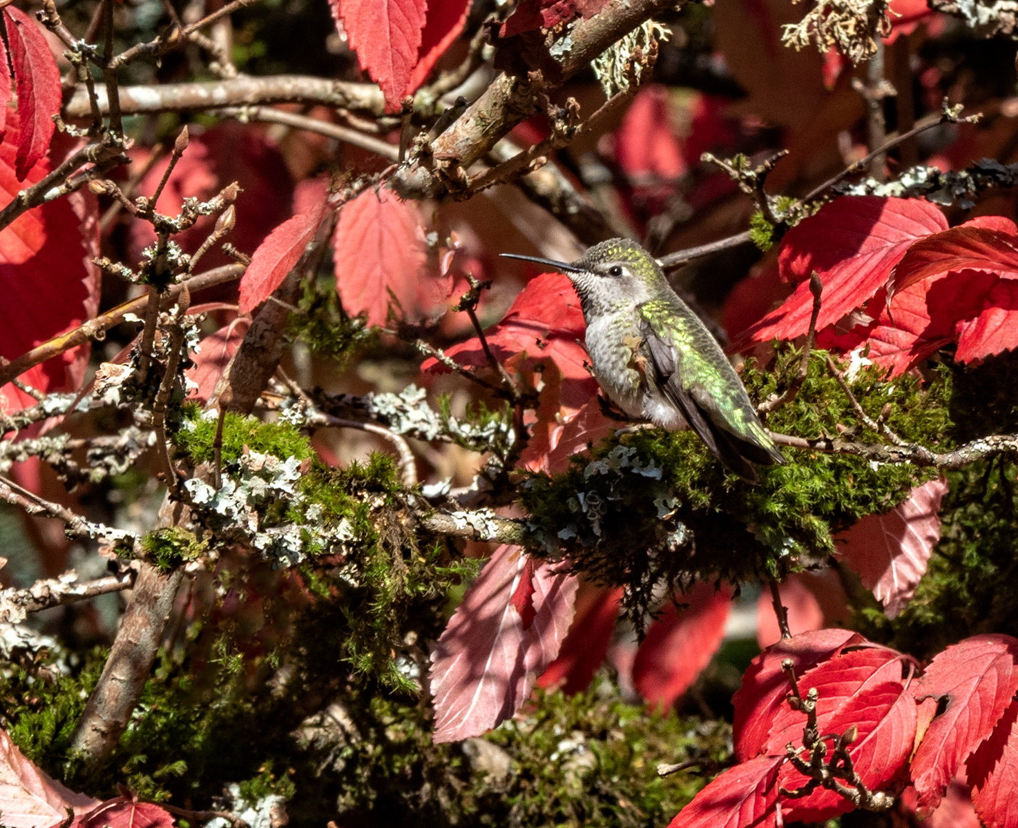
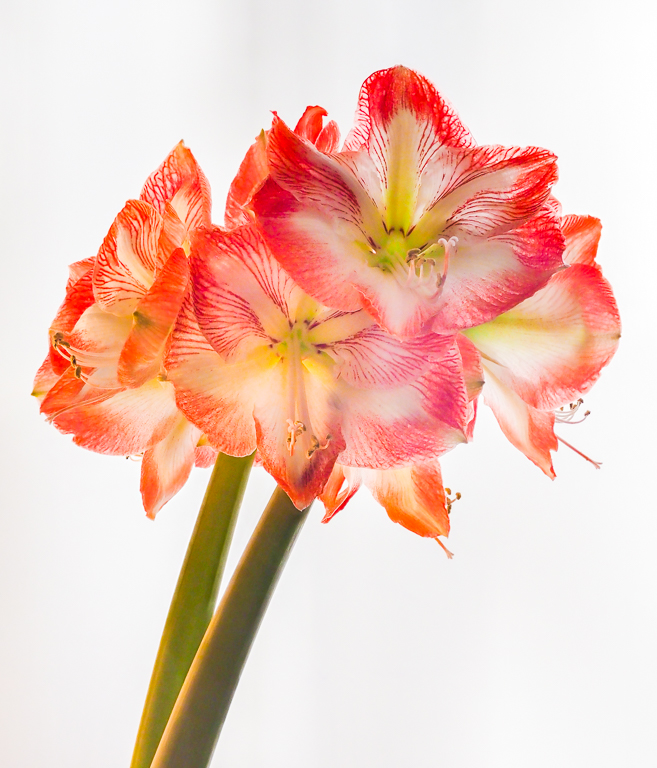
thanks Renee. I agree the lines are busy. I was hoping the title "Fishing with Lions" might give the viewer a clue. Also if this was printed at 16 x20 you might have a closer look. |
May 11th |
| 27 |
May 23 |
Comment |
Yes, we did one this last year with Viking, and I have a similar shot. Isn't this just gorgeous? A little more light on the water might explain the context, but I think you nailed it!! |
May 11th |
| 27 |
May 23 |
Comment |
VEry well done in your processing and I like the new moon. The Louvre looks like a diamond in the lights, is that the silhouette of a person in front? I would appreciate a little bit mor light from the moon and on the surrounding buildings. |
May 11th |
7 comments - 3 replies for Group 27
|
| 35 |
May 23 |
Comment |
i agree with Debbie, I'd prefer clouds, what you have looks like a textured wallpaper. If you do decide to keep it, then I'd clone out the black mark on the right edge of the sky, that is not in the original. Also I think the chair at the end of the leading line is distracting. Nice perspective, leading lines, and I think you have a natural texture on the walkway. Maybe that is too close to the texture on the sky. |
May 9th |
| 35 |
May 23 |
Comment |
Guess I forgot to write the title, "Tulip Path". It was on the file. |
May 9th |
| 35 |
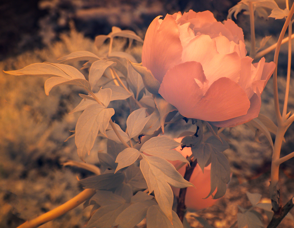
May 23 |
Comment |
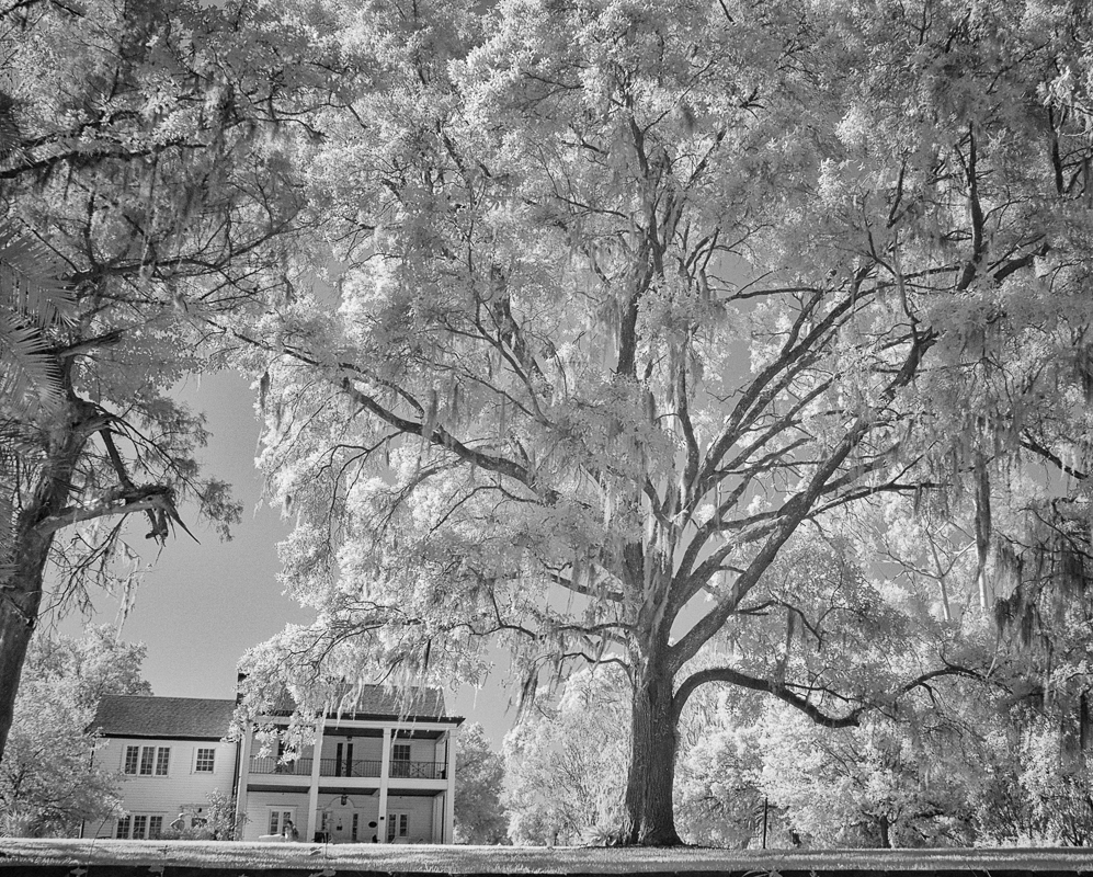
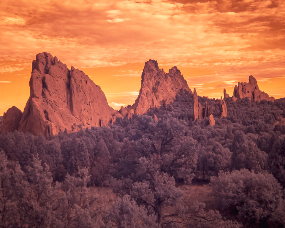
This is a great subject for IR and I appreciate the white greenery. The last column on the right has a slight bluish hue, stronger than the others. I know that the monument is on a hill. and that can cause some perspective issues (like the photo I had previously of a southern plantation). I think that if you snap a horizon line using the top of the monument you will find it is not level with the top of the photo, leaning down on the right. |
May 9th |
| 35 |
May 23 |
Comment |
Cool! I love the moody purple effect, and what a lovely wooden boat. One thing I learned about getting the entire boat with mast in the frame is to try a panorama that is in portrait perspective. Very nicely done. |
May 9th |
| 35 |
May 23 |
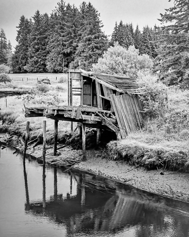
Comment |
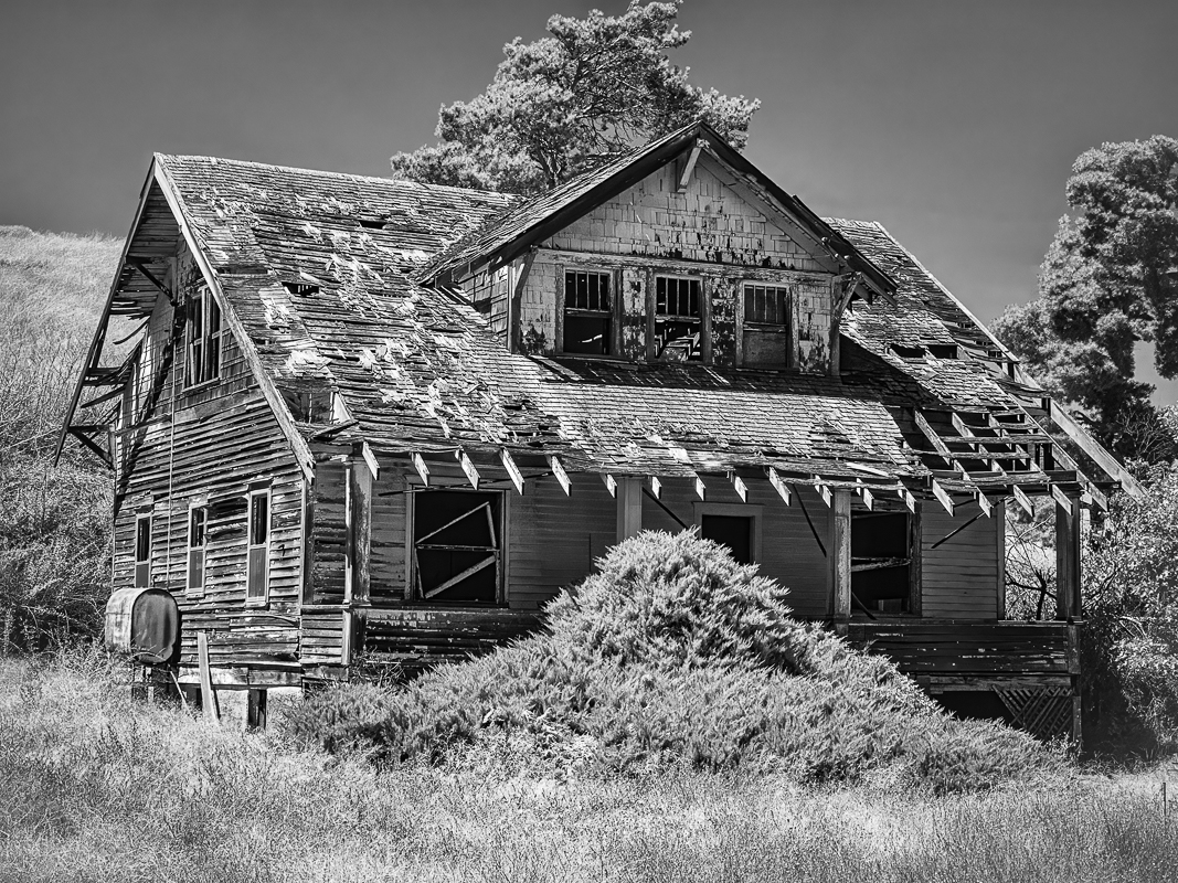
Hi Debbie, I like shacks too, and they are a great subject for IR. Please give the stats on your photo - what was your aperture? The sun flares are obviously your choice, but I don't think they add to the photo, and are distracting. |
May 9th |
5 comments - 0 replies for Group 35
|
| 79 |
May 23 |
Comment |
I just taught a lesson to elementary school kids on the compass rose - Never Eat Soggy Waffles! I like this. |
May 15th |
| 79 |
May 23 |
Comment |
Very creative Karl! I wonder if the doorman needs a tophat. |
May 11th |
| 79 |
May 23 |
Comment |
From a woman's perspective. Ouch.
The lighting is torturous, and I can't look at this for very long before I get chills up and down my spine. |
May 11th |
| 79 |
May 23 |
Comment |
Makes me think of Charlotte's Web, where Charlotte the spider writes in her web, "Radiant" "Some Pig" and "Humble". Poor Wilbur, in danger of being slaughtered by a farmer. OK, so Karl
and Barbara have good ideas, change the perspective. Perhaps head cheese. (sorry).
What if you cropped in on just the head? Or if you can go back, take the photo from the snout on? |
May 11th |
| 79 |
May 23 |
Comment |
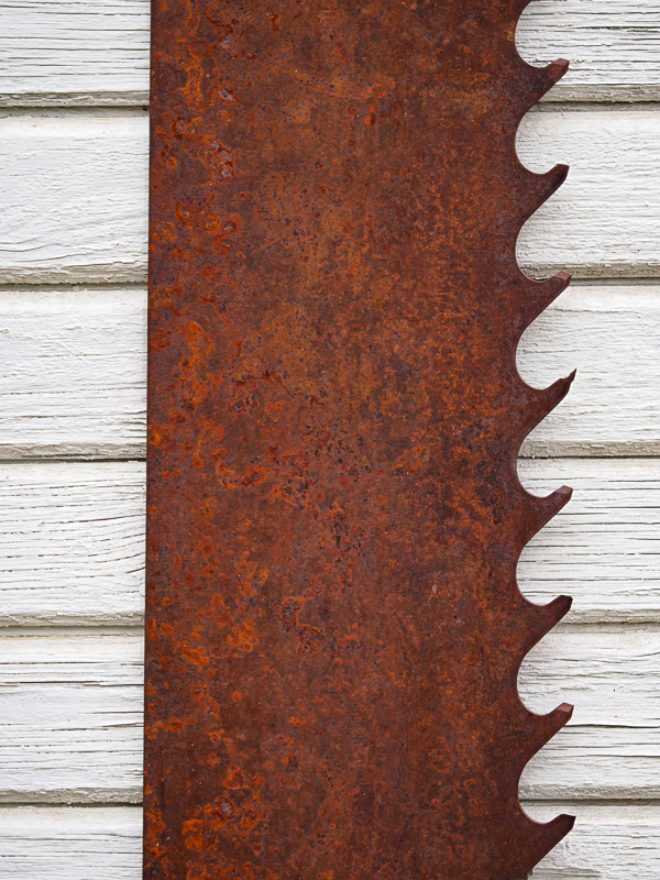
Hi Judith, here is another idea: if you can, set it on a piece of scrap wood and get the shavings to come out - you will be illustrating the use of the tool and will have it in correct perspective. Have you seen the series by Brooks Jensen of tools? His is a monochromatic series worth looking at. It is called Made of Steel. See: https://www.brooksjensenarts.com/books.html |
May 11th |
| 79 |
May 23 |
Reply |
Thank you Karl for your encouraging words! |
May 11th |
| 79 |
May 23 |
Comment |
What you don't see is the 3d from the side. - Lauren |
May 7th |
 |
6 comments - 1 reply for Group 79
|
18 comments - 4 replies Total
|