|
| Group |
Round |
C/R |
Comment |
Date |
Image |
| 50 |
Apr 26 |
Reply |
Thank you, Ger! |
Apr 7th |
| 50 |
Apr 26 |
Reply |
I actually like yours better than mine, Cindy. That little bit of foliage just to the right of the bulb, I think, gives more balance to the composition. |
Apr 7th |
| 50 |
Apr 26 |
Comment |
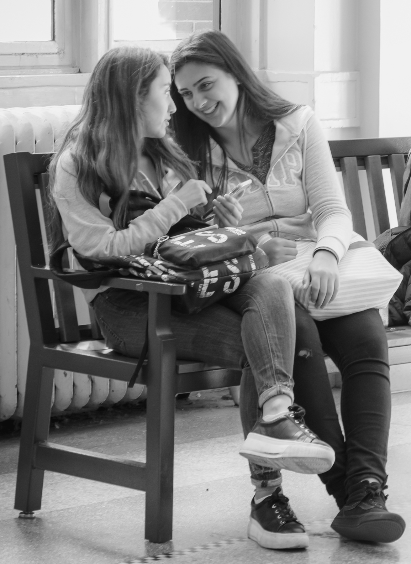
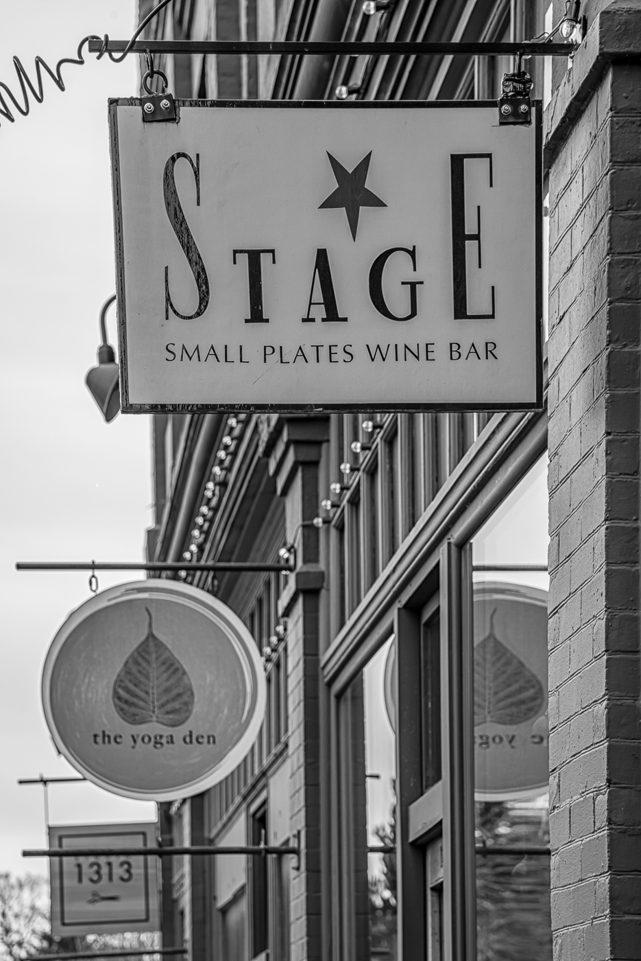
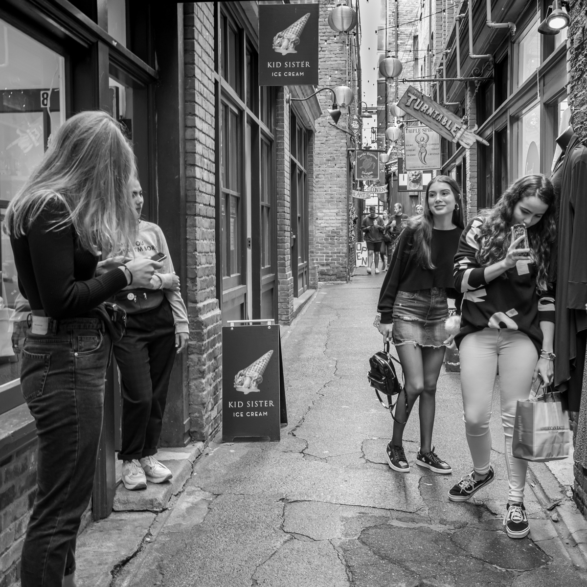
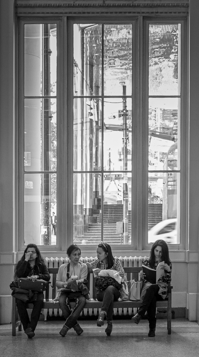
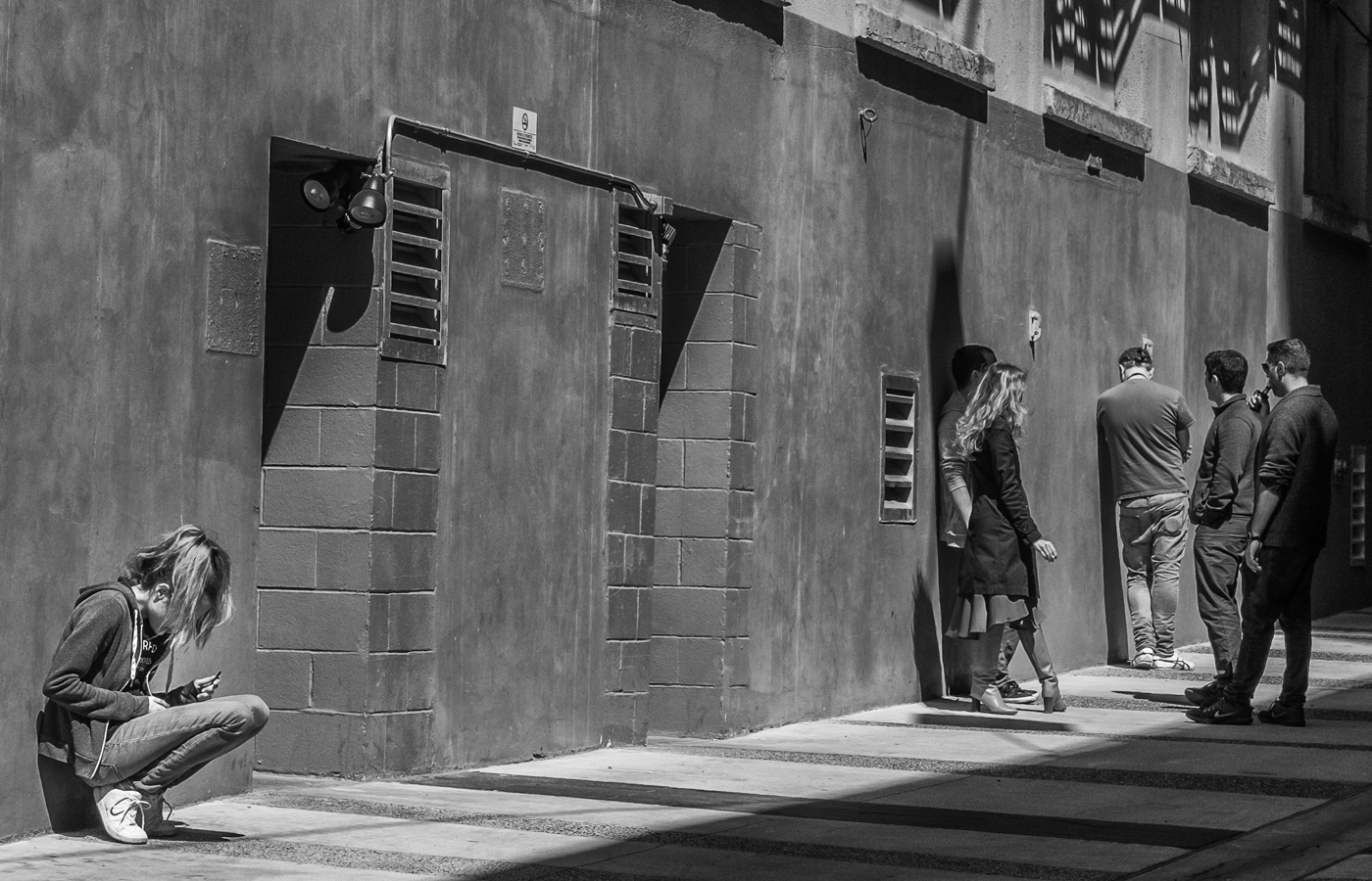
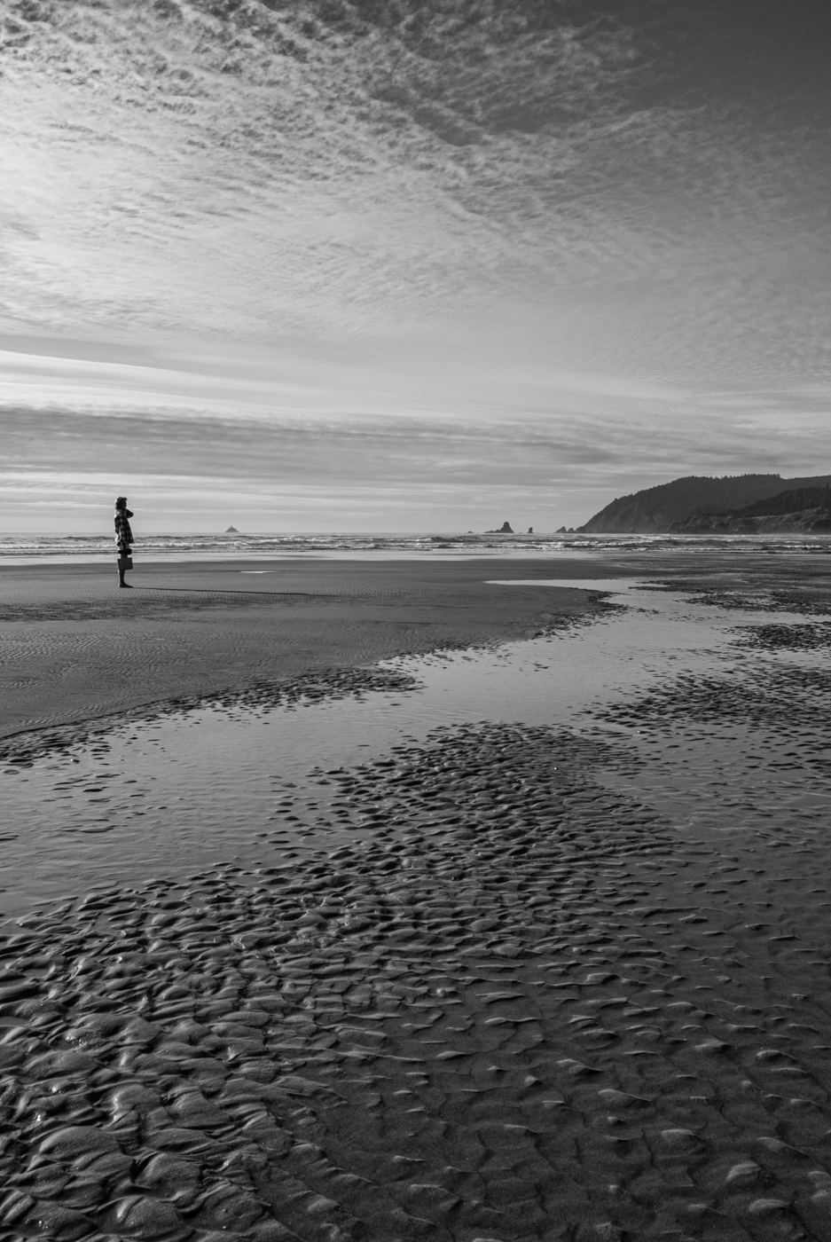
James, an interesting and quirky shot! If you hadn't mentioned that they walked by together, I never would have guessed they inhabited the same world. The contrast in their clothing, hair and facial expressions heightens my curiosity. Good exposure and tonal range, interesting background. Like Cindy, I wish there was a more obvious connection between the two (him looking more directly at her, for example) - but there has got to be a story there. It would be interesting to know what wasn't said... |
Apr 6th |
| 50 |
Apr 26 |
Comment |
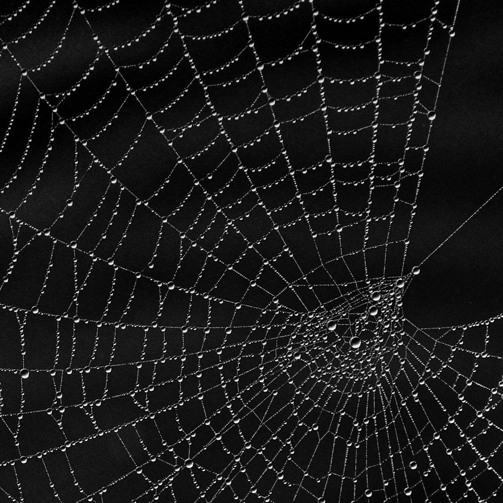
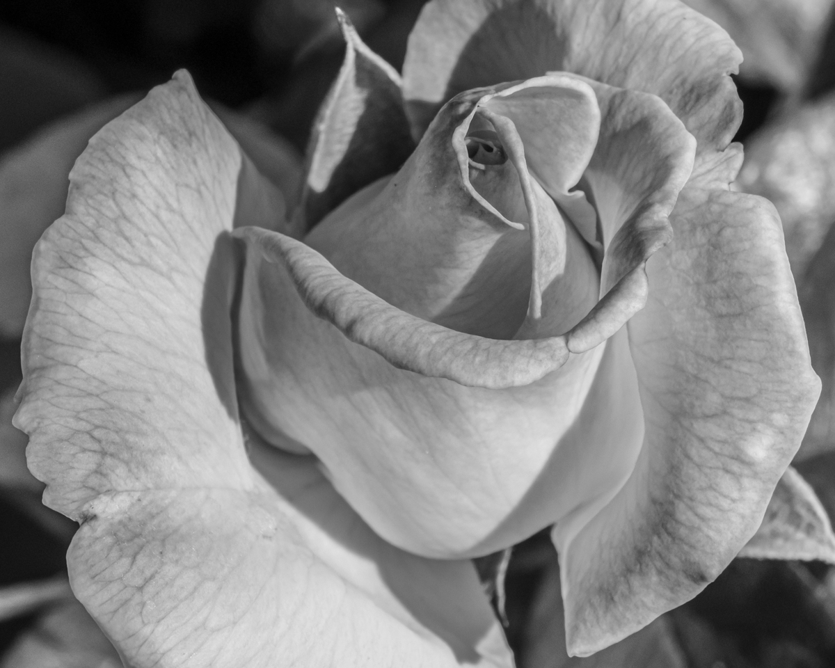
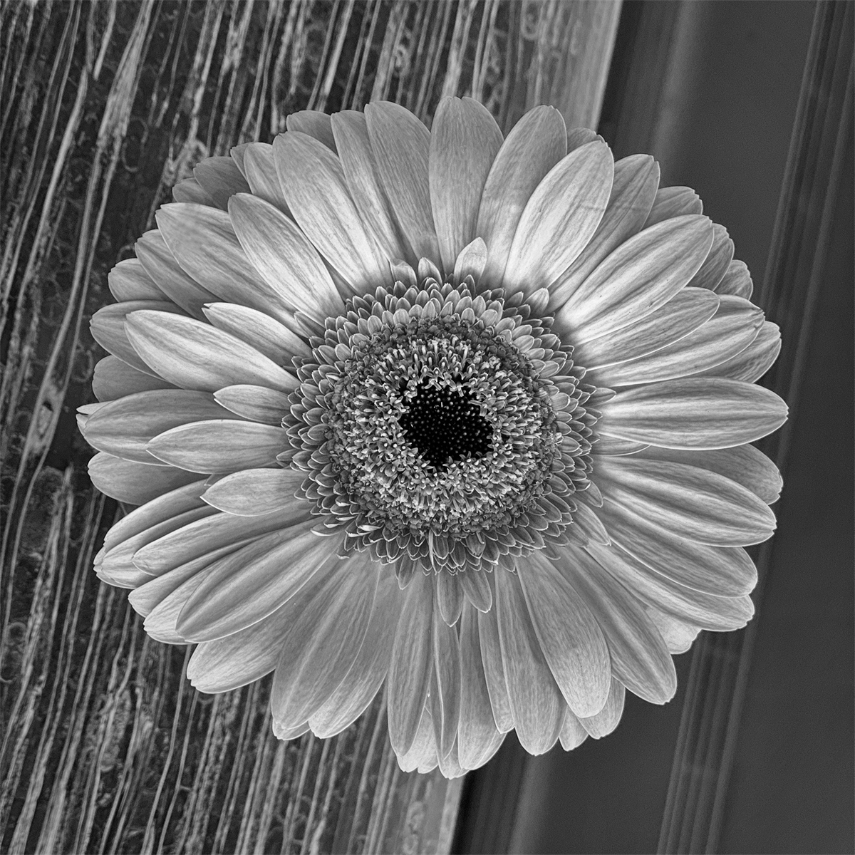
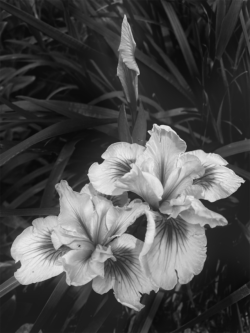
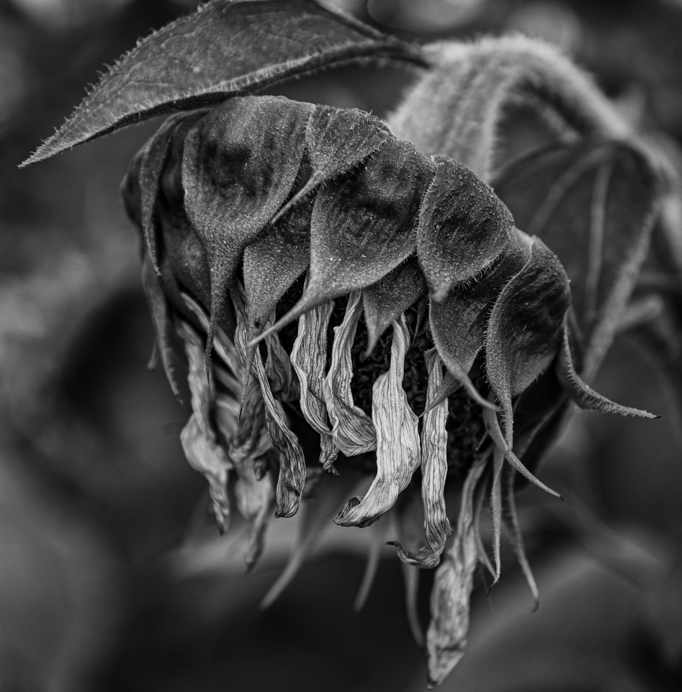
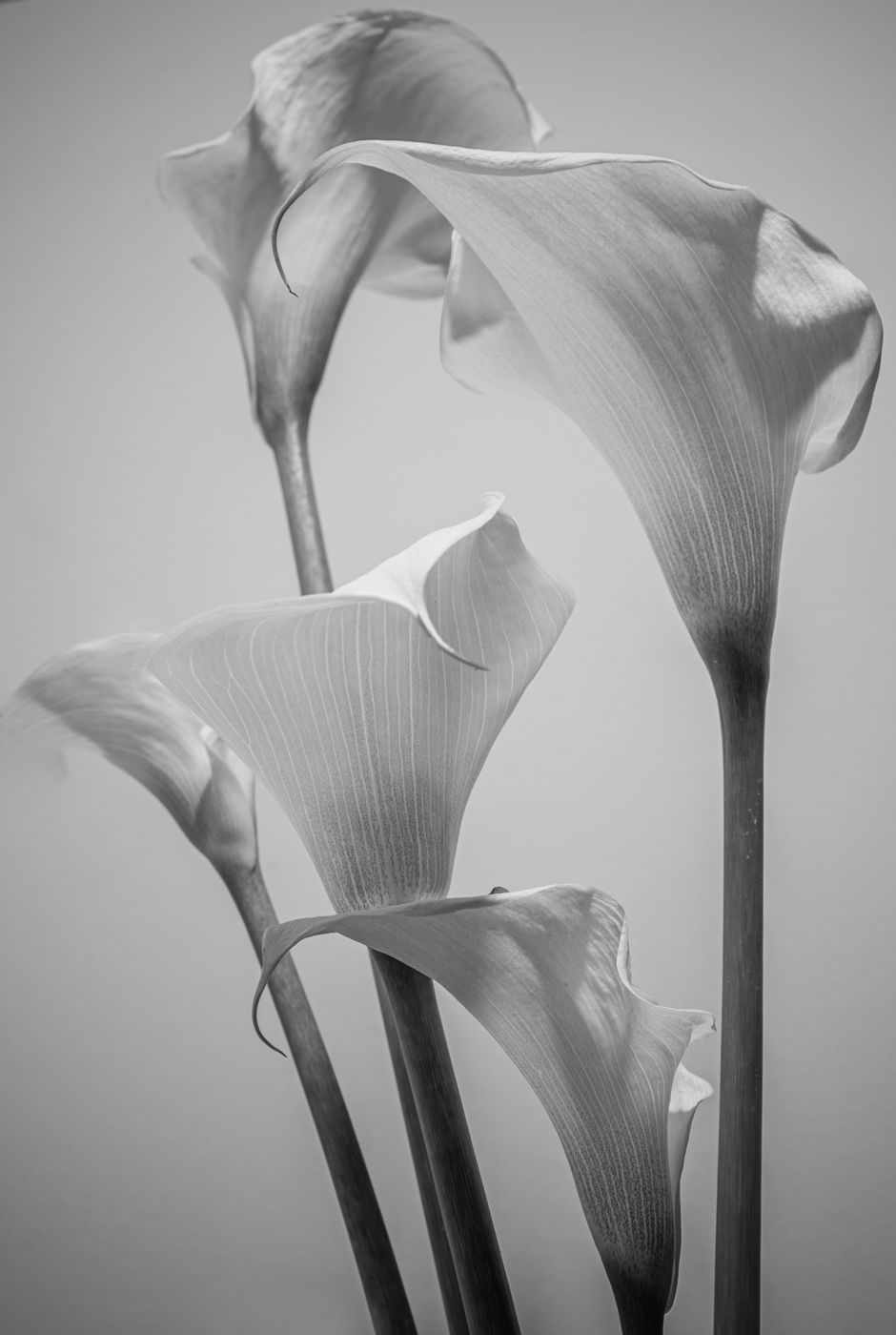
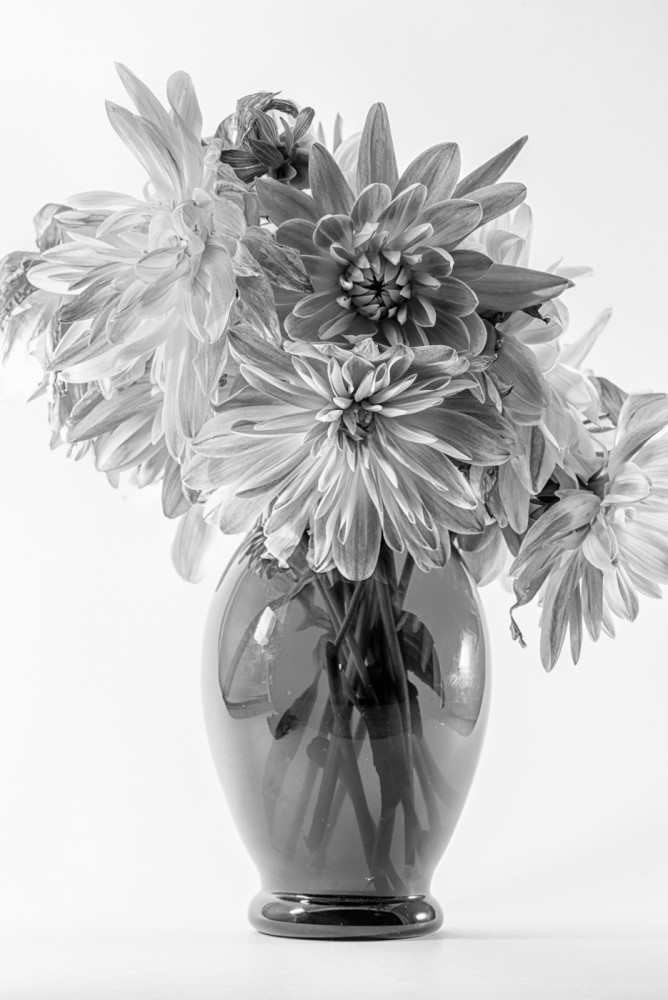
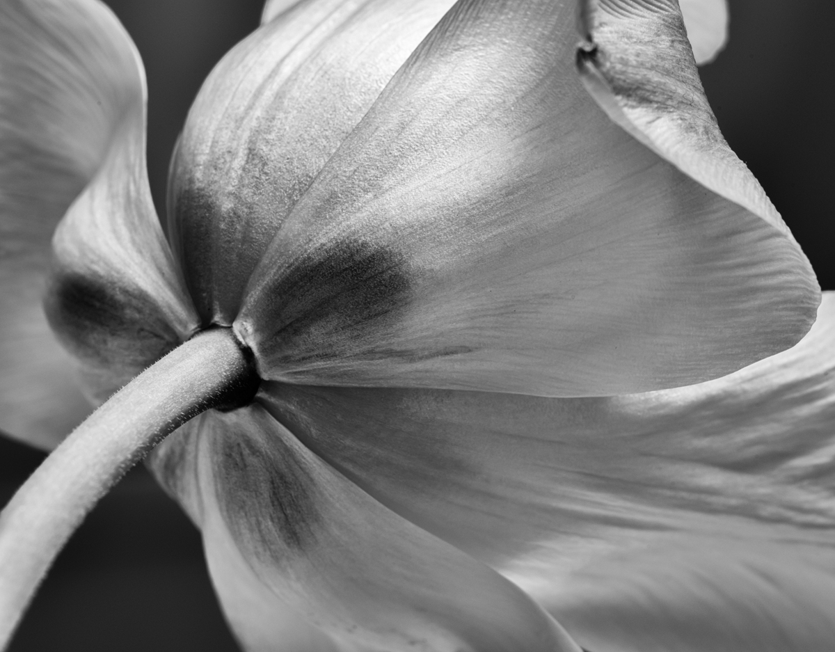
Cindy, a beautiful image - I love the side light, it is almost magical the way it highlights the texture of the bud. You have achieved good tonal range and depth of field. I do like the softness of the background foliage but find the bits surrounding the bud a bit of a distraction/detraction. I took the liberty of masking some of it out in PS and am not completely happy with my suggested result either but perhaps there is a middle ground? |
Apr 5th |
 |
| 50 |
Apr 26 |
Comment |
Charles, a great capture! I definitely prefer the BW conversion and crop - I find the variety of colours and the bright spots distract from the bassist. The monochrome allows all the aspects of the image - the intrument, the musician's skin tones, his jacket, the piano lid - to harmonise (no pun intended). I think the lighting brings out a lot of great detail and texture, but I agree with Cindy about the out-of-focus music stand in the foreground and like her crop suggestion. I don't, however, find the darkness of the piano lid a problem - to me, it provides a suitable backdrop for the main subject...personal taste, eh? |
Apr 4th |
| 50 |
Apr 26 |
Comment |
Thank you, Cindy, for these kind words. Yes, dust spots...I am usually more vigilant about them - thanks for the heads up. |
Apr 4th |
| 50 |
Apr 26 |
Comment |
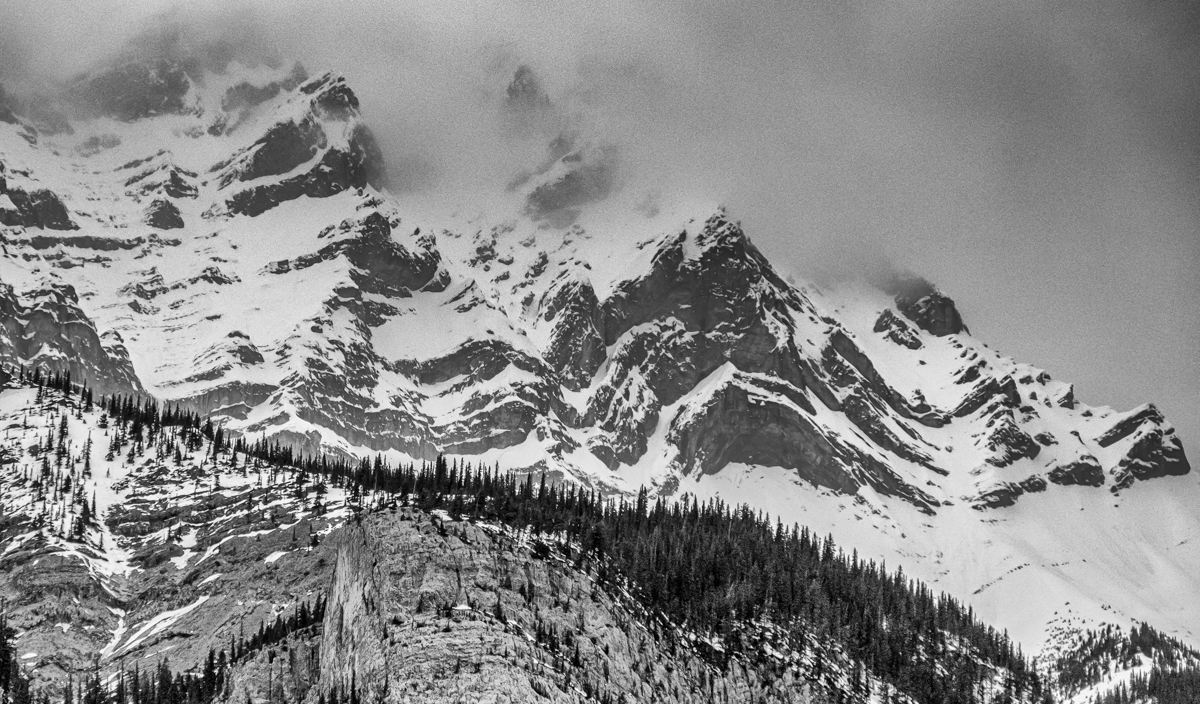
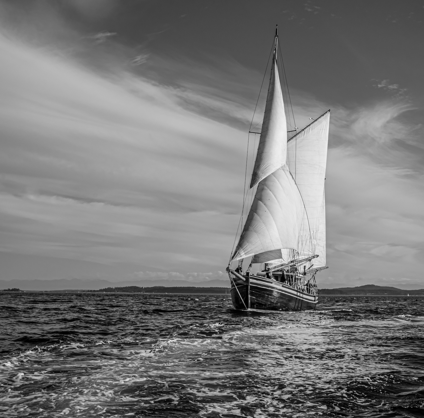
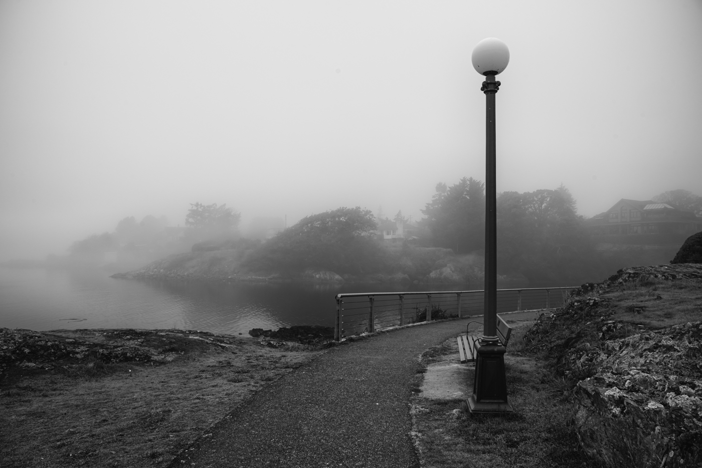
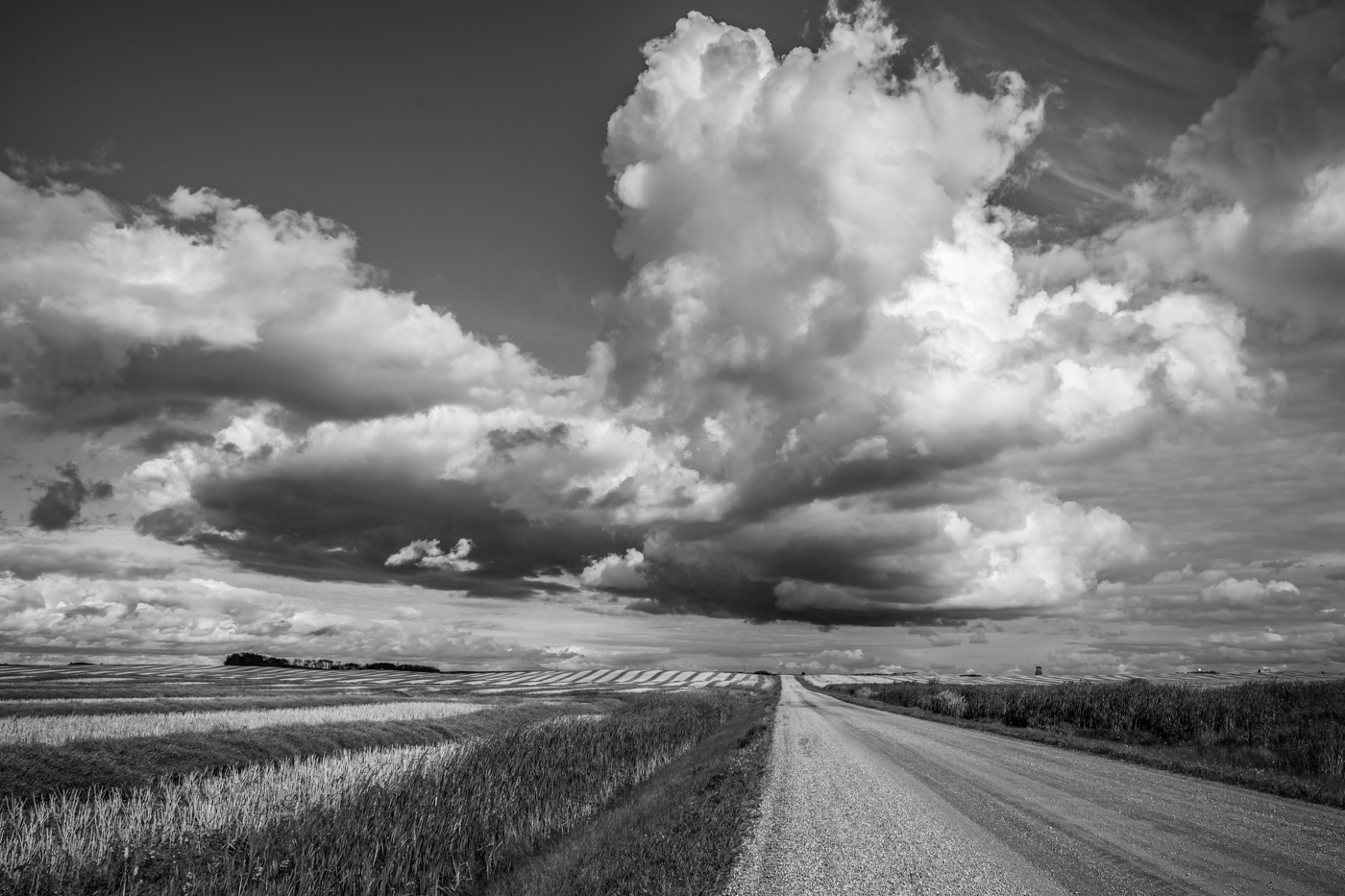
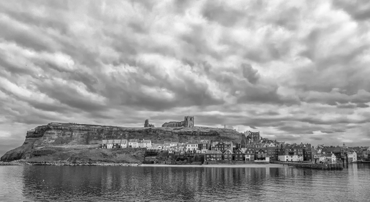
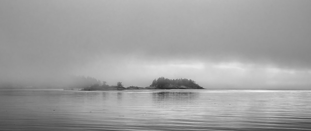
Ger, such a gorgeous and, as Cindy said, serene setting. I find the hues in the colour version very "yummy" and impactful but the monochrome works well for other reasons, I think: the well balanced composition with the post leading our eye towards the horizon, and the moon. The colour version is a beautiful landscape but the BW is a work of art. And just the correct length of exposure to smooth the water in my view. Lovely! |
Apr 4th |
| 50 |
Apr 26 |
Comment |
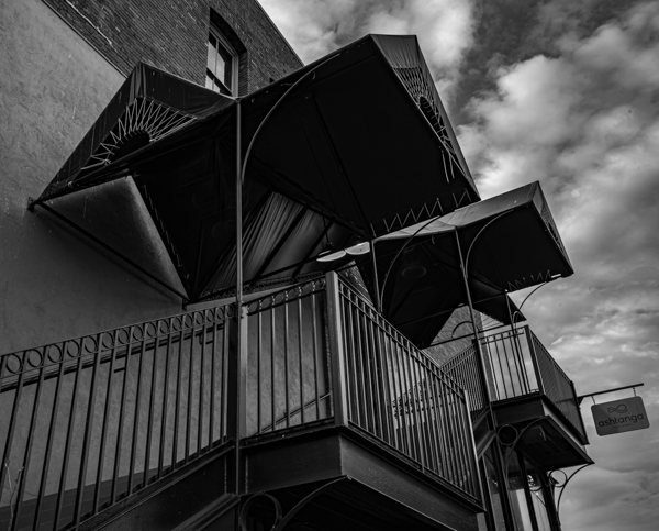
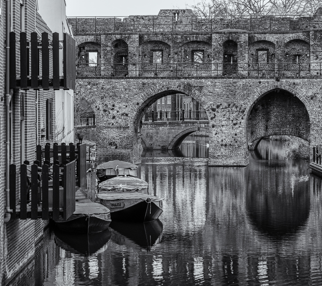
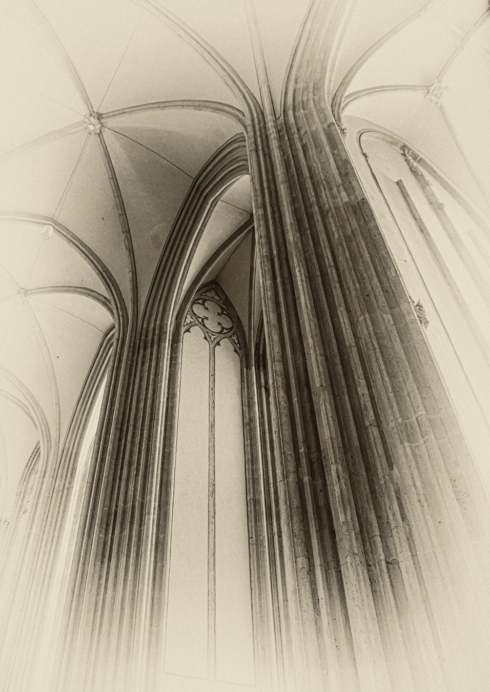
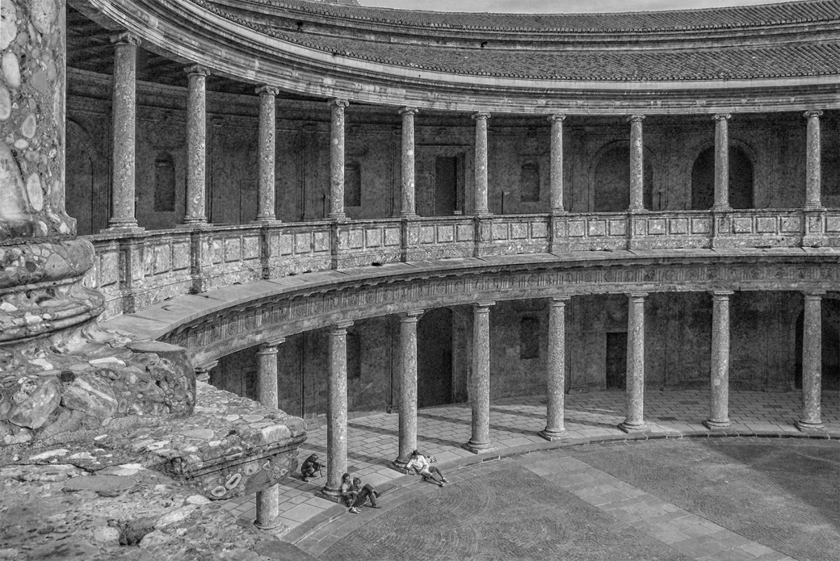
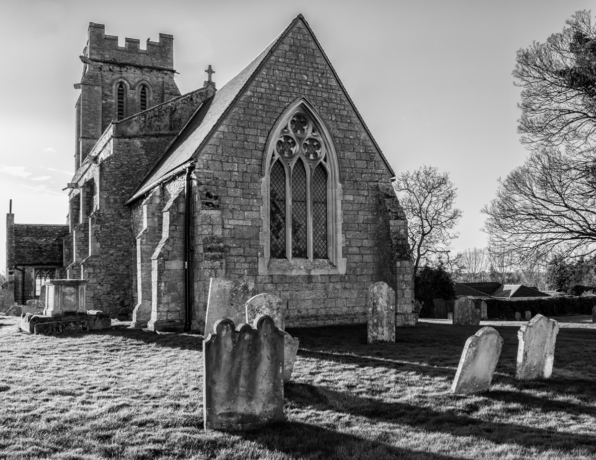
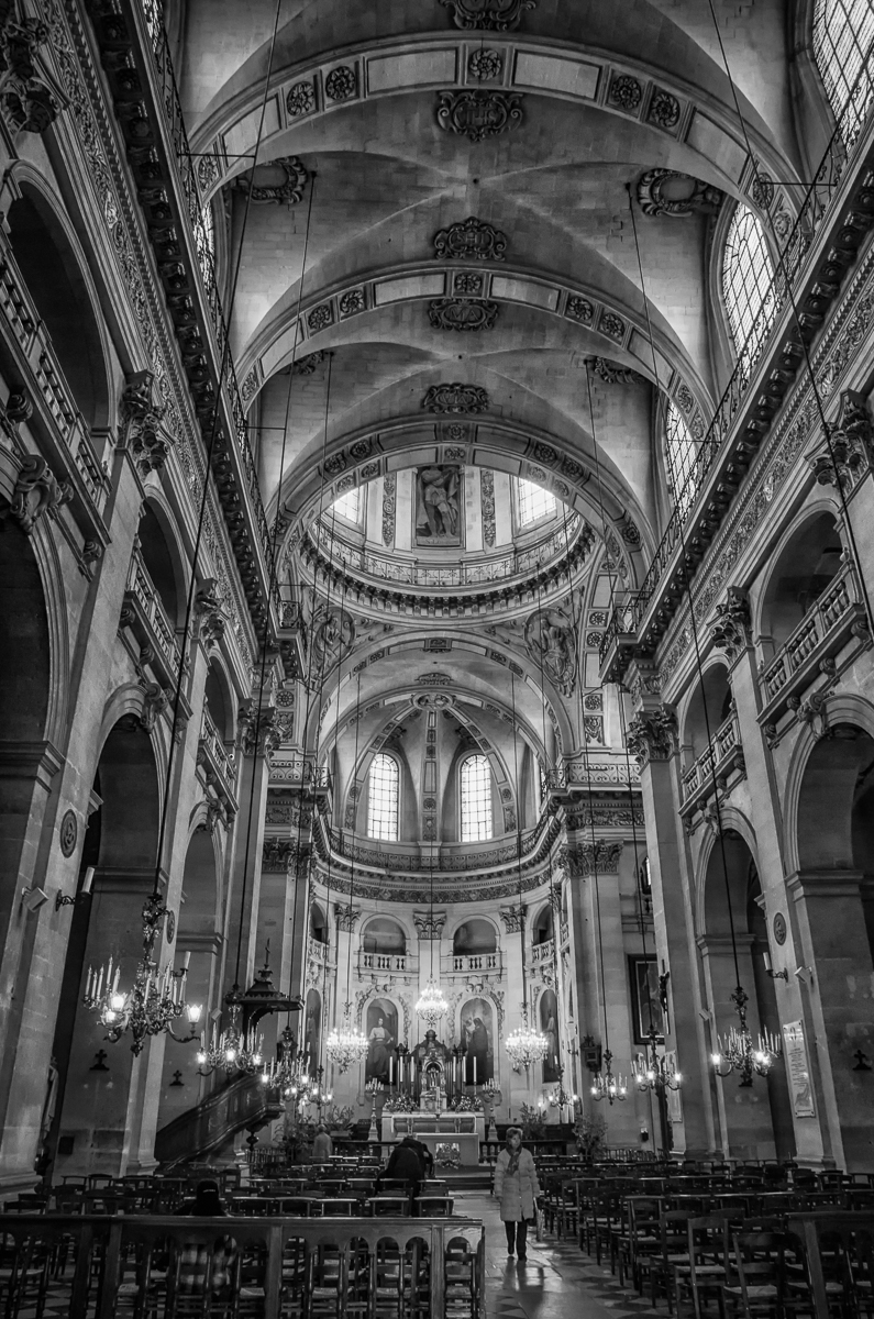
Paul, I love these majestic architectural subjects. I think I prefer the monochrome version of this - the brightness of the sunlight tends to highlight the detail and the tonal variation in the building rather than making the bright blue of the sky a "distraction", as you said. I do agree with Cindy's suggestions about 1) including more of the foreground stairway as a leading line and 2) darkening the sky a little for increased drama, perhaps. Nice job! |
Apr 4th |
6 comments - 2 replies for Group 50
|
6 comments - 2 replies Total
|