|
| Group |
Round |
C/R |
Comment |
Date |
Image |
| 50 |
Mar 26 |
Reply |
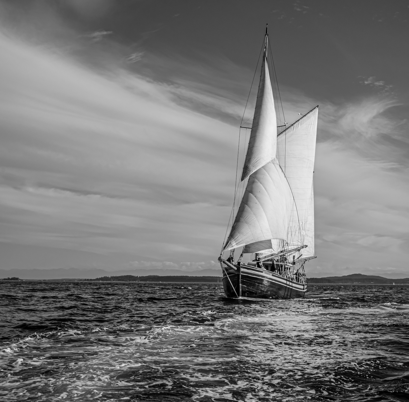
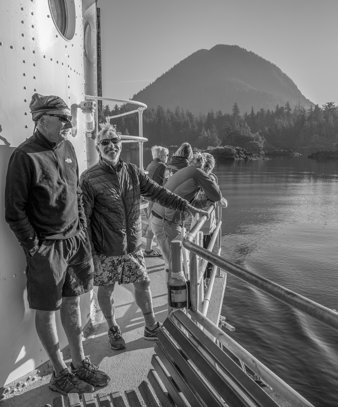
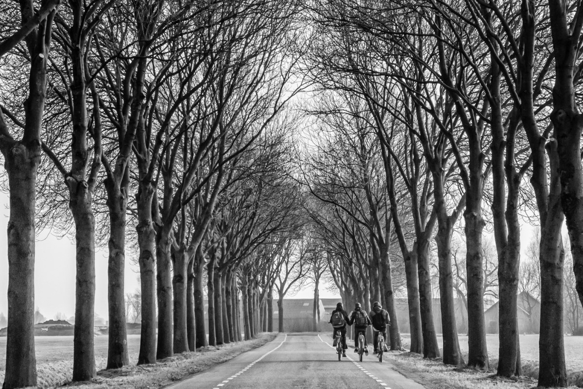
Thank you, Charles. Yes, lots to think about with landscapes, I agree, but having driven from eastern Ontario to where this was shot (Kicking Horse Pass in eastern BC) in 6 days, we were eager to keep moving and get home - so basically, it was point, focus (quickly), and shoot. I certainly don't feel like I have mastered the art of landscape photography (or any other genre, for that matter) so not sure how much help I would be. But thanks for the feedback/food for thought. |
Apr 1st |
| 50 |
Mar 26 |
Reply |
Cindy, what did you use to remove the curved shape? |
Mar 12th |
| 50 |
Mar 26 |
Reply |
Thanks, James. I see what you mean and like it. |
Mar 12th |
| 50 |
Mar 26 |
Reply |
Thanks, Cindy. I removed what graininess I could using the LR luminance slider but agree it wasn't enough. I haven't used Denoise but will look into it since I like your result. |
Mar 12th |
| 50 |
Mar 26 |
Comment |
Paul, this is indeed a beautiful hood emblem. Maybe it's me, but I prefer the colour version of this shot - to me it shows the lettering clearly enough. I find the reflections in the paint (particularly the boomerang shaped swath on the left) a little distracting, but I like your straight-on capture of the emblem and the keyhole cover and I like the interesting reflections in the latter. Call me weird, but I also like that you have included the line where the hood meets the body of the vehicle, making for a group of 3 design elements in the image. |
Mar 7th |
| 50 |
Mar 26 |
Comment |
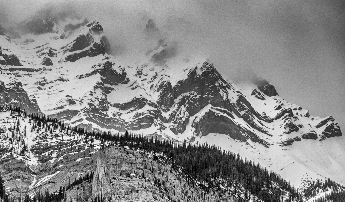
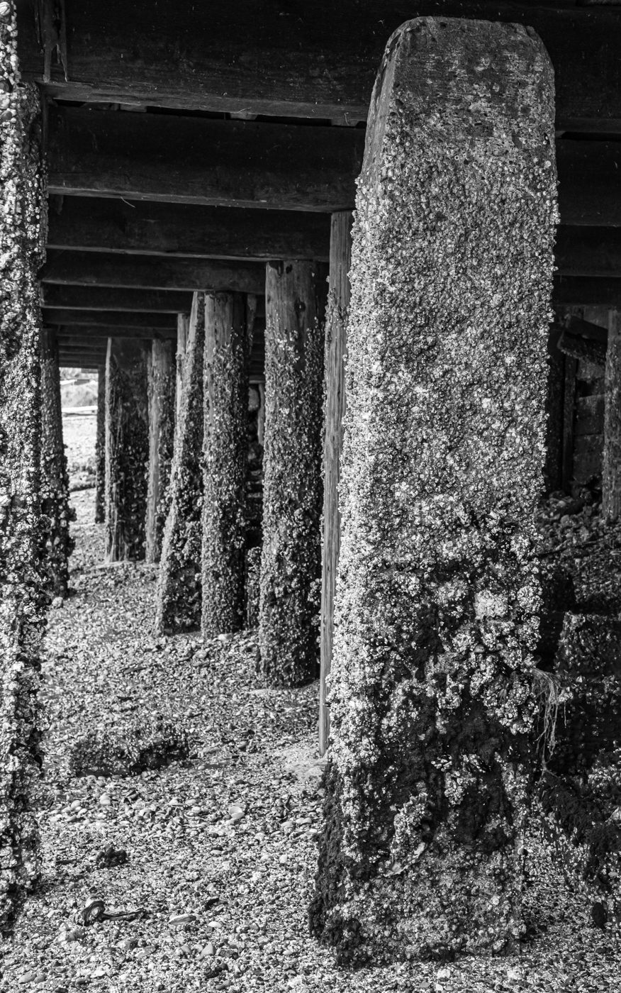
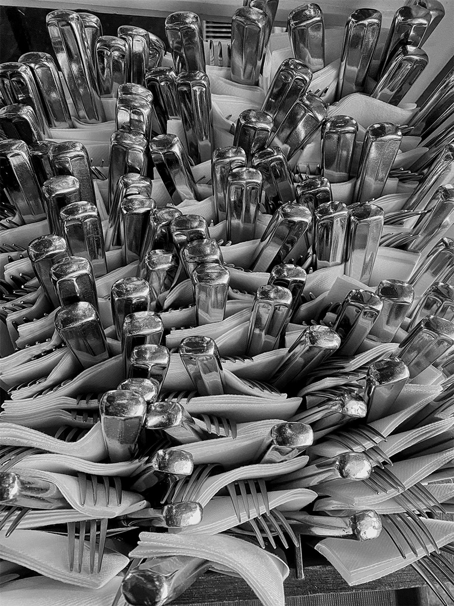
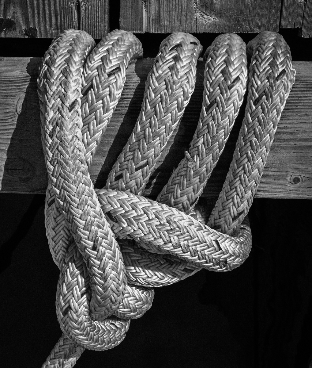
Charles, an interesting find! I like your choice of crop and your increase in exposure? contrast? highlights in the BW that allow us to see many of the details more clearly. However, I think I prefer the subtle colours of the original for this image. With the jumble of engine parts in various shapes and sizes, on the one hand it is difficult to find a place for our eye to rest. On the other hand, maybe that is the point - lots to explore within the frame. |
Mar 7th |
| 50 |
Mar 26 |
Comment |
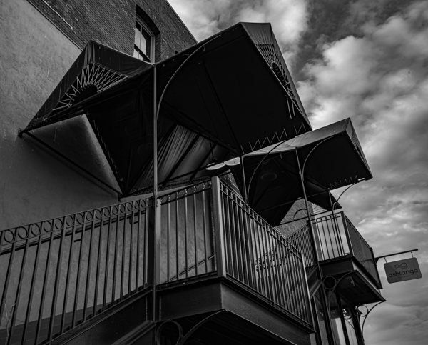
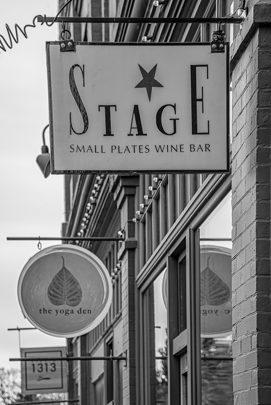
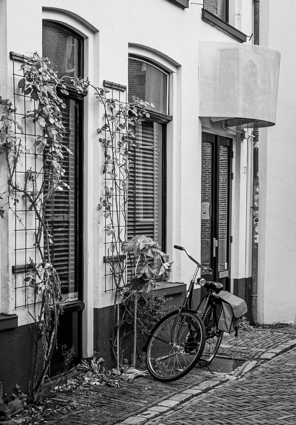
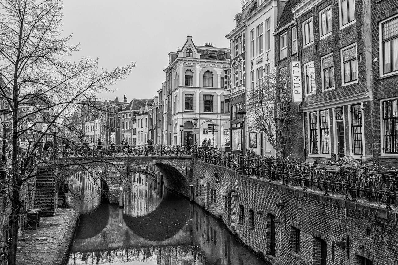
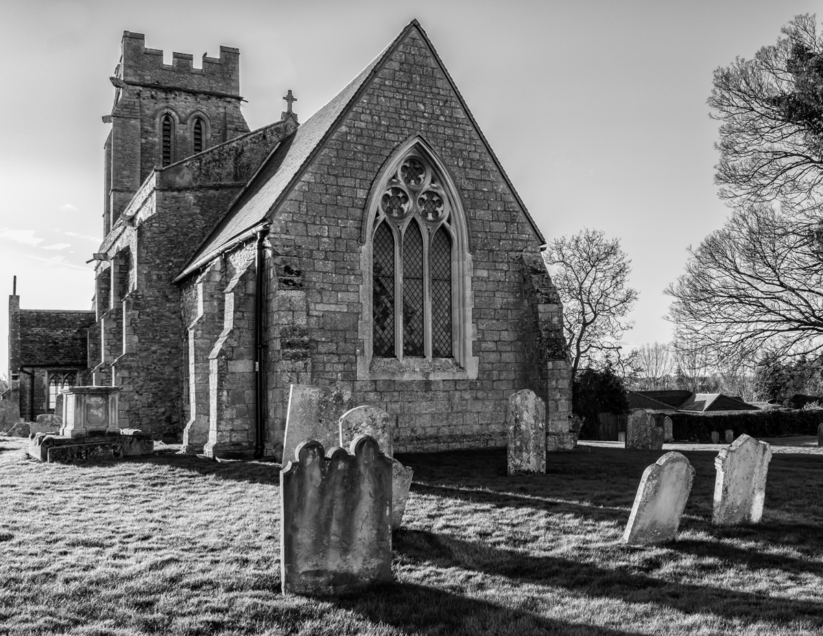
James, what a beautiful historic building! I do like architectural images in monochrome for the detail they emphasize, but in this case I think the contrasting blue and yellow hues in the original also create interest. You've done an intriguing crop which, in my view, actually works better in the BW version. I would like to see a little more contrast in the image or, perhaps a darker sky to create more tonal separation between it and the structure. Lots of interesting features to catch the eye, though. |
Mar 7th |
| 50 |
Mar 26 |
Comment |
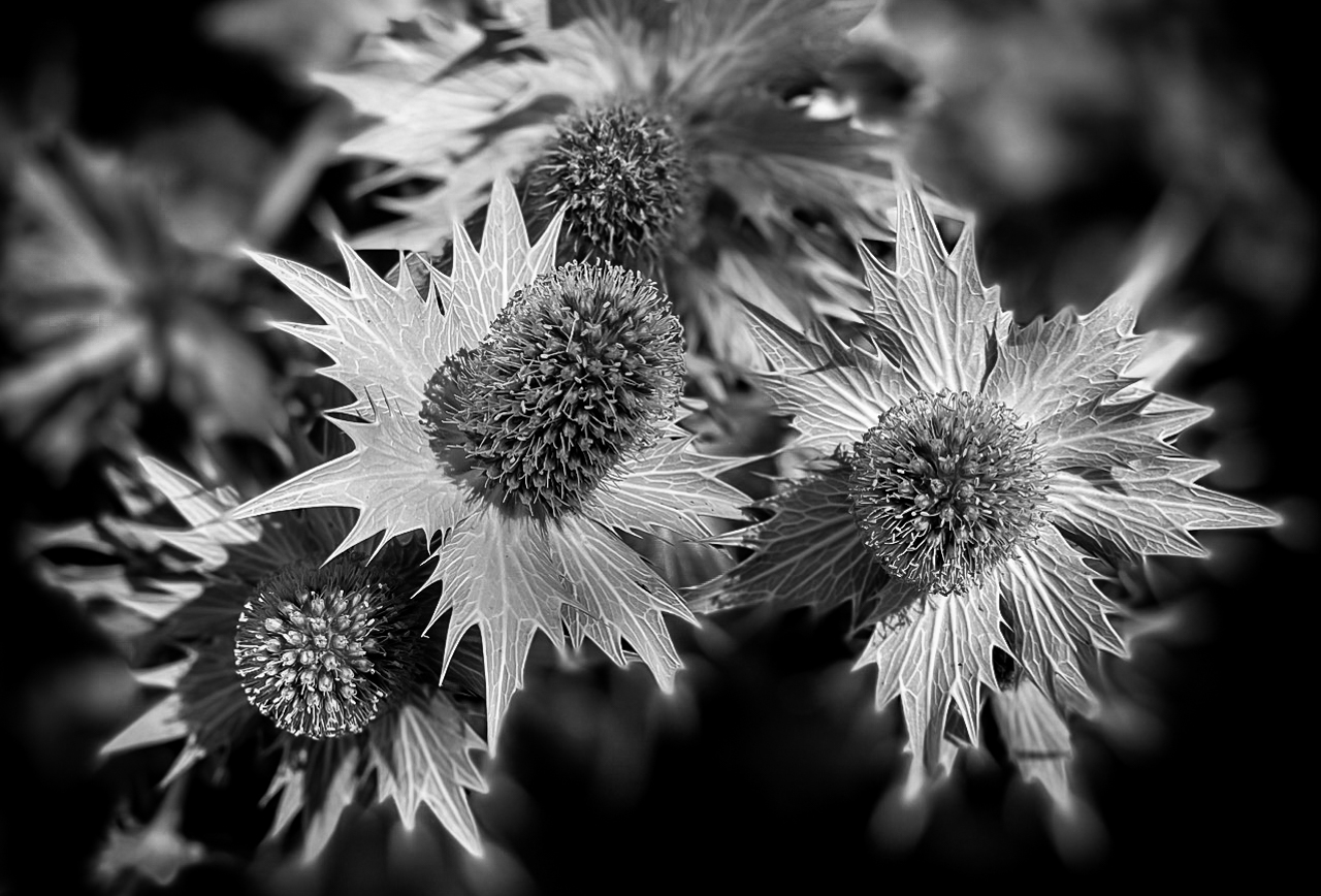
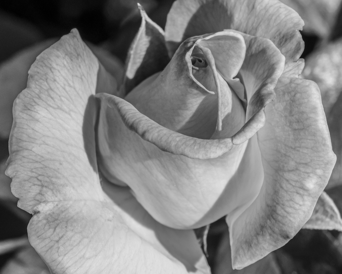
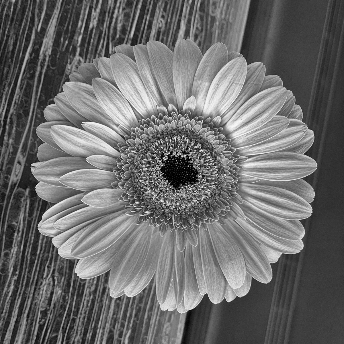
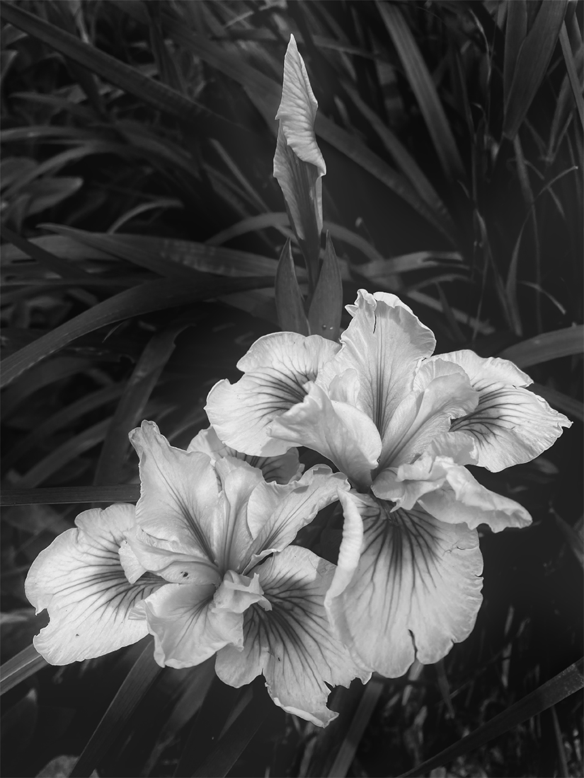
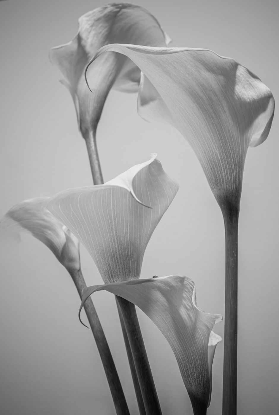
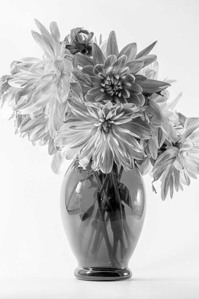
Cindy, the colours are very soft and "yummy" in the original but I think converting this image to BW really highlights the details in the centre of each flower and the texture of the petals. The closed blossoms in the bottom left lead our eyes into the frame, bringing them to rest on the fully open flower at the top, and giving a sense of gentle flowing movement. I like your darkened background giving us just a hint of context. Great job! |
Mar 7th |
4 comments - 4 replies for Group 50
|
4 comments - 4 replies Total
|