|
| Group |
Round |
C/R |
Comment |
Date |
Image |
| 50 |
Sep 25 |
Reply |
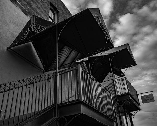
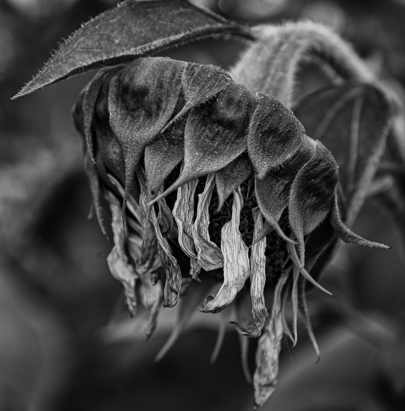
Thanks, Ger! I think I tried lightening the shadows on the underside of the canopies but ended up with some distracting patterns in that area. I will go back to the image and take another look. |
Sep 21st |
| 50 |
Sep 25 |
Reply |
Thanks, Cindy. I always appreciate your comments. |
Sep 21st |
| 50 |
Sep 25 |
Comment |
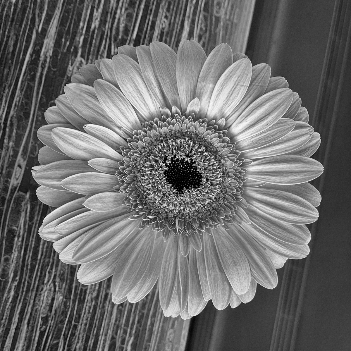
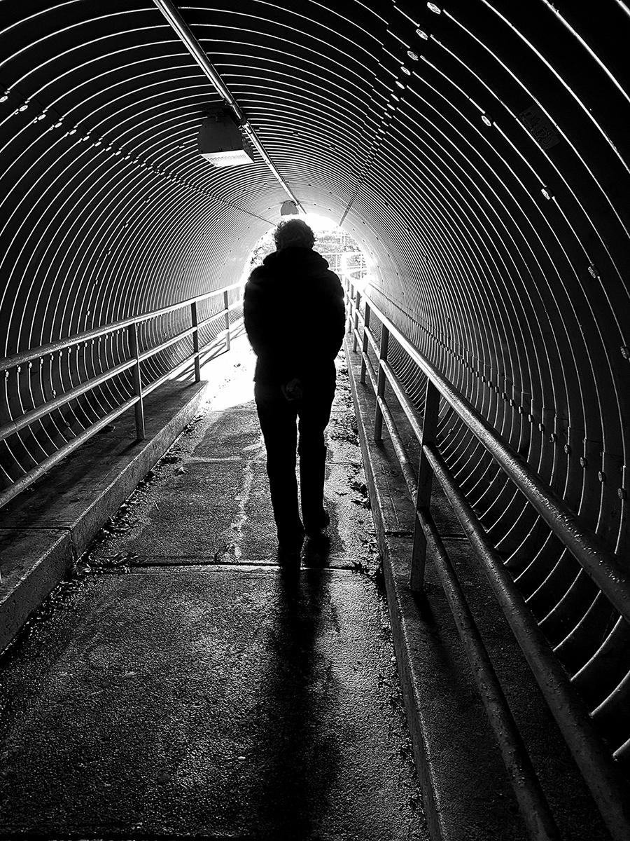
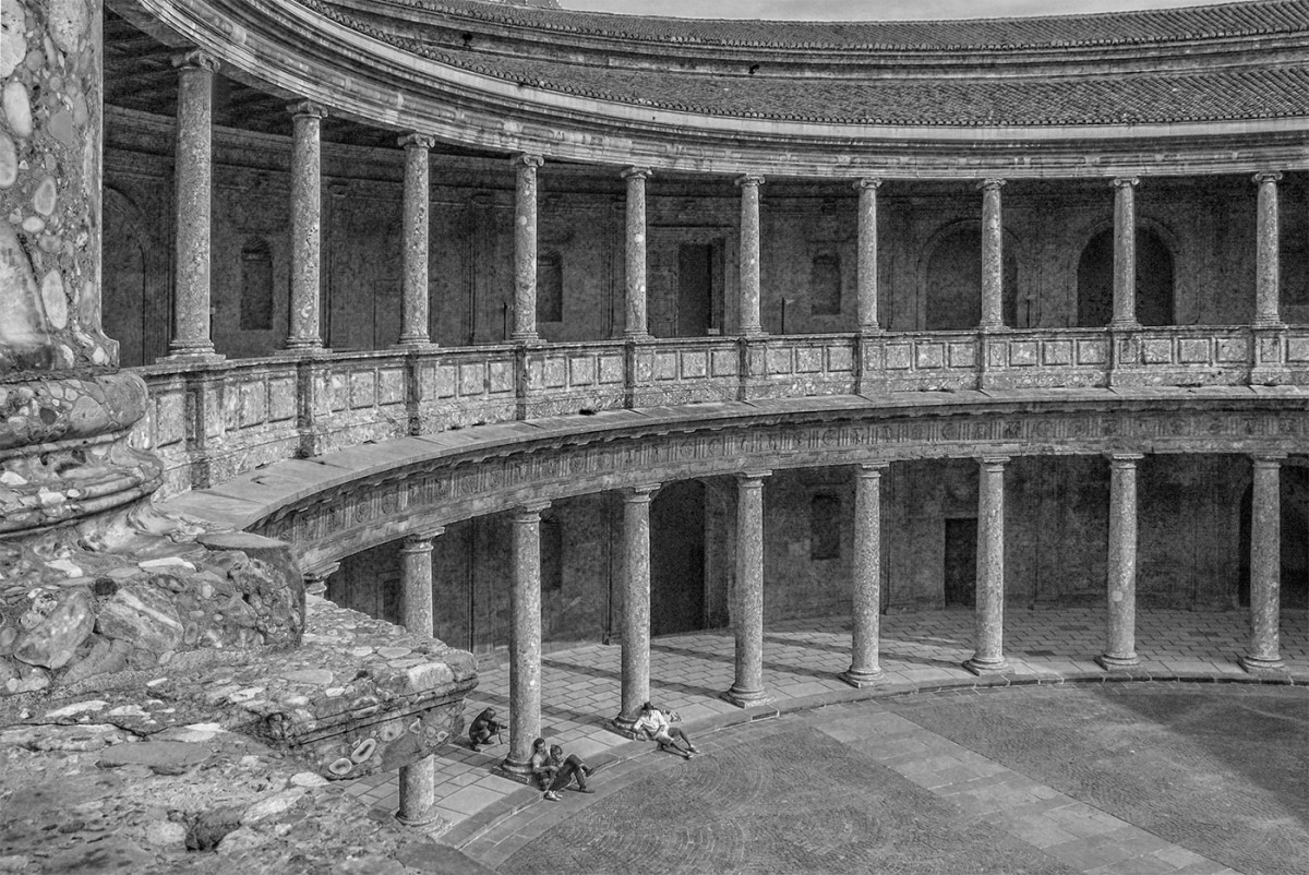
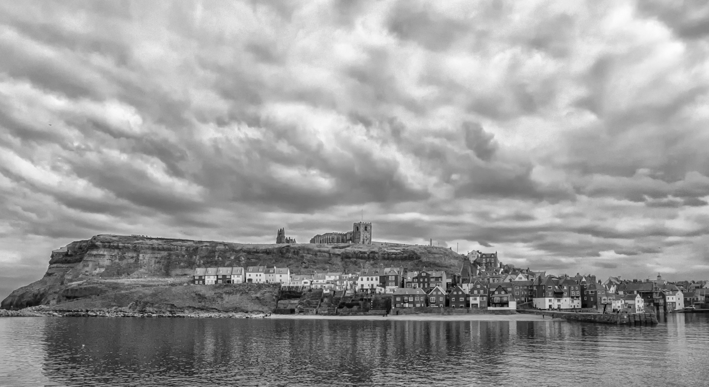
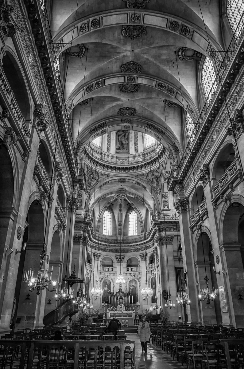
Sam, welcome to our group!! This is an interesting idea for an environmental portrait, however, even though I think I understand what you are trying to convey (the sense of infinity) with the soft-focused aisle/balcony tapering off into the distance through the overhanging curtains, I find the image quite busy with the background overwhelming the model. If she is the main subject, you are right about the light on her needing to be a little brighter, I think. |
Sep 13th |
| 50 |
Sep 25 |
Comment |
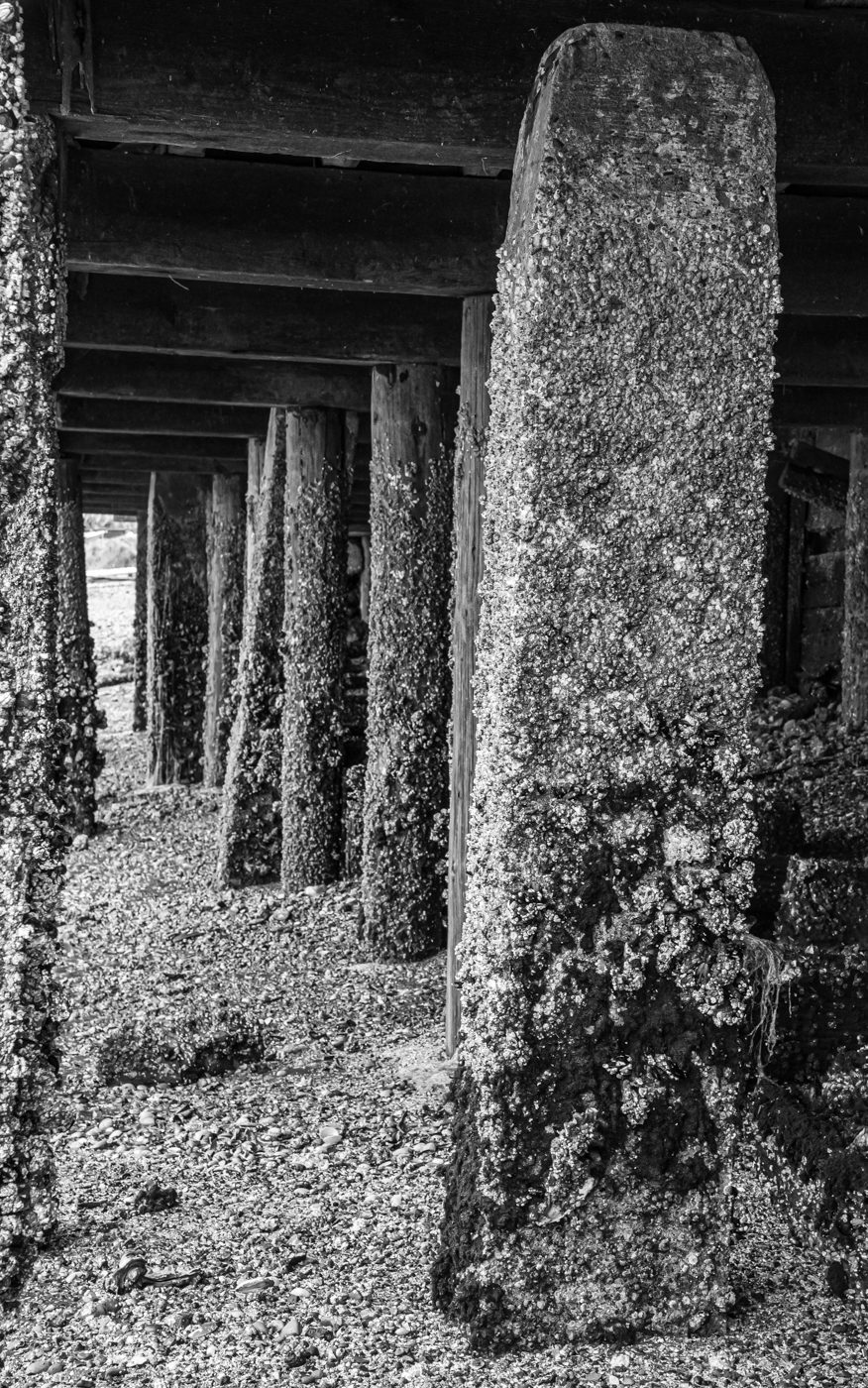
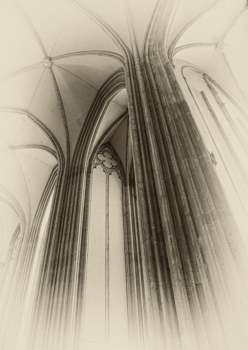
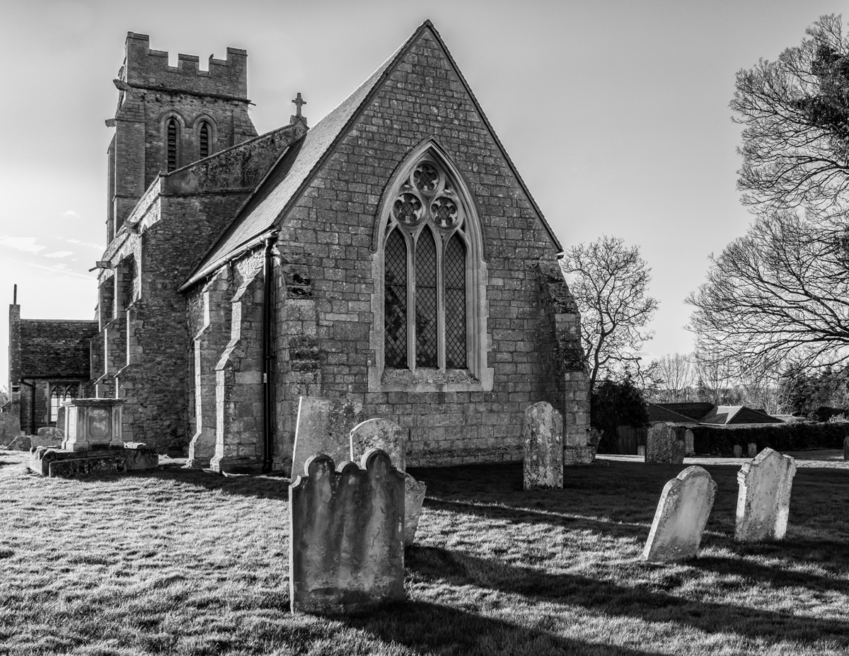
Paul, I definitely prefer the monochrome of this image - the bright reds and greens in the colour version overwhelm the main subject, I think. Good sharpness and texture in the stones and good tonal range although perhaps the shadows could have been lightened a bit. I am wondering whether you experimented with some variation in f-stops - a shorter depth of field (or shooting from a slightly closer position at f/4.5) might have blurred out the bushes and the electrical wires in the background enough to render them less noticeable. |
Sep 13th |
| 50 |
Sep 25 |
Comment |
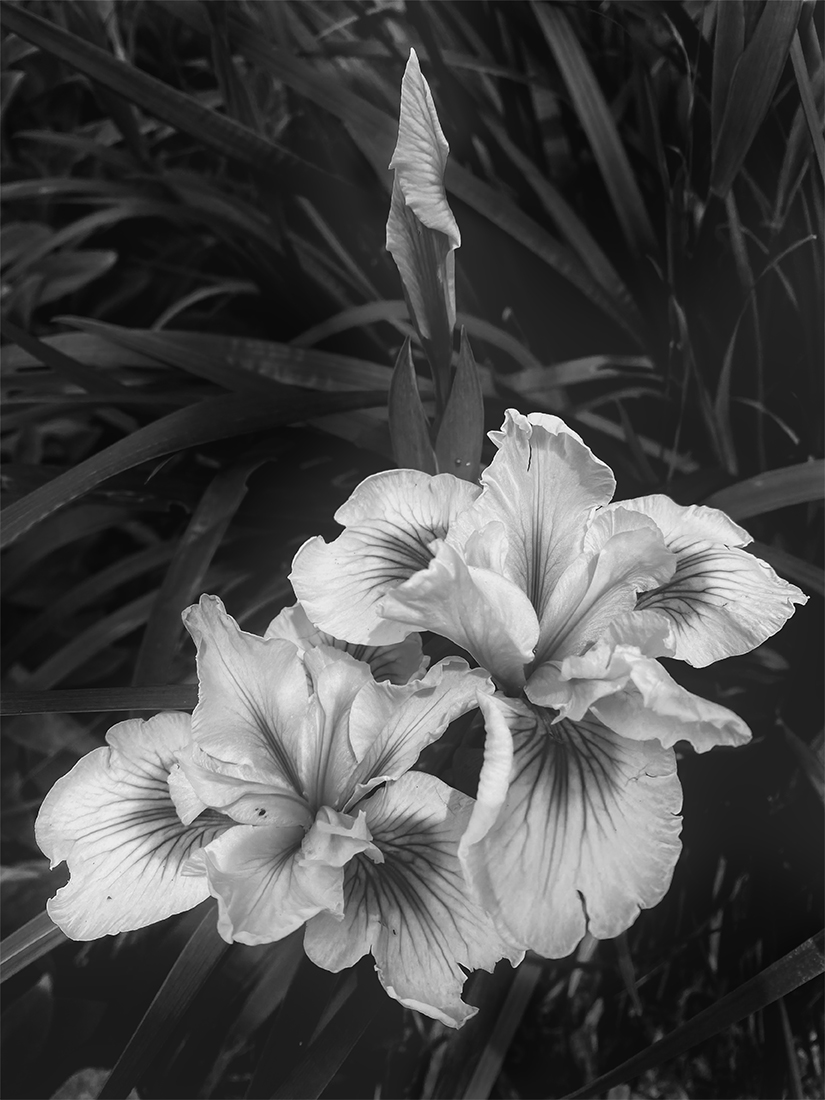
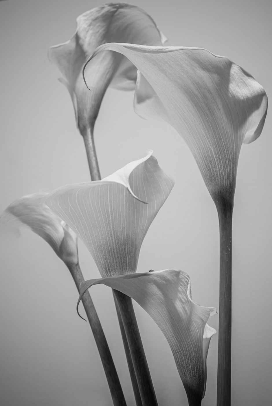
Ger, a beautiful portrait. Impressive sharpness and texture in the fur, the whiskers, the eye, even that little bone, or whatever it is, in the ear. And a nicely blurred background. I don't find the cropped tips of the ears a problem but wonder how it would alter the balance of the image if there was a little more room at the top. As a cat-lover, the image does elicit a "warm, fuzzy" emotional response. |
Sep 13th |
| 50 |
Sep 25 |
Comment |
Charles, I like both versions of this, the soft tones in the colour are appealing but, as I think is often the case, the shapes stand out more in the monochrome image. Your tonal range is good but I find the reflection of the surgical lamps in the stainless steel of the table a bit distracting. So much interesting detail to catch our eye though. |
Sep 13th |
| 50 |
Sep 25 |
Comment |
James, the colour version of this image is eye-catching but the BW really does it for me. Excellent tonal range with the black and white of the car standing out against an interesting, but more softly focused, background and sky. I like the way you have achieved "the distortion of speed" using a fisheye lens - clever! The takeaway meal hanging outside the passenger window adds a quirky touch but not sure whether it adds to, or detracts from, the main subject. |
Sep 13th |
| 50 |
Sep 25 |
Comment |
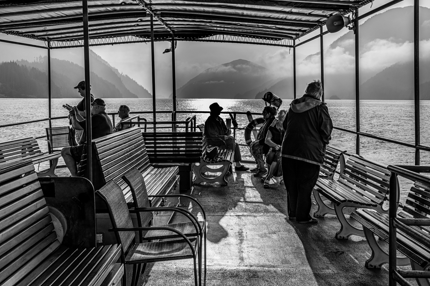
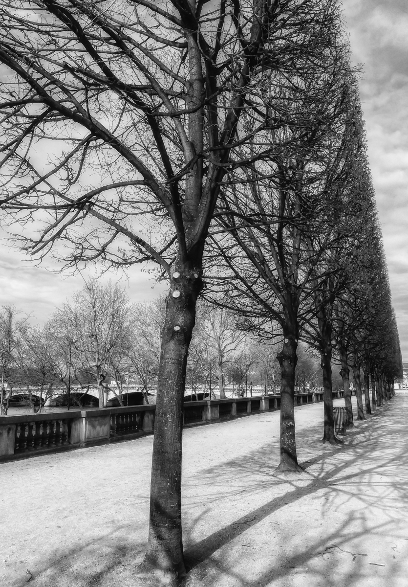
Cindy, not sure how it looked in colour but I really like this image in monochrome - great capture (yes, the camera you have with you). Great tones, sharpness, contrast - the chrome gleams without being blown out. I think the symmetrical composition really fits the subject. Not sure what distractions you removed but I like that you kept the "Paris 1925" structure in the background and the sharp shadows below the bumper in front - both, I think compliment the roadster. |
Sep 13th |
6 comments - 2 replies for Group 50
|
6 comments - 2 replies Total
|