|
| Group |
Round |
C/R |
Comment |
Date |
Image |
| 50 |
Apr 23 |
Comment |
Yes, a fun image. I do like the BW and James' slightly closer crop. You have achieved good sharpness in the capture and good tonal range in the conversion. I wonder how a less symmetrical arrangement of the minions (maybe 3 in one group and 2 in the other) might work. |
Apr 15th |
| 50 |
Apr 23 |
Comment |
Cindy, I like the detailed texture you have captured in the rider's hands and the saddle leather. I see James' point about the light on the hands but actually prefer your version, including the horse's mane and the blanket on the left of the frame in the "story". Lovely tones and exposure in the monochrome. On my screen, some elements (the shirt, the rope and the right hand, particularly the thumb) look a little over-sharpened. |
Apr 15th |
| 50 |
Apr 23 |
Comment |
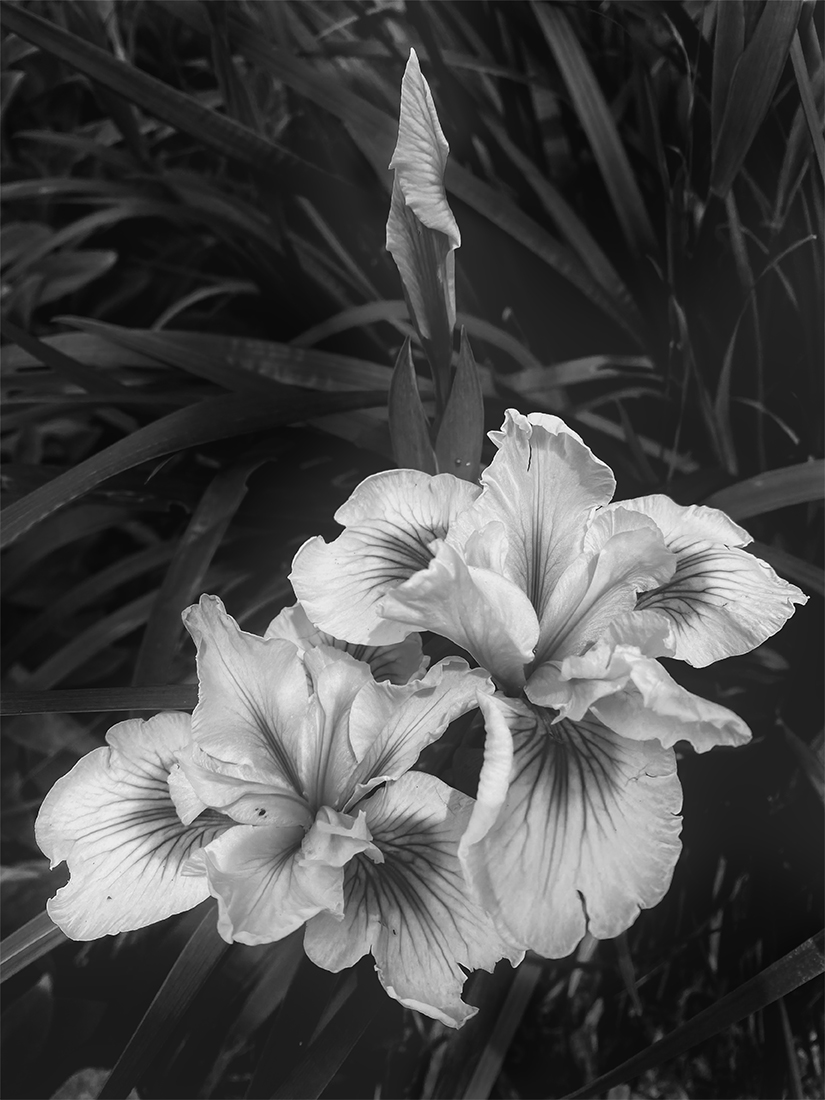
Karl, a wonderful artistic shot in monochrome! I don't mind that we can't see the artist's face or eyes - to me, in this case, the hands tell enough of a story. I like the tones and the texture you have captured in his hands, his beard, in the interesting metal structure supporting the torch, and contrast between those and the delicate piece he is creating. I also like Cindy's suggestion about darkening the bottom left corner and her solution to the rather tight crop at the top. |
Apr 15th |
| 50 |
Apr 23 |
Comment |
James, an awesome image in monochrome! An excellent crop brings this beautiful, historic building closer in as the main subject. I agree that the sky replacement really enhances the moodiness of the scene (although I can see what Cindy is referring to as a bit of overlap on the left side of the dome - nothing that a little Photoshop cloning on the sky layer wouldn't remedy, I think). I also like Cindy's suggestion (and example) about increased contrast. |
Apr 15th |
| 50 |
Apr 23 |
Comment |
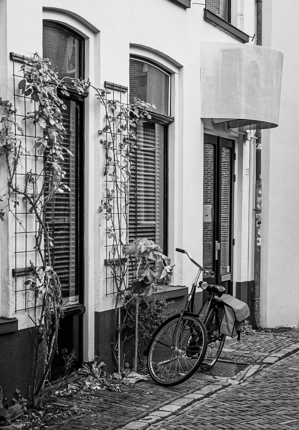
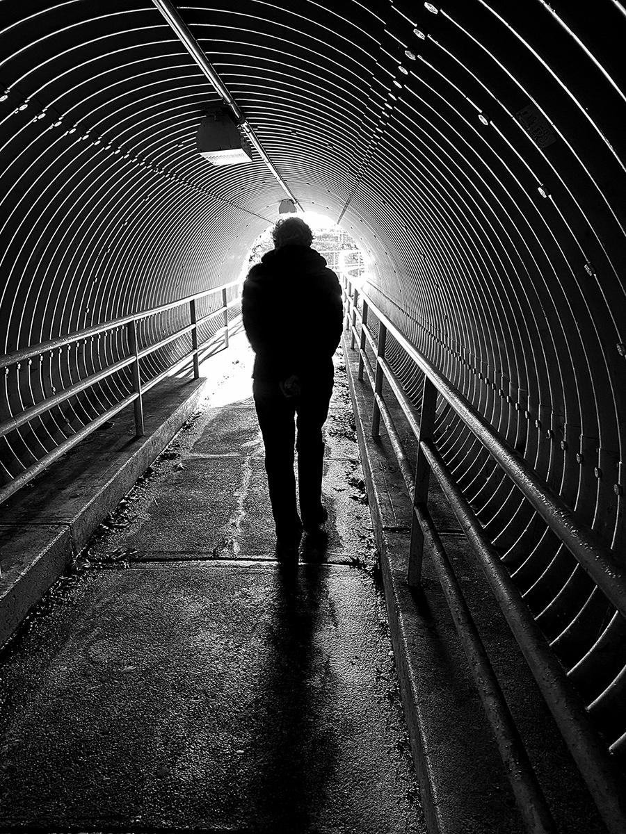
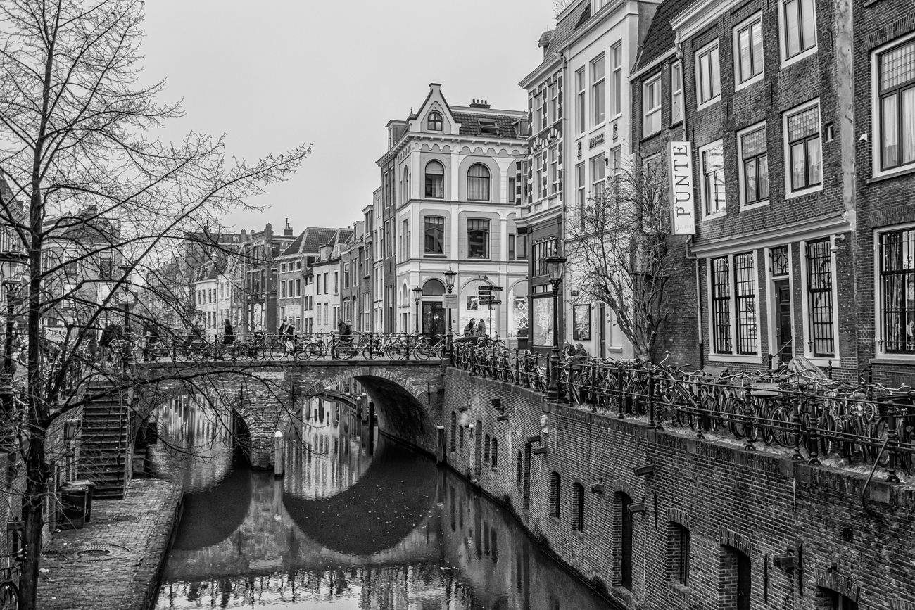
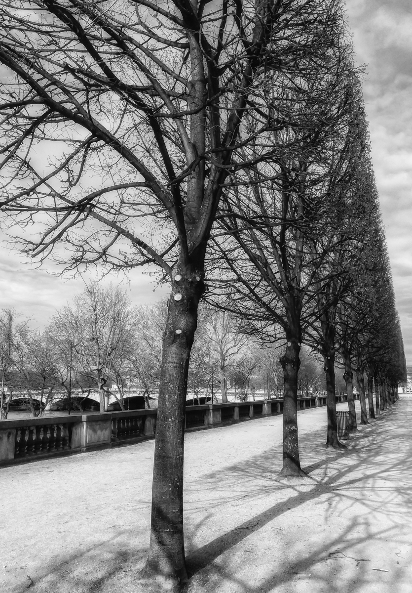
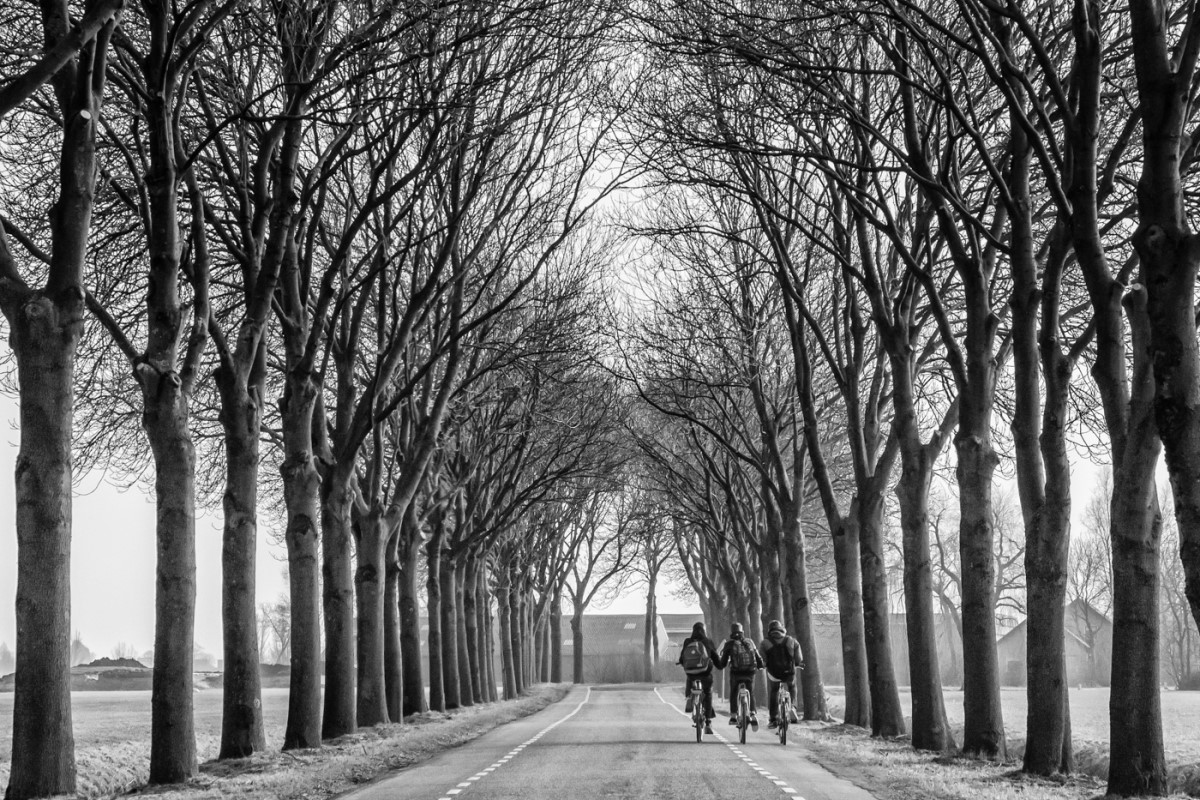
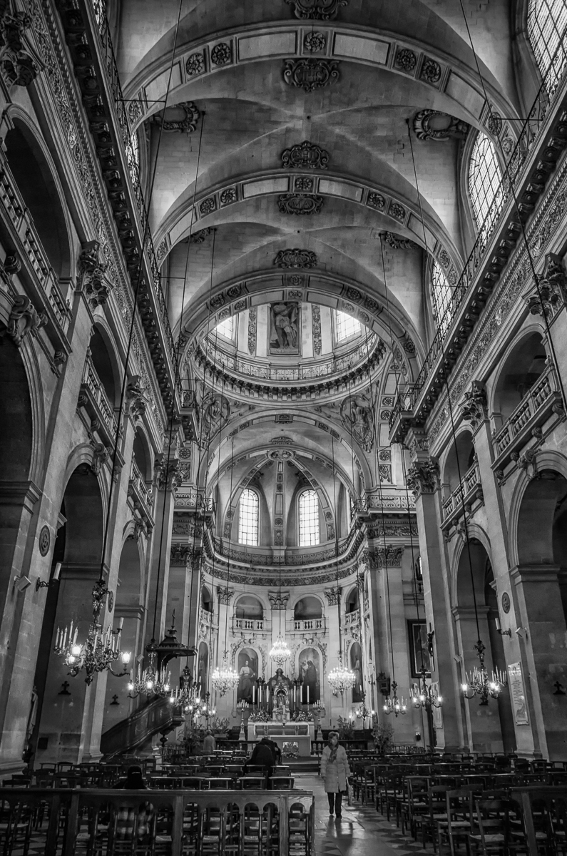
Paul, I really like the monochrome version of this image - another example of a photo becoming something more artistic with the BW conversion. Great leading lines formed by the bridge struts, the concrete paving stones and the shadows. I like your closer crop that brings the person walking away a little closer to our eye and the sharpness emphasising the texture in the ironwork and the concrete. I also think the symmetry of the shot works well. Nicely done! |
Apr 15th |
| 50 |
Apr 23 |
Reply |
Thanks, Karl. Good suggestions. |
Apr 7th |
| 50 |
Apr 23 |
Reply |
Thanks, Chuck. Hum...I went back to the metadata to check and was surprised to find it indeed clocked at 1/8 sec - my hands are not normally that steady. |
Apr 6th |
5 comments - 2 replies for Group 50
|
5 comments - 2 replies Total
|