|
| Group |
Round |
C/R |
Comment |
Date |
Image |
| 50 |
Feb 23 |
Comment |
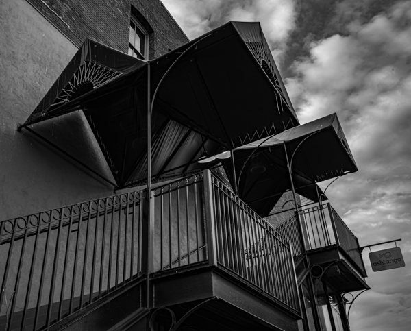
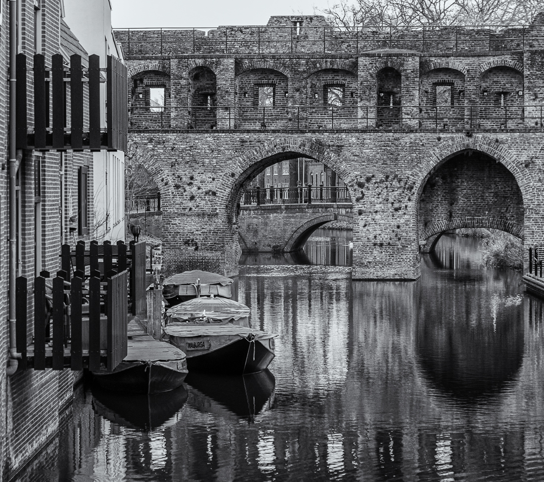
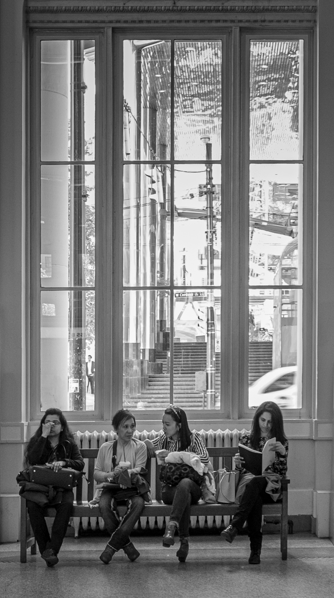
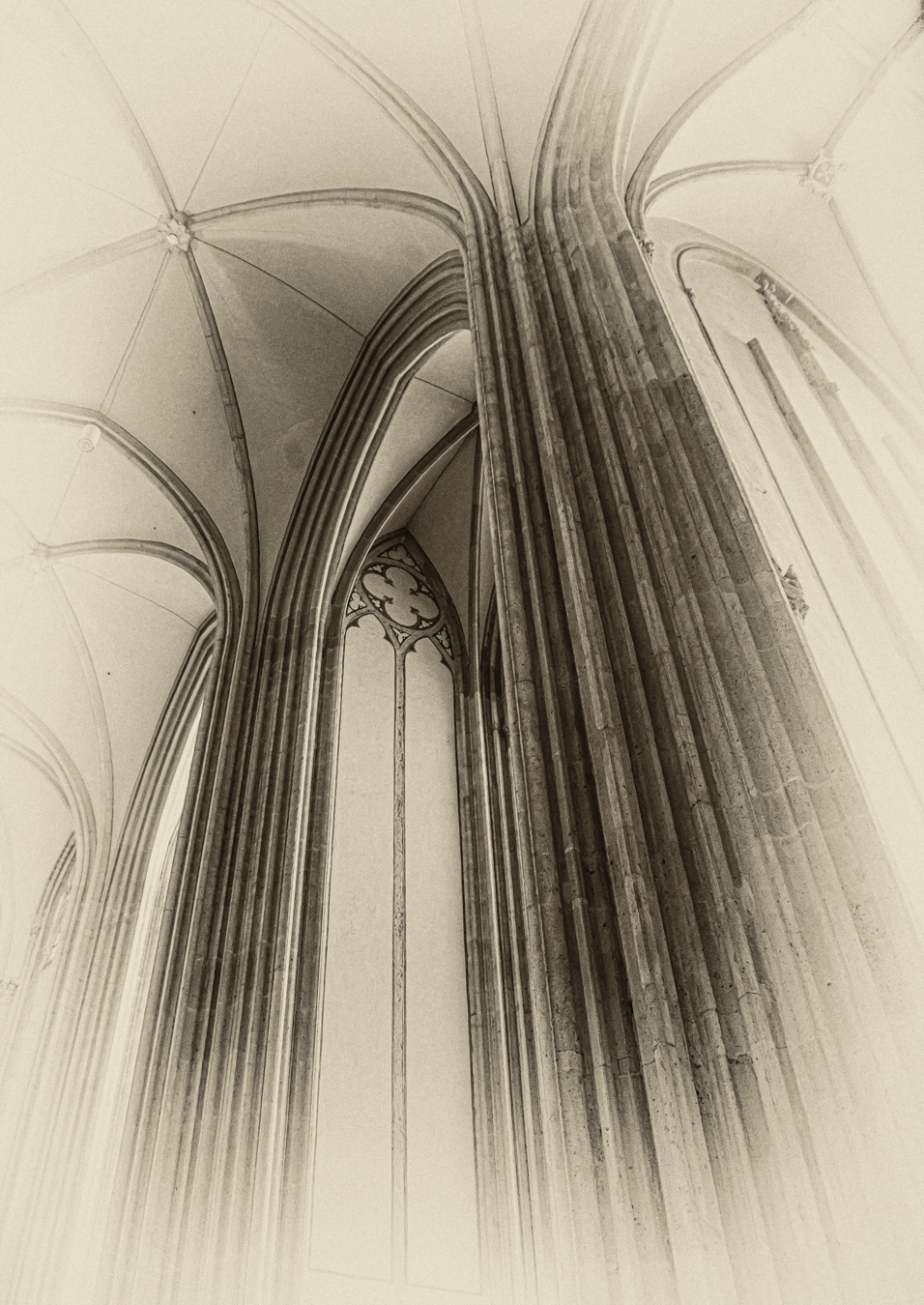
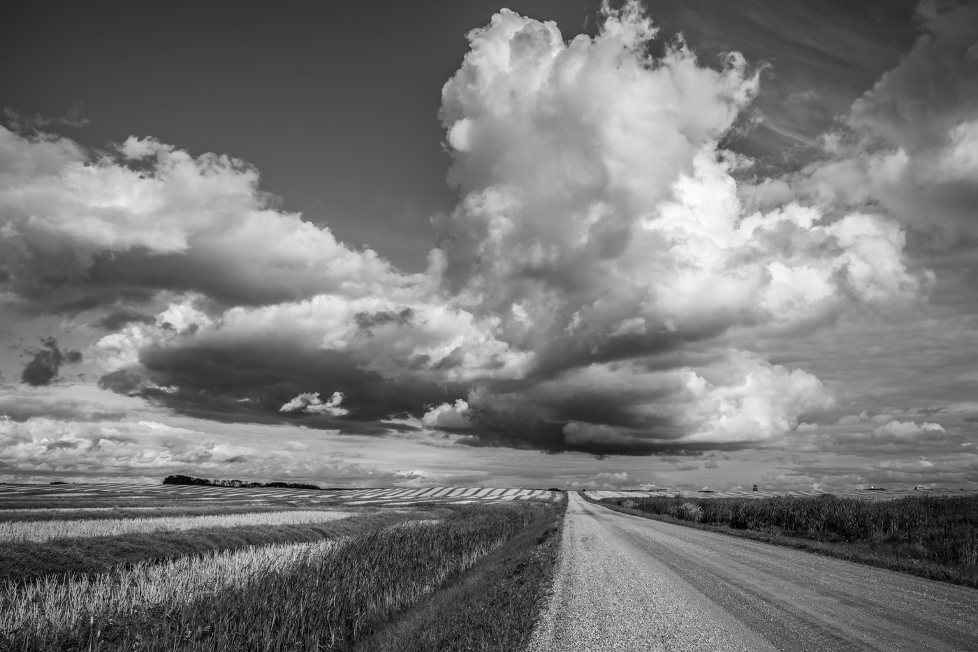
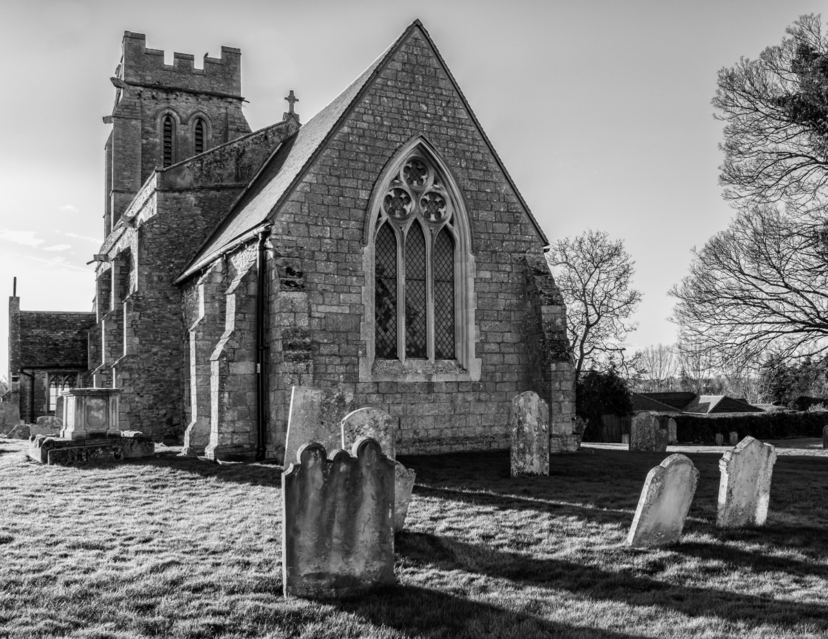
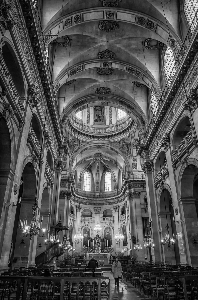
Chuck, I too like Cindy's edit, but also think you have done a great job of bring out the details and the tonal variations in this lovely historic building. The sky and clouds, to me, add interest to the composition and your shooting angle is perfect! |
Feb 15th |
| 50 |
Feb 23 |
Comment |
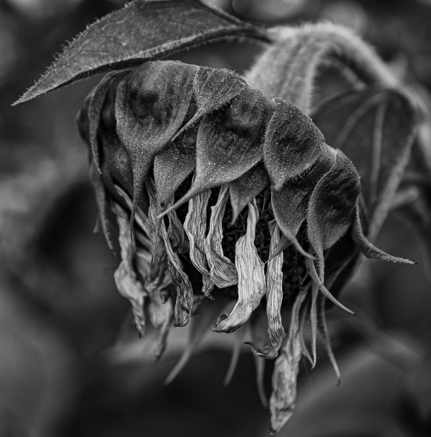
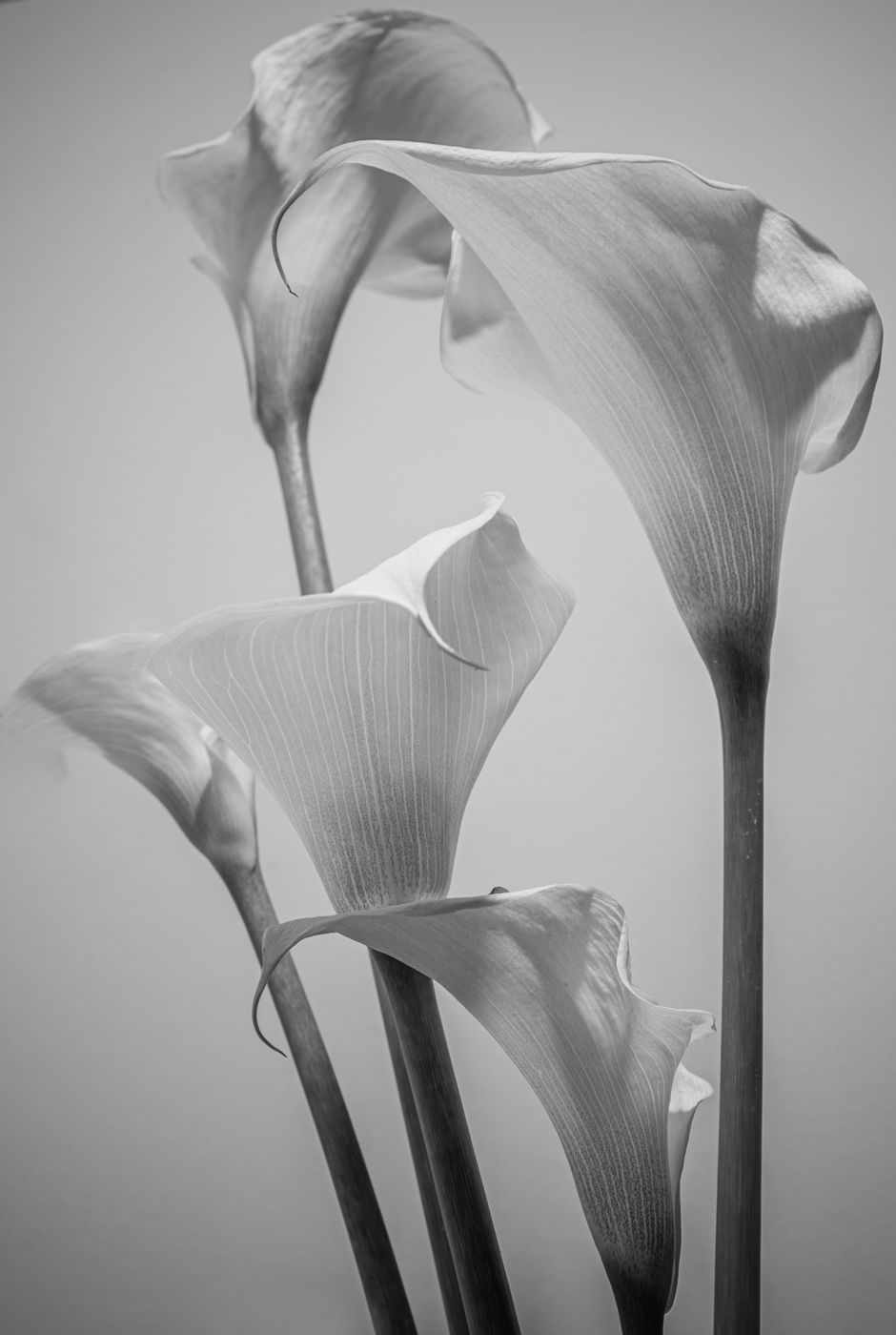
Cindy, a lovely image. I like the textures and the side light that stand out in the BW version, but the colour palette in the original is also very rich and appealing. You have a knack for setting up and capturing these "period" still life images. However, I find the arrangement in this one makes for an composition that feels a bit square or static. I might try several different set-ups to see if it's possible to achieve more of a sense of movement to the piece. |
Feb 15th |
| 50 |
Feb 23 |
Comment |
Karl, I really like this image in monochrome, but also think the soft tones of the colour version support the feeling of the image, perhaps even (dare I say it?) the story. To me, the expression on the woman's face says it all - she is ecstatic feeling the cool breeze on her face from the little girl's fan. Personally, I would not crop off the little one's legs and feet or the hem of her dress. I love the texture of their hair and clothing that you appear to have brought out in the BW. I don't find the background particularly distracting - it provides context and I don't think it overshadows the main subjects. |
Feb 15th |
| 50 |
Feb 23 |
Comment |
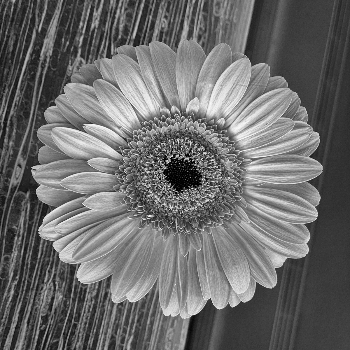
Mary Ann, I have to also agree with others - I would like to see more detail in the darks (the feeder) and more of the hummingbird. Since this little hummer is probably quite colourful, as they tend to be, it might be interesting to process this (or the other one you are working on) as a selective colour image - everything in BW but bring back the colour in the hummingbird. (Probably wouldn't qualify for this monochrome group, but...). |
Feb 15th |
| 50 |
Feb 23 |
Comment |
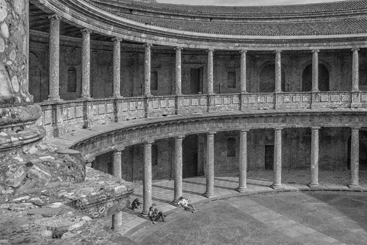
James, a beautifully sharp, well-exposed, well-composed capture (as others have said). Here is an image that works very well in monochrome allowing us to focus on its lines and patterns without getting distracted by colour. A perfect shooting angle, with the dancers' arms and clothing forming such effective leading lines into the (slightly off) centre of the frame. The chairs don't bother me - they are much darker than the main subjects and frame the dancers on either side. Well done! |
Feb 15th |
| 50 |
Feb 23 |
Comment |
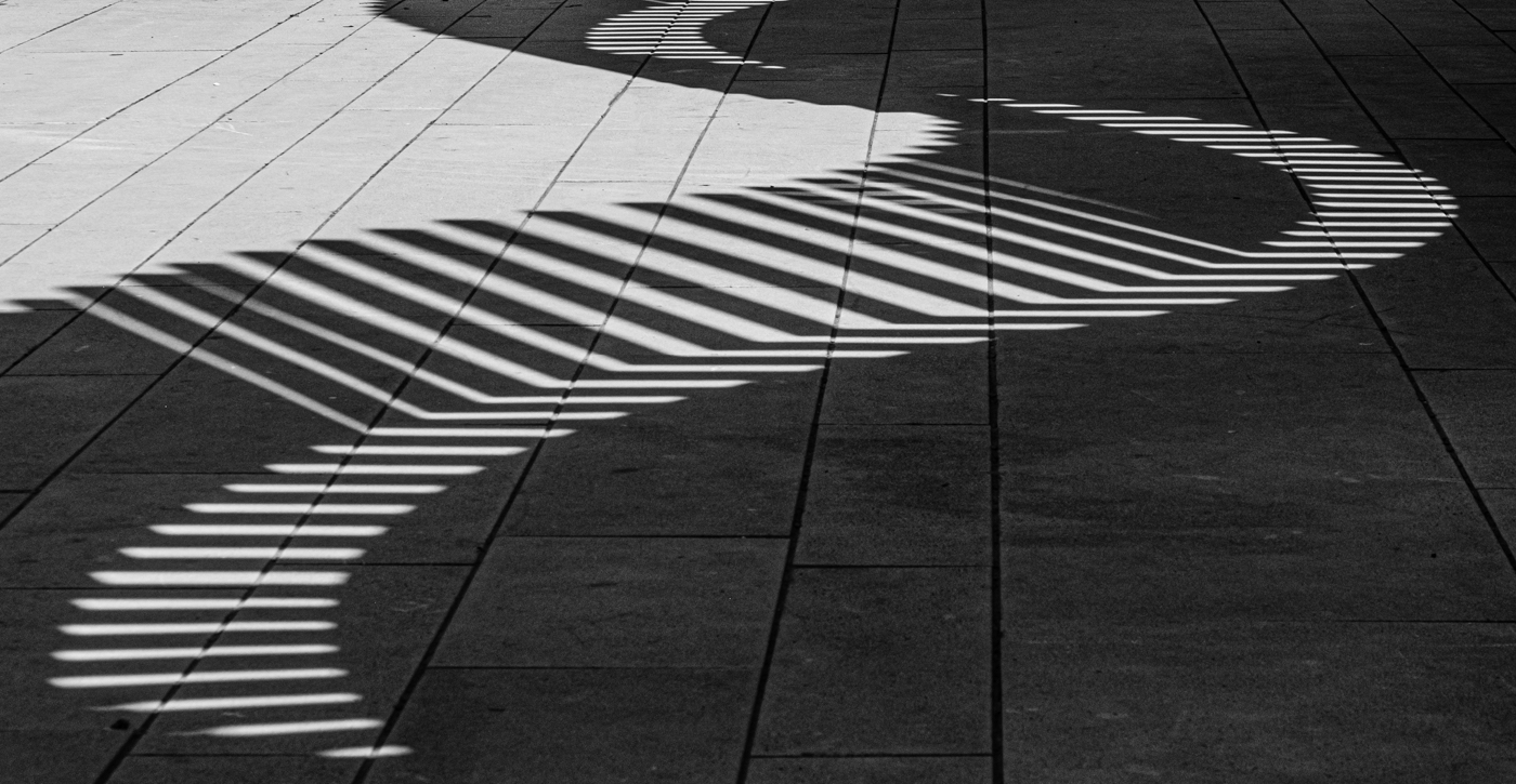
Paul. Yes, an abstract with, as James said, some interesting angles and sharp lines. I actually like the soft focus in the BW but find that the colour version catches my eye and guides it around the frame more effectively. |
Feb 15th |
| 50 |
Feb 23 |
Comment |
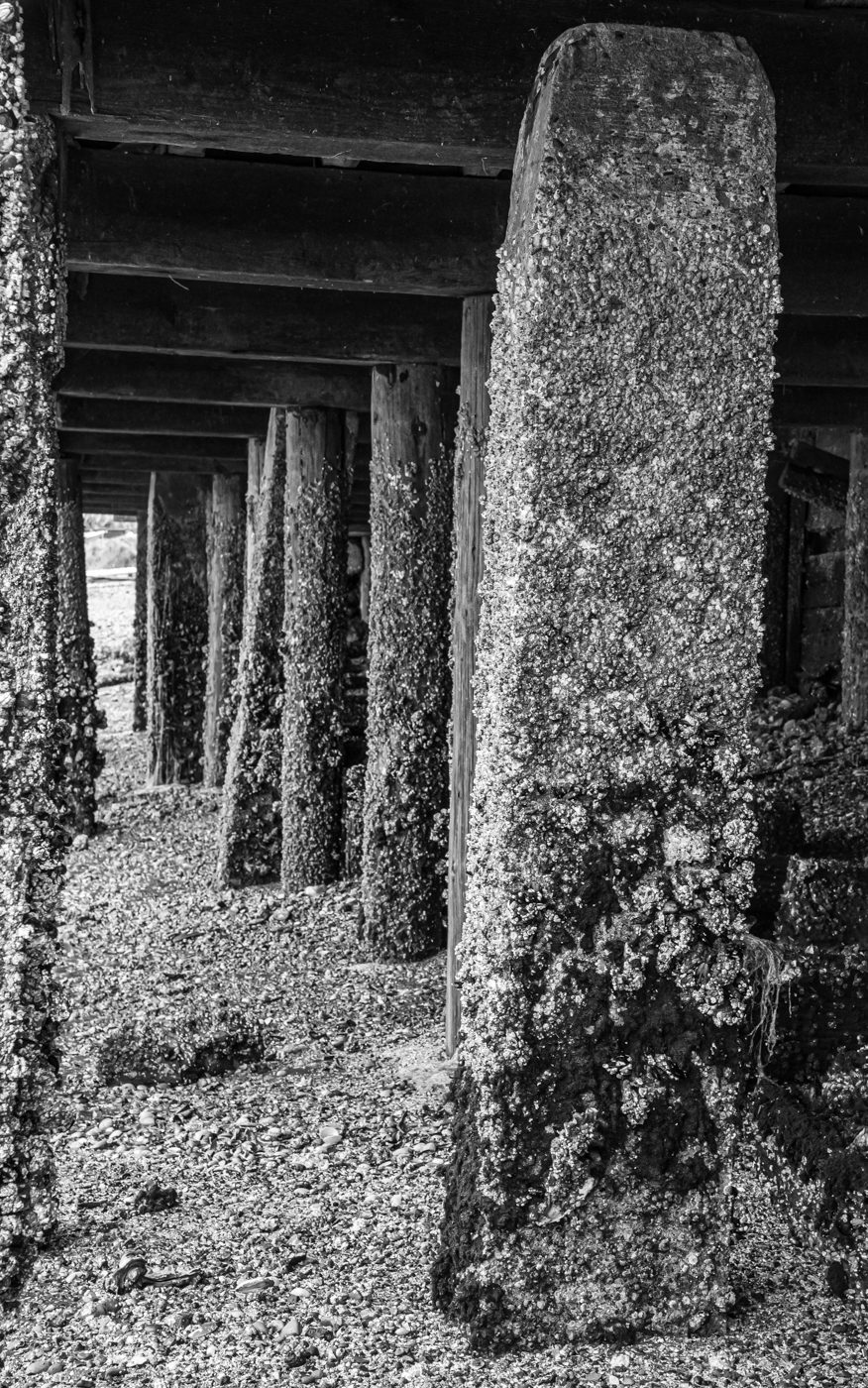
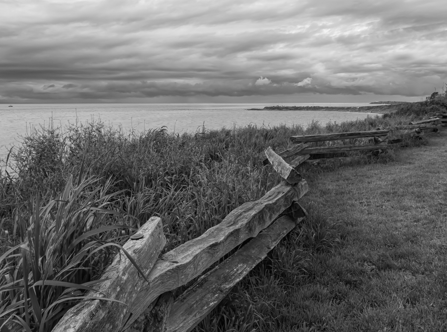
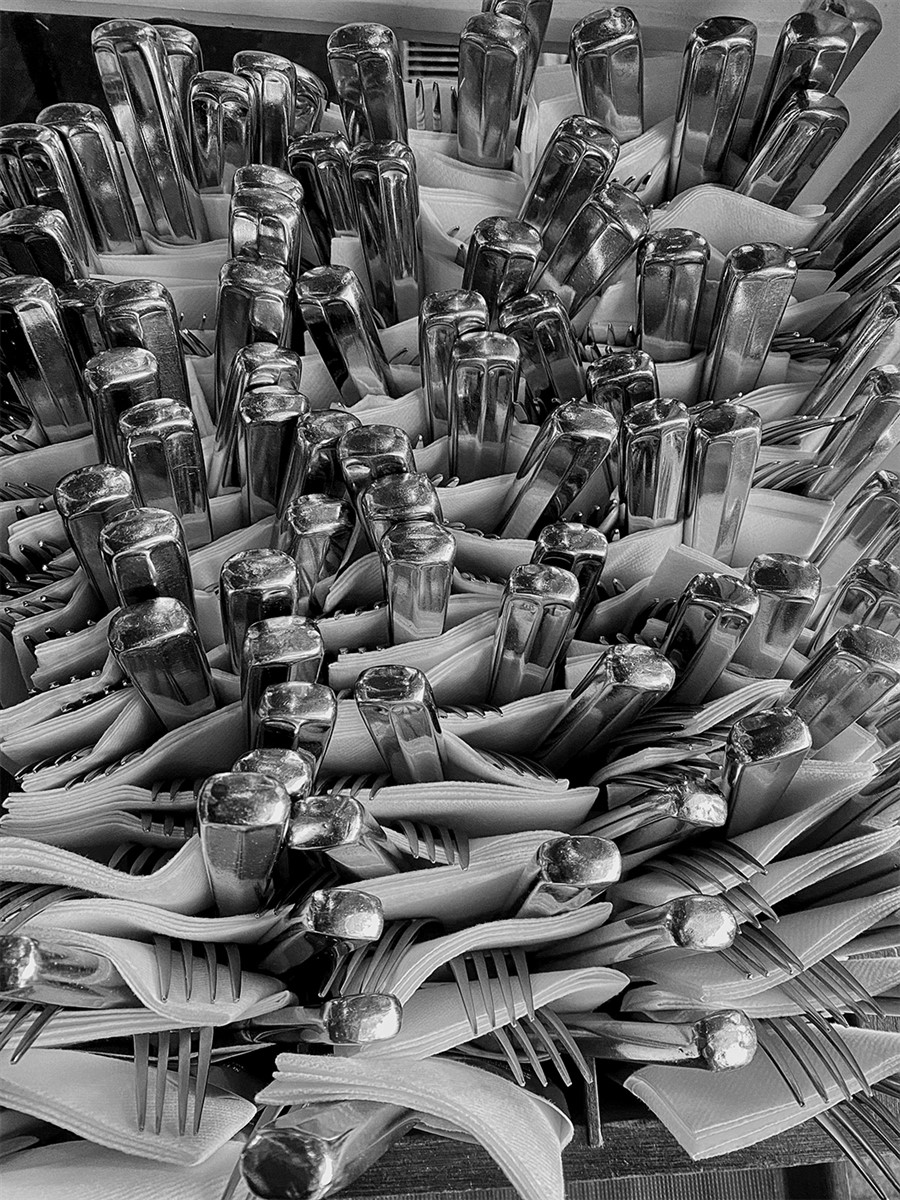
Thanks, Everyone. Yes, I appreciate and totally agree with the heightened contrast/darkening the wood suggestions. Not the most earth-shattering image to be sure, but thought I would try it out. |
Feb 15th |
7 comments - 0 replies for Group 50
|
7 comments - 0 replies Total
|