|
| Group |
Round |
C/R |
Comment |
Date |
Image |
| 50 |
Jun 22 |
Reply |
Wow, thanks, Cindy! |
Jun 17th |
| 50 |
Jun 22 |
Comment |
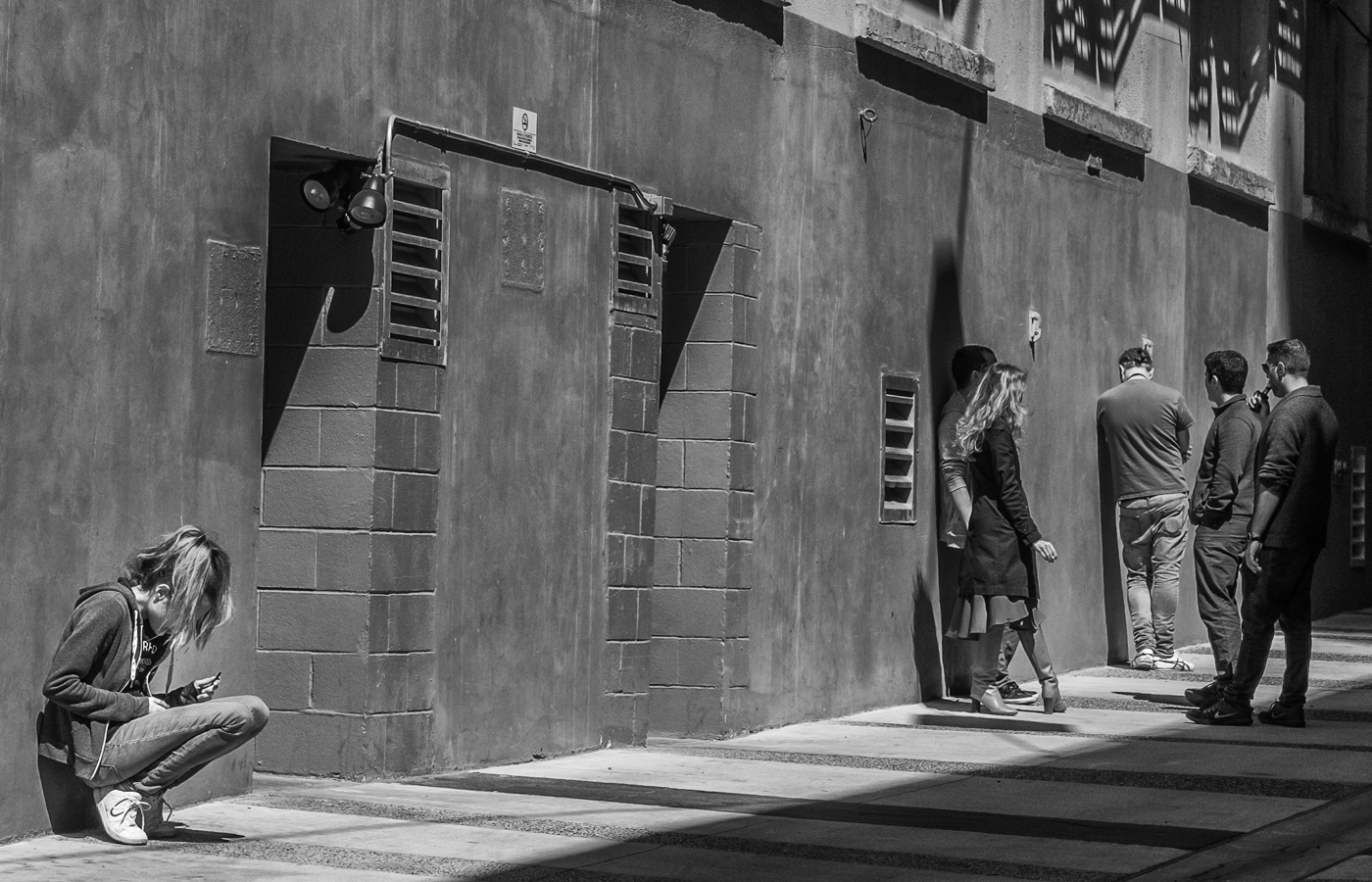
Chuck, I think the colour version of this image actually works better with the subject matter (just my opinion). The bright orange lends a quirkiness and a humorous touch to the image, and allows the minion to stand out more. That being said, though, the monochrome better highlights the textures and shapes and I like Mary Ann's slightly darker, higher contrast edit. A fun shot! |
Jun 15th |
| 50 |
Jun 22 |
Comment |
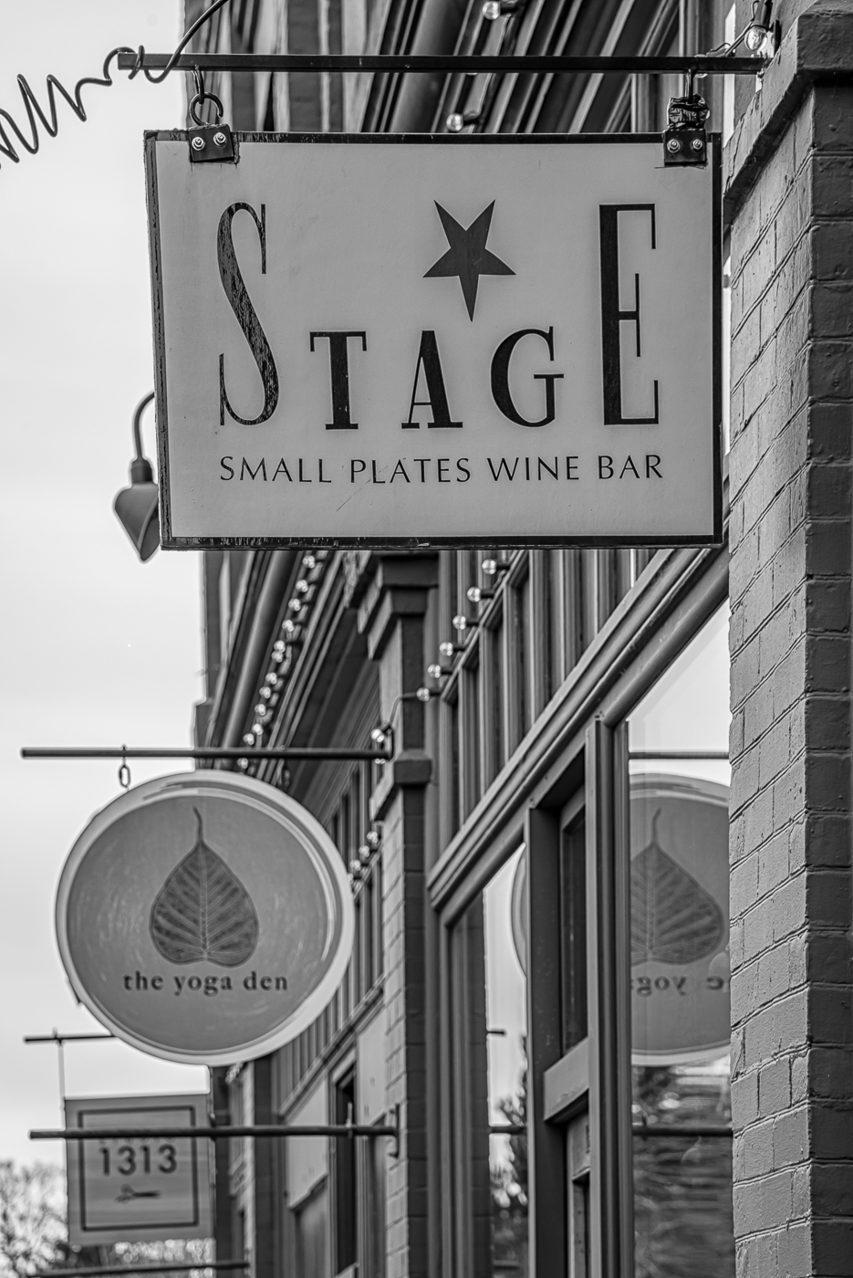
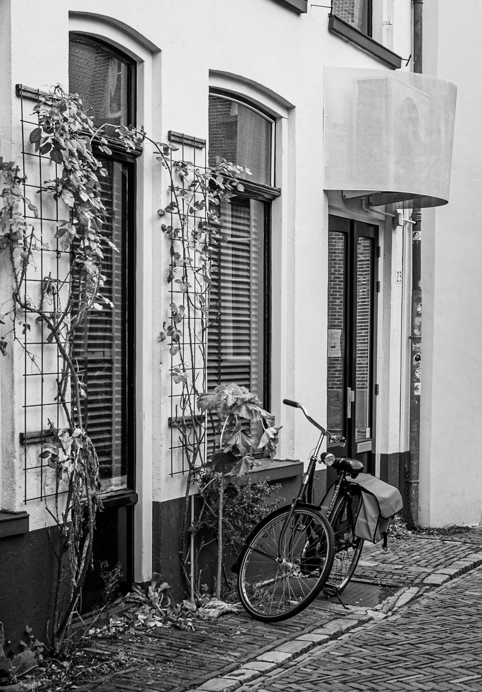
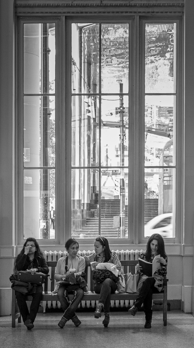
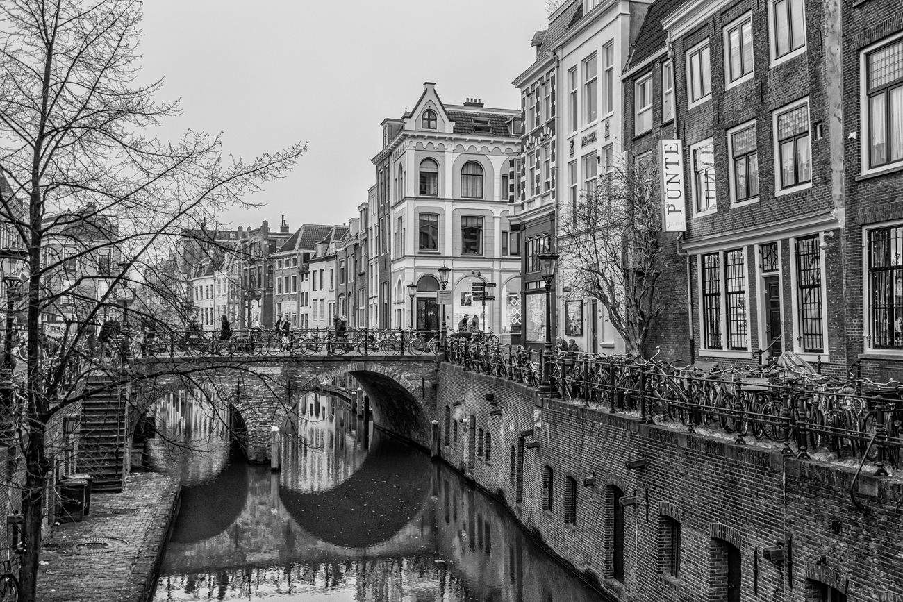
Yes, don't some images just seem to work better in monochrome. This is a scene that many people would pass by - well seen, Cindy. I like the strong lines, the tonal variation, the shine on the floor in the foreground, and some intriguing details...I thought that was a blackboard with something written on it in the background, but maybe not, and the rather forlorn looking American flag at the doorway. |
Jun 15th |
| 50 |
Jun 22 |
Comment |
Yes, don't some images just seem to work better in monochrome. This is a scene that many people would pass by. I like the strong lines, the tonal variation, the shine on the floor in the foreground, and some intriguing details...I thought that was a blackboard with something written on it in the background, but maybe not, and the rather forlorn looking American flag at the doorway. Well seen, Cindy. |
Jun 15th |
| 50 |
Jun 22 |
Comment |
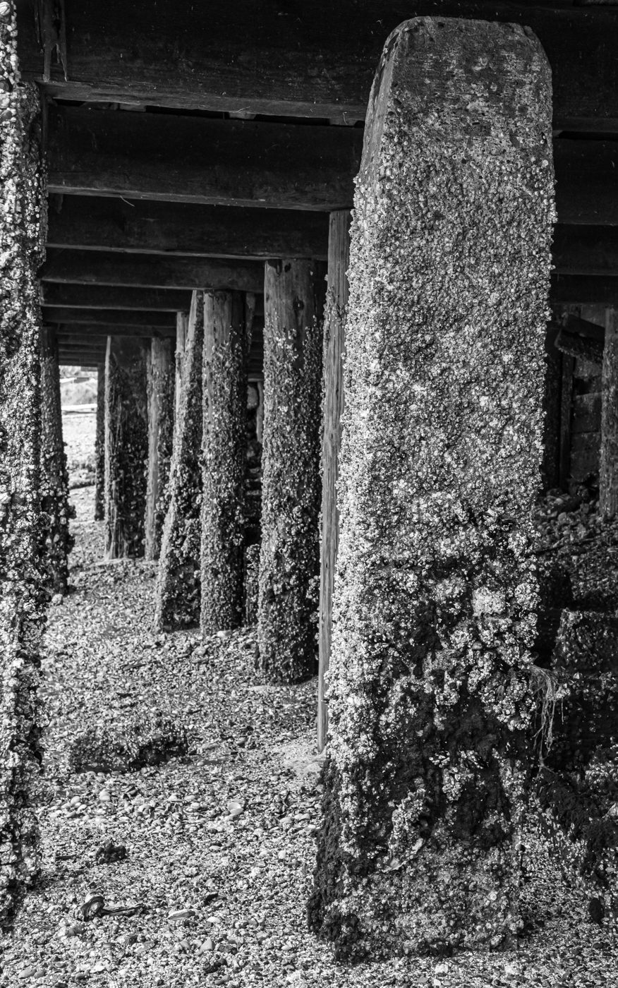
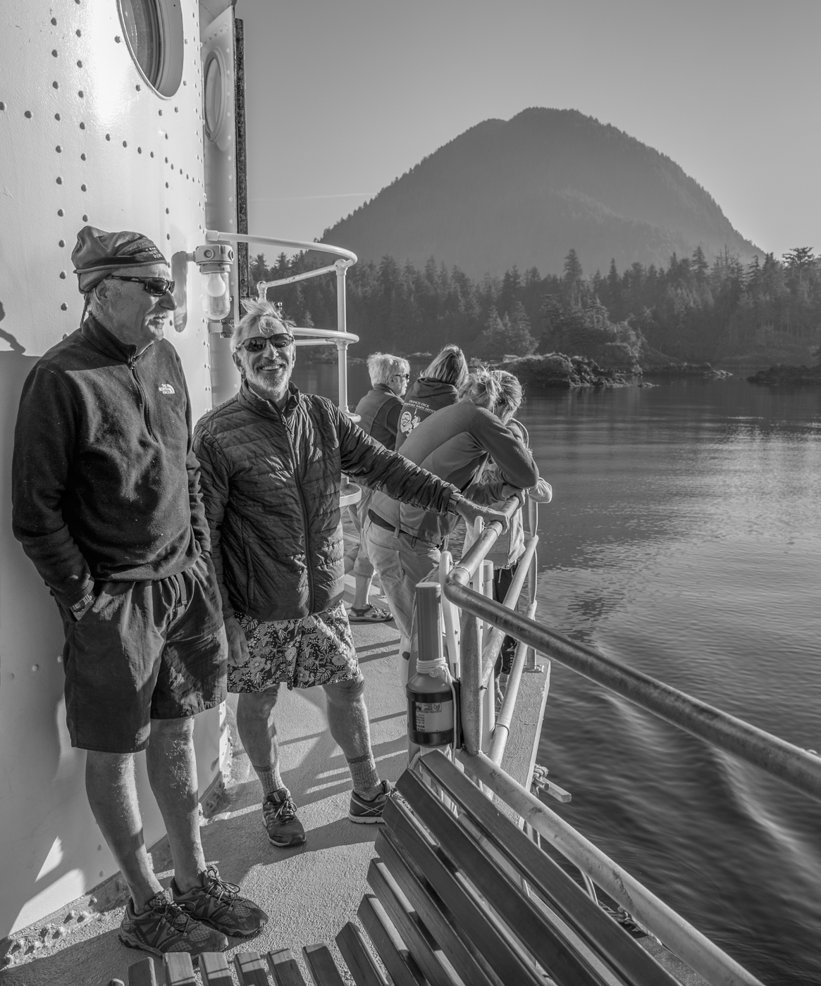
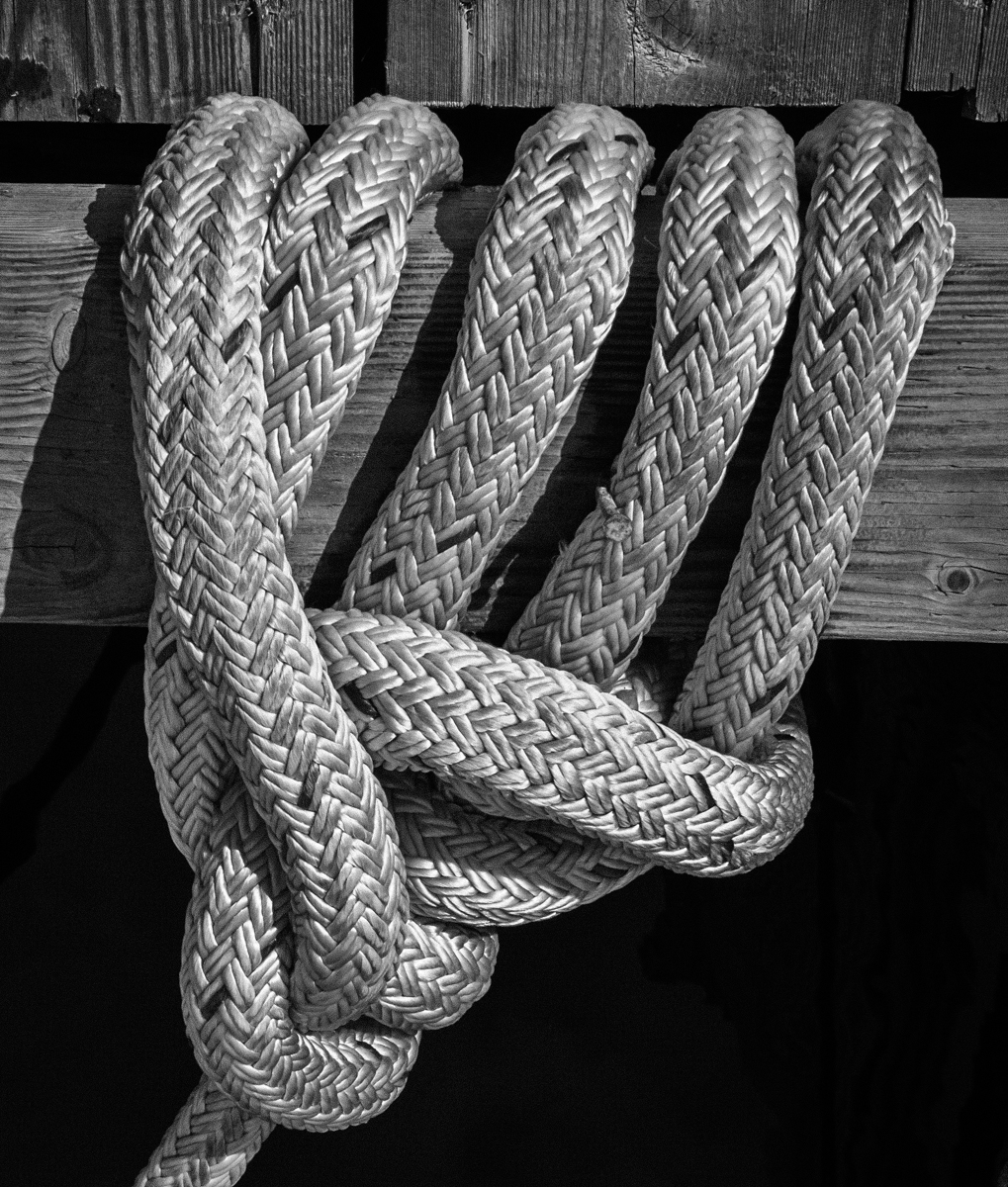
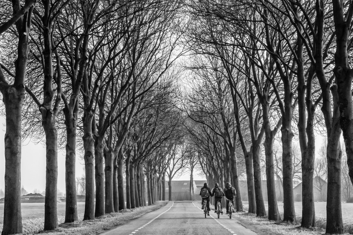
Karl, I don't mind that the two birds on each end are sleeping - in my mind, there is a story there. Looks like you have captured some nice detail in the feathers and in the shallow area where they are standing. I also like the reflections but, to me, the waves in the water are a bit of a distraction (and, of course, slow shutter speed to soften the water would not work with the birds). I might try a panorama crop, taking off some of the bottom and the top of the image. |
Jun 15th |
| 50 |
Jun 22 |
Comment |
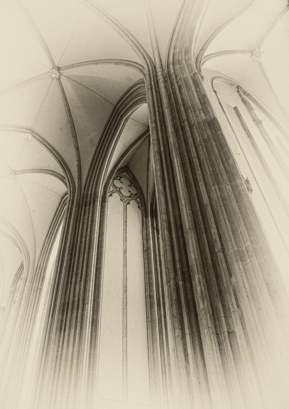
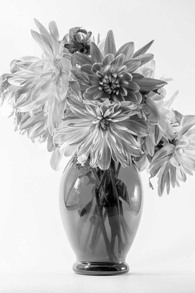
Mary Ann, Although I do like the soft tones in the colour version, I agree that your BW conversion really works to highlight the lines, shapes and textures in the image. All that carving is amazing - I think it would be interesting to see a straight-on, closer-up version of this scene, to allow us to peruse the "messages". Just a thought. |
Jun 15th |
| 50 |
Jun 22 |
Comment |
Paul, the detail on the plane looks sharp...more so, I think in Mary Ann's darker higher contrast version. Nice capture of the sunlight highlighting the edge of the wings and the tail. However, aside from the obvious movement of the propeller (phew!), the image seems a bit static (not sure what to suggest about that).
|
Jun 15th |
| 50 |
Jun 22 |
Reply |
Yes, me too. Thanks, Chuck.
|
Jun 15th |
| 50 |
Jun 22 |
Reply |
Thanks, Mary Ann. |
Jun 15th |
6 comments - 3 replies for Group 50
|
6 comments - 3 replies Total
|