|
| Group |
Round |
C/R |
Comment |
Date |
Image |
| 50 |
Feb 22 |
Reply |
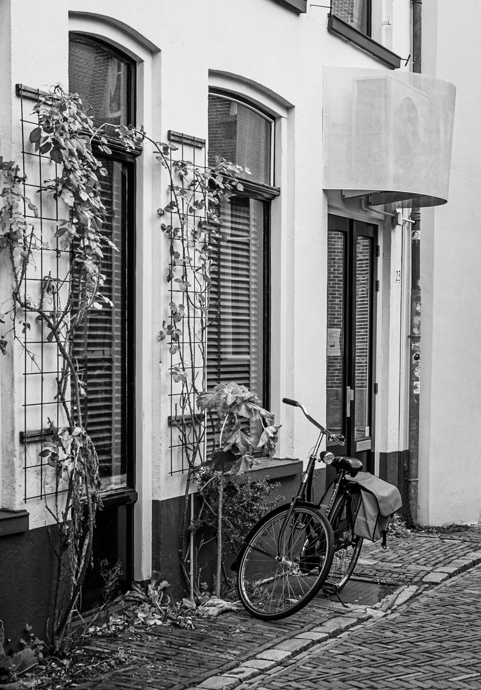
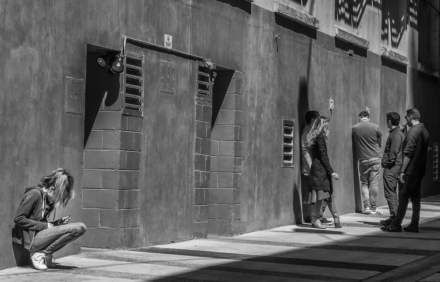
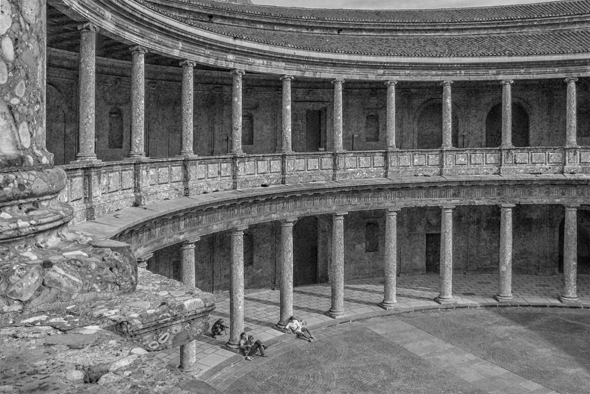
Tom, I believe those doors were the entryways to storehouses. Most of these buildings would have housed family businesses and goods were delivered via the waterways. |
Feb 24th |
| 50 |
Feb 22 |
Reply |
Tom, I believe those doors were the entryways to storehouses. Most of these buildings would have housed family businesses and goods were delivered via the waterways. |
Feb 24th |
| 50 |
Feb 22 |
Comment |
Chuck, I like the rich blues in your colour version but the monochrome is interesting as well. And wow - what magic can be achieved with various post-processing tools! Your edited version is spot on - I'd say the darken sky balances out the water and ice in the foreground just perfectly! |
Feb 16th |
| 50 |
Feb 22 |
Comment |
Karl, I really like both these versions for different reasons. In the colour, the strong red, white and blue hues, the positioning and the movement of the skaters give energy to the image and convey a feeling of excitement - we can almost here the roar of the crowd. The monochrome, to my mind, emphasizes form and movement, the softer focus giving the image an almost fine art feel. |
Feb 15th |
| 50 |
Feb 22 |
Comment |
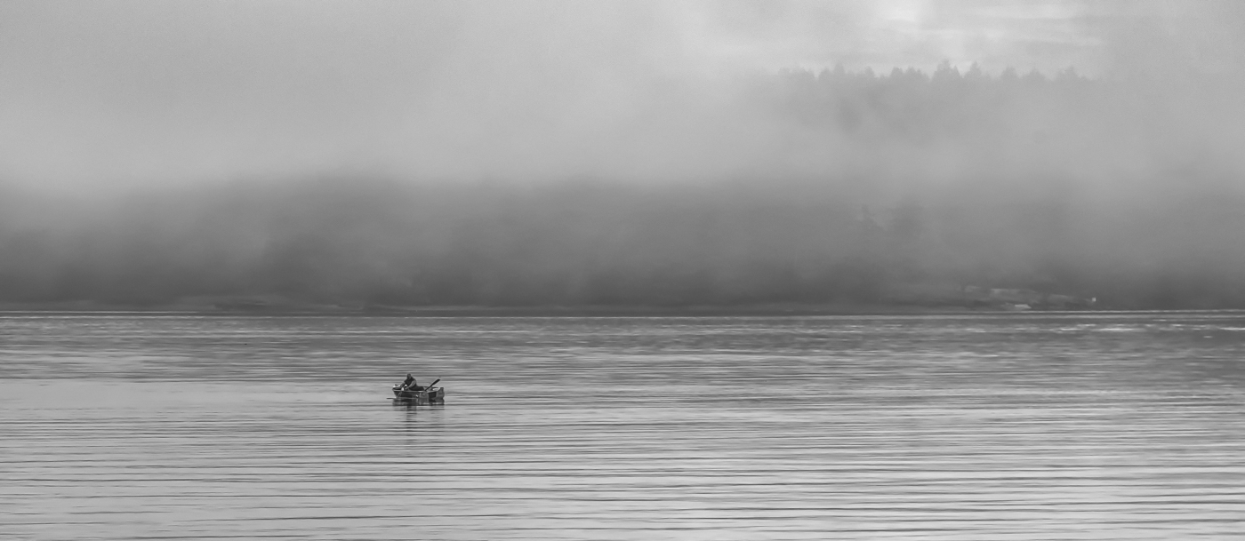
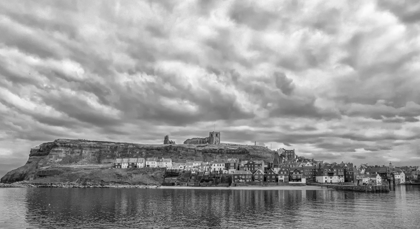
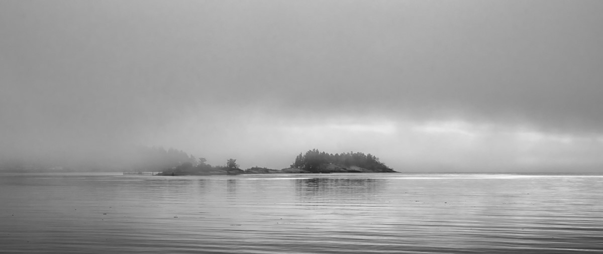
I love the monochrome version you have created from this shot, Mary Ann. Such strong moody texture in the clouds and the water and the panorama crop is perfect. Beautiful image. |
Feb 15th |
| 50 |
Feb 22 |
Comment |
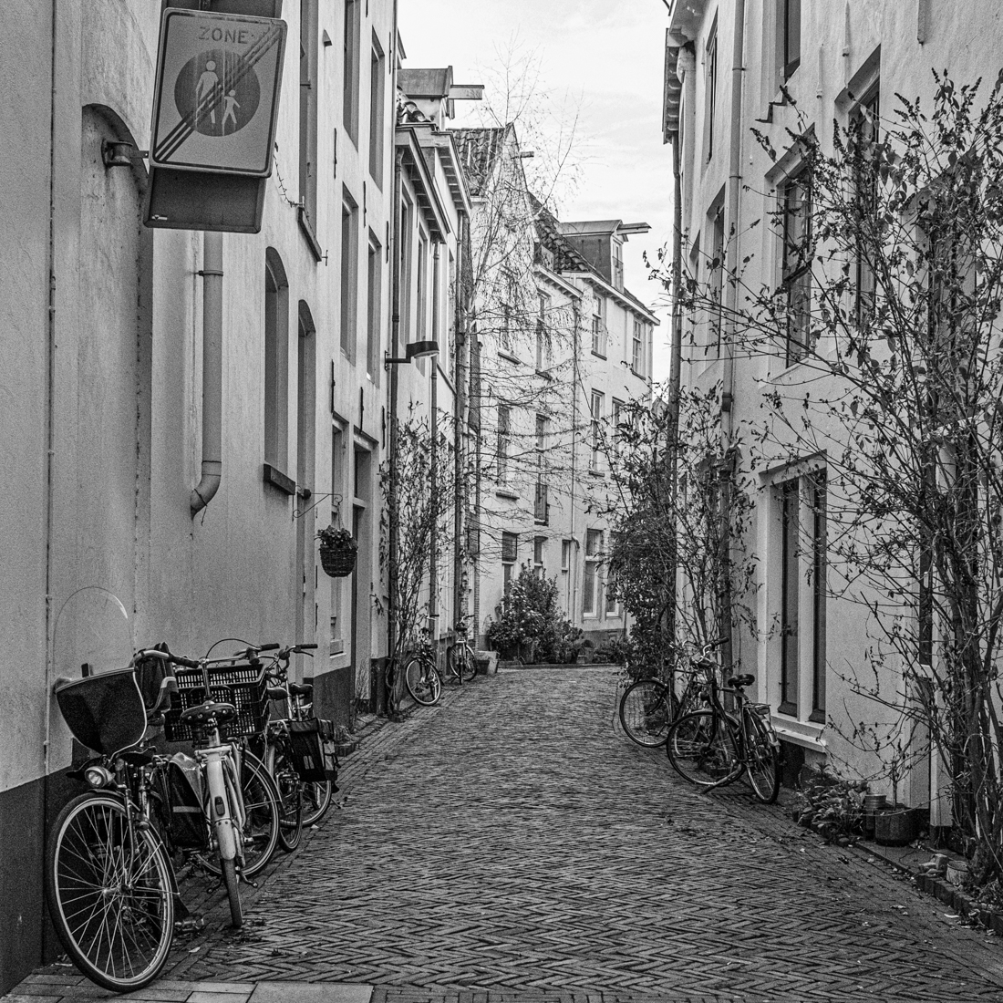
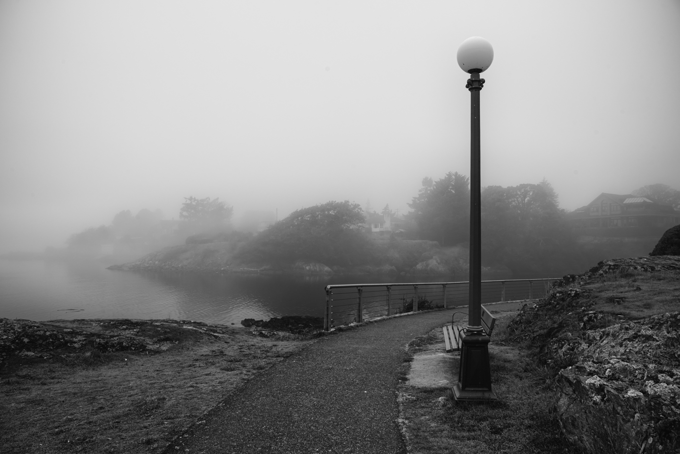
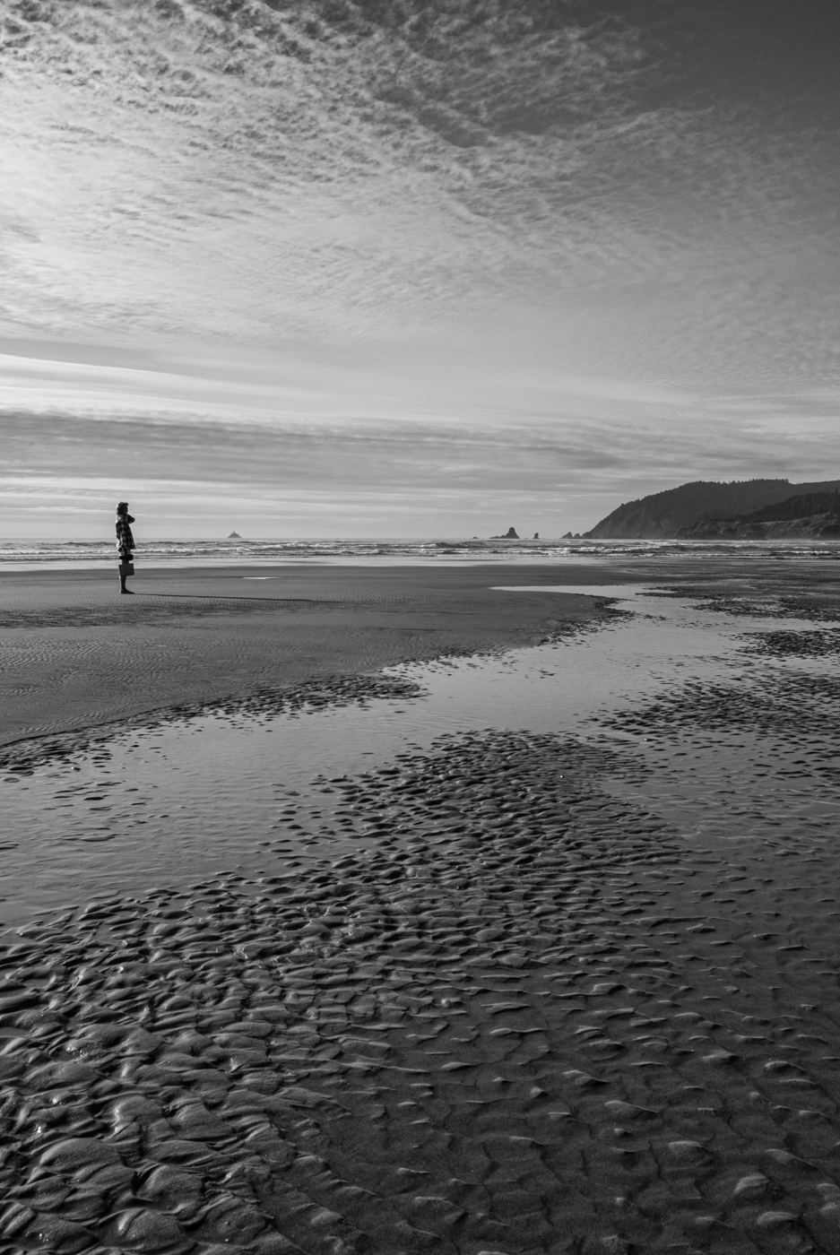
Paul, I tend to agree with you and Cindy about preferring the colour version. The soft blue of the sky and water and the dark green of the rocks lend a sense of serenity to the scene and the colours tend to draw attention away from the people (interesting how they become more prominent and distracting in the BW). The monochrome version could almost be two separate images - the misty horizontal breakwater with the beacon as the point of interest would make a lovely image in its own right. The vertical portion framing the family outing is almost a street shot. |
Feb 15th |
| 50 |
Feb 22 |
Comment |
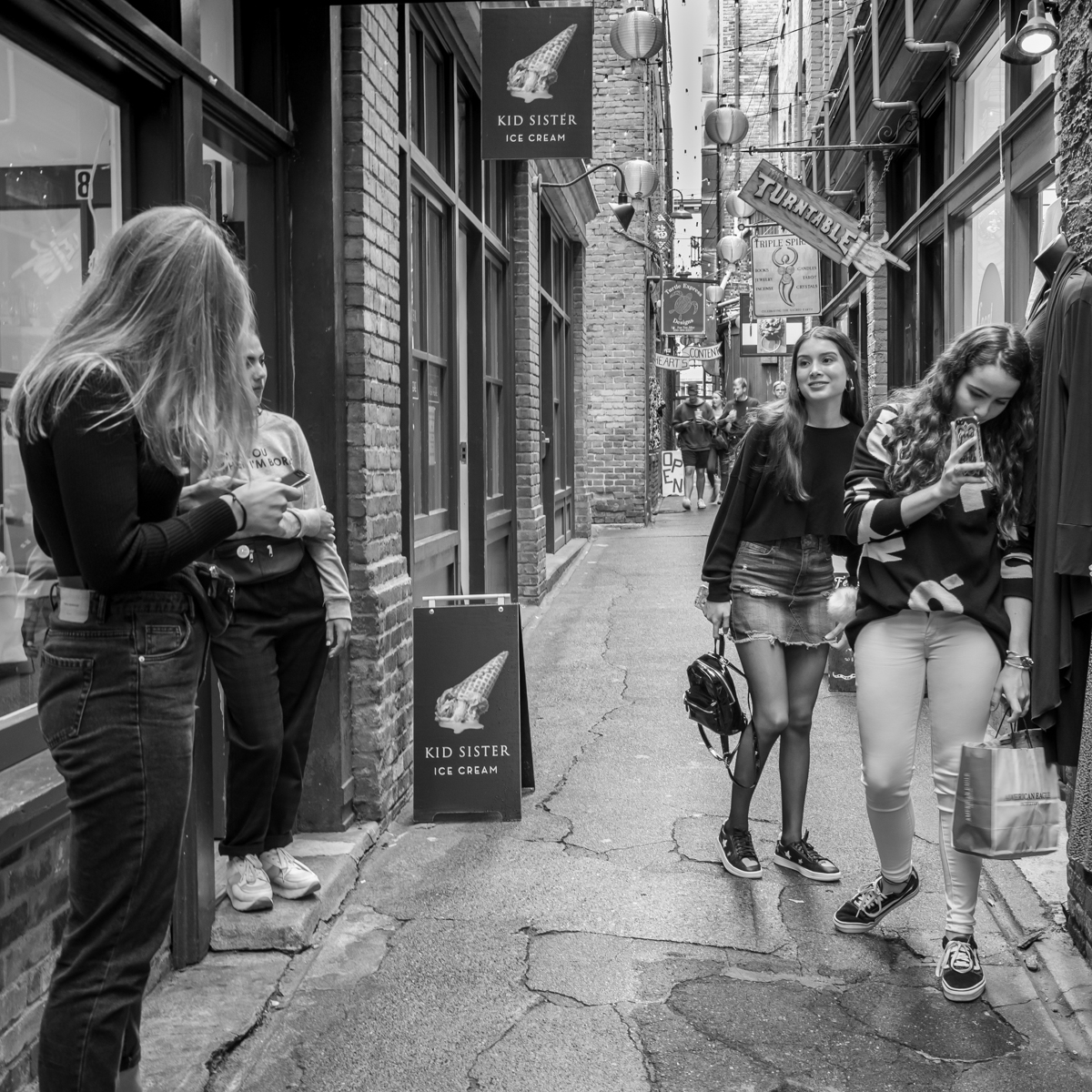
Cindy, such an interesting capture - so much texture and detail to draw us into and around the frame. I like that you have included the riveted opening to frame the plane interior. The light area in the centre draws the eye in, however mine tends to stay there - I think a very slightly darker centre would more easily allow my eye to explore the peripheral areas. The very intriguing view through the window(?) on the left adds interest. |
Feb 15th |
| 50 |
Feb 22 |
Reply |
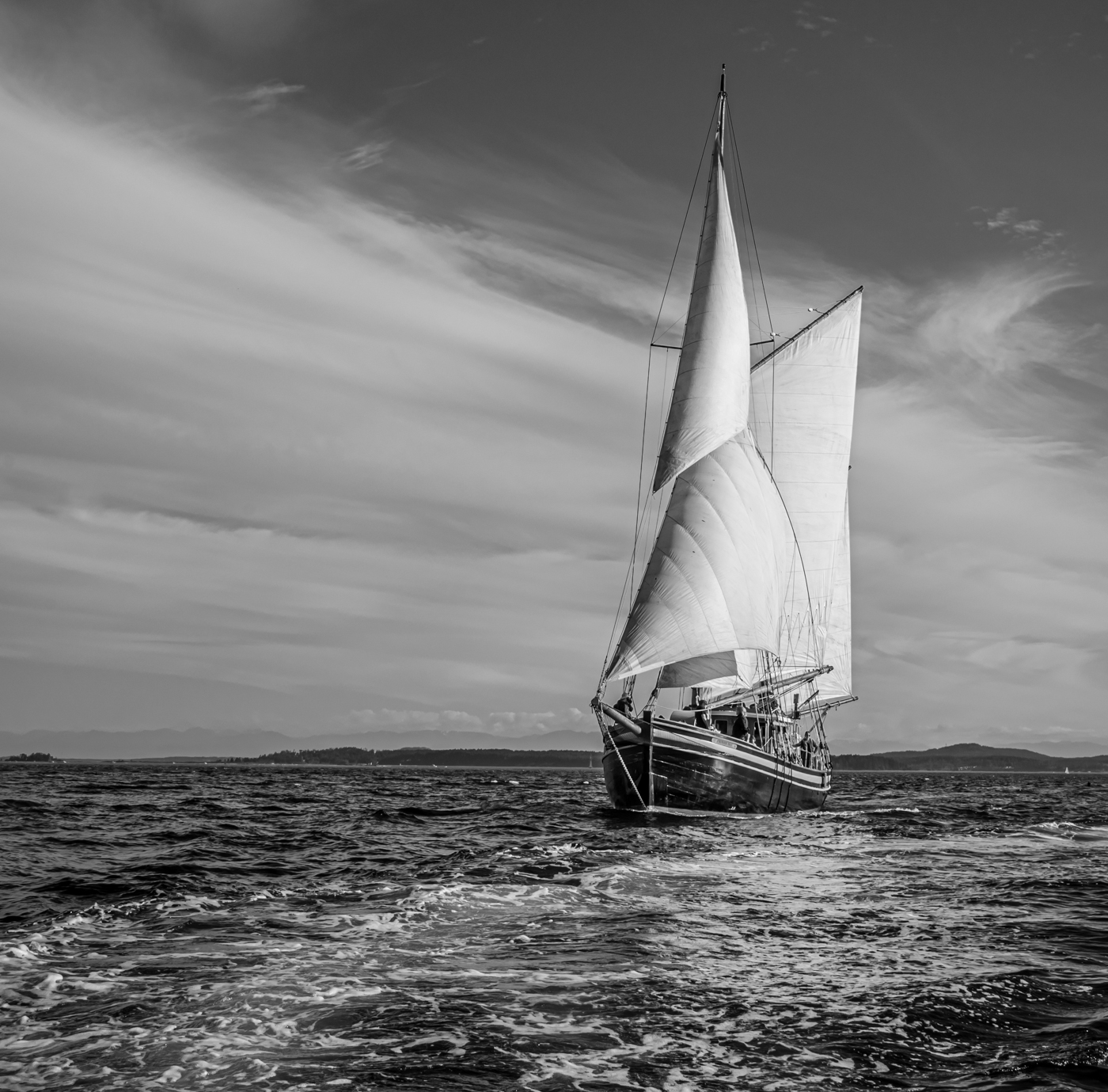
Thanks, Tom. I did darken the sky slightly in the monochrome version but could have done more, I agree. I would have liked more detail in the sky to begin with but, alas... |
Feb 15th |
| 50 |
Feb 22 |
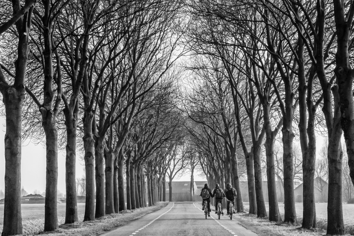
Reply |
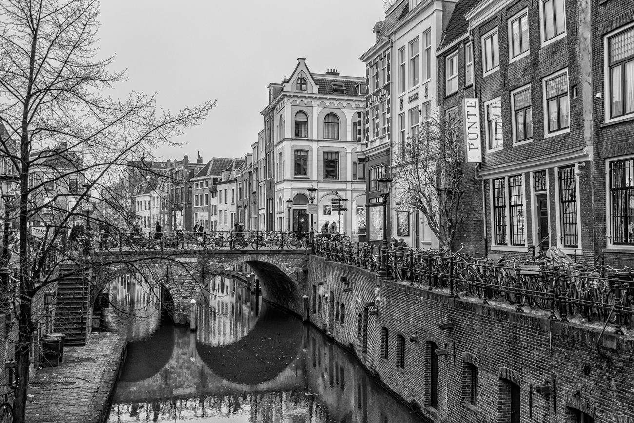
I really like the sky replacement - makes it look like a sunny day (somewhat rare in February in Holland) but compelling. Thanks! |
Feb 15th |
5 comments - 4 replies for Group 50
|
5 comments - 4 replies Total
|