|
| Group |
Round |
C/R |
Comment |
Date |
Image |
| 50 |
Nov 21 |
Reply |
Thanks, Kerry. Interesting suggestion - I see what you mean. In the past I have been criticized by competition judges for cropping too tightly. Consequently, I find myself giving my subjucts more room lately. |
Nov 20th |
| 50 |
Nov 21 |
Reply |
Thanks, Mary Ann. |
Nov 13th |
| 50 |
Nov 21 |
Reply |
Wow, thanks, Chuck! |
Nov 13th |
| 50 |
Nov 21 |
Comment |
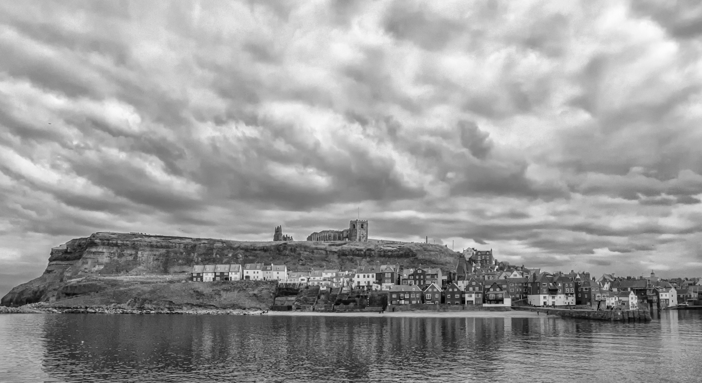
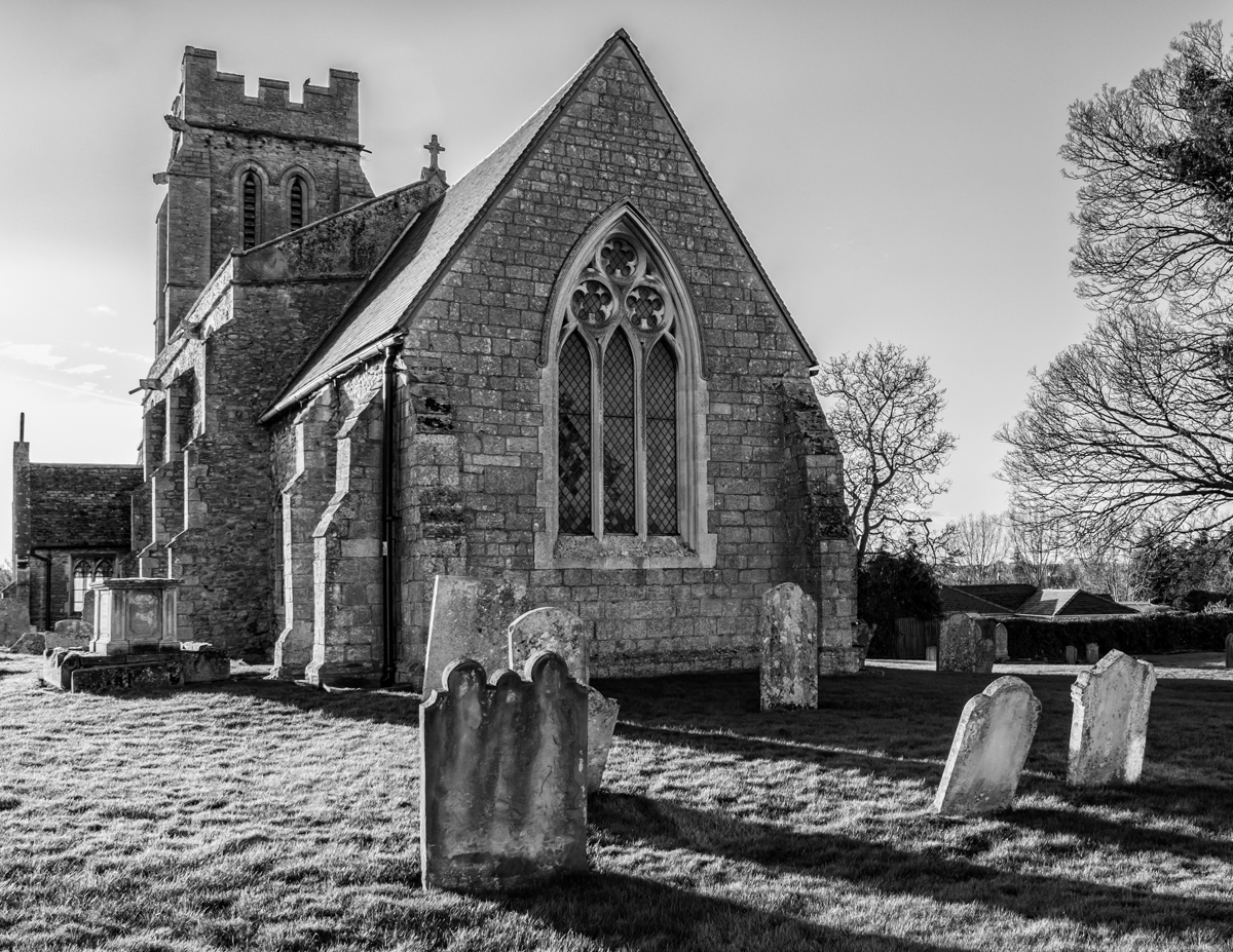
Chuck, I love your monochrome conversion of this image! The soft blurriness, the contrast, the darkened sky (merging the clouds and treetops into a strong backdrop). And in the foreground, dark imposing shadows leading our eyes to that spooky orb surrounded by gravestones for miles into the distance. You have achieved so much atmosphere in the BW - great image! |
Nov 13th |
| 50 |
Nov 21 |
Comment |
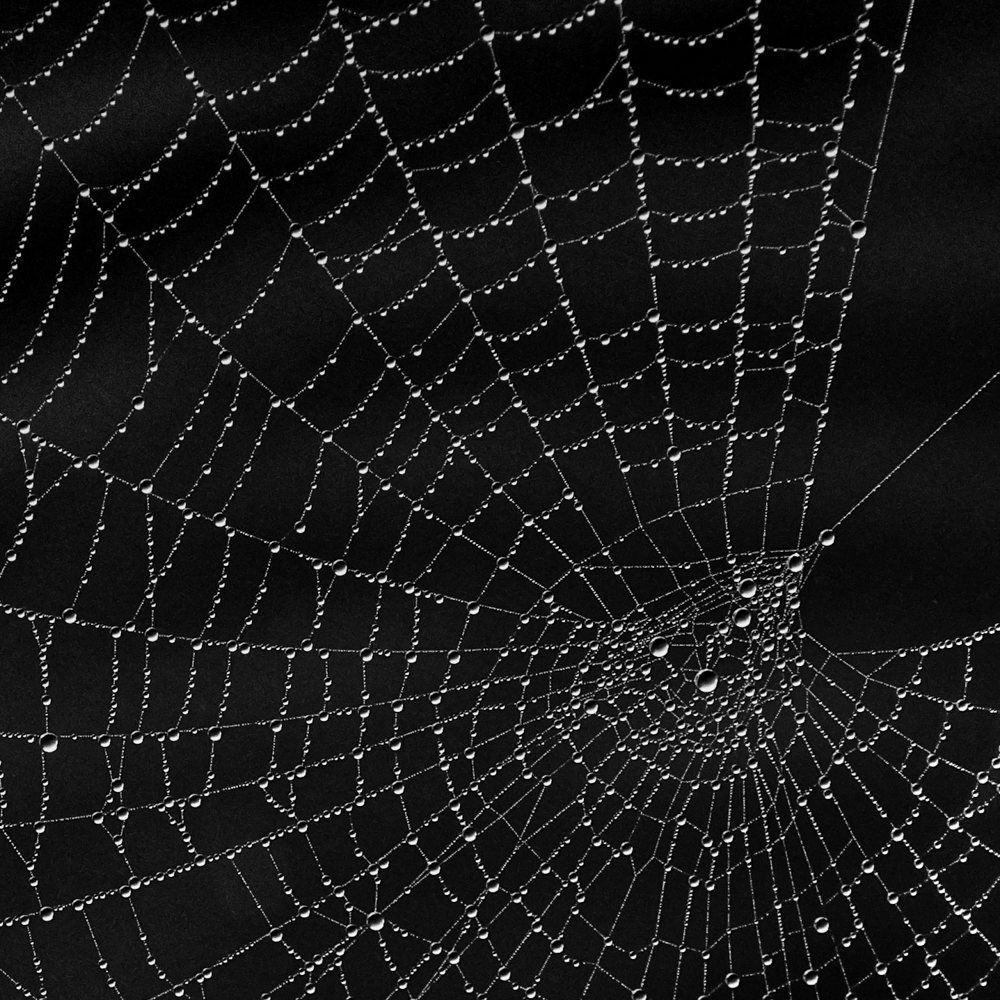
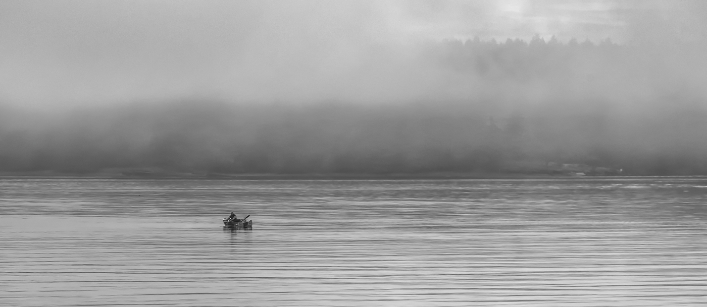
Cindy, I love what you have done with this BW conversion - the detail, the texture, the leading lines, all that there is to take in as we move around the frame. And that perfect sky you have captured! Easy to imagine the smells, the breeze, the sun on our faces - Thanks! |
Nov 13th |
| 50 |
Nov 21 |
Comment |
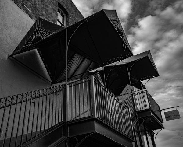
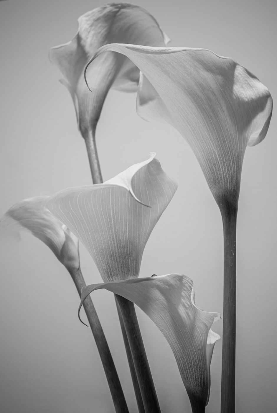
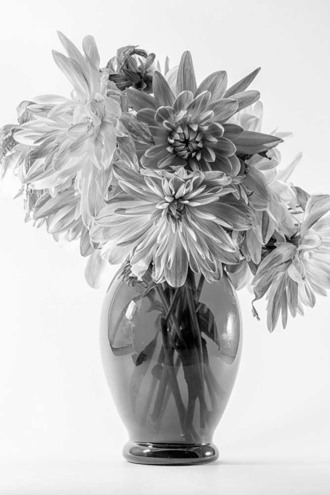
Mary Ann, this is a lovely image and I really like your BW version as well as the post processing you have done. I like Chuck's idea of cropping some off both sides, although I might not take off quite as much on the left. I think the vignette Chuck suggests works well to bring our focus onto this beautiful animal, but perhaps a little lighter in the upper corners? |
Nov 13th |
| 50 |
Nov 21 |
Comment |
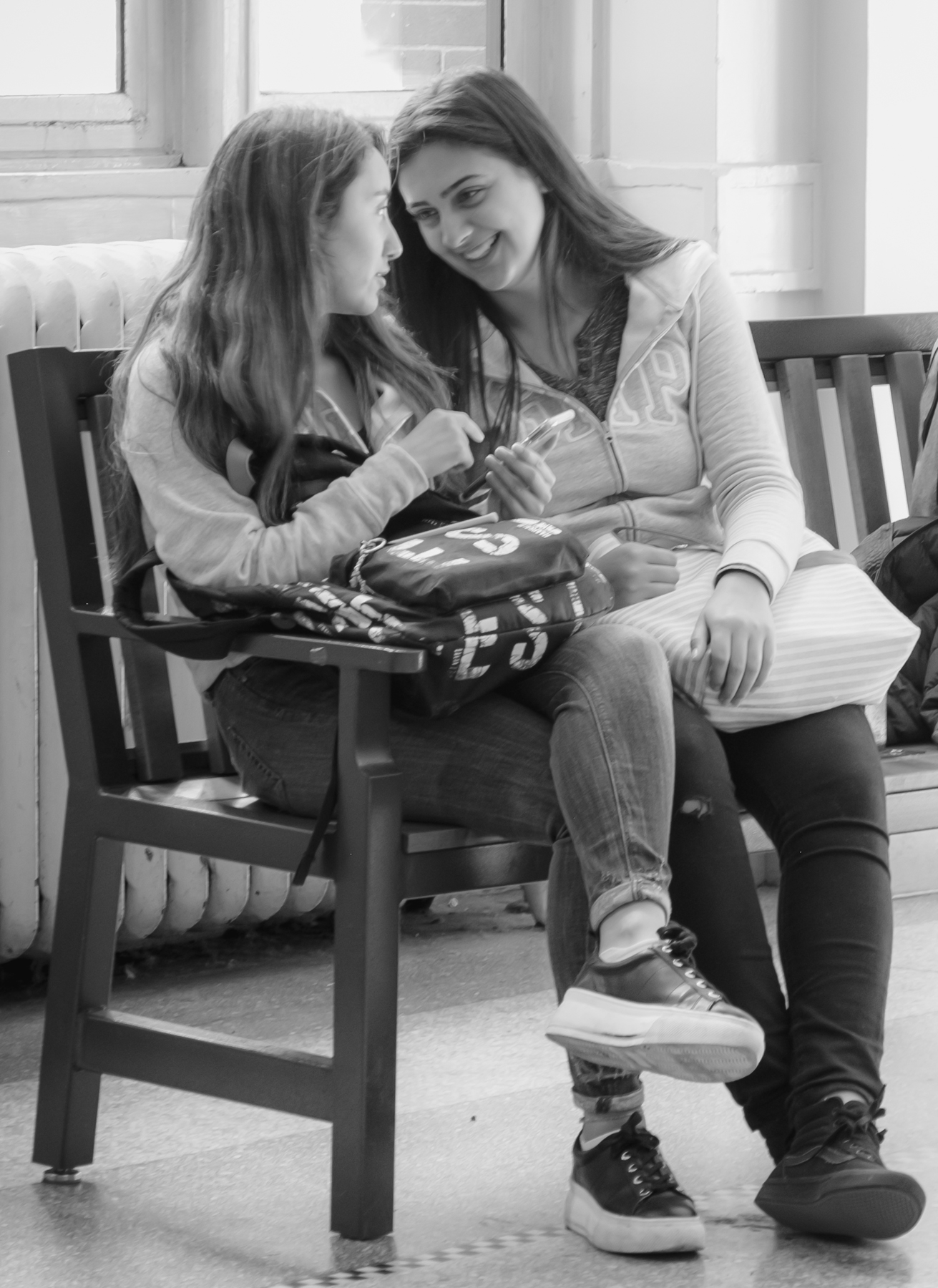
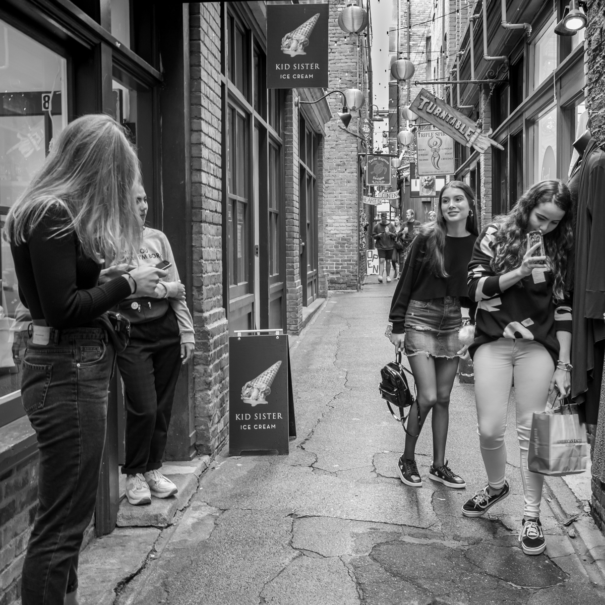
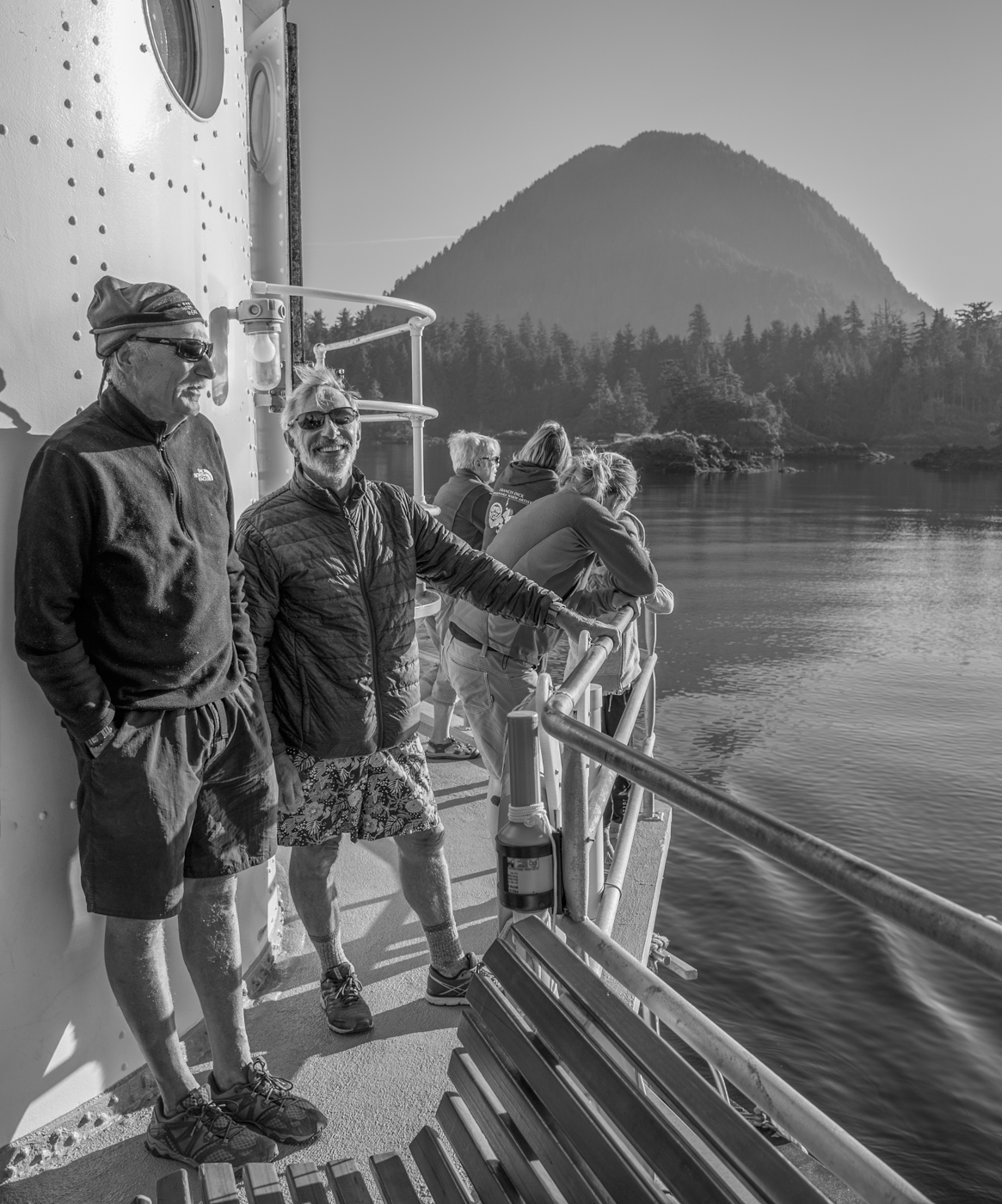
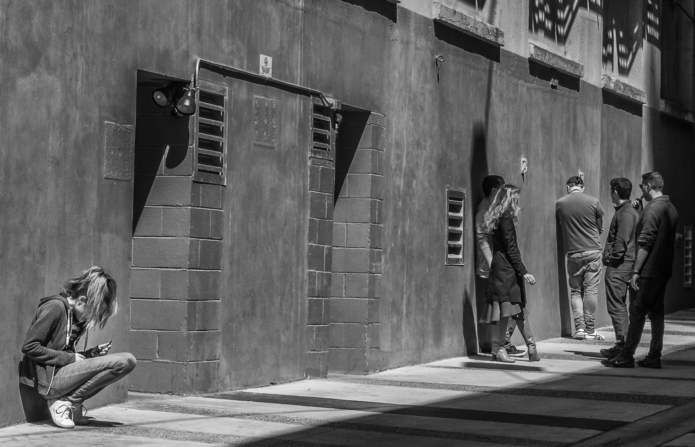
Kerry, one thing about having to wear masks is that the subjects' eyes really stand out. You are right that the eyes of these two young women give us insight into their emotions and characters. Unlike Mary Ann, I am not a fan of the bluish hue particularly in portraits - I would tone it down a little (in Lightroom HSL?), but that's just me. I find the bright areas in the background draw my attention away from the women. Monochrome is a great choice here. |
Nov 13th |
| 50 |
Nov 21 |
Comment |
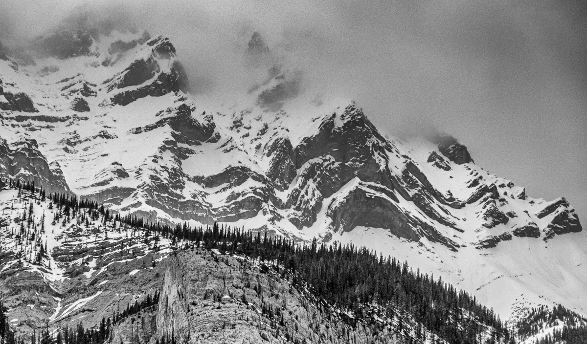
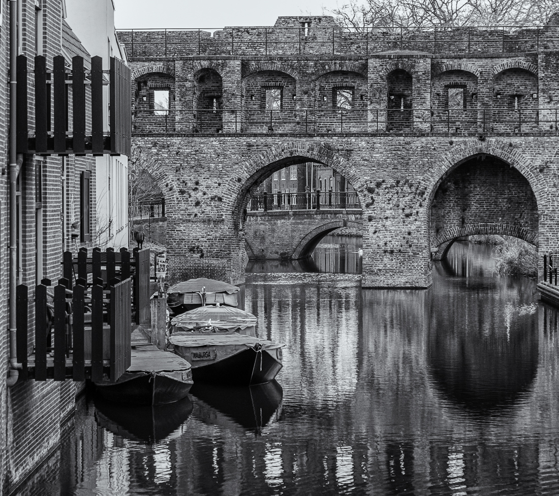
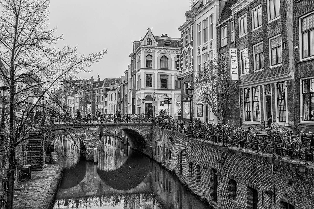
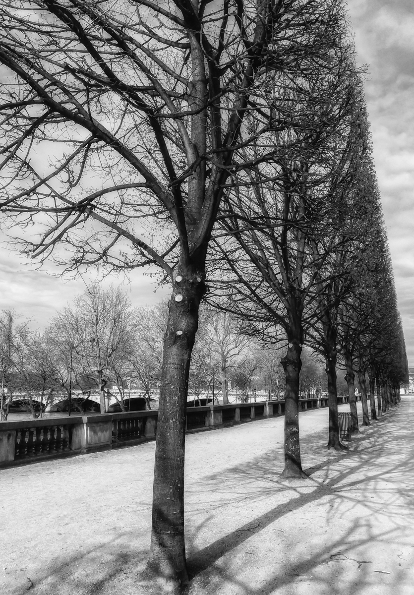
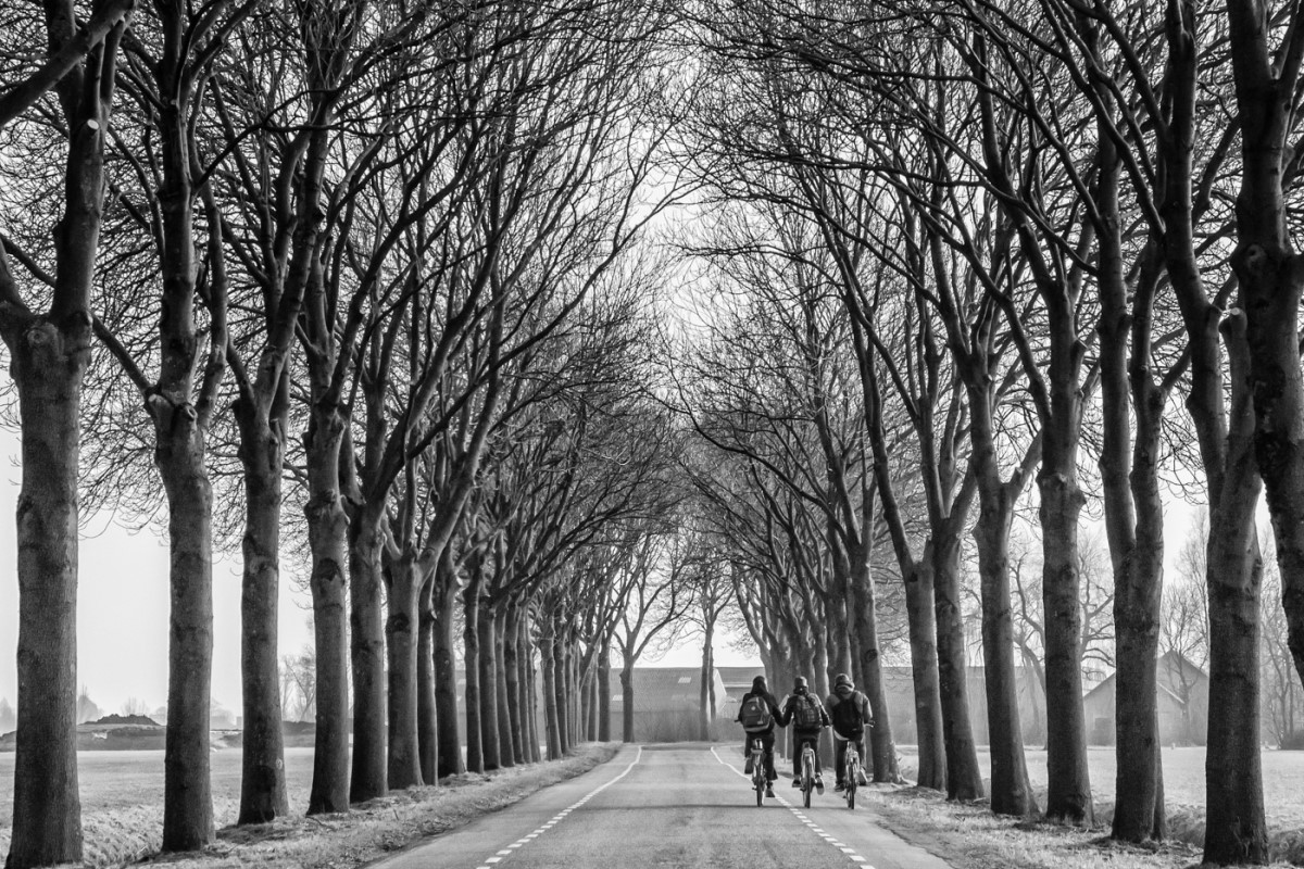
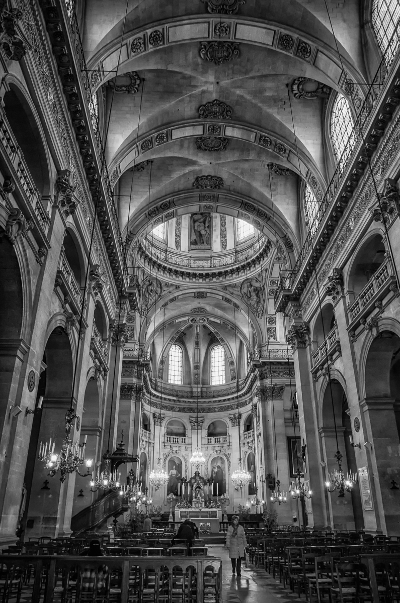
Paul, I prefer this image in monochrome which, to me, makes it more of an art piece than a travel image (not that there is anything wrong with travel images). I don't mind the square crop but I do think the wider panorama allows the trees to better lead our eye into the frame. I would not darken the sky quite as much as in Chuck's version but might selectively lighten the rock faces just a little. |
Nov 13th |
5 comments - 3 replies for Group 50
|
5 comments - 3 replies Total
|