|
| Group |
Round |
C/R |
Comment |
Date |
Image |
| 50 |
Jul 21 |
Reply |
Thanks, Michael! |
Jul 28th |
| 50 |
Jul 21 |
Reply |
Wow - thanks, Chuck. |
Jul 20th |
| 50 |
Jul 21 |
Comment |
Wow, thanks, everyone for your generous feedback! |
Jul 16th |
| 50 |
Jul 21 |
Comment |
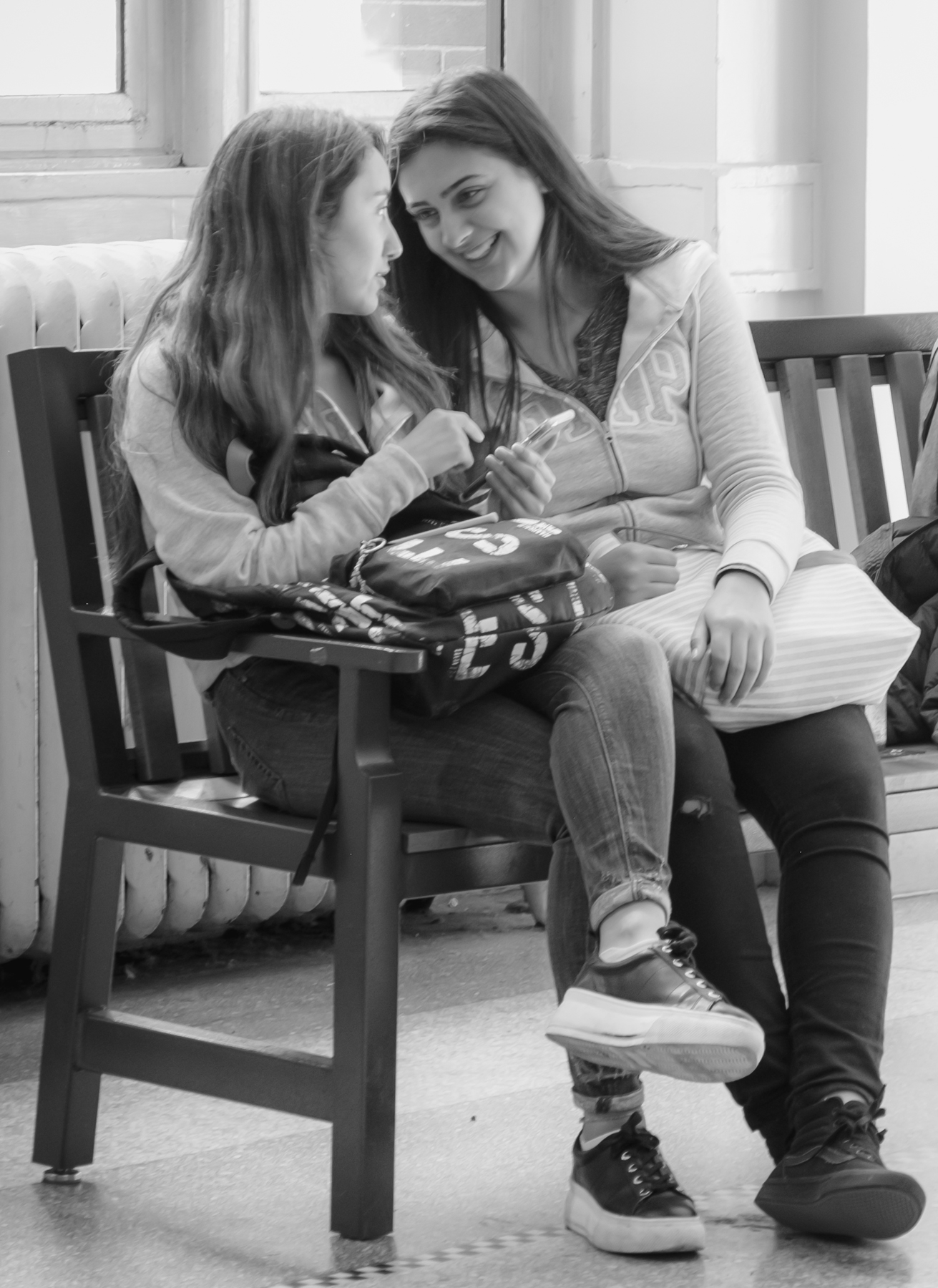
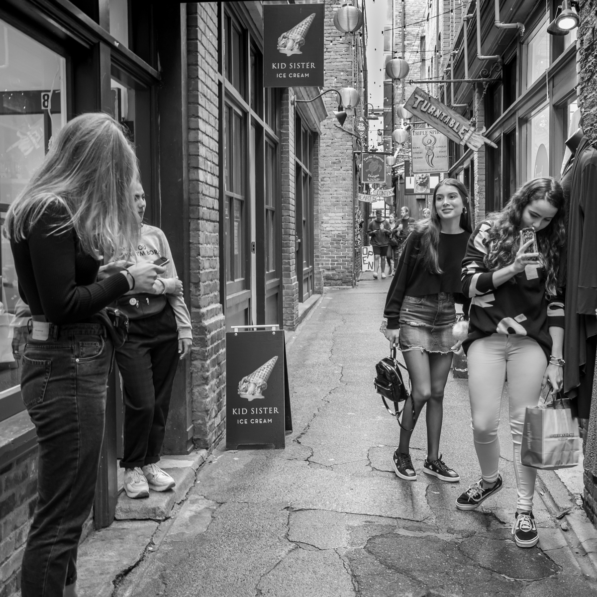
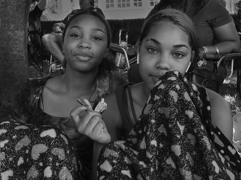
Hi Kerry - welcome!
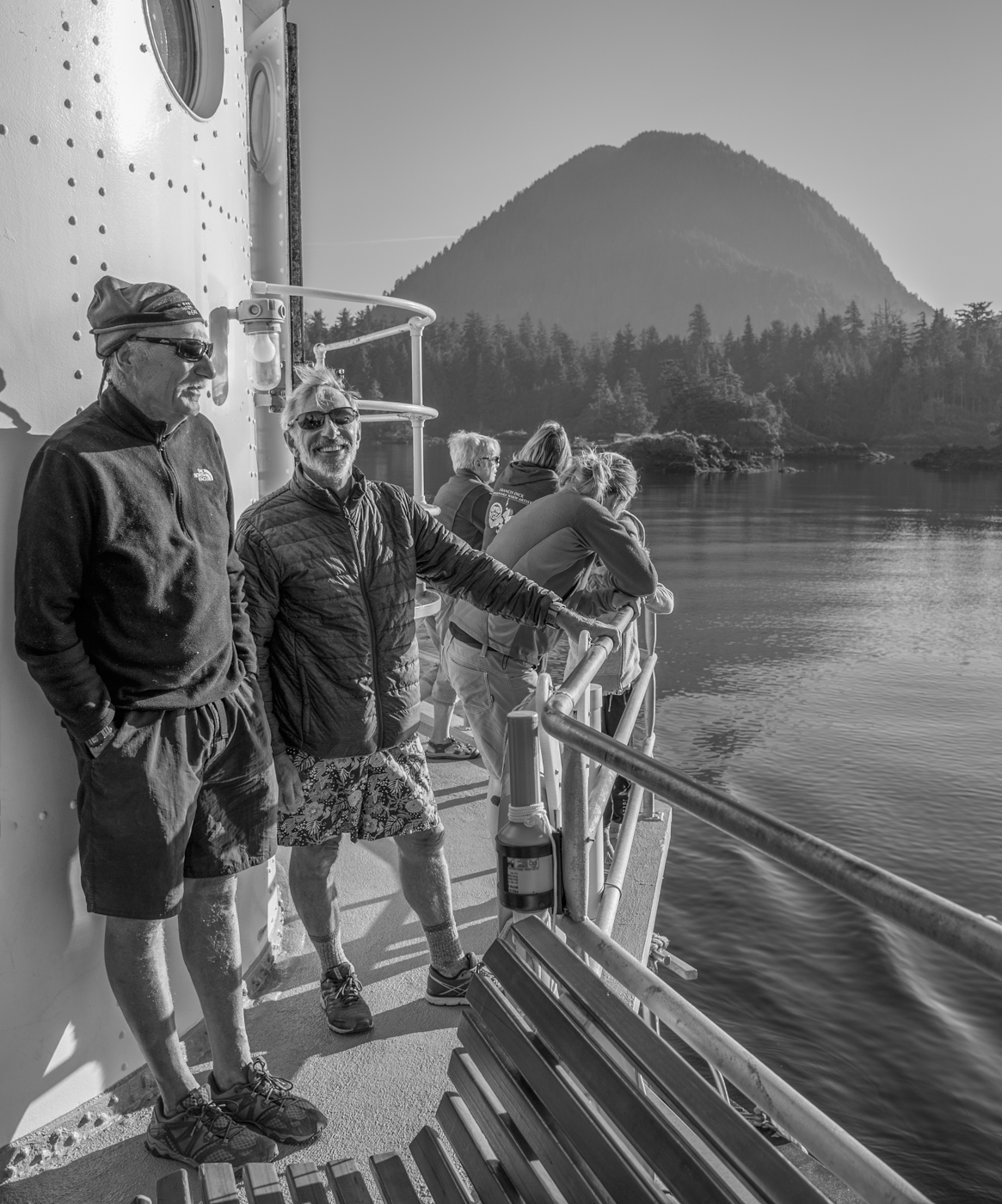
Yes, you have definitely captured a lovely energy in these two lovely young women! I like the hues in the colour version but agree that the BW allows us to focus more intently on the subjects without too many distractions. I think your edits (lightening, darkening for the BW conversion) work well. However it might be interesting to try a shot such as this with a some wider F-stops to see whether you could make the background figures a little softer while keeping sharp focus on the young women in front. Alternatively, I am suggesting a bit of a tighter crop (done in PS along with some selective darkening of the very white building in the background) - not ideal because it crops some of the people behind in odd ways, but... |
Jul 16th |
 |
| 50 |
Jul 21 |
Comment |
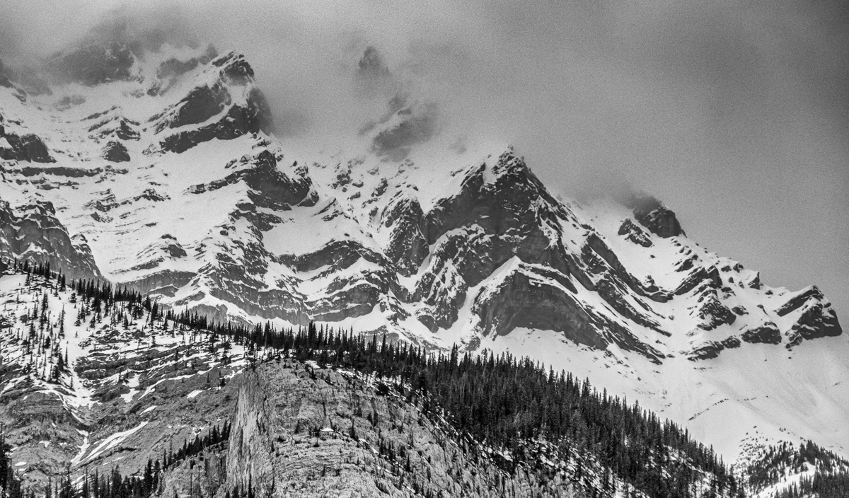
Chuck, I really like your edits incorporating Cindy's and Karl's suggestions. I think the sky and the eagle add to the story - nature vs. human ingenuity. The monochrome really works well. |
Jul 16th |
| 50 |
Jul 21 |
Comment |
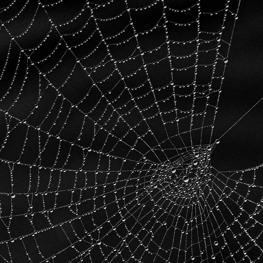
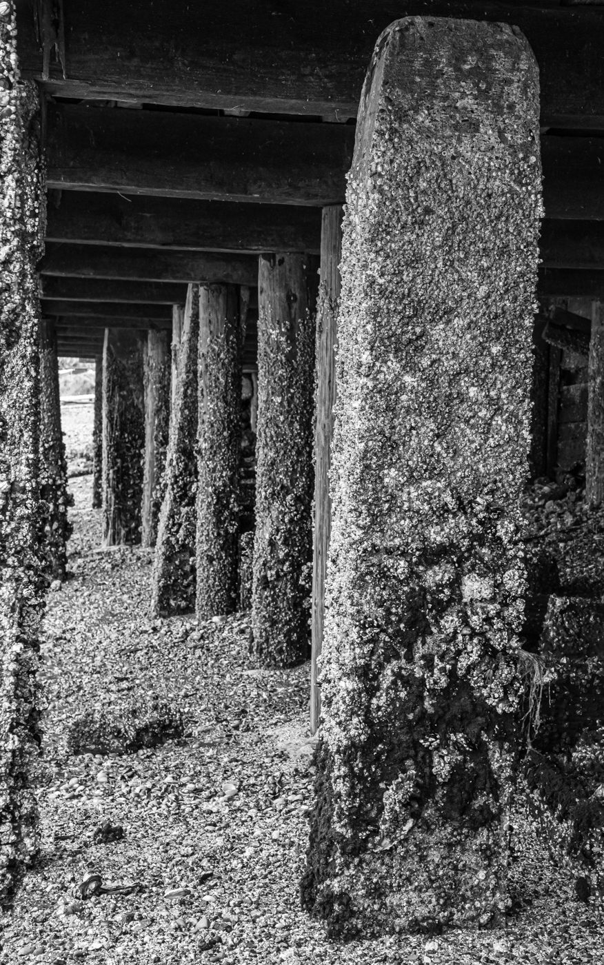
Love this image - nature's Fibonacci spiral. A beautiful detailed capture, Cindy, although I do like Chuck's square crop with the centre of the shell set dead centre in the fame. Also, It might just be my screen but, to me, the light areas in the middle look a little blown out (maybe less contrast in that area only - the rest of the image looks perfect in its detail). |
Jul 16th |
| 50 |
Jul 21 |
Comment |
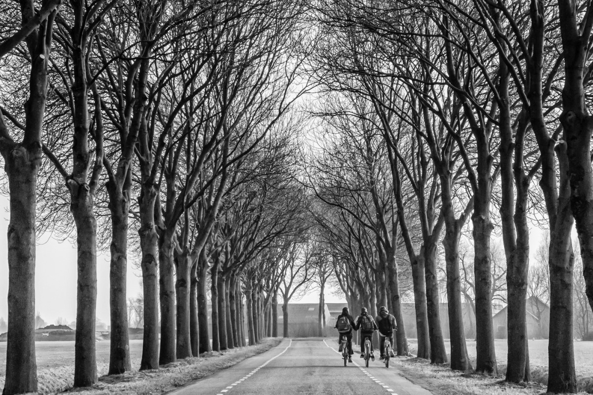
Yes, the car and driver are tack sharp - even more blur on the tires in the background might heighten the sense of his speed. I like the composition of the image with its horizontal "layers". The monochrome works well, drawing our focus to the main subject. |
Jul 16th |
| 50 |
Jul 21 |
Comment |
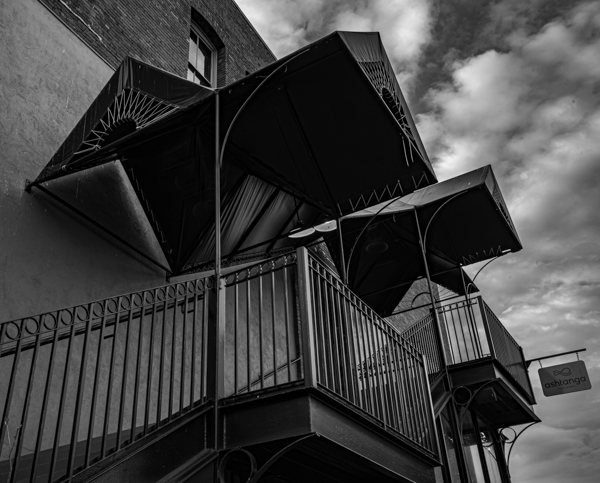
Wow, lots to weigh in on...
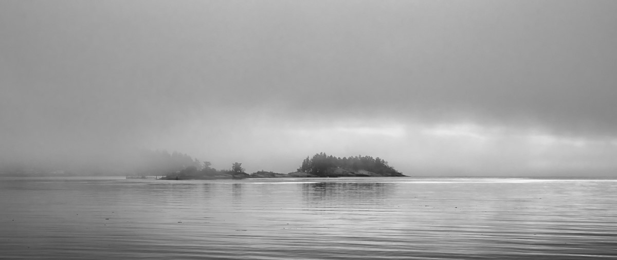
I do use sky replacement from time to time but, in this case, I like moodiness of your original BW version, Jeffrey. I agree that the sharp horizon line is a bit of a distraction so, since we are suggesting edits, here is mine to add to the mix. I took your original BW into PS, added a gradient filter (reflected), cloned out the horizon line and adjusted the brightness and contrast slightly.
That being said, I also like the soft blue tones in the colour version of this image. |
Jul 16th |
 |
| 50 |
Jul 21 |
Comment |
This is an interesting capture, as Kerry says, an extra large still life. I think Cindy's darker, higher contrast version works well, but I also like the way the foreground subjects "pop" more in your ON1 adjustment, Paul. Perhaps some dodging and burning would produce a combination of the two, with darker, more contrasty skies but also more foreground detail. The colour ON1 NoNoise version is a little too vibrant for my taste. |
Jul 16th |
7 comments - 2 replies for Group 50
|
7 comments - 2 replies Total
|