|
| Group |
Round |
C/R |
Comment |
Date |
Image |
| 50 |
Apr 21 |
Comment |
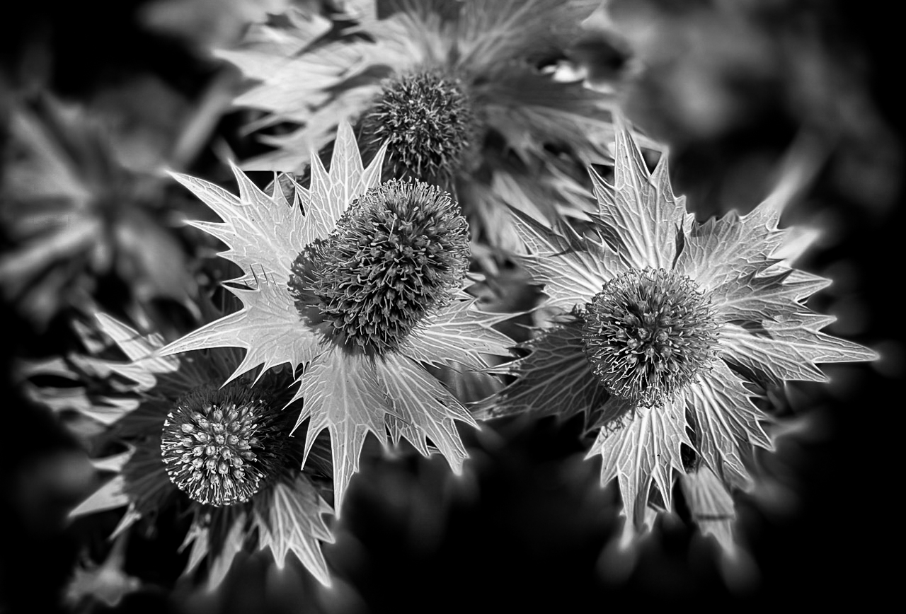
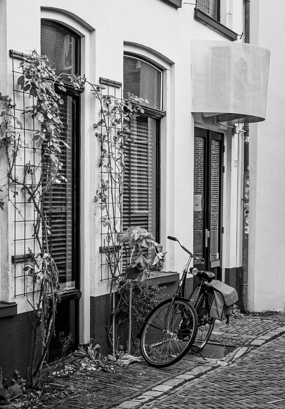
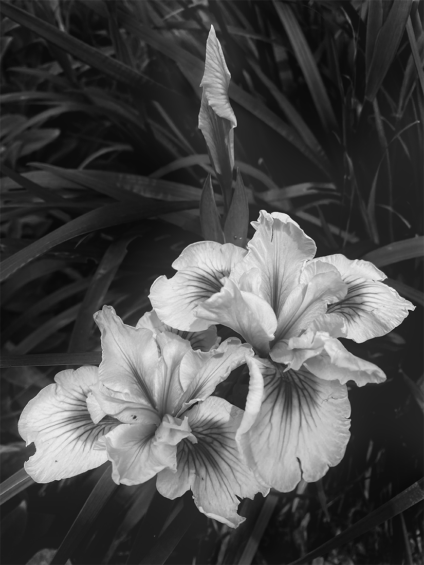
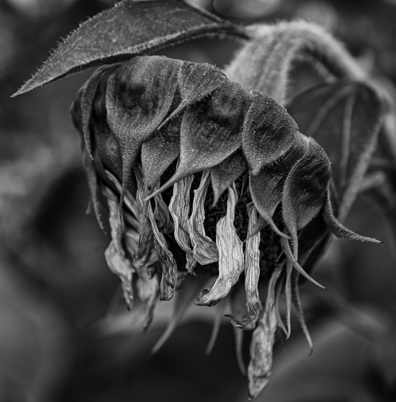
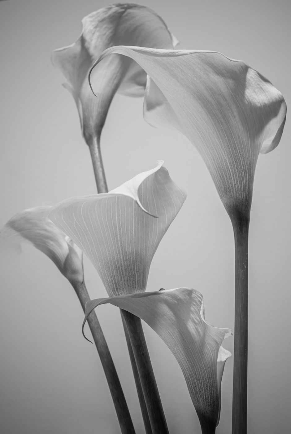
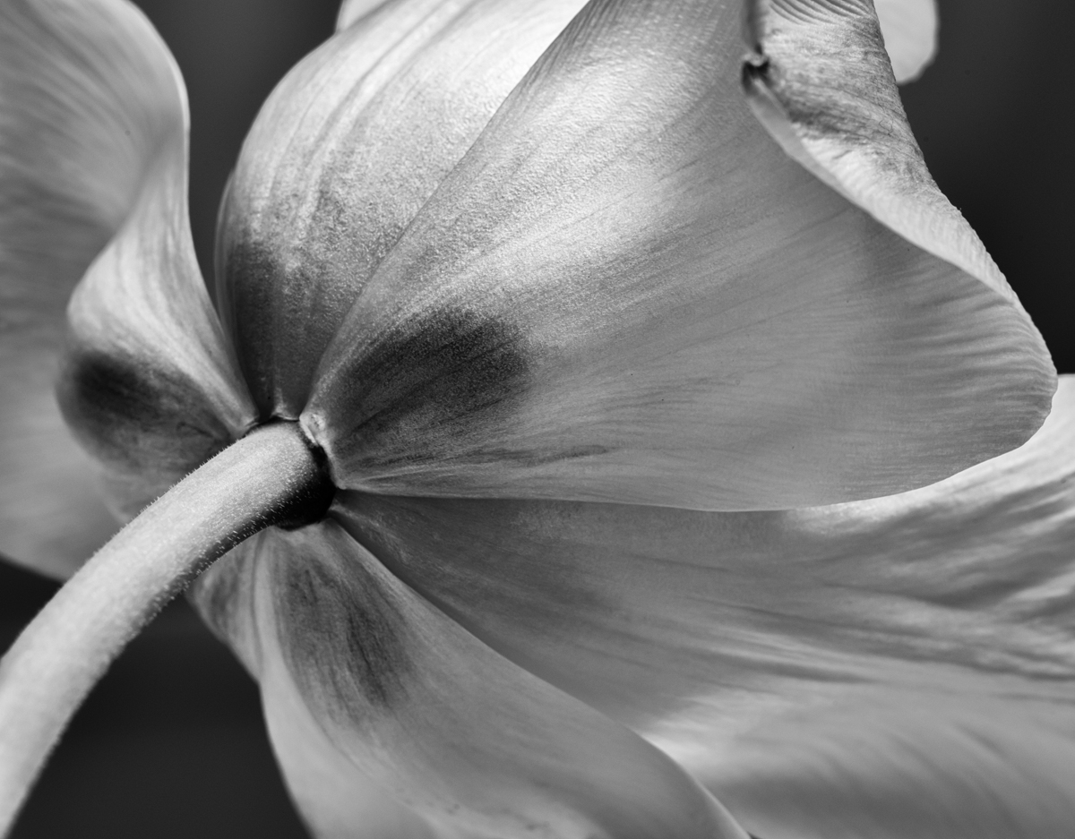
Michael, I often find myself doing exactly what you did here - on field trips getting distracted on the way to the main attraction. You have captured interesting layered shapes here - I can see why this plant drew your attention. However, the BW (conversion, I assume) looks a tad over-sharpened - on my screen, there is a bit of an aura on the edge of some of the stems and buds where they meet the dark background. Also, I would like to see the light a little less harsh - to me, a softer light would better reflect an "after the rain" ambience. Well-spotted, though. |
Apr 13th |
| 50 |
Apr 21 |
Comment |
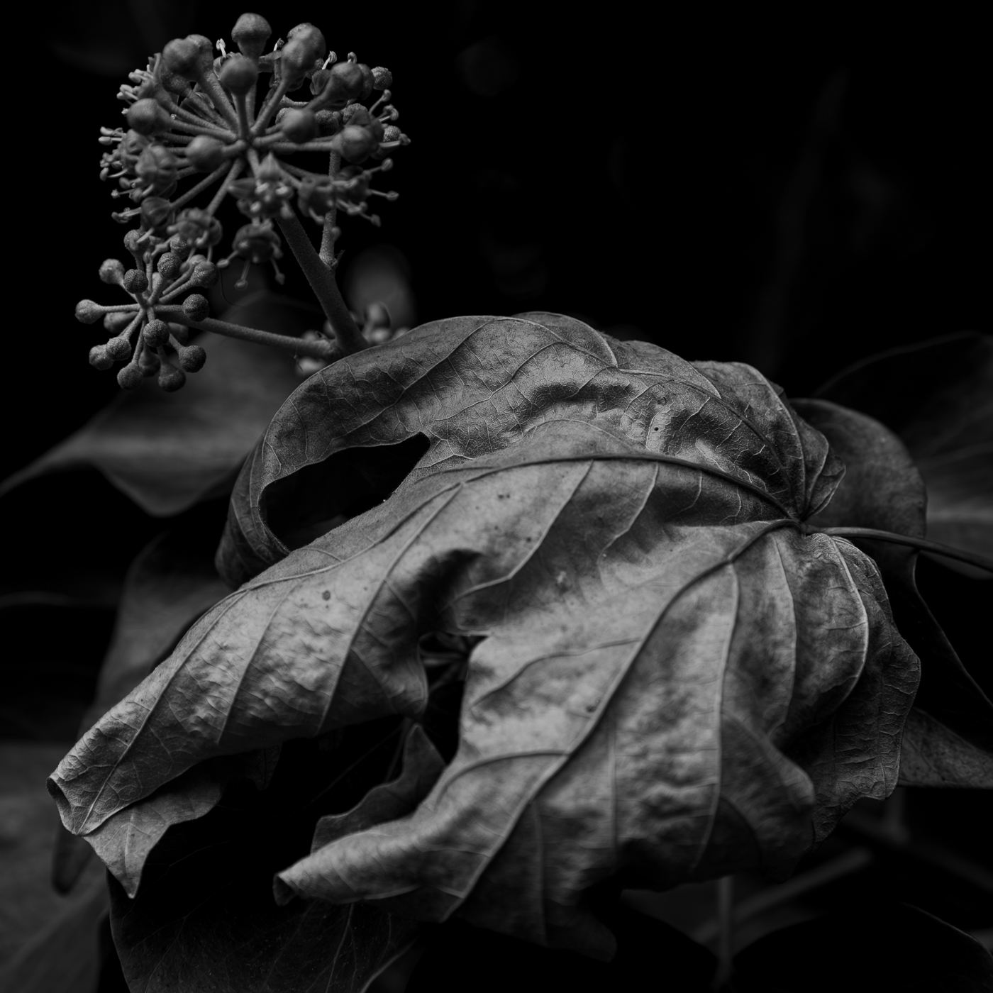
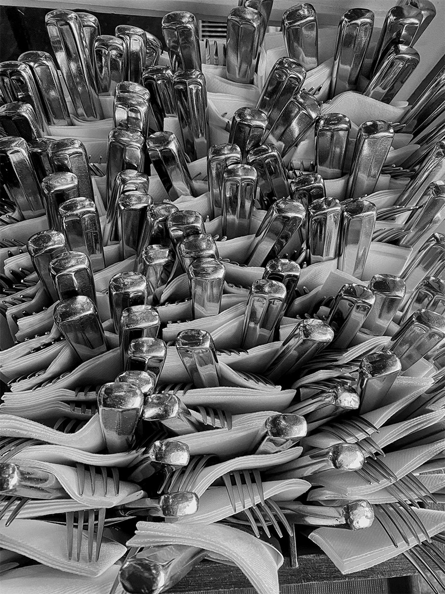
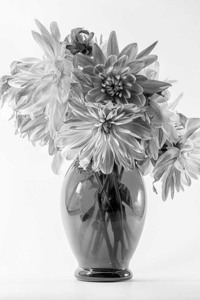
Chuck, I agree that the BW version works much better here - the shapes, the detailed textures and the shadow are all much stronger. An interesting still life, in a sense. Thank you for reminding us that compelling images emerge in unexpected places. |
Apr 13th |
| 50 |
Apr 21 |
Comment |
Cindy, a compelling portrait. The eye contact was definitely worth waiting for, and the soft light gives the coat a beautiful glow. Yes, I would say this is a successful photographic capture - well done! |
Apr 13th |
| 50 |
Apr 21 |
Comment |
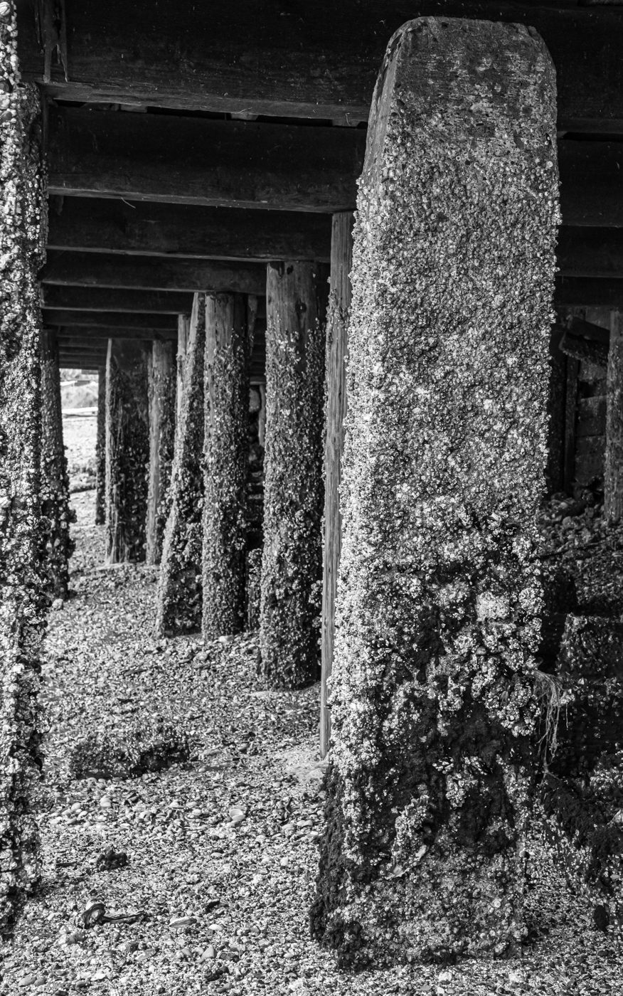
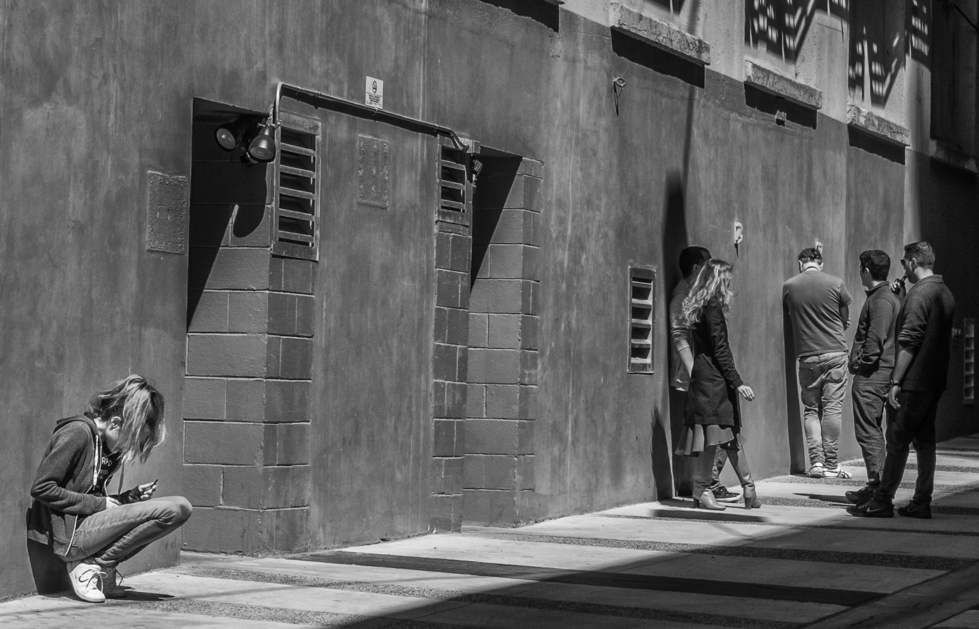
Karl, I tend to agree with Chuck that a closer crop would work better in terms of focusing on the "subject" - the worn tires on the foreground car. I also prefer the monochrome for it's increased texture (structure) and because there are fewer distractions than in the colour version. I think your low angle of capture works well. |
Apr 13th |
| 50 |
Apr 21 |
Comment |
Jeffrey, I also like the monochrome best. To me, the green in the colour version is a bit of a distraction while the BW has an abstract quality to it that makes the image. As Chuck says, timing is everything - detailed sharpness on the rider and the bike with motion blur giving that sensation of high speed. A skilled capture and a well processed conversion to BW. |
Apr 13th |
| 50 |
Apr 21 |
Comment |
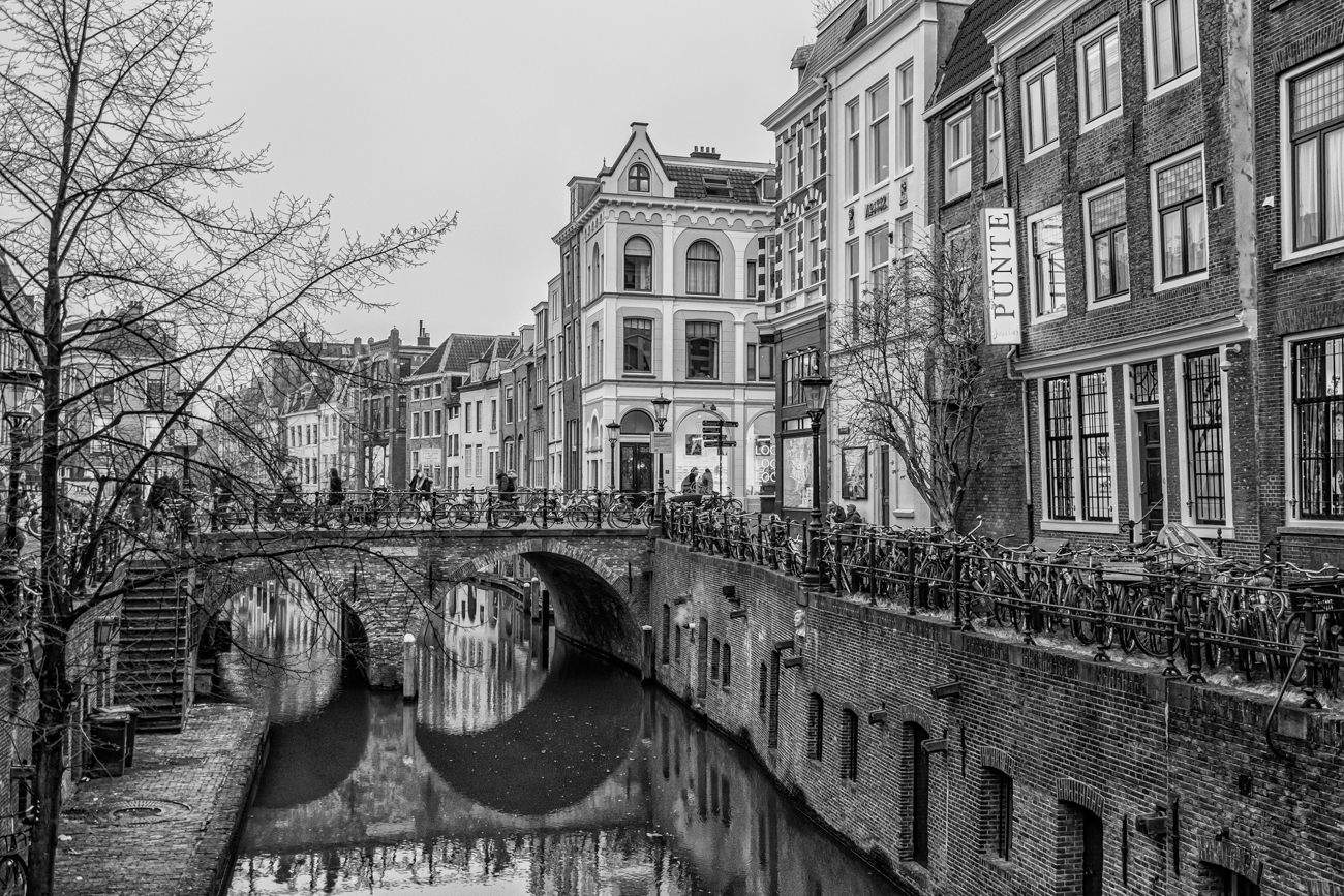
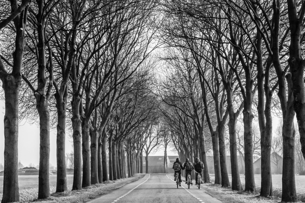
Yes, talk about taking advantage of what is in front of you! I agree that the higher contrast in the BW version makes the "subject" more obvious and would like to see this carried over to the colourized image. |
Apr 13th |
| 50 |
Apr 21 |
Reply |
Indeed, Chuck, thank you. My partner is a non-photographer so I actually do quite a bit of photography through the windshield (or the passenger window) when we travel. Not that our windshield is always clean but, if that is a problem, there is always post-processing (ha ha!) |
Apr 13th |
| 50 |
Apr 21 |
Reply |
Thank you, Michael, for your generous feedback. I do like your edit - I think both our versions work. Each gets the viewer to enter the image in a different way, and sets a slightly different tone to the afternoon. |
Apr 13th |
6 comments - 2 replies for Group 50
|
6 comments - 2 replies Total
|