|
| Group |
Round |
C/R |
Comment |
Date |
Image |
| 50 |
Oct 20 |
Reply |
Thanks, Cindy! |
Oct 25th |
| 50 |
Oct 20 |
Reply |
Thanks you, John. |
Oct 20th |
| 50 |
Oct 20 |
Reply |
Thanks, Paul. |
Oct 20th |
| 50 |
Oct 20 |
Reply |
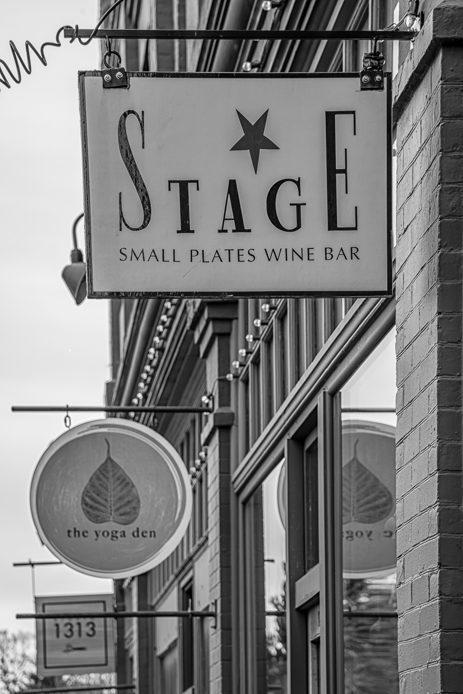
Interesting idea, Stephen. Thanks. I do have several versions of these patterns (different angles, some with people) - I will have to think about that. |
Oct 20th |
| 50 |
Oct 20 |
Comment |
I am not a bird or wildlife photographer so can't really comment on the restraints/wires. However the feather detail, particularly on the eagle, is sharp and the tonal variation looks good. The background is soft enough to give a nice bokeh while still placing the birds in a natural environment. |
Oct 20th |
| 50 |
Oct 20 |
Comment |
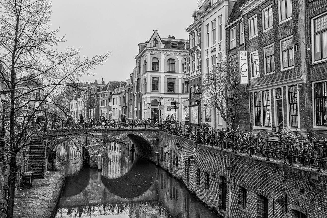
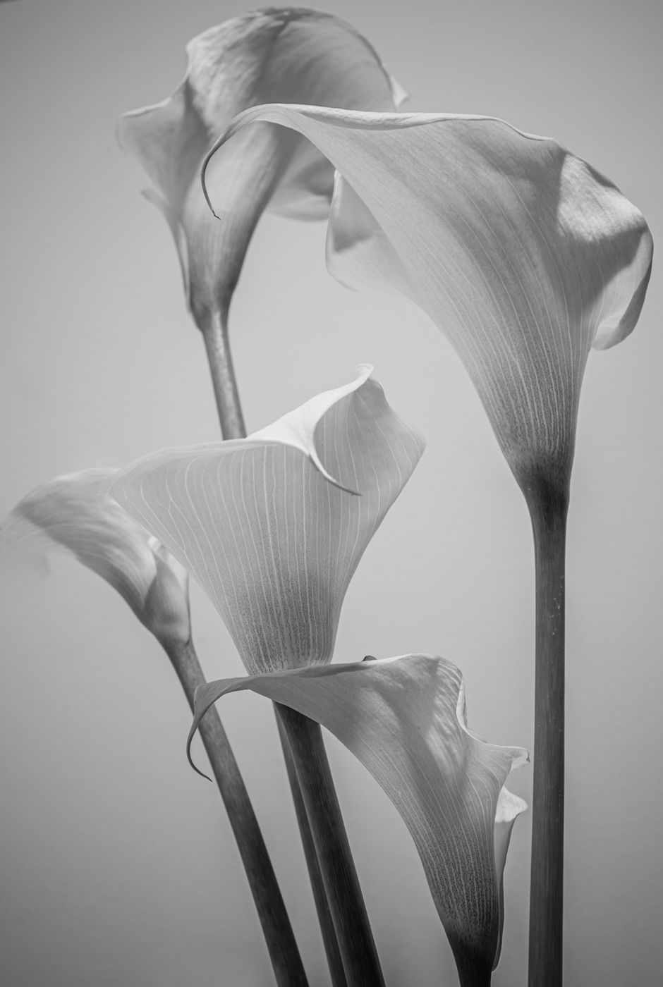
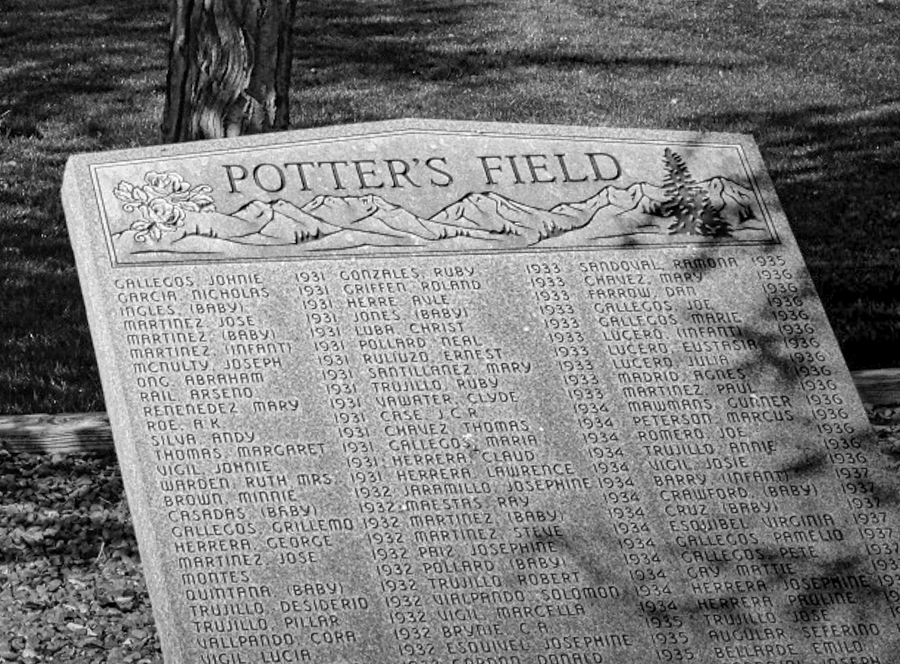
I think BW works well for this image - all those strong hues in the colour version are distracting. However even the monochrome is too busy to allow our eye to settle and to decide what the main subject is. The Potter's Field slab has nice detail and the tree shadow adds interest - I would suggest trying to crop so that this fills most of the frame. Here is one suggestion... |
Oct 20th |
 |
| 50 |
Oct 20 |
Comment |
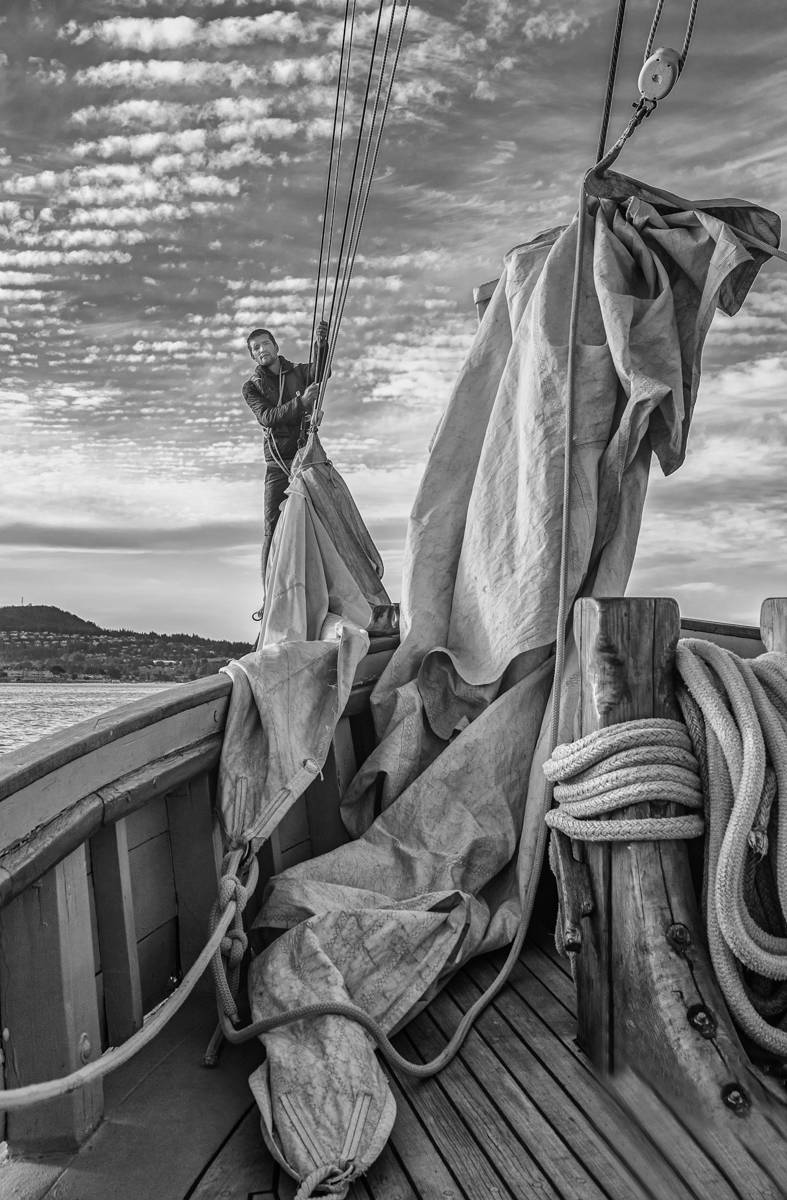
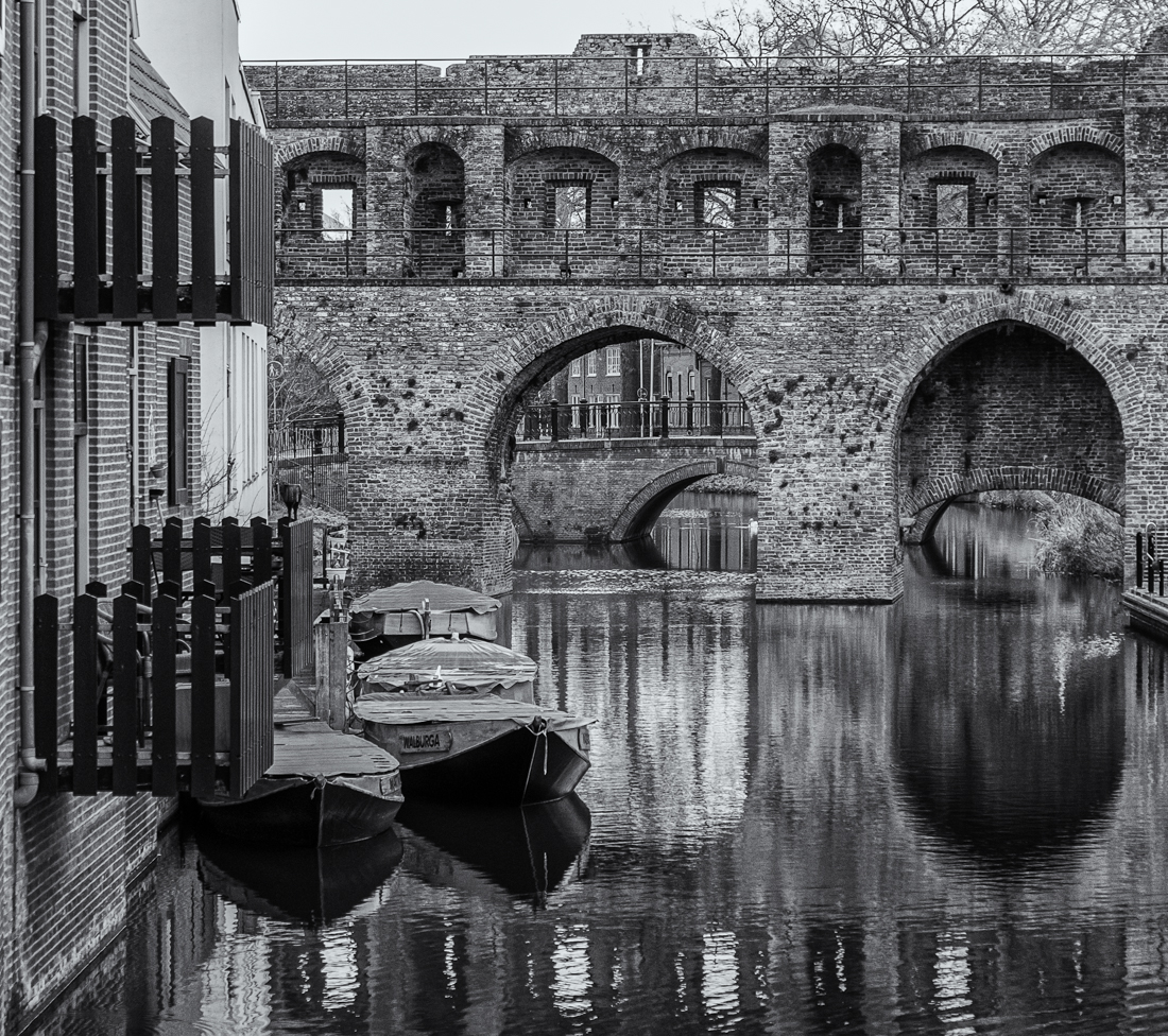
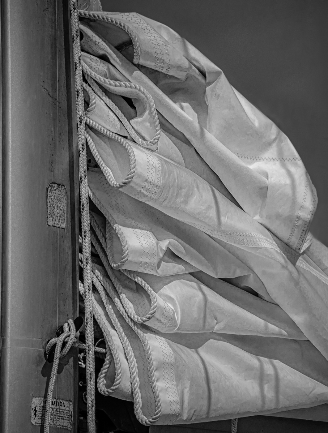
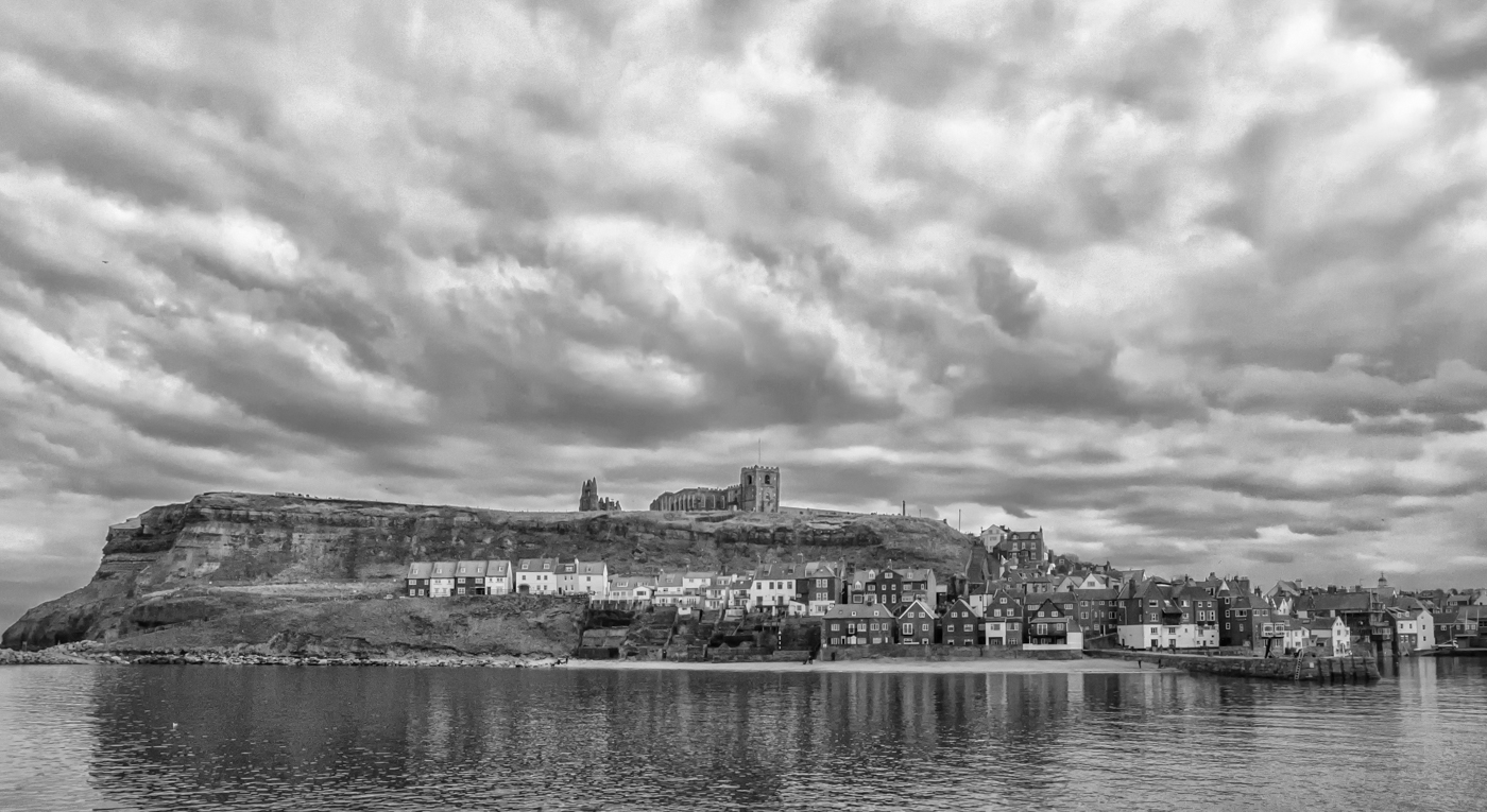
A beautiful scene, very moody in monochrome. I agree with your decision to include the boat. Well composed with a wonderful variety of textures all in sharp detail. The lightness of the abbey draws our eye deep into the frame. I want to be there! |
Oct 20th |
| 50 |
Oct 20 |
Comment |
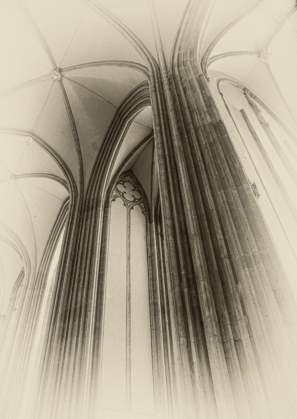
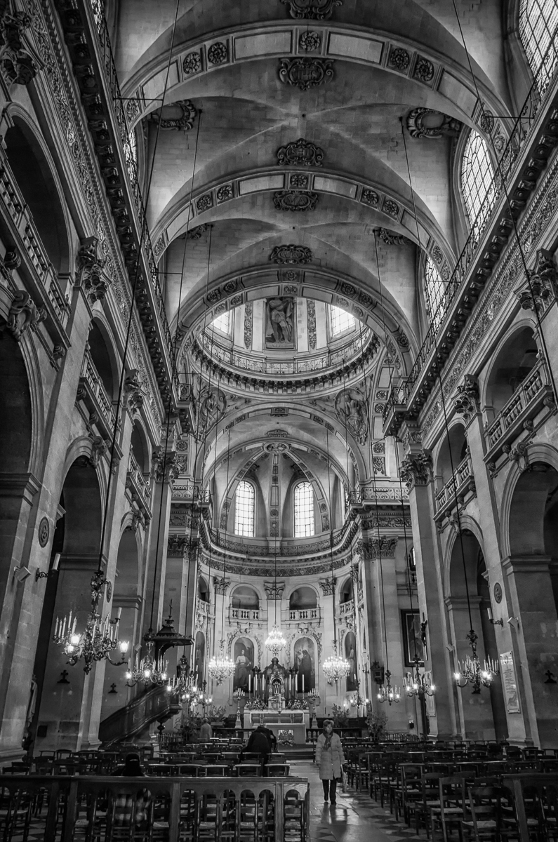
Jeffrey, I am not sure I could choose one version of this shot over the other - each has qualities that capture our interest. The soft hues, (umber? of the walls and pastel blues in the stained glass) make the colour image appealing, whereas in monochrome, shape and texture attract our attention. Nice exposure and detail in the BW conversion as well. Interestingly, in colour the lit chandeliers and sconces stand out giving the image an ethereal quality. The lighting isn't as obvious in BW - this version exudes more of a sense of solidness and strength. |
Oct 20th |
| 50 |
Oct 20 |
Comment |
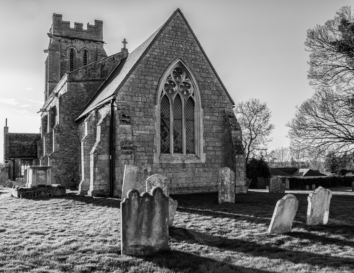
Church/cathedral/abbey interiors make for such awe-inspiring images, don't they? I like both versions of this shot, David - each has a very different feel. Contrasting hues, the dark red of the alter stairs in the centre, the soft blues in the stained glass draw me into the colour image. The BW version emphasizes shape and texture. I like the almost symmetry - shot just enough off-centre to add energy to the image. |
Oct 20th |
| 50 |
Oct 20 |
Comment |
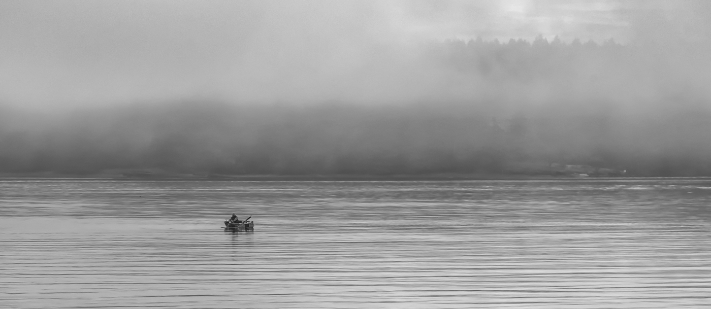
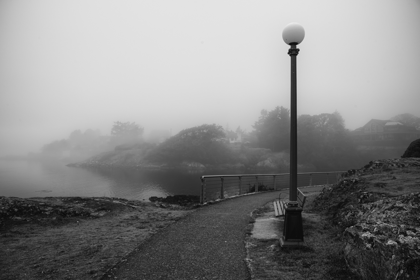
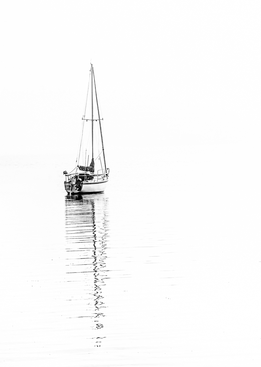
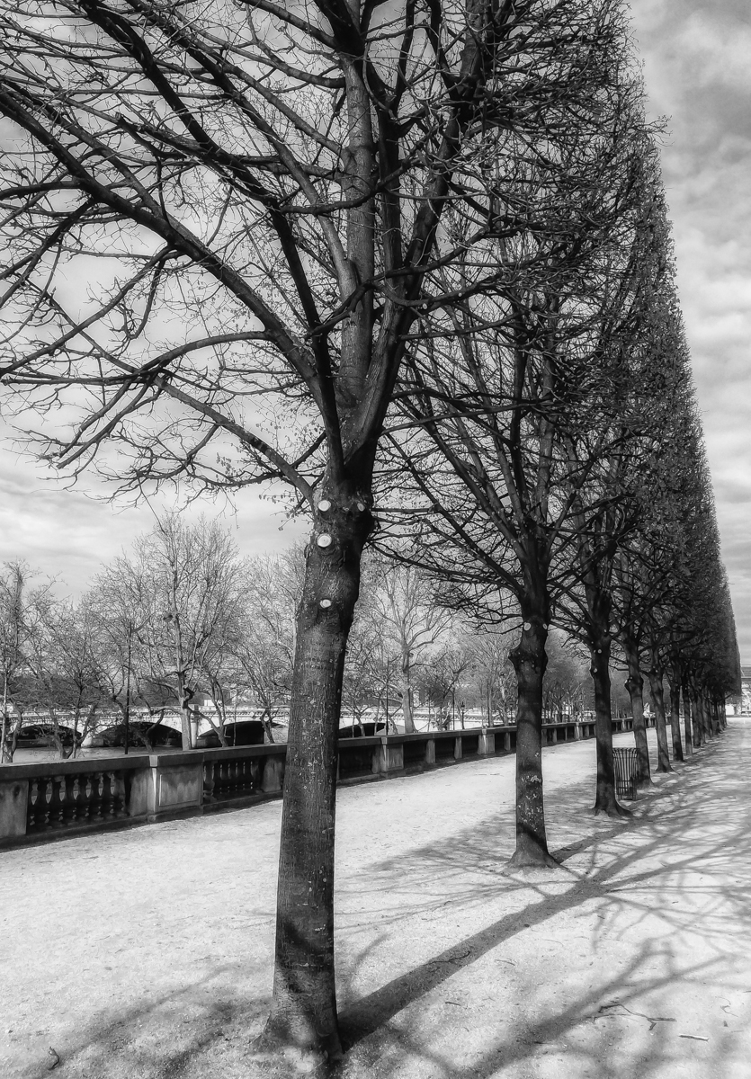
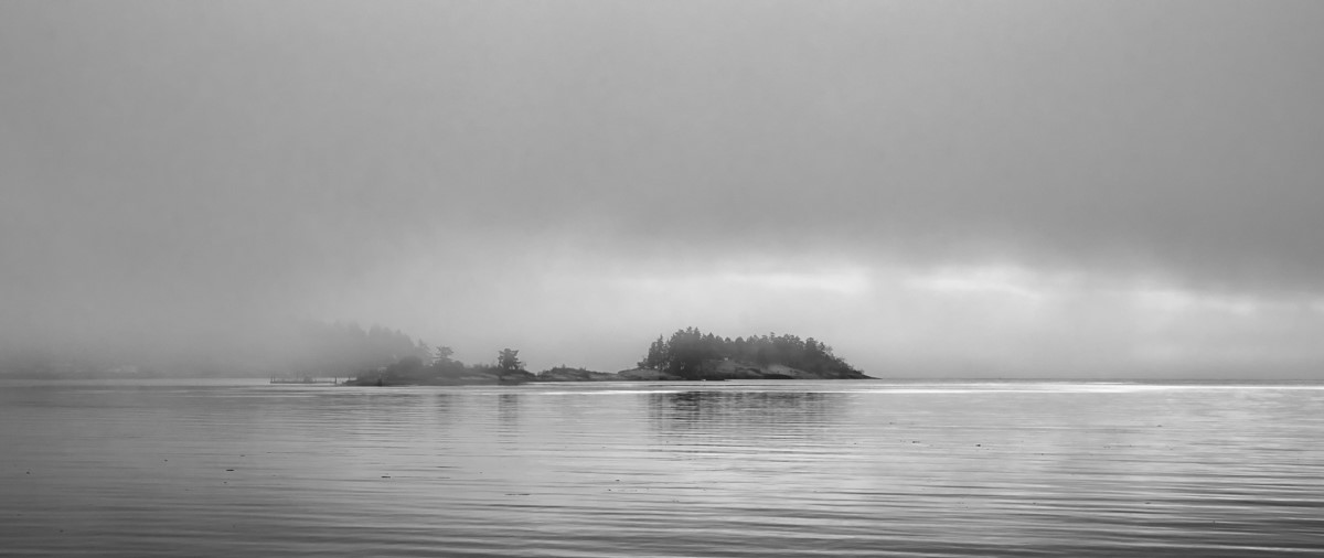
I like the soft hues of the colour version but converting it to BW has removed anything that might distract our eyes from the softness of the fog and the water and makes the shot more evocative. Nice detail and exposure in the foreground shadows. |
Oct 20th |
6 comments - 4 replies for Group 50
|
6 comments - 4 replies Total
|