|
| Group |
Round |
C/R |
Comment |
Date |
Image |
| 50 |
Aug 20 |
Comment |
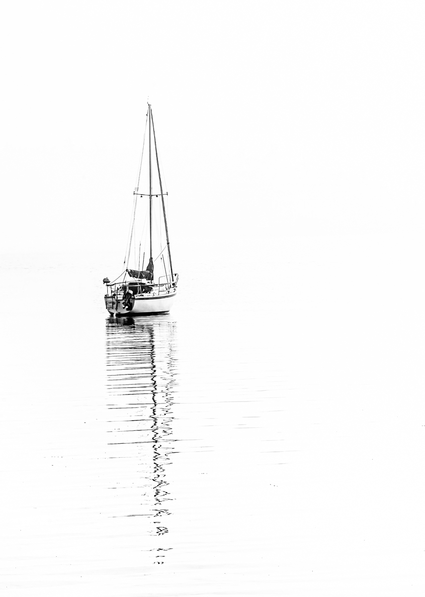
I like the colour version of this image, Paul, but think the monochrome is more of a fine art image. I agree with both of Jeffrey's comments - I like the darker monochrome version with a little cropped from the foreground. |
Aug 9th |
| 50 |
Aug 20 |
Comment |
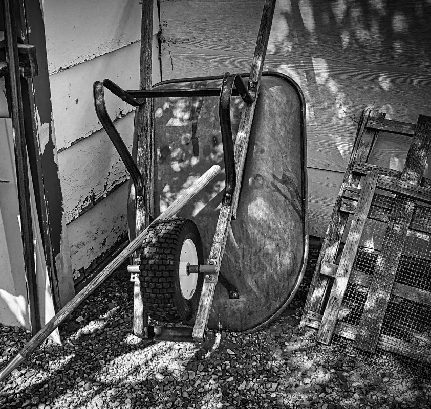
Great textures in this image - the old rusty wheel barrow, the peeling paint on the garage, the gravel in the foreground. I agree that some cropping would be helpful, but here is a slightly different suggestion. I like the wheelbarrow as the central focus of the image but also like the texture of the sifting screen on the right and the horizontal siding and the rake handle leading us into the frame from the left. I have cropped on the left just enough to tone down the busy-ness there and cropped from the bottom as David did. |
Aug 9th |
 |
| 50 |
Aug 20 |
Comment |
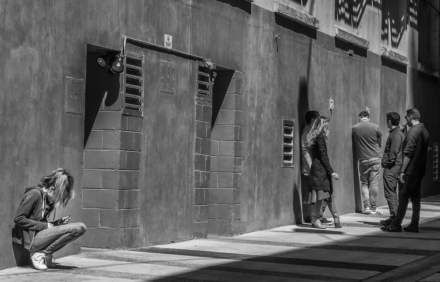
I also like the colour version of this caboose but the monochrome, I think, has an appeal of its own. The texture is compelling and the asymmetric composition works well. I particularly like the perpendicular lines - the railing, the siding, the window and door frames, the wheel (it probably has a railway-related name, but...)- coupled with those slight diagonals - the roof, the reflections in the windows - that add interest. |
Aug 9th |
| 50 |
Aug 20 |
Comment |
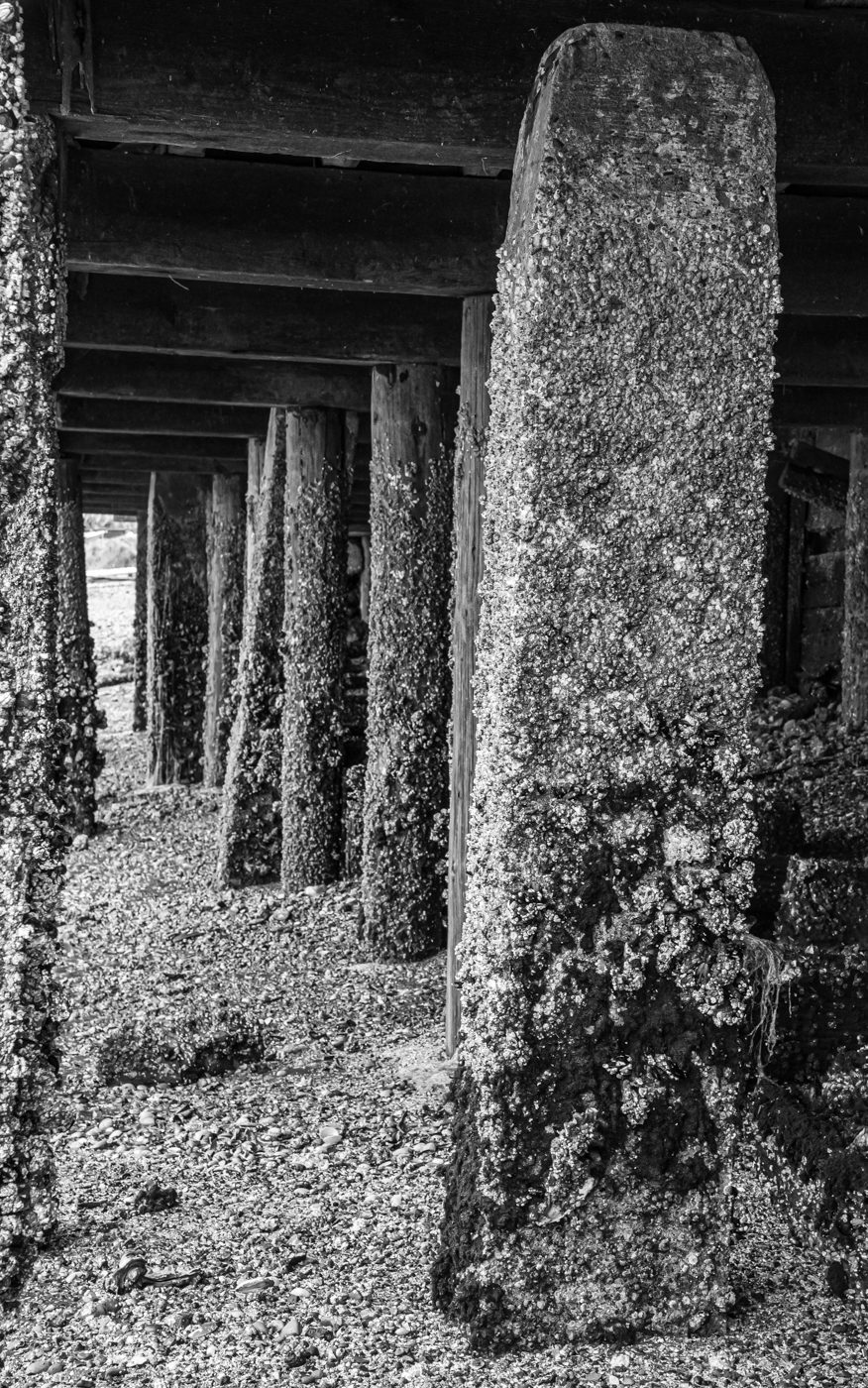
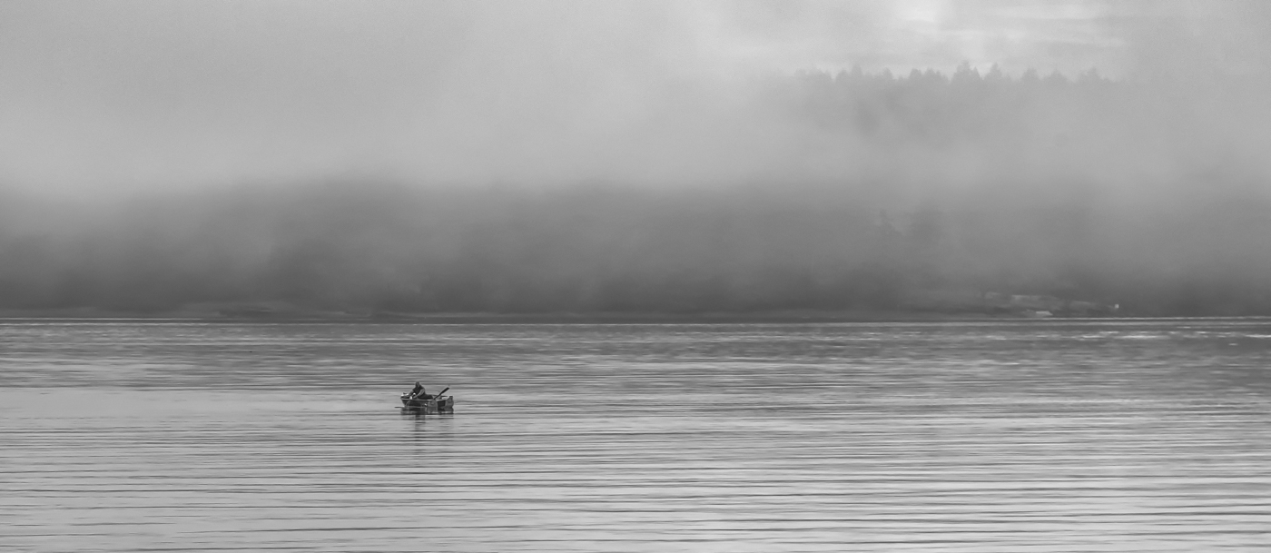
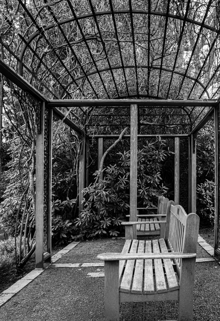
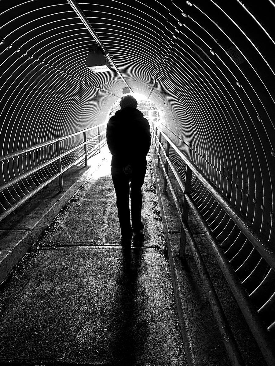
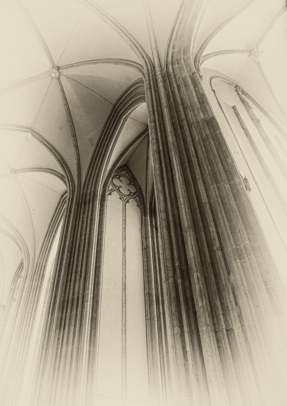
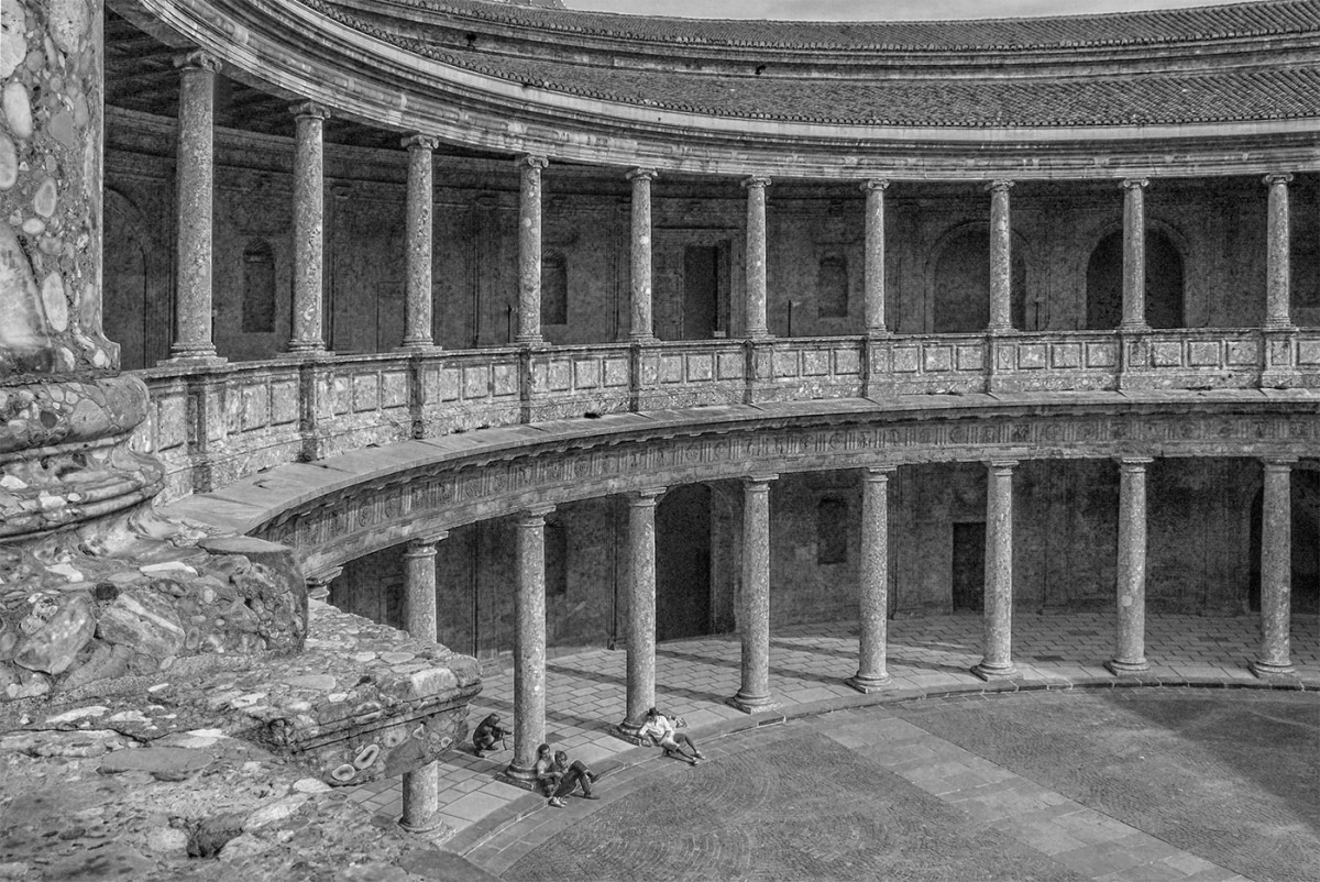
I love the grunginess of this scene, Cindy, the "echoing" arches leading into the distance! I don't mind the darkness in the foreground - the shadows seem just light enough to give some detail and the contrasting light in the background draws us in. In terms of cropping, I would take just enough off the top to remove the bright chunk in the upper right but, to me, the dark line below that encloses the frame nicely - I would not take much off the bottom, to me the rough texture of the ground leads my eye into the frame. All the best with the print competition! |
Aug 9th |
| 50 |
Aug 20 |
Comment |
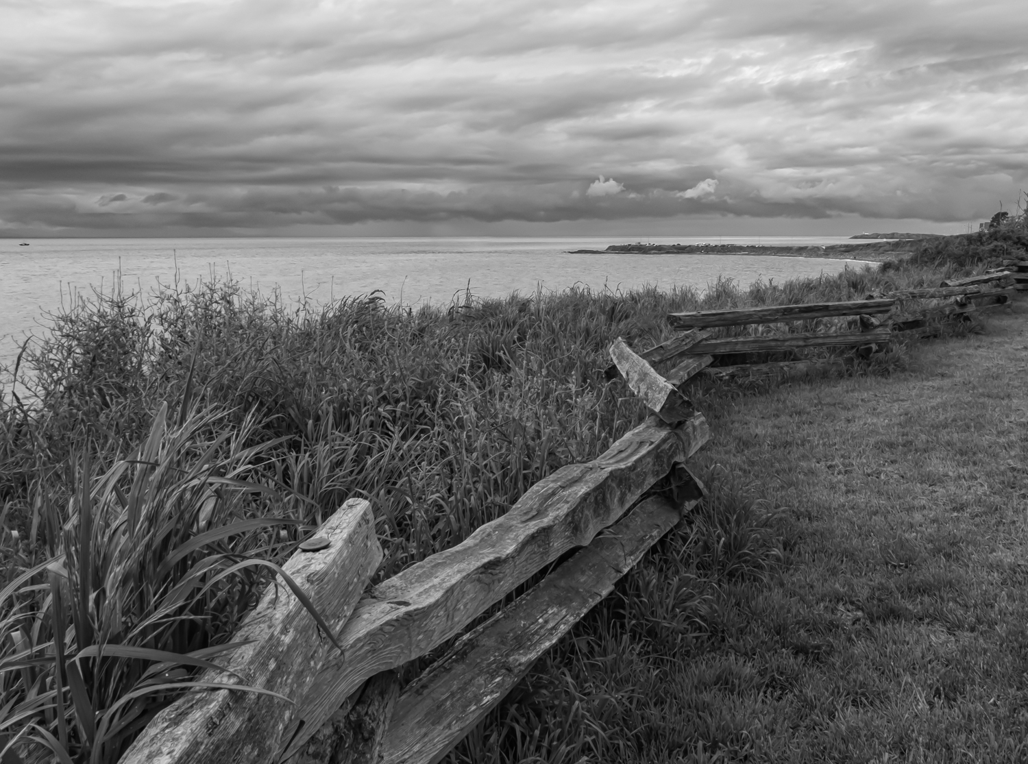
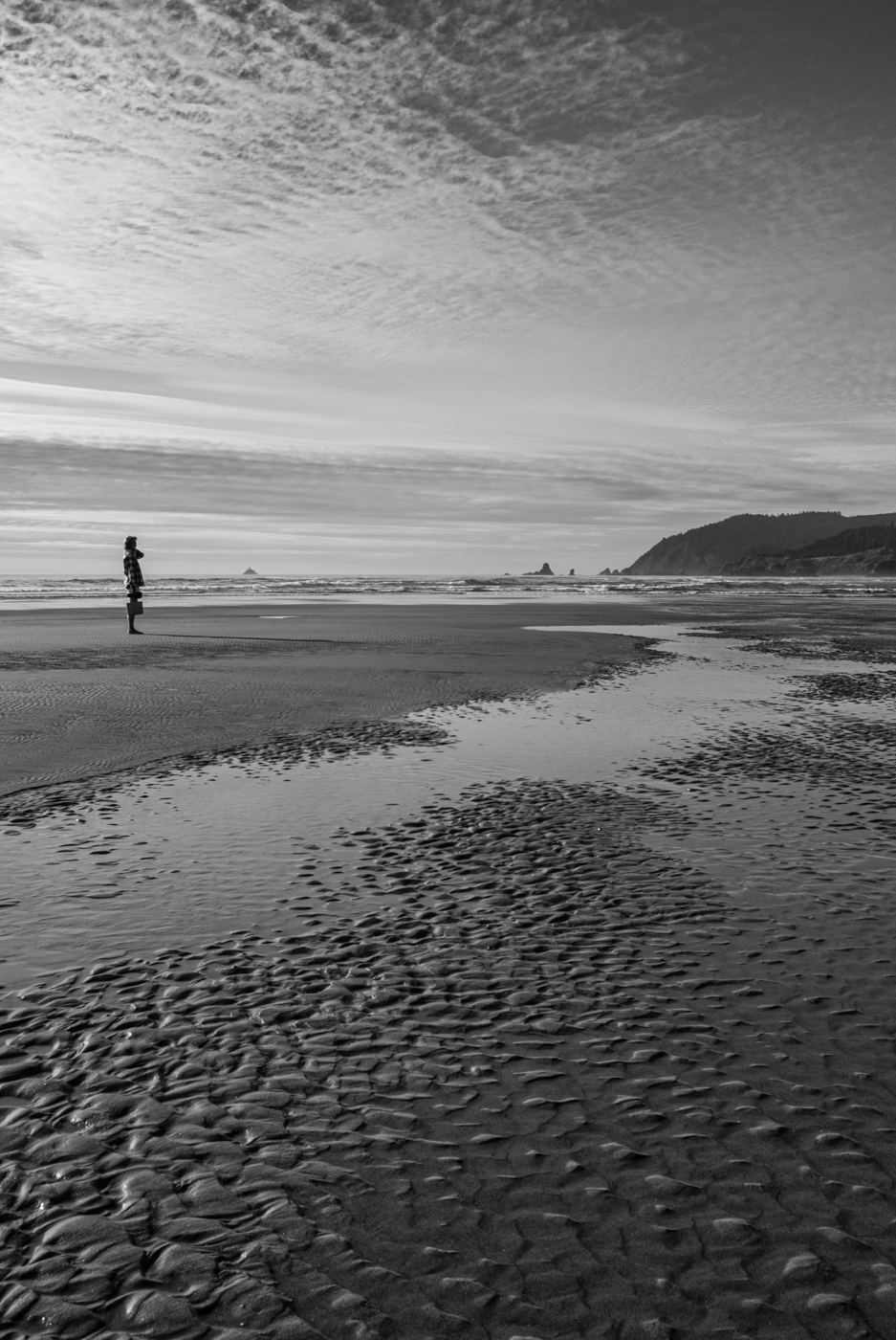
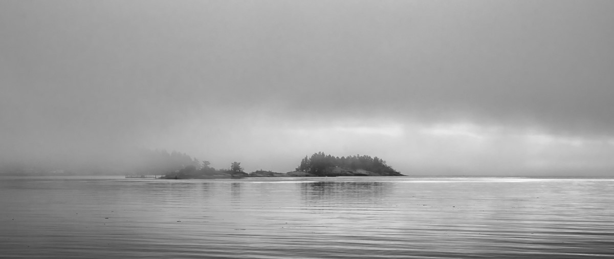
This is a fantastic shot, David! Great composition with the water and grasses in the foreground and those amazing clouds behind - a beautiful array of textures and tones. I like the sepia which, along with the slightly darker vignette, gives the image an antique photo look, but also would prefer it a little toned down, as Cindy and Jeffery have suggested. |
Aug 9th |
| 50 |
Aug 20 |
Reply |
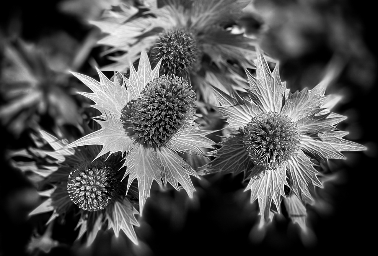
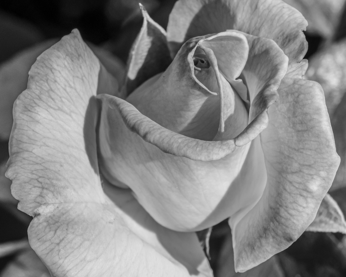
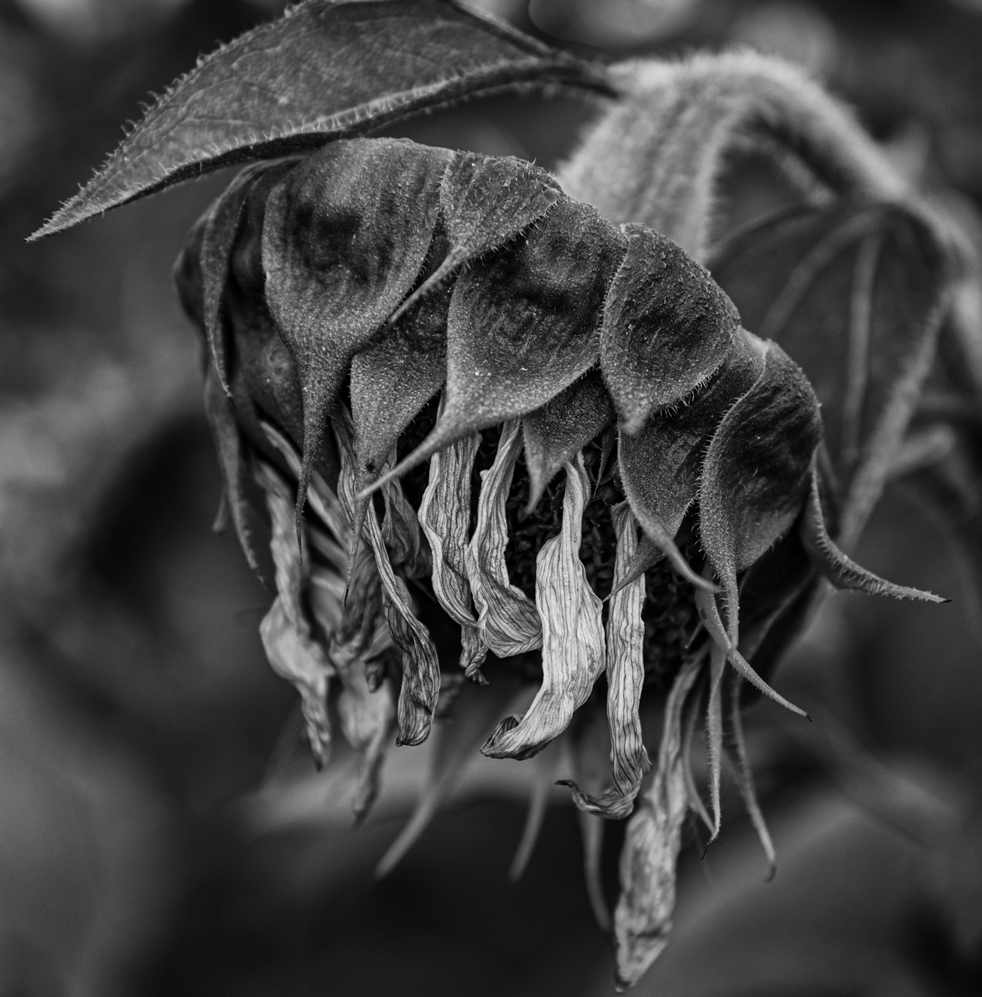
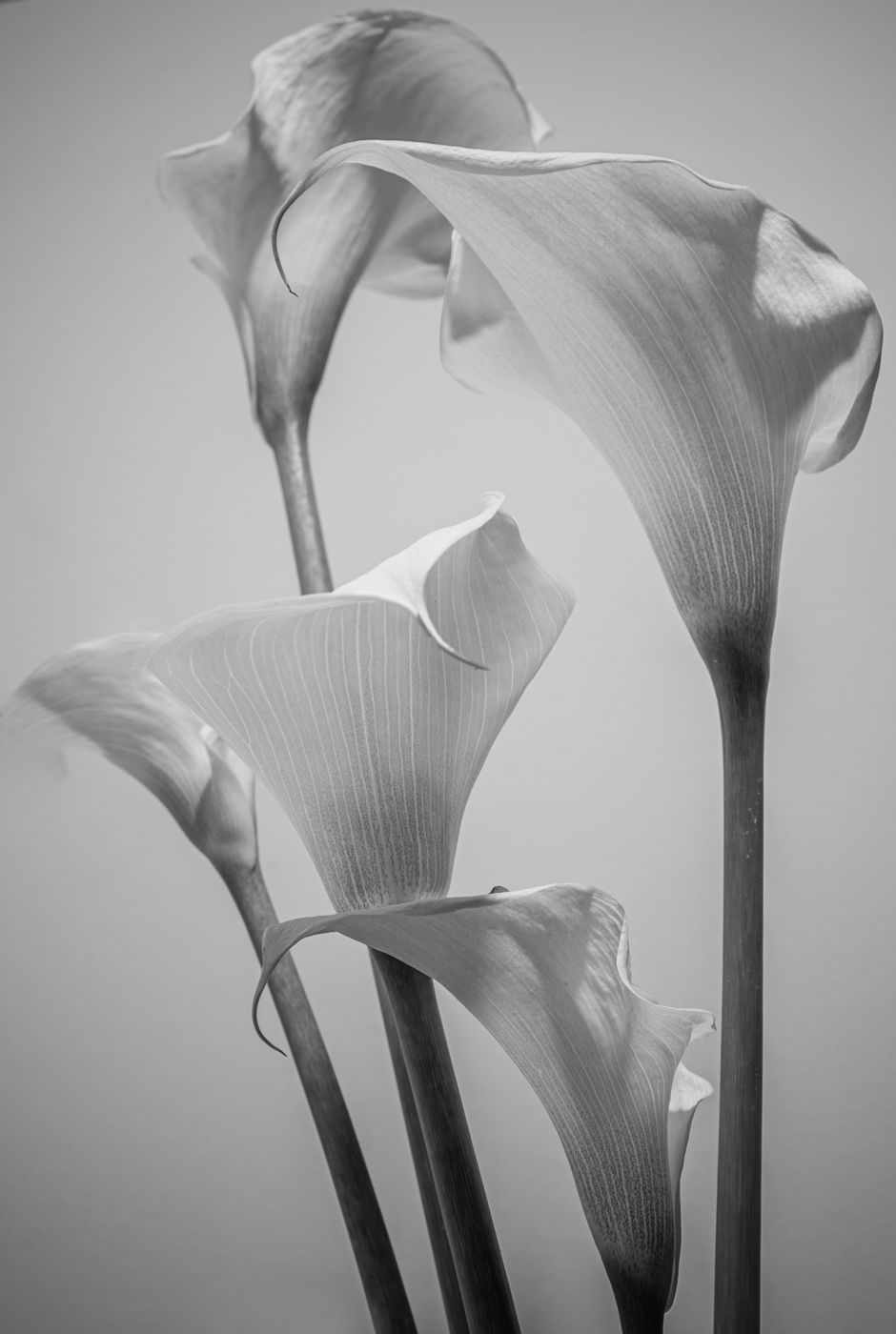
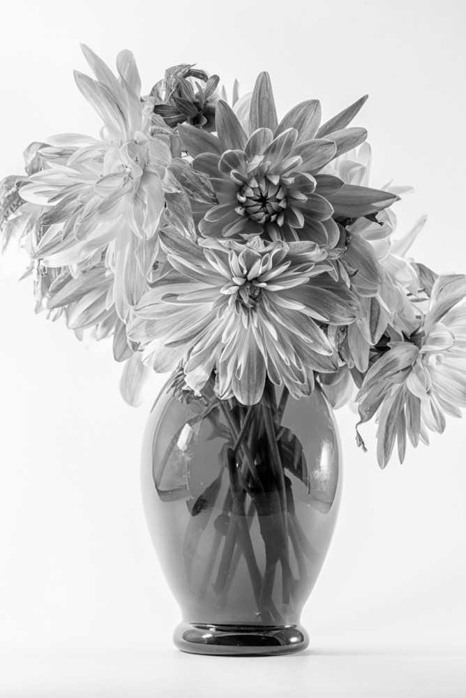
Thanks, Jeffrey! Yes, the flower on the left, especially, is clipped a little tighter than even I am comfortable with. I shot this with my macro lens which, even at f/14, yields a very shallow depth of field. I sometimes am aiming for this, but agree - a longer depth of field here would be preferable. |
Aug 9th |
| 50 |
Aug 20 |
Reply |
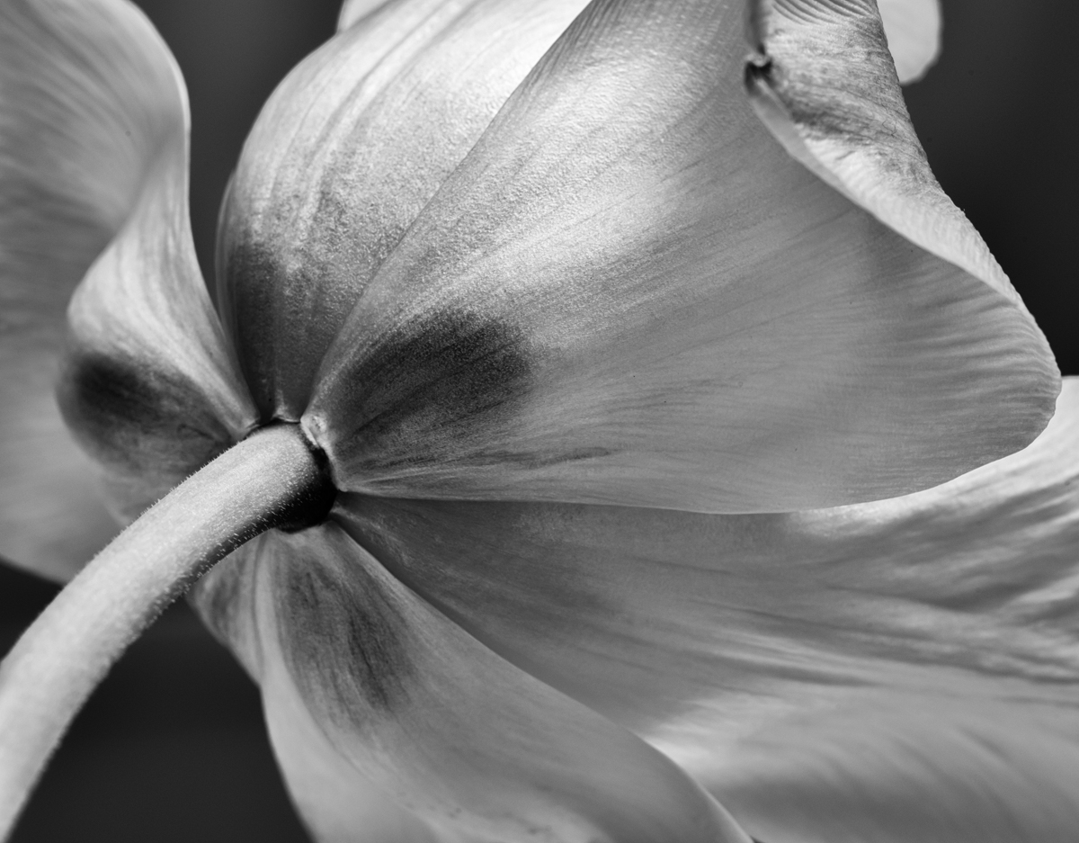
Thanks, Cindy! Yes, I see your point about negative space - I think I am more of a fan of tight cropping than most people. |
Aug 9th |
5 comments - 2 replies for Group 50
|
5 comments - 2 replies Total
|