|
| Group |
Round |
C/R |
Comment |
Date |
Image |
| 50 |
Jun 20 |
Comment |
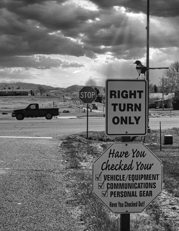
I actually like the irony of the magpie looking left juxtaposed with the "right turn only" sign. The bird, the signs, the truck going the wrong way, the added clouds and sun rays really tell a story. Do you have enough megapixels to crop in on those elements (maybe a vertical crop) to eliminate some of the busy-ness in the frame? Just an idea... |
Jun 10th |
 |
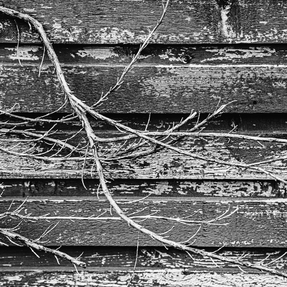
| 50 |
Jun 20 |
Comment |
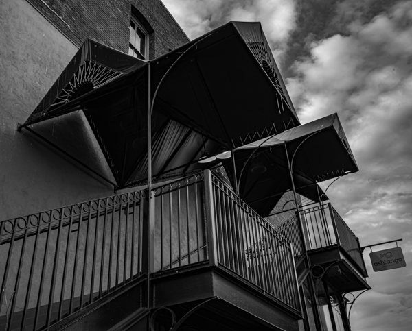
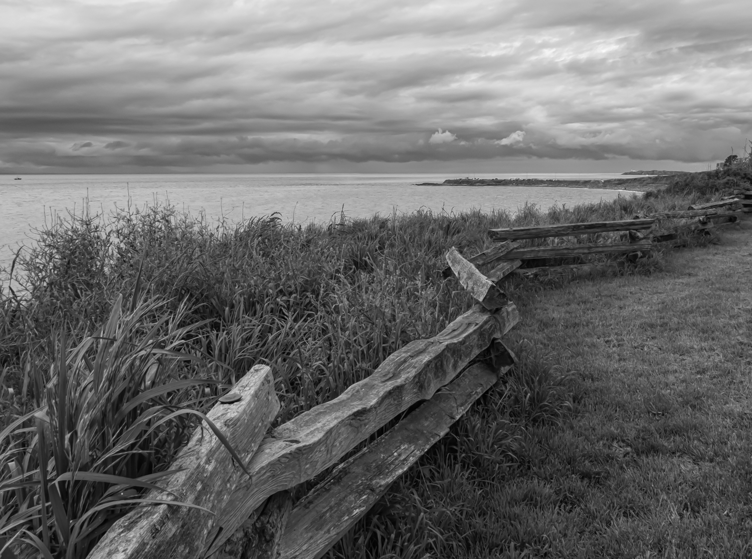
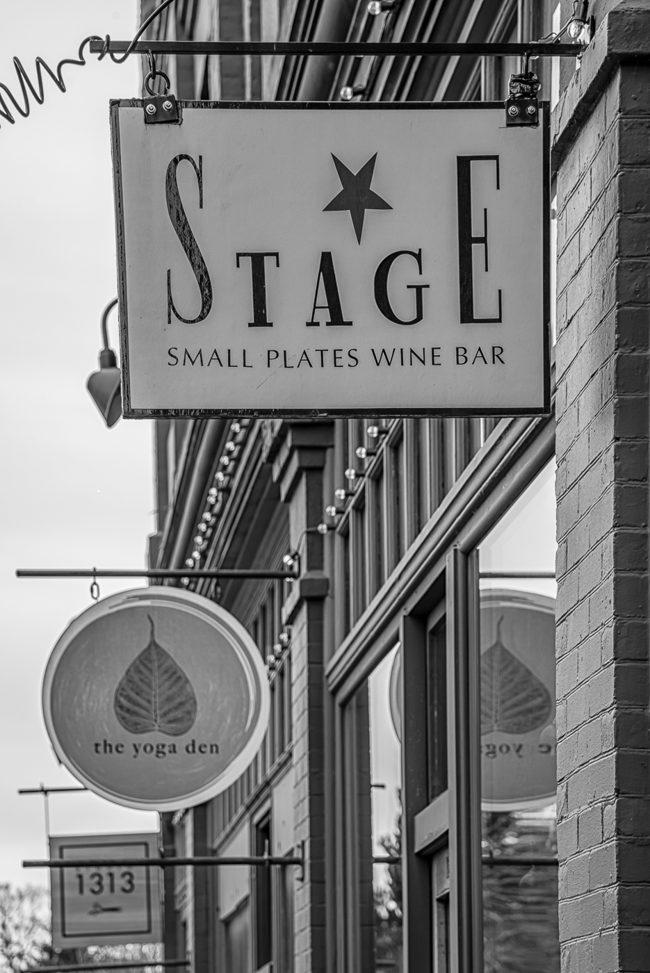
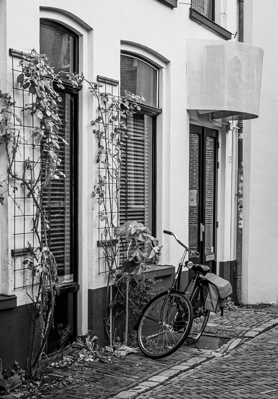
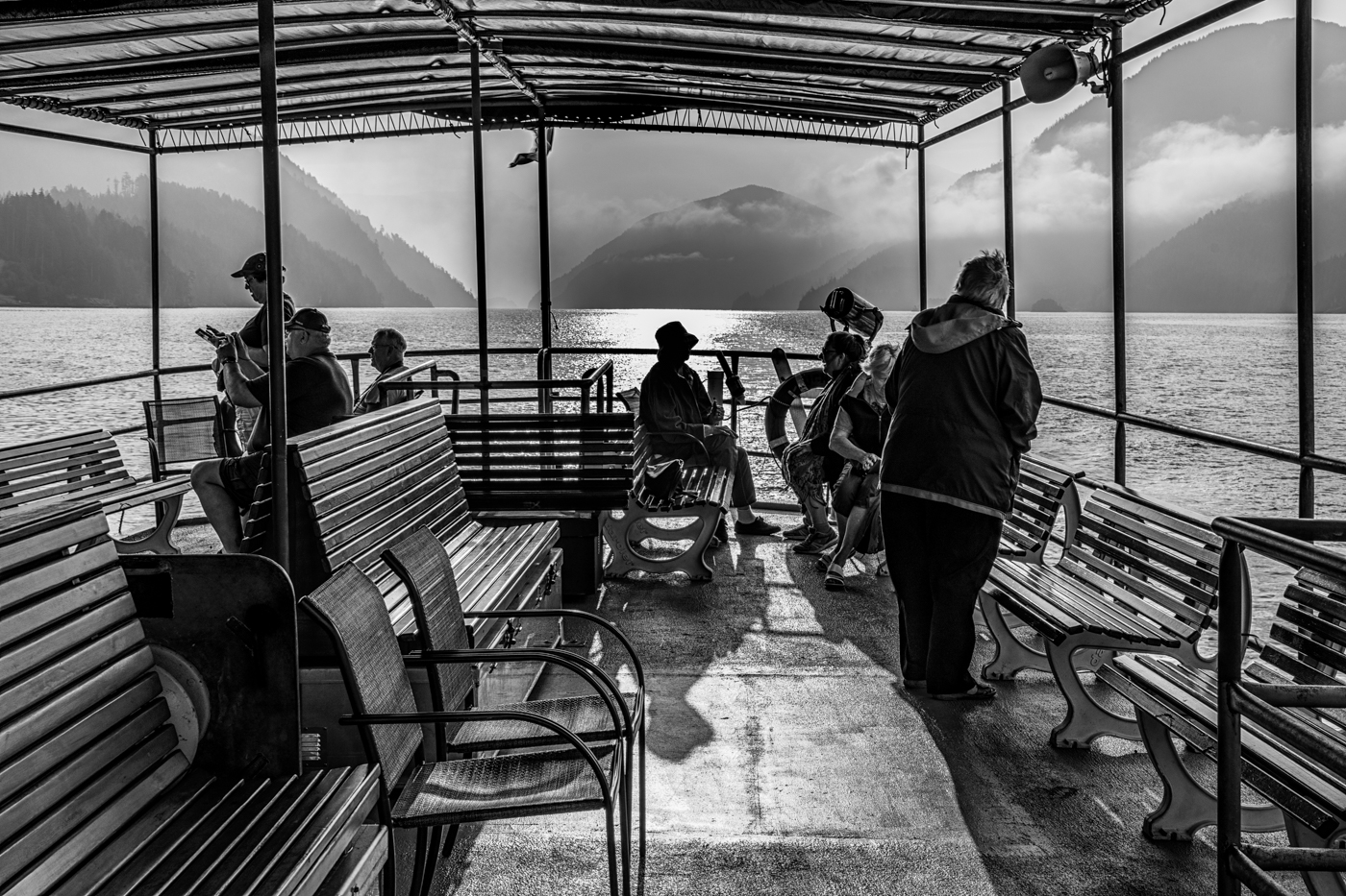
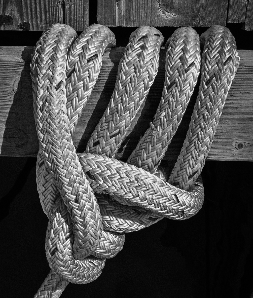
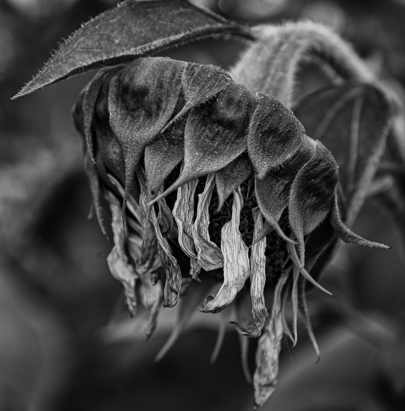
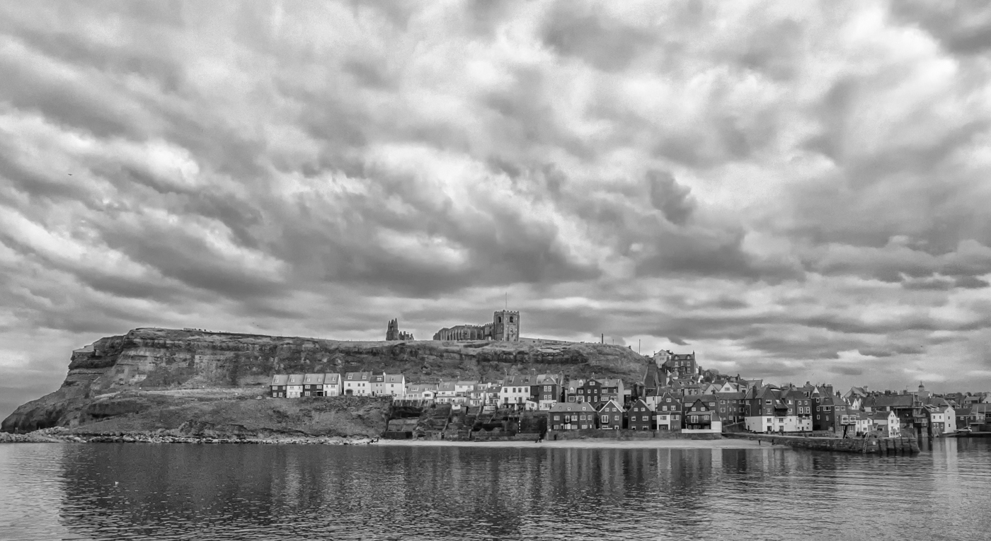
Cindy, I always enjoy your broody monochrome landscapes with their dark skies and cloud detail. In this one, you have added some appealing grungy elements, the disintegrating siding on the house and shed, the leafless tress. At first glance. the trees in the foreground seemed to overshadow the main subject but, on taking a second look, I feel they contribute to the atmosphere.
I like David's crop, making the buildings fill more of the frame (and darkening the downstairs window removes a minor distraction). |
Jun 10th |
| 50 |
Jun 20 |
Comment |
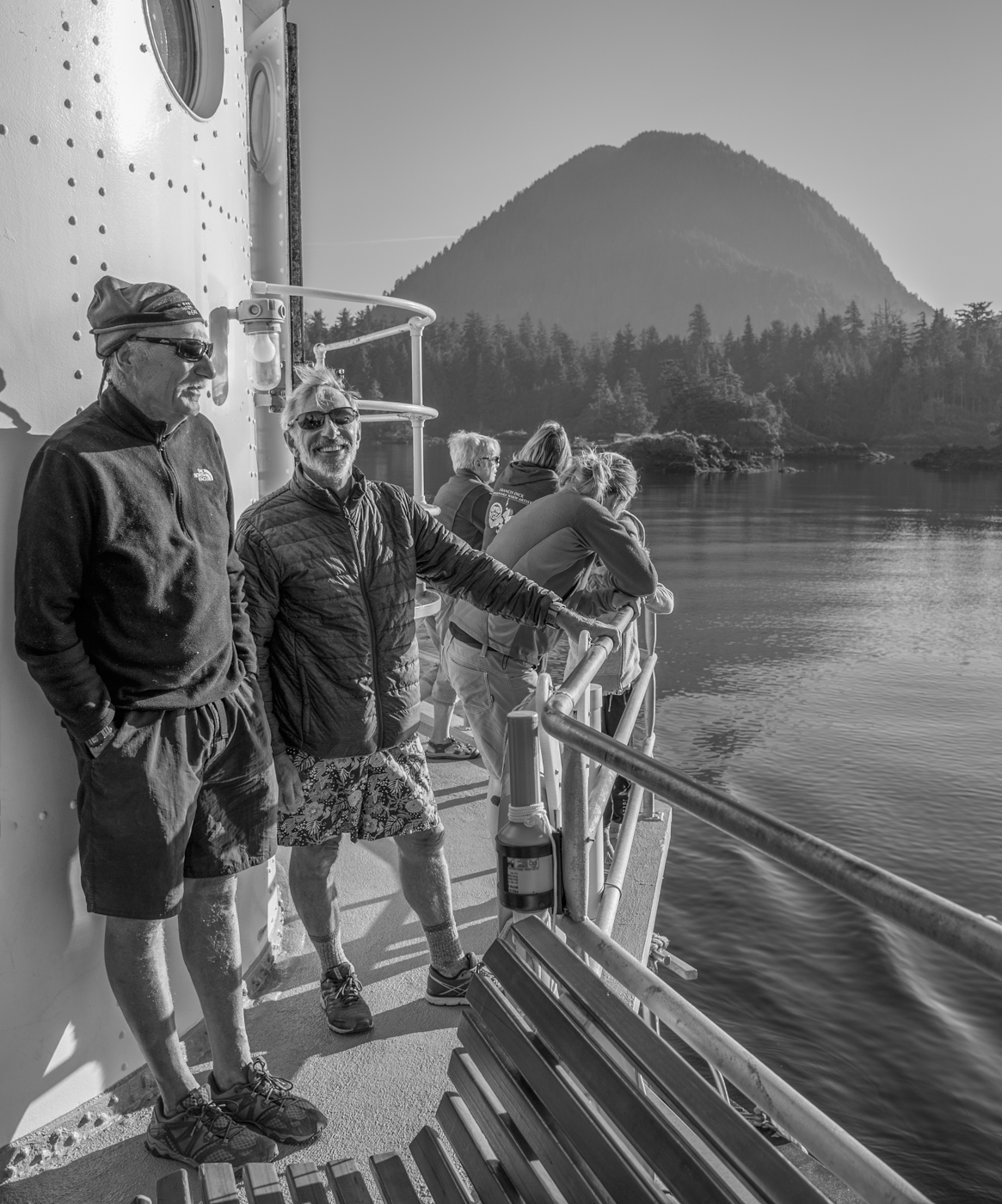
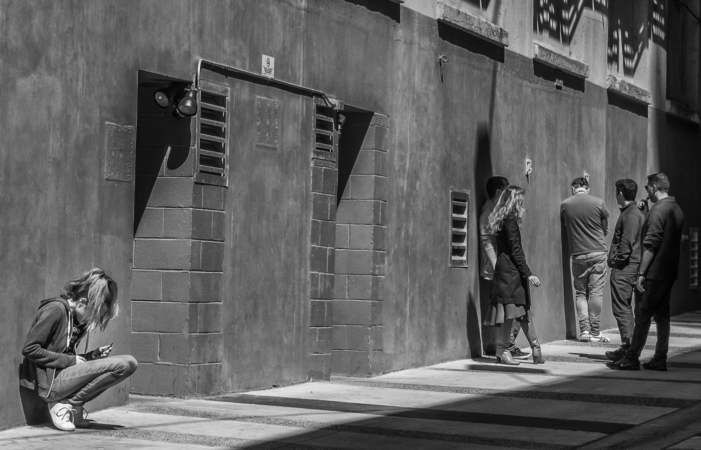
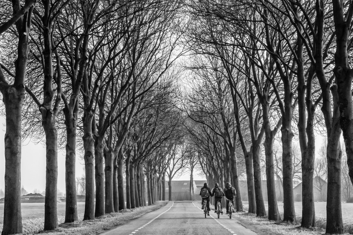
I like both versions of this image but, where the bikes and their riders tend to blend together in the colour version, the monochrome seems to put the action right in our faces. I also like that the lead rider's face is visible to us adding to the story. |
Jun 10th |
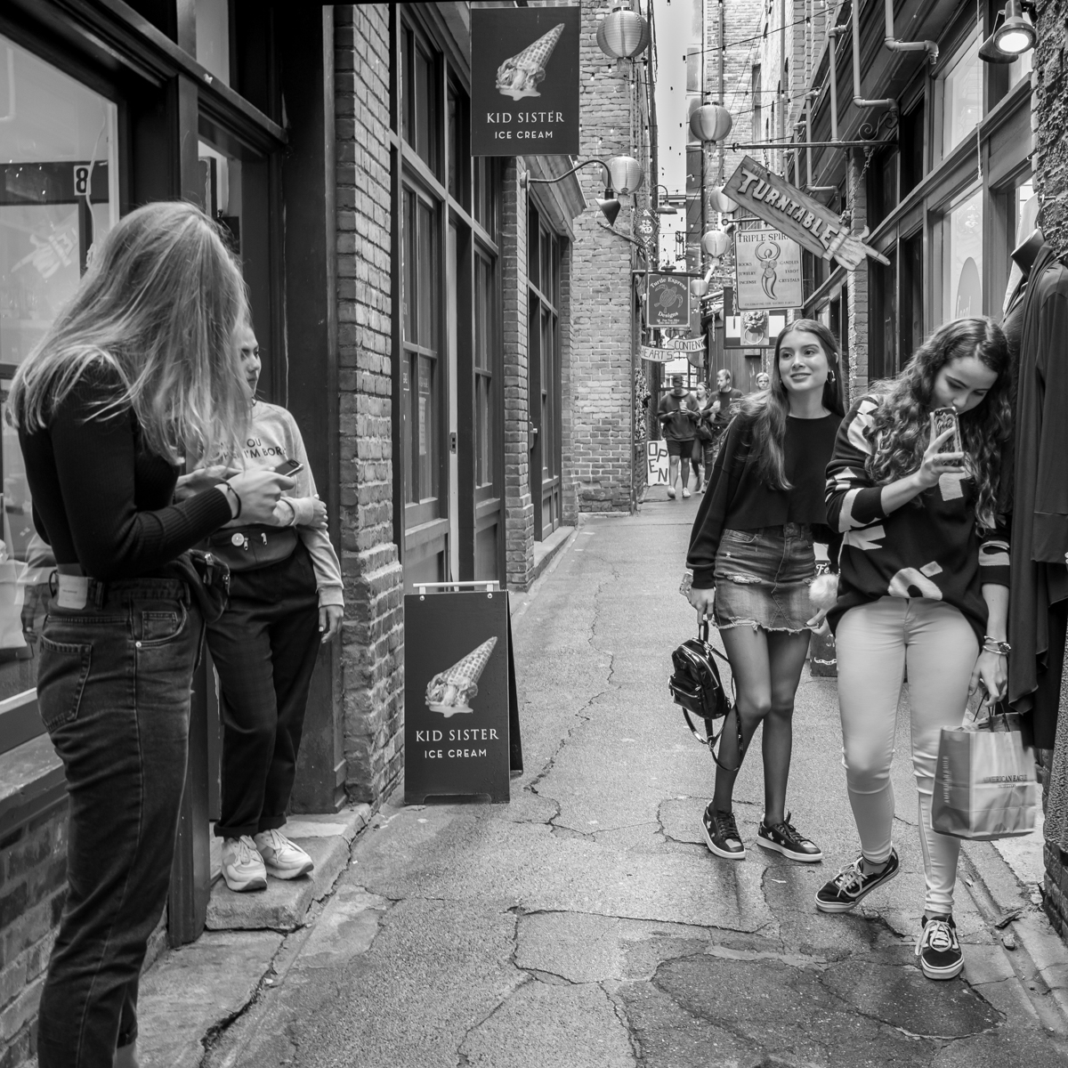
| 50 |
Jun 20 |
Comment |
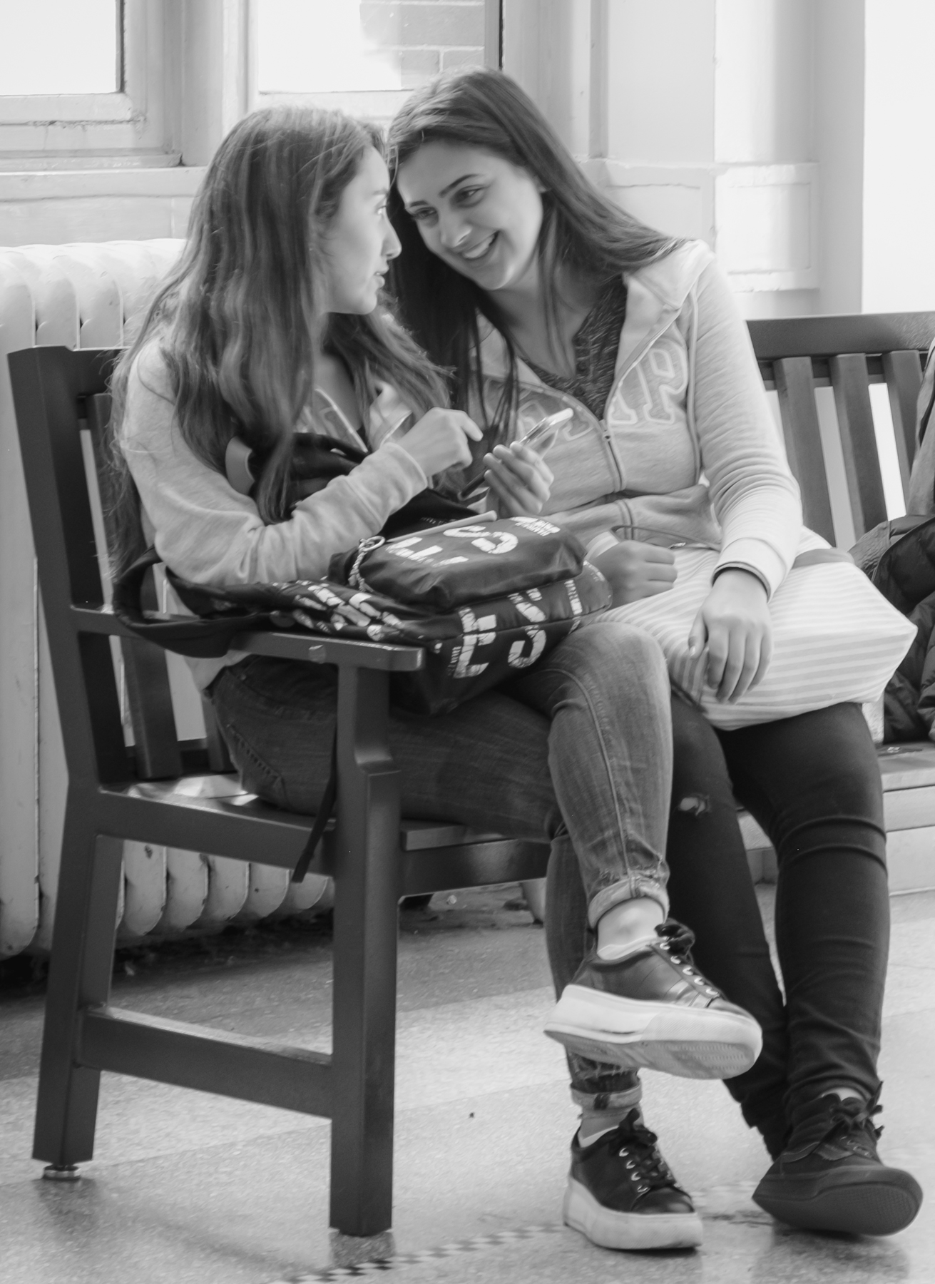
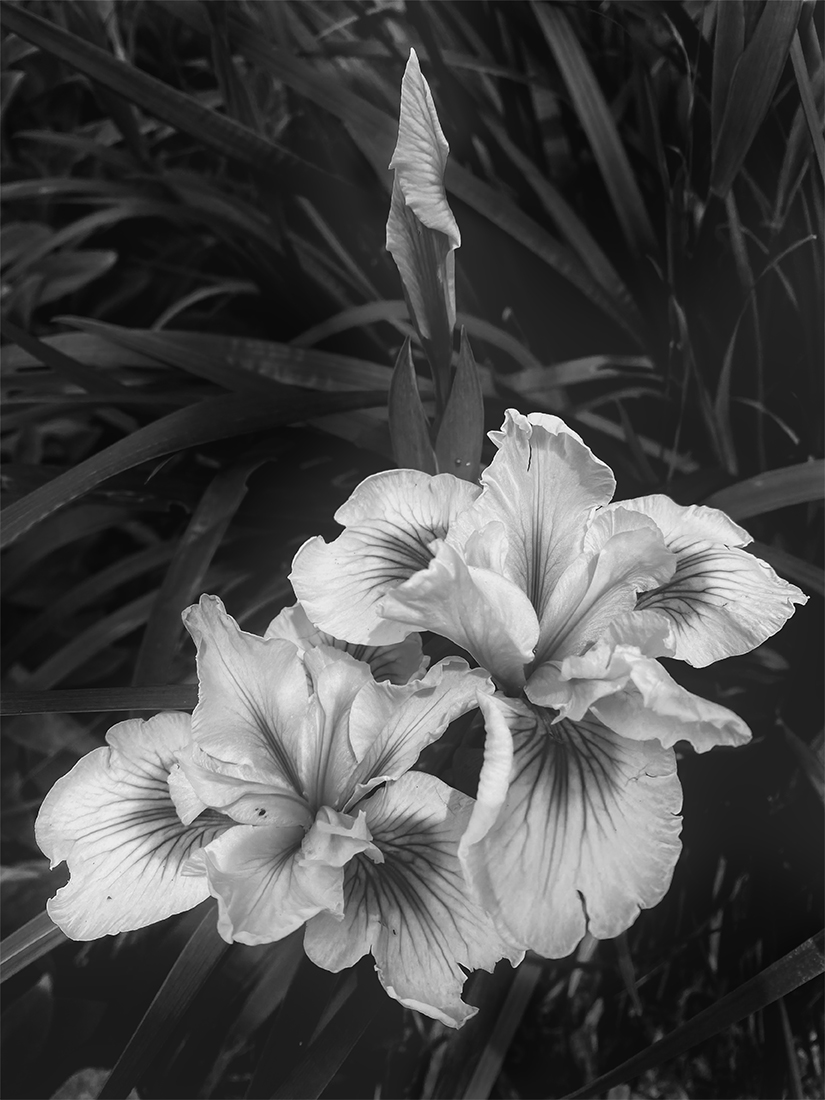
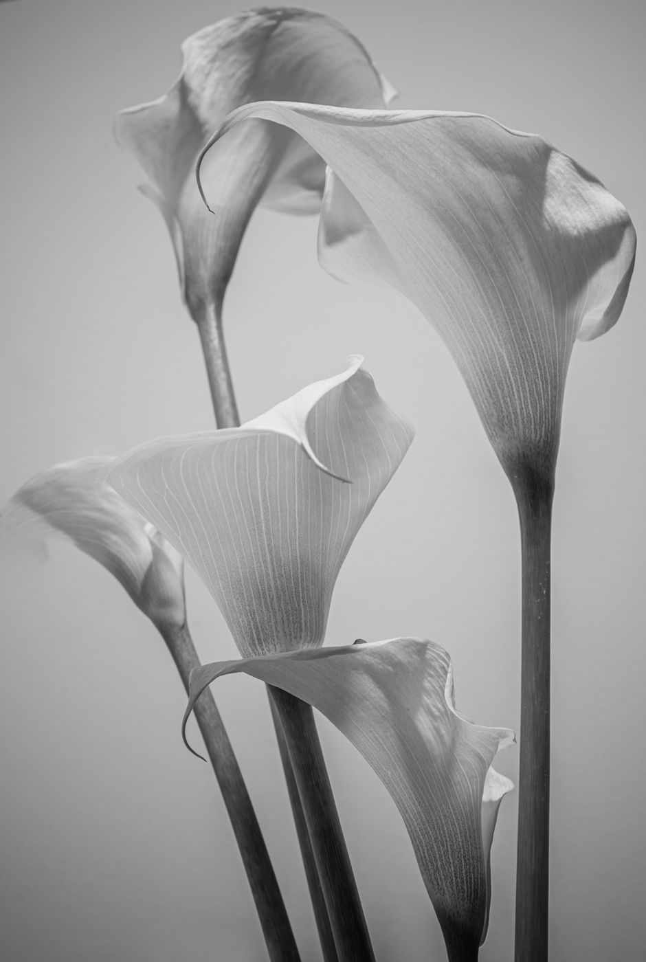
I like both versions of this image but I think the monochrome highlights more of the detail and the beauty of the woman's face than the colour version, in which the vibrant pinks and oranges of her clothing tend to overshadow it. The composition is great, with her in perfect sharpness sitting in front of the nicely blurred brick background, staring off into the distance. I winner, I would think! |
Jun 10th |
| 50 |
Jun 20 |
Reply |
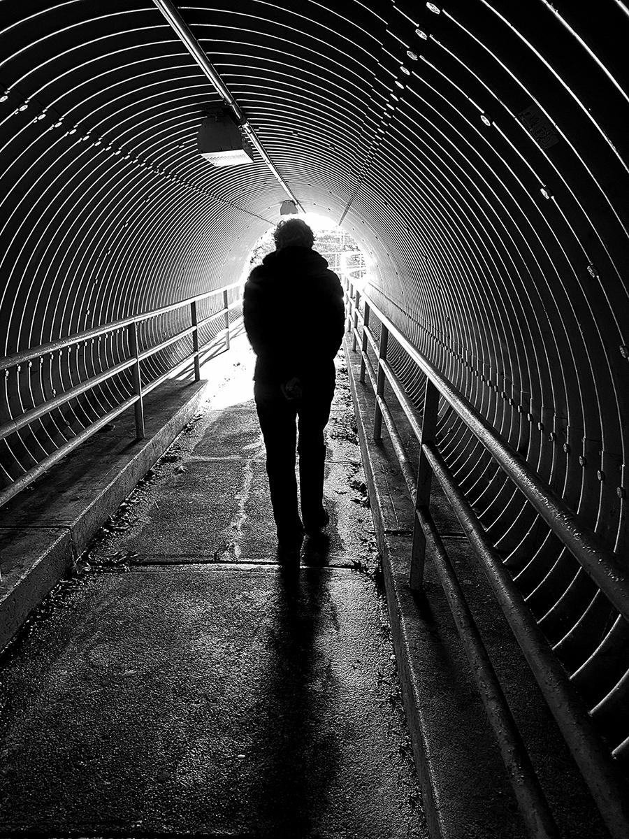
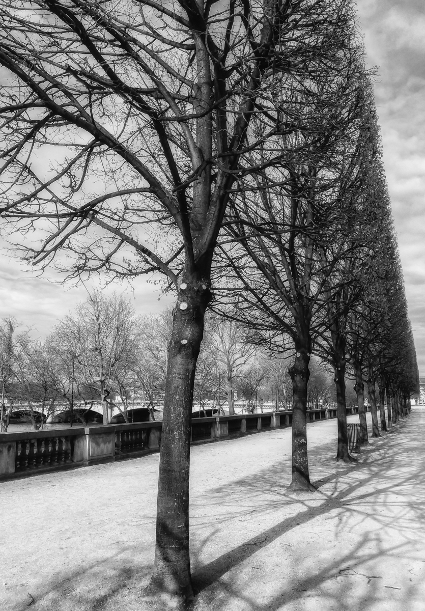
Thanks, David. I like your crop from the left. I did heighten the monochrome contrast, but ended up toning it down a bit so as to maintain as much detail in the dark tree on the right as possible. |
Jun 10th |
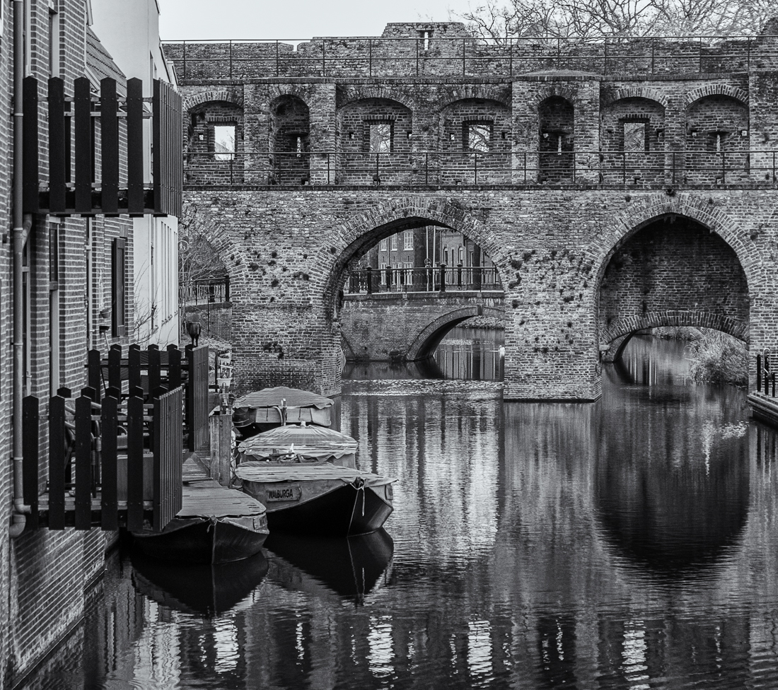
| 50 |
Jun 20 |
Comment |
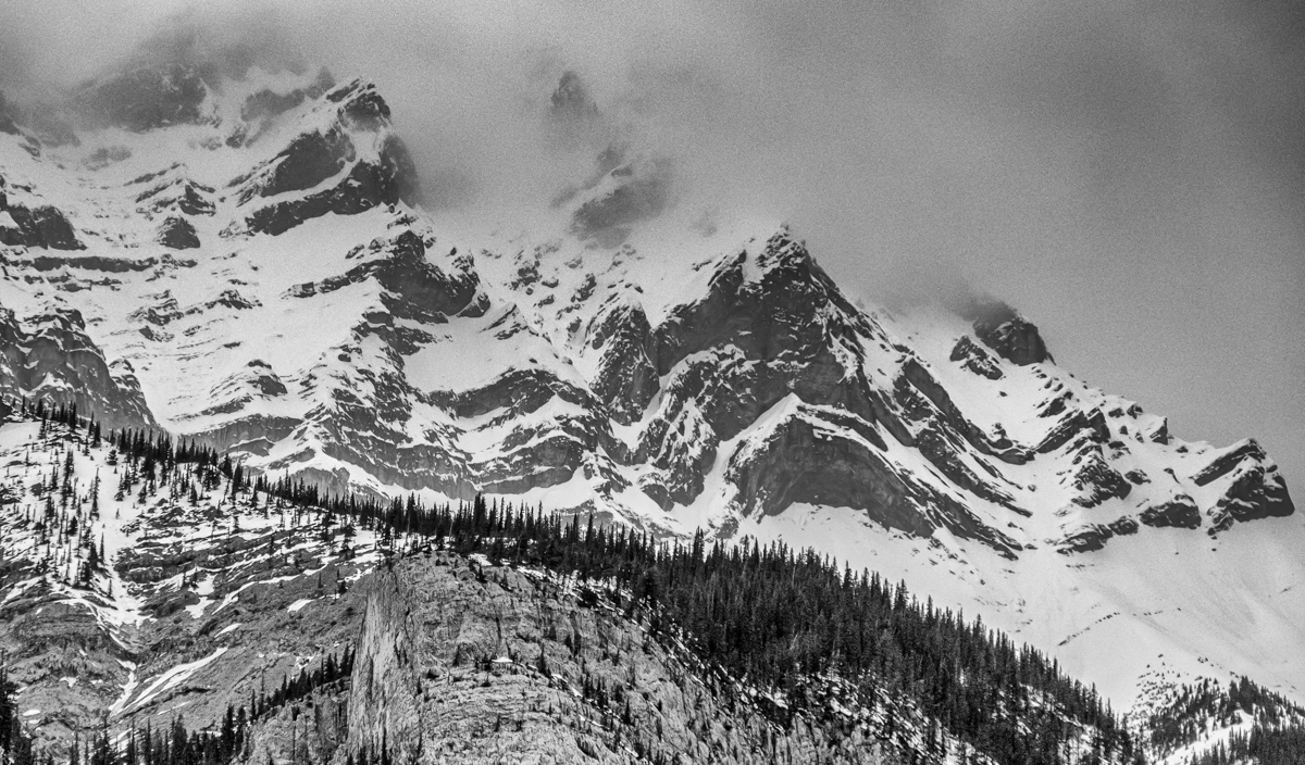
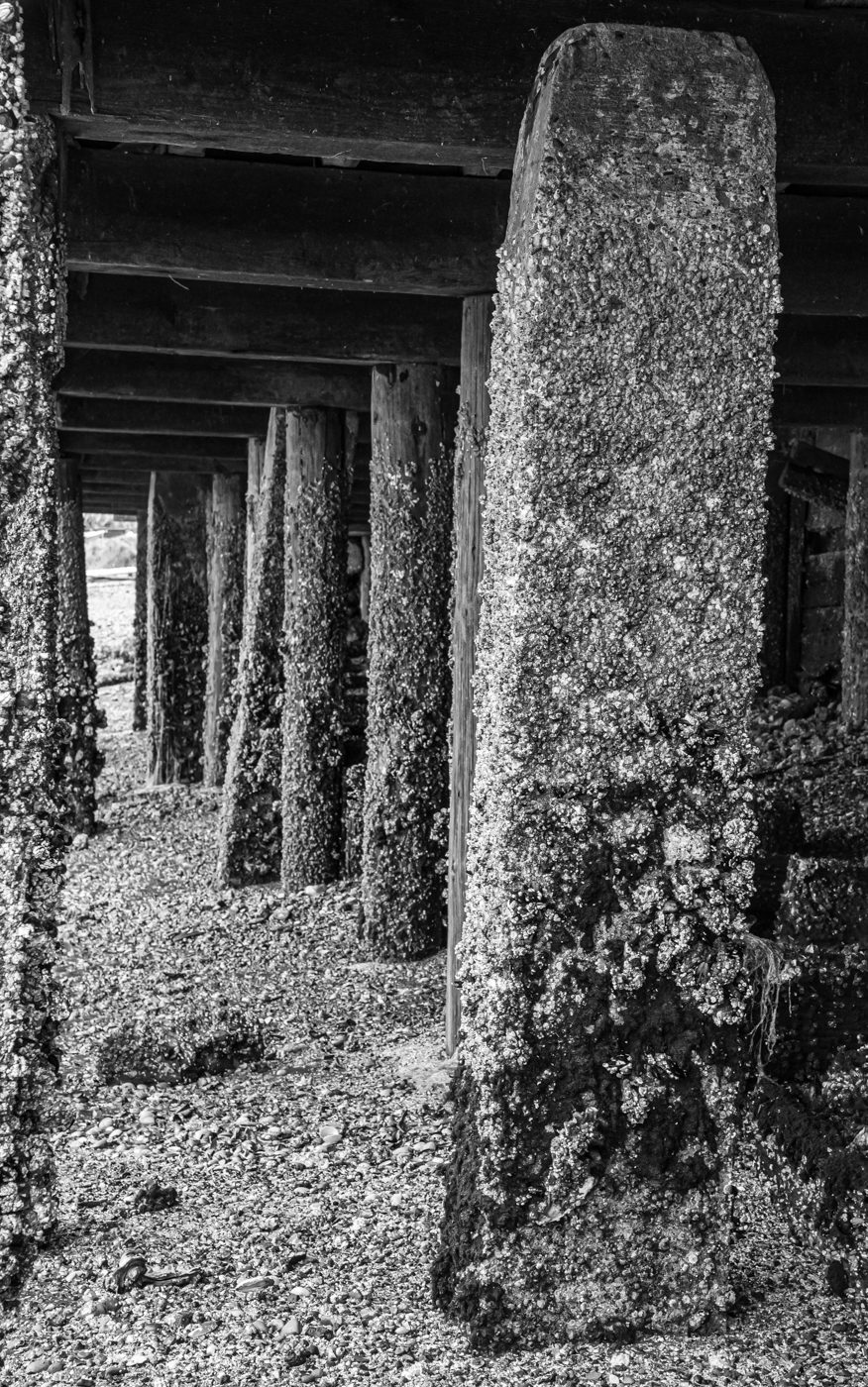
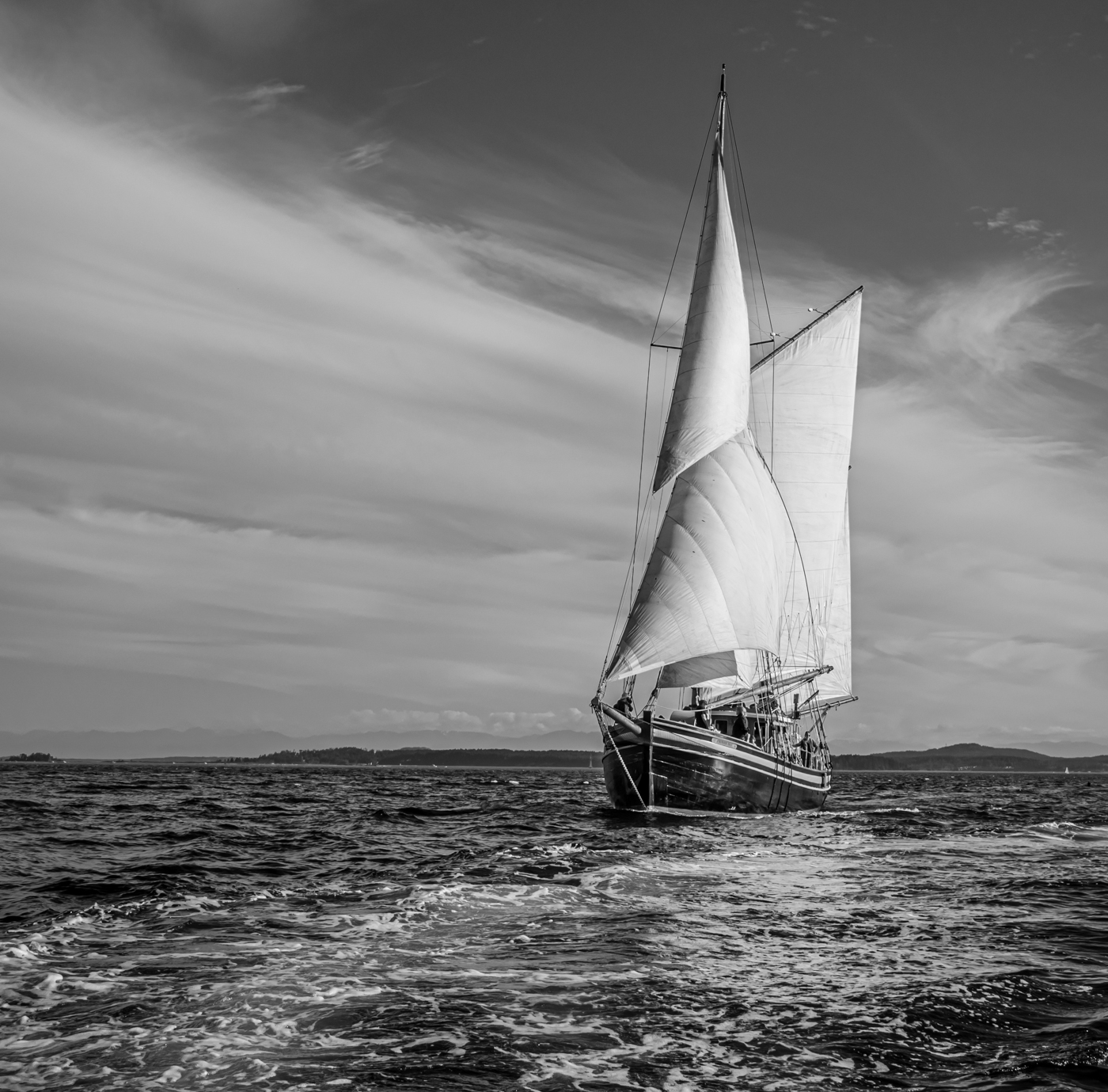
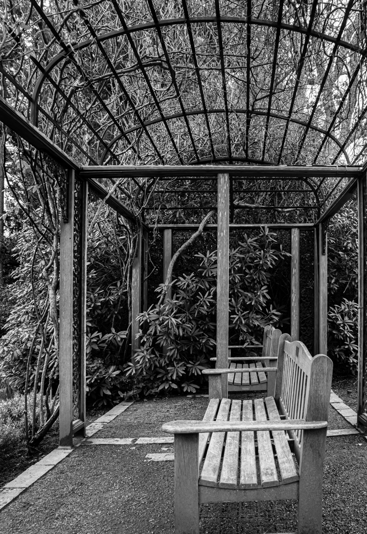
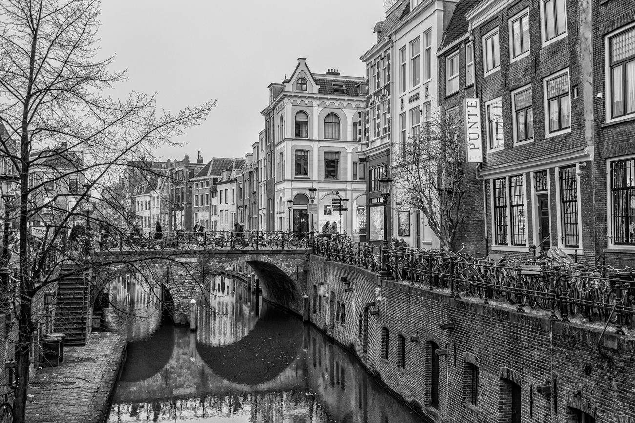
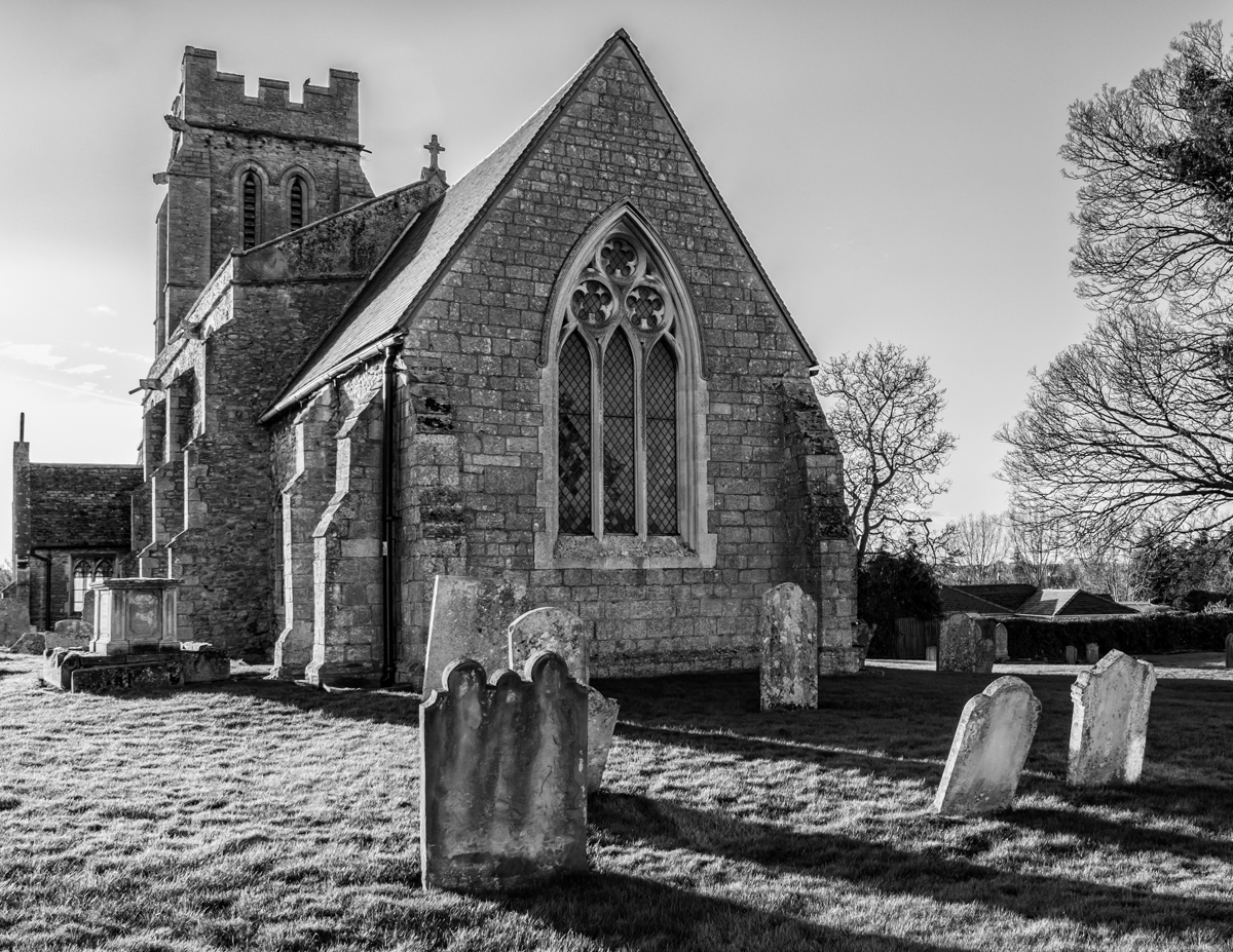
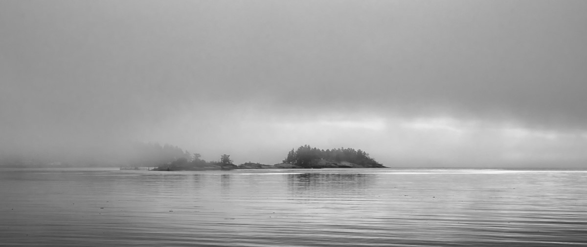
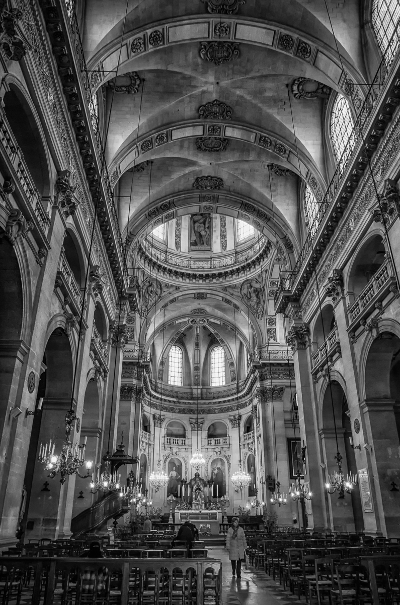
I really like the monochrome version of this, especially with your heightened contrast. I think the symmetrical composition also works well, with leading lines from all directions converging in the center. The only thing I might do differently (if this were my image) is lighten and/or smooth out the sky - I find the texture of the clouds detracts a bit from the strong fine art nature of the image. |
Jun 10th |
5 comments - 1 reply for Group 50
|
5 comments - 1 reply Total
|