|
| Group |
Round |
C/R |
Comment |
Date |
Image |
| 50 |
Apr 20 |
Comment |
I am not sure what to add here - I think the overall composition, with the placement of the figure on those rocks in the river well separated from the bank, works well. Chuck, I agree that the fisherman is a little dark in your image - he either needs to be lightened up or completely silhouetted, depending on what your intention is. His silhouette, in Jeffrey's edit, draws our eye to his shape as a strong component of the composition as a whole. But if your intention was to make this image about him as a person, I think lightening him up would be the way to go (perhaps with some additional masking, as suggested by David). |
Apr 20th |
| 50 |
Apr 20 |
Comment |
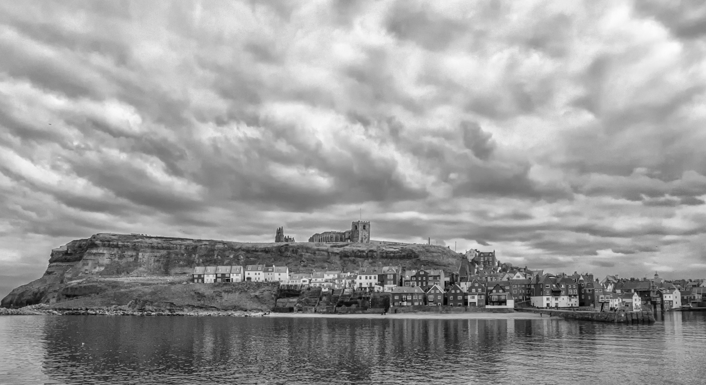
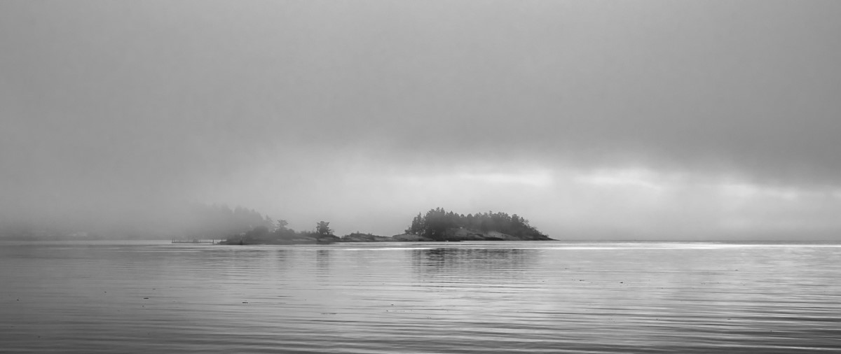
Wow, such a moody, dramatic feel to this image. The composition works well, with the shape of the cloud bank almost mirroring the small island on the horizon (and that island being perfectly entered between the right-hand side of the frame and the downpour). It might be my imagination but there are places in the clouds that look a little over-sharpened, creating what looks like some chromatic aberration along their edges (this looks particularly strong along the right side of the dark clouds on the left). |
Apr 20th |
| 50 |
Apr 20 |
Comment |
I initially agreed with Cindy's reasons for preferring the colour version, but Jeffrey's edits I think have done the trick for the BW. The added texture and clarity bring the duck's head and some of the body into sharper focus and the added space on the right gives her more room to move into. |
Apr 20th |
| 50 |
Apr 20 |
Comment |
Jeffery, I agree with Cindy about how you have captured the waterfall - perfect shutter speed I would say. I, too, like both the colour and the monochrome - to me, there is a very different feeling to each of them. The colour version is a compelling nature scene in lovely soft hues - I love the bluish tones in the water against the greenery. Your post-processing on the mono version has yielded a strong, emotionally impactful, almost abstract, image. |
Apr 20th |
| 50 |
Apr 20 |
Comment |
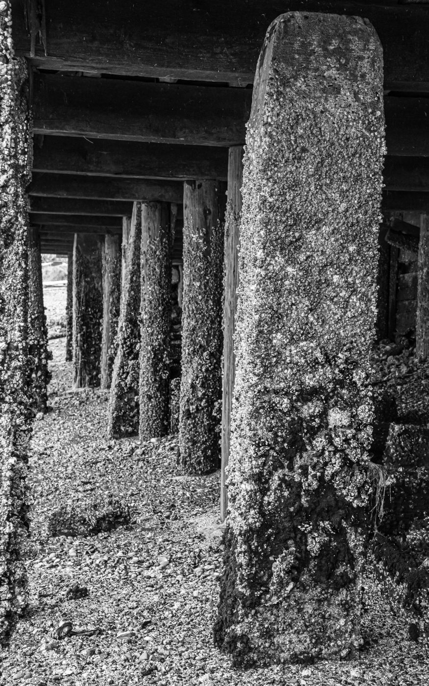
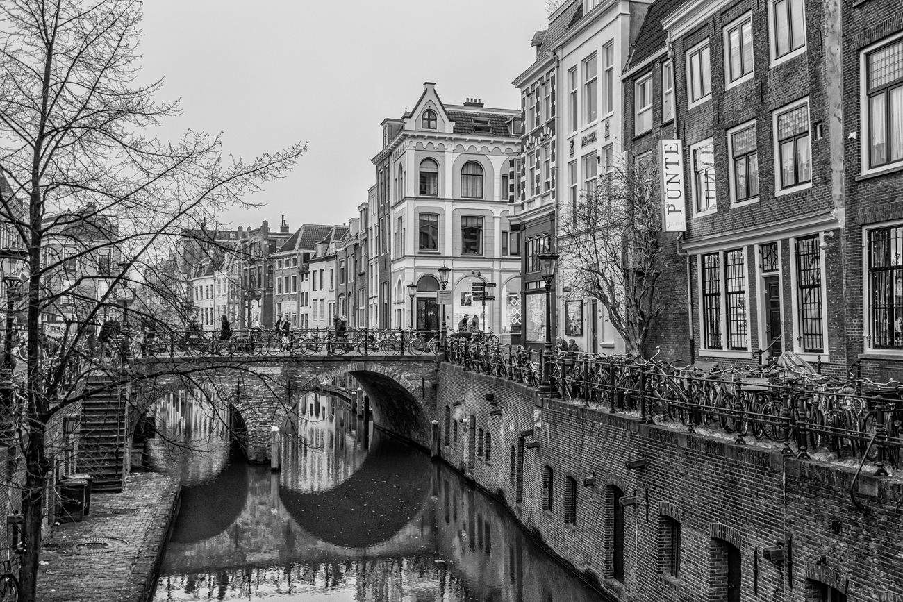
I also really like the monochrome of this image, which I think brings the interesting textures and strong leading lines more to our attention. However, I am wondering if a similar crop on the colour version would be just as effective. |
Apr 20th |
| 50 |
Apr 20 |
Comment |
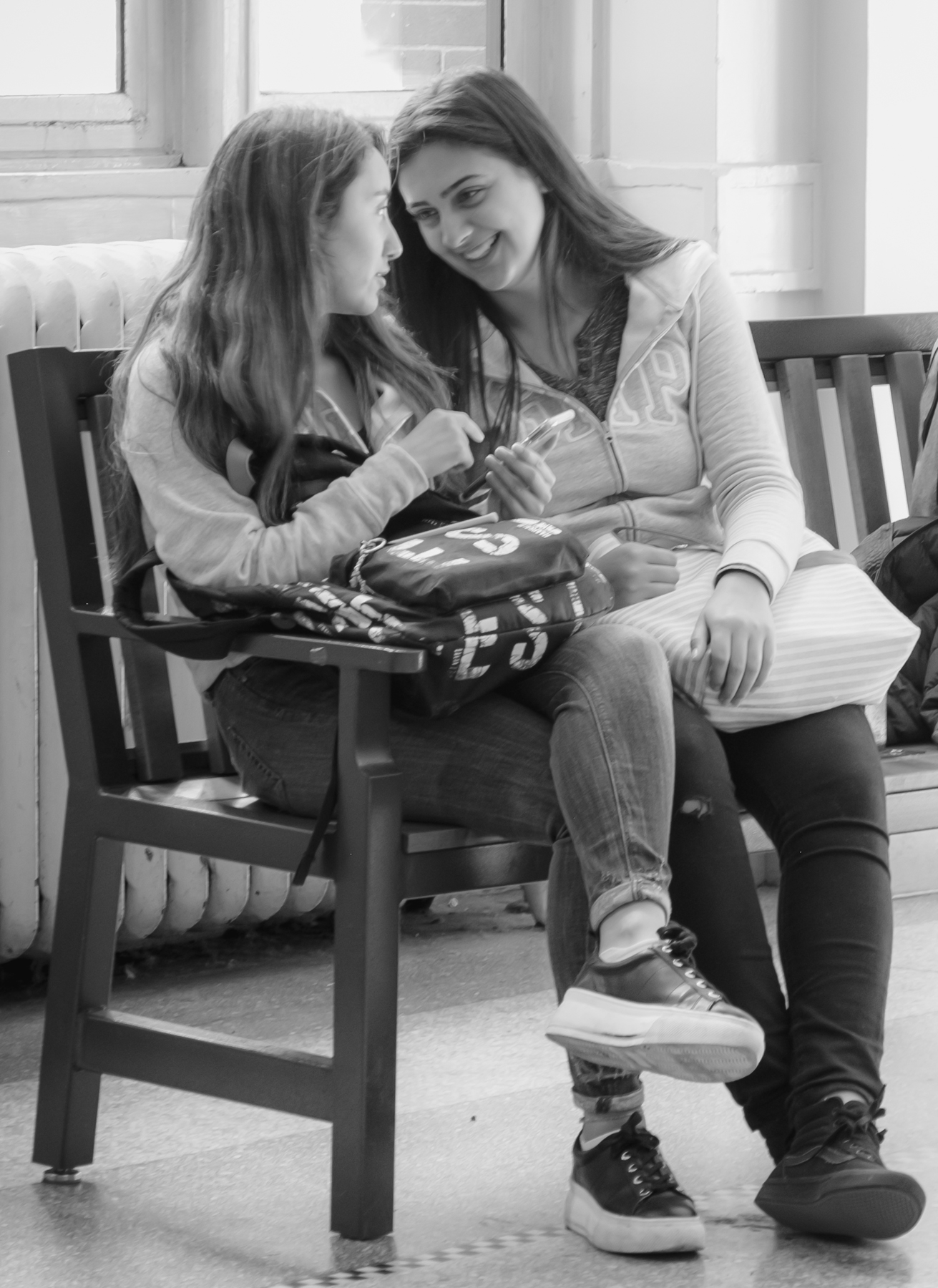
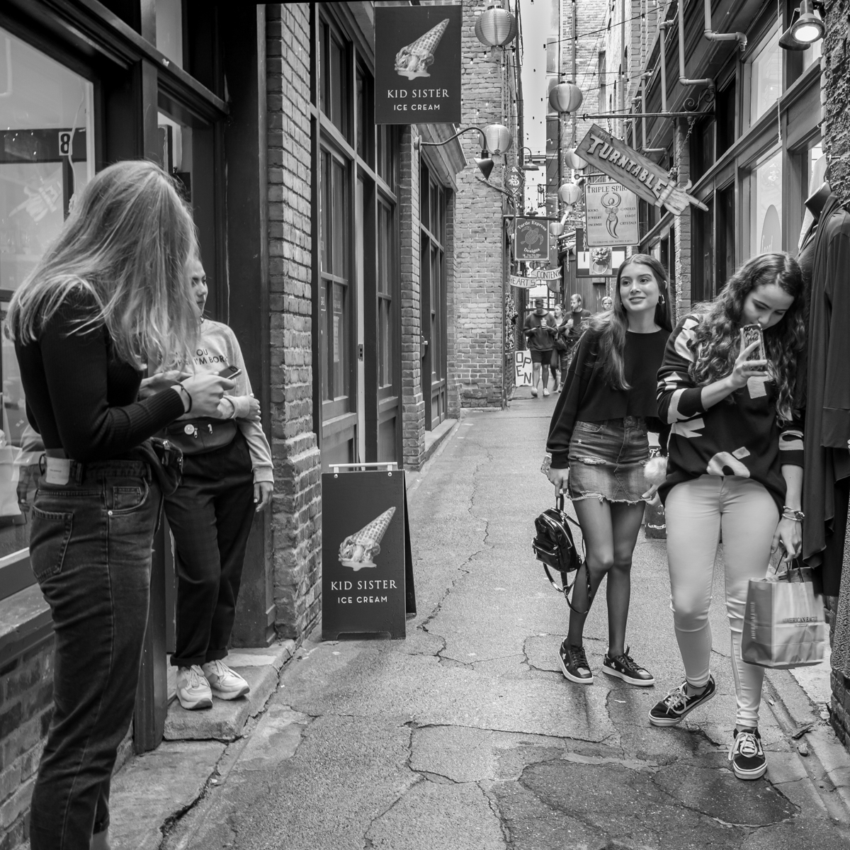
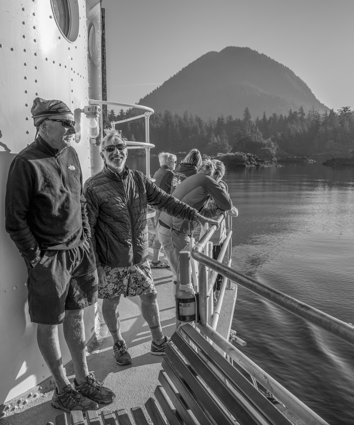
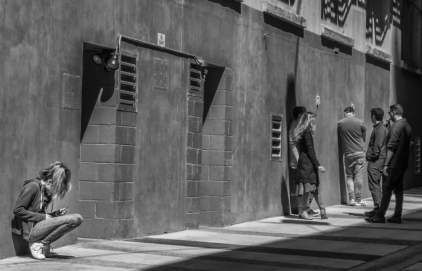
Yes, a wonderful "people" shot. I prefer the monochrome and like both the crop on the right and the cloning of the white sign on the left - all these help focus on the action. Well done on the technical aspects - the sharp focus, the tonal contrast and yes, great timing capturing that look on the child's face. |
Apr 20th |
6 comments - 0 replies for Group 50
|
6 comments - 0 replies Total
|