|
| Group |
Round |
C/R |
Comment |
Date |
Image |
| 4 |
Oct 23 |
Reply |
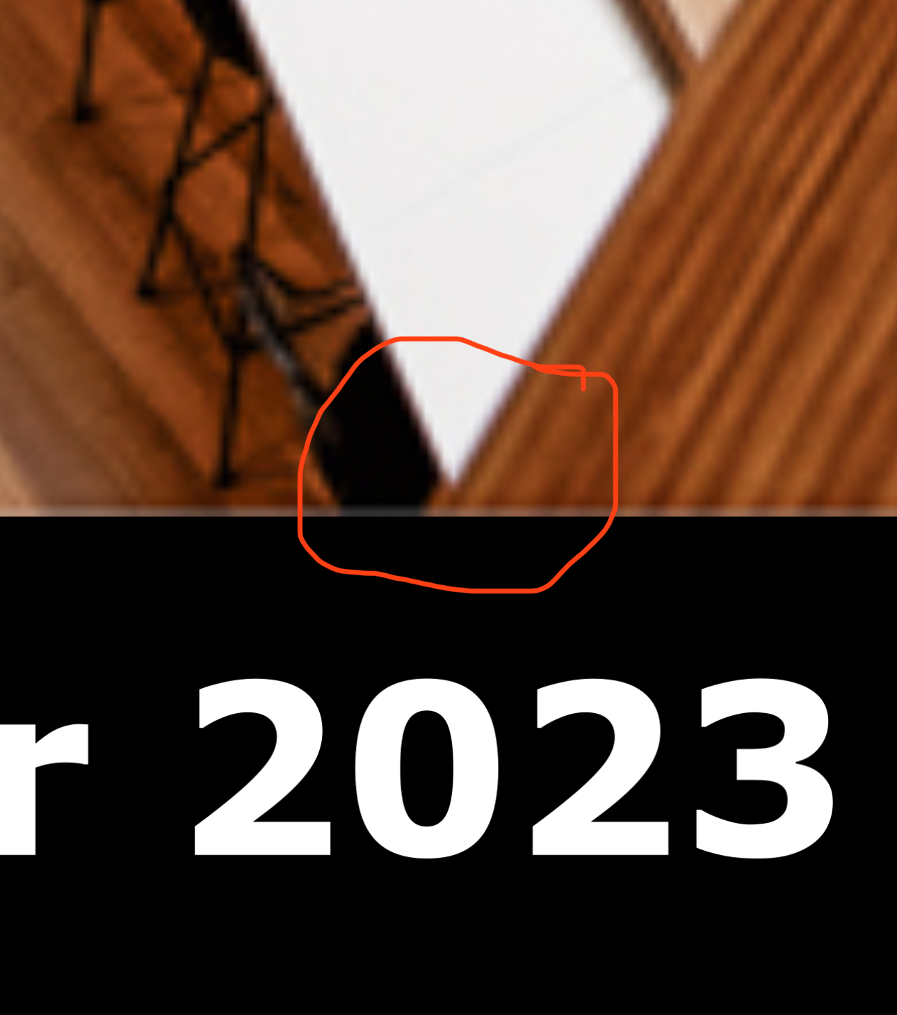
I was looking at the small V at the bottom, But after closer examination I see that it is not a merger. See my attached screenshot enlargement. |
Oct 25th |
 |
| 4 |
Oct 23 |
Comment |
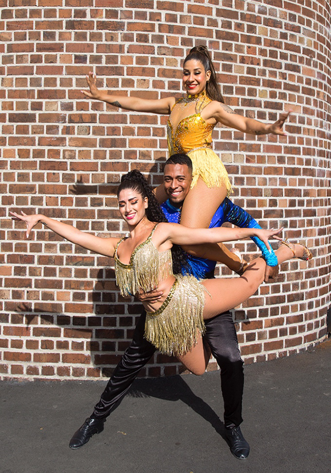
Great job. The image has a strong center of interest and one can't object to it being centered. I'm bothered by the little light trap in the lower right corner. That can be corrected with a little cropping. The tone of the background was just a little bright for my tase. I brought your image into Lightroom Mobile on my iPhone and using the masking tool I selected the subject and inverted the selection to adjust the background. I dropped the exposure ever so slightly and reduced the contrast. I'm finding that I'm using the masking tools in Photoshop and Lightroom Mobile quite often. |
Oct 24th |
 |
| 4 |
Oct 23 |
Comment |
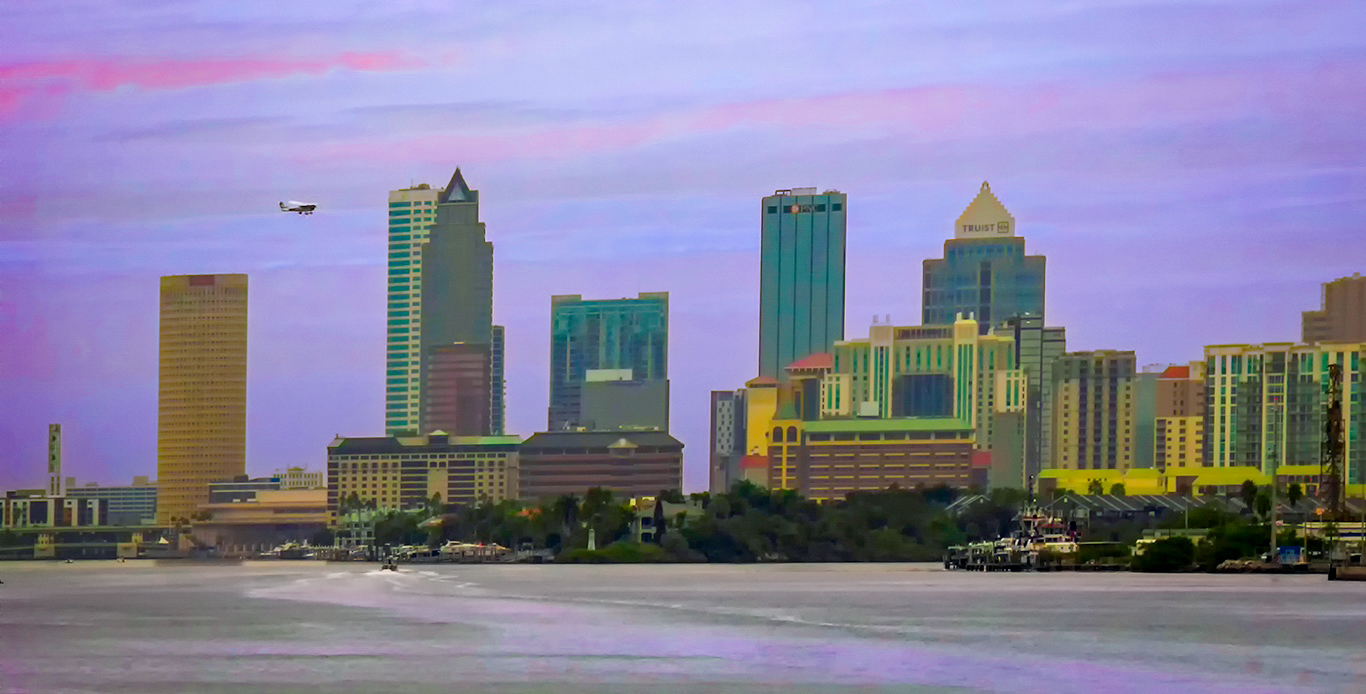
You and I have discussed this image on several occasions. I like to cartoon appearance of this image however, there seems to be a slight yellow cast that bothers me. I took the liberty of working with the color in the sky and water for a different effect. This was done on my iPhone with Lightroom Mobile. |
Oct 24th |
 |
| 4 |
Oct 23 |
Comment |
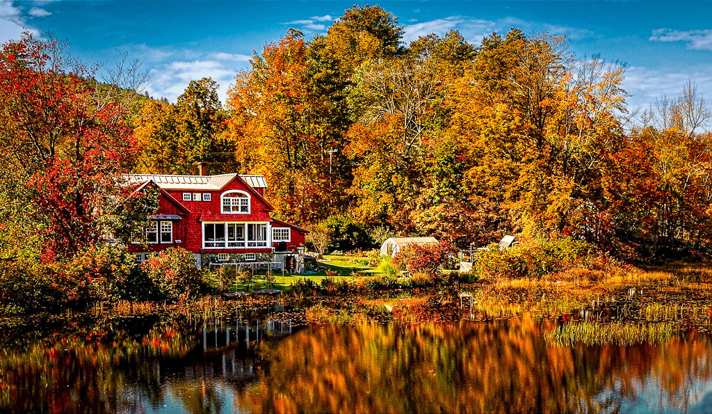
You have a pleasant composition and great weather conditions for great fall colors. I believe that the sky color does not look right. It appears to be slightly cyan. I did some quick adjustments on my iPhone using Lightroom Mobile. I corrected the color of the sky, used the Auto setting on the overall image and added a slight vignette. |
Oct 24th |
 |
| 4 |
Oct 23 |
Comment |
The bright surfboard certainly grabs your attention. I like the way you handled the composition leaving space on the right side. I would crop the top of the picture and eliminate the surf line. |
Oct 24th |
| 4 |
Oct 23 |
Comment |
Good job! Did you try any slower shutter speeds? The important part of the image, the race car, was very sharp. That's one picture that you can't flip. � I might consider cropping off the top and eliminate the distractions above the barrier. |
Oct 24th |
| 4 |
Oct 23 |
Comment |
You selected probably the best camera angle and lens for the situation. I prefer the color version opposed to the black and white one. The monochrome doesn't have the snap that makes me want to say WOW! To some degree the skylight is the brightest part of the image whereas the warmth of the wood holds my attention. There's a slight merger in the bottom with the shape. I also think you could add some additional warmth to enhance the wood. |
Oct 24th |
7 comments - 1 reply for Group 4
|
| 44 |
Oct 23 |
Comment |
First of all I commend you for going up that trail to get an overview of the town. I've been there twice and never considered going up there. I too hav found that some of my older images are looking better with newer technology. As others have commented, the trail add a nice touch of depth to the scene. |
Oct 24th |
| 44 |
Oct 23 |
Comment |
I have tried photographing pumpkins and the challenging part is creating a good composition. The large pumpkin in the foreground seems to work as a center of interest. I don't object to the black background but the partial pumpkin in the lower foreground is a slight distraction. Your overall process has been well executed. |
Oct 24th |
| 44 |
Oct 23 |
Comment |
The classic composition for this lighthouse. I've been there twice and have never had blue skies. I guess you have to be a New England resident to get them. Your process makes sense considering the conditions and the foreground. I might be a nit picker but that little puff of cloud off the tower looks like smoke. |
Oct 24th |
| 44 |
Oct 23 |
Comment |
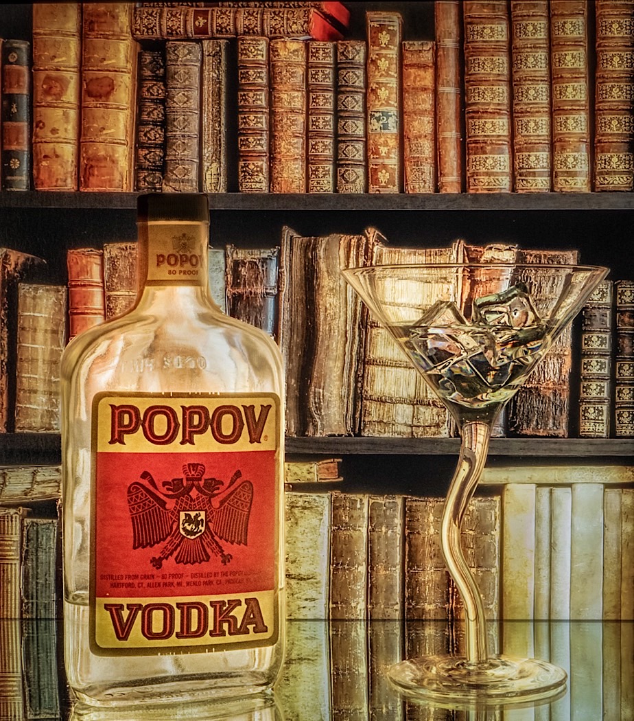
I liked the idea and the composition. The overall blend is smooth. I feel the brightness of the vodka bottle a little hot. One of the benefits of having Lightroom Mobile on my iPhone is the ability to edit on the fly. I used the masking tools and brush to tone down the glass area of the bottle and not the label. I also added a slight vignette to bring down the edge brightness. |
Oct 24th |
 |
| 44 |
Oct 23 |
Comment |
Glad to hear that you had the opportunity to do some traveling. It's difficult at times coming up with new material. Overall this month's image looks great. I probably would not have thought of trying HDR on animals. |
Oct 24th |
5 comments - 0 replies for Group 44
|
12 comments - 1 reply Total
|