|
| Group |
Round |
C/R |
Comment |
Date |
Image |
| 14 |
Aug 19 |
Comment |
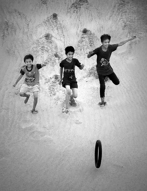
Great composition and really fine subjects are what make this image. I don't disagree (much) with what my colleagues above above said, but the problem was that the scene had a very narrow range of tones from black to white, which your camera placed in the middle of your available 256 tones. Less than full range of tones in the middle of the scale means that everything is GRAY, and that is a non-standard situation that is hard to handle.
Here's what I suggest. It's what I did to your image. Open the image in Photoshop, and select Levels. In Levels set the white point (higher end of the histogram) lower and the black point (low end) lower than it is. Then tinker with these adjustments and the center slider as needed. This procedure will stretch the range of pixels like magic to fill the whole 0 - 256 scale and give you something that is easier to work with. |
Aug 17th |
 |
| 14 |
Aug 19 |
Comment |
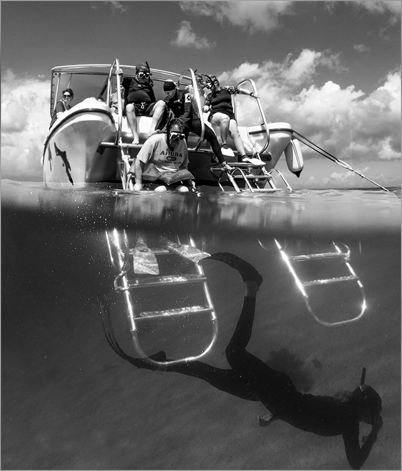
We often learn more from "difficult" undertakings than when we apply our skills masterfully on something we already know about. This one is particularly hard to do.
The image does look gray because it is a monochrome that has no real blacks in it; simply using Levels in Photoshop and adjusting the black point to get rid of the areas to the left of histogram in the image does a lot. A thin gray border also helps hold the image together.
|
Aug 17th |
 |
| 14 |
Aug 19 |
Comment |
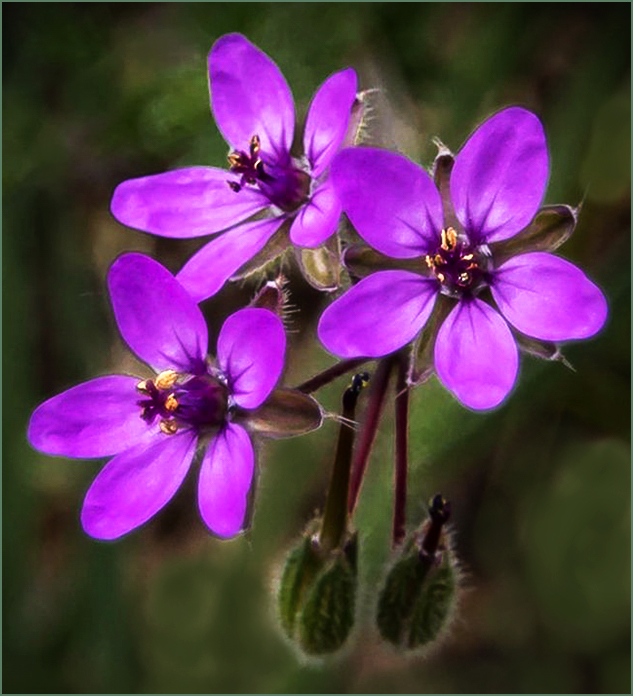
I like this image. Your colors and focus are outstanding. The composition is good, but I would like to see it cropped somewhat; you don't need all that space around the flower group, especially when that space is a bit "busy". The biggest (though still very tiny) problem I see is the light-colored background spots in the lower third of the image. These draw my eye from your flowers. |
Aug 17th |
 |
| 14 |
Aug 19 |
Comment |
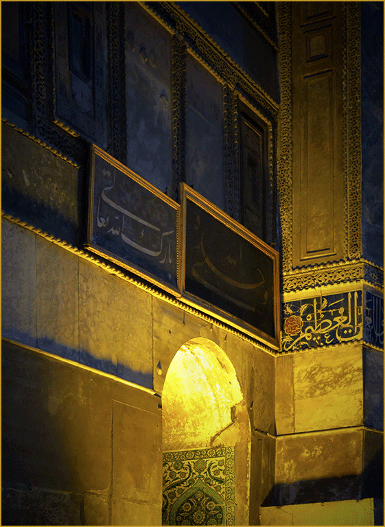
Your composition is a simple, yet not sparse, use of straight lines and the dominant curve of the arch, combined with a simple, two-color-plus-black color regime and good photographic technique to yield a very attractive image. There is no question of where my eye is drawn and kept. I have a few suggestions: (1) I added a circular gradient centered at about the top of the arch to darken the corners slightly, (2) then I used Levels in Photoshop to adjust the white point, black point, and gamma (effectively the contrast.) This This draws my eye to that arch, since the shadows now lead me there even more. Finally, I dodged the bright area at the top of the arch; you could also simply make a slightly darker version from the camera. The border helps helps unify the image and separate it more from the background. |
Aug 17th |
 |
4 comments - 0 replies for Group 14
|
4 comments - 0 replies Total
|


