|
| Group |
Round |
C/R |
Comment |
Date |
Image |
| 14 |
May 19 |
Comment |
This is really well done image, cropping, and workup. The only thing I can add is this: if you are going to display it against a black or otherwise dark background, please put a (very) thin usually grayish border around it. It should be thin and not bright enough to call attention to itself. Try it.
. |
May 22nd |
| 14 |
May 19 |
Comment |
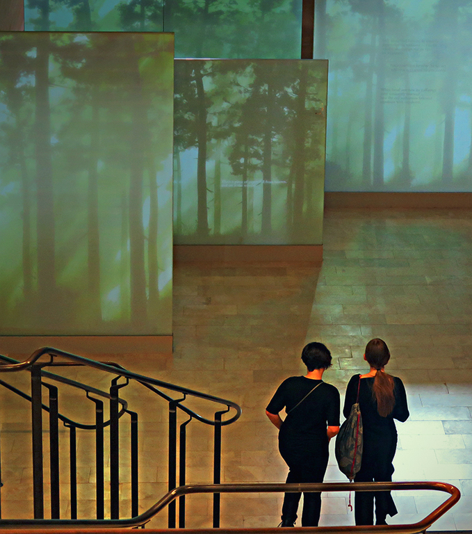
My three comment predecessors have covered it well. My only additional comments are to turn down the reds in the midtones, then tinker a bit with the other colors plus brightness and color, maybe something like this. To my eye, it is over saturated and dark.
|
May 22nd |
 |
| 14 |
May 19 |
Comment |
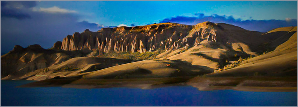
Your arrangement of the elements of the image is excellent, as are the colors, and cropping is very good. I hope I don't sound like a hack club judge, but to me it lacks a real center of interest; fortunately, you have one easily available. I suggest that you darken progressively from the big bump on the right of the cliffs in both directions, so that the bump stands out because it is brighter. I tried to do something about the softness, but wasn't able to do so. You did overdo the noise compensation. In Photoshop I use the sequence Filter>Sharpen>Smart Sharpen as he last thing in post processing, and usually get good results.
. |
May 22nd |
 |
3 comments - 0 replies for Group 14
|
| 33 |
May 19 |
Reply |
I did it on purpose. I've always been told that a photograph should lead in from the right; that just looks more "proper," and to me, it does. You have to be careful doing that, but in this case only you and I (and now anyone who reads this) knows any different. In the big sweep of the image, the center of interest is the point and the clouds above it, with the land leading to it. |
May 28th |
| 33 |
May 19 |
Comment |
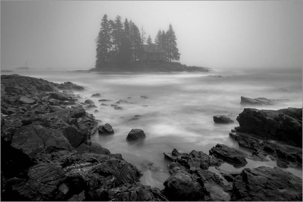
This is a very well done mood picture. You can heighten the mood even more by giving the image more depth. I tried by darken the lower half with linear gradient that started just below the island on a separate layer, then adjusting overall brightness and contrast to taste. |
May 26th |
 |
| 33 |
May 19 |
Comment |
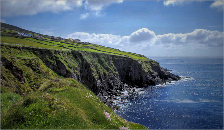
You have good eye for landscapes, and this is a good one. It is often found that it's changes to the small details that make the biggest difference between an image that's OK and one that someone would want on the wall. I suggest something like this. In Photoshop I turned down the exposure maybe a third of a stop, and cropped a bit from the top and right. Then I tinkered with contrast, clarity, dehaze, vibrance, and levels, and darkened the corners some. |
May 26th |
 |
| 33 |
May 19 |
Reply |
Sorry about the civil war. I did look up "Mevagissey" and was interrupted before I wrote my comment. My memory being so short....... |
May 26th |
| 33 |
May 19 |
Comment |
Beautiful mood picture of boats in a Welsh harbor. If it were mine, I might crop about half of the distance from the top of the frame to the tip of the mast. Otherwise I would go along with Bob's ideas, but add more vignette on the basis that it would direct more attention to the sailboat instead of its surroundings.
|
May 25th |
| 33 |
May 19 |
Reply |
It's sharp enough to see every detail of the standing rigging of the sailboat, and even red the name on the fishing boat in the left background.
|
May 25th |
| 33 |
May 19 |
Comment |
Wonderful location, beautiful detail, a "WOW" image indeed. I suggest a slight brightening of it; its exquisite detail and the ominous portent of the mountains can stand our having a better look. While you are at it, I think you should decide which of your two pictures you prefer, the mountains with a small, but still spectacular portion of the sky, maybe the lower half of the image, the dramatic sky supported by a rim of mountains. I vote for the lower half.
. |
May 25th |
| 33 |
May 19 |
Comment |
You found a good subject, and made a good start on photographing it. My high school photography teacher always said "fill the frame with the subject." When you don't, as in this case, you end up with essentially two subjects to choose from, which is what the discussion above amounts to. The rest of the background just makes it busy.
The infrared has longer wavelength than the visible part of the spectrum that our eyes and cameras normally see. It has a different index of refraction from most of the visible, and is therefore not focused as sharply by many, if not most, lenses we are likely to use. My experience with IR photography goes back to needing to use deep red "A" filters with special film; its primary use was to give dramatic cloud pictures (white) against blue skys, in which there is no red. Since chlorophyll reflects IR strongly, foliage always turned out white. I'm glad to see that modern sensors incorporate more infrared capability along with the visible than they used to. |
May 25th |
| 33 |
May 19 |
Comment |
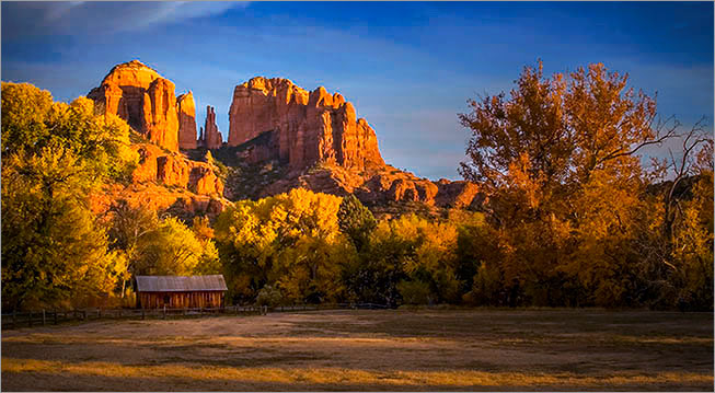
Well done! Your composition is right on, but would like to see the colors less orange, as you say. I did it by reducing the warm colors, increasing th cool colors all slightly, and giving it a circular black gradient centered at the base of the tall, thin pillar on the skyline, ending with readjustment of brightness and contrast in levels.
|
May 24th |
 |
| 33 |
May 19 |
Reply |
That's a rock and a hard spot. If the canyon wall in the middle of the image is level, the trees lean to the left; I left it the way I found it. |
May 22nd |
| 33 |
May 19 |
Comment |
Thank you, Elizabeth. |
May 21st |
7 comments - 4 replies for Group 33
|
10 comments - 4 replies Total
|