|
| Group |
Round |
C/R |
Comment |
Date |
Image |
| 14 |
Apr 19 |
Reply |
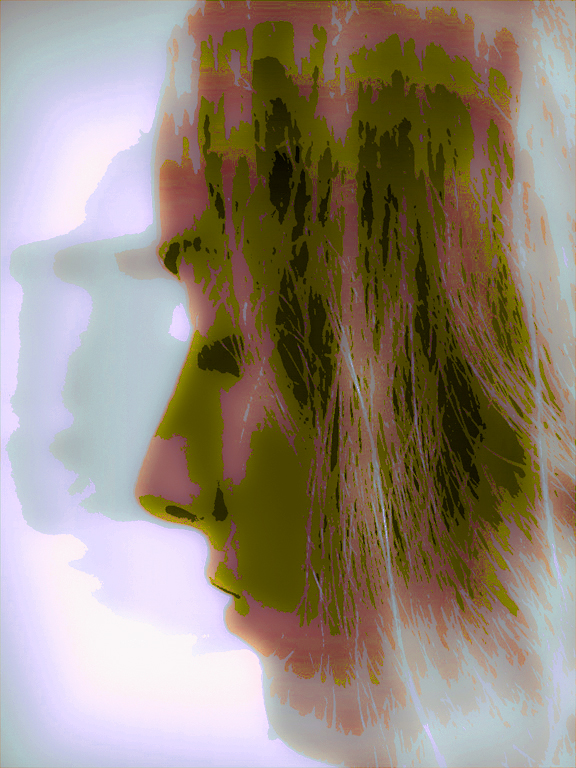
It is my opinion that an image as bright and colorful as this one is, is almost impossible to OVER saturate. Landscapes and portraits and their relatives are another story, where they likely would look, shall we say, a little strange if over saturated.
. |
Apr 25th |
| 14 |
Apr 19 |
Comment |
I like bright colors, and you've done it! As long as you have it, flaunt it! Turn up the vibrance and saturation. |
Apr 18th |
| 14 |
Apr 19 |
Comment |
Your image is very successful in capturing and displaying emotion. It is clean and simple, and has very strong composition. What an exhibition judge might say about it, I can only speculate. I played with your image to see what else the technique might do, and came up with this, using only Color Balance and Hue and Saturation. Thank you for sharing the idea with us.
. |
Apr 17th |
 |
| 14 |
Apr 19 |
Comment |
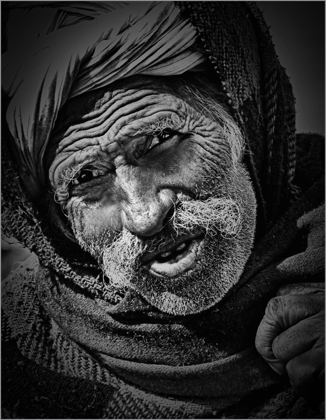
Fantastic lighting for a fantastic subject! You have captured the entire range of important detail very dramatically. I suggest going a bit further in you processing. Emphasize the face. If it were mine, I would crop it a bit more; the face is your subject, while the rest is supporting detail. I added a stronger circular gradient (on a separate layer) centered about on his nose, then adjusted the opacity of it and brightness and contrast of the whole picture to taste. With this kind of subject matter, don't be afraid of contrast!
. |
Apr 17th |
 |
| 14 |
Apr 19 |
Comment |
This is one of the better story-telling images we've had in a while! It has excellent camera and processing work. I do suggest warming it up a bit, and cropping a little from both sides, just enough to leave as much white on the sides as there is on the top.
. |
Apr 17th |
| 14 |
Apr 19 |
Comment |
I appreciate all your comments. They all have merit. On the other hand, I've deliberately done what some have complained about, and need to make my case on why. I would like to hear your opinions on the following, if and when you have time.
I was drawn to the picture by the lighting; it is hard to find aspen groves around here that have good lighting AND simple backgrounds at any time of day. This scene had very subdued lighting on the background, just enough to make it distracting without add anything to the image. To me the picture IS the trunks, and more detail behind them distracted without adding anything. The foreground grass seems necessary to keep an impression of solidity; it suggests to me that the trees would fall over if it weren't there. I agree that there is a brownish branch and a green leaf in the green area that probably should be removed.
. |
Apr 17th |
5 comments - 1 reply for Group 14
|
| 33 |
Apr 19 |
Reply |
Thank you for your suggestion. If that much is to be cut from the top, the left part of your version will look heavy, a bit out of proportion. I think the left side would be cut off, something like this, and maybe maybe something more creative than I did on the very top. What do you think?
. |
Apr 17th |
 |
| 33 |
Apr 19 |
Comment |
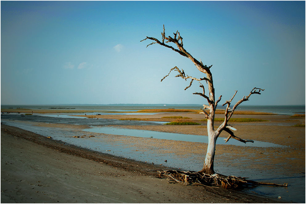
Your image tells a story of stark survival against the odds; at lest what it tells me, who live in the Rockies far from the sea. For me, it's the simplicity that does it, and doe it well. The bright, nearly white sky draws my eye, and I had to fight to concentrate on the rest of the picture.
There is blue in the sky, not much, but enough to make what I think is a difference. It took a lot of work with Selective Color, alone, to bring it out. |
Apr 16th |
 |
| 33 |
Apr 19 |
Comment |
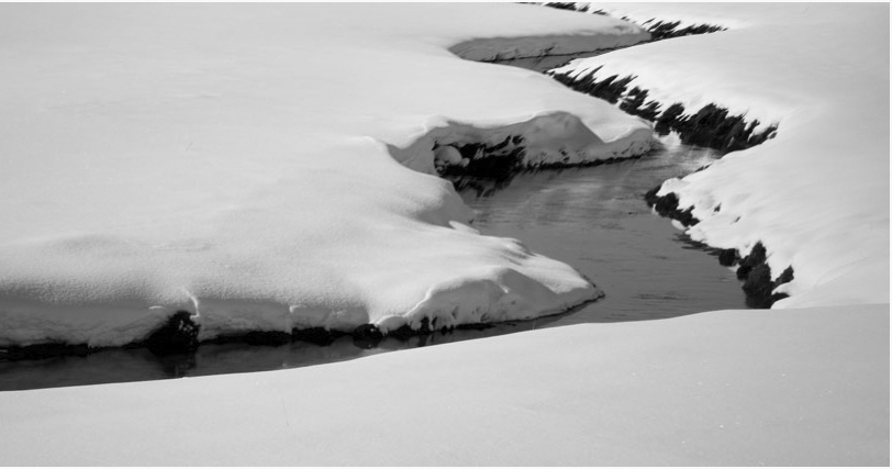
Your use of variable focus to draw the eye to where you want it is unusual, but highly effective. You have achieved a diagonal composition and its' implication, in a horizontally-stratified composition. I really like it.
In my opinion, your image is not "too contrasty," but not constrasty enough; most monochrome images should have areas of real (000 brightness) black, and others of real saturated white (255). |
Apr 15th |
| 33 |
Apr 19 |
Comment |
Simple composition with plenty of subdued detail, strong and saturated colors (I would make the greens more so, though), and fantastic lighting. Everything.
I suggest adjusting the shadows locally on the main tree to give them a bit more detail, and cropping from the left, out to about half the way between the two vertical trees. |
Apr 15th |
| 33 |
Apr 19 |
Reply |
Right on, Mark! I agree; if you've got it, flaunt it! |
Apr 15th |
| 33 |
Apr 19 |
Comment |
Your viewer's eye is usually drawn to and held by the highest-contrast, more usually the brightest place in an image. My eye acts that way now; I know that the sky is not where you want me to look, so here's what I would do.
I would increase the contrast, needed to bring out the fields and building more anyway, then use Selective Color, white and blue, to make the sky darker. That may do it. |
Apr 15th |
| 33 |
Apr 19 |
Reply |
You are right. It is underexposed, not a full stop, but more like a quarter of a stop; the brightest white, on the far bank of the creek, has a numerical value of roughly 225 (out of 255.) A full stop increase would make it close to 500, truly "brighter than bright." The histogram shows a major minimum at about 160; the peak in between is from all the sunlit snow. I can afford to saturate some part of the brightest snow while some detail in most of the rest of the snow, but I'm not sure that I like that.
The fleshly-fallen snow has a smooth surface which is crosslit and with only minor detail.
Aside from not taking any pictures with such surfaces, I don't know how to handle such a thing, and will welcome anyone's suggestions on how.
|
Apr 15th |
4 comments - 3 replies for Group 33
|
9 comments - 4 replies Total
|


