|
| Group |
Round |
C/R |
Comment |
Date |
Image |
| 14 |
Feb 19 |
Reply |
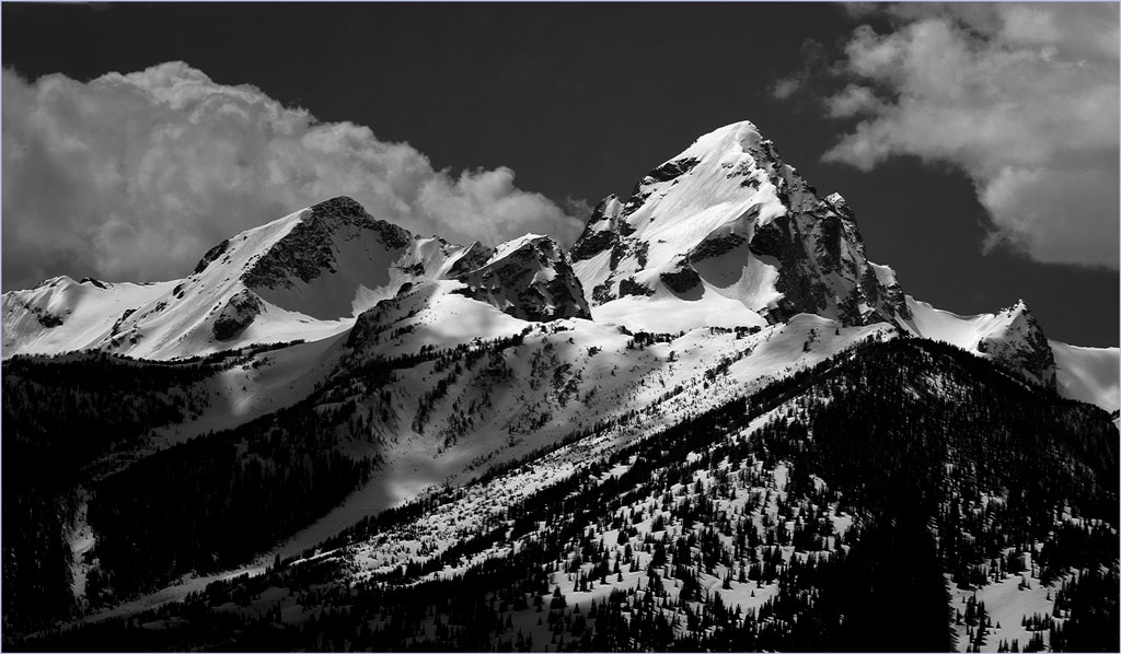
Thank you. You are right about those clouds; I had not noticed them. but now think they must be taken. out. I did it with a lasso, feather, and fill sequence, which sometimes give a better match than cloning.
Our advantage is that we live only an hour or so from the Tetons, and can access them almost any time and any weather. We find that the better times are usually at sunrise (usually the only times they are really cross-lighted in good light,) in mid-morning, as in this image, and in stormy weather.
. |
Feb 11th |
 |
| 14 |
Feb 19 |
Reply |
Thank you.
I was trying to do the whole contrail at once, then at (bigger than you used) smaller pieces.
. |
Feb 11th |
| 14 |
Feb 19 |
Reply |
Glad to be able to be back! |
Feb 11th |
| 14 |
Feb 19 |
Comment |
Your use of color on a black and white accomplished what you intended. Among other things, it tells us what they are talking about. In my opinion, however, you now need to darken the vehicle so that it calls much less attention to itself.
. |
Feb 10th |
| 14 |
Feb 19 |
Comment |
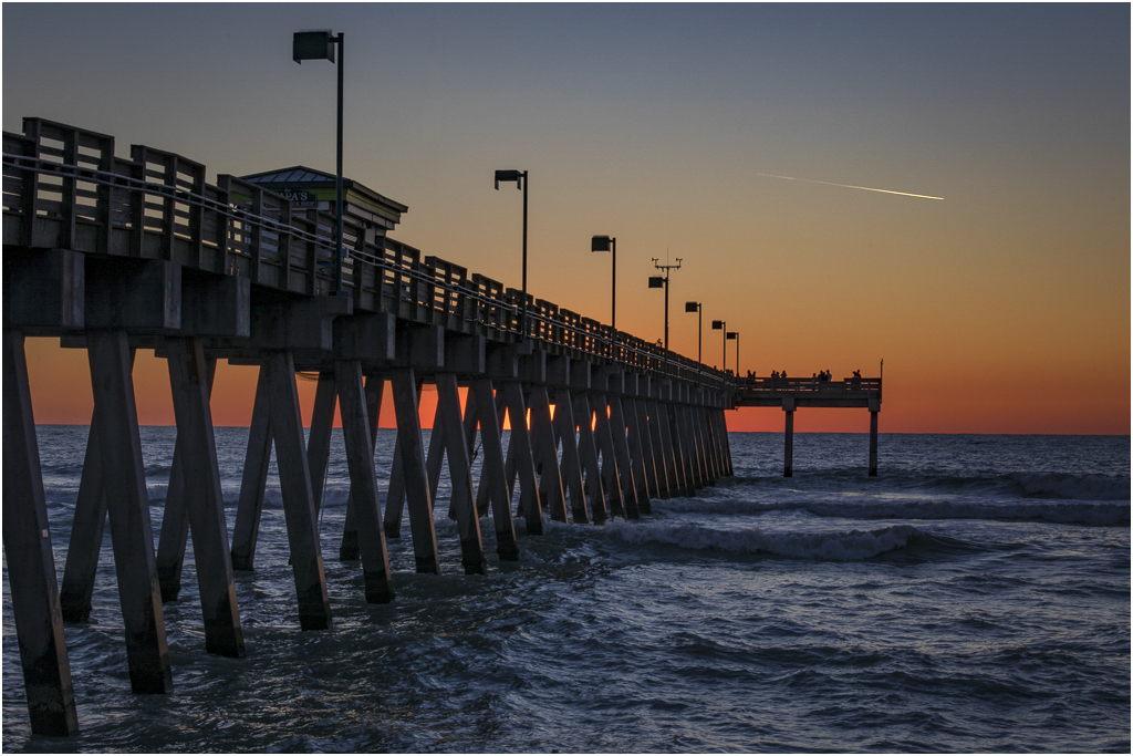
This is the right time of day for your colors, and your composition helps tell the story well. I think that it would show off he colors better if the image were brighter, more like this suggestion; it still lets us know it's after sunset, but with more colorful colors. I moved the white point half way between the end of the histogram and the amplitude limit of 254 units.
I would take out the contrail if possible; it's a sharp, high-contrast element that calls attention to itself, and tells a different story from the rest of the picture. My problem in trying to get rid of it was that, no matter what I did I couldn't match the tones. If anyone can tell me how to do that, I will be highly gratified.
|
Feb 10th |
 |
| 14 |
Feb 19 |
Comment |
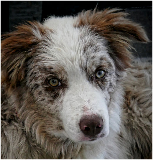
You are right on.......:"the EYES have it," and Oliver's right again; it's more that a "cute puppy shot." "Nicely done!" I think you should crop much more tightly to emphasize . |
Feb 10th |
 |
| 14 |
Feb 19 |
Comment |
I must agree with most of Oliver's comments and changes. It's a fine action and story-telling shot. If it were mine, I would probably crop the black spot from the top right side (as a distraction,) however. I especially agree with changing the color balance from the yellow, and might even make it slightly bluish; the yellow is strong enough to draw attention to itself, and away from the action you depict so well.
. |
Feb 10th |
| 14 |
Feb 19 |
Comment |
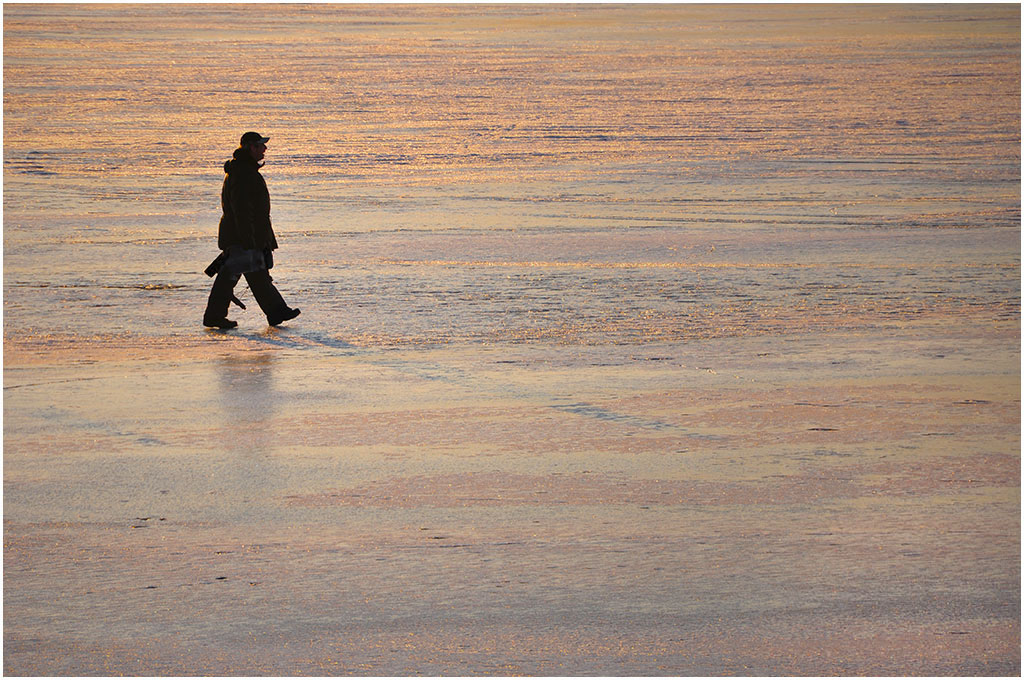
I agree wholeheartedly with Greg. I suggest a (very) slight darkening of the right side; I'm not entirely sure what it does, but it does seem to relieve bit of the monotony of the big stretch of sand.
. |
Feb 10th |
 |
5 comments - 3 replies for Group 14
|
| 33 |
Feb 19 |
Reply |
Yes, it was handheld, braced against the truck. It was taken at 1/640 second, which should have been enough to make it "sharp enough." Maybe I'd had too much coffee in town.
. |
Feb 27th |
| 33 |
Feb 19 |
Comment |
Your technique is excellent, showing us that it IS possible to get good exposure, detail, focus,and color even in the deep woods, and you have selected a fine portion of the deep woods to do it in. On the other hand, the image doesn't quite come off as well as it should. Strong leading lines are necessarily absent. Light, shadow, and color are effectively the same in all parts of the image, the eye has no place to land and therefore wanders, all fancy ways to say that the composition is not as strong as it might be.
One way I found to help that is to darken the sides and top, and lighten the center and part of the bottom, a way to use the light to give a path to the now bright center, all without needing to crop. It then needs a border to define the image from a dark background, though I wouldn't want to say that my yellow is the best color for that.
. |
Feb 20th |
 |
| 33 |
Feb 19 |
Comment |
I love your composition, with the building nicely balanced, but not upstaged by the blue expanse of the water. Your image conveys the timeless and firmly settled look that I took away from the Maine meeting. Your golden border does help the image in a way that a white one would not. Aside from the almost negligible yellow cast, about the only change that I can suggest is to crop from the top of the sky, down to and including the contrail above the building.
I didn't find this view because I spent all my time here concentrating on the lighthouse itself, and of course got only the conventional images that everyone else did.
.
|
Feb 19th |
| 33 |
Feb 19 |
Reply |
The color balance is sightly yellowish; you can see it in the whites of the building and in the lower clouds with modest blue-ish changes in the midtones and highlights. |
Feb 19th |
| 33 |
Feb 19 |
Comment |
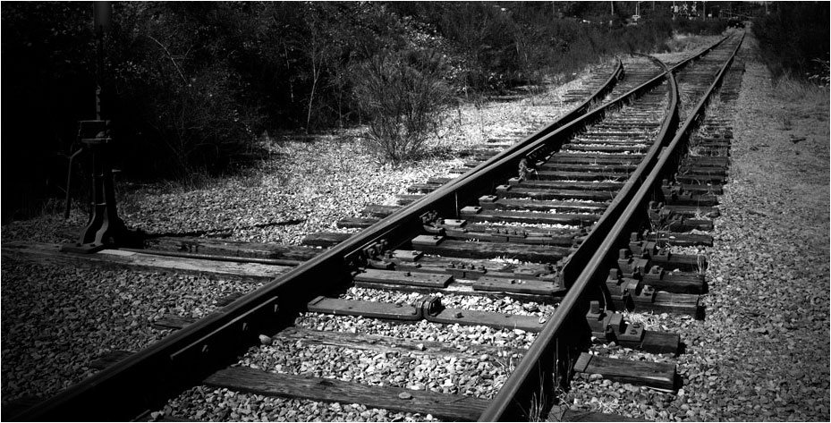
Your picture isn't about Greenbaum's, it is about the pattern of the tracks. The picture simply has too much in it, so much you have hidden what attracted you in the first place.
Try simplicity. This is what attracted you. I cropped, gave it more contrast and darkened the corners.
. |
Feb 19th |
 |
| 33 |
Feb 19 |
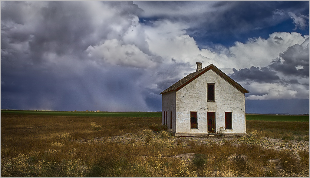
Comment |
There is no reason to disagree with any of the previous comments, but I do have a couple of very minor additions. If it were mine, I would darken, slightly and progressively, the clouds as they lead away from the house (on the basis that the eye is attracted to the brightest part of most images, and you want the viewer to see the house first) and I would flip it left to right, since that's hour most people see images. Now the clouds really do lead you to the house.
. |
Feb 18th |
 |
| 33 |
Feb 19 |
Comment |
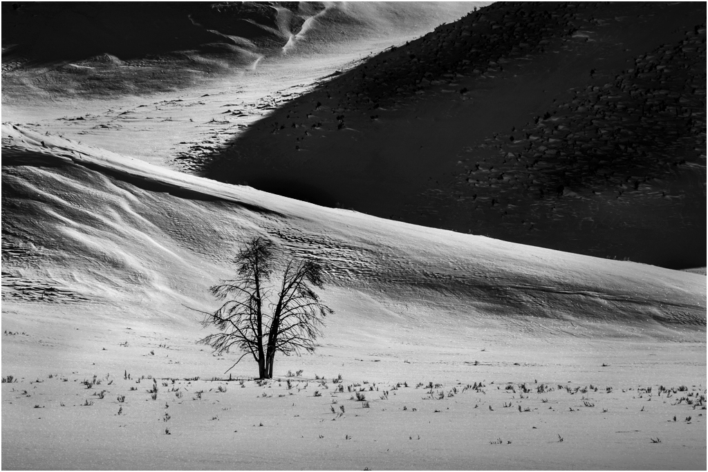
This image intrigues me. I like each of the elements, and think etch is needed to tell your story, but......
This is what I came up with after a lot of thought and messing around. The larger black area IS overwhelming, in part because it is so large without much detail. Light areas in general tend to attract the eye, bu these don't have enough detail to hold the eye. I ended up by making the large dark areas lighter where there was detail, and the brightest areas somewhat darker and more varied in tone. The tree is your center of interest, so I made it stand out more by flipping and using the ripples in the sand to lead toward it. |
Feb 14th |
 |
| 33 |
Feb 19 |
Reply |
These are camera settings that, as far as I can see, don't make big differences, but do affect RAW images. |
Feb 14th |
| 33 |
Feb 19 |
Reply |
I forgot to add the image! |
Feb 14th |
 |
| 33 |
Feb 19 |
Reply |
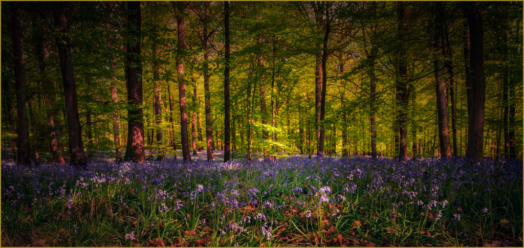
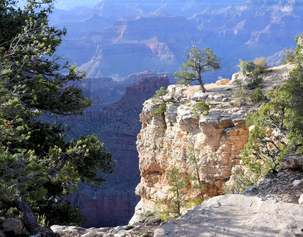
Your fine image offers lots of scope for post processing. I will add a few ideas. You have three areas that you can adjust essentially independently: the bright foreground dominated by whites, with touches of red and yellow; the foliage, primarily green; and the background, mostly bluish. I went back and forth between Selective Color and Levels (in Photoshop) and adjusted each listed color to my satisfaction several times, ending with a final adjustment of brightness and contrast, to get this thumbnail. I also put on a narrow white border to keep the dark parts of the image from bleeding into its surroundings.
That brought out a lot more pictorial detail that was hiding in your image, without working directly on detail at all, and to me gave it better colors.
. |
Feb 12th |
5 comments - 5 replies for Group 33
|
10 comments - 8 replies Total
|


