|
| Group |
Round |
C/R |
Comment |
Date |
Image |
| 14 |
Oct 18 |
Comment |
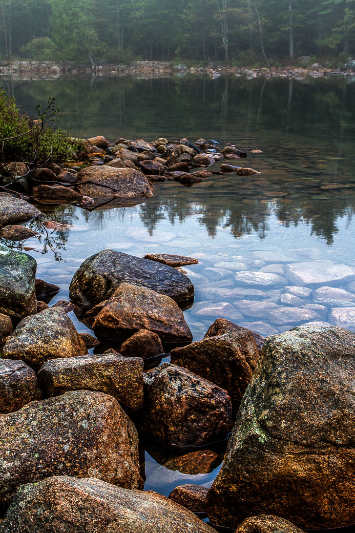
I can't really disagree with Yvonne; it is very well done. If it were mine, though, I would increase the contrast and brightness in Photoshop's Levels by moving the white point to the top of the histogram (it is now at about 217 vs 250) and setting the middle slider at about 0.75. This gives to me brighter colors and more crisp detail. It needs more fogginess if you want to make the whole thing foggy.
. |
Oct 14th |
 |
| 14 |
Oct 18 |
Comment |
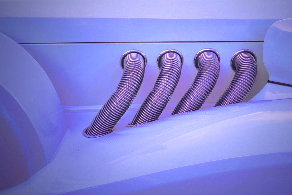
I love the bright, shiny reflections and the crisp tones they generate. I echo Mark: the composition is great. To the blue color lingers on as an aftertaste. If it were mine I would do this to it. I experimented with the colors until the pipes showed something beside a blue cast, and offer it as an alternative.
. |
Oct 14th |
 |
| 14 |
Oct 18 |
Reply |
I forgot to suggest that a thin white border (one pixel for this size image is enough) would really help make the image stand out from the black background. |
Oct 14th |
| 14 |
Oct 18 |
Reply |
It was taken about mid-day. There were a few thin and very light high-altitude clouds that mostly went away when I perked up the colors; you can see that it left a darker blotch just to the left of the power pole. I still have to get rid of that. |
Oct 14th |
| 14 |
Oct 18 |
Comment |
Your image is tack sharp throughout, with colors and detail just about perfect. The subject is clearly the flowers, with the background serving to give depth and a sense of place to the image. I suggest a slight (emphasis on slight) darkening from both sides to make the center flowers stand out a bit more. If the background were lightened any more, it would begin to compete with your subject. |
Oct 12th |
3 comments - 2 replies for Group 14
|
| 33 |
Oct 18 |
Comment |
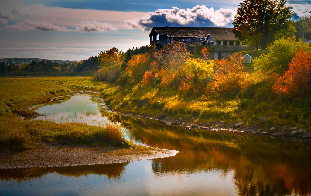
This is a pleasant, well composed scene. From the title and composition, one would expect the house(s) to be much more prominent though. The houses are in the right place, but tone values are exactly opposite from what they need to be; my eye is drawn to the (brighter) river and marsh and away from the (darker) structures. You can make the buildings bright enough to fix that by darkening the corners,tinkering with all the colors in Selective Color, Vibrance,and Saturation. |
Oct 16th |
 |
| 33 |
Oct 18 |
Comment |
I like your subject and fine technique and composition. If your sky had a bit more contrast and saturation of all the colors, it would add a bit of drama to the "dawn" part of your title. |
Oct 12th |
2 comments - 0 replies for Group 33
|
5 comments - 2 replies Total
|


