|
| Group |
Round |
C/R |
Comment |
Date |
Image |
| 14 |
Jul 18 |
Reply |
Later versions of Photoshop have Vibrance and Saturation as closely related operations. Vibrance is supposed to bring out more of the subtle color differences, but does seem to affect saturation, too. |
Jul 16th |
| 14 |
Jul 18 |
Comment |
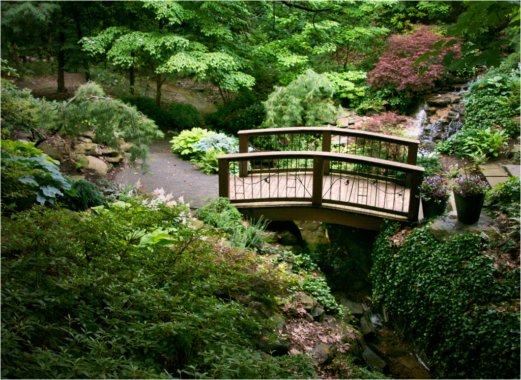
This is a pleasant and well composed image taken from a well-chosen viewpoint. I have two suggestions. First, the colors and tones seem to me a bit dreary, even for a cloudy day in a heavily shaded location. I experimented quite a bit, starting with levels to give it a wider dynamic range, with true blacks and brighter whites. I adjusted Color Balance to bring out the few warm tones it has, and an especially to bring out the few light and middle greens. I had to iterate a few times with these adjustments and including vibrance. |
Jul 15th |
 |
| 14 |
Jul 18 |
Reply |
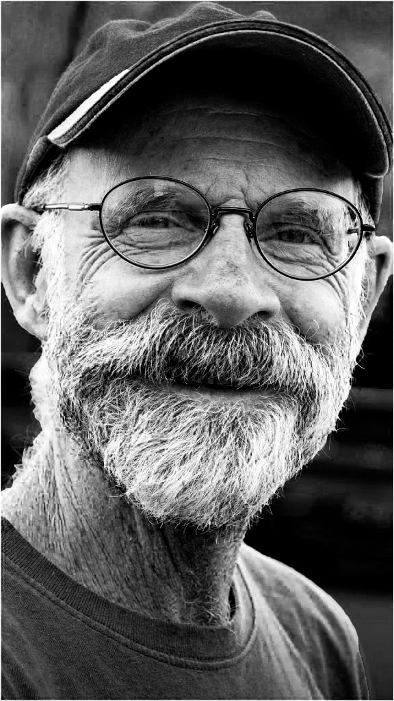
It was taken on a cloudy-bright day, with the subject wearing a long-bill baseball cap in the shade. It seems to me that reflections come from partial mirroring of a light source that points at the glasses, usually by the sky; note the small sky reflection over his right eye. I was standing in deep shade, so there wasn't much to reflect. |
Jul 14th |
| 14 |
Jul 18 |
Reply |
How's this? I think I like it better than color. Thanks for your comment. |
Jul 12th |
 |
| 14 |
Jul 18 |
Reply |
Thank you, Steven. I hadn't considered that, and will take your suggestion. |
Jul 12th |
| 14 |
Jul 18 |
Comment |
Your first image as a member of the group is outstanding! Glad to have you aboard. The photographic quality of your image speaks of lots of experience in this genre, of which we see very little. I especially appreciate the texture throughout, and wish it continued into the background at the bottom. I suggest a thin white border to distinguish the dark edge of the image from the black background; for this image size (1024 pixels max) a single pixel is wide enough. |
Jul 12th |
| 14 |
Jul 18 |
Comment |
I like the composition the way it is, and see the upper left clouds as being part of the story. The problem I see is that the whole image is dark. Terry is on the right path, but I suspect that all you have to do is turn up Exposure and/or Brightness to the point that the brightest pixels just touch the right-hand end of the histogram. Everything else should fall into place, but you may want to darken the clouds a bit.
. |
Jul 11th |
| 14 |
Jul 18 |
Comment |
I came out slightly better than even, which I consider a win. As to inheritance, he's too bright to be a photographer! |
Jul 11th |
| 14 |
Jul 18 |
Reply |
I long ago lost interest in Rembrandt lighting, hair lights, and such that go with formal portraits, for the same reasons you suggest. |
Jul 11th |
| 14 |
Jul 18 |
Comment |
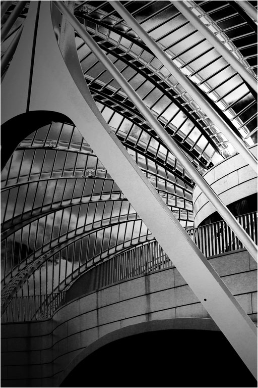
You have a good eye for strong composition, and this architectural rendering shows it off. I really like it. Even an abstract needs a center of interest to keep the eye from wandering around, and all the lines in the dome led to it, the balcony in the middle of the left side. Monochrome is a good choice; color would only be a distraction.
You can further emphasize your center of interest by darkening from the edges away from it, something like the vignette in the thumbnail. If it were mine, I would flip it horizontally, since most people "read" an image from left to right, and that helps lead them into the image. Try it and see. I also suggest making your brightest areas even brighter; you can see that also in the histogram.
|
Jul 11th |
 |
| 14 |
Jul 18 |
Reply |
There are, several ways. I usually usually go first to Levels, adjust the White Point (on the right of the histogram) and Black Point (on the left), then adjust the midscale contrast with the center slider, finally going to Brightness and Contrast to fine tune it.
. |
Jul 11th |
| 14 |
Jul 18 |
Comment |
Your comments about leaving more space are perfectly valid. I had no more than three seconds to make the image, and I mostly pointed and shot. My problem is that this image is full frame; there is no more. Glad you liked it anyway.
|
Jul 8th |
6 comments - 6 replies for Group 14
|
| 32 |
Jul 18 |
Reply |
I think you need most of the background for context, but otherwise agree with what Tom says. I suggest darkening the background to make the musician stand out.
|
Jul 7th |
| 32 |
Jul 18 |
Reply |
I think you need the background for context, but otherwise agree with Tom. I would simply darken most of the background to make the musician stand out. |
Jul 7th |
0 comments - 2 replies for Group 32
|
| 33 |
Jul 18 |
Comment |
I can't argue with my colleagues, but I can add to the conversation by noting that vertical lines do in fact converge; the top is further away, so it appears smaller, and parallel lines must converge in the old railway tracks effect. That vertical lines can't converge is only a convention that can be played with, either in the camera or in post processing. |
Jul 19th |
| 33 |
Jul 18 |
Comment |
Thank you for your comments. Two great minds, yours end Ken's, with but a single thought. The foreground does need work. I lightened the trees to help give depth and a change in color to keep it from being too monotonous. I know exactly nothing about luminosity masks, so I will have to study those pretty soon. |
Jul 19th |
| 33 |
Jul 18 |
Comment |
A very nice image indeed! The overall composition is just right. I have to disagree with Ken, though, about that dish. You have a colorful picture of the seashore; the dish on the hill is not prominent enough to do more than distract. If it were mine I would get rid of it.
. |
Jul 11th |
| 33 |
Jul 18 |
Comment |
Southern Utah In one of the most colorful places for taking photographs one can imagine, but the colors work best in bright sunlight. You have an excellent subject, but it has a bluish cast mostly, I think, because it is in the shade. |
Jul 11th |
| 33 |
Jul 18 |
Reply |
The image does have a darkening from the left by way of a black linear gradient on a separate layer which is then adjustable to taste in opacity, intended to emphasize the snow patch on Teewinot by making it relatively brighter, as you inferred. I probably overdid it. One can do a better job with luminance adjustments, and I need to learn how to do that.
As to the snow patch itself, it is already on the edge of saturation. Look at the histogram of the image; the bright patch is the brightest part of the image, so it is represented at the very right side of the histogram, which is the brightest one can get. Making it any brighter loses any detail the snowfield might contain. There is an old "rule" that suggests you should reduce the exposure from what your meter wants when you have sun on the snow to prevent this sort of thing. I didn't follow it, but probably should have.
. |
Jul 7th |
4 comments - 1 reply for Group 33
|
10 comments - 9 replies Total
|


