|
| Group |
Round |
C/R |
Comment |
Date |
Image |
| 14 |
Apr 18 |
Reply |
I think you should have. The green of the water is far too intense: white water is white, not green. I suggest that you reduce the intensity of the green water until what was white water turns white.
. |
Apr 25th |
| 14 |
Apr 18 |
Comment |
You have another very interesting pattern. I like it and especially Arun's adjustment of it. The pattern is the ropes and railings; the shadows on the deck, while echoing that pattern, don't do it in a strong enough fashion to avoid being distractions from you much stronger ropes themselves. All of which says that I agree with Terry, and suggest that you crop out the sunlit part of the deck.
. |
Apr 25th |
| 14 |
Apr 18 |
Reply |
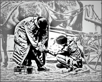
It's not hard to isolate the two figure, especially in this context. Select the two figures with a lasso, feather the selection heavily (to blur the selection line, add a new layer, fill the area on the new layer that you want to lighten with white, then adjust the opacity of the white-filled layer to taste. Then you can darken corners, or any large white areas you missed (like I did,) etc.
. |
Apr 23rd |
 |
| 14 |
Apr 18 |
Reply |
That's why I darkened the left! Your eye unconsciously goes to the place in the image with the most contrast,which is usually the brightest spot.
. |
Apr 20th |
| 14 |
Apr 18 |
Comment |
I really like your clean, simple design and composition, and the story it tells. He's looking right at me in disapproval of my having awakened him! It has everything from true blacks to pure white, and is in focus where it must be. I suggest cropping more tightly, first from the out-of-focus area in the foreground, and then from the top and sides; this will make the bird himself more prominent.
. |
Apr 20th |
| 14 |
Apr 18 |
Comment |
This is an interesting approach, one of those things that I wish I had thought of. My one major problem with it is that there is that to me it should be cropped more tightly; the extra space around the subject doesn't add anything, and it seems to diminish your subject's prominence. What happens if you also turn it upside down? The stick and it's nearby debris would then lead to your center of interest and the fact that the label would then be upside down would only add to the story.
. |
Apr 20th |
| 14 |
Apr 18 |
Comment |
This is fine story telling! It could be done well in either monochrome or color, and I think like you mono best. In my opinion, this version, though, is a bit busy; I suggest toning down everything except the two figures of people, and maybe darkening the corners slightly. |
Apr 20th |
| 14 |
Apr 18 |
Comment |
The pose and most aspects of the composition are right on; I like what you have done. I think it can be improved by a better treatment of the tonality. The problem is that you have a black bear that looks grey even in color; there are no true blacks in the picture. |
Apr 20th |
| 14 |
Apr 18 |
Reply |
The sunlight is real; it came from holes in the lifting early-morning ground fog. As you point out, there is not much logic in fog in any event.
. |
Apr 18th |
5 comments - 4 replies for Group 14
|
| 33 |
Apr 18 |
Comment |
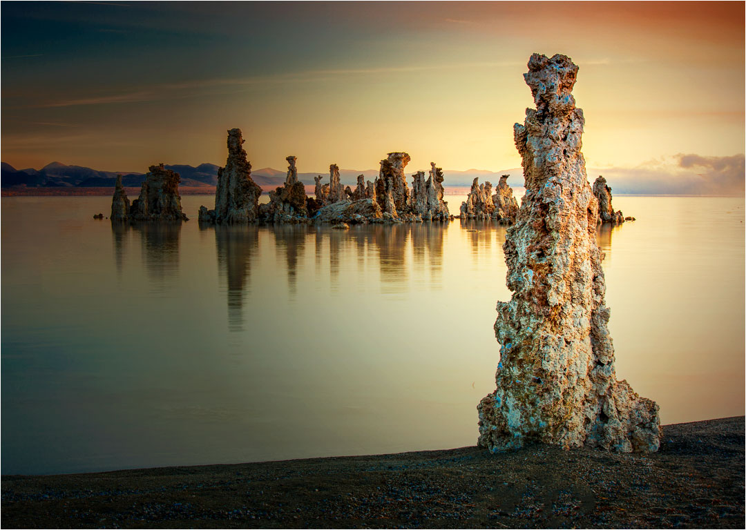
This has beautiful detail and stunning colors, with a strong, if unusual composition. It's a place I've always wanted to photograph, but never have! Your placement pf the hoodoo so prominently on the shore identifies as your real "target," and everything else in the picture leads to it.
You can make the hoodoo stand out more by making it brighter, i.e. darkening most of the rest slightly. If it were mine, I would emphasize the colors a bit more, which I did by use of Levels and Brightness and Contrast in PS. Now, your red and blue changes stand out too much, though. Anyway, you get the idea.
. |
Apr 28th |
 |
| 33 |
Apr 18 |
Comment |
I like it pretty much the way it is. I would turn down the vignetting just a bit, and the contrast up, again just a bit.
I suspect that your relatively long exposure and high ISO have conspired to give your image a case of ordinary color noise; at least that is what it looks like to me at high magnification.
|
Apr 25th |
| 33 |
Apr 18 |
Comment |
I suggest that your image has far too much contrast, and that, since it is usually the lighter areas that attract the eye, you have three different subjects competing for attention. Why not choose one and darken the others? |
Apr 25th |
| 33 |
Apr 18 |
Comment |
Thank you, Dan. You are right, of course, about the upper right. It was much lighter and more blue before I started, and I didn't keep at it enough. The sea level in the picture is just below the bottom of the picture, so there is an unexpected trick of perspective that suggests that the fjord wall, the blue area, must be below sea level! |
Apr 15th |
4 comments - 0 replies for Group 33
|
9 comments - 4 replies Total
|


