|
| Group |
Round |
C/R |
Comment |
Date |
Image |
| 14 |
Mar 18 |
Reply |
Yes. This is actually our third time for this portion if Scandinavia. |
Mar 26th |
| 14 |
Mar 18 |
Reply |
I concur that the left side is ....slightly....darker than it could be. On the other hand, "valuable" is not an appropriate descriptive term for more detail in this case; it already has plenty of detail,and further details would make it even more "busy." Simplicity is one of the keywords for landscapes. As to "garish" colors, garishness is in the eye of the beholder. This is what the place looked like at that sunset. It is autumn at the peak of fall colors at sunset, with the sunset light under a cloud deck lighting up a hillside of deciduous trees in full fall color. I actually toned down the warm colors to bring out more of the green in the middleground and on the fjord wall.
|
Mar 21st |
| 14 |
Mar 18 |
Reply |
I was on the Norwegian "mail boat" that stops at every port between Bergen and the Russian border and back to deliver mail, cargo, passengers, and tourists. it's a real experience.
. |
Mar 18th |
| 14 |
Mar 18 |
Reply |
I forgot to ask: where does the texture in the sky come from?
. |
Mar 18th |
| 14 |
Mar 18 |
Reply |
That steel plate is across the joint where the door would open, bolted securely to each side. The door cannot open. If anyone goes upstairs, it must be by another door. You note correctly that it does also protect the door and jam from also being forced.
. |
Mar 18th |
| 14 |
Mar 18 |
Comment |
You have a beautiful owl in a good pose. The only problem is all that stuff in front and around him distracts us when we try to see him. Fortunately, most of the distractions are small or narrow twigs, which Photoshop's Healing Brush set fairly stiff and to a small size can eliminate; I just traced the branches carefully with it, and they went away! I adjusted Levels to brighten the owl's face and give a little less contrast as a center of interest (noting that the brightest and/or highest contrast part of the image attracts attention,) used a circular gradient centered on the owl's face to darken the rest. The last step was to darken with the Burn Tool to smooth out some distractions, and give it a final crop. The result won't go in Nature exhibits because of what I took out of the frame, but he is a pretty owl for the wall.
. |
Mar 17th |
 |
| 14 |
Mar 18 |
Comment |
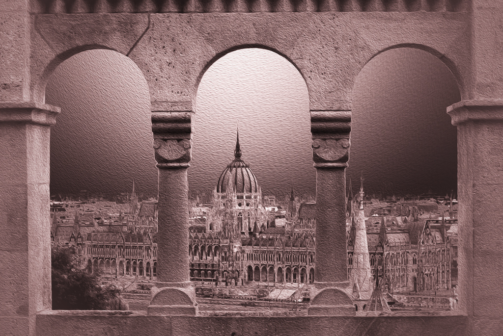
There are innumerable images taken from here, but this one is unique. Every visitor has one this or a neighboring location. I have a whole potful, none of which come close.
I think that with so much detail available, that color only obscures the delicate detail you have found. I suggest that you brighten it and give it more contrast. The dome of the parliament building is the real center of interest; you want to make it stand out. I did with a very light reversed circular gradient in one of the dark colors in your image centered on the dome to darken everything else slightly.
. |
Mar 17th |
 |
| 14 |
Mar 18 |
Comment |
There is a lot in this picture, but it is nevertheless a very simple composition; my eye goes right to her face, and is held there. Your thin white border helps to define the image space. Her face, in particular, seems dark and a bit muddy to me, and I suggest that you brighten it up.
. |
Mar 17th |
| 14 |
Mar 18 |
Comment |
Your camera technique is right on, especially for a basically unpredictable action such as this. The one thing that would do the most to make this shot a real "keeper" would be to see the boy's face. Aside from that, and if it were mine, I would try to darken the bright spots in the background, since they are a distraction.
. |
Mar 16th |
| 14 |
Mar 18 |
Comment |
Good eye! You have found a realistic subject that tells a real story in an abstract mode. It is strongly composed, with no doubt about where you want us to look, and it keeps my eye always within the frame. The only suggestion I have would be to use Selective Color to make the black paint a bit darker. Terry's suggestion of a thin white border is a good one.
Your suggestion that "Old Door #3" is not a good title is right on. The abstraction almost hides from us that it is actually a door; I don't have a suggestion, though.
It may lead to an upstairs apartment, but if it does, the apartment hasn't had any tenant for some time; that red-blotched gray steel plate prevents the door from being opened. |
Mar 16th |
| 14 |
Mar 18 |
Comment |
Your image is as much a design, a very successful design, as it is a photograph. All parts of the design contribute to the story it tells, and your arrangement of the elements holds my eye firmly within the frame. The subject is instantly recognizable even without the title. Even your thin white border is an essential part of the design. Well done!
. |
Mar 16th |
6 comments - 5 replies for Group 14
|
| 33 |
Mar 18 |
Reply |
I have always been told that a good landscape needs either unusual lighting, unusual atmospheric effects, or or unusual weather effects, preferably all three if you can swing it. I found out myself that these occur almost exclusively at sunrise or sunset, and I don't get up early enough for sunrise......
|
Mar 21st |
| 33 |
Mar 18 |
Reply |
Generally, that there should be borders is the only rule, or should I say strong suggestion. You do want your image to be the main attraction instead of the border, so it should generally be unobtrusive, but I can imagine a situation where a colorful border might be a help. I usually use either white or light gray, the latter when I want the whites in the image to be definitely stronger.
. |
Mar 19th |
| 33 |
Mar 18 |
Comment |
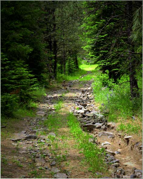
You have a good location, one that has fine potential. It doesn't quite come off, because I think you are looking at it wrong. There is a lead-in line, but it leads away from your real scene to a rut with rocks in it; it has to lead that way: the white areas of any image almost invariably attract the eye. Your real scene is the lane between the green trees leading to the bright green at the top. The image has too much in it. I suggest that you crop from the right to get rid of the signs, and then get rid of a little bit on the other sides, something like this. Then put more brightness and contrast into the colors. The main thing is to simplify it and give it bright colors.
. |
Mar 18th |
 |
| 33 |
Mar 18 |
Comment |
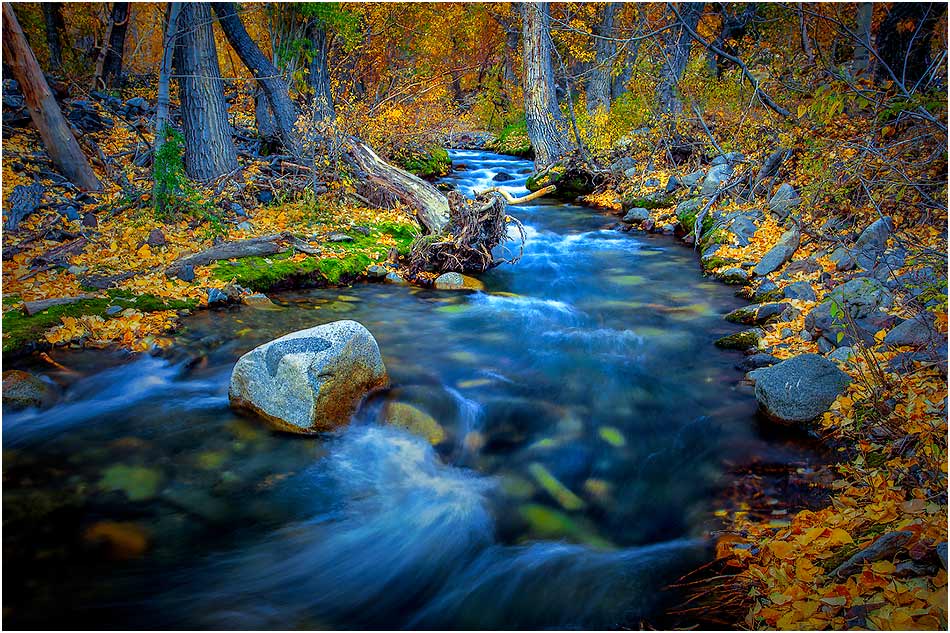
If the colors seem off, it's because they are. Light brown leaves with an occasional yellow one don't really remind most people of what fall colors can be. Your colors are there; you just have to bring them out, and an exaggeration in fall color is usually forgiven. Start with a liberal dose of Selective Color, Vibrance and Hue and Saturation. I would darken the white water in the foreground because it trips up my eye before I can get into the image, and darken the corners slightly. Then I would tinker with Brightness and Contrast. I wouldn't change the composition beyond that; it's just fine.
. |
Mar 18th |
 |
| 33 |
Mar 18 |
Comment |
It IS a beautiful shot. Your camera technique is very near perfect, and only my innate pickiness prompts me to suggest changes. The most important suggestion is that you remove that broad white border and use one much smaller; the rule is that it should be wide enough to separate the image from a background without itself being noticed. I would crop it a bit, just as Dan suggests, but mostly to simplify the image. Lastly, I would ramp up the Vibrance and Saturation: If you have color like this, by all means flaunt it!
. |
Mar 17th |
 |
| 33 |
Mar 18 |
Comment |
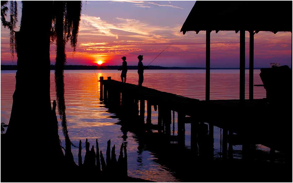
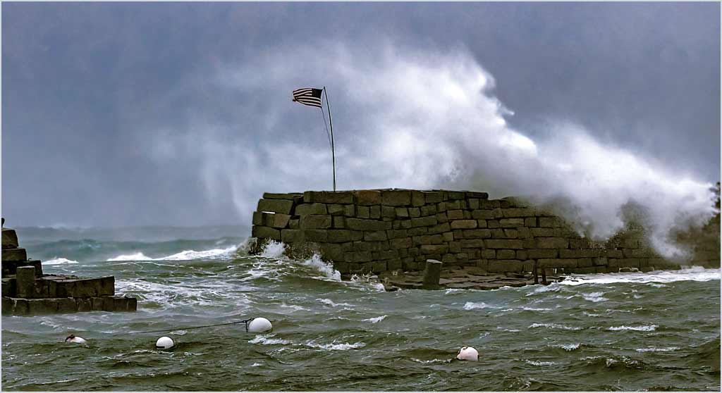
You have the crop just right for my tastes. The beauty of a severe storm is readily apparent. The image is clean, simple, stark, and very dramatic. If it were mine, I would (actually did) play a lot in Selective Color with the detail of each color to strengthen the overall effect. I twiddled every color to find a set that I think may have helped, then worked with Levels to get the brightness and contrast the way I thought they should be. My work made only a small diffe4rence: You got it very close to perfection.
. |
Mar 17th |
 |
| 33 |
Mar 18 |
Reply |
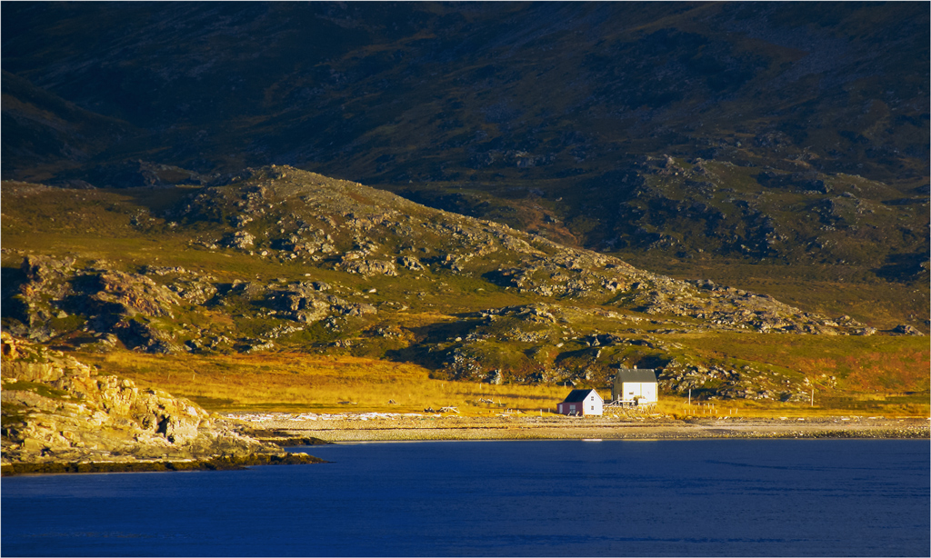
The upper third of the image IS naturally dark, though I have added (only) a bit to it; image was taken at about 71 degrees north just at sunset under a cloud deck. The thumbnail shows what the scene was like without any darkening. The main purpose of the darkening is to tone down the lower left, where the brightness draws attention away from the house.
People living this far north don't seem to care much for architectural details: Look carefully at the buildings. The buildings are not so much blown out, as they exist without significant detail to be seen.
. |
Mar 13th |
 |
4 comments - 3 replies for Group 33
|
10 comments - 8 replies Total
|


