|
| Group |
Round |
C/R |
Comment |
Date |
Image |
| 14 |
Feb 18 |
Comment |
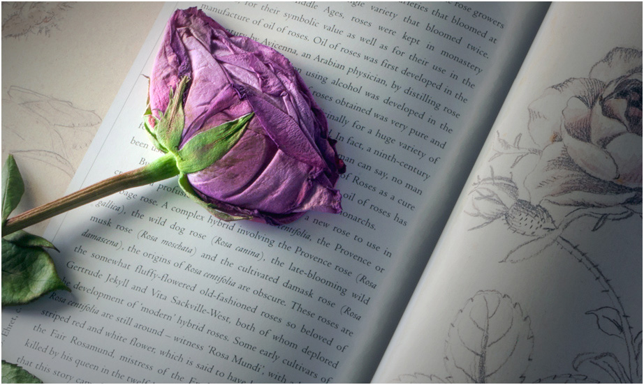
You have an excellent storytelling idea here, but it doesn't quite come off for me. There are a couple of things that I believe would help tell the story better, though.
One's eye is usually drawn to the brightest part or the highest-contrast part of the image, which in this case is the brightness of the diagonal fold; it is only after that that I see the rose itself, followed by the sketch. It helps to make it brighter; then the high contrast of the rose brings it out. Bright corners don't help much, so they should be darkened subtly. Next, if it were mine, I would crop from the bottom and right; you don't need all that writing to tell your story. Finally, the rose is very close to the top of the frame; if you have any more room above the rose, put it back!
If you do it again, it would help to place the rose and its sketch much closer together. i would put it in the middle of this frame and work from there. |
Feb 20th |
 |
| 14 |
Feb 18 |
Reply |
P.S. I forgot to say that I didn't straighten the perspective, which isn't very severe anyway. The slightly-askew perspective seems to me to be appropriate to the subject; when I first saw it, I thought you had done it on purpose because it compliments the subject! |
Feb 18th |
| 14 |
Feb 18 |
Comment |
You've found a good subject, and you are mining it for all it's worth. It's well done and worth quite a bit. You need to make the tones and their contrast a bit stronger. In the thumbnail I used Levels in PS to give it more contrast by steepening the curve some, then adjusted Brightness and Contrast.
. |
Feb 18th |
 |
| 14 |
Feb 18 |
Reply |
You got part of your wish already. It already has a slight vignette. Take a close look. I do believe that the center sky should be darker.
. |
Feb 18th |
| 14 |
Feb 18 |
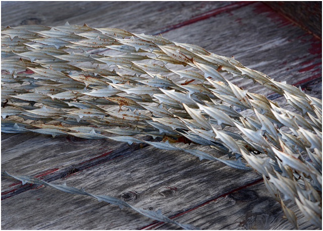
Comment |
I agree with everything our colleagues said. I also have to add that the texture of the boards competes with that of the wire for my attention, but note that the wood texture is subdued when the wood is darkened. In the thumbnail, I just selected the wood with the Lasso tool in PS, and turned down the brightness, and darkened the wire a little at the ends.
. |
Feb 18th |
 |
| 14 |
Feb 18 |
Comment |
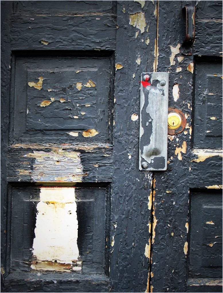
Simple, but actually quite complex! You have maneuvered the composition so that the viewer's eye, especially mine, is not only held within the frame, but at the point of the V. Your use of pure blacks and pure whites is masterfully done; that's what makes the image.
. |
Feb 18th |
| 14 |
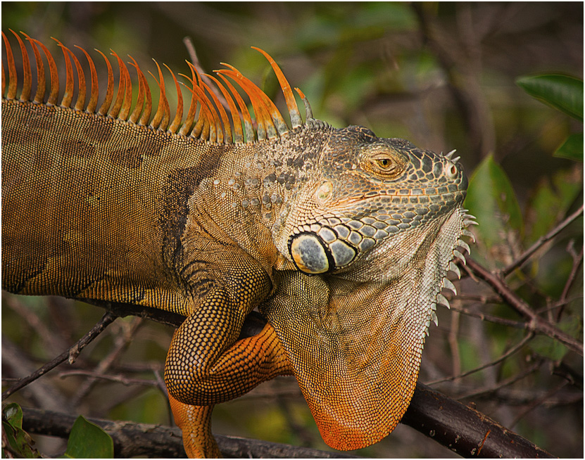
Feb 18 |
Comment |
You have combined color, focus, sharpness, and a cooperative model to make a beautiful nature image.
The partially cut off claw helps illustrate a point: it's distracting, and would still be almost as distracting if it were all there. The first thing everyone saw was the missing claw. Don't worry about it; just like arms and legs in portraits, you can minimize distraction if you cut in the right place, arms for example just below the shoulder, etc. Make it look like you intended to do it. In the thumbnail I cropped it a bit more tightly, especially including the offending claw. I also darkened everything except his head to suppress some of its distraction, the brighter places usually being what one sees first and most strongly as our colleagues have noted. I did remove a bit of yellow with Selective Color in PS, added a bit of contrast, and sharpened it a tad. I also reversed it; most people's eyes enter a picture from the left, so the body is then a leading line toward the head and eye, where you want them to look. I exaggerated the darkening a little so what I did is visible.
.
|
Feb 18th |
 |
| 14 |
Feb 18 |
Comment |
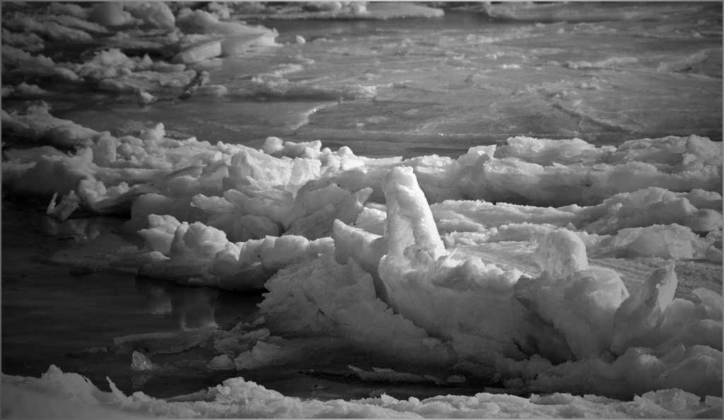
You have an interesting subject that has great possibilities. Your center of interest in the right foreground is distinguished by its shape and size. I think that you can distinguish it by darkening the rest of its "supporting cast" of ice pieces to make it stand out even more; the basis for this is that there are very few photographs in which you viewer's eye is NOT attracted to the brightest place, and you should not want your viewer's eye to wander around in the frame. Your composition is much stronger this way.
A monochrome is a special case where filling the histogram fully, from real black blacks to white whites (from 00 to 256) is very important. As this picture shows, the image will be grey if you don't. It also simplifies the image.
. |
Feb 5th |
 |
6 comments - 2 replies for Group 14
|
| 33 |
Feb 18 |
Comment |
Yes, don't re-size JPEGs. Small details, like sharp lines and edges, depend on having lots of pixels, and downsizing to a JPG involves an averaging over neighboring pixels at each point, which is a smoothing operation. Once is enough and twice can be too much, as you have discovered. The best way to keep the most detail is to make the exposure in RAW, and keep a "master" file in TIFF, PSD, or the like, then change it to JPG at the last step.
. |
Feb 26th |
| 33 |
Feb 18 |
Comment |
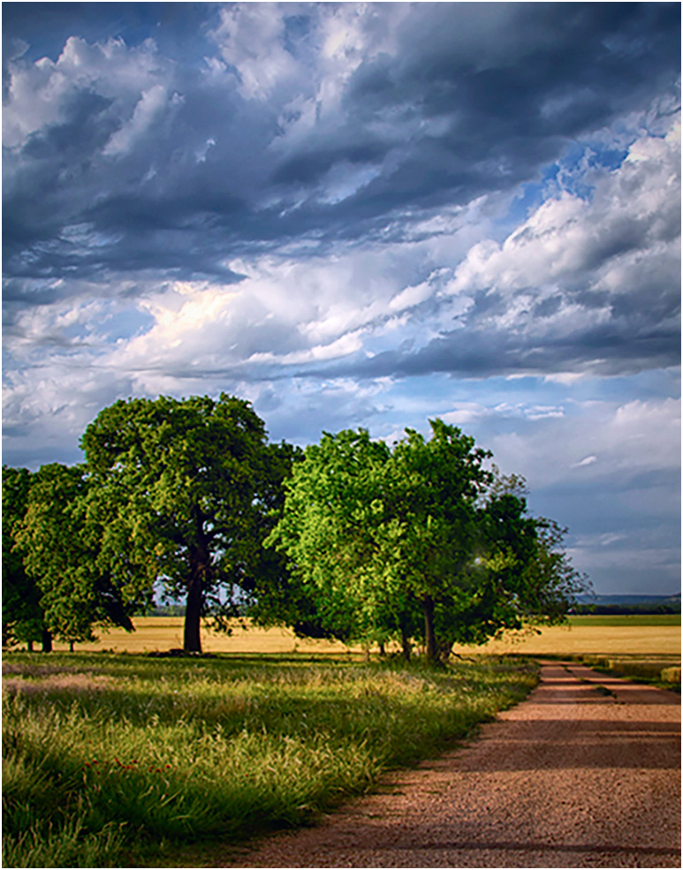
You have found a beautiful scene and arranged it well. I suggest that you need to process it a bit further,though. For starters, it has a yellow cast that needs to be made significantly more blue. Then, it is darker and has less contrast than it might, because the exposure was not sufficient to bring the brightest areas anywhere near to the top of your histogram. The bright halo across the tops of the trees suggests that it was either over-sharpened or that there was a maladjustment of the conditions for the HDR; since you didn't sharpen, it must be the latter.
To illustrate, the thumbnail removes the yellow cast with Color Balance, and fills the histogram by increasing Exposure. I also darkened the corners slightly, which helps to hold my eye in the frame. I noticed that the added brightness made the tree-top halo much less prominent.
It is a fallacy that a RAW image is "pure" in the sense that it is the best exact representation of what is in front of the lens. The design involved in any engineering project recognizes that the end product must be a a series of compromises and trade-offs to get the best design overall of the system: sensor, its control circuits and readouts, and the interface with the camera, and so forth. It is an unpleasant fact of life for designers that they can never have everything they want.
. |
Feb 19th |
 |
| 33 |
Feb 18 |
Comment |
I agree that this fine architectural study belongs in our 'Scape Category because it is as much about the buillding's setting in spacious grounds as it of the building itself. The lighting is just right to bring out the 3-D shape and form of the building, and the framing helps hold my eye into the image.
The sky, with its leading-line clouds is an essential part of the image, but to my eye the image is unbalanced in the vertical direction; I would like to see significantly more of the walkway in the foreground. I see it as needing a bit more sharpening, and I suggest that you increase both the brightness and contrast.
. |
Feb 19th |
| 33 |
Feb 18 |
Reply |
The highlights are specular reflections from facets of the rocks, quite bright, but not actually saturated. I suspect that they were slightly damp from the fog. Enlarge the image and you should see that they are actually slightly gray. Should I make the fog in the upper right slightly brighter?
. |
Feb 13th |
| 33 |
Feb 18 |
Comment |
This is an interesting subject, and you have chosen the subdued lighting conditions that best emphasize it. It's a shame you can't go back and photograph it any more, because I would suggest a different perspective. If you were more to your right, more of the winch would be in sunlight; as it is, there is very little detail of the machine visible in the shadows. I can suggest that you crop this one from the top, possibly to just above the lowest blue sky area.
. |
Feb 5th |
4 comments - 1 reply for Group 33
|
10 comments - 3 replies Total
|


