|
| Group |
Round |
C/R |
Comment |
Date |
Image |
| 14 |
Jan 18 |
Reply |
I think that is the lower end of his shawl hanging down. |
Jan 25th |
| 14 |
Jan 18 |
Reply |
The way I see it, my comes into the frame from the left, and travels over the whole scene to get to the lightest part, but if the lightest part were on the right, it would stop there and not get to the rest. |
Jan 25th |
| 14 |
Jan 18 |
Reply |
Not only that. The image "reads" from left to right, a point that you and I don't always agree on! |
Jan 25th |
| 14 |
Jan 18 |
Comment |
I love the bright, saturated, and unreal colors. they separate this one from the usual similar treatments. A "realistic" treatment would not have been as striking.
. |
Jan 19th |
| 14 |
Jan 18 |
Comment |
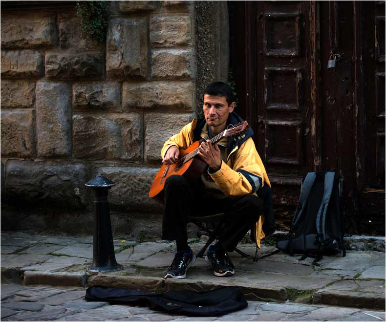
Your image tells a real story very well. I can't disagree with Arun on that. If it were mine, I would make it a bit brighter and give it more contrast.
That fine old door is an important part of your image, but not important enough to take up as much space by itself as your musician does. I wish you had taken a few steps to your left before taking the image, though. That would have put the door behind him, and given a better composition by cropping off unneeded space.
. |
Jan 19th |
 |
| 14 |
Jan 18 |
Comment |
Your excellent portrait reveals a priest who likes to talk on his cell phone and seems to have a sense of humor, too. The only change I would make would be to darken g the background even more, since tits brightness competes with the face for attention.
. |
Jan 19th |
3 comments - 3 replies for Group 14
|
| 33 |
Jan 18 |
Comment |
If the subject of this Digital Dialogue group were documentary photography or travel illustration, I would agree with Elizabeth and Dan. That is not our subject though, and I don't understand how Paul's arrangement of the elements of a general-category photograph, or preferences and comments on it per se, have anything to do with "ethics" or should be "hated."
Compare the original with Ken's reversed version. Paul is almost certainly the only one of us who can tell which is "real" and which is reversed, and HE might even have trouble because of the very clean and uncluttered design of the image. On the other hand, my eye stops at the lighthouse in the original, and I see the island only secondarily after that. The island, shore, and even the sky seem to lead my eye to the lighthouse in Ken's reversed version. Why? I am afflicted, like most people, by seeing an image first from left to right, AND having my eye attracted to the area of the image having the highest contrast. The highest contrast is usually, but not always the brightest part of the image.
If what you want to be seen first, what your eye is led to, is the island, then the tones are reversed, and your viewer, or at least most viewers, are like me: they will miss the island and be drawn to the lighthouse.
. |
Jan 20th |
| 33 |
Jan 18 |
Reply |
I've been told for many. many years that "reading" an image from right to left is preferred by most people, that it is universal and independent of the direction in which writing is read, as for example in kanji and with Hebrew writing.
Be that as it may, many images do look very different when reversed, so much so that I almost always try reversing images as part of a workup. There was a man in one of my groups years ago who would even cut out, reverse and paste any writing on reversed images so that it would come out right.
. |
Jan 19th |
| 33 |
Jan 18 |
Reply |
My bill is in the mail. |
Jan 19th |
| 33 |
Jan 18 |
Reply |
I did that to Paul's "Great Orme" last month, and he remarked that "wars have been started for less....."
. |
Jan 19th |
| 33 |
Jan 18 |
Comment |
I tried your suggestion about cropping, and found that a crop between the two trees on the left does improve it. I rationalize the high contrast between the trees and white building(s) as "necessary" to show of the buildings. The buildings themselves are to me the main part of the image, the fjord and mountains being in a supporting position to be imaged with low contrast in the mist. Does this come through? |
Jan 19th |
| 33 |
Jan 18 |
Reply |
Yes, there are several ways to strengthen the light streak. In his image this month, Ken shows us one. You can also use Dodge and Burn as appropriate. That's what I did, because there is a concern about adding anything to a Photo Travel image.
Unfortunately, there is no or very little detail in the dark trees. I would normally have used HDR or such to take advantage of the wide dynamic range if I hadn't been on a moving ship. |
Jan 19th |
| 33 |
Jan 18 |
Comment |
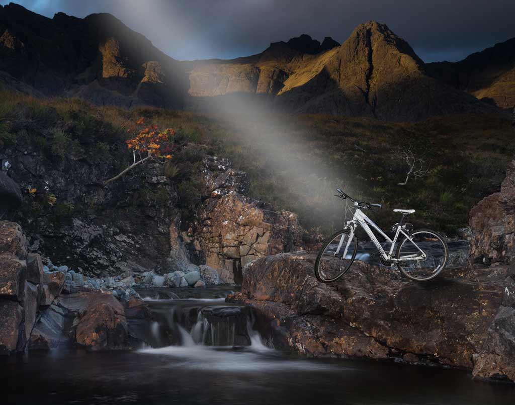
Now, this IS different! It is a very well done composite. I think you can make the composition stronger by darkening the waterfall slightly; it's brightness competes with the star of the show for attention. If it were mine, I would reverse it, too.
|
Jan 19th |
 |
| 33 |
Jan 18 |
Comment |
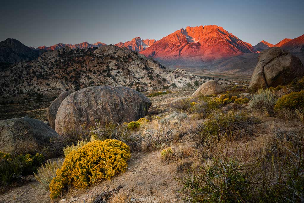
Again you have a beautiful, simple and clean composition of an interesting subject. Well done. If it were mine, I would make it a touch lighter, though.
I don't want to provoke another war, but I do think it would look better reversed. |
Jan 19th |
| 33 |
Jan 18 |
Comment |
As it is, the mage is a bit busy and is weakly composed for a landscape. Ken pointed out a good way to improve both by darkening the upper left and lower right. You can do it with gradients from the upper left and lower right. I went a step further and lightened Ken's path from the rock to the mountain. |
Jan 19th |
 |
| 33 |
Jan 18 |
Comment |
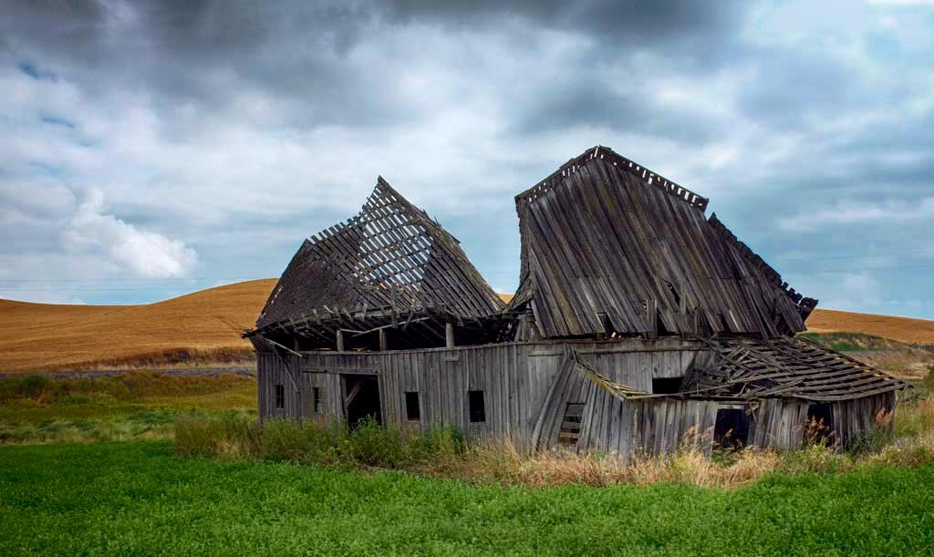
The Palouse is one of my favorite places to photograph, in part because of what Bob has illustrated here: there is almost total lack of distracting detail in nearly anything you want to picture. My two colleagues have pointed out problems with this otherwise excellent image.
It's easily corrected by simply turning the green darker with the Black and/or Neutral slider in Selective color. i did darken it a bit more in the green with the Burn tool. |
Jan 19th |
 |
| 33 |
Jan 18 |
Comment |
The Palouse is one of my favorite places to photograph, in part because of what Bob has illustrated here: there is almost total lack of distracting detail in nearly anything you want to picture. My two colleagues have pointed out problems with this otherwise excellent image.
It's easily corrected by simply turning the green darker with the Black and/or Neutral slider in Selective color. i did darken it a bit more in the green with the Burn tool. |
Jan 19th |
| 33 |
Jan 18 |
Comment |
I,too, agree with Dan, but will go a step further and say that the tree IS the problem because its position in the center of the image gives us two separate and mostly unrelated images. I like both of them.......separately. No amount of cropping will make the two into one.
.
|
Jan 19th |
8 comments - 4 replies for Group 33
|
11 comments - 7 replies Total
|


