|
| Group |
Round |
C/R |
Comment |
Date |
Image |
| 14 |
Dec 17 |
Comment |
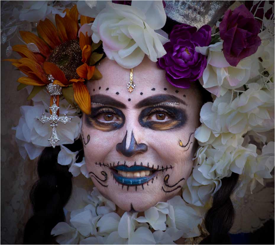
You have made her the personification of Carnival! Your busy composition is just right for the subject, and every detail is sharply in focus. You need the busy-ness to tell the story, but I suggest that you suppress it just a bit with something like a vignette. That way you are drawn even more to those eyes and smile. I would brighten up the image just a bit and add a touch of warmth in the midtones.
. |
Dec 19th |
 |
| 14 |
Dec 17 |
Comment |
What an unusual idea! I like the simplicity and bright colors. This is a reversal of the usual "the brightest parts draw the eye" dialog. The subject is much less bright, but you still see him first. Maybe that's because he is in the middle of the brightness. I'd like to see a tad more brightness on his face, but wouldn't change anything else. |
Dec 19th |
| 14 |
Dec 17 |
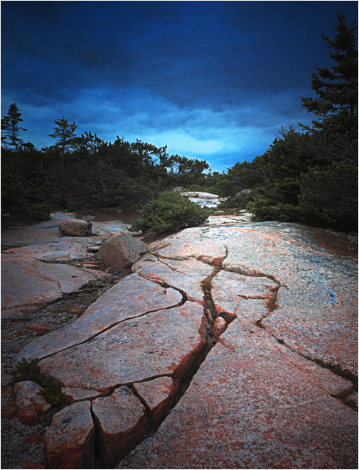
Comment |
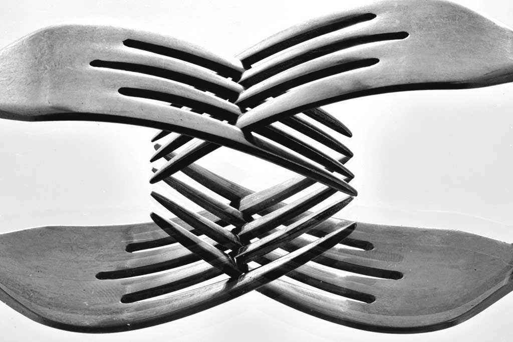
This is a strong, clean, simple design. I would never have guessed how it was done. The repetition in the pattern is one of the pest parts. I suggest two things. The first is to include the rest of the top right fork that is missing; if it isn't in any file, it will be easier than you may think to fake it. The second has to do with brightness and contrast. Your image has no real whites, and only moderately strong blacks, and therefore is overall gray. I used both Brightness and Contrast and Levels (in PS) to give it some more effective contrast. (Almost) all monochromes need some real black and some real white.
. |
Dec 19th |
 |
| 14 |
Dec 17 |
Reply |
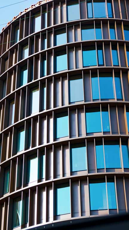
This building is part of a complex of similar towers, of which this is one.
. |
Dec 17th |
 |
| 14 |
Dec 17 |
Comment |
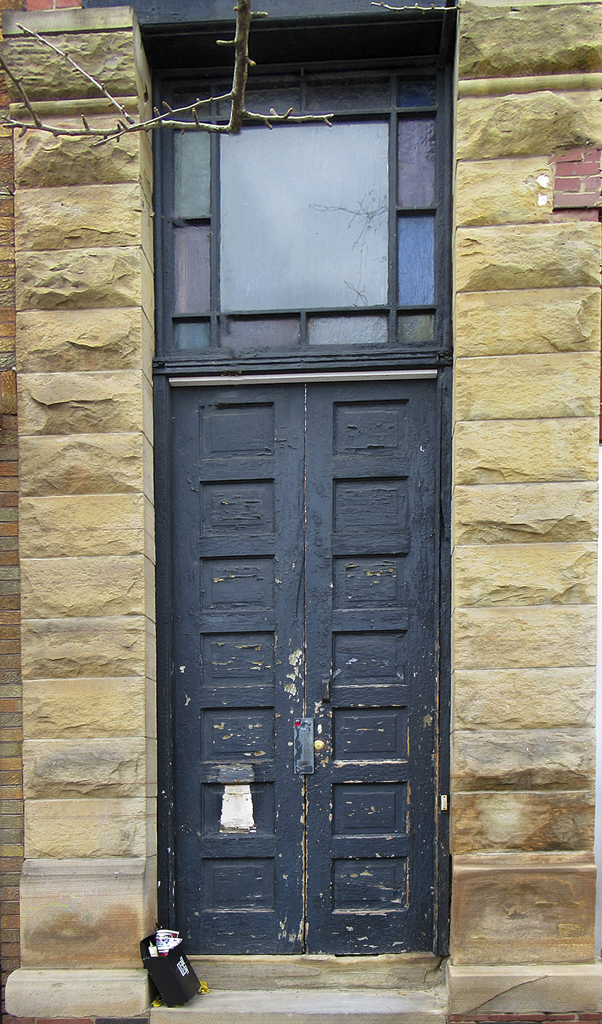
I have to agree with both of my colleagues: The brightness of the window competes with the white and black elements at the bottom left. It needs to be simplified. The door is your picture; if it were mine, I would crop from the sides on the basis that you don't need so much masonry to hold the door in place in the image, but the bricks actually distract. I suggest warming the image a little.
It's easier than you think to remove the branches without cropping. Adjust the Spot Healing Brush to about the diameter of the biggest branch. Then wiggle it along the branch you want to remove. The trick is to move it on only one background color at a time. It took me about ten minutes to do this.
. |
Dec 17th |
 |
| 14 |
Dec 17 |
Comment |
This is the classical baseball picture, but with beautifully captured action and near-perfect technique. I wouldn't change a thing.
Using the burst mode as you did gives one enormous advantage to sports photographers. I remember the times when one had to re-install the dark slide, remove the cut-film holder, turn it over, re-install it, and pull out that dark slide in preparation for the next frame. You had to have a good trigger finger on the first exposure.
.
. |
Dec 14th |
5 comments - 1 reply for Group 14
|
| 33 |
Dec 17 |
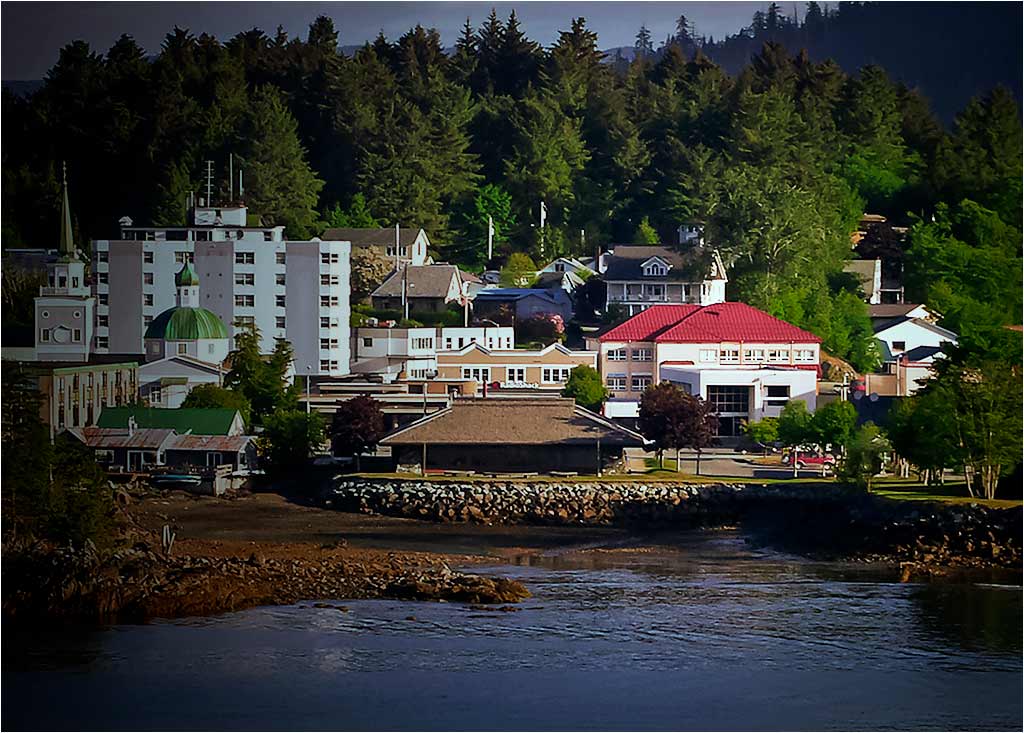
Comment |
I see this as a photo travel image that illustrates an interesting small town on an important travel route. Elizabeth's image invites us to visit this unique city, and it does that well. The complex of white buildings on the left do compete for attention with the red roofed building on the right, but we need both to tell the story. I suggest that you try something like this. I used a long vignette from the left to give emphasis to the red-roofed building,Selective Color to bring out the colors a bit more brightly, and then adjusted brightness and contrast. The trick I tried was to make a somewhat busy image less busy. Did that help?
. |
Dec 23rd |
 |
| 33 |
Dec 17 |
Comment |
Your image has strong lines and simple composition, and substantial prospects. I suggest that you flip the image so those strong lines lead in from the left, which most people seem to prefer. I would use a black vignette centered on the image; my eye otherwise goes to the brightest spot, which is at the bottom, and you want to invite me into it. Finally, I would brighten the colors a little.
. |
Dec 20th |
 |
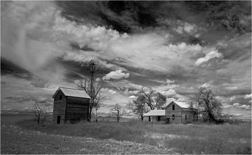
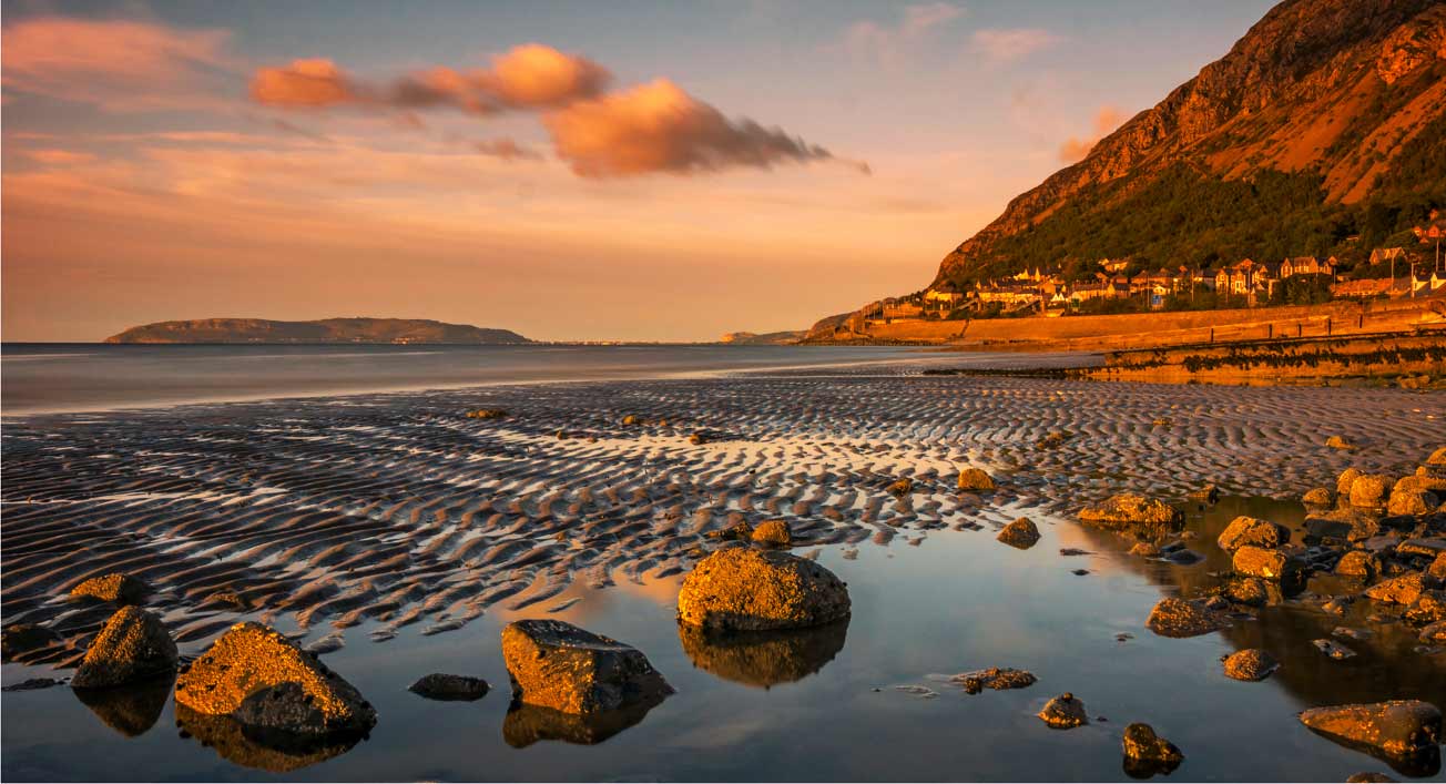
| 33 |
Dec 17 |
Comment |
You have a beautiful story-telling picture. You did just right to make this a monochrome; this is what monochrome is for. I wish it weren't so gray, though. Monochrome, especially, needs the full range of tones from real black (000) to real white (255;) your histogram is centered, but doesn't reach either end. The image is therefore gray, almost by definition. To illustrate, I used Levels in PS to set the black point and white point, Curves to boost the shadows; a long, black and opacity-adjusted gradient centered on the peak of the roof of the house to cool down the sky and make the house stand out, and then brightened and increased contrast.
. |
Dec 20th |
 |
| 33 |
Dec 17 |
Reply |
Anyone who knows the place will likely hate me for this, but see what happens when you then flip it. To me, the mountain recedes in importance, and everything leads to the island. It's a different picture, and the (former) "vacant" quadrant is no longer vacant.
. |
Dec 20th |
 |
| 33 |
Dec 17 |
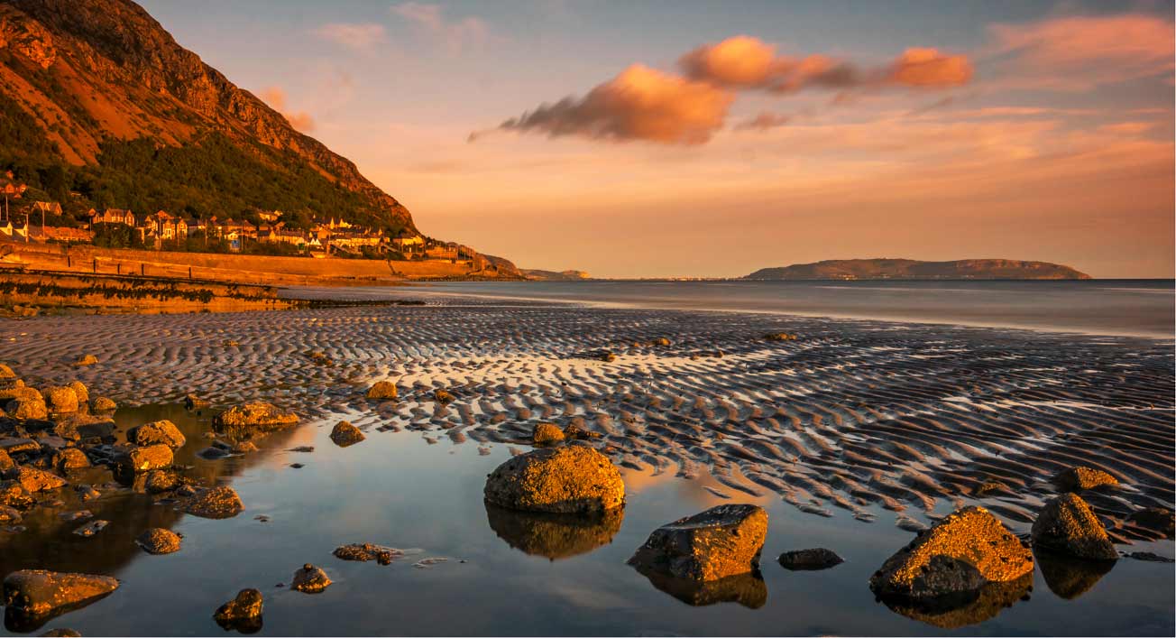
Comment |
This is an outstanding landscape. I do see it differently from my colleagues, though I can't entirely disagree with them. For me, the colors are too yellow. I had to tinker a lot to get them to my liking. Using Color Balance and Selective Color in PS, I ended up with more and darker blue (turning some of the yellow to blue,) and added a little magenta and cyan, then brightened and increased the contrast. The foreground IS the picture, the clouds, mountain, and sky are necessary, but in a supporting position. Since the horizon is in the vertical center, the foreground can be emphasized by cropping a little from the top and the right. This seems to place the emphasis on the lower right of center....
. |
Dec 20th |
 |
| 33 |
Dec 17 |
Comment |
You have rendered the color of this peaceful scene superbly. I also love the overall composition, but I am of two minds about the pilings. If they weren't there, your composition would have a big, colorful but blank hole in the middle, which could be fixed by lowering the camera position. Since they are there, a raised camera position could have separated them from the mountains. The brightened mountains in this version compete with the bright water this side of the pilings. I think your original idea is valid: make the snow on the mountain the same brightness as the other mountains (maybe lightening the base of the mountain a bit) and your pilings should become the center of interest. Paul's right, we're jealous.
. |
Dec 19th |
| 33 |
Dec 17 |
Reply |
I routinely flip my images to see what that would look like as I work them up. This sometimes gives me different or additional ideas on how I should finish it. In this case I didn't like the result, mostly because I usually like my images to "read" from left to right.
In this case I toyed with the idea of eliminating the water altogether, reasoning that it was intended as a simple pattern for which the water was foreign to my subject. To do so I would have had to get rid of the line of white rocks. I didn't do that because I am aiming to use it in Nature or maybe Travel exhibitions. We'll see as things develop.
. |
Dec 14th |
5 comments - 2 replies for Group 33
|
10 comments - 3 replies Total
|


