|
| Group |
Round |
C/R |
Comment |
Date |
Image |
| 14 |
Nov 17 |
Reply |
What would make it be scored lower?
|
Nov 21st |
| 14 |
Nov 17 |
Reply |
What's a rule of composition? There are some suggestions, which, if you have no other ideas, may lead to an acceptable, if possibly common, result. It is often said that religious subjects MAY be centered. That's where I started
It wasn't actually that complicated. When I find a subject I like, I try to start with what first attracted me, then make as many variations on that theme as I have time and patience. This is the treatment I liked best. I suspect that I like it because the center of interest defined by the triangle of the two eaves and the cross arms of the cross is led to by almost everything in the image. The one unambiguous lead-in is from our left; two such lead-ins (if the right-hand eave had been included)would compete and be distracting. I do note that in the images I made from further away, so that more of the church is included, look best with the roof peak centered. You pays yur money and takes yur choice.
. |
Nov 19th |
| 14 |
Nov 17 |
Comment |
I like your idea, but to my taste you have too much in the image. The floor is a dramatic pattern, but in this context needs some support, while the scene outside doesn't directly relate to it, and also needs support.
Suppose we crop from the top and the left, then tone down what is left of the top, something like the thumbnail. The histogram suggests that there can be detail in some of the now-white areas; you can find it by darkening those areas. The one you want, now in nearly the center has detail which is brought out by the Burn tool,and the rest can be darkened easily. Now it's not so busy, you have a center of interest with real lead-in lines, and the two regions of your image tie together.
. |
Nov 19th |
 |
| 14 |
Nov 17 |
Comment |
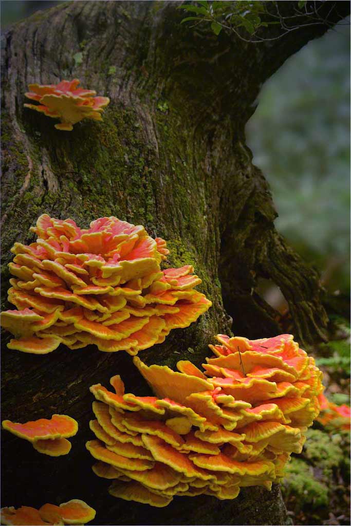
Your image has strong and simple composition, good color and fine details. It is a striking nature image.
It does have a slight green cast that needs to be corrected. If it were mine, I would also reverse it and darken from the top right. |
Nov 16th |
 |
| 14 |
Nov 17 |
Comment |
Ditto what Pat says! Wonderful. Have you noticed that the kids, between them, are looking all in all directions?
I would suggest only two minor changes. If it were, mine, I would turn down the contrast and clone out the sky pieces between the leaves. I might also adjust be brightness some.
|
Nov 14th |
| 14 |
Nov 17 |
Comment |
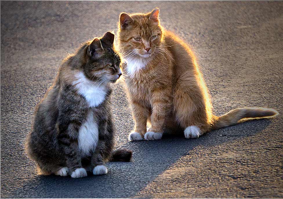
The wonderful simplicity of this image is what puts it over the top! The cats' expressions are great. The lighting is good, and also not so good; the bright background grabs my eye even from the cats and their simplicity.
There is a way out. First I darkened the background on a separate layer, then adjusted that layer's opacity to what I thought I could get away with, then brightened the whole image in Levels. I was in a hurry, so I used long gradients from the sides, along with burning. I might have done it a different way of I could have spent more time. Anyway, I did allow some darkening of parts of the cats' fronts to help bring out the third dimension.
. |
Nov 14th |
 |
| 14 |
Nov 17 |
Reply |
It's even more amazing how much more we don't see in our own pictures because we have an emotional attachment to them. i always ask my wife to check my images before I show them.
|
Nov 14th |
| 14 |
Nov 17 |
Comment |
The meerkat is well captured, and the image is worth saving. His texture makes him stand out from the out of focus background, but the brightness of the stump grabs my eye from him, and the overall effect is gray. It is almost always true that one's eye is drawn to the brightest area of the image, which in this case is the stump. It is also true that a monochrome will be gray without a sufficient amount of both true white and true black.
I suggest that you crop a bit tighter to get rid of as much of the stump as you dare and keep the same aspect ratio. Then I would lasso the stump and turn its brightness down. After that, I would use Levels to move the black point up and the white point down; this makes the meerkat stand out more from the background, and gives true blacks and whites. A few adjustments with Brightness and contrast after that may be needed. See what I mean in the thumbnail.
|
Nov 11th |
 |
5 comments - 3 replies for Group 14
|
| 33 |
Nov 17 |
Comment |
Your subject matter is fine, but Ken's right, the size and brightness of the foreground wall take my attention away from your real subject. Beside that, he is right about getting up earlier, which is why I prefer to take sunsets.
If you do something like this of the foreground, though, you might save it. |
Nov 16th |
 |
| 33 |
Nov 17 |
Comment |
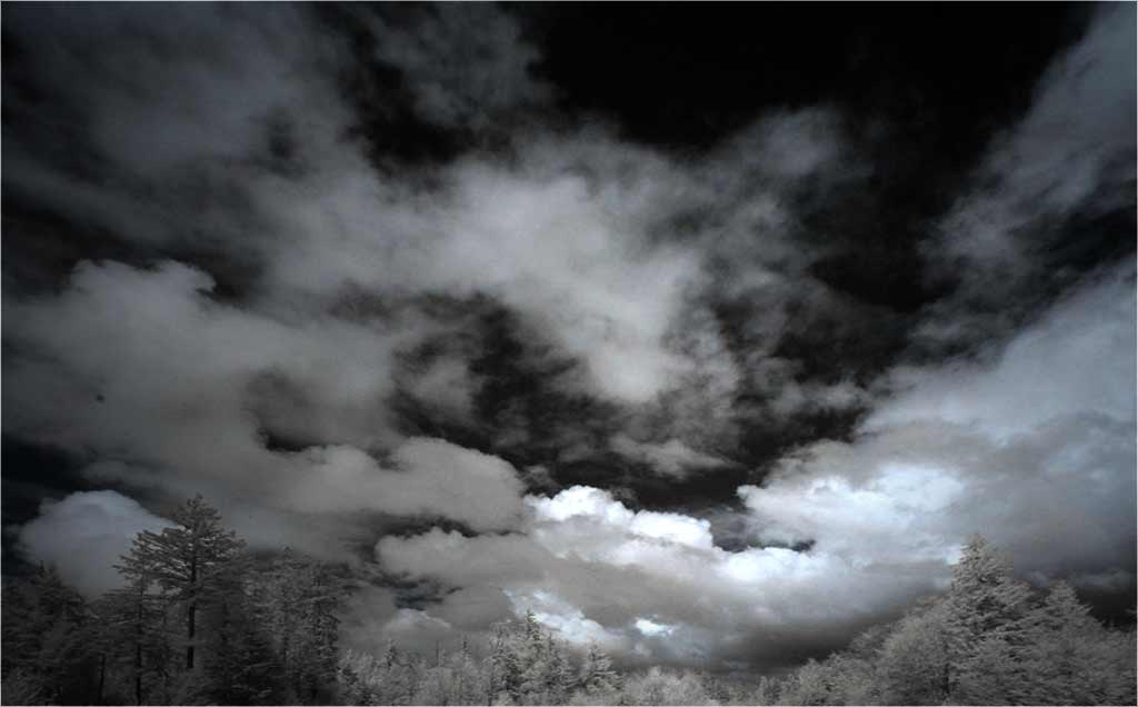
You have a magnificent cloud effect, one that I envy. In my opinion, the cemetery is a big distraction; the trees by themselves are enough to support the cloud effects. I suggest that you crop them off.
The clouds are their own lead-in lines, and I suggest that you reverse the image so that they read from the left to the brightest white spot, which is clearly your center of interest. If it were mine, I would also darken around it, something like the thumbnail. Straightening the trees is really needed. How did you convert it? When I look at it in Photoshop, the histogram shows colors and attempted changes in color affect only the tone of hte image.
. |
Nov 16th |
 |
| 33 |
Nov 17 |
Comment |
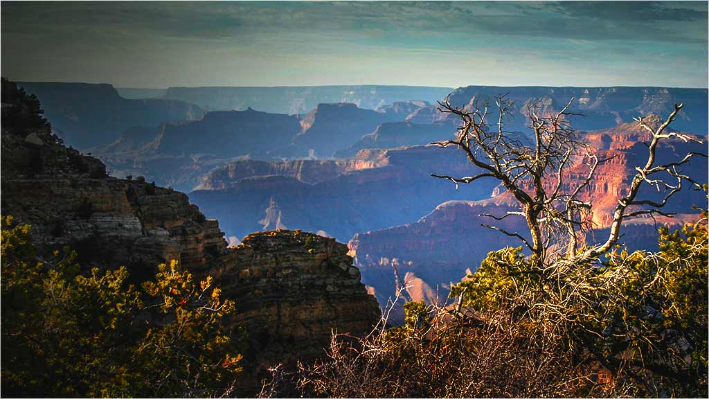
It's hard to do a "different" image of the Grand Canyon, but you may have accomplished it! I like your idea. In this case, your composition, and your title, lead from the upper left to the lower right to the scrubby tree, which is your center of interest.
To me, the tree then needs to stand out from the background more than it does. My thumbnail is a suggestion on how that could be done. I darkened the sky and lower left, the selectively darkened the lower right. You have beautiful colors; you should flaunt them with Vibrance and Hue and Saturation.
.
|
Nov 16th |
 |
| 33 |
Nov 17 |
Comment |
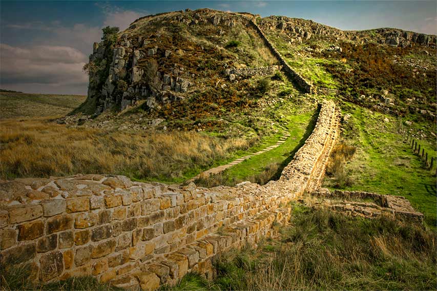
It IS a beautiful scene, but I have to agree with Ken. The bright areas in the distance grab my attention from the more nuanced and attractive left third and bottom of the image. In my opinion, that's where your picture is. I sure hope you took more in this area.
|
Nov 16th |
| 33 |
Nov 17 |
Comment |
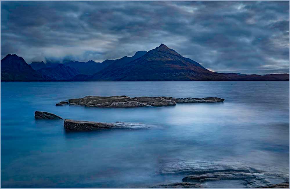
The careful simplicity of your subject and its arrangement make this an outstanding image. It is very well done.
If I had done it, though, I would have darkened the clouds over the mountains, since the two bright spots compete, at least for my attention. Then I would have reversed it on the premise that most, but not all, images "read" better from the left than from the right. I am interested in your opinion of my idiosyncrasies. |
Nov 11th |
 |
5 comments - 0 replies for Group 33
|
10 comments - 3 replies Total
|


