|
| Group |
Round |
C/R |
Comment |
Date |
Image |
| 14 |
Sep 17 |
Comment |
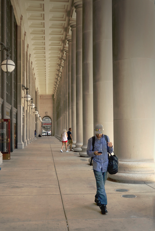
You have a story to tell, and have all the elements you need to do so, but you have more than you need, and some distract. The converging lines lead right to....an eye-catching white sign. If it were mine, I would darken it. Similarly, the two people leaning on the wall aren't part of the story, and I would crop them out. The ceiling is brighter than your subjects, and draws the eye from them. If you darken it, you can see your story much better. Now, your story pops out.
. |
Sep 10th |
 |
| 14 |
Sep 17 |
Comment |
This is a well done sunset. The trees, the clouds and the sun all contribute all contribute to a well-composed peaceful scene of the kind that you might want to put on your wall. The technique and color are also very good, although I would consider toning down the yellow and white; those make it very contrasty for my tastes. If it were mine, I would think about moving the bird maybe half way to the center of the sun spot, on the basis that the sun and the bird are high contrast compared to the respective backgrounds, giving to my eye competing centers of interest. When closer together they wouldn't be in as much competition.
. |
Sep 7th |
| 14 |
Sep 17 |
Comment |
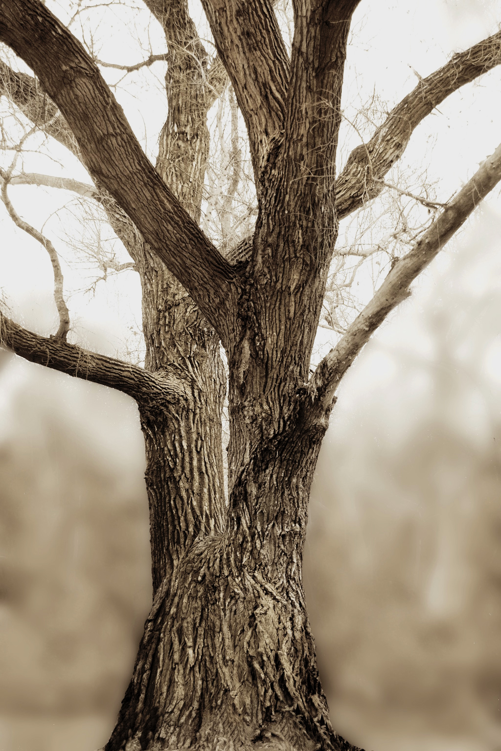
You pretty much accomplished what you set out to do. The texture is lovely, and the soft background is what makes it.
If it were mine, I would take it a step further and give the tree more contrast and some real blacks. It is generally agreed that a monochrome should some true whites and some true blacks, ehr browns in this case. If it doesn't have those in some part, the image will almost always look gray, ehr, brown.
. |
Sep 7th |
 |
| 14 |
Sep 17 |
Comment |
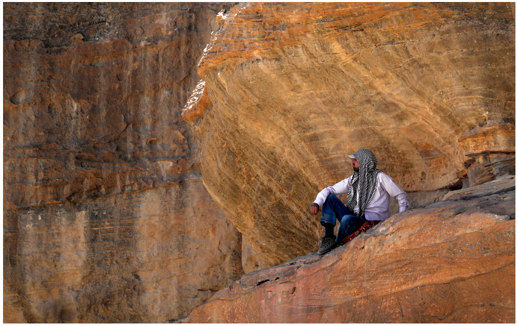
This tells a story with a high degree of clean simplicity. It's one of those that I wish I had taken!
I have only two suggestions. Your subject is in the shade, but the shade makes him dull and drab. That's easy to fix: I used two successive instances of Selective Color > White to take out all the black. In this case there is nothing else except his shirt that is white, except for small sunlight patches that you don't even need to change if you don't want to. Your white stroke is the right thing to do, especially on a black background, but it's thick enough to call attention to itself; if it were mine, I would cut it in about half.
. |
Sep 7th |
 |
4 comments - 0 replies for Group 14
|
| 33 |
Sep 17 |
Comment |
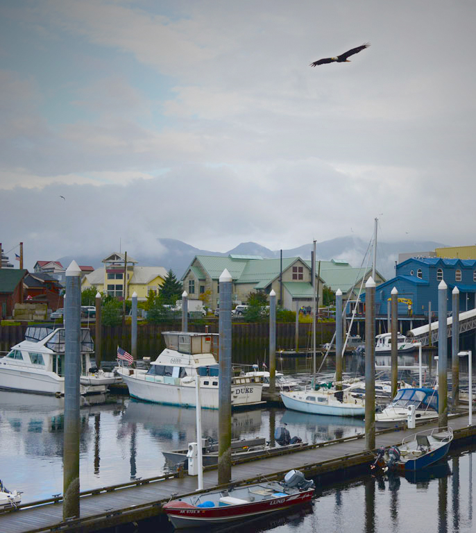
You're right, there is no question of where this is! This is an excellent travel image. It would be blah without the eagle, but the eagle makes the picture. I think you should back off on the contrast and use a lot of vibrance and saturation to bring out the colors and unblock the shadows. I would also tone down the sky a bit.
. |
Sep 13th |
 |
| 33 |
Sep 17 |
Comment |
Your processing makes this shot by turning what could have been stark contrasts into a view of an interesting phenomenon. Your techniques has lots of possibilities. I don't think it is too simple at all; if anything, is has two competing areas. I would leave one out.
. |
Sep 13th |
| 33 |
Sep 17 |
Comment |
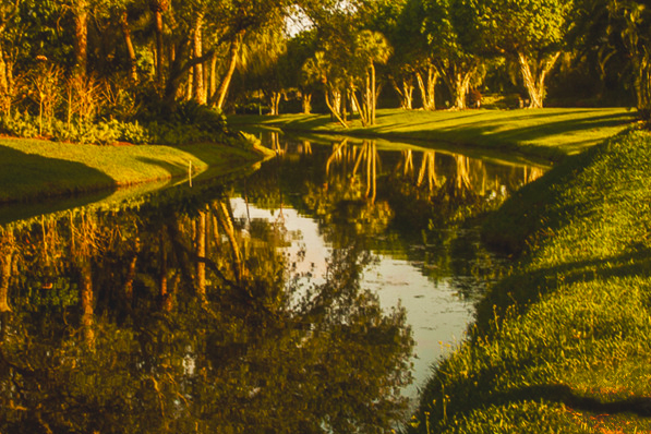
You have what should be a peaceful, warm scene that doesn't really speak to me that way as much as it should. I think that is because it is "busier" than it needs to be, with deep contrasts all over that hide what could be a sweeping composition. It needs simplification. I tried cropping and reducing the contrasts some. It seems to me to help.
. |
Sep 13th |
 |
| 33 |
Sep 17 |
Comment |
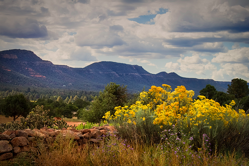
Your image is a well done view of what is so attractive about the Southwest. It has a lot of detail, but retains a certain simplicity from its strong leading lines and brighter center of interest. I suggest only minor change: I would reverse so that the lines lead from the left side and increase saturation a smidge.
. |
Sep 11th |
 |
| 33 |
Sep 17 |
Comment |
This is a very unusual composition. The foreground is striking, the sky is striking, and all have beautifully correct colors, yet my eye is drawn to the precise spot you want me to see, the small cross and the lighthouse. This is a beautiful image.
If it were mine, I would lighten the large Celtic cross and its base just a bit. I think it is because the high contrast of the cross against the clouds draws more attention than it should.
. |
Sep 7th |
5 comments - 0 replies for Group 33
|
9 comments - 0 replies Total
|


