|
| Group |
Round |
C/R |
Comment |
Date |
Image |
| 14 |
Jun 17 |
Comment |
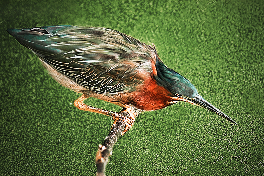
For your first foray into detailed masking you picked an image that would challenge anyone, and did a good job of it. If you do much of this kind of thing, I suggest that you look into Topaz Remax, which is designed especially for this situation. The branches are a problem, but once those are gone, the bright color of the grass is still a major problem. If it were mine, I would have cut out the bird and his branch and put it on a much less intrusive background; this one is so bright it dominates the image. To see what I mean, I have simply changed the colors of the background with Selective Color to a darker color. My color still isn't right, but you see my point: your eye is usually drawn to the brightest part of the image.
.
|
Jun 18th |
 |
| 14 |
Jun 17 |
Reply |
That's why it is important to use the histogram in this situation. It uses numbers to represent shades and colors, and the numbers don't change; black is 000 and white is 255. Levels changes the numbers so that 000 is set at the left slider and 255 is where the right slider is set and all others are set proportionally. Numbers don't change, but your eye is an analog gadget that is so adaptable it can fool you and your monitor, depending on room light (and color,) background, and even fatigue. Usually, if you want black, set it with the left slider as you watch the histogram. Then set white, and adjust in between with the center slider.
. |
Jun 14th |
| 14 |
Jun 17 |
Reply |
Watch the histogram when you are setting black and white points. The part of the image corresponding to the left triangle will be fully black, and the right triangle will point to fully white. Movement of the center triangle pushes the histogram in the opposite direction to the movement, and has the effect of changing the contrast. You want the window black? Move the left slider until you can definitely see a change. Move the right slider to get a true white where you want it, then adjust the middle slider to get contrast change. My image this month has no true whites, making it a bit harder to adjust.
. |
Jun 13th |
| 14 |
Jun 17 |
Reply |
You are right about the bright spot distraction. It is far too bright, but I do think something is needed to keep the scene from becoming a simple pattern. How does this work for you?
. |
Jun 13th |
 |
| 14 |
Jun 17 |
Comment |
You have an eye for the unusual. This is a fine nature image. Your composition really helps in telling the story. If it were mine, I would crop it a bit more tightly, in part to get rid of as much of the bright grass as I could. The brightness distracts, but you can use Selective Color to tone down what's left; select green, add black, add magenta, and maybe a little cyan, darken what's left.
. |
Jun 12th |
 |
| 14 |
Jun 17 |
Comment |
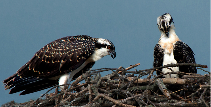
Beautiful bird image! The story is outstanding. If it were mine (and I wish it were!) I would flip it, crop it a bit to make the birds more prominent, darken the blue/cyan sky with Selective Color, and up the contrast to a center slider setting of bout 0.75 in Levels. Beautiful.
. |
Jun 11th |
 |
| 14 |
Jun 17 |
Comment |
This is a pleasant afternoon well pictured. You did well with the sky. I suggest that you go further, using Selective Color to make the blue and cyan stronger and take out a bit of yellow. It would help to unify the (dual) composition and draw attention to the lighthouse with a slight darkening of the left and corners.
. |
Jun 11th |
 |
| 14 |
Jun 17 |
Comment |
Your image tells the story of a truly haunted house. Maybe the creepers and brush hold it all together! Monochrome is obviously the right choice. You are right, your camera is at an angle that rotates the image about eight degrees clockwise, but that doesn't really affect the impression it gives in this case. Maybe you can claim you did that on purpose. Your composition does something I didn't think possible: the lack of detail around the edges acts to draw my eye to the second story window on the right as a center of interest.
As a technical point, monochromes almost universally look gray, as this one does, when they don't have some area of true black and some area of true white. I tried to put some of each in, but the histogram is so uniform from black to white that I couldn't make much difference. I suggest cropping from the sky; the house is your picture, not the trees, and the bright sky distracts from it. Better yet, return on some sunny day when the sky is blue (so you can make it darker) and there are shadows to play with, plus give true blacks and true whites. Do it before the creepers and brush give up!
. |
Jun 11th |
 |
| 14 |
Jun 17 |
Reply |
I think I probably overdid the darkening, but it does illustrate my point.
. |
Jun 6th |
| 14 |
Jun 17 |
Comment |
Your recognizable abstract is well composed, though maybe a little soft. The color is fine, and the drops of water are a nice touch, though in real life I think they would be more uniform in size.
The center of your composition is in the middle. There is nothing wrong with that, but, since most of the time the brighter areas draw attention, the bright edges take my eye around the frame with no real place to light. I suggest a darkening of the edges to give me a place to light, something like this.
. |
Jun 5th |
 |
6 comments - 4 replies for Group 14
|
| 33 |
Jun 17 |
Comment |
Wow and Impact for sure. Well done with strong color, strong simplicity, strong composition. I don't think I would change a thing.
Sometimes a bit of vignette should be used to add what might be called "movement" to to an otherwise monotonously constant sky.
. |
Jun 11th |
| 33 |
Jun 17 |
Comment |
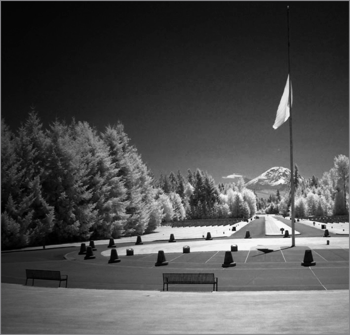
Well done! I have to agree with Paul about the camera position. I would go a step further and darken from the left to draw more attention to the mountain/flagpole/walkway area which is your center of interest. To my eye, that simplifies the image. If it were mine, I would give it more contrast and make it completely monochrome; these residual colors seem to distract.
. |
Jun 11th |
 |
| 33 |
Jun 17 |
Comment |
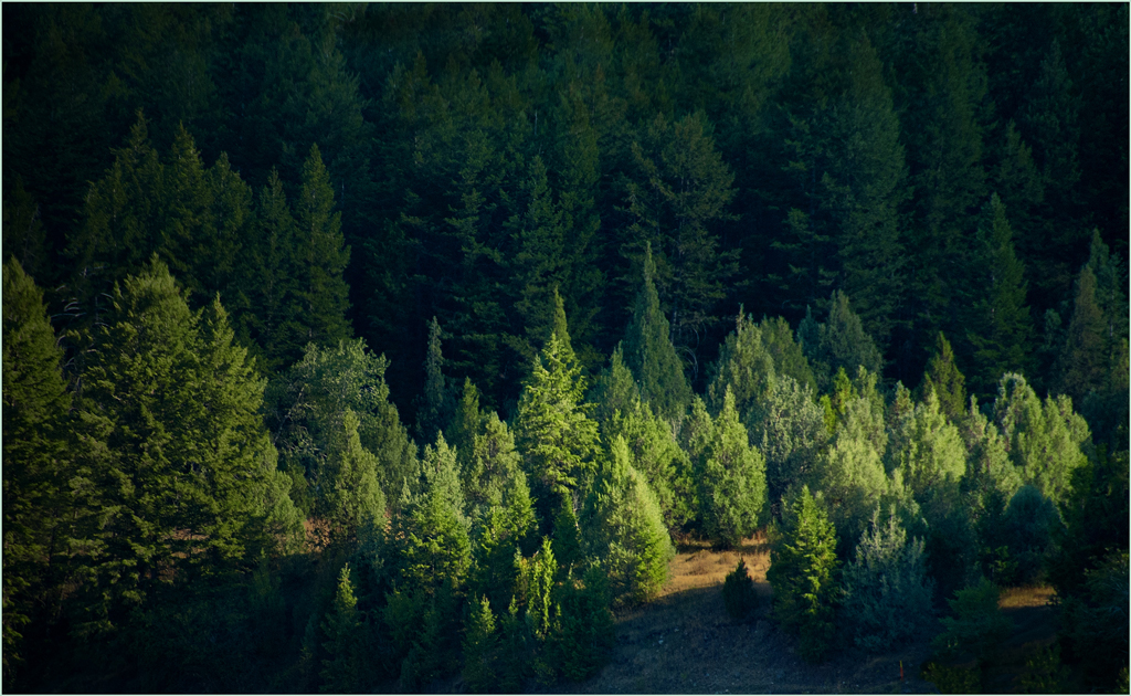
I don't think you have struck the right balance between detail and compositional shapes. To me, the detail overwhelms the composition, making it a "busy" image. In contrast, your "Original 2" strikes me as a better place to start. The haze in that one suppresses the detail enough to bring out the mountain contours.
. |
Jun 5th |
3 comments - 0 replies for Group 33
|
9 comments - 4 replies Total
|