|
| Group |
Round |
C/R |
Comment |
Date |
Image |
| 14 |
May 17 |
Comment |
The simplicity is what makes this image, but to me, the out of focus foreground dominates even the mushroom, and I would prefer the original (after cropping much of the foreground) over the final version, mostly because of its crispness.
. |
May 19th |
| 14 |
May 17 |
Comment |
Thank you for the insight into how this image came about.
The image has an unusual concept. The use of what amounts to a negative of the central element, the tree, certainly draws attention. Your suppression of the hills in the background certainly justifies the title. In my view, the dust spots and scratches detract and distract from the overall theme. I don't know what to recommend to replace them, but maybe something more regular in an irregular way. It would to me be more striking with increased contrast, possibly something like the thumbnail, where the increased contrast draws attention to the tree, i.e., "alone."
. |
May 19th |
 |
| 14 |
May 17 |
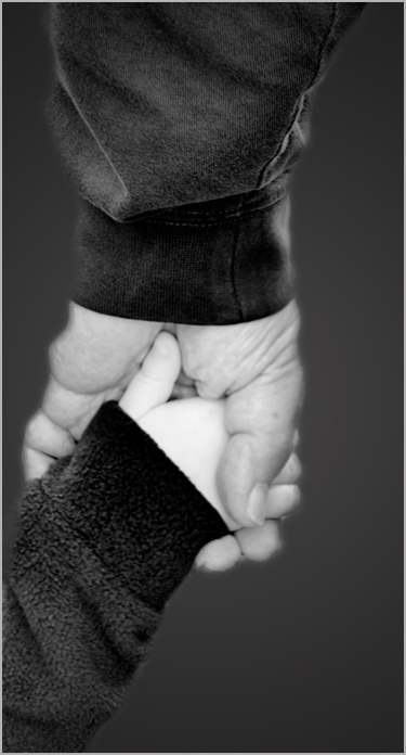
Reply |
It's very simple to change the background in PS, and very messy to burn it in without its becoming too dark. I used lasso to select the arms and hands, feathered 5 pixels, copied that layer (now minus the offending background,) and pasted it on a medium gray layer. If that layer is too dark, fill that layer with some shade of your choice.
. |
May 17th |
| 14 |
May 17 |
Reply |
Aren't we all. If the image file is named anything.jpg, it is JPG regardless of how anything else was set on the camera. This is an example of why one should use RAW mode regardless of whatever is set (if it is possible.) Raw gives data almost exactly as the sensor saw it, which still needs help to be fully "realistic." Camera JPG mode s an attempt to make it more acceptable. We, too, have a concern with camera bulk and weight, and have gone to much smaller Leica cameras; they have excellent optics and full range of controls, with costs to match, however.
. |
May 15th |
| 14 |
May 17 |
Reply |
If you son't like that, you can get realistic color the same way, with a little experimentation. How about this?
. |
May 15th |
 |
| 14 |
May 17 |
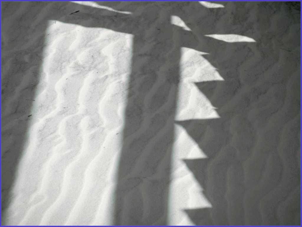
Comment |
This IS at least a semi-abstract, and an interesting one. I could do without the black spots in the white sand, though. It reminds me of a bedspread my grandmother made me once.
As to the blue color, it almost surely originates from having the sand lit from the blue of the sky; this usually gives a slight blue tint in such cases. Your How I Did It says your camera is a "point and shoot." You don't say so, but I expect that you took it as a *.jpg. In-camera jpgs are set by the manufacturers to be brighter and more saturated because most point-and-shooters like them that way. If you don't like that color, try another. How about pink? You can do it in two minutes total in Photoshop with Image > Adjustments > Replace Color.
|
May 14th |
 |
| 14 |
May 17 |
Comment |
You have indeed captured a "very emotional moment" as Arun says. The background almost destroys it, though. The background's bright and confusing tones draw my eye away from your real picture. If you get rid of that background and substitute another, see what happens.
. |
May 11th |
 |
| 14 |
May 17 |
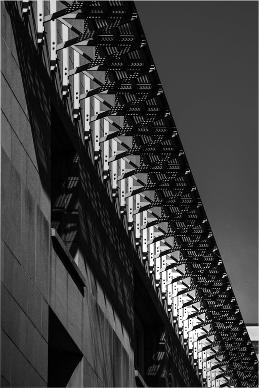
Comment |
Correct exposure, clean whites, smooth blacks, fine lighting, and simplicity; this one (almost) has it all. The diagonal composition of white and black provides a satisfying texture to the image. The "almost," my one reservation, is that my eye wanders, the long diagonal having no place to light. I think it needs one. Suppose one part is a bit brighter than the rest. I've tried something like that in the thumbnail, but I'd bet you can find a better one.
. |
May 11th |
 |
| 14 |
May 17 |
Comment |
With another title, would the door still be of the wrong shade of red?
. |
May 10th |
| 14 |
May 17 |
Reply |
I think the stems must be there, but suggest just cutting off the dry, stale-looking tip.
. |
May 5th |
| 14 |
May 17 |
Comment |
Tack sharp, perfect exposure, good color, so well done, in fact, that I wish you had clipped of the tip of the dried stems. It's that realistic. My only suggestion is that you put the three peppers in the middle, by maybe cropping a little from the right. I especially like the white stroke to set the image off from the black background.
As to background, what did you use for it?
. |
May 5th |
7 comments - 4 replies for Group 14
|
| 33 |
May 17 |
Comment |
I'm not sure of what is meant by "over processing." That word has the connotation that somehow the camera manufacturer's design tradeoffs and design limitations should be changed or modified only minimally, leaving very little for a photographer's imagination. Beyond that, the expression "over processing" does not have a precise meaning in a critique: What should be changed?
Given that editing tools give us complete control of every property of each of those millions of bytes of image, there can be such a thing -- and I plead guilty to this -- as poor or inappropriate processing. Again, what should be changed?
In this case I believe that the degree of saturation is a legitimate topic for discussion of this image. I investigated that I liked the way Ken handled saturation more than any changes I had made.
. |
May 15th |
| 33 |
May 17 |
Comment |
Clean, simple, colorful, well composed, perfect exposure: this one has it all. You used the exact time of day for this effect. I really wish I had taken it! About the only thing I might change if it were mine would be to add a thin white line as a border to separate the black shore from the black background.
In my opinion, a reflection or car trails would spoil its basic simplicity.
. |
May 15th |
| 33 |
May 17 |
Comment |
This image shows why photographic simplicity is a huge virtue. Without simplicity you wouldn't have told the story you did. The broken down fence with burnt post and the windmill whose rotor has fallen off are telling details; I wouldn't have seen these details in a busier image. Well done.
I think it would have been just as simple and a bit stronger if you had been a step or two to you left, so as to reduce the angular distance between your two objects. I would like a thin white border on images like this when shown against a black background.
. |
May 6th |
| 33 |
May 17 |
Comment |
The lighting and your unusual treatment of crop make this image. The low angle and color of the just-before-sunset lighting pick out exactly-right details and set the frame for your story. A little brighter lighting with a bit of contrast wouldn't change that, and would, I think, help. I have to agree with Ken about the people on the beach and the radio tower.
To my regret, we have seen this location only from a distance, and will one day go back.
. |
May 4th |
| 33 |
May 17 |
Comment |
I believe that the light areas behind the tree are clouds. They used to be much more prominent, prominent enough that I did tone them down, but obviously not enough. I'll try it again later.
I find that Simplify is useful in a variety of circumstances, from very light suppression of unwanted detail to complete comic-book treatments; this use is closer to the first.
. |
May 4th |
| 33 |
May 17 |
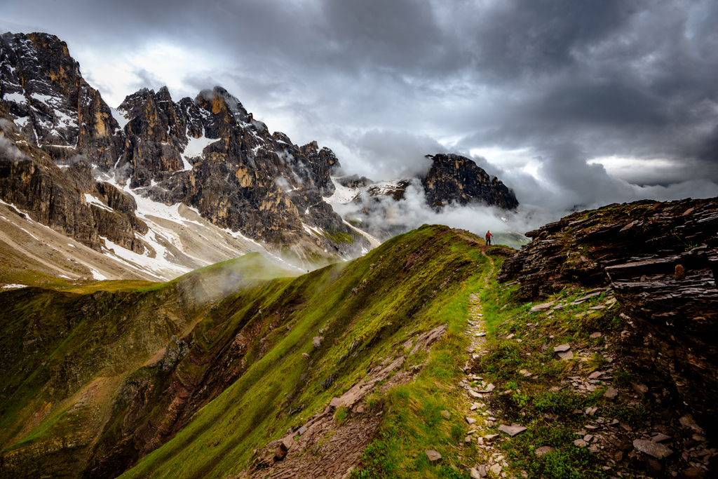
Comment |
This is the essence of "a wind swept overcast/rainy day in the ....... mountains." Your knowledgeable use of the wide variety of photo editing tools brings out the tack-sharp detail that gives the image its great depth and realism. No cardboard cutout mountains here! Even that teeny tiny person with the red shirt shows up well.
The only changes I would make if it were mine would be to flip it to its mirror image. This is one of those images where reversing it makes it into a different image. That way, the peak ridge and contours in the lower right quadrant become leading lines to that teeny tiny person, which makes the composition stronger. I also suggest a thin white stroke line around the image; that helps hold the eye into the image when it is displayed on a black background.
At first glance the image seemed maybe a bit oversaturated. I tried turning down the saturation a little, but didn't like the result; you have it just right for my tastes, at least.
. |
May 2nd |
 |
6 comments - 0 replies for Group 33
|
13 comments - 4 replies Total
|


