|
| Group |
Round |
C/R |
Comment |
Date |
Image |
| 14 |
Apr 17 |
Comment |
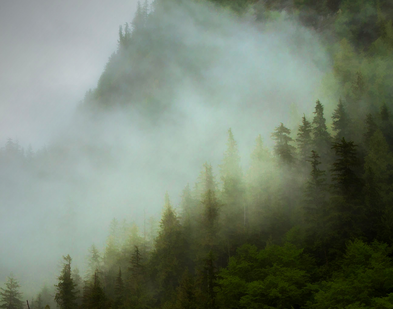
I would go further than either Arun or Stuart would. Despite wishing or dreaming to the contrary, large bright white areas without detail will always grab your attention in this situation. Fog makes itself known, not by being blank, but by what it partially obscures. I recommend that you tone it down, as Stuart wants, and crop much more tightly than Arun wants. When that is done, the fog itself is much more prominent.
. |
Apr 25th |
 |
| 14 |
Apr 17 |
Reply |
It's not sharp because I twitched during the exposure, and he was gone thereafter. One thing I didn't try was to use the PSCC Shake Reduction filter; your comment made me try it now. If you click on the thumbnail, you can see that it helps. It's intended to be a nature image, so there is not a lot more to do with it, even if I understood what you mean by more artistic processing. Tell me what you had in mind if it weren't for nature.
. |
Apr 21st |
 |
| 14 |
Apr 17 |
Comment |
The bee is in a good place, and the blossoms can form a leading line toward it. I find the image to be hugely distracting, with its out-of-focus yellows, greens and blues as a background to take the eye away from what you want your viewer to see. It helps a lot to darken the background, which you can do by at least two different ways. I used a short, circular gradient to darken everything except the bee, then erased the gradient over the upper flowers; you can also do it by selecting and darkening the greens and yellows in Selective Color in PSCC. This last leaves the out-of-focus blooms still there to district.
This is a good example of the fact that your eye is drawn to the lighter areas, the upper blooms, instead of the darker bee.
. |
Apr 21st |
 |
| 14 |
Apr 17 |
Comment |
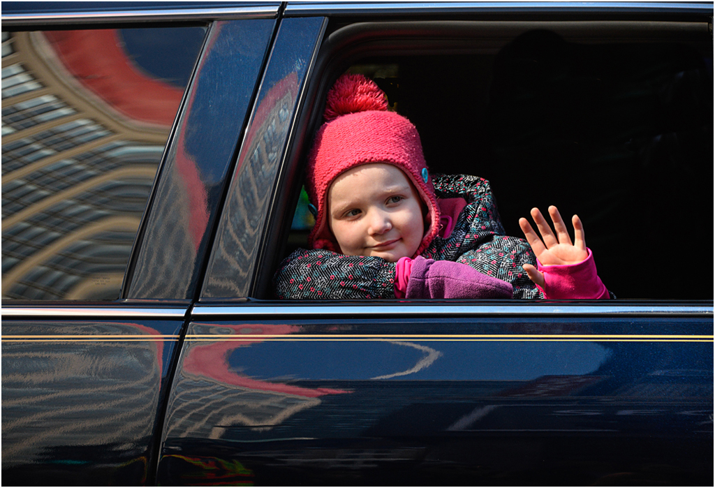
Your technique, subject, and pose are superb. It really tells a story. The window behind the subject initially bothered me as being a distraction, but I couldn't improve it by cropping. If you flip it horizontally, the formerly distracting reflection s now are a lead-in line to the subject, as asset instead of a liability.
. |
Apr 21st |
 |
| 14 |
Apr 17 |
Comment |
I have to agree with Arun (again,as usual,) except that I would crop a bit more from the bottom, and do something about that mast and its reflection on the extreme left, which is distracting. The reason for not placing a horizon in the center of the frame is that doing so makes the image into two competing images, which is what happens here; a good picture can be made of either half alone. Moving it out of the center helps emphasize one or another of the three elements: buildings, boats, or reflections.
It looks to me bit washed out. If it were mine,I would tweak the contrast some, and strengthen the colors a bit; it is, after all, sunset.
. |
Apr 14th |
| 14 |
Apr 17 |
Comment |
You have captured much of the simplicity of traditional Japanese design. It must be complete, balanced and simple, but not too complete, too balanced, or too simple. This is why Pat's crop fails.
I suggest three or four simple changes. I would crop a bit from the left, just enough to make the wooden frame the same distance from the edge as the right side is. Then I would extend the top so that the shoji frame is that same distance from the edge, or at the very least the wooden frame is straight and level. Next I would darken the blue-gray of the screen enough that it doesn't compete so much for attention with the bench. Finally, your "thin white frame" doesn't show, but you do need it; I suggest a stroke of three or four white pixels. If that's too prominent, make it gray or grayer until you like the results.
. |
Apr 14th |
| 14 |
Apr 17 |
Reply |
All of these have in common that though their written languages do not read from left to right, native speaking photographers and judges seem to prefer their images reading from left to right, as you said. Why, I don't know.
. |
Apr 3rd |
| 14 |
Apr 17 |
Reply |
Right on two accounts: warm room and hot coffee. I plead guilty on the third count: left to right, BUT that applies to almost all cultures, even readers of Hebrew and Oriental ideographs, not just our culture and writing conventions.
. |
Apr 2nd |
| 14 |
Apr 17 |
Comment |
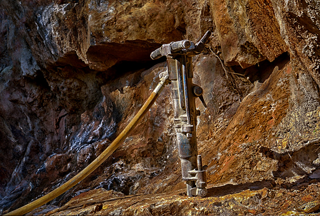
The subject matter is interesting and unusual. The air line is an essential element of the composition, but I wish that the drill were more prominent.
You can make the drill stand out because it is a different color and a different texture. It is almost colorless (except for the dust on it) and it is smooth, not rocky. To make the drill stand out more, I worked with the reds and yellows in Selective Color (PSCC) to make the background darker and with white to make the drill a little brighter, then with Levels to compress the brightness range. There is a slight vignette to darken the edges and hold the eye in the frame, and small changes in brightness and contrast as a final adjustment.
I think it works best in color. In monochrome, my choice would be a slightly darker sepia.
. |
Apr 2nd |
 |
6 comments - 3 replies for Group 14
|
| 33 |
Apr 17 |
Comment |
Your image has a lot of story-telling potential, but the bright areas on three sides are distracting your viewers from seeing it. How about getting rid of all the bright areas by cropping and filling, and then increasing brightness and contrast, something like this.
. |
Apr 25th |
 |
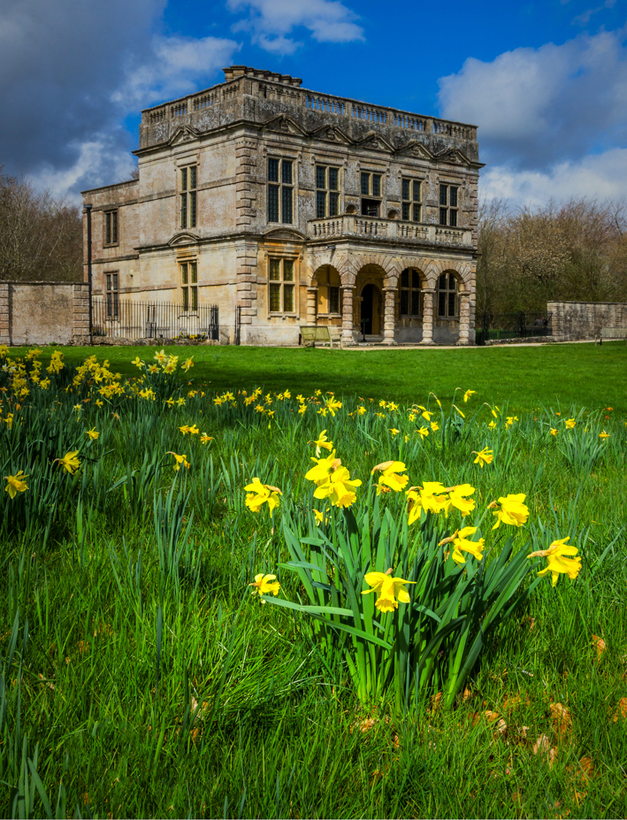
| 33 |
Apr 17 |
Comment |
This is clearly a shot with divided interest, spatially divided almost equally between the building and the daffodils. I suggest that the main center of interest should be the daffodils, and that you make the building less prominent by cropping, and the daffodils more prominent by making them brighter, something like this.
. |
Apr 25th |
 |
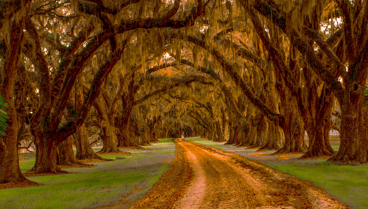
| 33 |
Apr 17 |
Comment |
The slight curves in the road make the composition much less static than it would otherwise be. I wish it had some point of interest right where the image converges, but it is a pleasant image even without that.
To my eye, the heavy, dark trees are almost foreboding. I tried Paul's suggestion by raising slightly the lower half of the curve; that puts light and detail into it.
. |
Apr 25th |
 |
3 comments - 0 replies for Group 33
|
9 comments - 3 replies Total
|


