|
| Group |
Round |
C/R |
Comment |
Date |
Image |
| 14 |
Mar 17 |
Comment |
I must have hit it about right when my viewers can't agree on whether or not the edges are too sharp or not sharp enough!
. |
Mar 23rd |
| 14 |
Mar 17 |
Reply |
I understand your concerns, but must disagree on the basis that the capital and lintels are the picture, the columns are only the supporting cast. (Pun intended.) Light areas attract the eye; in this case making the columns lighter would draw the eye away from the detail I want you to see.
.
|
Mar 23rd |
| 14 |
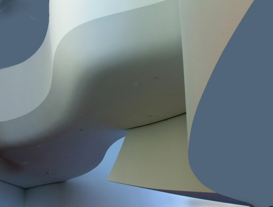
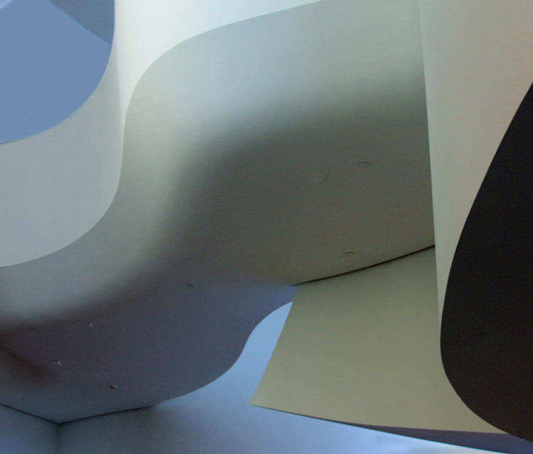
Mar 17 |
Comment |
A very strongly composed and simple picture. Like Stuart, I like the second image better. Its sweeping curve gives it a much more pleasing composition. I suggest brightening the whole image just a bit to give more definition to the details, then darkening the upper bright spot so that it doesn't divide the viewer's interest quite so much. .
. |
Mar 23rd |
| 14 |
Mar 17 |
Comment |
The flower is delightful and well photographed. The two blooms in the foreground are your real image, the buds are only supporting players, and don't deserve half of the frame. If it were mine, I would crop most of the buds and re-do the somewhat heavy vignette to more subtly emphasize the lower left bloom.
. |
Mar 23rd |
| 14 |
Mar 17 |
Reply |
Just playing with an interesting photo.
. |
Mar 15th |
| 14 |
Mar 17 |
Reply |
Now add (4) the picture is about curves and light and shadow, not colors, (5) most people "read" an image from left to right, and (6) you really have a chance at a pure abstract by eliminating unnecessary details (e.g. the lights.) |
Mar 14th |
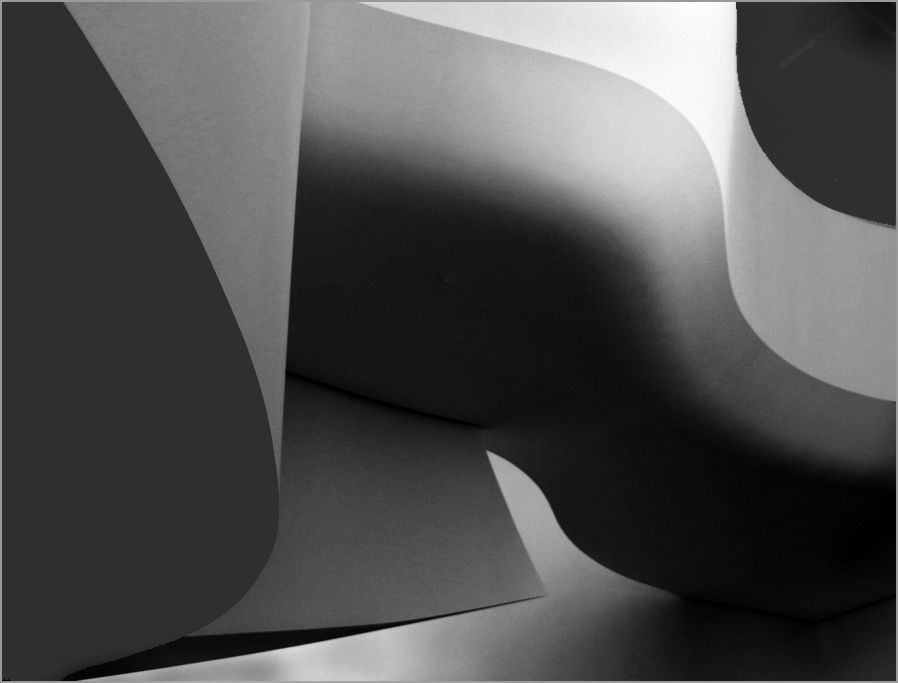 |
| 14 |
Mar 17 |
Reply |
In that case, try something like this one, remembering that (1) black dominates in part because a black object always looks bigger than it really is, (2) white attracts the eye, and that (3) your picture is the curves and smooth transitions and not about large blank areas.
. |
Mar 14th |
 |
| 14 |
Mar 17 |
Reply |
You don't want to let the blob dominate, as being black makes it very dominant. If you want the blob bigger, make it another color besides black.
. |
Mar 13th |
| 14 |
Mar 17 |
Reply |
One easy method to play with colors is to use Selective Color in Photoshop. With it you can adjust the brightness of individual colors within fairly broad limits.
. |
Mar 13th |
| 14 |
Mar 17 |
Comment |
Fine curves and colors. You've found a magnificent subject.
To answer your question: Yes. The black blob and bright upper corner both dominate the composition; black always looks bigger than it actually is, and brightness (white in this case) always pulls the eye. Your curves, the real subject, is between the two.
Your subject is curves. You don't need so much of the black blob for that, but some black helps. The bright white isn't really part of the curvy subject, so tone it down. I filled it with a medium blue and did minor cropping. Now your subject really jumps out.
. |
Mar 13th |
 |
| 14 |
Mar 17 |
Comment |
You have unbelievable detail in the head and face; that's what makes this image. It's hard to imagine how you got the detail, especially at 1/30 second with a wiggly monkey. Arun is right about the rock in the background; you really ought to get rid of it.
While you are at it, you could fix the hand. Extend the canvas, then clone in the background and enough to fake the missing fingers, which are blurred by movement, anyway. If it were mine, I would subtly darken the corners (and the new fake hand) to hold the eye in the frame; to me the bright background tends to pull me away from the face. I do like the thin white border, which is needed to separate the picture from the black background here and when it is projected.
.
|
Mar 12th |
| 14 |
Mar 17 |
Comment |
Your simple pattern and texture are just right. If it were mine, I might make it a little bit brighter and maybe give it a little more contrast.
I don't often disagree with Arun, but I have to this time. The shadow at the top gives the composition depth; without it, the image is flat, to my eye, anyway. |
Mar 12th |
| 14 |
Mar 17 |
Reply |
In Assign Profile you can change back and forth before your very eyes. Do it without exiting Assign Profile. When I first opened it, the image was RGB. It may be that the Save for Web operation is restoring the RGB.
. |
Mar 4th |
| 14 |
Mar 17 |
Comment |
I like your composition; without fuss or muss it holds my eye within the frame, and the streak of clouds is a nice touch and an essential element.
You SHOULD have done further processing. It came out of the camera with an Adobe RGB (1998) color profile, which is fine, but then show it to us in a browser, all of which are confined to the sRGB color space/profile. The sRGB color space lacks a big fraction of warm colors, especially the reds, which are essential to this image. Without them, it is blah. To see what I mean, open the image in Photoshop and Edit > Assign Profile. Change between RGB and sRGB profiles; in sRGB you will see how it really appears in a browser. You can correct the problem by processing in sRGB to get the colors the way you want browser users (us) to see them.
. |
Mar 2nd |
7 comments - 7 replies for Group 14
|
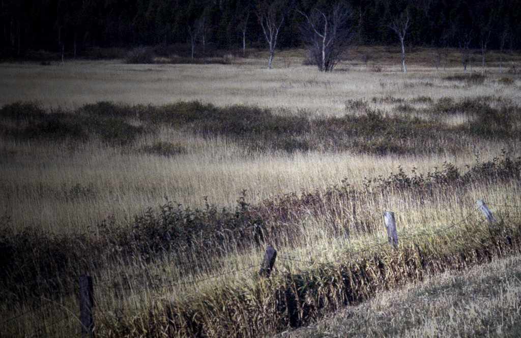
| 33 |
Mar 17 |
Comment |
Good eye. Most people would pass it by, as Paul says, but I'm glad you didn't. The layers give it depth, and you did right to keep the color. To my eye it has a bit more contrast than it needs, and the brightness of the farthest field divides my attention with the foreground. If it were mine, I would turn the contrast down and add a subtle darkening from top left to lower right to emphasize the foreground.
. |
Mar 23rd |
 |
| 33 |
Mar 17 |
Comment |
Elizabeth is on the right track. Her treatment, with increased contrast and saturation, gives depth and life to the image. Your composition is unusual, but it works. It tells a st0ry.
. |
Mar 23rd |
| 33 |
Mar 17 |
Reply |
THIS is the treatment that it really needs! Now can you combine the previous sky and this mountain?
. |
Mar 18th |
| 33 |
Mar 17 |
Comment |
Welcome to Group 33!
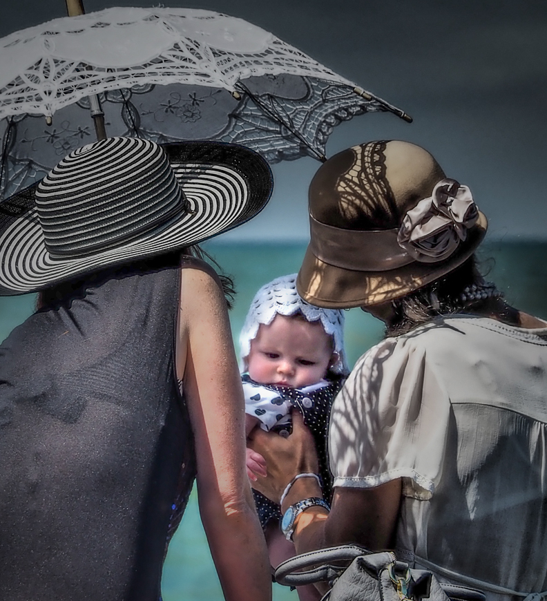
I like your selection of photo op subjects. Your technique is impeccable, and you have a very pleasant image. On the other hand, I have to disagree with our colleagues on your treatment of the subject. If it were mine, I would crop it severely on the basis that your real subject is the child, who happens to be in the shade. The face is dark, and the eye is attracted to other things because they are much brighter. A much tighter crop, a brightening of the child's face, and a relative darkening of the rest will give you a picture where your subject jumps out.
After cropping I brightened the face by selecting it with a lasso, feathering, followed by adjustment of the selection with Levels, a shallow light vignette centered on the face, and a little darkening of the woman's arm makes your subject really stand out.
. |
Mar 17th |
 |
| 33 |
Mar 17 |
Comment |
First things first: congratulations on your house, and the sooner the better!
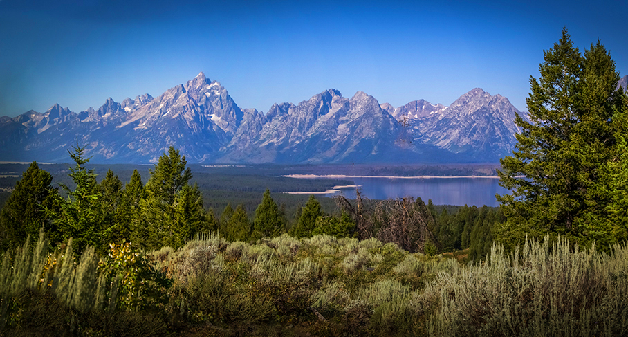
We live an hour's drive from the Tetons and go there often to photograph. This is one I genuinely wish I had taken. It has an unusual perspective, taken I believe from the Triangle-X or nearby. The time of day is fine, but you are right in that it might have been better with more morning crosslight earlier. The lack of clouds is essential, since clouds would only distract, and your more or less subtle vignette brings out stillness of midmorning. The foreground trees and sage add depth, and are likewise just right, once you are rid of Mt. Moran's distraction through the trees.
I would suggest two changes beyond that. The most important is to darken the immediate foreground; it's brightness pulls the eye from the mountains and lake. I tried cropping there, but found that the detail and shadows in the bright foreground are also important. Good eye. Next, the original is correctly in the RGB profile, but you are showing it now in a browser, which are always in sRGB, in which you lose reds and blues. For the thumbnail I switched profile to sRGB and then increased saturation.
Incidentally, I have climbed six of the summits in your image. I can remember every hand and foothold in each climb!
. |
Mar 14th |
 |
| 33 |
Mar 17 |
Reply |
It was shot in portrait format. I cropped it only slightly, a little of the sky area and a bit more at the bottom.
. |
Mar 13th |
| 33 |
Mar 17 |
Comment |
We could make more meaningful comments if you were to tell us what you have done in processing in a bit of detail. Otherwise we can only say what we think it needs. Pending that, the foreground needs a bit more definition, and the sky should show more of the color that seems to be there.
. |
Mar 6th |
| 33 |
Mar 17 |
Comment |
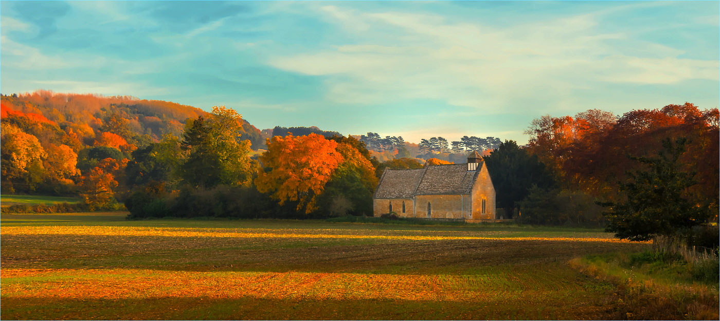
Fine composition. It leads from the right to the chapel, the dark tree and stand of tall grass or weeds on the right keep my eye in the frame and help give good depth to the image, and the low-angle light and shadows not only give depth, but show off the trees very well.
If it were mine, I would brighten the chapel, which is your real center of interest, but as one of the darker features, competes with the bright sky for attention. I would also increase the brightness and especially the contrast; it needs the extra punch.
. |
Mar 2nd |
 |
6 comments - 2 replies for Group 33
|
13 comments - 9 replies Total
|


