|
| Group |
Round |
C/R |
Comment |
Date |
Image |
| 14 |
Feb 17 |
Reply |
Appreciate your comment. but there is no architectural distortion; the adobe building is sloped backward as shown here.
|
Feb 16th |
| 14 |
Feb 17 |
Reply |
I think this is much better. This is a good one.
|
Feb 12th |
| 14 |
Feb 17 |
Reply |
It is Camera Raw 9.8 that does have Dehaze. I subscribe to Lightroom and Photoshop, which cost less than buying them every second or third year did; updates come automatically. The only thing I can suggest is to go the Adobe main page and search for it.
Dehaze works a lot like Clarity does, mostly by messing with mid-tone contrasts, only more strongly. If you can't get 9.8, try applying Clarity repeatedly.
|
Feb 12th |
| 14 |
Feb 17 |
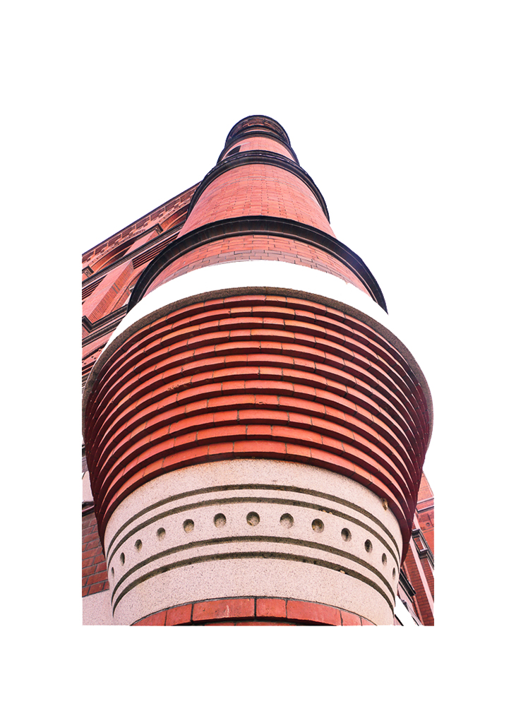
Comment |
Your unusual viewpoint gives a perspective that really emphasizes the features of this building. It is well done.
The building is a bit crowded in its frame, especially when displayed against a black background, as it is here. On the other hand, when displayed against a white background without an added border, the cropping is OK. This thumbnail is what I think you had in mind.
|
Feb 10th |
 |
| 14 |
Feb 17 |
Comment |
Beautiful! I'm reminded of the club judge who always insisted on SIMPLE pictures because "if it's simple enough, the judge can't find anything to criticize." It's lovely, the colors are just right, and your treatment of the tonality and (lack of) detail, along with the exactly-right white border, are the finishing touches that make it. The sun does need to be slightly off center as you have done, but I think it goes better flipped horizontally so it has more space in front of it as your eye enters (customarily) from the left.
You surely need the pink sky. If you do want to crop, do it from the middle; you can obscure the resulting suture very easily.
|
Feb 10th |
 |
| 14 |
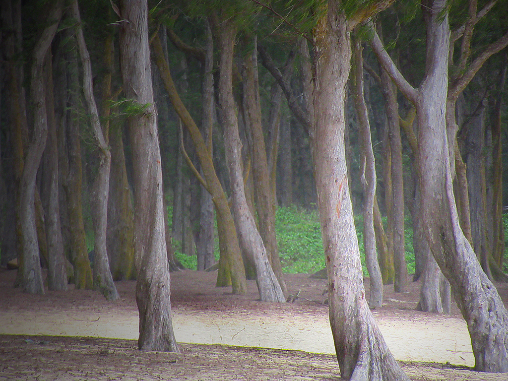
Feb 17 |
Comment |
An "enchanted forest" it is. The level of detail in your image is superb, and I wouldn't change the composition a bit. This is one of your better images!
On the other hand, I think I would change the tonality a little; it would add to the mystery if it were a bit darker and had maybe a bit more contrast. I would leave a part of it brighter than the rest to serve as a highlight. If it were mine, I would make it look liked this.
I'm pretty sure that the "sensor dust" that Stuart complains about is really weeds, twigs and the like on the ground.
|
Feb 10th |
 |
| 14 |
Feb 17 |
Comment |
This is a fine story-telling image. I like the spontaneity, unposed, and "it's happening now" feel. The brilliant white of the steam in the background does dominate one's attention, but the story is strong enough to draw my attention to the man anyway.
There are ways that these (minor) problems can be changed; this is just a suggestion about what can be done. I used Shadow and Highlight mostly to turn down the brilliance of the steam to give it some detail and relieve some of the shadow on his face; now you really see the man. The latter versions of Camera Raw have a procedure called Dehaze; with it you can do anything from completely eliminating the haze to increasing it tremendously, I used it to reduce some of the haze, but left enough for atmosphere. I think that the color balance is too red, so I did a little adjustment on that, followed by changing Brightness and Contrast. if you decide to tinker with these ideas, I would be interested in seeing what you come up with.
|
Feb 10th |
 |
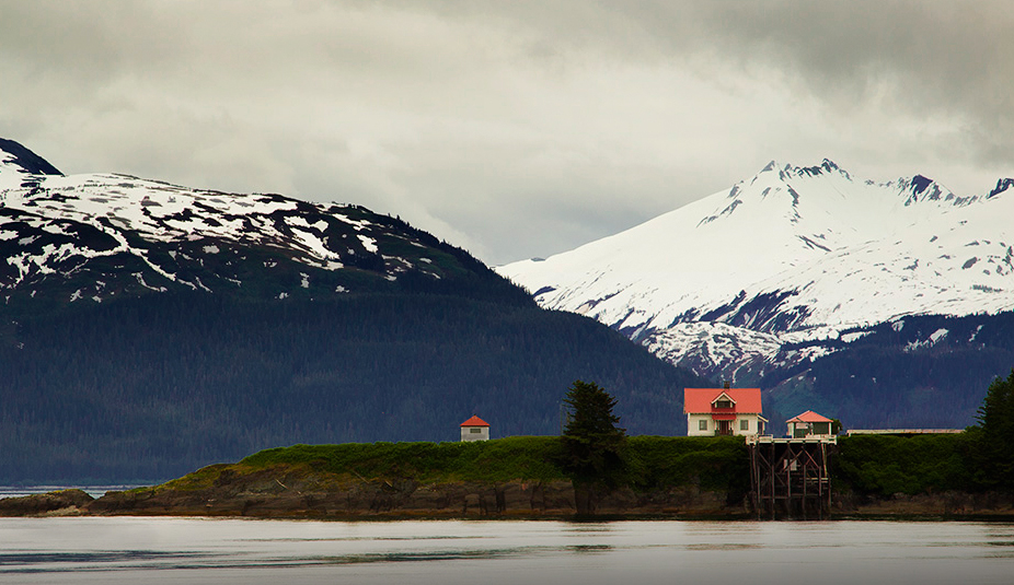
| 14 |
Feb 17 |
Comment |
I love the content and setting of your image. Your technique, colors, and tones are right on. To answer your question, no, and yes. No, it needs the water to do two things: provide context to what is shown, and echo even further the fine layers of sky, mountains, island, buildings, and water. Yes, you have too much water; it's brightness dominates the scene. Don't forget that brightness and/or high contrast always attracts the eye. I would compromise by cropping most of it, to leave just the dark streak as a lead-in line.
As presented, the sky and snowy mountain, the house, and the lighthouse each competes for attention. If it were mine, here's what I would do. Crop as I suggested, and darken the water slightly. Then flip it and remove the attraction of the lighthouse, while darkening the outbuilding a bit. This doesn't change the majesty that attracted you, nor the comparison of man's handiwork with nature's, but the eye stays in the frame and all lines lead to that red roof. (On the other hand, that wouldn't go in Phototravel.)
|
Feb 5th |
 |
5 comments - 3 replies for Group 14
|
| 33 |
Feb 17 |
Comment |
Sorry to be so late in commenting.
I like the simplicity of it, and the beautiful tones you have brought out while keeping the kind of detail that monochrome is so good in bringing out. Very good. If it were mine, I would darken the bright portion of the sky, since the brightness competes with your lone tree for attention.
. |
Feb 26th |
| 33 |
Feb 17 |
Comment |
You have a very pleasant location at the right time of day and a good technique. I have to agree with Lloyd on the lack of a center of inter fest; my eye wanders from bright spot to bright spot. If it were mine, I would do something like this thumbnail. I cropped much like Lloyd suggests and then darkened the corners slightly. This leaves the area around the outlet stream as a focal point/center of interest, and has fewer distractions.
|
Feb 19th |
 |
| 33 |
Feb 17 |
Comment |
That wonderful old house must have been part of a large establishment. You have pictured it well. I like Paul's crop, but I would leave a bit more of the fence, probably to just after the sign. I would like to see what it looks like under different lighting conditions and viewpoints. I can imagine that one could almost make a career of photographing this place.
|
Feb 19th |
| 33 |
Feb 17 |
Comment |
Yes, lighting and mood is everything, and this image has them. Your technique is very good, but if it were mine, and would lighten the shadows....just a touch. To me, the rocks in the foreground are essetial to give it depth and keep it from being a cardboard cutout or a picture postcard, but I would definitely get rid of the grass as being distracting.
Your use of a neutral density filter and long exposure did just the right thing for the clouds. It seems unlikely that the water surface could remain so glass smooth for that long a time; is it possible that the long exposure averaged out all small ripples?
|
Feb 19th |
| 33 |
Feb 17 |
Comment |
Your composition and atmospherics give great depth to this well-composed image. It is a very pleasant image. I do think that purple rocks are a bit jarring, though.
|
Feb 19th |
| 33 |
Feb 17 |
Reply |
Your image is in RGB format, which includes a wide range colors and tones. Browsers, which are usually intended to be used on the internet, use sRGB format, a much narrower range of tones. When you prepare your image in RGB, and then look at it in sRGB, tones and colors will almost always not look the same.
You can change it, and make the two look much more closely alike, in Photoshop by going to Edit> Assign Profile and select sRGB as the working profile. |
Feb 13th |
| 33 |
Feb 17 |
Reply |
I tried it in monochrome. I does make a decent monochrome, but I like it better in color. Maybe I will save the monochrome version for entry in a monochrome-only exhibition. |
Feb 10th |
5 comments - 2 replies for Group 33
|
10 comments - 5 replies Total
|


