|
| Group |
Round |
C/R |
Comment |
Date |
Image |
| 14 |
Jan 17 |
Comment |
I like simplicity, and this certainly has that. The bird is clearly in the midst of a complicated maneuver. I wish that it had more detail; then you could crop a little closer so we cold really meet the bird himself.
|
Jan 13th |
| 14 |
Jan 17 |
Comment |
This is a very original and well done presentation of a scene that could easily have been photographed in conventionally humdrum fashion. Arun's suggestion takes the column far enough from the center to keep it from being static. My only problem with it is that it took me a (short) while to realize that I am looking up instead of horizontally. I like it, but I do think that the short delay would be fatal in a club or exhibition setting.
|
Jan 13th |
| 14 |
Jan 17 |
Comment |
Let's compromise. There is a lot of good detail here that tells a story. Pat's suggestion is undoubtedly stronger as an image, but leaves us guessing about what it is. I suggest cropping the top to about the dimensions of the other three sides, then maybe darkening the foliage.
|
Jan 13th |
| 14 |
Jan 17 |
Comment |
Though I like what Arun has done, I like the original a little better. Consider that the falls and river are out of focus; there is enough detail in the man with the white shirt to steal our interest from the out of focus detail.
|
Jan 13th |
| 14 |
Jan 17 |
Comment |
Right on! Very nicely done indeed. The only suggestion I can make is to tone down the bright sidewalk a bit; then we can better see the sunlight on the gateway and into the city.
|
Jan 13th |
| 14 |
Jan 17 |
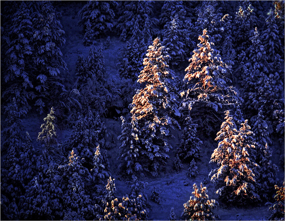
Reply |
Thank you for going to the trouble to suggest a revision. I hadn't thought about monochrome, since I was intent on using the red and yellow of the sunrise to help pull the sunlit trees from those in shadow. You have a valid point: this can also be a monochromatic subject. I suggest that my simplicity objective would be better approximated with greater contrast that shoves the shadowed trees further into the shadows, maybe something like this:
|
Jan 13th |
 |
| 14 |
Jan 17 |
Reply |
Your comment made me take a second look at this image. You are right; it needs more detail in the blue areas. I hope this is enough. There is a trade off between detail in the shadows and simplicity, so I don't want to go too far.
There is another more subtle problem. The latest version of PS CC threw out all my Preferences, substituting "Don't color manage...." for sRGB color profile. When I correct the shadows and color profile, it looks like this. Does this help?
|
Jan 13th |
 |
| 14 |
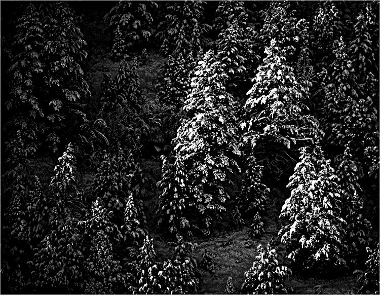
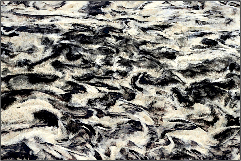
Jan 17 |
Comment |
You have found an interesting pattern in nature, when most of us would have bean inside around a fire. I have a couple of suggestions that I think will enhance it.
The image is gray because it has no true blacks or true whites. If you use PS Levels to move the White Point down and the Black Point up, and then use the middle slider in Levels (Gamma) you can give yourself real blacks and whites so that it isn't gray. Next, the grains of sand make it look, well, grainy, detracting from the pattern. In Topaz Simplify, I used a preset called Spot Removal IV under Detail Removal and Enhancement to give rid of just the graininess. Finally, I couldn't resist strengthening the composition a bit by brightening a portion of it.
|
Jan 7th |
 |
6 comments - 2 replies for Group 14
|
| 33 |
Jan 17 |
Reply |
You can find clues to whether or not the image is level by looking at the trees. Most firs and spruces, but not all, grow vertically; bring in a vertical guide line from the left to test trees. In this image, there is a leaning tree at the right edge, but almost all the others are vertical until you get to about the left quarter of the image, and some of them are not very far from vertical. This suggests that at worst Judi has some key-stoning. Pull down a vertical guide to find that the far away shoreline is in fact horizontal. It rises as it should, just where the stream turns toward us. Sherlock could probably find even more evidence....
|
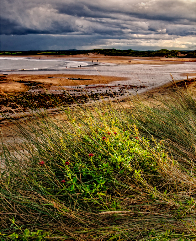
Jan 15th |
| 33 |
Jan 17 |
Comment |
Your image illustrates your point very well. The exposure and basic technique are very good. This looks just like what most people envision as a cold, windy Northumberland August day. Brrrrr. The composition is unusual, but it works for me,though I do wish there was a way around the grasses and flowers to "step into the scene." The scene looks flat to me, with not much tonal separation between your focal point, the grass and flowers, and the background.
I think what I have done helps. I selected the upper part along the shoreline, feathered it a bit, and darkened it. I also darkened the lower corners.
|
Jan 7th |
 |
| 33 |
Jan 17 |
Comment |
If you can do this well right out of the camera, you don't need much post processing! To me, your composition is great and a bit unusual, and seems to put the Canyon in proper perspective. The only suggestion I need to make is about the colors.
I suggest that you use the sRGB color space when you are preparing images for Digital Dialogues, instead of RGB as this one is. Your DD viewers use browsers, mine is Firefox, which all use sRGB colors. Reds in particular are not handled well in RGB. In this case the reds of your image are a bit understated and dull; if you prepare it to look right in Photoshop with sRGB color space, it will show up much better for DD viewers. A bit of increased Vibrance and maybe a little more saturation and a bit of contrast will make it really shine.
|
Jan 7th |
| 33 |
Jan 17 |
Reply |
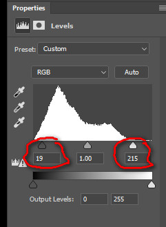
Yes, I used the Photoshop function called Levels. It is best used in conjunction with viewing the histogram of the image. The histogram plots horizontally the numerical value of pixels (000 to 255 for eight-bit pixels) vertically against how many pixels have that value. The value 000 represents black, and the value 255 is a fully-exposed pixel, as bright as it can get. (See the image below, which shows the Levels dialog.) The brightest pixels in your image are about 220, definitely grayish. While the darkest couple of pixels in your image were about 000, most of the darkest pixels were between 010 and 020, which is definitely gray. Gray is gray, and your image gave that appearance.
The right-hand red-circled slider sets the image pixel value to white at lower value than 255. In this case, I set it at 213; all pixels of that value and higher were set to 255, pure white, and Photoshop adjusted all others proportionately. This is called the White Point adjustment. Similarly, I set the lowest slider to 019 in the illustration; this is the Black Point. All pixels of that value and less were set to 000, black, and all others adjusted proportionally out to the new White Point. Your image that ran from about 015, a gray, to 220, now runs from 000 to 256, full black to full white. Black is black, white is white, and colors, if any, are cleaner and brighter. It's usually worth while to tinker with each value a bit to find the ones that you like best.
There are other ways to do similar 5hings, but most are not so simple.
|
Jan 5th |
 |
| 33 |
Jan 17 |
Comment |
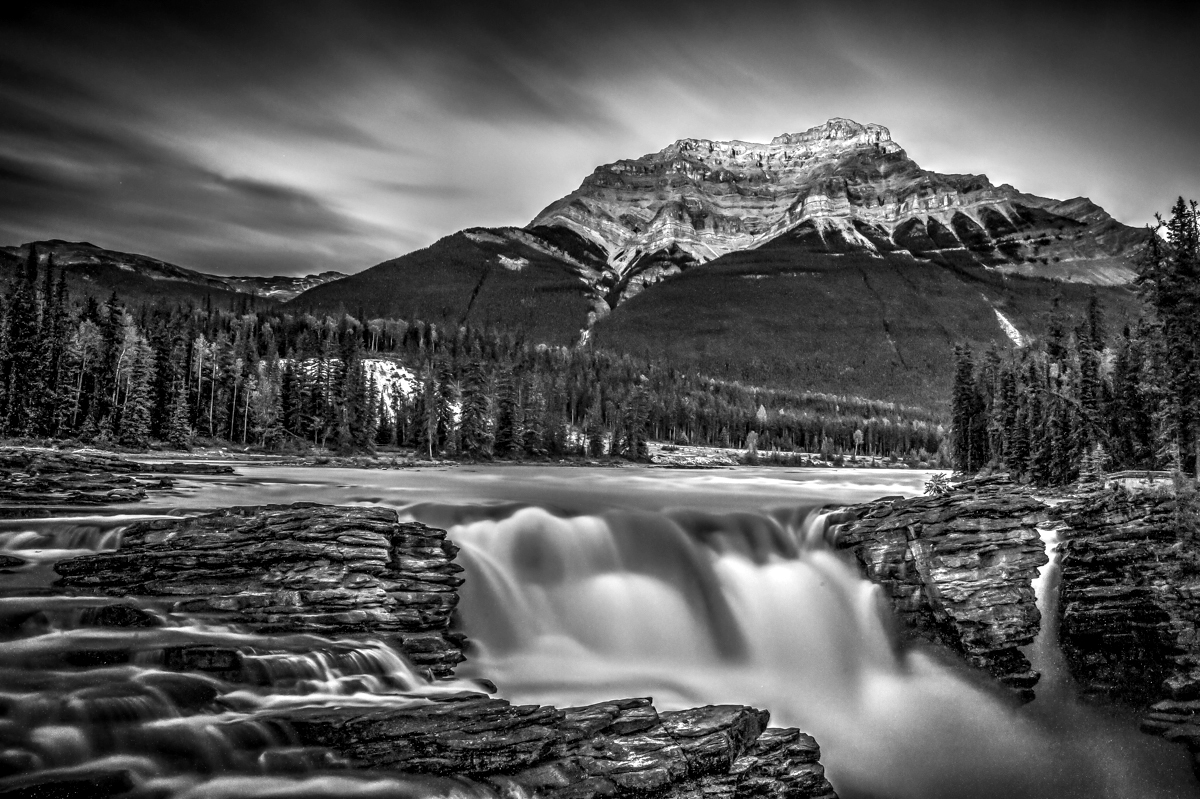
You have a beautiful image here. It is well composed, sharp and clear, presenting a striking landscape. It's a minor point, but I suggest that you do some hand work to get rid of the halo where the mountain meets the sky on the left.
There is a more major issue, though. Many,many moons ago when I was competing with monochrome 16X20s made in a chemical darkroom, I learned the hard way that, unless a monochrome has some areas of real (255) white and some areas of real (000) black, it will look gray no matter how much Contrast you put in. This one looks gray because it has no true whites or true blacks. In the thumbnail I did just one thing. I used Levels and set the White Point to 221 (the highest color you have in your image) and the Black Point to 015, your deepest black. Notice how it sparkles now.
|
Jan 4th |
 |
3 comments - 2 replies for Group 33
|
9 comments - 4 replies Total
|


