|
| Group |
Round |
C/R |
Comment |
Date |
Image |
| 92 |
Apr 20 |
Reply |
Hi Jill
I'm in Waverley Camera Club in the South Eastern suburbs of Melbourne. :-)
|
Apr 12th |
| 92 |
Apr 20 |
Reply |
Hi Brandon. I take your point. I'm probably not a good person to judge mood from colours as I am partially colour blind. I'm all for experimenting. :-) |
Apr 8th |
| 92 |
Apr 20 |
Reply |
Interesting question - capturing a moment on the street vs editing. If it was photojournalism, such edits wouldn't be appropriate. In this case I was thinking the blurring would be what you'd see if a wider aperture had been used for the original capture so the edit does not misrepresent the scene, but I take your point. |
Apr 7th |
| 92 |
Apr 20 |
Comment |
Thanks for the nice comments. I submitted this image last month for our local club competition but the judge didn't like it. I guess it is all very subjective. :-) |
Apr 7th |
| 92 |
Apr 20 |
Comment |
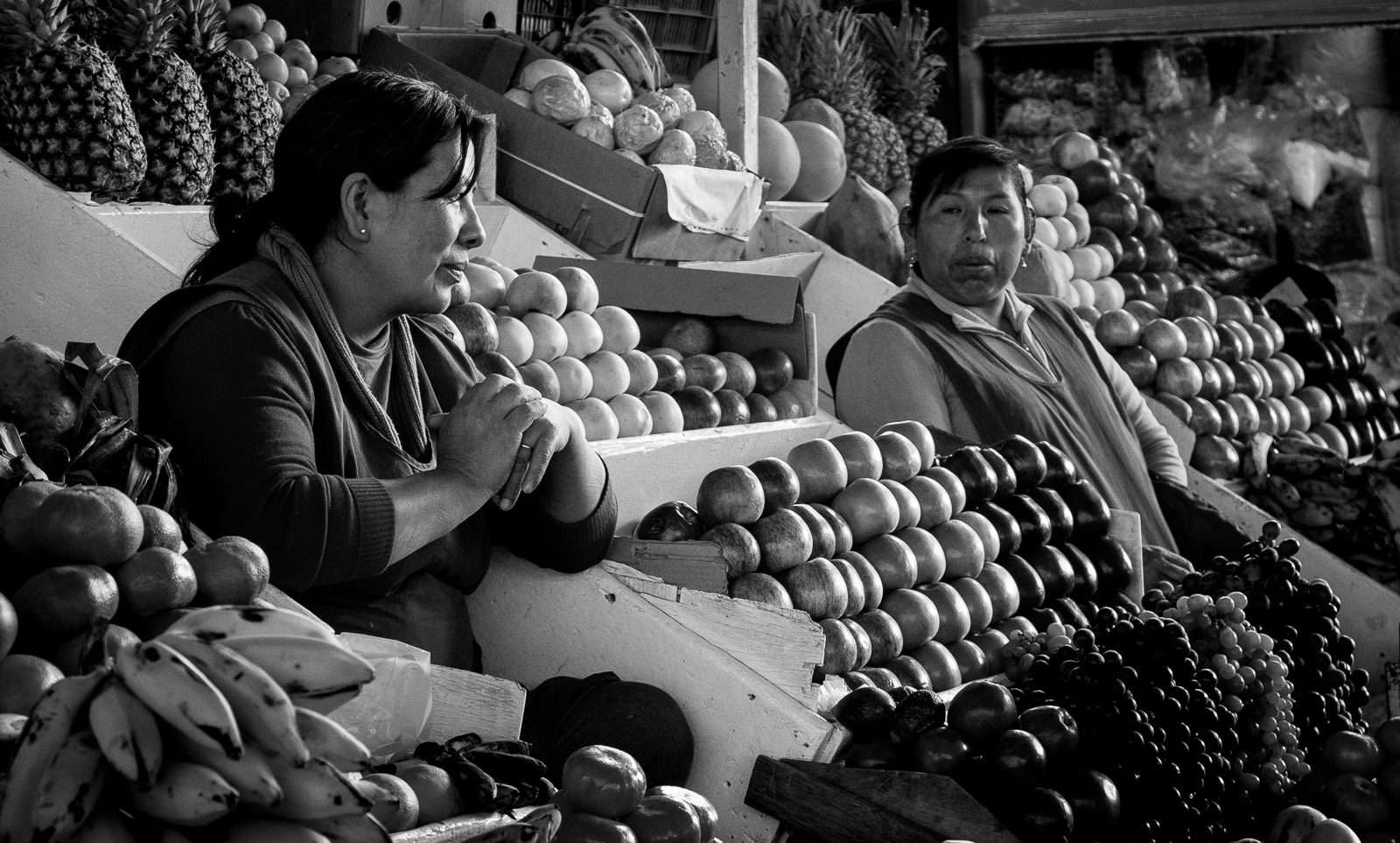
Strong travel portrait, which draws in lots of detail about the lifestyle and environment of the subject. Is this a crop from a larger image? Are there more coconuts to show at the bottom left (I assume he is selling them)? The only other suggestion I have would be to desaturate the yellows slightly so the number plates of the bike and car are not so eye-catching. |
Apr 7th |
| 92 |
Apr 20 |
Comment |
There is certainly a sense of emptiness, and the thought of the stop lights is good, but speaking personally, the blue colouring doesn't excite me. What does it look like in more naturalistic colour? Or perhaps monochrome, with selective colour for the red lights? |
Apr 7th |
 |
| 92 |
Apr 20 |
Comment |
Playing a bit more in PS... a tighter crop, with the background fuzzed even more. It's all down to personal feelings ... What are your thoughts? |
Apr 7th |
 |
| 92 |
Apr 20 |
Comment |
An interesting image with an interesting story. I find the background a bit distracting. What do you think if the saturation on the background is reduced? |
Apr 7th |
 |
| 92 |
Apr 20 |
Comment |
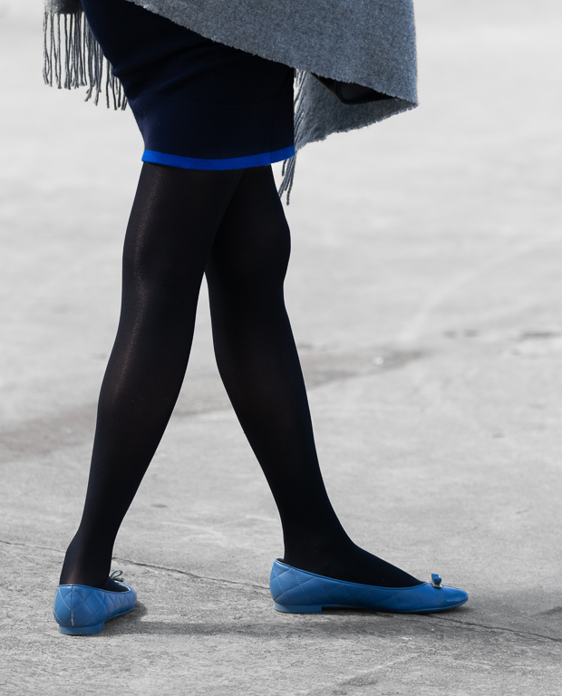
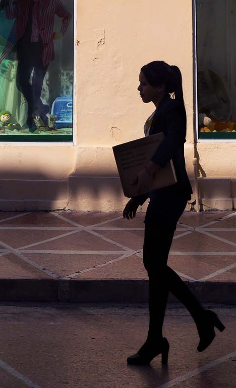
Well timed shot. I like the way the legs of the walking woman match the crossed legs of the mannequin in the shop window. I had a little play in PS - tried to make the leg silhouette more distinct from the dark horizontal line of the kerb, and a slight adjustment to improve the contrast in the shop window and overall. What do you think? |
Apr 7th |
 |
| 92 |
Apr 20 |
Comment |
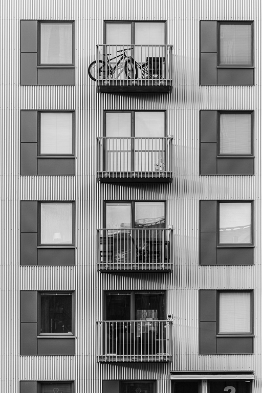
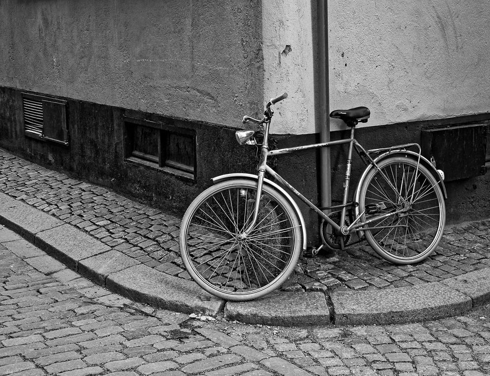
I agree that monochrome is good for this image.It's definitely street photography and an interesting scultpure, but for me, the image seems a bit busy. My eye keeps wandering around from the sculpture to the passing car to the road signs. The bright rectangle at the bottom corner, and the small wedge on the mid-right side could probably be toned down to remove distractions at the edges. Is this somewhere you can go back and explore further? I wonder if an overcast day or one where the sun is veiled by light cloud might not give less harsh shadows (though that may be what you aimed at) and bring out more of the texture on the sculpture. Perhaps you could move some of the distractions like the stripey bollards at the edge of the road below and beyond the airport sign. Just some thoughts. |
Apr 7th |
7 comments - 3 replies for Group 92
|
7 comments - 3 replies Total
|