|
| Group |
Round |
C/R |
Comment |
Date |
Image |
| 92 |
Feb 20 |
Reply |
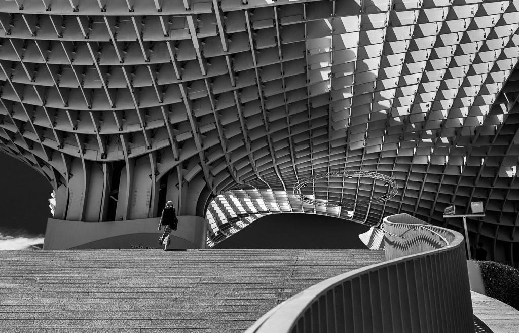
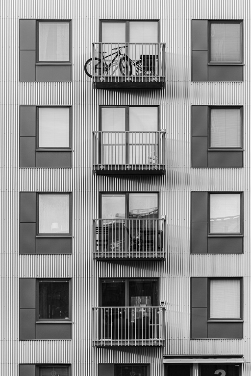
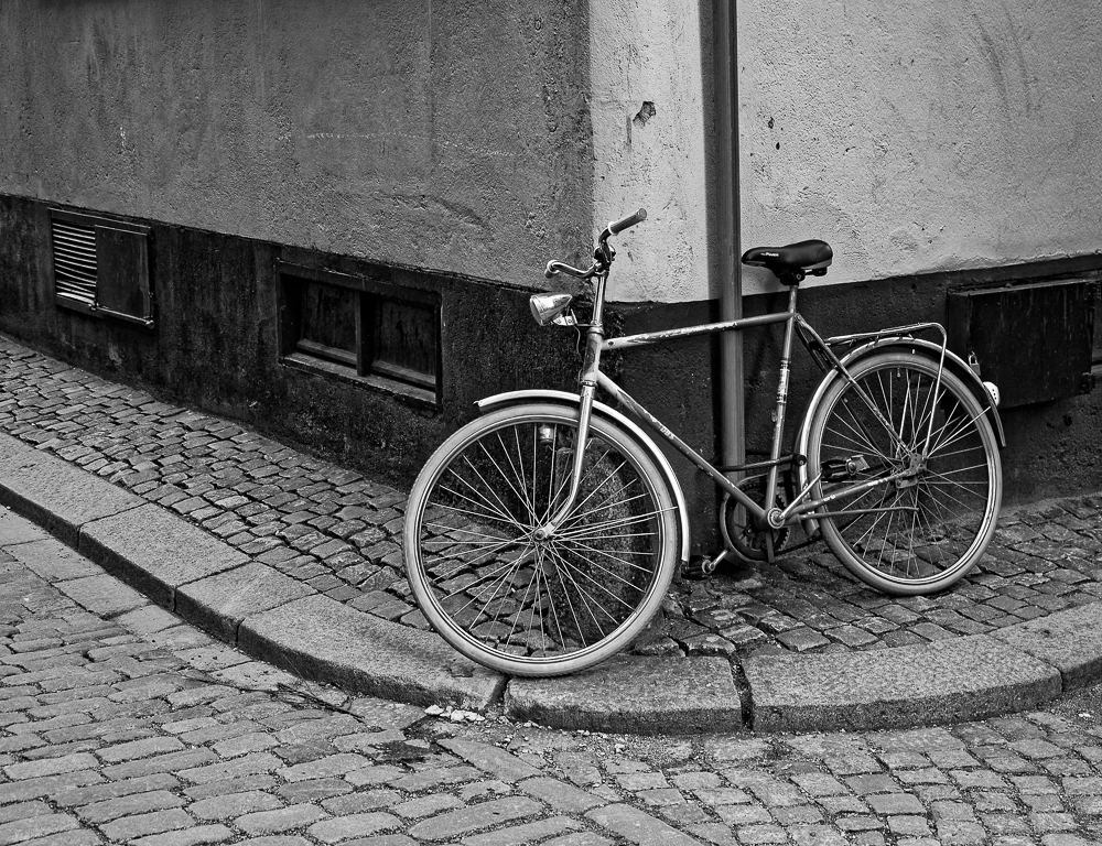
I didn't think the ground floor added to the story. Here is a wide shot that includes the lower floor so you can see. To me it loses the repetition of structures on the floors above that to me draws the image together. |
Feb 17th |
 |
| 92 |
Feb 20 |
Comment |
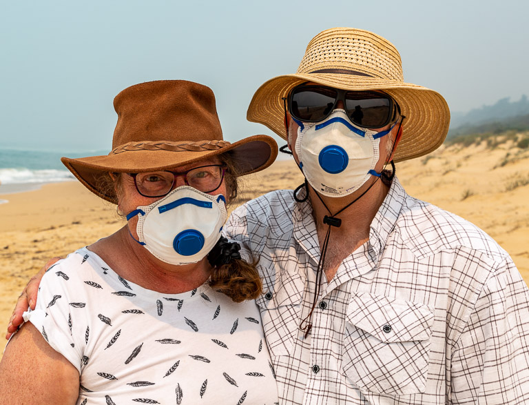
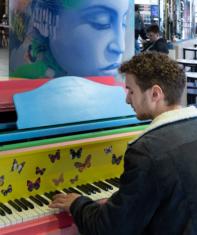
Interestn=ing looking subject. However I find the lighting a bit harsh, and the patch of bright sky above her head tends to draw my eye away from her face. A slight move to the right might have given a more uniform background. I had a play in photoshop. What do you think of the difference with a few adjustments? |
Feb 7th |
 |
| 92 |
Feb 20 |
Comment |
You could clear up the horizontal fence issue using content aware fill (in photoshop) or the equivalent in GIMP. |
Feb 7th |
 |
| 92 |
Feb 20 |
Comment |
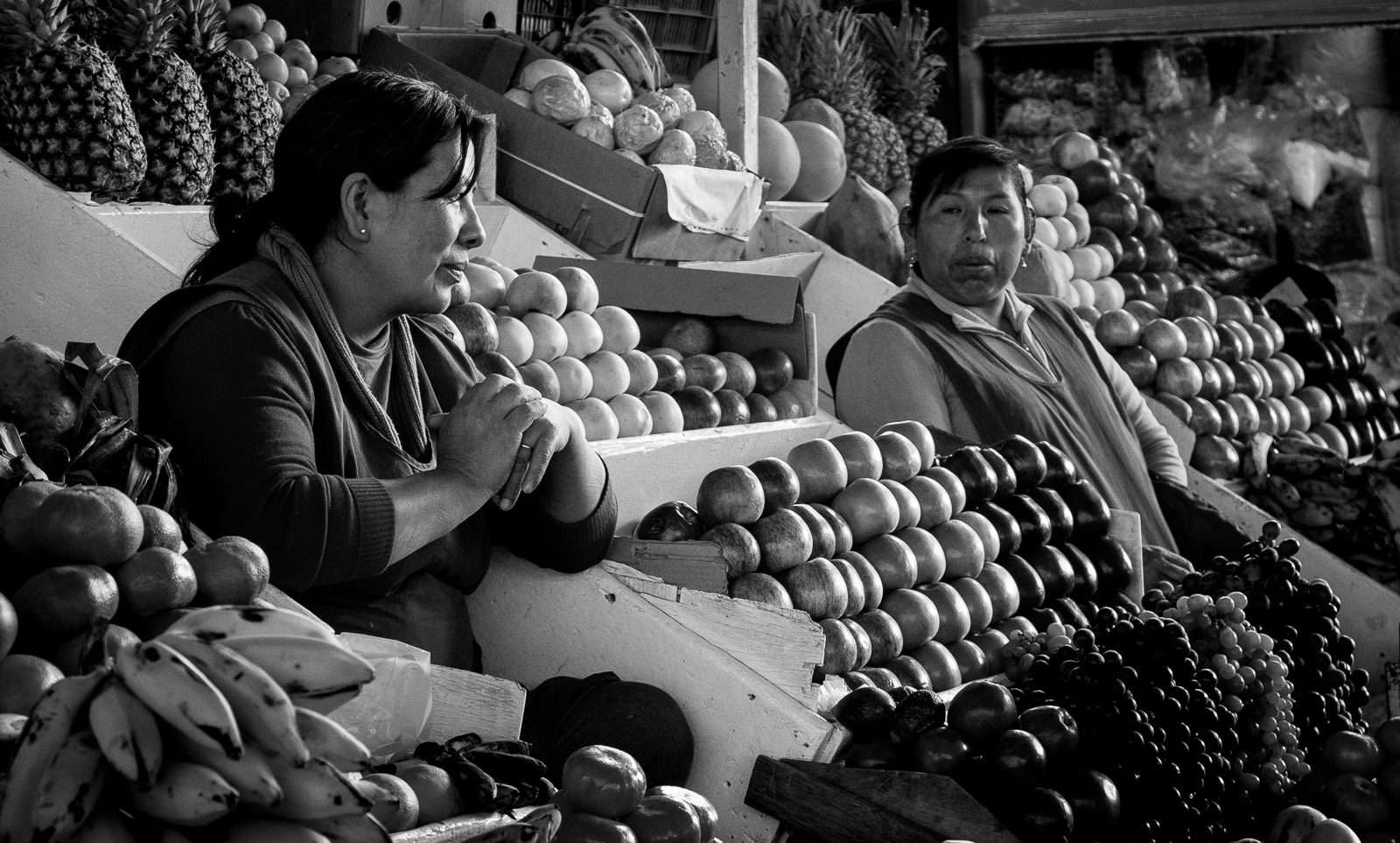
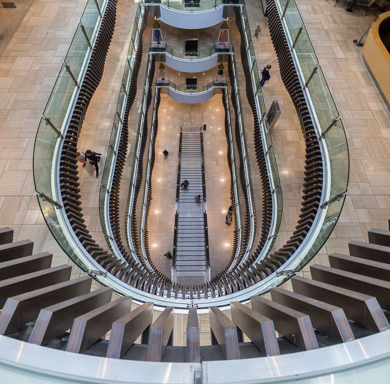
Strong image. It has a dynamic feel and tells a story. |
Feb 7th |
| 92 |
Feb 20 |
Comment |
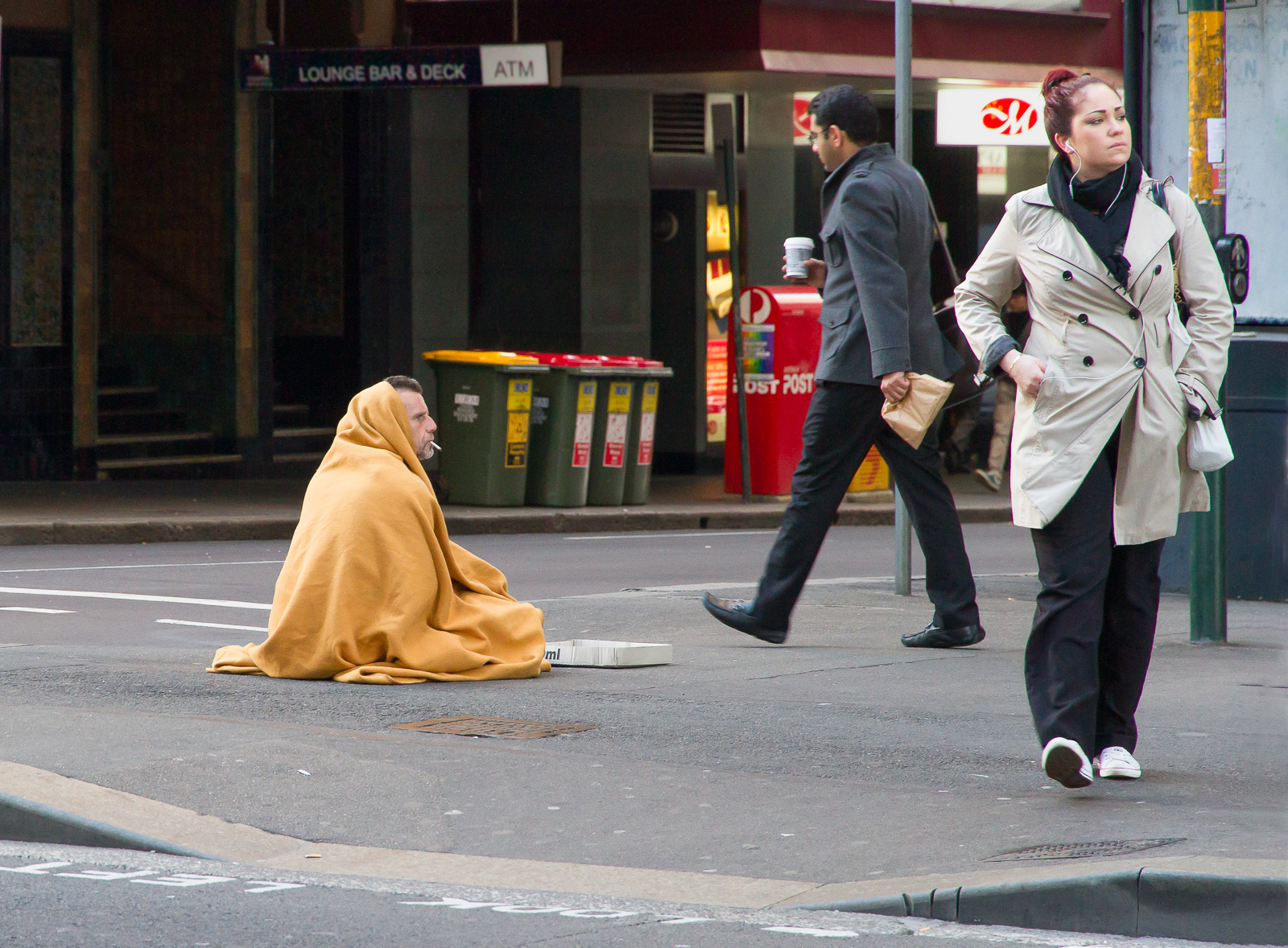
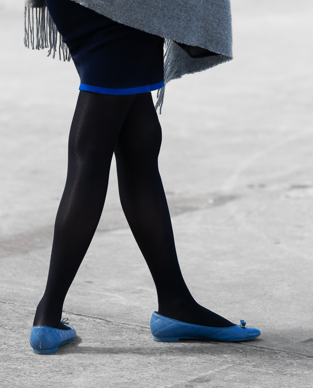
I like this composition - it has a nice balance and a nice message. |
Feb 7th |
| 92 |
Feb 20 |
Reply |
Hi Stephen
Thanks for your comment. My thinking when I included the top of the lower story was to show there was more of the building below the part I photographed - to give a bit of context. Do you think it works or would it be better cropped at the bottom?
It's near impossible to get perfect parallels out of the camera unless you are on something that gets your camera level up to the midpoint of the building, so I usually need to do some correction of converging verticals for a graphic image like this. In this case I used Lightroom's Transform-guided to set the verticals and horizontals to get the nice regular image. Photoshop, GIMP etc all have similar functions. |
Feb 3rd |
4 comments - 2 replies for Group 92
|
4 comments - 2 replies Total
|