|
| Group |
Round |
C/R |
Comment |
Date |
Image |
| 60 |
Feb 22 |
Comment |
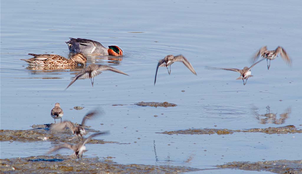
Hi Richard, this image is very restful to me and evokes peace. There isn't any clutter - yet you have interesting objects and subjects to look at. It doesn't take much to make a fantastic image. It's difficult to make out where the horizon is and makes for a great abstract picture. If that's not what you were going for you may consider darkening the water just a smidge. Either way a wonderful shot and location! |
Feb 7th |
| 60 |
Feb 22 |
Reply |
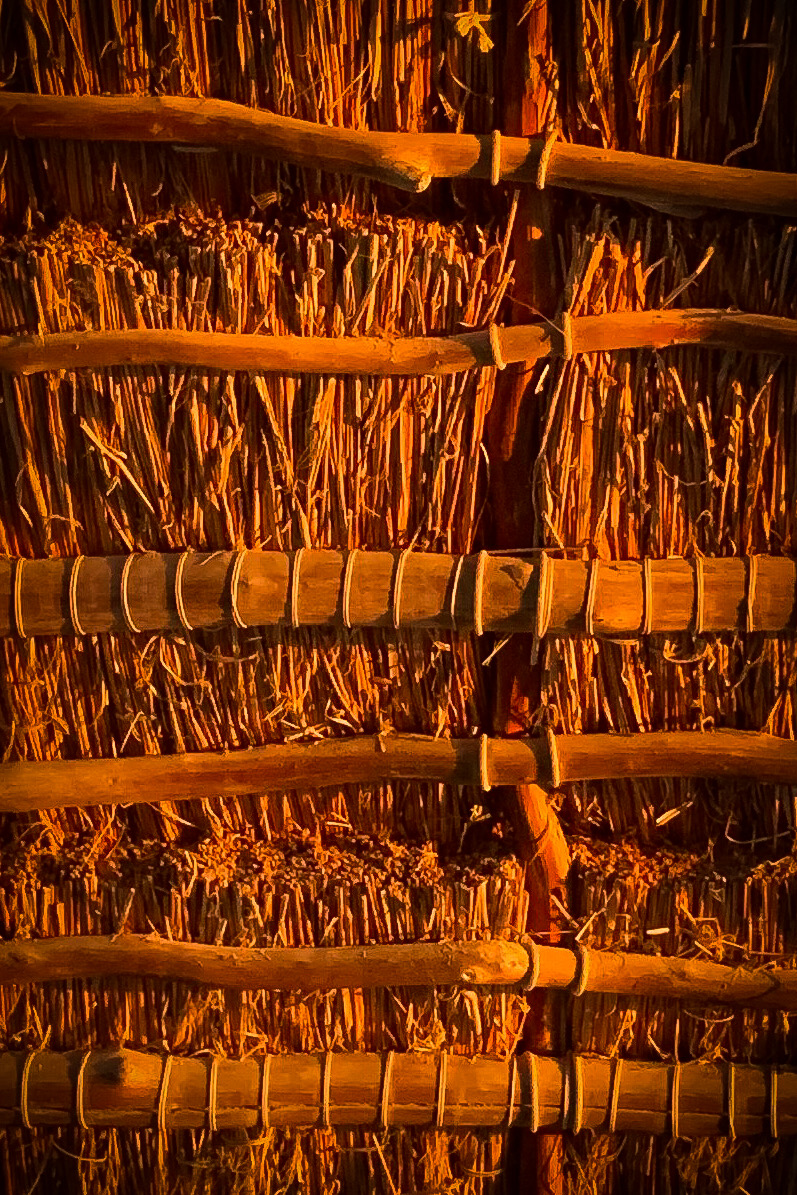
Thank you Rita. The sunset was so vibrant orange. The grass looked like it was glowing. You know my iPhone has as much resolution as my first digital Nikon with a crop sensor. It has better resolution than the photos I used to take with ASA 400 film. It's a fairly decent camera if you understand it's limitations. |
Feb 7th |
| 60 |
Feb 22 |
Reply |
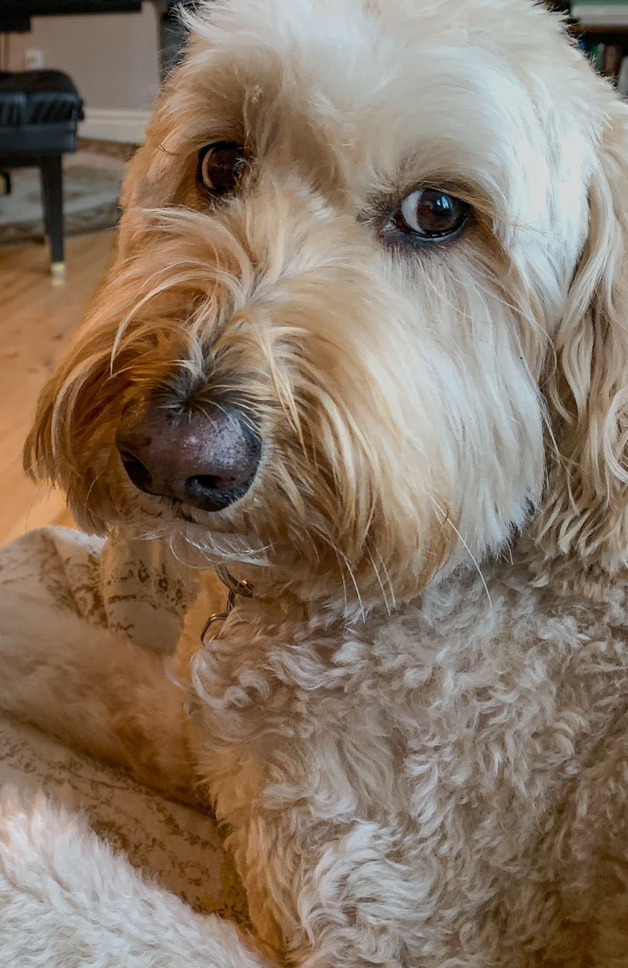
Thanks for teaching me about Rembrandt lighting. Let us know how you fix the left ear and shoulder. |
Feb 7th |
| 60 |
Feb 22 |
Reply |
Thanks Damon- it's hard to do that in photoshop express on an iPhone. |
Feb 7th |
| 60 |
Feb 22 |
Reply |
Thank you Rita. The sunset was so vibrant orange. The grass looked like it was glowing. You know my iPhone has as much resolution as my first digital Nikon with a crop sensor. It has better resolution than the photos I used to take with ASA 400 film. It's a fairly decent camera if you understand it's limitations. |
Feb 6th |
| 60 |
Feb 22 |
Comment |
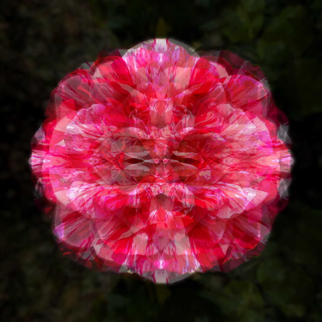
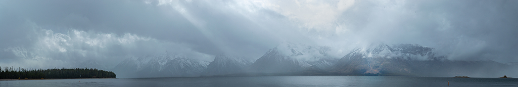
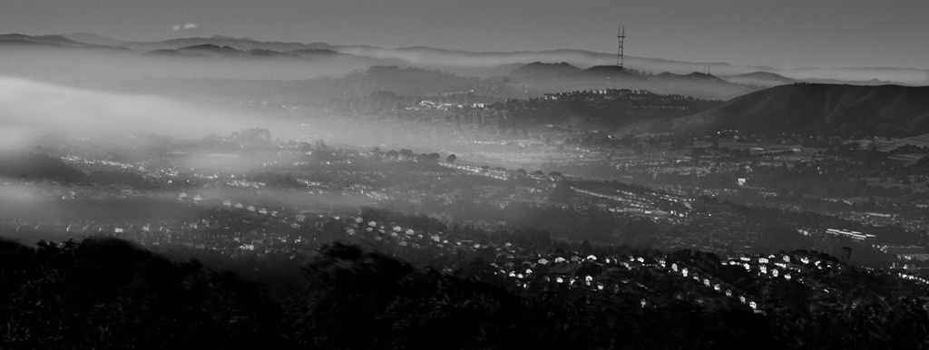
Hi Rita, I like what you're trying to go for. When I turned up the brightness of my iPhone I saw the colors. I think Damon is right that using gradients and masking will help you out quite a bit. I think also cropping in from the right just past that tall mast would help focus attention on the water. Do I understand right that the sun has actually set and that what we are seeing in the sky is the moon? BTW, that reflection of the bridge in the water is pretty cool, have you thought of cropping in to that of course that would be another photo altogether.
A question to everyone, do you all calibrate your monitor? |
Feb 6th |
| 60 |
Feb 22 |
Comment |
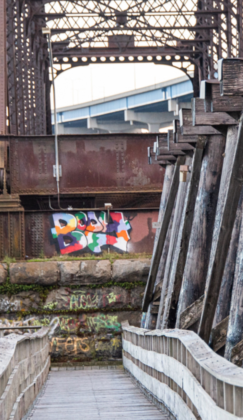
Hi John, great subject with nice leading lines that lead your eye to interesting colorful graffiti. I like the fact that the graffiti is the only colorful thing in the photo. My eye sees a little competition and tension between the new bridge in the distance and the graffiti. I wonder if you were to crop the photo to get rid of the weight of the piers, get rid of some of the clutter and add a vignette if that would lower the competition between the bridge and the graffiti? I tried it here, just an idea. I'm on my iPhone (long story) editing so I only got rid of some of the clutter. There is a silver light that I didn't get rid of but wish I could. Nice photo! |
Feb 6th |
 |
| 60 |
Feb 22 |
Comment |
Hi Damon, great subject. I'm not very experienced with lighting and portraits. I think it's great that you are experimenting with Rembrandt lighting and crunchiness. I always thought of Rembrandt lighting as soft so it's cool to see a different take. I wonder though do you think the left ear rim light is a tad too harsh? Maybe bring it down by a half a stop? I think if you do that and darken the left side just a little you'll get the effect you want. |
Feb 6th |
4 comments - 4 replies for Group 60
|
4 comments - 4 replies Total
|